[CASE STUDY] How Platformly Onboard Users with their Complex Product
![[CASE STUDY] How Platformly Onboard Users with their Complex Product](https://userpilot.com/blog/wp-content/uploads/2020/02/platformly_1_5e7a264edd5c7d605bb5a1a66f292cf6_2000.png)
Onboarding is a crucial part of any SaaS product. It educates your users, and helps them start seeing value from your product right away.
It becomes even more important, however, if your product is particularly complex.
Platformly is a marketing automation platform. Among its many features is the ability to nurture leads, analyze customer journeys, and develop personal relationships.
It’s a fantastic product, but the wide range of features make it relatively complex for new users.
The team at Platformly needed a way to make their complex product more simple.
Here’s how they did it…
How Platformly onboards new users
When you first log in to Platformly, you’re greeted with an empty dashboard.
There are lots of different menu categories to choose from, and the whole thing looks a little overwhelming.
That’s why Platformly includes three key onboarding features, highlighted in the image below:
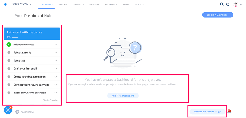
The first thing to note is the checklist on the left-hand side. This is going to guide new users through the main areas of the product.
We’ll talk more about the checklist later.
For now, draw your attention to the empty state. This empty state is designed to drive you towards creating your first dashboard. The CTA is clear and compelling.
The final thing you should look at is the bottom-right corner. Here you can see a button that says “Dashboard Walkthrough”.
These walkthrough CTAs will appear at the bottom of each page in the product, enabling new users to choose whether they need the help or not.
Clicking the walkthrough CTA on this dashboard page triggers this modal to appear.
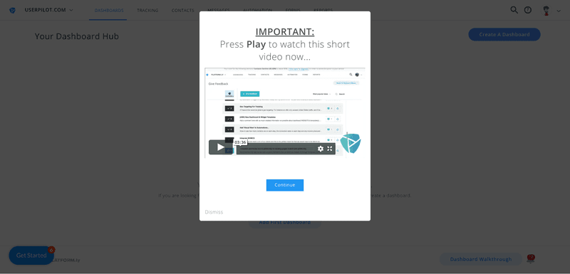
The modal contains a video that shows you how the dashboard work, and the benefits of using this feature.
Once you’ve seen the video, Platformly uses an interactive walkthrough to help you build your first dashboard.
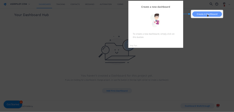
Driven actions are used so that users must click on the relevant buttons and complete the task. This is far more effective than simply pointing out features to your users, as they have to act there and then.
These interactive walkthroughs have been added to all of the main features that Platformly has to offer. This gives you a great overview of what the product can do, and how you can use it.
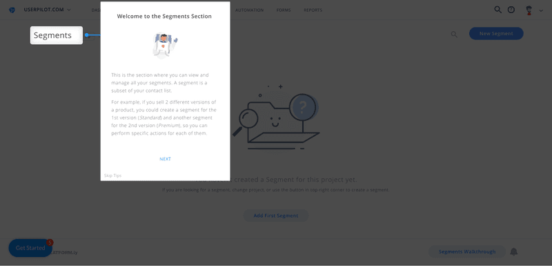
It’s also worth pointing out that Platformly’s copy perfectly explains the more complex areas of the product, using clear and simple language.
Now, let’s go back to the checklist.
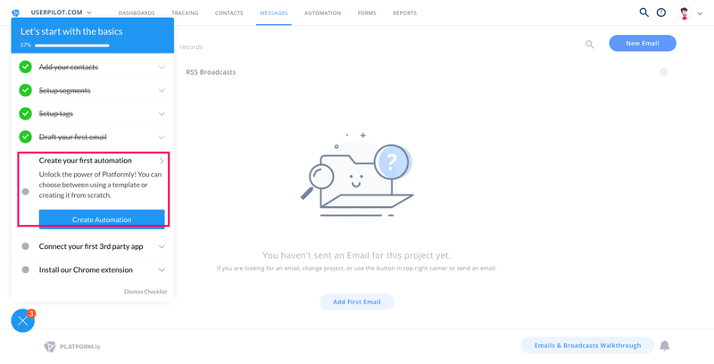
Clicking on a checklist item expands it out, revealing a little more information and a CTA that will direct you to the relevant part of the product.
This is a perfect onboarding checklist. It contains a progress bar so users know how far through the onboarding they are. It also started with the first item crossed off, a good example of the “Endowed Progress” effect, motivating users to carry on.
RELATED: 6 Tips to Create the Perfect User Onboarding Checklist
Once you’ve worked through each of the items on the checklist, you’re shown a congratulatory message. It’s always a good idea to celebrate your users’ achievements.
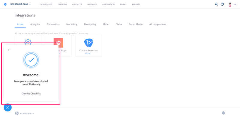
Even though users have finished the checklist, the various walkthroughs are still there on pages that haven’t yet been used.
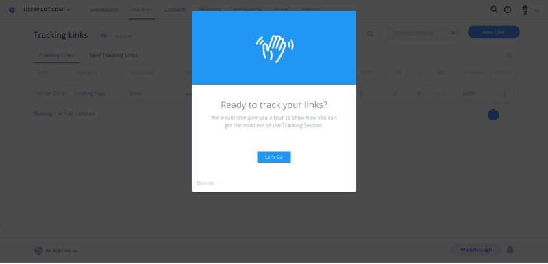
This is a great way to extend the onboarding in a way that is both useful and optional.
What were the results?
Generally, an onboarding flow completion rate of 30% is pretty good.
By making their complex product simple, Platformly had completion rates of 40% and over on their onboarding flows.
This meant more users saw value from the product, and as a result are more likely to convert into paying customers.
That’s a great result for the team at Platformly.
What can you learn?
If you have a complex product, you need to make sure your onboarding is as simple as possible.
That means breaking down your onboarding into a number of different flows. Ideally, you’ll have one flow for each of your main features.
These walkthroughs should be interactive, so users learn by doing.
You should also make sure the option to trigger the walkthrough manually is always there, much like Platformly did with their button in the footer.
This makes it easy for new users to get the help and guidance they need, as and when they need it.
Improve your onboarding today
You can start improving your product’s onboarding today. All you need to do is sign up for your trial of Userpilot.
You can then start adding your onboarding flows, with no coding knowledge required.
It’s the easiest way to improve your onboarding, and put what you’ve learned from Platformly into practice:
