Customer Effort Score Survey Template: Types and Examples
Looking for a customer effort score survey template to collect insightful feedback?
We got you covered! This article shows you different types of CES survey templates and examples of questions to include in them. Additionally, we will walk you through the process of creating a survey and analyzing the data from A-to-Z.
Summary of customer effort score survey template
- CES measures the perceived effort customers exert when interacting with your product or teams. The data uncovered will provide insights for improving customer satisfaction.
- Customer effort score survey questions can include a Likert scale, a numeric scale, smiley faces, and a follow-up open-ended question.
How to build and trigger a customer effort survey step-by-step:
- Choose the right tool or build from scratch.
- Map the user journey and define the touchpoints you want to collect feedback at: these could be after using a feature for the first time or interacting with your customer support team.
- Choose your CES template: one question scale or include a follow-up.
- Customize the template to match your brand.
- Trigger the surveys contextually to the right users.
- Analyze responses to understand customer experience and improve.
Example of questions to ask in your customer effort surveys:
- On a scale of 1-7, how easy was it to use the [X feature]?
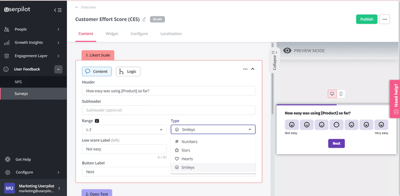
- How easy was using [Product] so far?
- How much do you agree with the following statement: The support team made it easy for me to handle my issue.
- Was it easy to find the information you wanted in the help center?
- Were the instructions you received during the onboarding stage easy to follow?
- What exactly made your interaction with our company difficult?
What is the customer effort score (CES)?
Customer effort score (CES) is a customer experience metric for measuring the user’s perceived effort when engaging with your product or service. By tracking CES, you can identify friction points, monitor product health, and understand overall satisfaction.
Types of customer effort score survey templates
There are several types of survey templates to measure the customer effort score, each used in different contexts and at different touchpoints.
You could use a Likert scale, numeric scale, emoticons, or an open-ended survey. Let’s consider the various methods and their nuances.
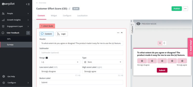
Likert scale CES survey template
The Likert scale is a psychometric scale widely used to gather quick customer feedback. It presents a statement, which is then followed up by a five or seven-point scale with answers ranging from ‘strongly agree’ to ‘strongly disagree.’
Use these types of surveys when the user interacts with a new feature, finishes a demo, finalizes a purchase, etc.
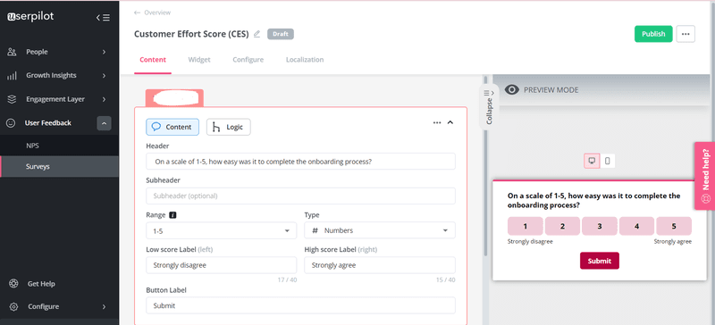
Numerical scale CES survey template
Numeric scales are similar to the Likert scale but use numbers. It can be a 3-point, 5-point, 7-point, or 10-point scale, but it’s better to stick with five or seven to help you quantify responses easily.
Trigger this survey to know the effort it takes to complete the onboarding process, finish a guide, etc.
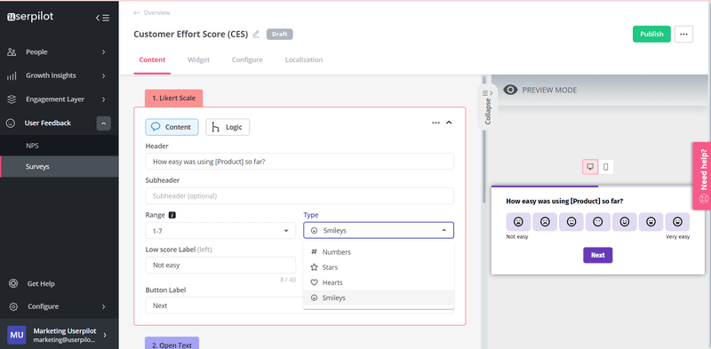
Emoticons and smiley face CES survey template
The visual nature of emojis makes it easy for customers to reply. All the respondent has to do is quickly go through the list and identify the emoticon that best captures their feelings.
Send emoticon surveys after customer service interactions to understand how the experience made customers feel.
Two-question CES survey template
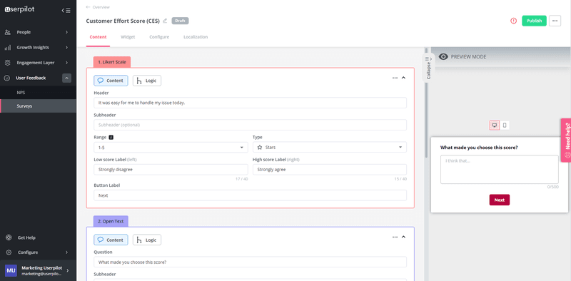
This survey method uses emoticons, a numeric, or Likert scale, plus an open-ended question to understand the reason behind customer rating.
You can use it at almost every touchpoint: after support interaction, new feature engagement, when customers make a purchase, etc.
The follow-up open-ended question will help you better understand the reasons behind a specific score.
How to build and trigger a customer effort survey
Now that you’ve seen different types of CES surveys, it’s time to start building. The following steps will help:
Use a tool vs build from scratch
You can build your surveys from scratch, but that’s generally an expensive approach (time and money). It’s much easier and faster if you use no-code survey tools.
The survey results are also easier to analyze without having to export results into spreadsheets. Not to mention you can automatically act on data and trigger follow-up communication directly in the product based on survey scores or responses.
Define the relevant touchpoints and CES survey type
Contextual surveys will drive more accurate responses than the ones you send randomly.
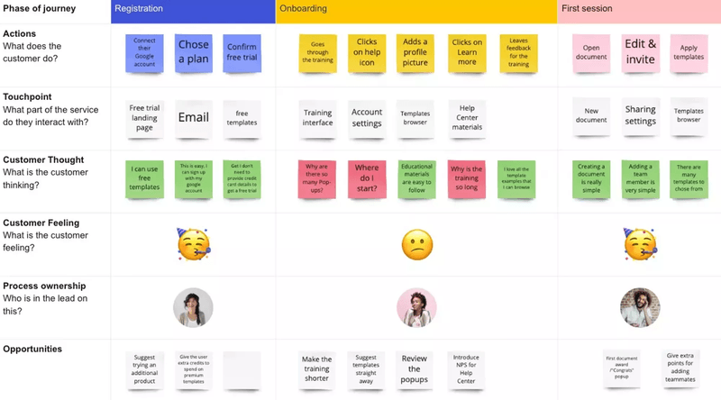
To make that happen you should start mapping the customer journey and list all the touchpoints in the user journey. Having the visual map in front of you, it would be much easier to determine where you should use surveys and how.
Choose your CES template
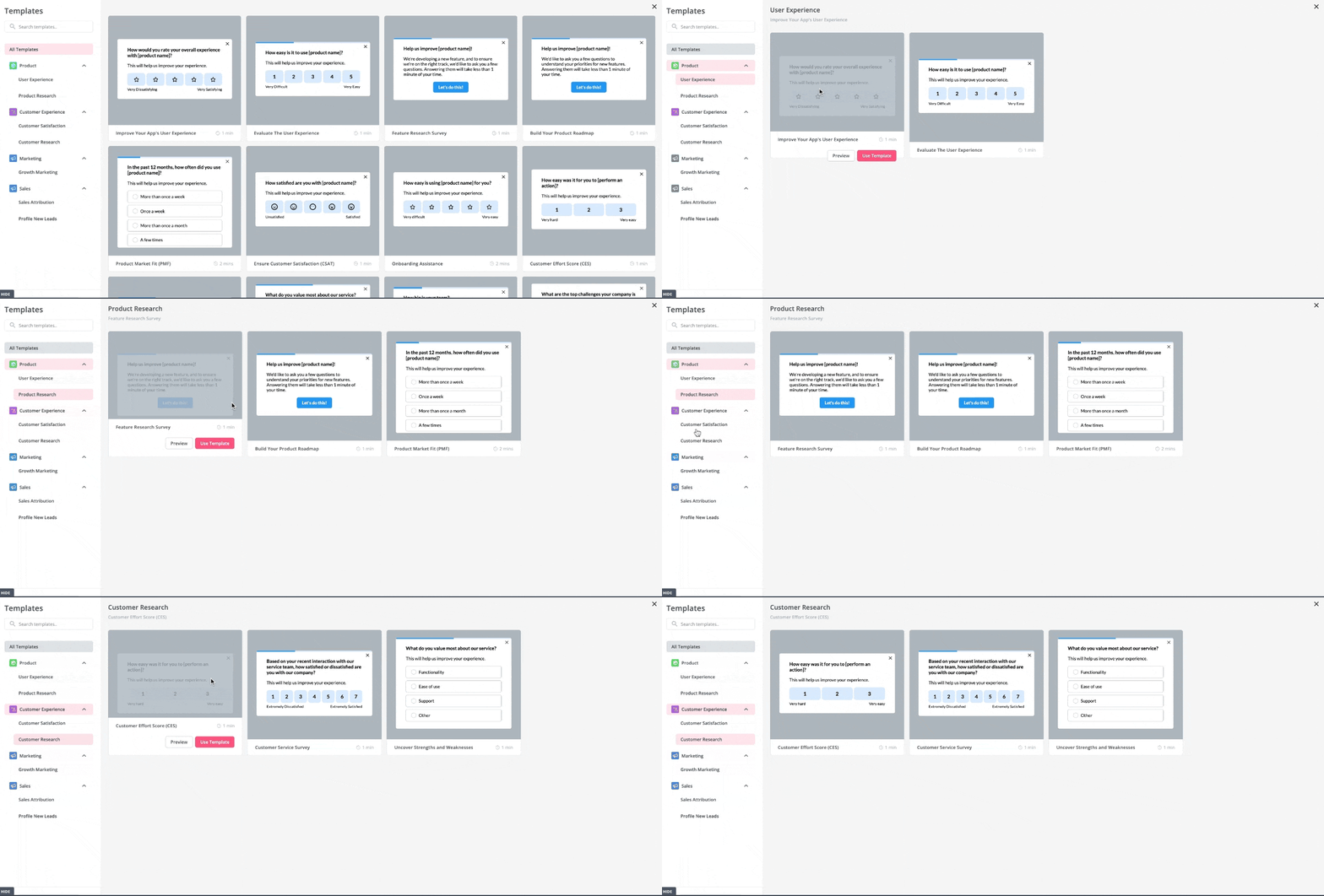
The feedback form you use should be something that aligns with your goal and is suitable for the touchpoint in question.
Feel free to choose from the templates discussed in the previous section and adjust them as necessary.
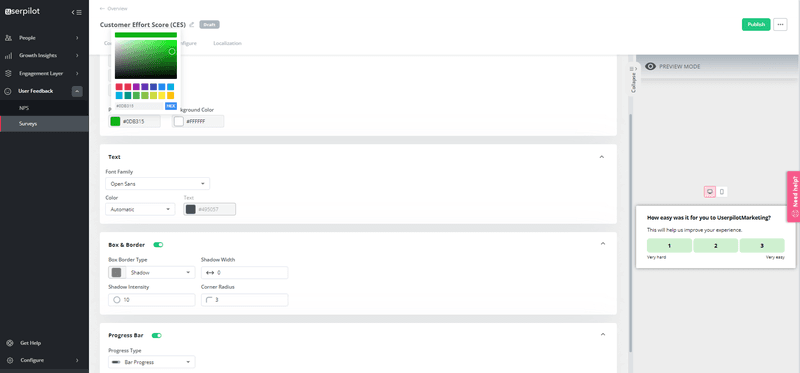
Customize your CES template
Match the design with your brand so the surveys feel completely natural. That includes using familiar colors and adding your company logo.
Also, stay consistent with your font, question types, progress bar type, etc. This is why you should choose a survey tool that allows for full customization.
Set contextual triggering
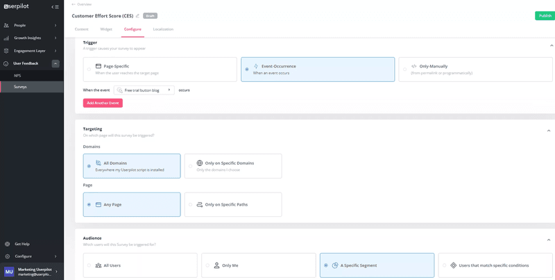
Your survey audience, timing, and placement are critical to getting the right response.
For example, triggering a CES survey two days after users interact with your support team won’t generate as many accurate answers as when you send it immediately after the experience.
How to send contextual surveys?
Determine what survey goes for which event, then segment customers to ensure only those that complete that event get the survey.
Analyze responses to understand customer experience
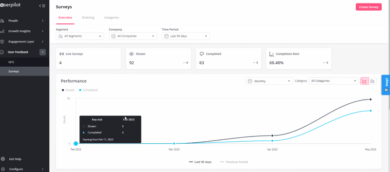
Sending automatic surveys can make you pile up feedback without acting on them. But in the end, you gain nothing.
Regularly analyze your feedback to identify patterns and implement solutions. Also, look at survey completion statistics and A/B test different approaches to improve the survey experience and drive high response rates.
Example of questions to ask in your customer effort surveys
As mentioned earlier, you can generally ask two CES survey questions:
- The primary question
- And the follow-up question to gather more in-depth feedback
Below are examples of both question types.
Primary questions
Ask the following questions using Likert, numeric scale, or emoticons to get quick quantitative feedback.
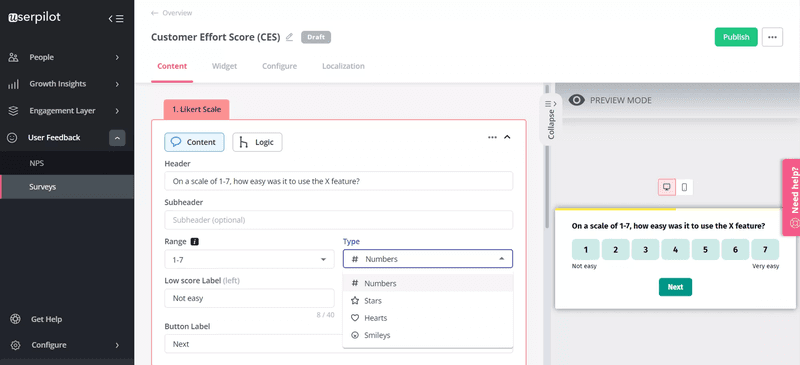
On a scale of 1-7, how easy was it to use the [X feature]?
This question lets you collect feedback on a specific feature and reveals the features that add friction to the overall user experience.
Pair this survey response with product analytics data and session recordings to find ways to improve the usability and UX of the feature.
You can ask it right upon users interacting with a feature for the first time.
How easy was using [Product] so far?
Send this question to measure the overall perceived effort of your product and uncover insights to boost customer loyalty.
You can send it early in the user journey (e.g., after activation) or at later stages in the journey so you can be proactive and help users when the score drops.
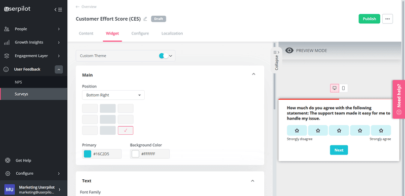
How much do you agree with the following statement: The support team made it easy for me to handle my issue.
This simple question helps you measure the ease of resolution in a customer support request.
With it, you will easily identify and address unhelpful customer service interactions, such as a difficult service phone call or chats that left users with unresolved issues.
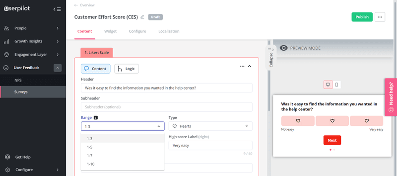
Was it easy to find the information you wanted in the help center?
Use this question to evaluate the structure of your help center and guides.
If many people are finding it difficult to locate resources, it means your resource center has a poor structure.
The question can be asked when the customers use the knowledge center’s search bar to look for information on a specific topic.
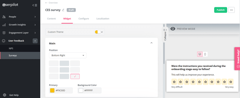
Were the instructions you received during the onboarding stage easy to follow?
Good onboarding is smooth and requires little cognitive load. Trigger this question to measure the effectiveness of your onboarding process and instructions.
Follow-up question
You can directly use the questions above or make little changes to suit your purpose. Let’s consider examples of follow-up questions you might want to add.
What made you choose this score?
This open question goes with any primary question and lets you collect both positive and negative qualitative feedback which you can use to either drive improvements or double down on what you are doing.

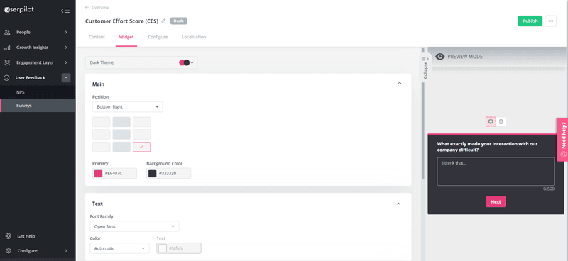
What exactly made your interaction with our company difficult?
This follow-up question is best triggered at touchpoints perceived as a high effort by customers. It will help you get into the customer’s mind and understand what exactly burdens customers and makes the interaction unpleasant.
Conclusion
Ready to save time by using a customer effort score survey template to collect feedback? Get a Userpilot Demo to try our templates and also build from scratch if you want.
In addition to templates, Userpilot lets you send surveys contextually and analyze the results to improve customer satisfaction.

