SaaS Product Metrics

Benchmark Report 2024

Compare your performance on top 6 product metrics benchmarks from 547 SaaS companies across 7 industries

↑ Get the full PDF copy of the 2024 SaaS Benchmarks Report.

Play Video

Why You Should Read This Report

Make Better, Data-Driven
Decisions

Benchmark Your Performance Against Industry Standards

Optimize Your Metrics to Maximize Your Revenue Growth

Metrics Analyzed

Averages from 547 companies analyzed

37.5%
Activation Rate
62 companies analyzed
19.2%
Onboarding Checklist Completion Rate
188 companies analyzed
1 Day 12 Hrs
Time-To-Value
62 companies analyzed
46.9%
1 Month Retention Rate
83 companies analyzed
35.7
Average NPS
229 companies analyzed
24.5%
Core Feature Adoption
181 companies analyzed

By Industry

By PLG vs SLG Approach

By Company Size

Where Is This Data From?

We’ve collected first-party data from pulling anonymized user data directly from Userpilot’s Analytics Dashboards. To compare these 6 product metrics from 547 companies, we’ve reviewed the following Userpilot dashboards and reports:
Previous slide
Next slide

Companies Analyzed by Industry

$63.9 milion
Average Revenue
327
Average Employee Count

Track your product metrics
with Userpilot Analytics

No coding required

Companies Analyzed by
Product-Led vs Sales-Led Strategy

Report Summary

Average Activation Rate

37.5%

Average
activation rate

62

Companies
B2B SaaS

37.04%

Median
activation rate

🔍 What is User Activation?

Activation is the moment in your users’ journey when the user experiences the value of your product for the first time.

User activation rate measures the percentage of new users who complete a specific action that demonstrates the initial value of your product.

🤔 Why is User Activation Important?

User activation is one of the most important SaaS metrics for determining long-term revenue and success, and yet it’s often not measured – perhaps because the activation point is different for each product (and sometimes there may be several different activation points in one product for different personas!).

A 25% increase in user activation brings about a 34% increase in MRR in a year (Source: Fairmarkit) – which is the highest of all the “Pirate Metrics”. This shows how important this often-overlooked metric is for your bottom line.

Activation has the biggest impact on MRR in a 12 month period:

⚙️ Methodology

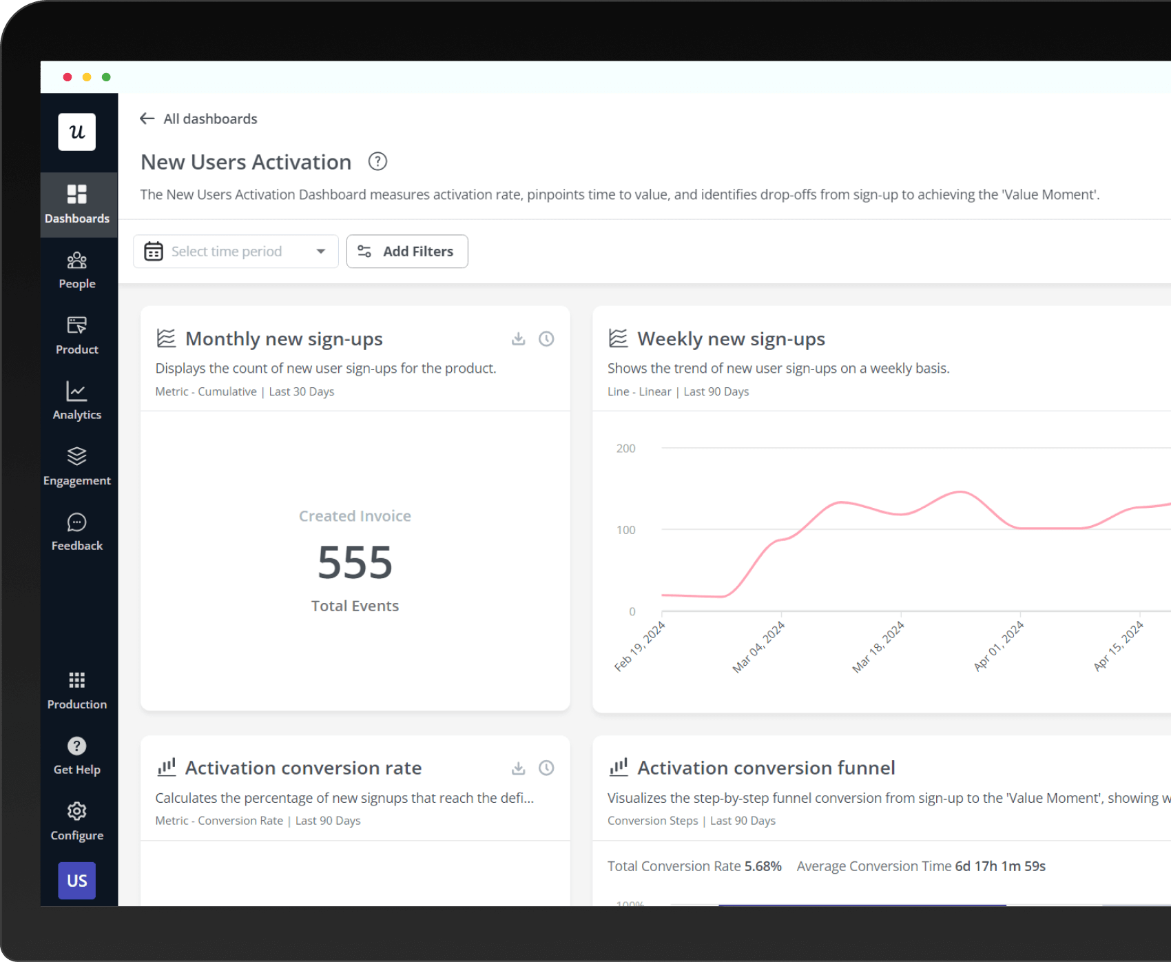
We collected first-party data from 62 B2B companies using Userpilot’s Activation Dashboard. This dashboard not only tracks the activation rate but also pinpoints the time to value (TTV) and identifies key drop-off points from sign-up to the Activation Point. The data is segmented by company size, industry and business strategy (PLG vs. SLG).
Get the full Report

For more data, in-depth analysis & full expert insights!

By Industry

AI & ML
High activation rate at 54.8%
Healthcare
Average activation rate at 23.8%
CRM & Sales
High activation rate at 42.6%
HR
Low activation rate at 8.3%
MarTech
Average activation rate at 24%
FinTech & Insurance
Low activation rate at 5%

By Company Size

Smaller companies often focus intensely on user acquisition and engagement to establish themselves in the market.

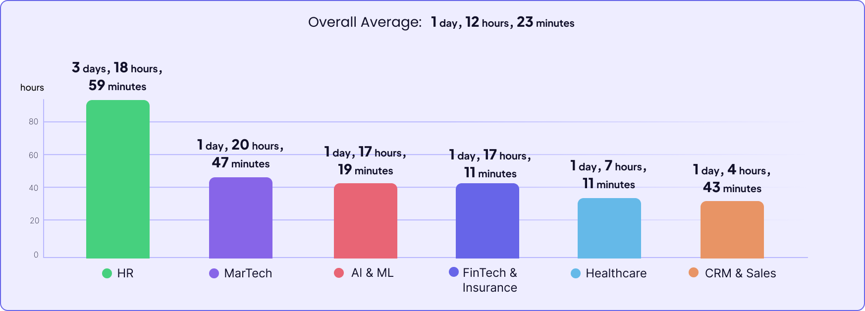
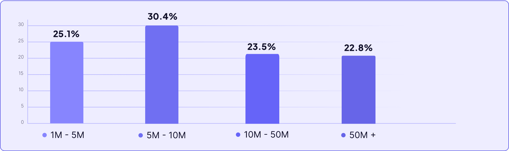
Mid-sized companies might struggle more with activation as they navigate the complexities of scaling, whereas the smallest and largest companies show better performance, likely due to their ability to focus intensely on user needs.

And larger companies have more resources to invest in effective marketing, customer onboarding, and user engagement strategies.

By PLG vs SLG

As Product-Led Companies often serve B2C or SMB-B2B customers, offering a free trial or freemium, their users may have a lower motivation to activate compared to enterprise users of products by Sales-Led companies – that often require an annual contract and payment up-front.

How to improve your User Activation Rate?

Now that we’ve discussed what a good activation rate is – it’s time to look at some actionable tips on how to improve it. If you want to improve your user activation, you should:

Track User Activation without code!

User activation dashboard with activation rate, time to activation, and activation conversion funnel done-for-you

Some Conclusions to take away…

Time to Value (Activation)

1 day, 12 hours,
23 min

Average
Time to value

62

Companies
B2B SaaS

1 day, 1 hour,
54 min

Average
Time to value

🔍 What is Time to Value (Activation)?

It’s the time it takes the user to get value out of the product – i.e. a measure of how quickly the product can deliver its promise to the users.

🤔 Why It's Important?

Imagine being excited to play a new board game with your friends. But the instructions are long, complicated, and the game itself has many pieces that take forever to set up. The motivation to play is now declining rapidly, right

That’s why minimizing Time to Value is important!

And it’s not just about how quick your tool loads or the shortest 1 step product tour you could possibly make. It still has to be effective, but efficient!

⚙️ Methodology

We analyzed the same 62 companies as in our activation rate study to provide a detailed view of how long it typically takes for users to reach their first value moment after starting to use the products. The data was taken from Userpilot’s user activation dashboard again.

By Industry

HR
TTV - 3 days, 18 hours, 59 minutes
FinTech & Insurance
TTV - 1 day, 17 hours, 11 minutes
MarTech
TTV - 1 day, 20 hours, 47 minutes
Healthcare
TTV - 1 day, 7 hours, 11 minutes
AI & ML
TTV - 1 day, 17 hours, 19 minutes
CRM & Sales
TTV - 1 day, 4 hours, 43 minutes

By Company Size

There’s no direct correlation between company size and time to value – in fact, the time-to-value is shortest in both the smallest – and the largest companies.

This might mean though that the smallest and the largest companies are able to dedicate more resources to onboarding – while the “messy middle” companies in the fast-paced growth stage might be the ones dropping the ball on it.

By PLG vs SLG

PLG models focus on the user independently exploring and adopting the product, which can sometimes mean a slower start. Users need to discover features and understand the value on their own, which can take time. On the other hand, SLG companies often involve sales engineers and customer success managers in the process of customer onboarding, making it more guided and tailored to their needs – and possibly faster.
Get the full Report

For more data, in-depth analysis & full expert insights!

How to minimize TTV

To minimize time to value:

Want Step By Step Guidance To Shorten Your TTV?

Some Conclusions to take away…

Onboarding Checklist Completion Rate

19.2%

Average
Checklist Completion Rate

188

Companies
B2B SaaS

10.1%

Median
Checklist Completion Rate

🔍 What is an Onboarding Checklist?

It’s a tool used during the onboarding process to ensure that new users are guided through the essential features or steps of using a product or service.

🤔 Why It's Important?

It makes it easier for users to find the next step and ensure that they don’t drop off before hitting their activation point.

⚙️ Methodology

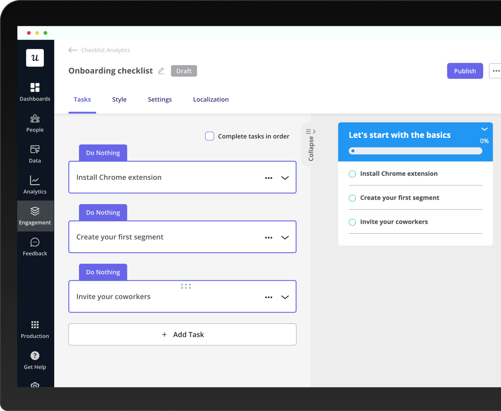
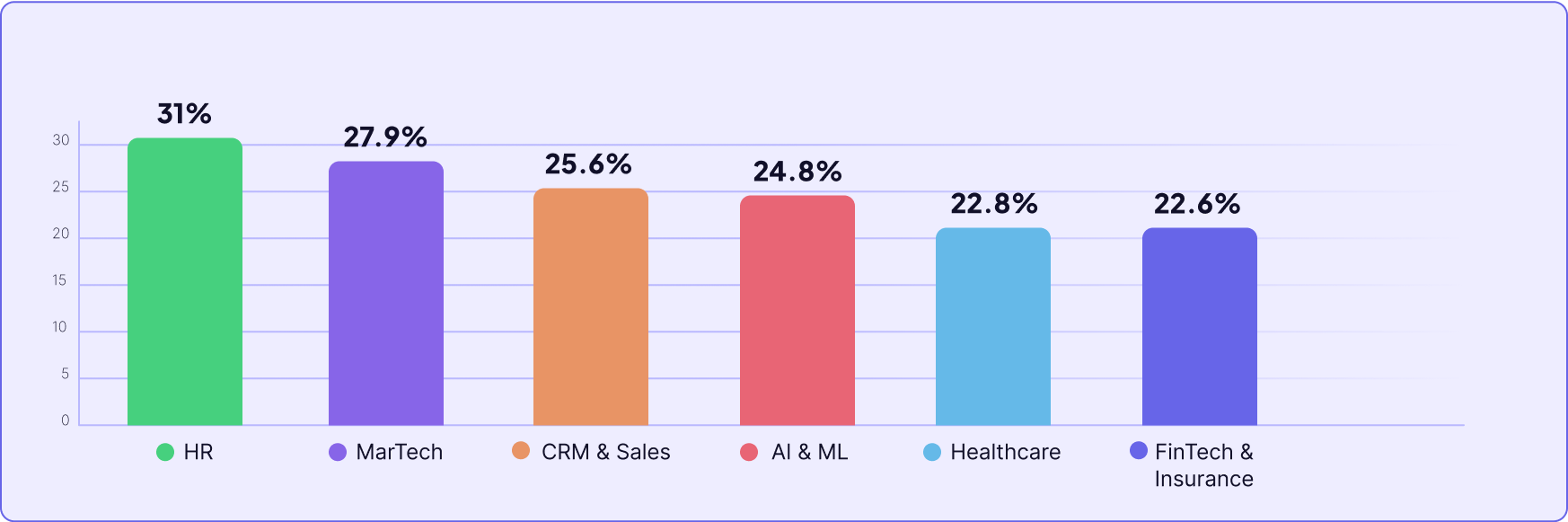
We analyzed onboarding checklist completion rates across 188 companies from different industries.

By Industry

FinTech & Insurance
Completion Rate - 24.5%
AI & ML
Completion Rate - 14.7%
Healthcare
Completion Rate - 20.5%
CRM & Sales
Completion Rate - 13.2%
EdTech
Completion Rate - 15.9%
MarTech
Completion Rate - 12.5%
HR
Completion Rate - 15%

By Company Size

Smaller companies lead with the highest rates. As company size increases, there’s a slight decline in completion rates, particularly noticeable in mid-sized companies. However, the largest companies manage to improve their rates slightly, which could be attributed to their resources.

By PLG vs SLG

And again we have a surprising turn of events, SLG companies are outperforming PLG companies in onboarding checklist completion rates as well. This outcome could be attributed again to the hands-on approach that SLG companies typically take during the onboarding process.
Why build a user onboarding checklist?

You should build user onboarding checklists to:

Some Conclusions to take away…

Core Feature Adoption Rate

24.5%

Average
Core Feature Adoption Rate

181

Companies
B2B SaaS

16.5%

Median
Core Feature Adoption Rate

🔍 What is Core Feature Adoption Rate?

Core feature adoption measures the percentage of users that have adopted the product’s key feature in a specific time period.

🤔 Why It's Important?

By increasing core feature adoption, you can maximize the value users get from your product and strengthen customer satisfaction and loyalty.

⚙️ Methodology

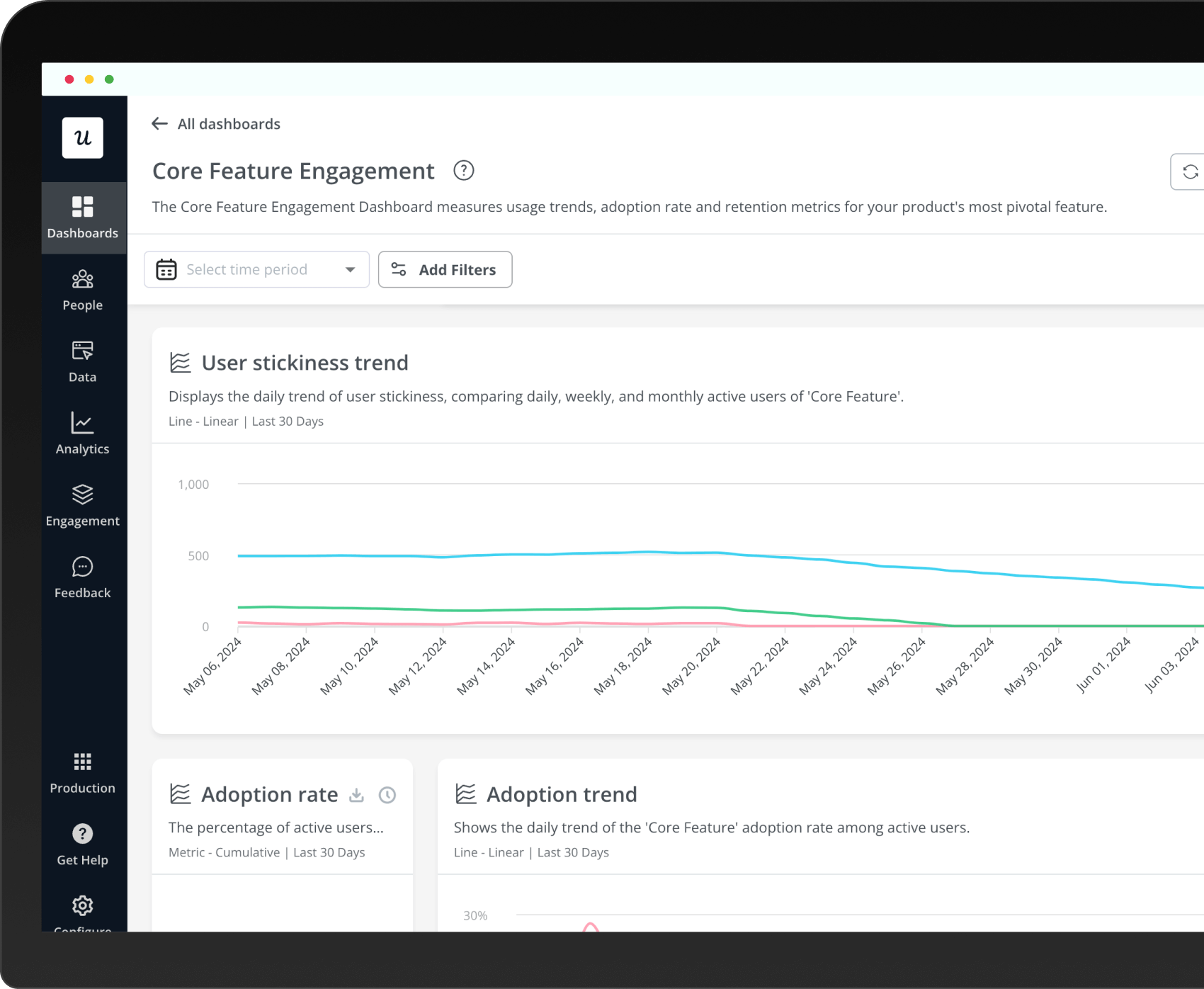
To see how the users engage with the core feature and how this correlates with the key activation rate, we grabbed data from the Core Feature Adoption dashboard in Userpilot for 181 companies that were using it at the time of writing.

By Industry

HR
Core Feature Adoption Rate - 31%
AI & ML
Core Feature Adoption Rate - 24.8%
MarTech
Core Feature Adoption Rate - 27.9%
Healthcare
Core Feature Adoption Rate - 22.8%
CRM & Sales
Core Feature Adoption Rate - 25.6%
FinTech & Insurance
Core Feature Adoption Rate - 22.6%

By Company Size

There are no statistically significant correlations between company size and core feature adoption rate – although we can see that it tends to be slightly higher with smaller companies – which may be allocating more resources to more individual, personalized onboarding (or may just happen not to be large B2C behemoths with a fairly unmotivated audience base.)
Get the full Report

For more data, in-depth analysis & full expert insights!

By PLG vs SLG

Looking at the core feature adoption rates between Product-Led and Sales- Led companies, it’s interesting to note that SLG companies show a slightly higher rate at 26.7% compared to PLG companies at 24.3%.  Again – if manual onboarding by the CSMs and sales engineers correlates with higher user activation rate, it’s expected it would also correlate with a higher core feature adoption rate.

How to increase the core feature adoption rate?

To boost core feature adoption:

Wanna discover strategies to increase core feature adoption

Some Conclusions to take away…

Month 1 Retention Rate

46.9%

Average
Retention rate

83

Companies
B2B SaaS

45.25%

Median
Retention rate

🔍 What is Month 1 Retention Rate?

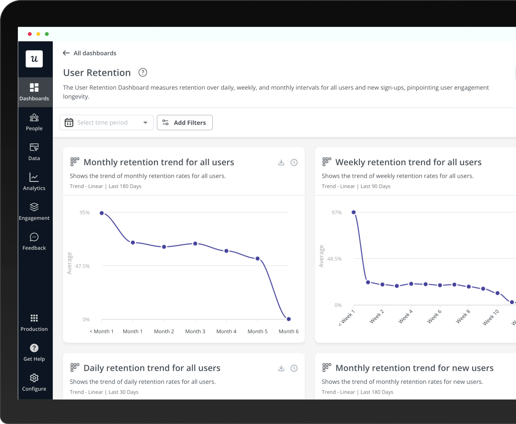
Month 1 retention rate measures the percentage of users who continue to use the product or service one month after their initial activation or sign-up.

🤔 Why It's Important?

 A high month 1 retention leads to higher long-term retention and customer lifetime value.

⚙️ Methodology

We analyzed 83 companies to determine the average Month 1 retention rate, using our User Retantion Dashboard for this purpose. This dashboard measures retention over daily, weekly, and monthly intervals for all users and new sign-ups.

By Industry

FinTech & Insurance
Month 1 Retention Rate - 57.6%
MarTech
Month 1 Retention Rate - 44.7%
AI & ML
Month 1 Retention Rate - 53.6%
HR
Month 1 Retention Rate - 41.4%
CRM & Sales
Month 1 Retention Rate - 52.5%
Healthcare
Month 1 Retention Rate - 34.5%

By Company Size

Overall, the trend shows that as companies grow in size, the complexities of scaling customer engagement and maintaining the initial level of customer satisfaction might lead to slightly lower retention rates.

Get the full Report

For more data, in-depth analysis & full expert insights!

This field is for validation purposes and should be left unchanged.

By PLG vs SLG

We see a slight advantage in retention for PLG companies.

One big factor here could be how PLG companies handle support. Our research from last year showed that 37% of customers would actually prefer cleaning a toilet over having to talk to support teams. This shows that the self-service options offered by PLG models are really hitting the mark.

How to improve month 1 retention rate?

Now let’s see what you can do to get similar results. To improve month 1 retention rate, focus on:

Increase user retention and drive users to become brand advocates

Some Conclusions to take away…

Average NPS

35.7

Average
NPS

229

Companies
B2B SaaS

39%

Median
NPS

🔍 What is NPS?

 It’s a metric that measures customer satisfaction and loyalty by asking customers how likely they are to recommend the product or service to others. 

🤔 Why It's Important?

⚙️ Methodology

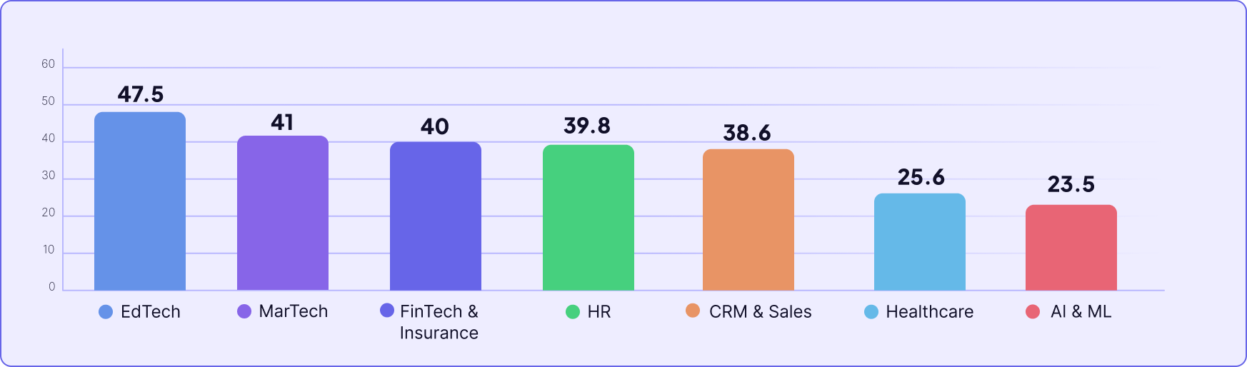
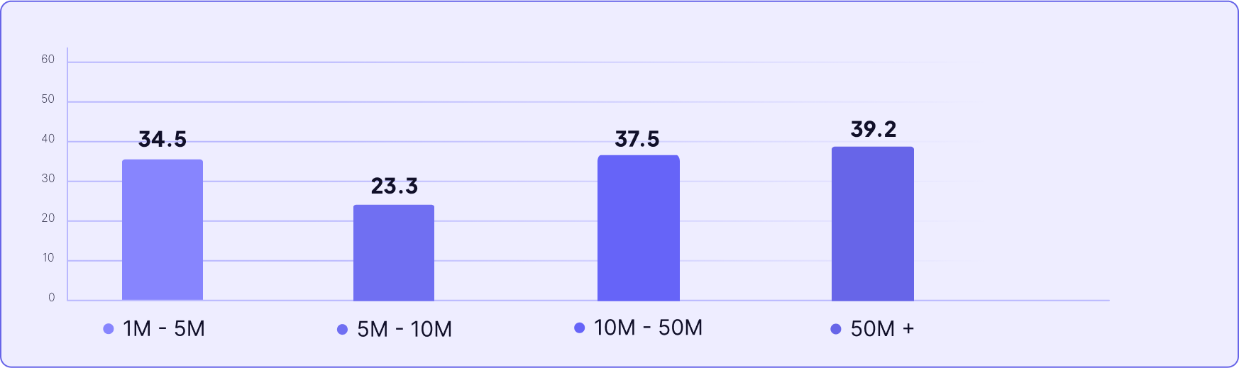
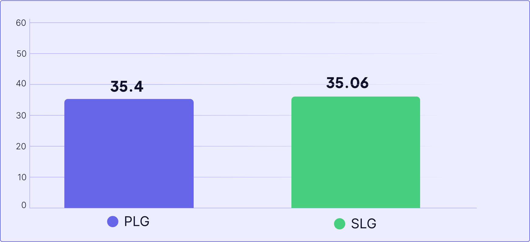
We analyzed 229 SaaS companies to get the average NPS. For this analysis, we used our NPS Dashboard, which is specifically designed to track and interpret customer loyalty and satisfaction metrics. Here you can track how many views your NPS surveys have gotten, the number of responses, the overall response rate, and how the score has been trending over time.

By Industry

EdTech
Average NPS - 47.5
*only 4 companies were using NPS in edtech industry.
CRM & Sales
Average NPS - 38.6
MarTech
Average NPS - 41
Healthcare
Average NPS - 25.6
FinTech & Insurance
Average NPS - 40
AI & ML
Average NPS - 23.5
HR
Average NPS - 39.8

By Company Size

Looking at the NPS scores by company size, there’s a clear trend where generally, as companies grow in revenue, their NPS tends to improve.
Get the full Report

For more data, in-depth analysis & full expert insights!

By PLG vs SLG

Both scores are fairly close, showing that the overall customer satisfaction and willingness to recommend the services or products are somewhat similar between these two growth strategies.

How to increase average NPS?

Now let’s see what you can do to get similar results. To improve month 1 retention rate, focus on:

Want to collect user feedback, and track how customers are interacting with your features code-free?

Some Conclusions to take away…

Tailor Your Strategy for Unique Success

While it’s important to understand industry benchmarks and where you stand relative to them, remember that every business—and every product—is unique. Chasing the numbers of other companies without considering your specific context might not lead you in the right direction for your own success. It’s not just about keeping up; it’s about defining what success looks like for your specific situation.

To truly optimize and tailor your metrics for peak performance, we are excited to offer a free onboarding and UX audit. This personalized audit is designed to help you understand your product’s unique strengths and areas for improvement, ensuring that the strategies you implement are the best fit for your specific needs.

Share Now and Win!

Enjoyed reading the report?

Share your favorite insights on social media, mention @Userpilot, and get a surprise gift from us. It’s our way of showing appreciation for your engagement and feedback.