In-App Guidance: What It Is & Why It Matters (+ Examples)


Helping users succeed inside your product isn’t just a nice touch anymore: it’s essential.
In-app guidance bridges the gap between your product’s complexity and users’ expectations. It moves them toward success, directly inside your app, without forcing them to seek help elsewhere.
In this guide, we’ll cover what in-app guidance is, why it’s important for user engagement, different types you can use, best practices to get it right, and examples from leading products.
What is in-app guidance?
In-app guidance refers to instructional content delivered inside your product interface that helps users navigate features, complete tasks, or discover new value.
It includes tooltips, walkthroughs, checklists, banners, and self-serve help centers: anything that teaches users as they work.
Effective in-app guidance keeps users moving forward without friction, ultimately enhancing product adoption . Instead of relying on external manuals or support articles, users learn by doing, inside the product itself.
Examples:
- A tooltip showing a new user how to create their first project.
- A checklist that nudges users to complete setup steps.
- A resource center embedded in the app with help articles and tutorials.
8 Types of in-app guidance
In-app guidance appears in many forms. These all serve a different purpose, so they can guide each user as per their needs.
| Type | What it does | Example |
|---|---|---|
| Tooltips | Small hints triggered by hover or click on the user interface. | Slack highlighting the “Add Channel” button. |
| Interactive walkthroughs | Step-by-step guides for completing tasks. | Salesforce walking new users through CRM setup. |
| Checklists | Actionable task lists guiding users toward goals. | Duolingo encouraging daily practice. |
| Modals | Full-screen or centered popups for critical announcements or required actions. | Zoom prompting users to update before joining a meeting. |
| Banners | Persistent messages for updates or milestones. | Loom announcing feature updates. |
| Slideouts/Popups | Attention-grabbing nudges triggered by behavior. | LinkedIn suggesting new connections. |
| Resource centers | Embedded help hubs offering self-serve support. | Hotjar’s Help widget inside their app. |
| Micro surveys | Quick, in-context feedback prompts. | Uber Eats asking for order feedback right after delivery. |
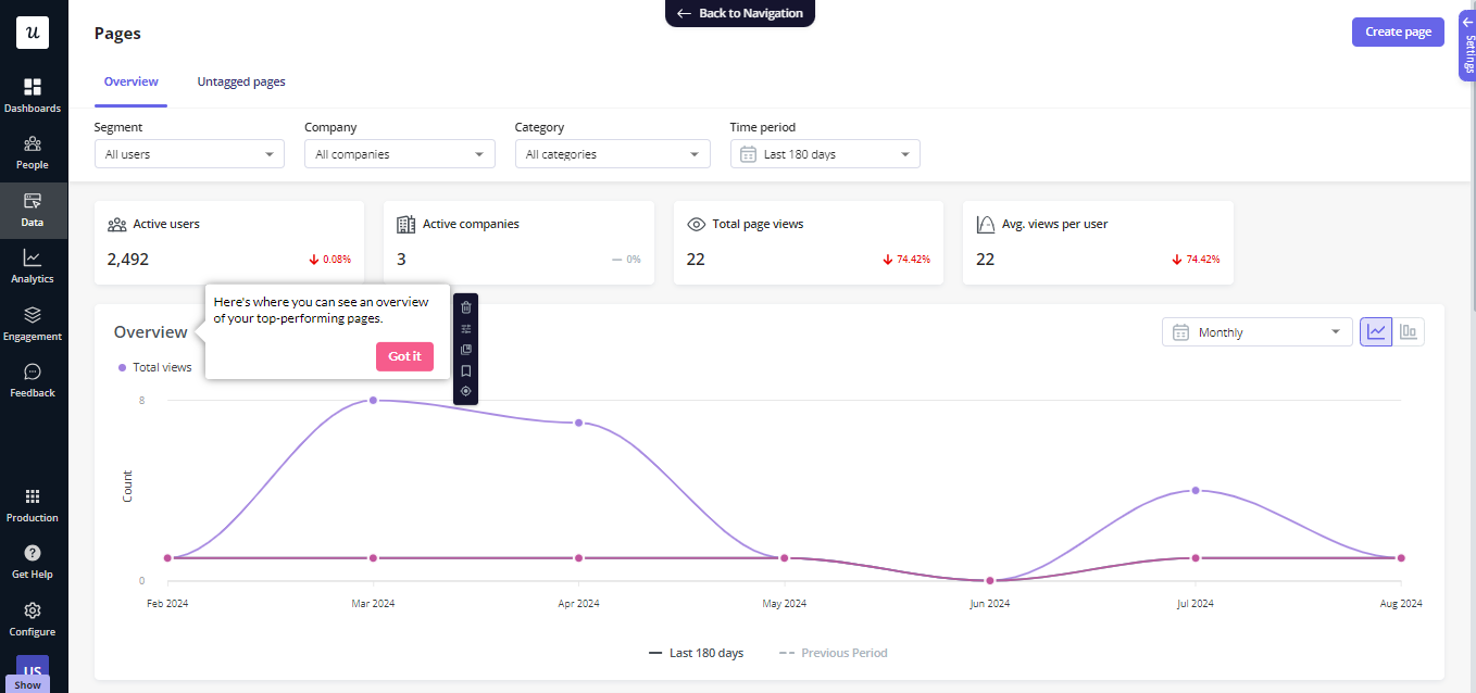
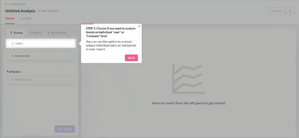
1. Tooltips
A tooltip is an in-app guidance feature that offers a single prompt. It helps users gain a better understanding of a specific feature of your product.
You add docked prompts to a specific element on your UI that is not self-explanatory, pushing for deeper feature adoption.
Here are some use cases for tooltips:
- Offer in-app guidance for the later stages of the customer journey to increase the adoption of more advanced product features.
- Power product launches by adding prompts to new features so users who missed your announcement email can still discover it.
- Drive new users to adopt features that you have launched in the past.
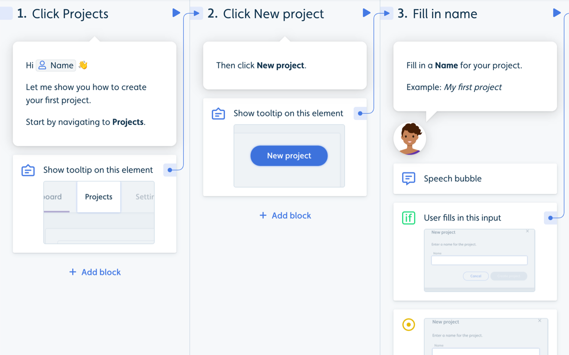
2. Interactive walkthroughs
An interactive walkthrough is similar to a product tour but with one key difference.
Product tours are passive, interactive walkthroughs aren’t.
They require user input after showing each step and don’t progress until the user takes the action, making them a more effective UI pattern in the user onboarding process.
Since people learn better if they learn by doing, interactive walkthroughs have a lot of advantages over linear product guides:
- Interactive walkthroughs are far more engaging because the user needs to act. They have to click certain buttons or enter text to proceed. They can’t see step 4 before they complete steps 1, 2, and 3.
- App walkthroughs provide value upfront – they drive users to perform actions that show them the value of your product (the key activation points) – and experience the Aha! Moment.
- Product walkthroughs increase user engagement by actively involving each person in learning new features.
3. Checklists
Onboarding checklists are especially effective in new user onboarding – they push new users to explore certain features in a specific order, leading them to complete a set of actions.
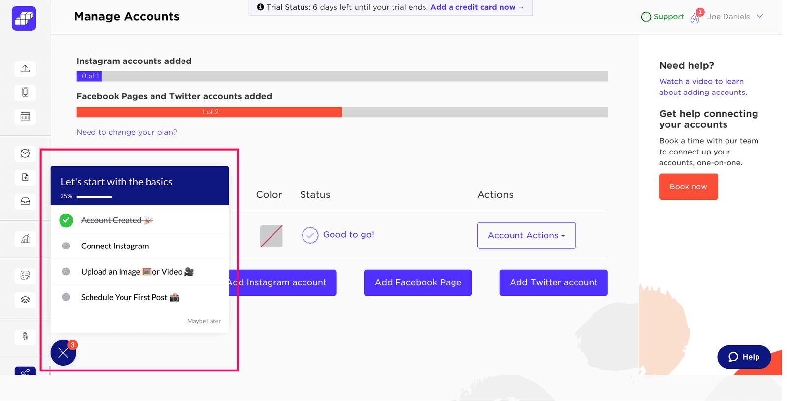
You can also use them to offer in-app guidance to more advanced users and encourage them to adopt advanced features of your app, thus driving product adoption.
Nobody said you could have only one checklist – you could build one for every area of your product, and trigger them at different times, depending on when your users are ready.
Moreover, you can personalize your checklists based on user JTBDS:

4. Modals
A modal is a large, rectangular UI element created by SaaS companies to grab users’ attention.
A modal window appears not as a separate page, but rather as an overlay on the parent page where users were before the modal pops up.
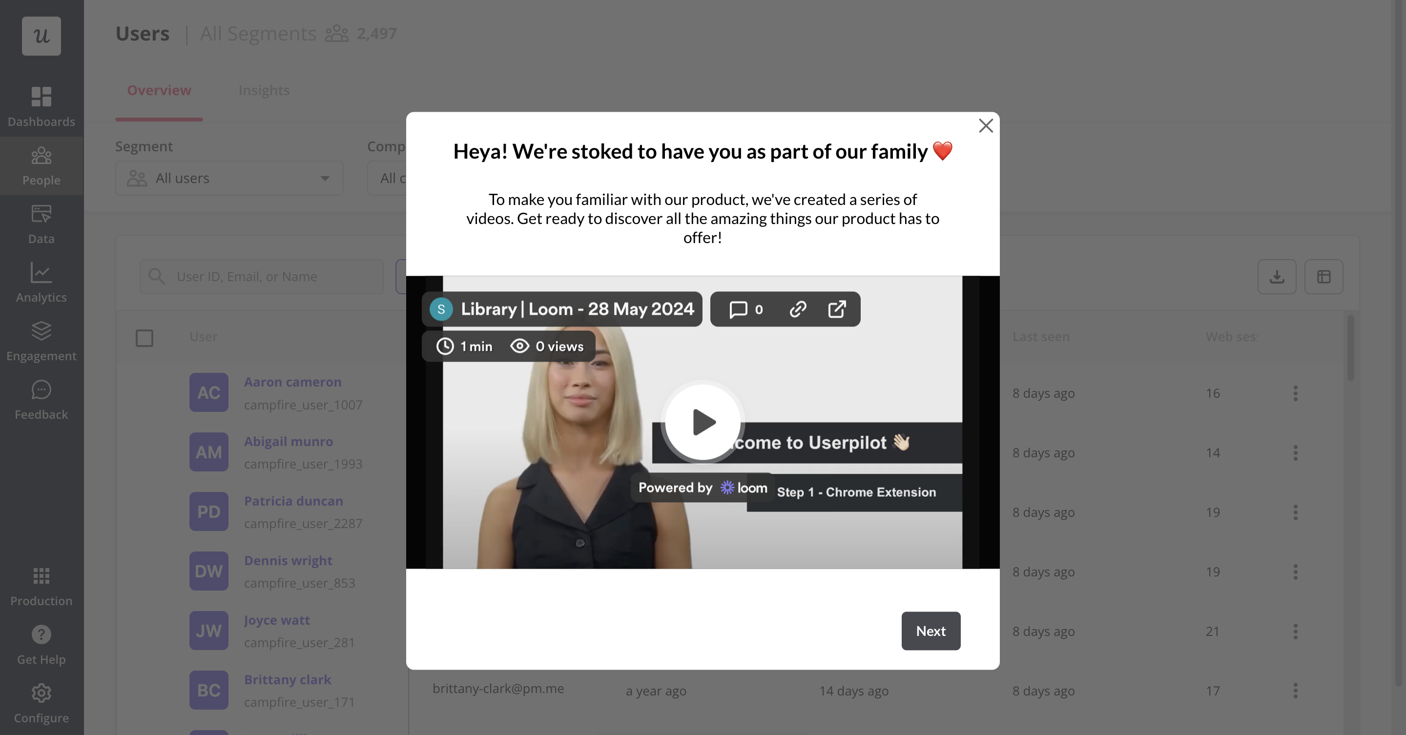
Due to the size of a modal, as well as the fact that modals often contain images, they are ideal for interrupting the user flow.
This makes them useful in urgent situations that require user interaction, such as when a customer needs to renew their subscription but also means that overusing modals rapidly becomes annoying for users.
Similar to other design elements, UX modals have their pros and cons that should be carefully considered before implementing them. Whether you decide to incorporate them in your UX design or not depends on how much value you believe they will bring to your SaaS product.
5. Banners
A banner is a small bar that often appears at the top of your website, usually used to communicate updates, promote a new feature, or announce limited-time offers.
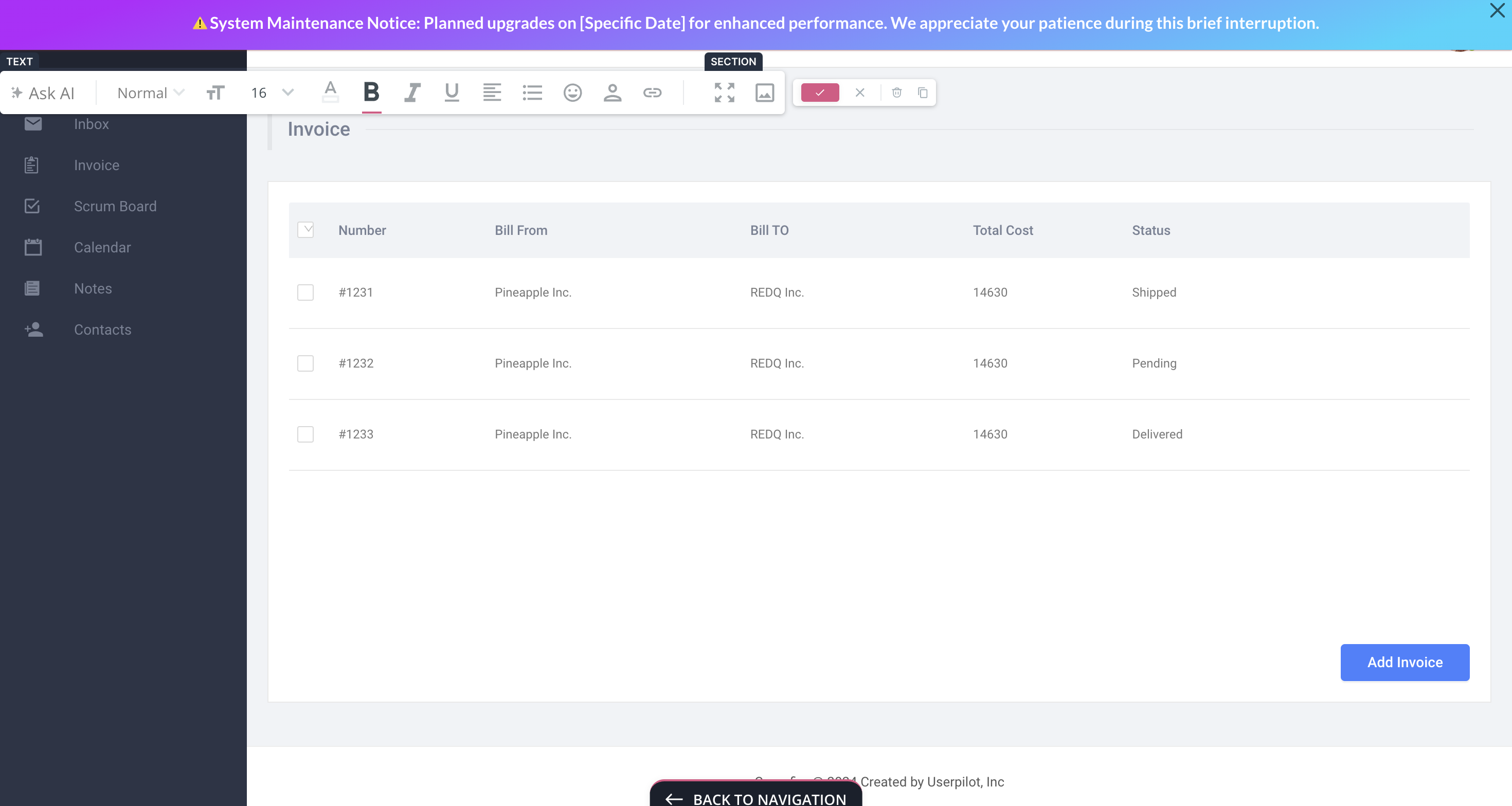
Notification banners are less intrusive and don’t hurt users’ experience. They take up about 5% of the entire page, and it’s not overwhelming for the users. As notification bars are non-disruptive, users don’t feel the urge to dismiss the bar and tend to engage with the product/app more.
You can use banners to announce important news, promote new features, highlight special offers, and notify users about system maintenance or downtime.
6. Slideouts
Slideouts are a less aggressive version of modals. They are very similar in terms of looks, but slideouts only take up a small part of the screen.

They are ideal for:
- Sharing tips, tutorials, or best practices related to using the application effectively, helping users maximize their experience and improve their proficiency.
- Informing users about important account-related updates, such as subscription renewals, billing information changes, or security alerts.
- Presenting special promotions, discounts, or limited-time offers to capture user attention and encourage immediate engagement.
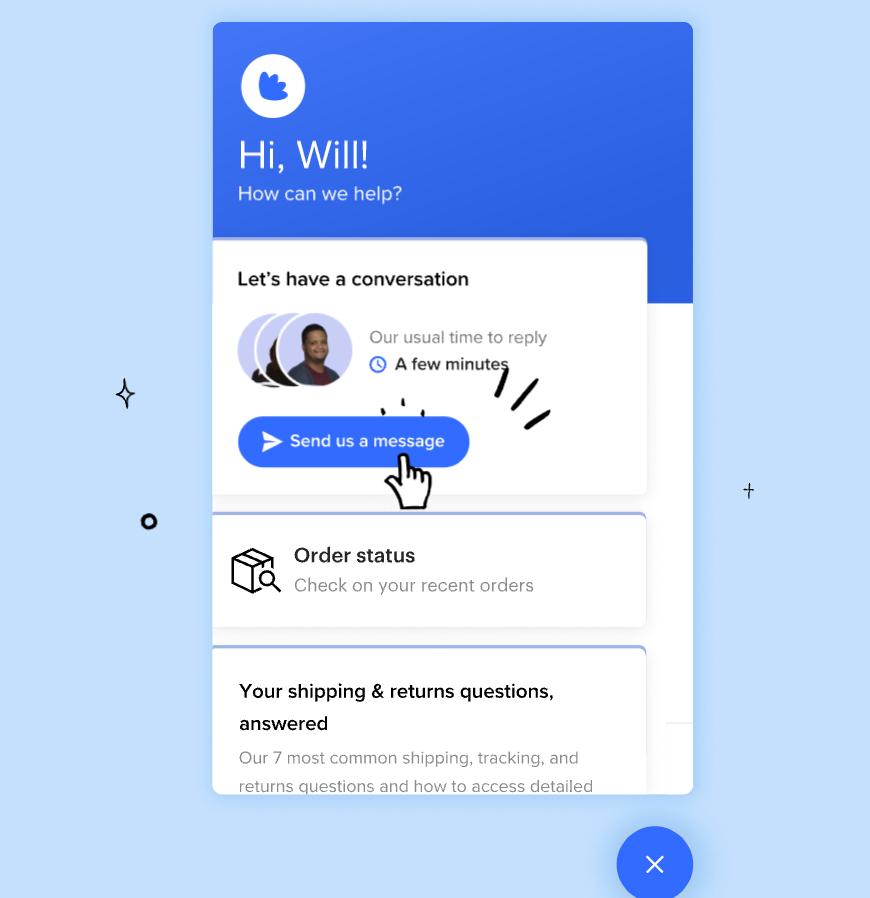
7. Resource center
Resource center is a self-service in-app guidance hub that offers instant answers without real-time human involvement.
It often appears as a pop-up that features videos, guides, tutorials, and more. Users can look up articles simply by searching for a relevant topic. You can also add a “Contact customer support” button just in case.
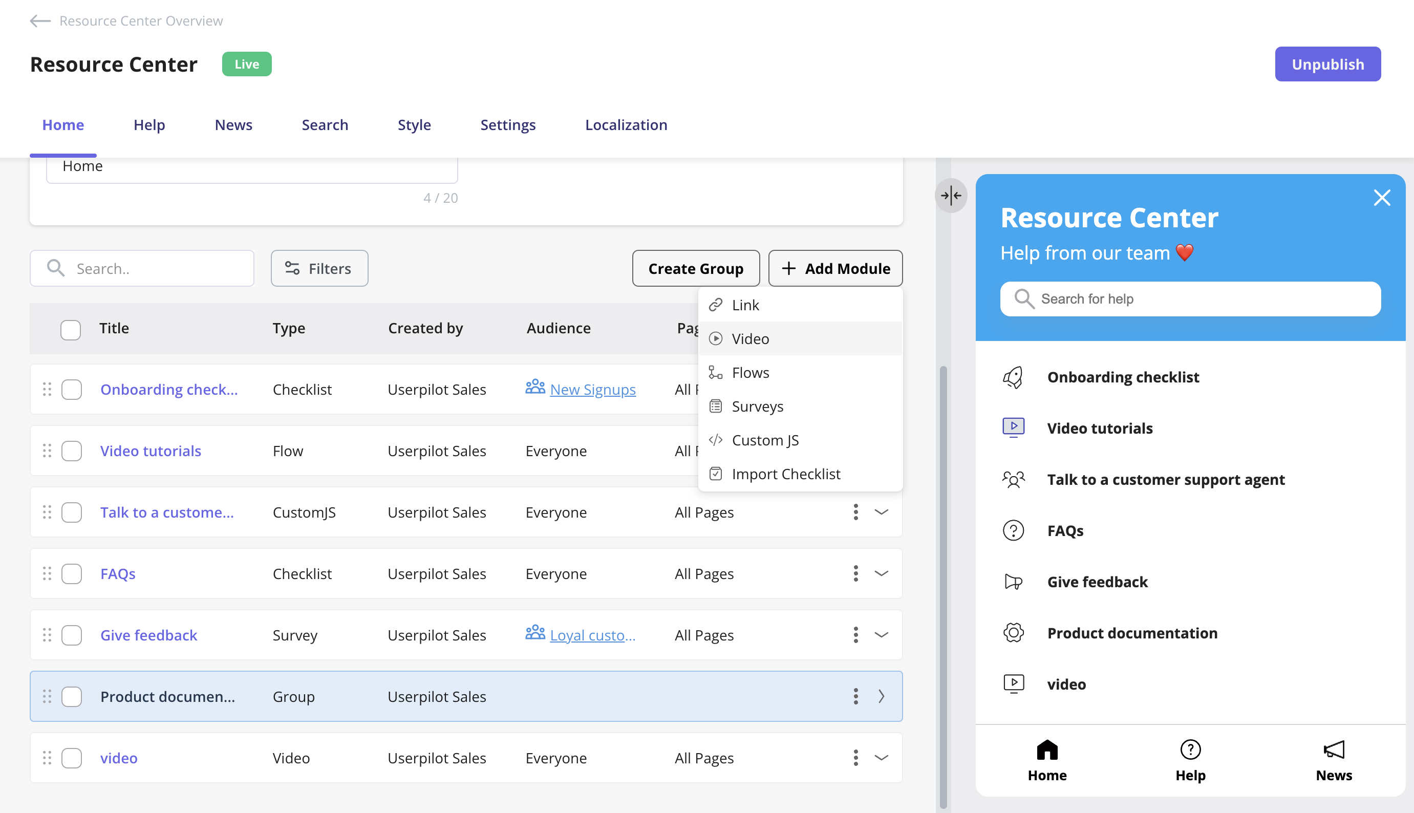
If you’re using an app guidance tool such as Userpilot, you can also personalize resources for each segment to enhance user experience.
Resource centers are proven to massively reduce the number of customer support tickets. In our case studies, Osano managed to shave off 25% of their support tickets – while Growth Mentor reduced support ticket volume by a whopping 87% after implementing our resource center.
8. Micro surveys
Micro surveys are short, contextual surveys triggered inside your product, typically after key actions or milestones.
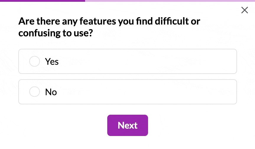
They help you capture real-time feedback, validate new features, uncover friction points, and prioritize improvements without interrupting the user experience.
Examples include asking for onboarding feedback after setup, triggering an NPS survey after 30 days, or prompting users for input after using a new feature.
Benefits of in-app guidance
Implementing effective in-app guidance empowers users and delivers substantial advantages for both your users and your business. When done correctly, it creates a seamless learning experience that drives user adoption, retention, and ultimately, customer success.
Reduces time-to-value
The faster users can experience your product’s core value, the more likely they’ll stick around. Interactive in-app guidance accelerates this journey by:
- Eliminating the learning curve that typically delays value realization.
- Guiding users directly to key activation points.
- Providing contextual help exactly when and where it’s needed.
For example, RecruitNow drastically reduced their onboarding time from hundreds of hours monthly to just 4 hours per month after implementing Userpilot, a 99% reduction in customer training hours.
Decreases support costs
When users can help themselves, your support team benefits:
- Fewer basic “how-to” tickets flood your support queue.
- Users find answers without waiting for responses.
- Support agents can focus on complex, high-value issues.
For example, GrowthMentor reduced support tickets by 83% (from 25-30 daily to just 1-2) after implementing Userpilot’s checklists for mentors and mentees. Similarly, Osano cut support chat requests by 25% after implementing a resource center.
Improves feature adoption
Many products suffer from feature blindness—where valuable functionality goes unused because users don’t discover it. In-app guidance solves this by:
- Highlighting new or underutilized features at appropriate moments.
- Demonstrating complex features through interactive tutorials.
- Celebrating feature discovery to reinforce exploration.
For example, Kommunicate.io increased chatbot integration by 15% and overall feature adoption by 4% by implementing onboarding checklists, interactive walkthroughs, and notification bars to highlight key features that users were previously unaware of.
Enhances user retention
Users who understand your product are less likely to abandon it. Effective guidance:
- Reduces frustration during critical learning periods.
- Creates successful usage habits through guided repetition.
- Builds confidence in users’ ability to master your product.
For example, Touchright saw a 40% increase in conversion rates from trial to paying customers after switching to Userpilot, while Sked Social found that users who completed their onboarding checklist were 3 times more likely to become paying customers.
Personalizes the user experience
Not all users need the same guidance. Modern in-app guidance prompts for:
- Segment-specific onboarding paths based on role or goals.
- Contextual help triggered by actual user behavior.
- Progressive disclosure of features as users advance.
For example, Troi implemented a personalized guided tour using Userpilot that not only improved user onboarding but also pre-qualified leads, allowing their sales team to focus on high-quality prospects while saving significant time and development costs.
Gathers valuable user insights
In-app guidance isn’t just about pushing information to users, it’s also about learning from them:
- Micro-surveys collect user feedback at key moments in the user journey.
- Usage analytics reveal where existing users struggle most.
- Guidance engagement rates indicate which features need better explanation.
For example, Beable Education increased student participation by 76.59% using in-app surveys, while Cledara found that in-app messages outperformed email communications, improving response time by 88% and gathering the same interest in 1 week instead of 8 weeks.
Effective in-app guidance examples
It’s all well and good talking about how great in-app guidance can be, but let’s observe some real-world examples.
Groupize gamifies user onboarding with in-app guidance
Groupize is a modern meetings management platform that unifies travel, spend, and compliance. The company utilized Userpilot to create a gamified onboarding so new users would be eager to learn their app.

Groupize’s onboarding agent, G.G.
The same character helps new users progress through the onboarding, guiding them through the product features. Groupize used clever copy and interactive dialogue to make this in-app onboarding stand out.

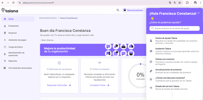
Talana uses a combination of in-app guidance elements to facilitate onboarding
Talana is a company offering human resources solutions. It offers 8 products that help companies recruit staff, manage payroll and benefits, improve communications, and build workplace communities.
Talana is a complex product that requires extensive onboarding.
Talana uses a checklist and interactive walkthrough to guide users through their product.
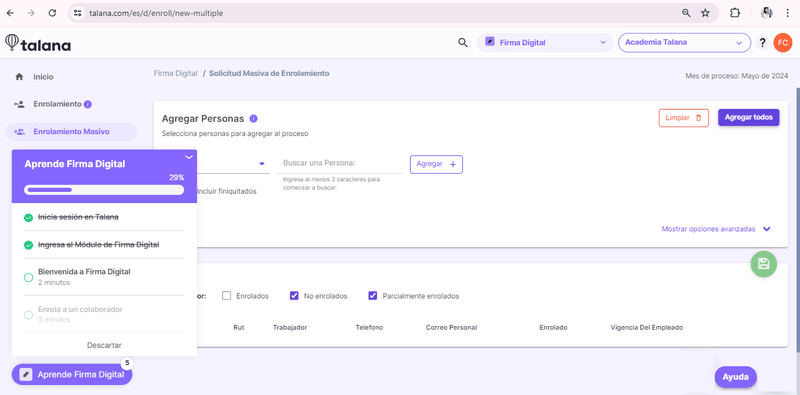
They also communicate with their users using Userpilot’s engagement features. This includes triggering banners, modals, and tooltips.
Userpilot has also enabled Talana to improve its self-service support via its resource center. This gives users easy access to articles and guides.
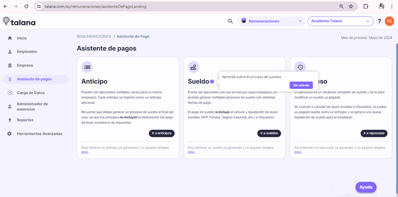
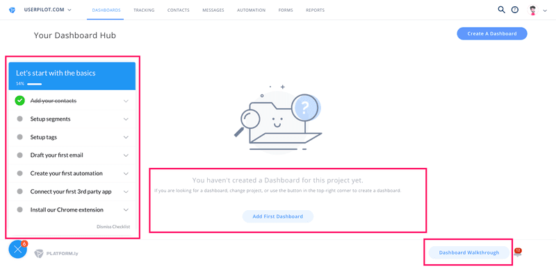
Platformly uses step by step guidance in their onboarding
Platformly is a marketing automation tool. Their wide range of features can be overwhelming for new users, so Platformly adds in-app guidance with Userpilot.
Platformly’s in-app onboarding
As well as providing users with a checklist and utilizing the empty states, Platformly offers an interactive walkthrough to help users get started.
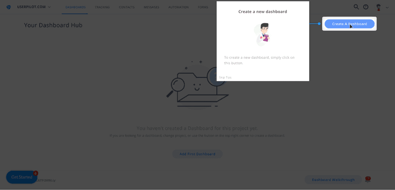
Platformly’s interactive tooltips
Rather than simply showing users how to build a dashboard, it walks them through it step-by-step. These interactive walkthroughs exist for all of Platformly’s main features, accessible at any time.
This led to completion rates of over 40%, which is exceptional for a complex SaaS product.
Tools for creating in-app guidance
Here’s a quick comparison of the top tools for building in-app guidance, depending on your product type and team needs.
| Tool | Best for | Standout features |
|---|---|---|
| Userpilot | No-code in-app experiences for SaaS companies. | Walkthroughs, onboarding checklists, micro surveys, advanced user segmentation, UI patterns, analytics, auto capture, session replay, localization, A/B testing |
| Appcues | User onboarding for startups and scaling SaaS products. | Drag-and-drop flow builder, behavioral targeting, A/B testing for experiences. |
| Whatfix | Employee onboarding and internal digital adoption. | Smart interactive walkthroughs, multi-format content creation, LMS and SCORM support. |
| Userflow | Lightweight onboarding for product-led growth teams. | Fast flow creation, self-serve onboarding checklists, user segmentation, affordable pricing for startups. |
| Salesforce In-App Guidance | Training and guidance inside Salesforce CRM. | Native prompts for users, low-code setup, admin control over messaging visibility and timing. |
Userpilot: Best no-code builder for onboarding
Userpilot is an easy-to-use product growth tool that offers all the UI patterns needed to guide users through your app (product tours, walkthroughs, tooltips, checklists, resource centers) without limitations. Moreover, pricing starts at only $299 per month if you commit to the annual subscription.
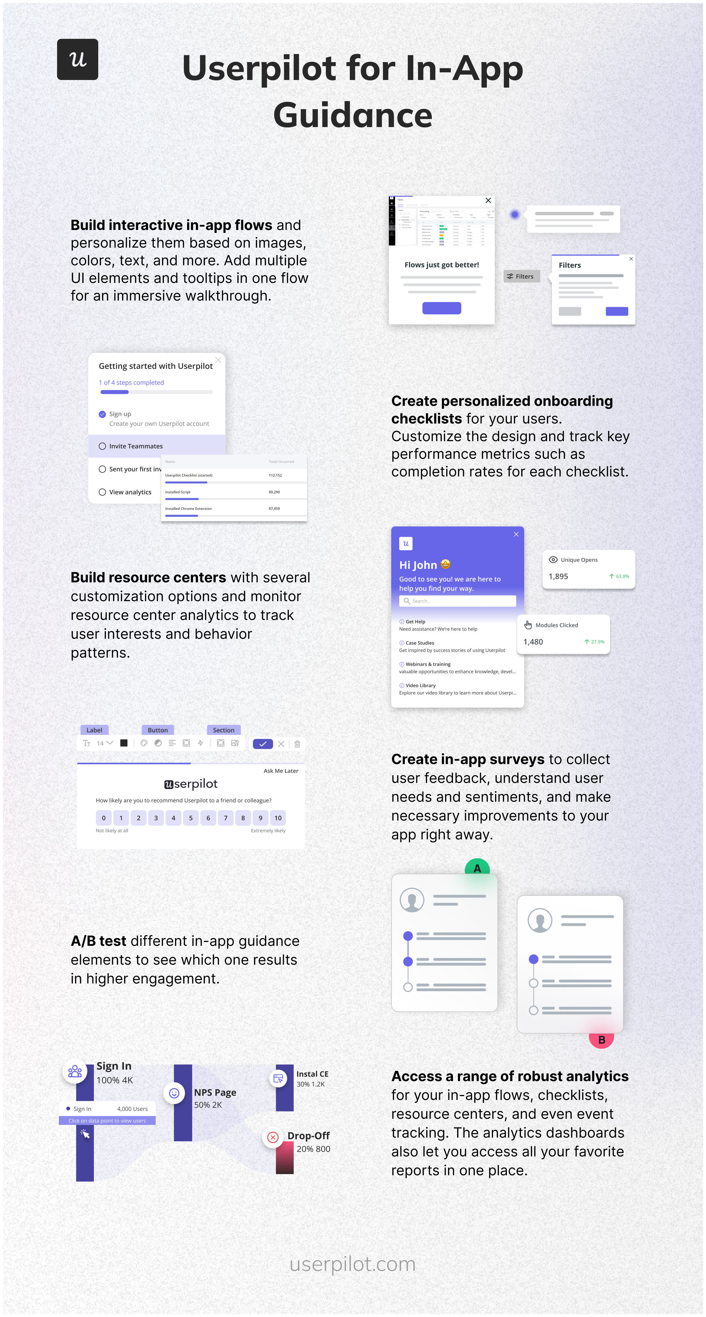
Here are some features worth noting:
- Build interactive in-app flows and personalize them based on images, colors, text, and more. Add multiple UI elements and tooltips in one flow for an immersive walkthrough.
- Create personalized onboarding checklists for your users. Customize the design and track key performance metrics such as completion rates for each checklist.
- Build resource centers with several customization options and monitor resource center analytics to track user interests and behavior patterns.
- Create in-app surveys to collect user feedback, understand user needs and sentiments, and make necessary improvements to your app right away.
- A/B test different in-app guidance elements to see which one results in higher engagement.
- Access a range of robust analytics for your in-app flows, checklists, resource centers, and even event tracking. The analytics dashboards also let you access all your favorite reports in one place.
Appcues: Easy-to-use in-app guidance builder
Appcues is often praised as the easiest-to-use platform for onboarding users.
You can create flows in Appcues really fast, but the lack of a resource center and limited analytics mean it’s not the best value for money (and it limits you to only a basic resource center with Appcues design and 5 user segments in its basic $300 plan!)
Some users have also noted issues with setting up flows and surveys:
Intercom
Intercom is a popular customer support tool but it also offers product tours for in-app guidance. It comes with support for linear product tours (so no branched walkthroughs). Its limited analytics mean you won’t be able to understand your user behavior with Intercom.
Userflow: Fastest flow builder
Userflow allows you to build in-app guides on its dashboard but unlike Userpilot and Appcues, it doesn’t have a Chrome Extension letting you build on top of your product.
Whatfix: For building in-app guides for employee productivity
Whatfix is a no-code digital adoption platform and product analytics tool that’s used to create in-app experiences to drive adoption for customer-facing teams, product managers, and IT support teams.
Whatfix lets you create interactive product tours for both users and employees. This reduces the time to value (TTV), whether it’s for customers using your product or employees learning how to use a solution in the internal tool stack.
It also lets you create checklists as widgets that target specific segments and group tasks under headers. Whatfix’s gallery of direct integrations with tools like Salesforce, Amplitude, SurveyMonkey, and more helps you centralize all onboarding data.
However, Whatfix has several drawbacks, including its high cost, an overwhelming number of features that may not be necessary for all users, and a lack of focus on end-user experiences compared to more specialized alternatives like Userpilot or Appcues.
Salesforce in app guidance
Salesforce offers its own in-app guidance capabilities through its In-App Guidance Builder, designed specifically for the Salesforce ecosystem. This tool allows administrators to create prompts, walkthroughs, and tooltips without coding knowledge.
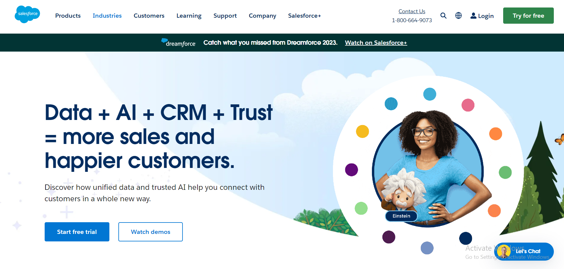
Key features include:
- Targeted prompts based on user profiles and permissions.
- Multi-step walkthroughs for complex processes.
- Custom branding options to match your company identity.
- Analytics on guidance engagement and effectiveness.
- Integration with Salesforce’s Learning Paths for comprehensive training.
While powerful within the Salesforce environment, this solution is primarily designed for Salesforce products and requires a Salesforce license. Organizations looking for cross-platform in-app guidance may find dedicated solutions like Userpilot more versatile for their broader product portfolio.
Conclusion: How to create in-app guidance?
Before we part ways, here’s a summary of in-app guidance best practices:
- Always have a goal in mind – approach onboarding users with a certain outcome in mind. For example, you might want your users to add a team member or to drive adoption of a new feature.
- Make it interactive – walk your users step by step, show them what they need to achieve their immediate goals, and avoid front-loading information (e.g., with lengthy step-by-step tours!)
- Offer in-app guidance to advanced users too – aka continuous Onboarding – (e.g. a tooltip informing them about a new feature,) not just flows for new users.
- Keep it short and sweet, so that users don’t get bored, and you’re good to go.
Want to drive users to adopt your product faster? Book a free demo with Userpilot today!
About the author