Best User Onboarding Tools for SaaS [Categorized by Use Case]


Let’s face it: without the right user onboarding tools, you can’t deliver a great onboarding experience for your new users. And without a great onboarding experience, your users won’t activate and will churn. That’s why I’ve compiled a list of the best free and paid user onboarding software to help you smash your user activation, product growth, and revenue goals.
And not just that: for your convenience, I grouped the tools into 9 categories by the different goals you can achieve with them, signup flow tools, in-app onboarding software, email onboarding tools, user analytics, user feedback tools, customer support, and success tools, etc., and then proposed a sample tool stack.
What are the best user onboarding tools for SaaS in 2026?
I selected the tools below based on my personal experience with them, focusing on mature, market-leading solutions with proven track records. I also reviewed user reviews on platforms like G2, Reddit, and Vendr.
For each category, I prioritized tools with strong feature depth, transparent pricing, active development, and reliable support.
There are several categories of user onboarding tools for different purposes, such as in-app onboarding, signup flows, emails, and in-app chat.
- In-app onboarding tools: Userpilot, Appcues, Userflow, Pendo.
- Signup flow tools: Auth0, Kinde.
- “DIY” user onboarding solutions: INTRO.js, Shepherd.js.
- Email onboarding tools: Mailchimp, ActiveCampaign, GetResponse, MailerLite.
- In-app chat tools: Intercom, Zendesk, Livechat, Sendbird, Olark.
- Video onboarding tools: Synthesia, Supademo, Walnut, Loom.
- Webinar tools: Sequel.io, Demio, Zoom, E-Webinar.
- Onboarding engagement analytics tools: Amplitude, Posthog.
- Feedback tools: Typeform.
- Customer support tools: Zendesk, Help Scout, Freshdesk.
Below, I’ll review them in detail.
💡 To streamline your user onboarding processes and save costs, look for tools that integrate natively with each other. Also, consider tools that cover several use cases, e.g., onboarding users in-app and via email, analyzing customer data, and engaging customers via live chat.
1. In-app user onboarding tools
Probably the first tool you should think of when building your SaaS onboarding tools tech stack is your in-app onboarding tool.
Such tools allow you to build in-app product tours to guide your new users through your product, thus significantly improving the chances they will activate (and reducing day-1 and week-1 churn). In this section, I’ll cover no-code user onboarding tools and DIY “budget” solutions that require coding.
Userpilot
Best for: Product and customer success teams at mid-market SaaS companies who need a single platform to build, personalize, and analyze in-app onboarding experiences without relying on engineering.
Userpilot is a no-code platform that provides an all-in-one solution to product and customer success teams. It features built-in in-app engagement tools that enable you to create personalized onboarding experiences and get granular insights into how users navigate your onboarding flows.
It also lets you monitor user behavior and product interactions in real-time and collect feedback through in-app surveys.
Key features of Userpilot:
- Chrome Extension for in-app onboarding flows: Offers a visual “what-you-see-is-what-you-get” (WYSIWYG) editor. It enables you to create interactive in-app experiences such as banners, spotlights, tooltips, and modals.
- In-app experiences: Userpilot supports an extensive range of UI patterns for creating in-app experiences, including interactive checklists, tooltips, modals, etc. Additionally, you can set up a resource center, a one-stop hub inside your app where users can access guides, FAQs, and video tutorials.
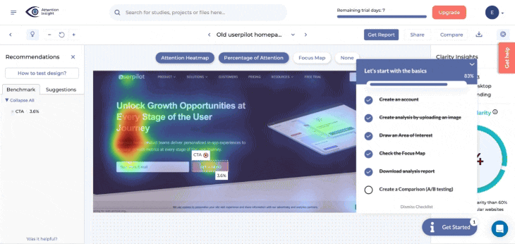
- Personalization: Flows have a targeting tab where you can configure them to show based on the user’s in-app behaviors, attributes, paths, survey responses, and more. This allows you to create personalized onboarding experiences for different user segments.
An example of this is how Smoobu used Userpilot to create an onboarding walkthrough to help users navigate their app’s top five most-used features. It triggers right after a user signs up, and if users still haven’t taken action, a persistent banner is displayed in the product UI to nudge them to connect to a channel.
“Userpilot allows us the flexibility to move fast, experiment, and really understand what users need. It’s helped us speed up processes and create a smoother user experience.” – Dasha Frantz, Product Designer at Smoobu
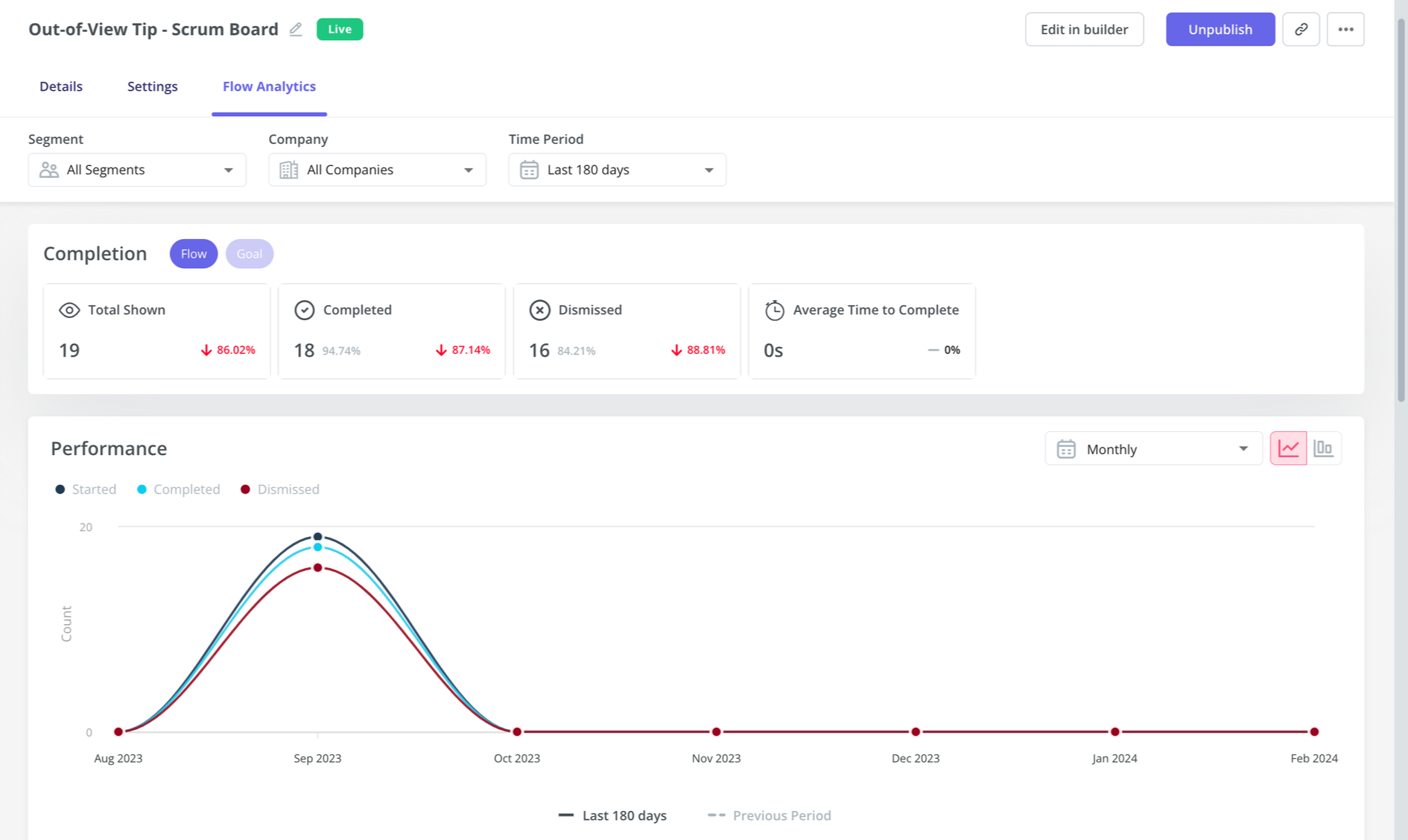
- Flow analytics: You can track clicks, form submissions, and other key user actions in real-time to see exactly how users engage with each step of your onboarding flows through customizable dashboards. These analytics can then help you segment users by their behavior, identify bottlenecks, and streamline onboarding.
- Mobile support: Userpilot allows you to design the onboarding experience for mobile app users via slideouts, carousels, and push notifications. Plus, you can track mobile app events and consolidate them with web analytics.
- Emails: By adding emails to the mix, you can consolidate your entire onboarding process in one place. In addition to targeting emails to specific segments, you can trigger emails based on in-app activity without workarounds. Then, track the performance of your email onboarding sequences and cross-reference it with in-app events for more realistic insights.
- Product analytics reports: You can create reports to analyze how users go through the funnels, the path they follow to achieve success, the user retention rates of different user cohorts, and behavioral trends inside your product.
- Session replays: Get access to session replays to watch how users interact with your product, tag bugs, skip inactivity, and collaborate with your team.
Userpilot pricing
Userpilot’s transparent pricing ranges from $299/month on the entry-level end to an Enterprise tier for larger companies.
Furthermore, Userpilot’s entry-level plan includes access to all UI patterns and should include everything that most mid-market SaaS businesses need to get started.
Userpilot offers three pricing plans based on monthly active users (MAUs):
- Starter: This entry plan begins at $299/month (billed annually) for up to 2,000 MAUs. It includes in-app user engagement features, segmentation, trend analysis, NPS surveys, and essential product analytics. This plan is ideal for small and mid-market SaaS teams getting started.
- Growth: This is a custom plan with advanced analytics, event autocapture, resource centers, in-app surveys, email engagement, and session replay. It’s best for growing teams that need deeper insights and scalability.
- Enterprise: Tailored for large organizations, this plan includes all Growth features along with bulk data handling, premium integrations, SOC 2 Type 2 compliance, custom roles and permissions, and enterprise-level support.
What do users say about Userpilot?
|
Pros |
Cons |
| ✅ Userpilot is intuitive and easy to roll out, so you can launch onboarding flows, surveys, and in-app experiences quickly without depending heavily on engineering. | ❌ There’s a slight learning curve once you start building more complex flows or using deeper analytics features. |
| ✅ Customer support is responsive, helpful, and proactive. | ❌ Userpilot can be relatively expensive, especially for smaller teams or when usage grows. |
Appcues
Best for: Non-technical product and marketing teams at SMB and mid-market SaaS companies that need to launch basic onboarding flows and product announcements quickly without developer involvement.
Appcues is a no-code platform that helps you create in-app onboarding tours, surveys, and announcements to guide users through their product journey. While it offers a user-friendly interface, its feature set is limited compared to other solutions at the same price.
Key features of Appcues:
- Easy-to-use UI for building in-app flows: It lets you customize onboarding flows, such as product tours, tooltips, and banners, in real time.
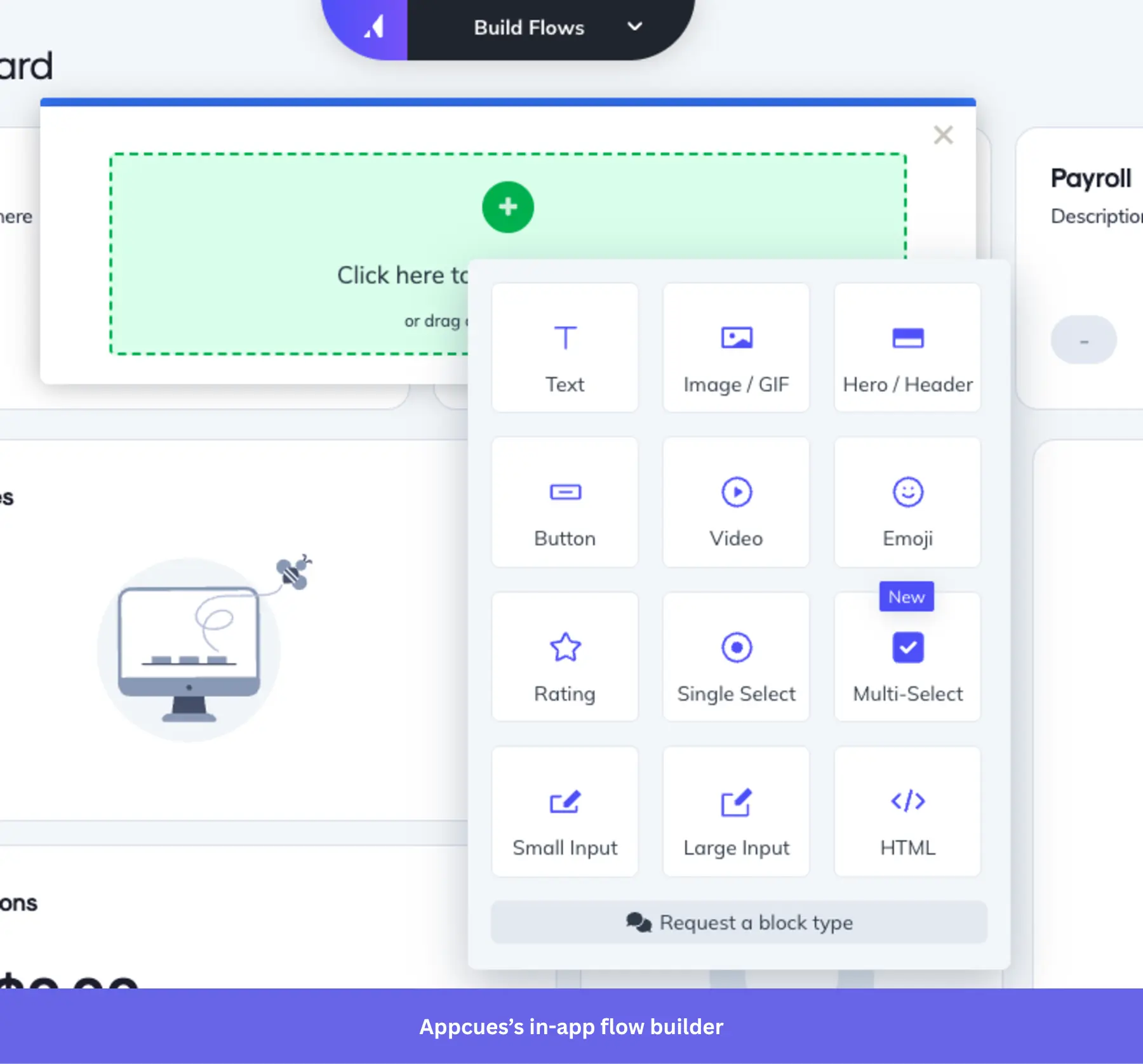
- Chrome Extension for in-product building: Allows you to build in-app experiences directly on top of your product. This means you can launch and edit product tours, tooltips, and more, without ever leaving your app.
- Onboarding checklists and action prompts: Appcues lets you create onboarding checklists that guide users through complex tasks.
- User segmentation and event-based triggers: Appcues allows you to deliver personalized onboarding experiences based on users ‘segmented behaviors, properties, or actions they take within your app.
- Event Explorer for tracking UI engagement: Sets up custom events and tags elements like buttons and forms.
- Mobile onboarding: Allows you to design an onboarding experience for mobile apps, including slideouts and push notifications.
Appcues pricing
Appcues’ pricing starts at $300 per month for the Start plan, which includes basic onboarding features like product tours and tooltips. However, if you need features like resource centers, NPS surveys, and additional segments, you’ll need to upgrade to the Growth plan, which starts at $750 per month. The Enterprise plan is custom-priced based on the specific needs of larger organizations.
What do users say about Appcues?
|
Pros |
Cons |
| ✅ Appcues is easy to get started, and you can customize it for different segments. | ❌ Reporting and customization can feel limited if you want deeper metrics or more flexibility across features. |
| ✅ Customer support is helpful and listens to user feedback for future improvement. | ❌ Initial setup is not fully no-code in practice, and some teams still need developer help to get Appcues live. |
Userflow
Best for: Small to mid-market SaaS teams that need a focused, lightweight tool for building product tours and onboarding flows without a dedicated engineering team.
Userflow lets you set up logic-based triggers, integrate with multiple tools, segment users, and support multi-language messaging. You can also personalize flows based on customer behavior and attributes to deliver better customer experiences.
The only potential concern would be its canvas-based experience builder, where you first design flow logic on a visual diagram. It may be a bit more difficult to pick up than the common Chrome builders that let you click directly on your live product UI to create flows.
Key features of Userflow:
- No-code flow builder: You can create and customize your onboarding guides and product tours via Userflow’s Chrome extension.
- In-app experiences: Includes tooltips, banners, announcements, as well as hotspots, icons, or buttons via the Launcher feature.
- Personalization: It can segment your users based on attributes and in-app behavior. Which you can use to trigger personalized flows.
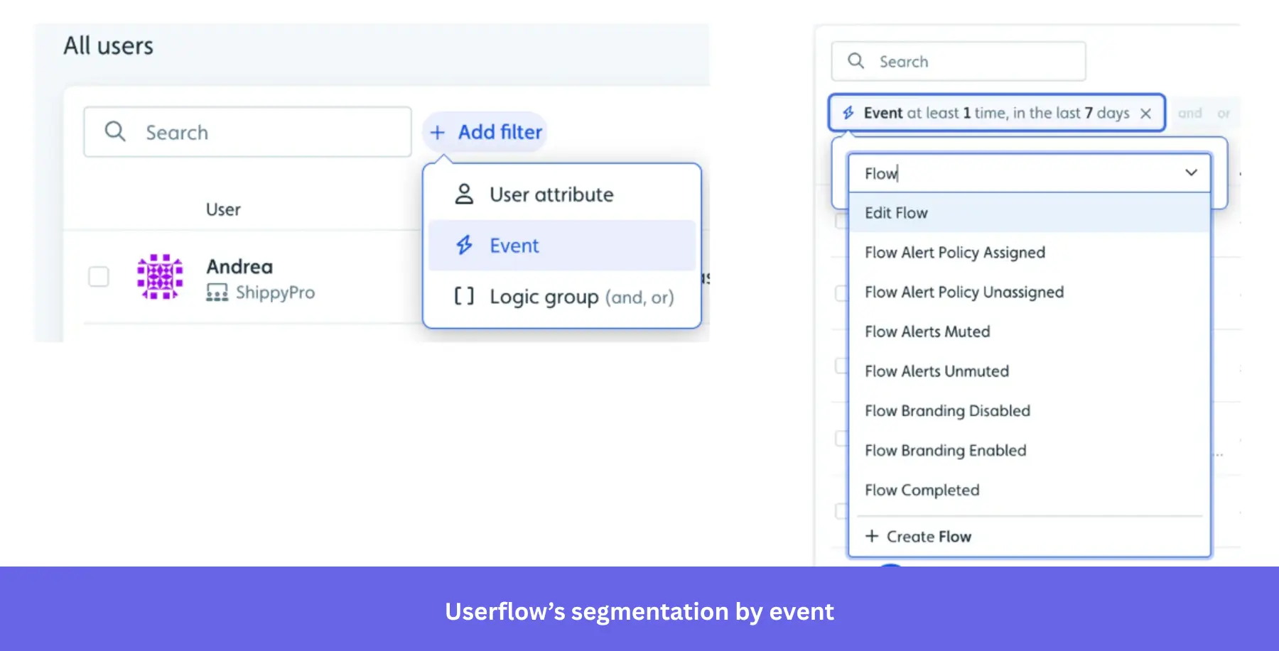
- Onboarding checklists: Can create checklists for new users to achieve activation faster.
Userflow pricing
At $240/month, Userflow offers most of its features (for up to 3,000 MAUs). However, if you need more than 3 seats, have up to 10,000 MAUs, integrate with your CRM, and want additional features like localization, you’d need to upgrade to the Pro plan at $680/month.
What do users say about Userflow?
|
Pros |
Cons |
| ✅ Userflow makes it easier for less-technical teams to build and manage onboarding content themselves, so support teams can take more ownership without waiting on engineering. | ❌ Analytics are limited, so teams that want more in-depth behavioral reporting may need an additional analytics tool alongside Userflow. |
| ✅ It gives teams a lot of flexibility to update flows, checklists, and guides quickly, while still keeping the platform manageable day to day. | ❌ Userflow’s AI flow creation works better for simple onboarding paths than more nuanced journeys, so teams with branching use cases may still need to refine flows manually. |
Pendo
Best for: Enterprise product teams that need a single platform for deep behavioral analytics, in-app guidance, and user feedback, and have the budget and dedicated resources to manage a complex tool.
Pendo is a comprehensive digital adoption platform (DAP) that combines user onboarding features with advanced product analytics, feedback collection, and product adoption tools.
Key features of Pendo:
- Advanced product analytics: Pendo offers in-depth analytics tools, including Paths, Funnels, and Cohorts.
- In-app guides and product tours: Build interactive onboarding flows, such as tooltips and walkthroughs, that guide users through your app.
- Feedback and feature prioritization: With Pendo’s feedback tool, users can submit requests directly in-app. Plus, Pendo Listen allows you to complete the feedback loop faster.
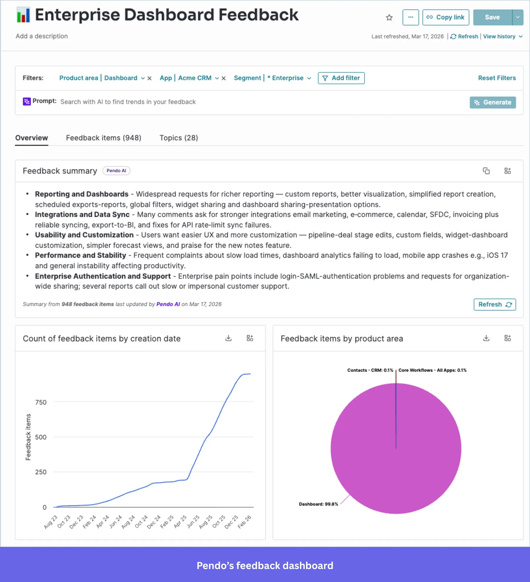
- Cross-platform support: Pendo supports web and mobile applications, and you can track user behavior and launch onboarding experiences across devices.
Pendo pricing
Pendo’s pricing is available upon request, but Vendr data indicates the median contract price is about $48,000 per year. It’s free plan supports up to 500 monthly active users, while more advanced plans offer additional features like cross-app tracking and enterprise-grade security.
What do users say about Pendo?
|
Pros |
Cons |
| ✅ Users consistently praise Pendo for giving clear visibility into user behavior and product usage. | ❌ Renewal pricing can climb, especially when you add capabilities later. Vendr community data notes standard uplifts around 5%, with some cases reaching 20% |
| ✅ Reviewers also like that Pendo combines analytics with in-app guidance in one platform. | ❌ Many teams report that some capabilities can require paid add-ons, which pushes total cost above the base plan and makes budgeting less straightforward. |
2. Signup flow tools – for removing friction from your user onboarding process
If you don’t want to lose users before they even sign up for your product, your signup flow should be as frictionless as possible.
You can eliminate such friction with Single Sign-On (SSO), a form of access control that enables access to multiple related yet independent software systems. With this property, a user logs in with a single ID and password to gain access to a connected system.
While building the in-app experience, you could add SSO so your users will have fewer signup forms to fill.
You can get such kind of frictionless authorization tools to streamline your user onboarding flow with the following companies:
AuthO (Freemium)
Best for: Development teams at SaaS companies that need a quick-to-implement authentication layer (SSO, MFA, and social login) without having to build it from scratch.
Auth0 is a freemium platform that provides authentication and authorization solutions for both web and mobile applications. It allows you to integrate Single Sign-On (SSO), multi-factor authentication, and social logins into your app, helping users sign up with fewer steps and added security.
Key features of Auth0:
- Single Sign-On (SSO): Allows users to log in with a single ID across multiple applications, improving conversion rates and reducing signup abandonment.
- Multi-factor authentication and social login: Has multi-factor authentication (MFA) and the option to sign up with social platforms like Google, Facebook, or Twitter.
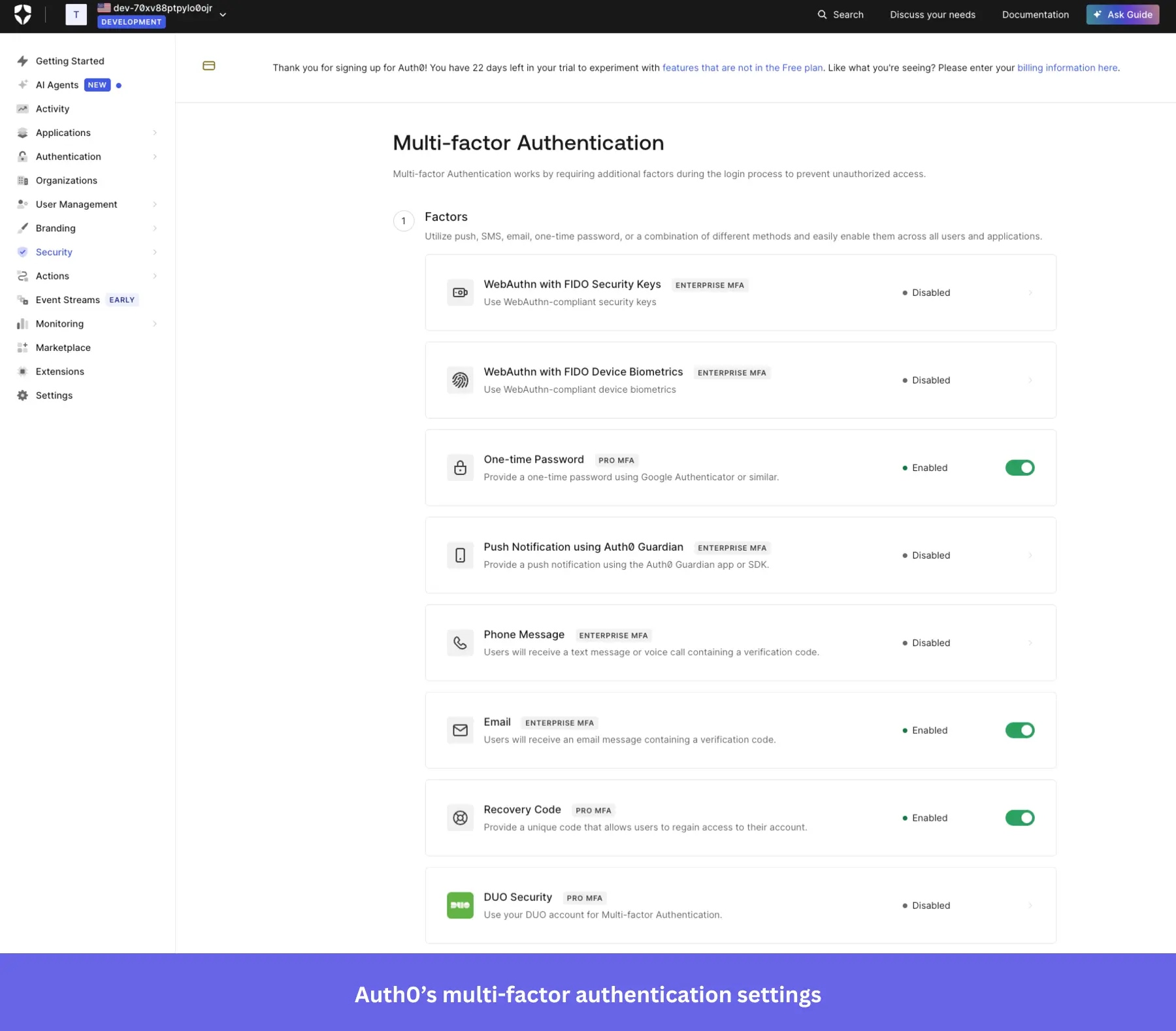
- Secure user data and APIs: Auth0 provides high-level security for user data and APIs, preventing unauthorized logins.
Auth0 pricing
It’s based on a freemium model, starting at $0 per month for up to 25,000 MAUs. However, you’d need a premium plan for B2B use cases ($150/month minimum for 500 MAUs) if you need multi-factor authentication, unlimited organizations, and streaming audit logs to AWS, Azure, Splunk, etc.
What do users say about Auth0?
|
Pros |
Cons |
| ✅ Auth0 gives you seamless security features out of the box, which reduces the need to build and maintain that infrastructure internally. | ❌ Pricing can climb quickly as your user base grows, and some important features are pushed into higher tiers. |
| ✅ Auth0 takes a lot of authentication work off developers’ plates, so you can add login, signup, MFA, and social auth without building all of it from scratch. | ❌ Once you move beyond the basics, the configuration can get hard to navigate, especially for newcomers dealing with rules, actions, and more advanced setups. |
Kinde
Best for: Early-stage SaaS founders and development teams who want to ship authentication, RBAC, and SSO quickly without stitching together multiple vendors.
Kinde is a newer platform that offers a simple solution for startups looking to integrate Single Sign-On (SSO) and improve their signup flow. With minimal setup, Kinde provides essential authentication features that make the signup process faster and more secure for users.
Key features of Kinde:
- Developer-friendly SSO integration: Kinde makes it easy to integrate SSO into your product, helping users sign up with fewer barriers and improving activation rates with minimal development effort.
- Customizable signup flows: Tailor your registration forms to suit your product’s specific needs, including user roles and permissions, making account management simpler for growing businesses.
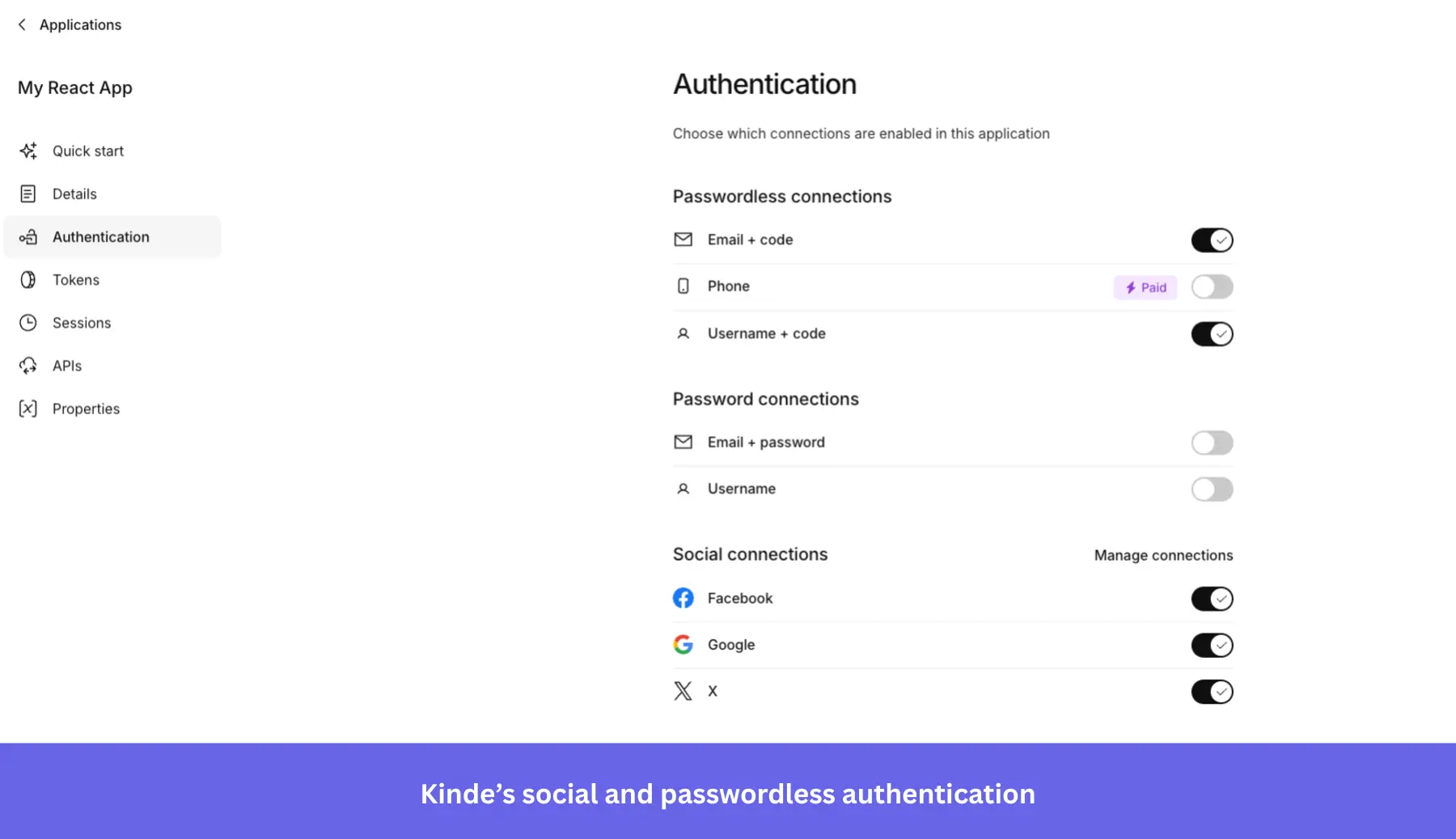
- User roles and permissions: Kinde offers flexible options for managing user roles and permissions, ensuring that the right users have access to the appropriate features.
Kinde pricing
Kinde’s pricing starts free for up to 10,500 MAUs with no credit card required, and the free plan already includes MFA, social login, B2B organization management, and custom domains. You can upgrade as needed, starting at $25/month, which includes uncapped MAUs, unlimited webhooks, and unlimited custom roles and permissions.
What do users say about Kinde?
|
Pros |
Cons |
| ✅ Kinde takes a lot of the friction out of auth setup, so developers can get SSO, MFA, and social login running without spending days wiring everything together. | ❌ Webhook support has been a real gap for some teams, especially when they want to sync users into their own database in real time. |
| ✅ It brings auth, roles, and permissions, feature flags, and billing-related capabilities into one platform, which can reduce the number of separate tools a team has to manage. | ❌ Some integrations and features still need work, so teams with more mature stacks may end up relying on workarounds. |
3. “DIY” user onboarding solutions (require coding)
Not every startup can afford to buy the convenient (but quite expensive) no-code user onboarding software, and may need to code up the guides for their user onboarding process themselves.
INTRO.js
Best for: Development teams that need a lightweight, dependency-free tour library they can drop into any stack quickly on a minimal budget.
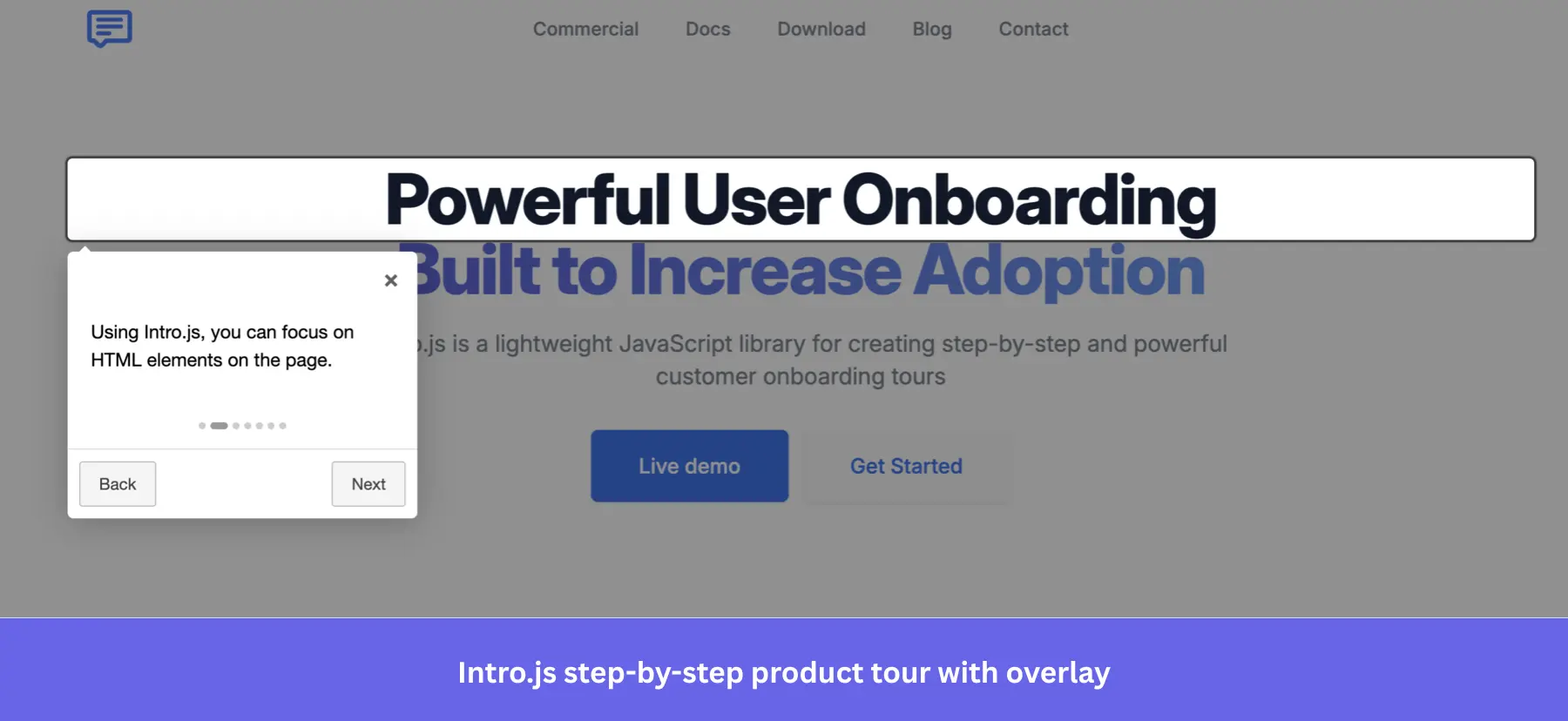
Intro.js has been a reliable JavaScript library for product tours since 2013, lightweight at ~10 KB, with zero dependencies, and fast to drop into any stack. That simplicity is the point: if you need a basic guided walkthrough running this sprint without a SaaS contract, Intro.js gets you there.
Key features of Intro.js:
- Step-by-step product tours with overlays: Intro.js highlights target elements with a dimmed backdrop and tooltips showing “Back,” “Next,” and “Skip” controls, keeping users focused on one UI element at a time during their first session.

- Progress indicators: You can add a dot indicator or a progress bar to multi-step tours, so users always know where they are in the onboarding flow and how much remains.
- Framework wrappers: Intro.js ships with wrappers for React, Angular, Vue, and more, so you can integrate it into your existing tool stack without having to rebuild from scratch.
- Multiple preset themes: Six ready-made themes are available via NPM or CDN, giving your tours a polished baseline without writing CSS from scratch.
Intro.js pricing
Intro.js is free under its AGPL-3.0, which requires that you disclose the source code if you distribute modified versions. If you need to keep your codebase private, you can purchase a one-time commercial license starting at $9.99 for a single project.
What do users say about Intro.js?
|
Pros |
Cons |
| ✅ Intro.js is easier to troubleshoot than many newer libraries because there is already a large trail of tutorials, examples, and Stack Overflow discussions around it. | ❌ Intro.js gives you the tour UI, but more advanced onboarding workflows still depend on your engineering team. |
| ✅ The commercial pricing is low-risk if you just need a simple tour library. | ❌ There are no built-in analytics, so tracking where users drop off in a tour requires setting up your own event tracking separately. |
Shepherd.js
Best for: Engineering teams building on React, Vue, Angular, or Ember who need a well-maintained, accessibility-compliant tour library with clean styling.
Shepherd.js is the better-maintained option in the open-source tour library space: 170+ releases, 100+ contributors, an active Discord, and a March 2026 release. If you’re already committed to building tours in code, it’s a solid foundation, especially for teams with a strong design system who want minimal default styling to fight against.
Key features of Shepherd.js:
- Step-by-step product tours with modal overlay: Shepherd.js renders popovers attached to specific UI elements with an SVG-based backdrop that can spotlight one or multiple elements simultaneously. It’s helpful to highlight related components in a single step.
- Floating UI positioning: Tooltips stay correctly anchored on long pages, in nested layouts, and near viewport edges, without manual positioning workarounds.
- Accessibility built in: Full keyboard navigation, focus trapping, and ARIA compliance come out of the box, which is crucial for products serving enterprise or regulated markets.
- Highly customizable styling: Default styles are intentionally minimal, so you’re not fighting the library’s CSS to match your design system.
Shepherd.js pricing
Shepherd.js is free under the AGPL-3.0 license. Commercial projects that need to keep their codebase private can purchase a one-time Business license starting at $50 for up to 5 projects.
What do users say about Shepherd.js?
|
Pros |
Cons |
| ✅ Shepherd.js is actively maintained enough that you can adopt it without worrying that it has gone stale. | ❌ It works better as a tour library than a full onboarding platform, so more advanced onboarding workflows still depend on your implementation work. |
| ✅ The minimal default styling is a genuine advantage for teams with an existing design system: you’re building on a clean foundation rather than overriding someone else’s CSS. | ❌ There are no built-in analytics, so you need to wire up your own tracking if you want to measure tour completion or drop-off. |
4. Email onboarding tools
Even with great in-app onboarding, email automation tools remain essential. Email verifications, sending transactional emails, invoicing, trying to re-engage users who haven’t logged in for a couple of days, or sending a list of links to read, can only be done via email. Just like a lot of a-synch support. So let’s see which email tools are best for improving the user onboarding experience, including:
MailChimp
Best for: Small and medium-sized businesses that need an easy-to-use email platform with a broad integration ecosystem to build onboarding email sequences.
Mailchimp is a widely used email marketing platform, especially among small and medium-sized businesses. It has evolved from a simple email tool to a full marketing hub, making it useful for creating onboarding email sequences.
Key features of Mailchimp:
- Customer journeys: Set up automated, trigger-based email sequences to guide users through your onboarding process.
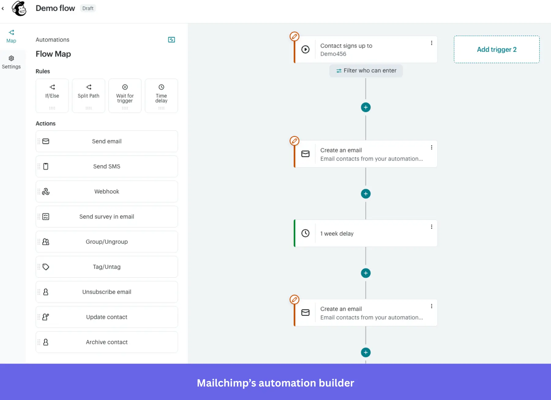
- Easy-to-use interface: Mailchimp’s drag-and-drop email builder makes it easy to create professional-looking onboarding emails.
- Detailed reporting: Track how users engage with your emails through open rates, click-throughs, and other key metrics.
Mailchimp pricing
Mailchimp has a free plan that’s limited to 250 contacts and 500 mail sends per month. Paid plans start at $13/month for additional features like 10x more contacts and 4 marketing automation flows.
What do users say about Mailchimp?
|
Pros |
Cons |
| ✅ Mailchimp makes it easier to build and schedule campaigns without much setup friction, so you can start sending emails and basic automations quickly. | ❌ Pricing gets quite expensive as your contact list grows, especially if you outgrow the free tier. |
| ✅ Mailchimp is generally easy to connect with other platforms thanks to its extensive library of native integrations, including WordPress, Shopify, and Google Analytics. | ❌ More advanced onboarding automations are limited for cheaper plans, so you may have to upgrade sooner than you expect. |
ActiveCampaign
Best for: Mid-market SaaS and B2C teams that need sophisticated multi-step automation workflows and behavioral segmentation to power their onboarding email sequences.
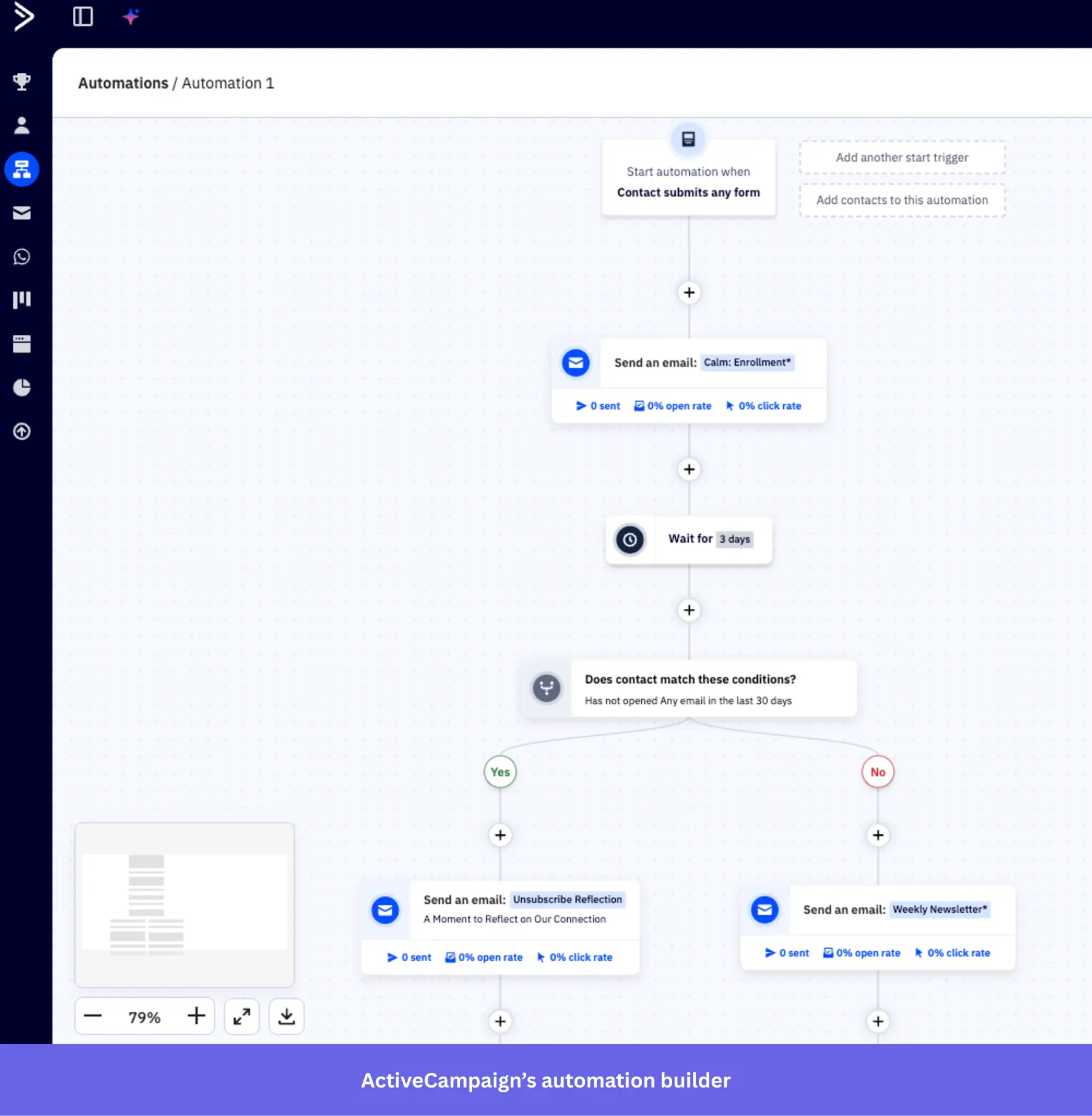
ActiveCampaign is a great email marketing platform for mid-level brands looking to scale.
But besides email, it also offers omnichannel marketing tools for SMS, landing pages, WhatsApp messaging, AI agents, and CRMs. Those capabilities make it more suitable for B2C companies.
Key features of ActiveCampaign:
- Email campaigns: Like any email tool, you can schedule, automate, send, and track recurring emails to your contacts, as well as newsletters.
- Multi-step marketing automations: Automate email sequences with multiple actions, waits, and branching options.
- AI assistant: Use prompts to create email drafts, refine copy, and generate multiple subject lines for A/B testing (available only in the Pro and Enterprise plans).
- Advanced targeting: Segments users by specific demographics and attributes to tailor email campaigns. It’s limited in the standard plans and requires the Pro plan to access advanced options.
ActiveCampaign pricing
ActiveCampaign’s standard offering starts at $15/month for 1,000 contacts, including basic email marketing features such as A/B testing, sequences, and limited automation.
If you need features like generative AI, predictive sending, or advanced segmentation, the plan can scale up to $145/month (more if you have more contacts).
What do users say about ActiveCampaign?
|
Pros |
Cons |
| ✅ ActiveCampaign gives you a lot of control over automations, so you can build more complex onboarding and lifecycle journeys from one visual builder. | ❌ Newer accounts are billed for all contacts, including unsubscribed, unconfirmed, and bounced contacts, which can push costs up faster than you expect. |
| ✅ The builder is powerful enough for branching logic, segmentation, and behavior-based journeys without forcing marketers to rely on developers for every change. | ❌ The form builder feels dated compared with the rest of the platform, so creating and customizing forms can be more clunky. |
GetResponse
Best for: Small to mid-sized businesses and ecommerce teams that need an affordable all-in-one email platform with automation, landing pages, and AI-powered content tools in one place.
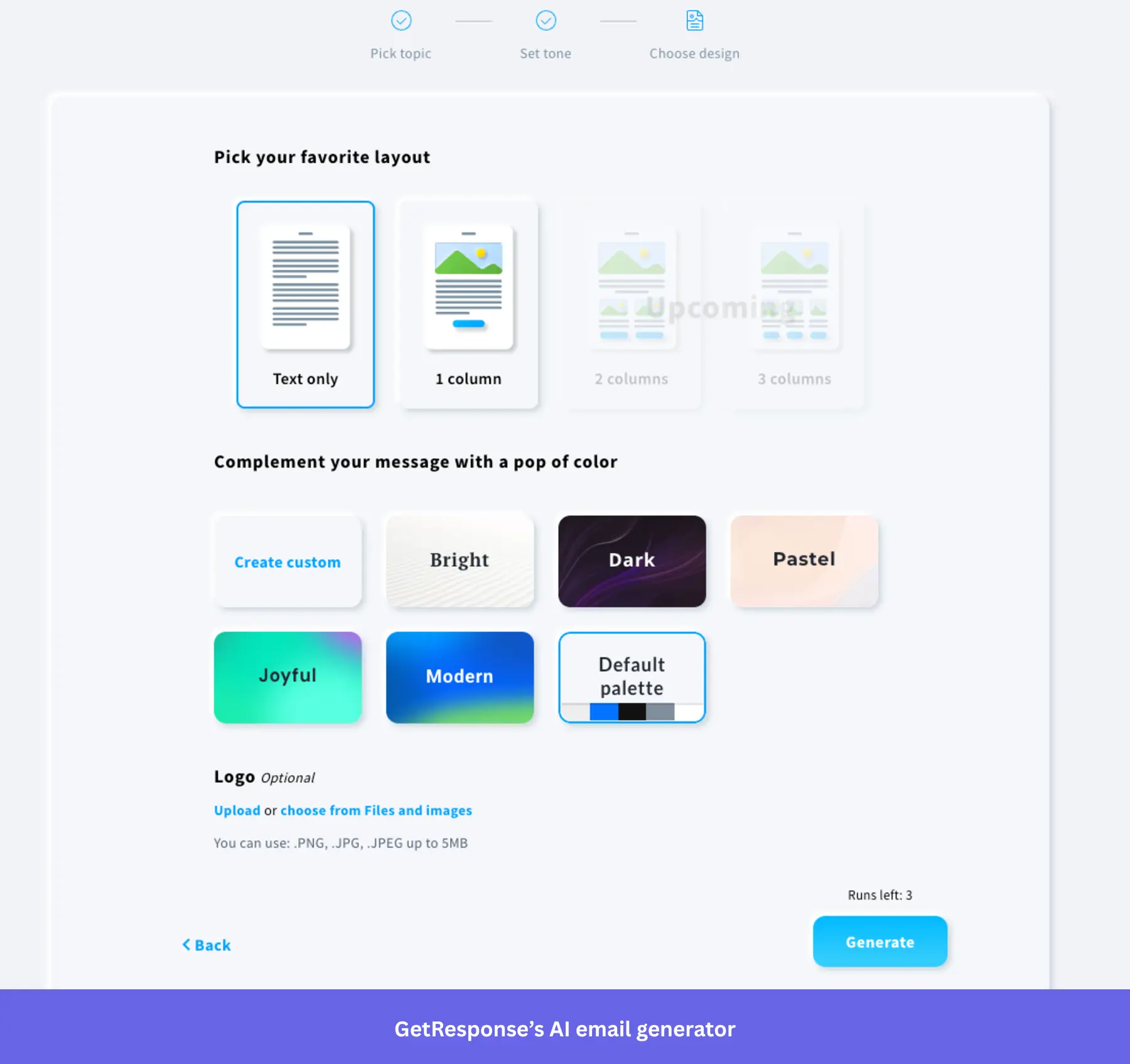
GetResponse is a household name in SaaS email onboarding. Today, in addition to AI-powered email marketing, landing pages, and ecommerce integrations, it also provides enterprise marketing tools for SMS marketing and mobile push notifications.
Key features of GetResponse:
- AI-powered email: Generate welcome sequences with contextual copywriting assistance.
- Custom workflows: Build onboarding funnels that trigger emails based on behavior (e.g., form completion, inactivity).
- Segmentation: Tailor onboarding messages based on user attributes or engagement behavior.
- Email analytics: Track email performance, conversion metrics, and refine onboarding flows with visual reports.
GetResponse pricing
GetResponse pricing starts at $19/month for the Starter plan, which includes 1,000 contacts, unlimited email sends, a landing page builder, and one custom automation workflow. It scales based on your contacts and the plan you’re on.
What do users say about GetResponse?
|
Pros |
Cons |
| ✅ GetResponse combines email, landing pages, forms, and automation in one place, so you can manage onboarding campaigns without relying on as many separate tools. | ❌ Some parts of the platform take a significant learning process to master, especially when you get into automation logic and more advanced setups. |
| ✅ You can build emails faster thanks to its drag-and-drop builder, while its reporting dashboard and integrations make it easier to track campaign performance and manage marketing activity across channels. | ❌ The Starter plan is too limited for more advanced onboarding (e.g., behavioral triggers) because it only includes 1 custom automation workflow. |
MailerLite
Best for: Small businesses, creators, and non-profits who need an affordable, easy-to-use email platform with automation and landing page tools without a steep learning curve.
MailerLite is a user-friendly email marketing platform. And just like other email marketing platforms in the market, it also offers omnichannel marketing tools for creating landing pages, publishing blogs, designing whole websites, and including e-commerce products in your emails.
Key features of MailerLite:
- Drag‑and‑drop email and signup pages: Quickly design welcome emails and signup pages without coding.
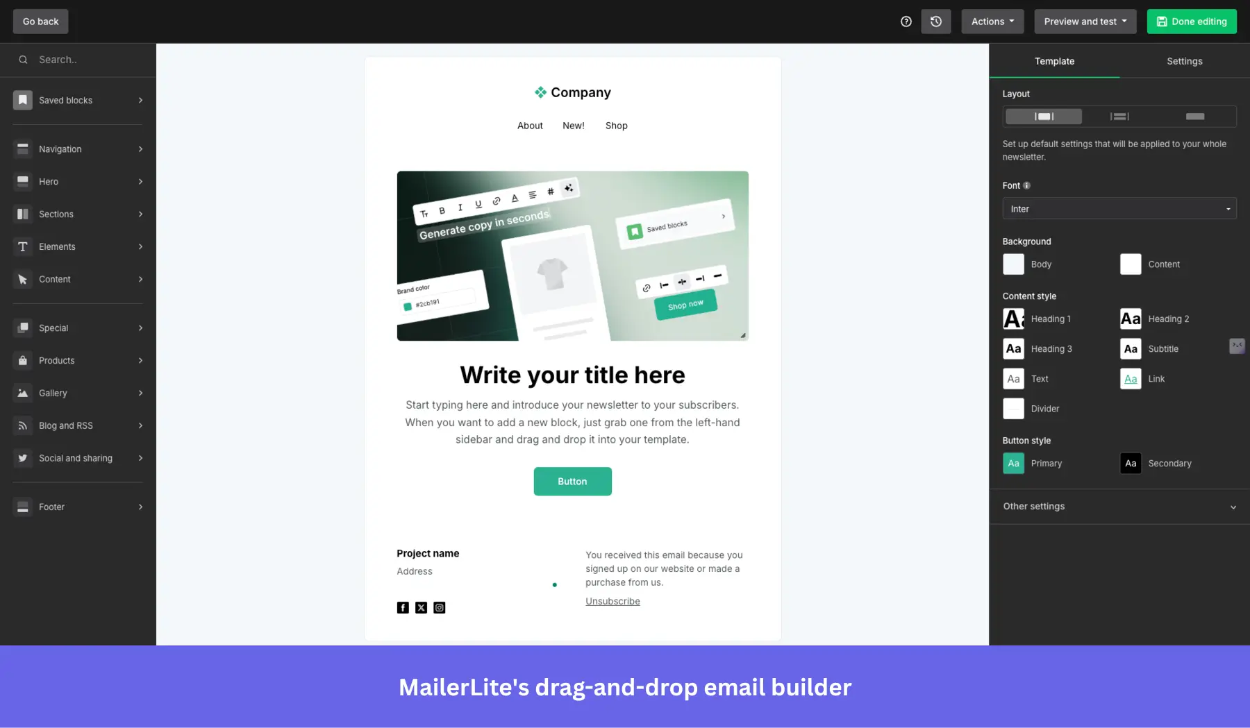
- Email automation workflows: Create multi‑step onboarding sequences triggered by user signups or behavior.
- Smart send: Uses AI to analyze each subscriber’s past interactions, sign-up dates, and time zones to determine the optimal time to send them your emails.
- AI writing assistant: Generate and refine onboarding email content using AI assistance (Advanced plan only).
- Surveys and quizzes: You can embed interactive quizzes and surveys inside your emails to reduce friction.
MailerLite pricing
MailerLite has a generous free plan for up to 500 contacts; however, it only includes the most basic email features. If you need website building and advanced segmentation, there are paid plans starting at $9/month that scale with the number of contacts you have.
What do users say about MailerLite?
|
Pros |
Cons |
| ✅ MailerLite keeps email marketing simple enough that smaller teams can manage campaigns and basic automations without a heavy learning curve. | ❌ Advanced automations and setup can still take some figuring out, especially once you move beyond basic email flows. |
| ✅ It’s budget-friendly because it only counts active subscribers toward billing, which makes costs easier to manage as lists change over time. | ❌ Account setup can be slower than expected or even rejected because new accounts may face approval delays due to MailerLite’s strict policies. |
5. In-app chat tools for user onboarding and guidance
To provide a seamless user onboarding experience, you should also offer real-time customer support, especially for high-ticket customers. A self-serve knowledge base or resource center may not always be enough to answer all your users’ questions, so in-app chat can help enhance your user onboarding process.
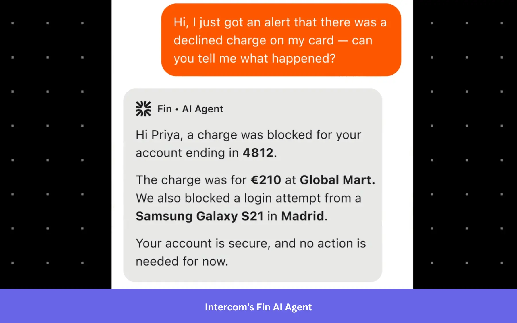
Intercom
Best for: SaaS companies that need a unified AI-powered support platform combining live chat, automated ticket resolution, and help center search.
In addition to Product Tours, Intercom’s main offerings include real-time live chat, chatbot automation (via the Fin AI agent), help center search, and proactive messaging. Which means it’s best used as a helpdesk for customer support.
Key features of Intercom:
- Fin AI agent: Intercom uses Fin to resolve more tickets without a human agent.
- Copilot: An AI assistant that helps support reps get the resources they need instantly and respond to user queries faster.
- Help center integration in chat: Users can search for articles directly in the messenger for self-service onboarding.
- Multilingual support: Help center and message support in multiple languages.
- Omnichannel support: Can relay conversations from in-app to WhatsApp, email, and even DMs.
Intercom pricing
The most basic Intercom plans start at $29/month per seat (billed annually) and include pre-built reports, a shared inbox, and a ticketing system. However, it can scale quickly as you get more outcomes via the Fin AI agent, which is billed at $0.99 per outcome on top of your seat costs.
What do users say about Intercom?
|
Pros |
Cons |
| ✅ Fin helps Intercom teams handle more repetitive support questions without adding as much human workload, which frees agents up for more complex cases. | ❌ Fin’s pricing makes costs harder to forecast as volume grows, because better AI performance can also mean a higher bill. |
| ✅ Intercom keeps email, customer context, and in-app messaging in a single inbox, which makes support workflows feel more connected and reduces tool switching. | ❌ Fin can feel harder to fine-tune than it should, because teams do not always have clear guidance on how it will interpret snippets or behave in different scenarios. |
Zendesk
Best for: Mid-market and enterprise customer service teams that need a scalable, omnichannel ticketing system with automation and reporting to support users across multiple channels.
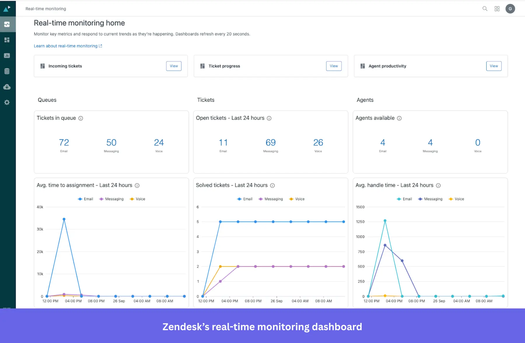
Zendesk is one of the main user engagement tools for busy customer service teams. It allows you to track every query (whether received via email, chat, social media, or other channels) in a ticketing system.
Key features of Zendesk:
- Smart ticketing system: Connects the right agent to the right queries based on expertise.
- Help center: Provides your customer support teams with a 360-degree view of all customer interactions + resources they’ll need to address these queries.
- AI agents: Which can step in for FAQs and provide personalized responses.
- Dashboards with support metrics: Tracks valuable insights on how customer interactions are being handled, and whether customer satisfaction has been achieved or not.
Zendesk pricing
Key features such as Zendesk AI and customer ticketing are available with the $19/agent/month starter plan. However, advanced features like multi-channel support, complex gen-AI replies, or routing to the right agent are only available on more premium plans (their “Suite Professional” plan is the most popular amongst users and is priced at $115/agent/month).
What do users say about Zendesk?
|
Pros |
Cons |
| ✅ Zendesk keeps tickets, chat, and other support conversations in one workspace, which helps you manage customer requests with less channel switching. | ❌ Zendesk gets expensive once you need more advanced workflows, reporting, or routing. Smaller teams can outgrow the cheaper plans quickly. |
| ✅ Zendesk’s automation tools help you cut down repetitive work, so ticket handling and support workflows feel more efficient. | ❌ Without admin time or technical knowledge, Zendesk can be overwhelming to configure. |
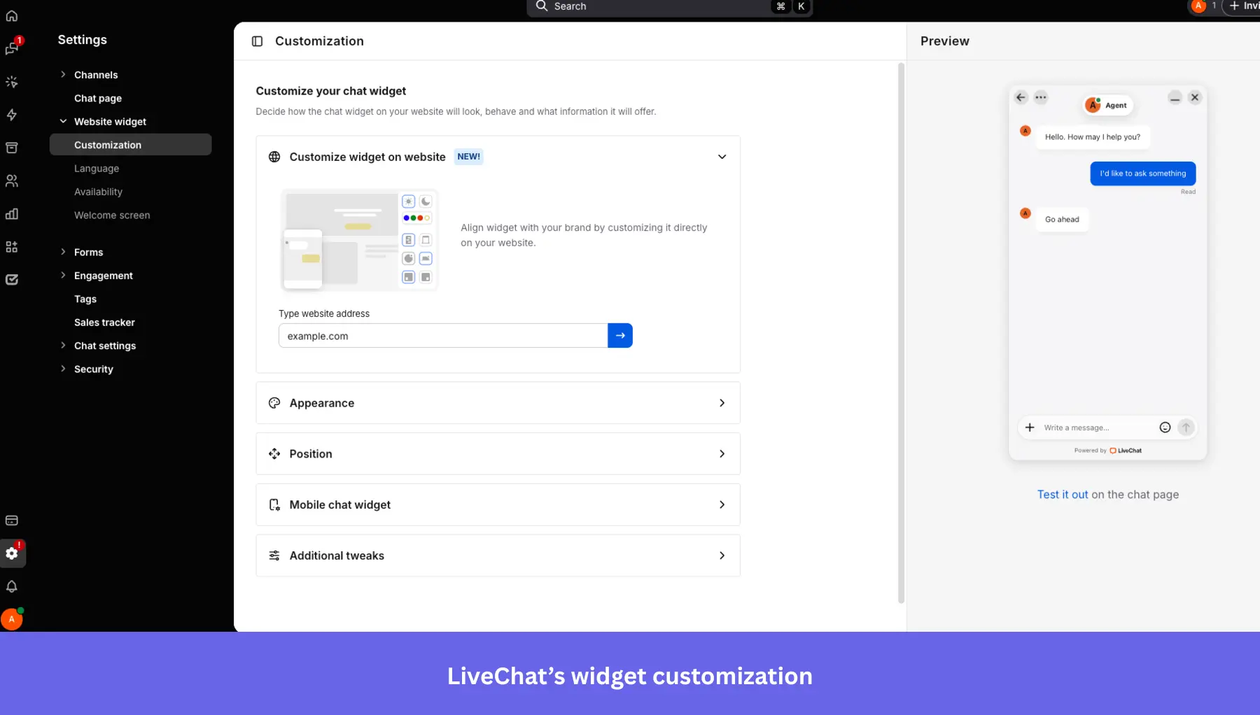
LiveChat
Best for: Small to mid-sized SaaS and ecommerce teams that need a fast, easy-to-deploy live chat tool with real-time analytics and agent coaching features.
LiveChat is another popular in-app chat tool for communicating with customers and resolving their problems in real time. It supports chatbots, multi-channel messaging (e.g., SMS, social apps), and AI-enhanced agent assistance.
Key features of LiveChat:
- Real-time web and mobile chat widget: Embed high-performance chat across web and mobile apps for instant onboarding support. Automatically route users based on behavior, reducing friction during early engagement.
- Copilot: Helps agents auto-rephrase and analyze chat tone to help agents deliver clear, supportive onboarding messaging.
- Customization: Make your chat fit your product’s UI, personalize your agents’ profiles, and use your customers’ native language.
- Real-time analytics: You can see where your users experience issues during onboarding (or anywhere else in their journey) and quickly respond to their problems and requests. It can track visitor behavior, chat volume, agent performance, and onboarding success metrics.
LiveChat pricing
LiveChat pricing starts at $20/month and includes an AI assistant. It can scale up to $59/month per seat if you need to track up to 1,000 visitors and get advanced reporting.
What do users say about LiveChat?
|
Pros |
Cons |
| ✅ LiveChat’s setup is easy, which means you can get started with it quickly. | ❌ AI chatbots are a separate product ($52/month), so teams that want more end-to-end automation have to layer extra tooling and cost on top of LiveChat. |
| ✅ LiveChat makes it easier for prospects to reach your sales team quickly, while features like internal messages let you coach reps in real time and help conversations stay on track. | ❌ Per-agent pricing can become expensive as support teams grow, and you are charged for every active user account unless you suspend inactive ones and update the subscription. |
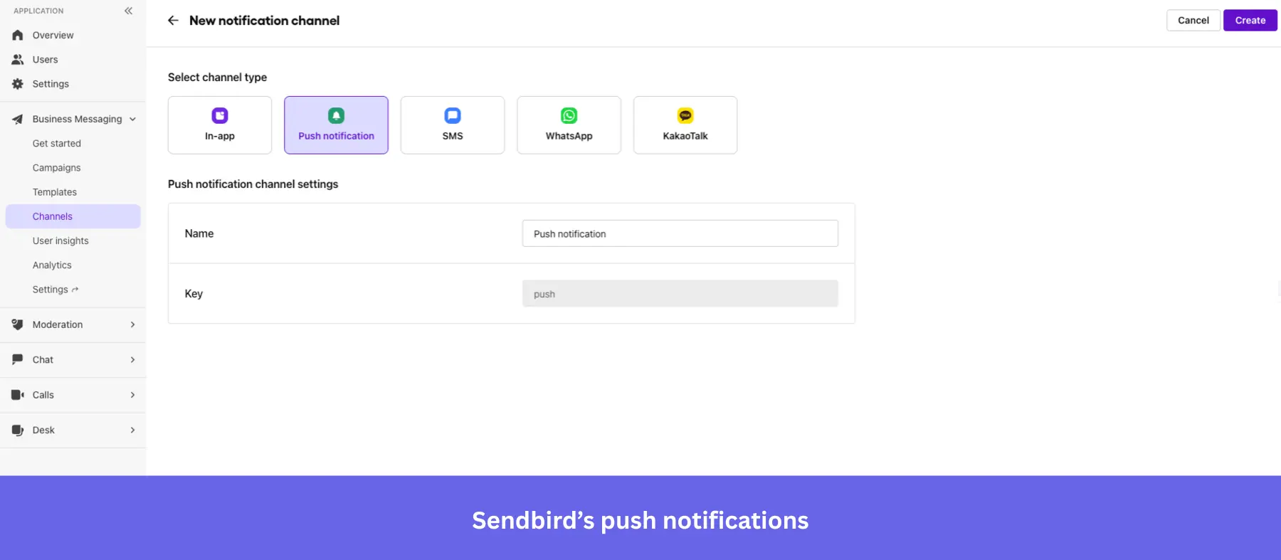
Sendbird
Best for: Engineering teams at mid-market and enterprise companies building custom in-app chat, community features, or cohort onboarding experiences that require a scalable API-first infrastructure.
Sendbird is a scalable in-app chat API and messaging SDK. It’s built for real-time one-to-one, group, or public conversations, with support for rich media, moderation, threading, and advanced features like translation.
The platform also includes analytics, delivery receipts, typing indicators, push notifications, and compliance-ready moderation tools .
Key features of Sendbird:
- AI support agents: Sendbird allows your customers to connect with each other or support teams (human, AI, or hybrid) over voice or video calls or via chat.
- Group and supergroup channels: Create community spaces or cohort onboarding experiences.
- Push notifications and offline messaging: Keep users engaged even when not in-app (via SMS, WhatsApp, mobile push notifications, or in-app messaging).
- Moderation tools: Includes profanity filters, image moderation, domain filters, and user blocking.
- Message translation: Enables multilingual support to onboard global audiences.
- Analytics and data export: Dashboard analytics, webhook support, and integrations for analyzing onboarding interactions.
Sendbird pricing
Sendbird’s chat plans start at $349/month (billed annually) for 5K MAU on the Starter tier, and $499/month for Pro. Enterprise pricing is custom. A free trial is available with no credit card required and is capped at 1,000 MAU.
What do users say about Sendbird?
|
Pros |
Cons |
| ✅ Sendbird helps developers add chat without building the full backend themselves. | ❌ Pricing scales aggressively with MAU growth, and moderation tools are not fully included in base plans. |
| ✅ Sendbird is reliable enough for higher-volume chat use cases, so you can use it for real-time messaging without worrying as much about stability. | ❌ Steep learning curve around message threading and moderation APIs. |
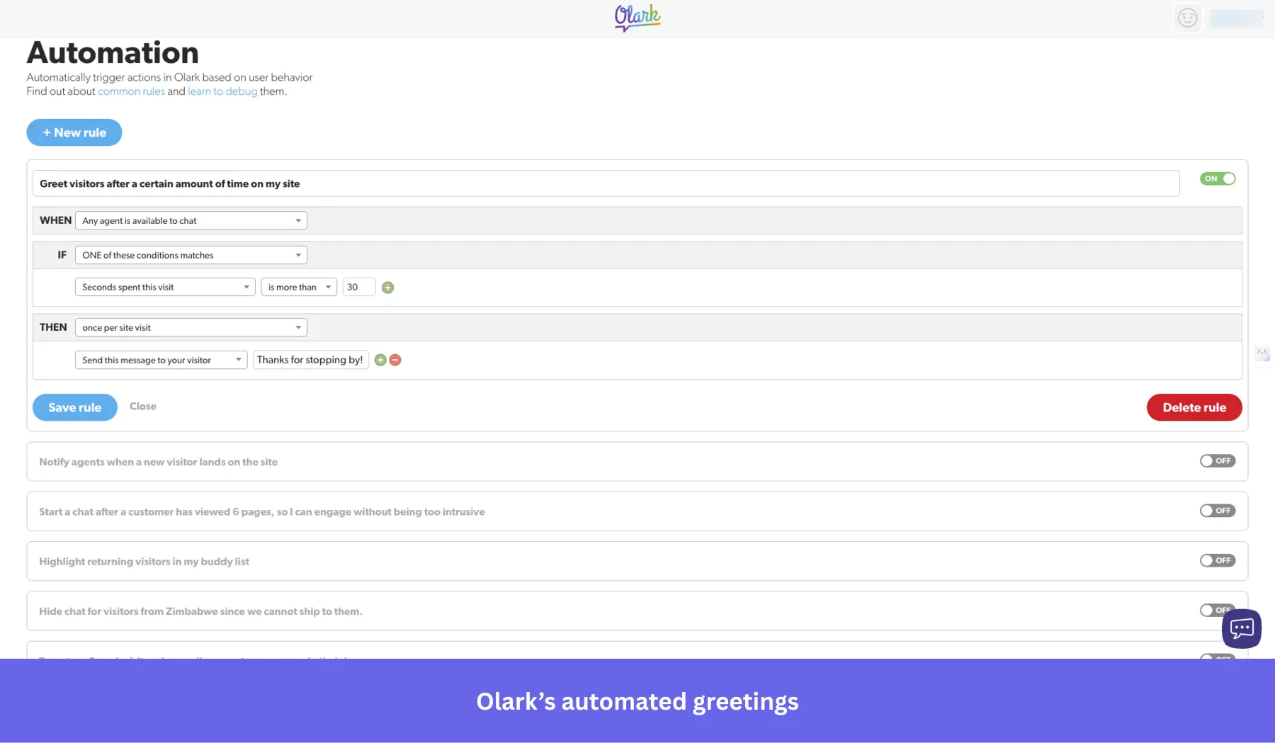
Olark
Best for: Small businesses and startups that need a simple live chat tool with automation rules and searchable transcripts, without enterprise complexity.
The Olark chat box matches your branding and lets you chat with customers when they run into a problem. You can also set up live chat automation rules to prompt users for feedback during onboarding.
Key features of Olark:
- Customizable chat widget: Olark’s chat box matches your product’s UI, so you can adjust colors, greetings, and agent profiles to create a branded, consistent onboarding experience for users.
- Live chat automation rules: Set up triggers to proactively reach out to users based on behavior, such as time on a page or inactivity, making it easy to surface onboarding help at the right moment.
- Searchable transcripts: All chat conversations are stored and searchable, letting you surface patterns in user friction and improve your onboarding flow over time.
- Real-time reporting: Track chat volume, agent performance, and customer satisfaction ratings directly from the Olark dashboard.
Olark pricing
Olark’s monthly plans start at $29/agent per month, with unlimited chats and contacts. Optional PowerUp add-ons (e.g., AI chatbots, co-browsing) are available from $29–$99/month each. A limited free plan is available, capped at 1 agent and 20 chats per month.
What do users say about Olark?
|
Pros |
Cons |
| ✅ Olark is simple to get running, so you can put live chat on your site without a heavy setup process or a lot of technical help. | ❌ Costs rise with headcount and add-ons, so you can end up paying much more than the base price suggests. |
| ✅ Searchable transcripts, reporting, and visitor details give smaller teams useful context without needing a more complex support stack. | ❌ Olark is better for straightforward live chat than for more advanced AI-heavy support setups, because stronger chatbot and automation features sit on higher plans or separate upgrades. |
6. Demo video + onboarding video tools
Video tutorials with an actual human behind them make it easier for a user to engage. This could be included in your initial product tours (e.g., in the welcome screen, built in Userpilot) or while showing certain features.
It lets you add that extra touch of personalization to your product and makes learning more engaging by breaking down complex processes. In fact, inserting a video in an introductory marketing email increases click-through rates by 96%.
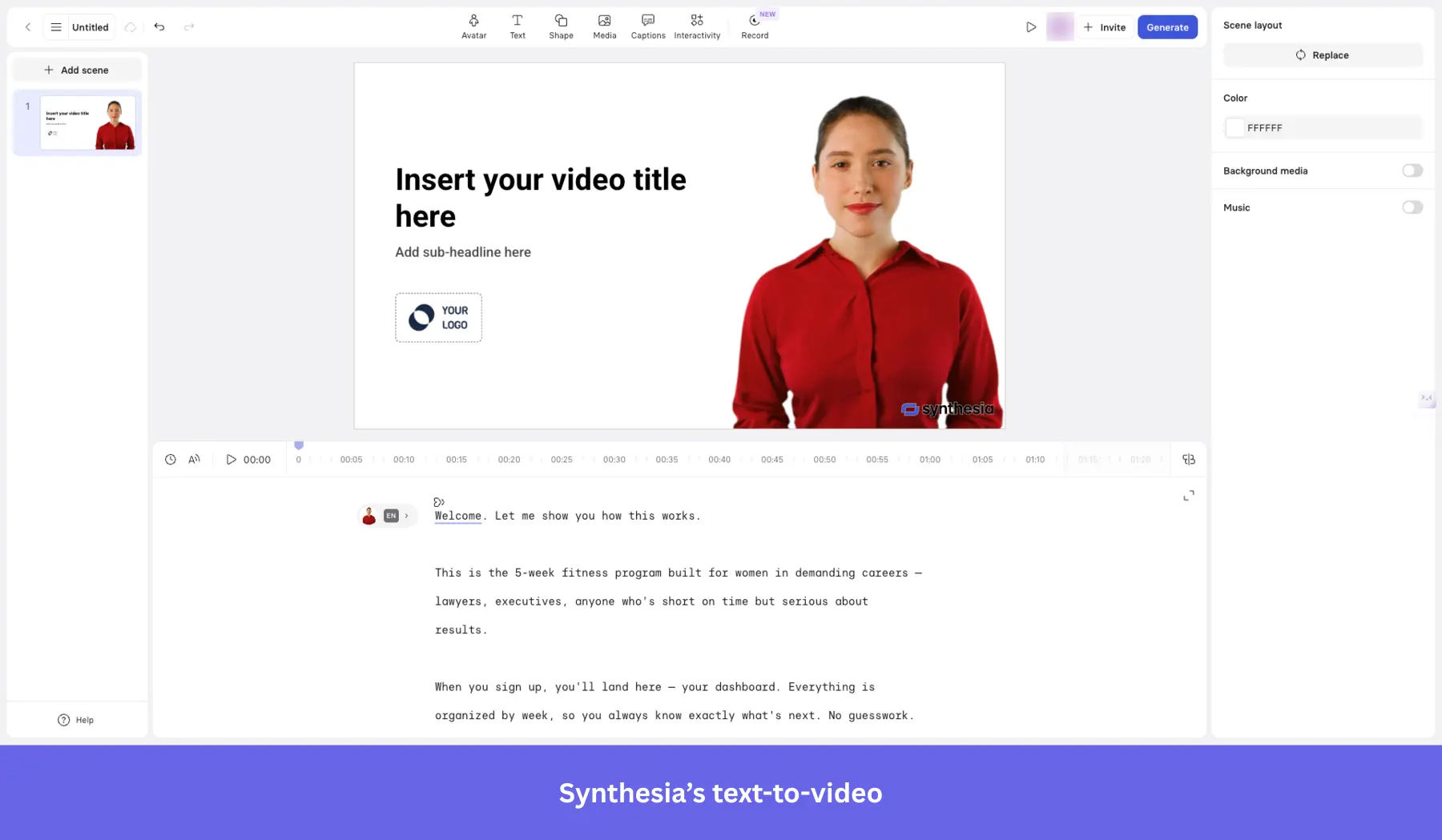
Synthesia
Best for: Learning & development, HR, and marketing teams that need to produce professional onboarding or training videos at scale without cameras, studios, or filming talent.
Synthesia is an AI-powered video creation platform that can produce polished demos and onboarding videos without traditional filming. All you need is a script, an avatar, and language selection.
Key features of Synthesia:
- Text-to-video and screen recording: Turn scripts or product walkthroughs into videos in minutes.
- Extensive AI avatar library: Access 240+ AI avatars (stock or selfie avatars) across tiers for personalized guides.
- Multilingual support: Produce videos in 160+ languages with auto dubbing and subtitles.
- Branded share pages and analytics: Customize shareable pages with CTAs, track user engagement, and embed in LMS.
- Collaboration tools: Workspace comments, version control, guest seats, and review workflows enable seamless team cooperation.
- SCORM export & API: Enterprise-grade integrations for LMS and workflow automation.
Synthesia pricing
Free for 10 minutes of video/month. Paid plans start from $18/month (billed annually) on the Starter plan, giving 120 minutes of video per year, 125+ AI avatars, 160+ languages, and video downloads.
What do users say about Synthesia?
|
Pros |
Cons |
| ✅ Synthesia cuts down the time and effort it takes to make training or onboarding videos, so you can turn scripts into usable videos without cameras, studios, or editing-heavy workflows. | ❌ Avatar realism and customization still have limits, so some videos can feel less natural than you’d want. |
| ✅ Synthesia works well for multilingual video creation, which makes it useful for global onboarding and training content. | ❌ Some higher-end training and LMS features sit behind Enterprise, so Starter and Creator can feel limiting for more advanced L&D use cases. |
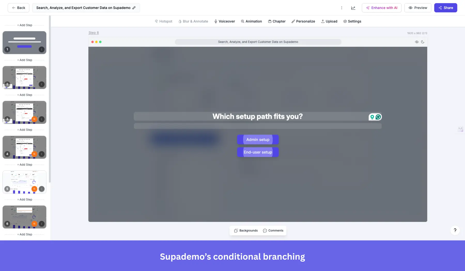
Supademo
Best for: Product marketing, sales enablement, and customer success teams that need to create self-serve interactive demos and onboarding walkthroughs without engineering resources.
Supademo is a no-code platform designed for creating interactive demo videos, walkthroughs, and onboarding experiences without coding or traditional video production. It captures user flows via the browser, screenshots, or HTML, enhances content with AI, and delivers personalized in‑app demos.
Key features of Supademo:
- Interactive product walkthroughs: Record workflows and turn them into clickable guides with hotspots, text, annotations, and zoom/pan capabilities.
- AI enhancements: Auto-generate voiceovers, text annotations, and translations into 15+ languages.
- Conditional branching: Create multi-path demos tailored per user for personalized onboarding journeys.
- Multi-demo showcases: Group multiple demos into one guided onboarding “starter kit”.
- In‑app embedding and shareable links: Trigger demos inside your product or embed in knowledge bases and emails.
- Collaboration: Team workspaces with commenting/version control, and detailed viewer analytics, such as drop-offs and completion rates.
- Export options: Download demos as video, GIF, or integrate with LMS via SCORM-compatible exports.
Supademo pricing
Supademo offers a free plan at $0 per creator/month, allowing up to 5 demos, unlimited screenshots, a basic editor, exporting capabilities, sharing, and analytics. The paid plans start at $38/month per user (billed annually) and include unlimited demos, team workspace, custom branding, and can scale up to $350/month per user (billed annually).
What do users say about Supademo?
|
Pros |
Cons |
| ✅ Supademo makes it easier to turn product flows into interactive demos without needing design or developer help. | ❌ Entry-level plans are light on analytics. If you want more in-depth demo tracking, you’d have to move up to a paid tier. |
| ✅ Supademo’s creator-based pricing is more scalable for customer-facing demos, because viewers are unlimited even on the free plan. | ❌ A few workflow details still feel manual because autosave can be inconsistent, and there is no built-in A/B testing, so you have to double-check edits and create separate demo versions to test different ideas. |
Walnut
Best for: Mid-market and enterprise B2B sales and GTM teams that need high-fidelity, personalized interactive demos at scale, and have the budget and seat count to justify a sales-led pricing model.
Walnut is a no-code platform that creates end-to-end interactive demo experiences and personalized onboarding walkthroughs directly in the browser. It captures real product flows, supports self-serve deployment, and provides tools for training new users.
Key features of Walnut:
- HTML-based interactive walkthroughs: Capture live product flows to create clickable, editable demos.
- Embedded in-app and shareable links: Seamlessly launch demos inside your product or via emails, LMS, and knowledge bases.
- Analytics and drop-off tracking: Track user interactions, session time, and steps where users disengage to refine onboarding.
- Conditional branching and personalization: Tailor demos based on user role, industry, or behavior for a contextual onboarding experience.
- Team collaboration & support: Workspaces with commenting, version control, and dedicated success management.
Walnut pricing
Walnut plans start at $750/month (billed annually; includes unlimited demos, 3 editor seats, demo analytics, and engagement tracking), then $1,550/month (5 editor seats; adds prospect personalization, advanced analytics, user engagement tracking, etc.). Enterprise teams or those needing more seats fall under custom pricing.
What do users say about Walnut?
|
Pros |
Cons |
| ✅ Walnut gives sales teams more control over demos, so you can easily tailor flows for different buyers without having to wait on engineering every time they need a change. | ❌ More complex demos take time to manage, so you can run into a significant learning curve once you move beyond simpler flows. |
| ✅ Walnut helps you keep demos consistent across the team, so prospects get a clearer product narrative and managers can track usage through CRM integrations without adding more manual work. | ❌ Demo upkeep can become time-consuming in fast-moving product environments, because you need to recapture and update content regularly to keep demos accurate. |
Loom
Best for: Remote and async-first SaaS teams that need a fast, frictionless way to create and share screen-recorded onboarding tutorials without video editing experience.
Loom is a popular tool for creating quick video tutorials by recording your screen. It’s a user-friendly option for SaaS companies that want to create step-by-step videos to enhance their onboarding process.
Key features of Loom:
- Easy-to-use screen recording: Record your screen with audio and video to create clear, concise onboarding tutorials.
- Quick sharing and embedding: Loom allows you to share and embed videos directly in your app or emails.
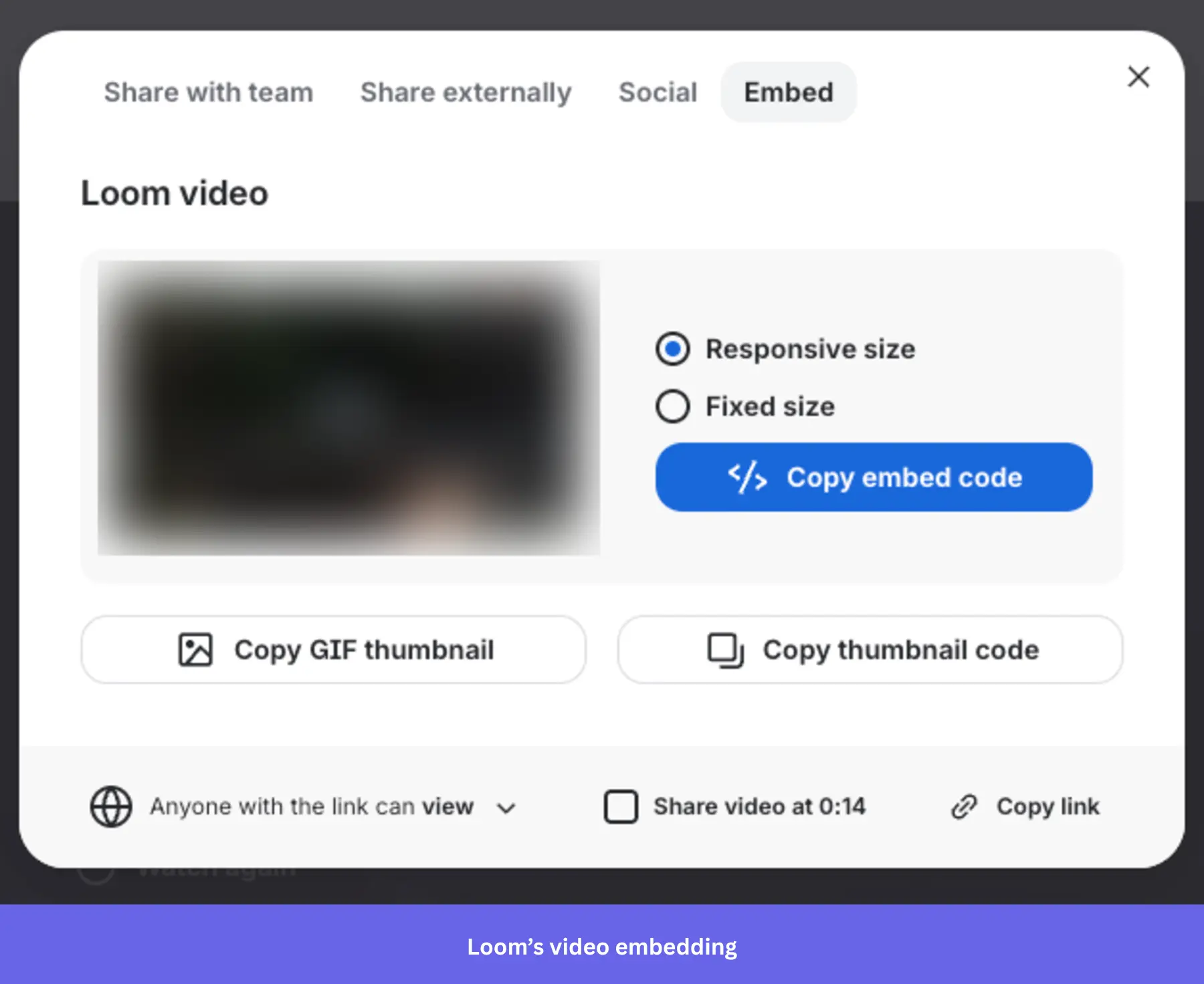
- Collaboration and feedback: You can leave comments or time-stamped feedback on Loom videos.
- Loom AI: Automatically generates video titles, summaries, chapters, and transcripts, and removes filler words and silences.
Loom pricing
Loom offers a free Starter plan with up to 25 videos, 5-minute screen recordings, and unlimited meeting length. Paid plans scale based on the number of users in your team. For up to 100 users, they start at $18/user per month (Business plan) for unlimited videos, unlimited length, and advanced features. For the same team size, the Business + AI plan at $24/month includes AI-powered transcription, auto-summaries, and filler-word removal.
What do users say about Loom?
|
Pros |
Cons |
| ✅ Comments and viewer insights help you gather feedback and see how people engage with shared videos. | ❌ Loom’s AI features cost extra, so teams that want auto-summaries, filler-word removal, and other AI editing features have to pay more. |
| ✅ You can explain processes, give feedback, and create onboarding videos without adding more meetings. | ❌ Recording and playback issues, such as slow video processing and glitches. |
7. Onboarding webinar tools
Apart from embedding video tutorials, live user webinars organized by CS to help the new users understand your product are an essential part of user onboarding.
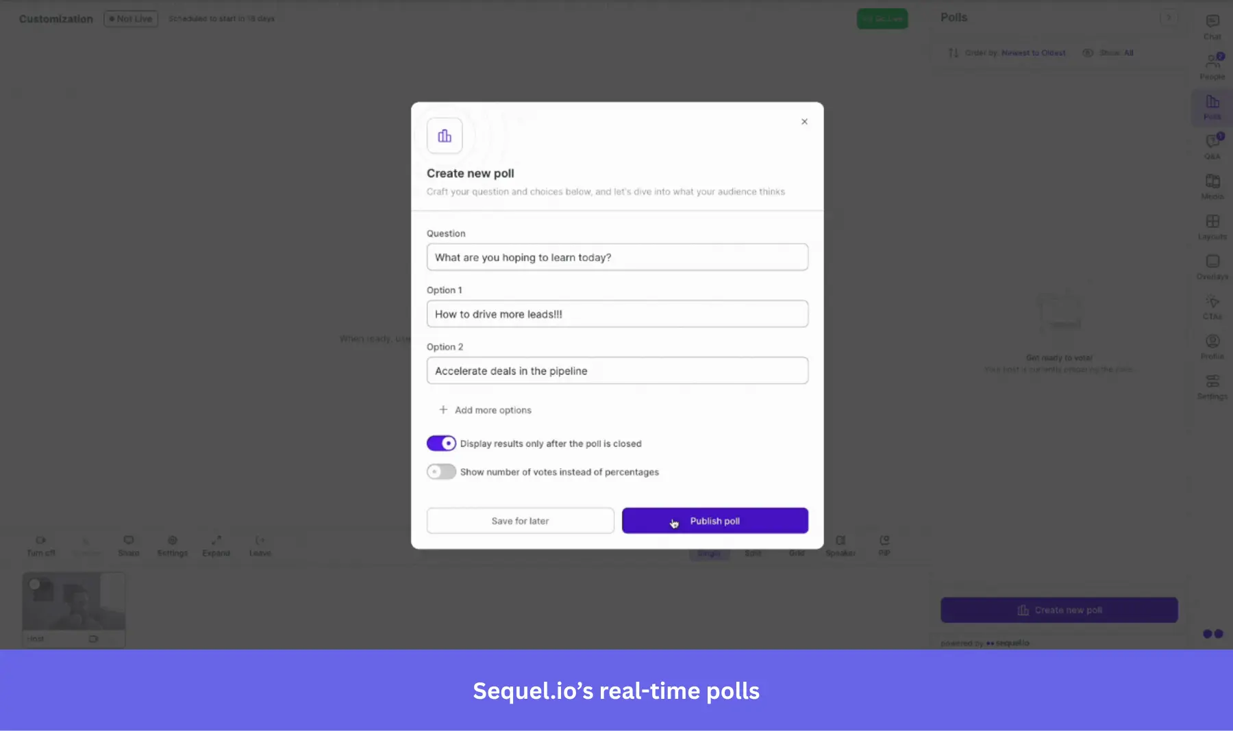
Sequel.io
Best for: B2B marketing and demand gen teams that want to host webinars natively on their website, keeping prospects in their brand environment and feeding first-party intent data directly into their CRM.
Sequel.io is a versatile webinar platform that lets you embed live and automated webinars directly onto your website or app. This unique feature gives you full control over the user experience while driving higher engagement.
Key features of Sequel.io:
- Embedded webinars: Host webinars directly on your product’s website or app without redirecting users elsewhere.
- Live and automated options: Sequel.io allows you to host live webinars or turn them into evergreen, on-demand sessions to fit different user needs.
- Interactive elements: Add polls, Q&A sessions, and CTAs to engage users during webinars.
Sequel.io pricing
Sequel.io’s plans start at $833/month (billed annually) for 500 attendees per session, with unlimited hosts and sessions, email and brand customization, and audience engagement. It also has higher tiers available for larger audiences. If you’re on a tight budget, you may want to check out some of the cheaper solutions below.
What do users say about Sequel.io?
|
Pros |
Cons |
| ✅ Sequel.io keeps webinars on your own site, which gives attendees a more seamless branded experience and keeps conversion paths closer to the event itself. | ❌ Sequel.io is expensive enough that you should have a clear webinar strategy to justify the cost. |
| ✅ Strong hands-on support that makes it easier to run live events with confidence, especially during onboarding. | ❌ Reporting and registration have some gaps, like inability to filter analytics by webinar. |
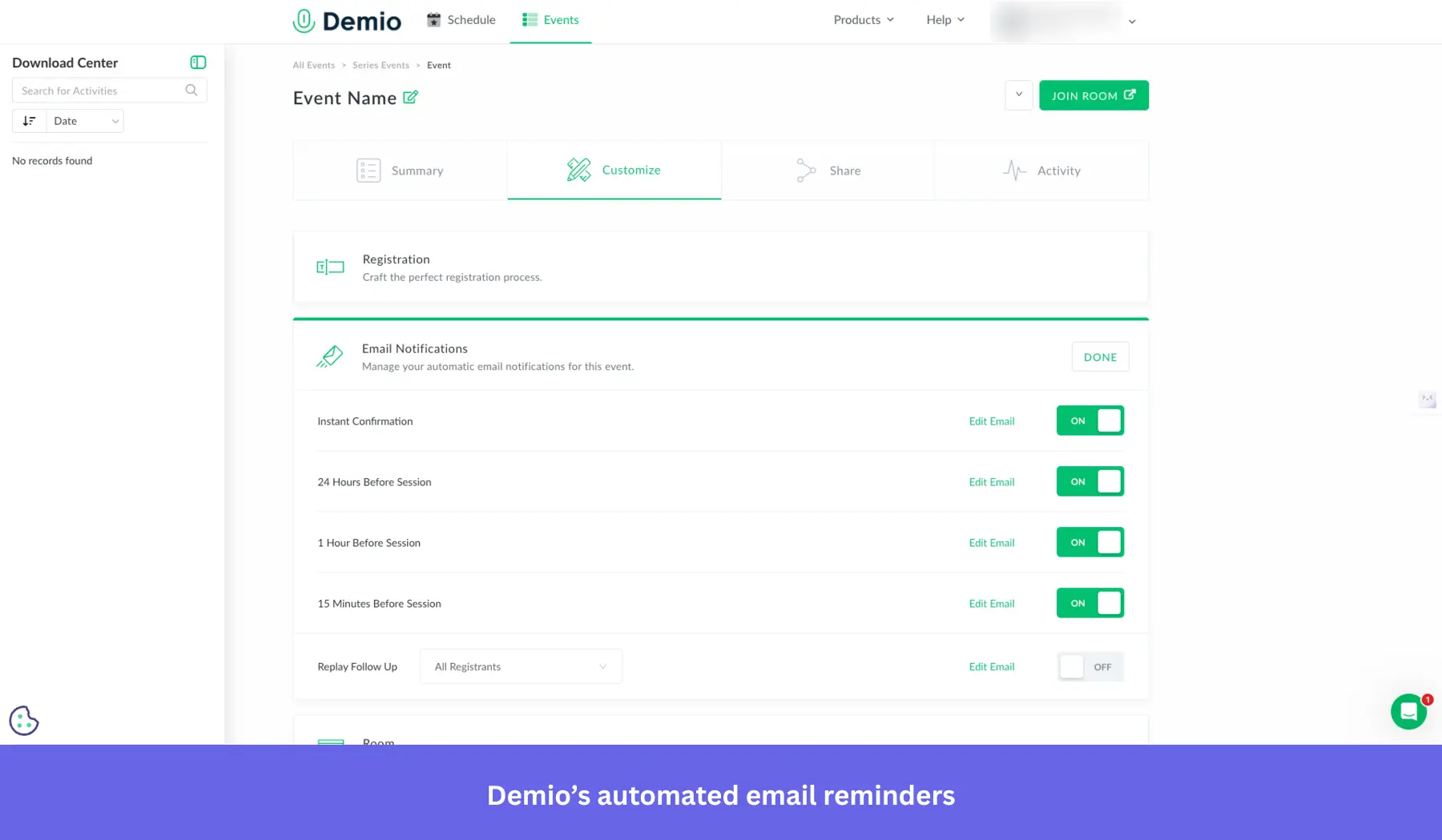
Demio
Best for: Small to mid-sized SaaS and e-learning teams that need a clean, no-download webinar platform for live onboarding sessions, automated evergreen content, and basic CRM integrations.
Demio is a user-friendly webinar platform designed for hosting live, scheduled, and automated webinars. Its minimalistic interface and customization options make it a great choice for onboarding users through engaging live sessions.
Key features of Demio:
- Live and automated webinars: Host live webinars or set up automated sessions that run on demand.
- Customizable branding: Personalize your webinar experience with customizable registration pages, thank-you pages, and interactive elements such as polls, handouts, or CTAs.
- Automated email reminders: Keep users engaged by setting up automated email reminders before and after the webinar.
Demio pricing
Demio starts at $45/month (billed annually) for a single host and up to 50 attendees. The Growth plan scales up to 150, 500, 1,000, or 3,000 attendees per session with per-host pricing. Automated and evergreen webinars are available only from the Growth plan onward.
What do users say about Demio?
|
Pros |
Cons |
| ✅ Demio removes friction for attendees by letting them join webinars in their browser instead of downloading software first. | ❌ Starter is too limited for teams that want evergreen onboarding content, because automated and on-demand webinars start on higher plans. |
| ✅ Live sessions are easier to keep interactive because polls, handouts, calls to action, and chat are built into the webinar experience. | ❌ Demio can make it harder to access your webinar data after cancellation. A user reported losing the ability to export registrant emails unless they subscribed again. |
Zoom
Best for: Teams already in the Zoom ecosystem that need a familiar, reliable platform for large-scale onboarding webinars without switching to a dedicated webinar tool.
Zoom is a well-known video conferencing tool that also offers a webinar feature. While not as specialized as other onboarding tools, Zoom Webinars is widely recognized and easy to use, making it a familiar choice for onboarding sessions.
Key features of Zoom Webinars:
- Live webinar hosting: Zoom lets you host live onboarding webinars with no participant limits (as long as you pay for it), making it ideal for businesses with a large user base.
- Recording and on-demand access: Record live webinars and offer them as on-demand videos, allowing users to access onboarding content at their own pace.
- Interactive features: Engage participants with features like polls, Q&A, and chat during live webinars.
Zoom pricing
Zoom Webinars is an add-on that requires an existing Zoom Workplace Pro subscription. The Webinars plan starts at approximately $83.33/month for up to 500 attendees (billed annually). Pricing scales based on attendee capacity.
What do users say about Zoom?
|
Pros |
Cons |
| ✅ Zoom removes a lot of attendance friction because most people already know how to join and use it. | ❌ Zoom Webinars is not a lightweight entry-point product, because you need a paid Zoom base plan before you can add webinar functionality. |
| ✅ Zoom is reliable for larger virtual events, while built-in features like breakout rooms, Q&A, polls, and chat help keep attendees engaged without adding extra tools. | ❌ Branding and customization options are limited. For example, you always have to enter reusable details, like speakers, instead of copying them from past events. |
eWebinar
Best for: SaaS customer success and onboarding teams that need to automate recurring webinars without running live sessions repeatedly, while maintaining an interactive experience for attendees.
eWebinar focuses on automating webinars by turning pre-recorded content into interactive, on-demand sessions. It’s ideal for onboarding users without requiring constant live webinars.
Key features of eWebinar:
- Automated, on-demand webinars: Upload any pre-recorded video and turn it into an interactive webinar that runs on demand.
- Real-time interaction: Even though the webinars are automated, eWebinar allows for real-time chat, polls, and quizzes.
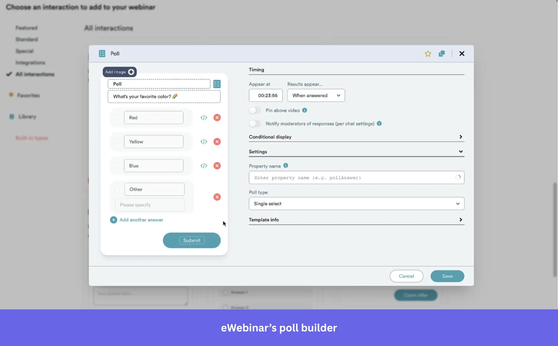
- Scheduling flexibility: Set your webinars to run at specific times or offer “just-in-time” sessions.
eWebinar pricing
eWebinar starts at $99/month for 1 active webinar (billed monthly), with annual billing available at a ~20% discount. The Growth plan at $199/month covers up to 5 active webinars, while the Scale plan at $299/month offers up to 15 active webinars. A 14-day free trial is available.
What do users say about eWebinar?
|
Pros |
Cons |
| ✅ eWebinar’s just-in-time scheduling makes automated webinars feel more flexible, because people can join on demand or within minutes of registering instead of waiting for a fixed live session. | ❌ eWebinar gets expensive once you need more than one or a few active webinars, so multi-program onboarding teams will likely outgrow the entry plan quickly. |
| ✅ Support is hands-on enough that you can feel confident using the platform, even while you are still learning it. | ❌ It’s built for automated webinars, not live-hosted ones, so you’ll need another tool if you want both live and automated events. |
8. Onboarding engagement analytics tools
To optimize your onboarding process, analyze user behavior to identify where users stumble and get stuck.
The tools listed below record all your users’ actions, providing a full-spectrum image of your users’ actions and product analytics. These include:
- Amplitude
- Posthog
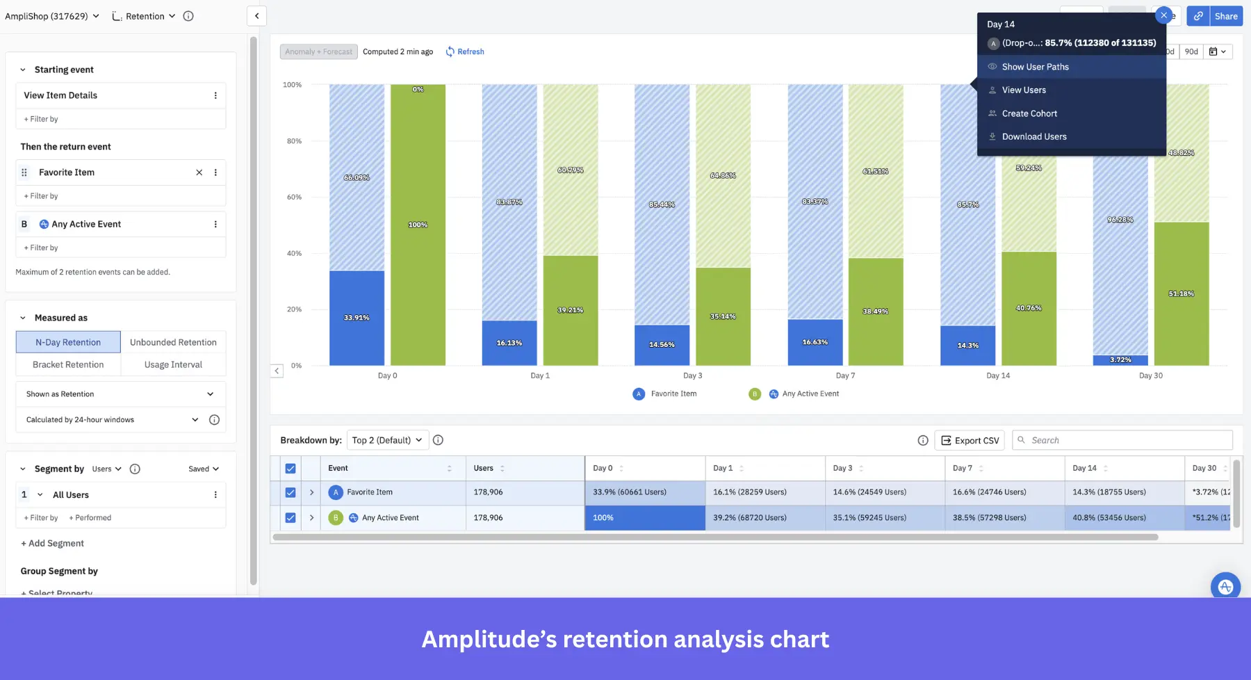
Amplitude
Best for: Mid-market and enterprise product teams with dedicated analytics resources that need deep funnel analysis, behavioral cohorts, and retention analytics to optimize onboarding flows with precision.
Amplitude is a robust analytics platform designed to deliver actionable insights into user behavior, adoption, and retention. It is especially suitable for SaaS companies aiming to optimize onboarding through data-driven decisions.
Key features of Amplitude:
- Cross-platform user tracking: Amplitude tracks user behavior across multiple platforms.
- Behavioral cohorts: Segment users into behavioral cohorts to see how different groups engage with your onboarding flow.
- Custom dashboards: Build custom analytics dashboards to track specific onboarding KPIs, including completion rates, drop-offs, and time-to-value.
Amplitude pricing
Amplitude offers a free Starter plan that includes 10K monthly tracked users (MTUs), core analytics, basic session replay, and unlimited feature flags. The Plus plan starts at $49/month (billed annually) for growing teams. Growth and Enterprise plans are custom-quoted based on volume and features needed.
What do users say about Amplitude?
|
Pros |
Cons |
| ✅ Having features like funnel, retention, and segmentation reports under one tool makes it easier to identify friction points and behavior patterns. | ❌ Due to its complexity, Amplitude has a steep learning curve that can feel overwhelming for non-technical users. |
| ✅ The free Starter plan gives early-stage teams a strong starting point, so they can test funnels, retention, and product analysis before committing to paid plans. | ❌ Pricing becomes less predictable once you grow beyond the self-serve tiers, because Growth and Enterprise plans require sales conversations instead of transparent public pricing. |
PostHog
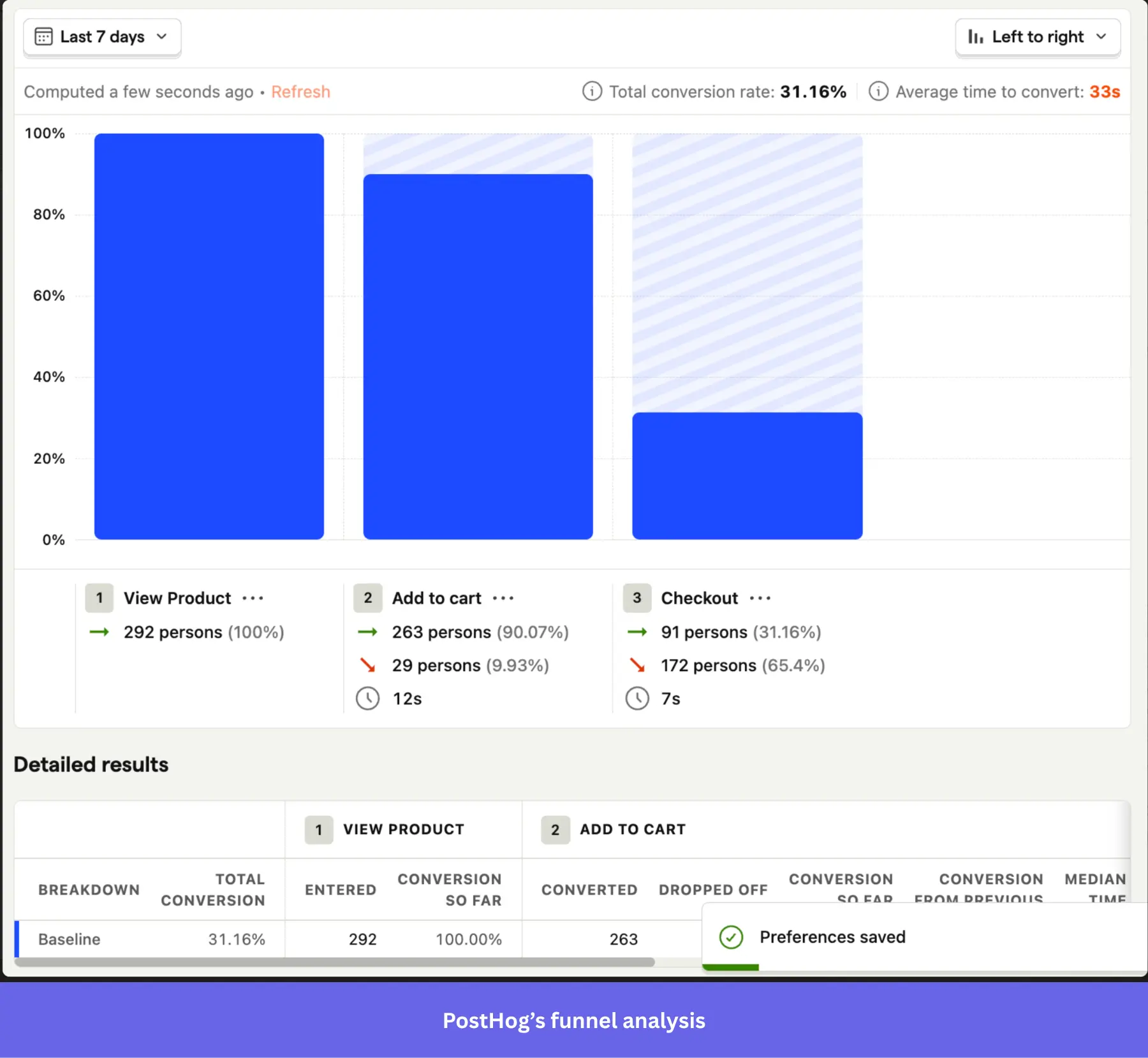
Best for: Engineering-led product and growth teams at developer-focused SaaS companies that want a single open-source platform for analytics, session replay, feature flags, and surveys.
PostHog is a comprehensive, open-source product analytics tool that’s ideal for measuring onboarding engagement. It offers behavior tracking, funnel analysis, session replays, feature flags, and in-app surveys in one integrated suite, making it easy to understand how users move through onboarding flows.
Key features of PostHog:
- Autocapture event tracking: Automatically logs clicks, form submissions, rage clicks, page leaves, and more events that show where users struggle during onboarding.
- Funnel and user path analysis: Build custom funnels and explore paths to spot friction points.
- Session replay: Watch real users complete key onboarding tasks to identify UX issues and anomalies.
- Surveys: Collect post-onboarding input directly from users to collect qualitative insights.
PostHog pricing
PostHog offers a free plan that includes up to 1 million events per month, 5,000 session replays, feature flags, experiments, error tracking, surveys, and data warehouse integration. Once you exceed the free-tier limits, you move to usage-based pricing, which can scale quickly as your user base grows.
What do users say about PostHog?
|
Pros |
Cons |
| ✅ Analytics, session replay, feature flags, experiments, and surveys in one platform can help you replace a stack of separate product tools. | ❌ There’s an initial learning curve as the UI presents a lot of features at once. |
| ✅ The free tier is generous enough to be genuinely useful, so early-stage teams can track onboarding flows and use session replay before paying. | ❌ If you aren’t careful, its usage-based pricing can still surprise you, because turning on multiple products at once increases billable usage across each module. |
9. User feedback tools to measure onboarding success
Collecting user feedback is vital for identifying usability issues and evaluating the onboarding process itself.
You can gather feedback in various ways, from simple email surveys to in-app NPS surveys provided by onboarding solutions. Let’s review my top choice for the job: Typeform.
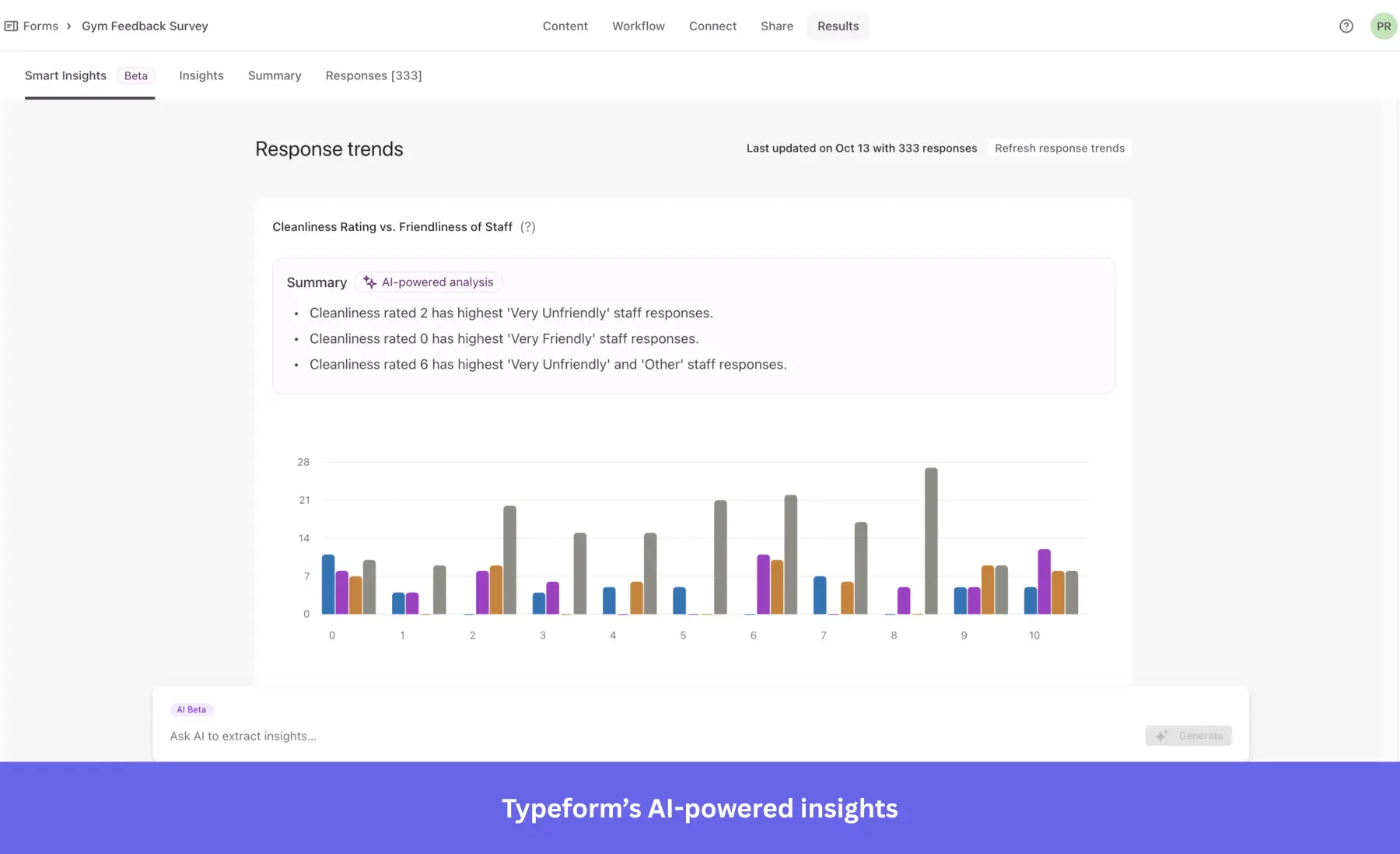
Typeform
Best for: Small- to mid-sized SaaS teams on a limited budget who want a visually polished, conversational survey experience to collect post-onboarding feedback without building anything from scratch.
Use a simple form creation tool like Typeform if you’re on a limited budget. Typeform offers the benefit of being conversational and interactive. Creating a survey is straightforward; it’s like typing in a notepad, with no coding required.
Key features of Typeform:
- Pre-built templates: Includes specific survey templates to collect customer feedback throughout onboarding.
- Branding: Remove the Typeform logo, add a custom subdomain and fonts, and create a seamless onboarding experience.
- Analytics + AI Insights: Monitor completion rates, respondent drop-off, and conversion performance to gain user insights via AI summaries.
- Integration with major platforms: Send responses to HubSpot, Slack, Mailchimp, and Google Sheets via native or Zapier integrations.
Typeform pricing
Typeform has a free plan (10 responses/month). Paid plans start at $28/month (billed annually) for 100 responses/month, scaling to $91/month for 10,000 responses, with additional features like tracking drop-off rates and conversions.
What do users say about Typeform?
|
Pros |
Cons |
| ✅ Typeform’s one-question-at-a-time format makes surveys feel more engaging, which can help keep respondents moving through forms instead of dropping off early | ❌ The free and lower-tier plans are restrictive enough that teams collecting meaningful onboarding feedback will probably need to upgrade quickly. |
| ✅ Its no-code builder makes it easy for non-technical teams to build polished forms and fit them into existing workflows. | ❌ Advanced reporting can feel limited compared with dedicated analytics tools, and working with large response sets or certain CRM and analytics integrations can be more cumbersome than you’d expect. |
10. Knowledge base & resource center tools for product onboarding
All website visitors, as well as trial and premium customers later on, immediately want access to specific information. That’s why every company, whether a small startup or a large enterprise, should have an in-depth knowledge base for its customers.
Especially during customer onboarding, a resourceful knowledge base helps us create better resources for our customers and retain more users by providing answers, ideas, and information on a wide range of topics, from “How the tool works” to different use cases.
Not to mention that when your potential customer sees your tool in action or in a use case, you will more easily and quickly reach the “Aha!” moment.
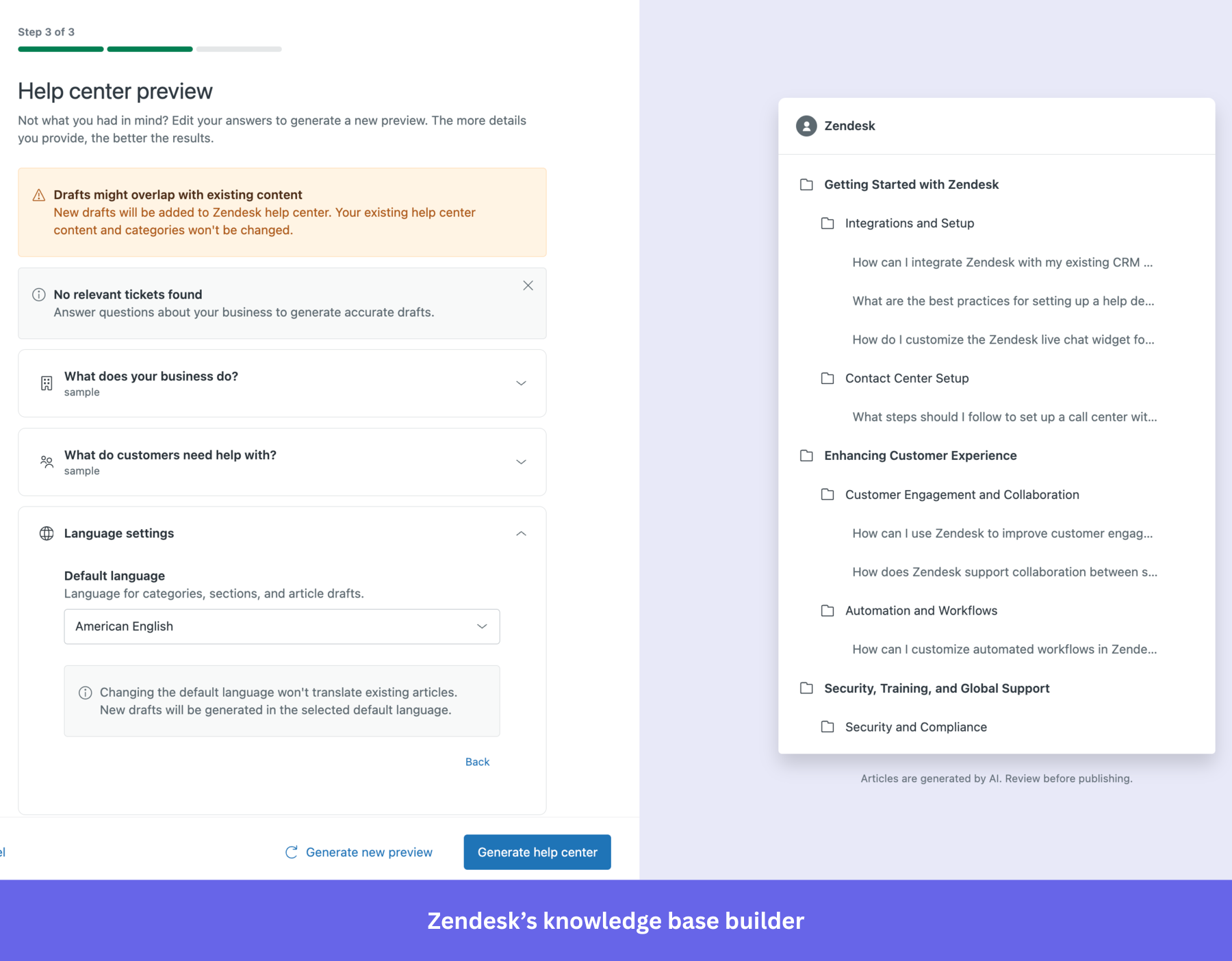
Zendesk
Best for: Mid-market and enterprise support teams already in the Zendesk ecosystem that want a knowledge base tightly integrated with their existing ticketing and live chat workflows.
Zendesk also offers a powerful knowledge base feature, making it simple to provide users with self-service support during onboarding. It integrates with live chat and email, allowing smooth transitions between automated help and human support.
Key features of Zendesk:
- Integrated knowledge base: Build a comprehensive database with articles, guides, and FAQs that users can access directly from your product.
- Live chat and ticketing integration: Zendesk connects its knowledge base with live chat and ticketing systems, enabling users to escalate issues to support agents if they can’t find the answers they need.
- Other features: Community forums, a unified agent workspace, a ticketing system, automated responses, SLA management, email-to-case, reporting, and analytics.
Zendesk knowledge base pricing
Help centers are available in the customer service Suite plans starting at $55/agent/month (Suite Team), with options up to $115/agent/month (Suite Professional) to add more languages, additional help centers, and a customer portal.
What do users say about Zendesk?
|
Pros |
Cons |
| ✅ Zendesk keeps the help center closely tied to ticketing and support workflows, so you can use knowledge content without managing a separate knowledge-base stack. | ❌ Zendesk Guide (the knowledge base) is expensive if you only want a help center, because the current help center plan starts at Suite Growth. |
| ✅ Zendesk works well for global or multi-brand documentation, because it supports multiple help centers and multilingual workflows inside the same ecosystem. | ❌ Customizing the help center often takes extra technical work. It usually means editing themes or working with HTML or CSS rather than staying fully no-code. |
Help Scout
Best for: Small to mid-sized SaaS teams that want a simple, email-first support platform with an integrated knowledge base without the complexity or cost of enterprise tools.
Help Scout is a customer support tool that includes a straightforward knowledge base. It’s designed to help small and mid-sized businesses provide quick and easy access to help articles and documentation during onboarding.
Key features of Help Scout:
- Customizable knowledge base: Help Scout lets you create a branded knowledge base that users can access for self-service support.
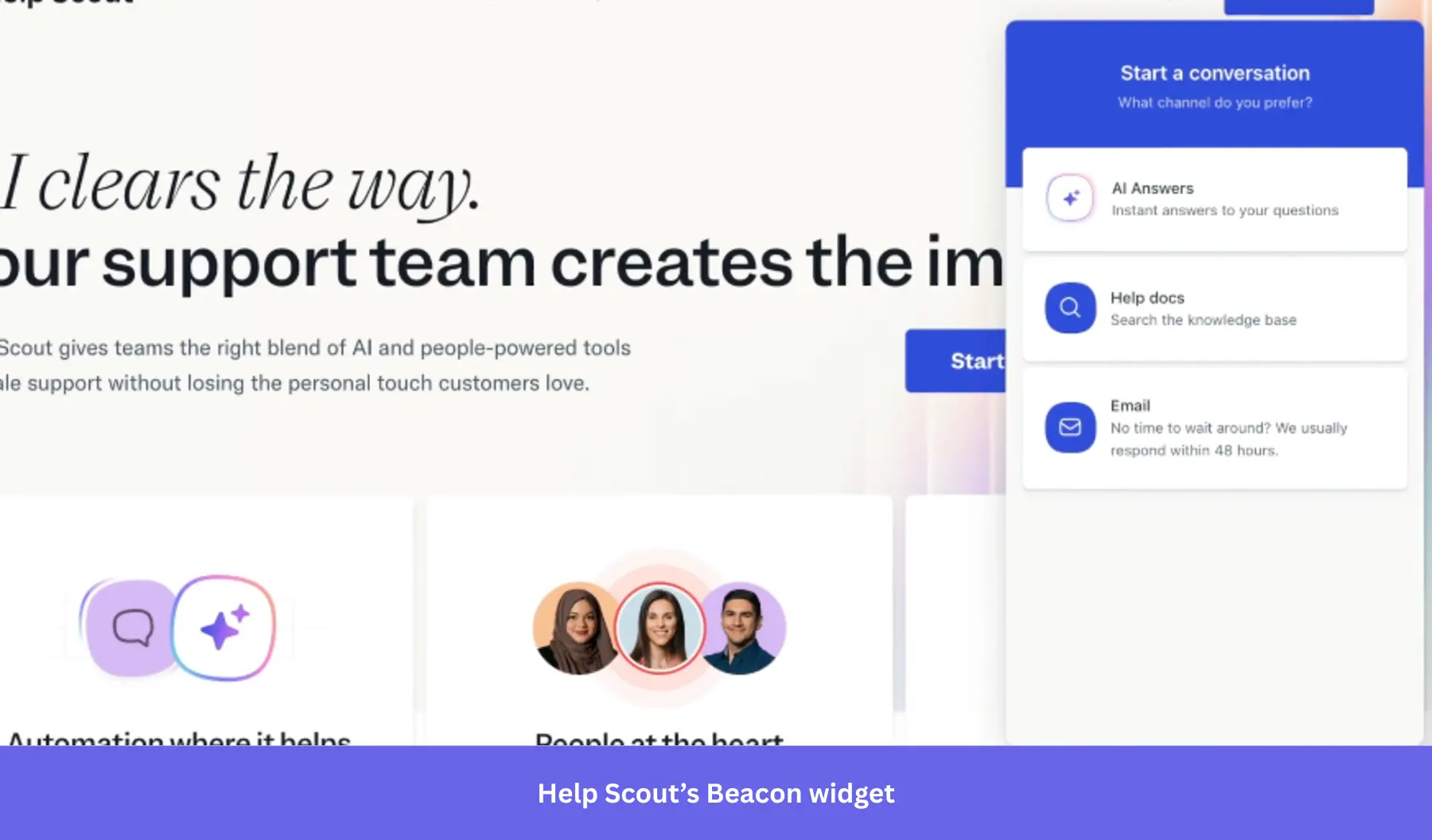
- Beacon widget: Combines live chat, email support, and knowledge base access into a single embeddable widget so users can find answers, chat live, or submit a request without leaving your product.
- Live chat integration: Help Scout integrates live chat and email support with its knowledge base. It also supports integrations with various tools, including Slack, HubSpot, Salesforce, Jira, and MailChimp.
- Humanized ticketing: You can make your ticket emails look more humanized, personal, and customized for every user.
Help Scout pricing
Help Scout’s free plan covers up to 50 contacts/month and includes 1 inbox, 1 Docs site, and AI features. Paid plans start at $50/month (Standard, 100 contacts/month) and $75/month (Plus, 100 contacts/month, adds Salesforce, Jira, and HubSpot integrations). Pro plan pricing is custom and starts at 1,000 contacts/month.
What do users say about Help Scout?
|
Pros |
Cons |
| ✅ Help Scout’s clean, email-like interface makes it easy to work in without much ramp-up time. | ❌ Reporting can be unreliable enough to create friction, and the platform may feel light on features if you need a more advanced support setup. |
| ✅ The Docs knowledge base is included across all plans, so you can manage email, chat, and knowledge base support without using separate tools. | ❌ The knowledge base lacks template variety and advanced formatting options. |
Freshdesk
Best for: Small to mid-sized businesses and growing SaaS teams that need an affordable, multi-channel helpdesk with a built-in knowledge base.
Freshdesk is a customer support tool that offers a multi-channel helpdesk solution, including a knowledge base for self-service support. It’s ideal for companies that want to provide a unified support experience across chat, email, and self-service.
Key features of Freshdesk:
- Comprehensive knowledge base: Freshdesk allows you to build a rich knowledge base with FAQs, help articles, and tutorials.
- AI-powered chatbots: Includes AI-driven chatbots that can guide users to the right knowledge base articles based on their queries.
- Ticketing and automation: Integrate your knowledge base with Freshdesk’s ticketing system so users can escalate issues when they don’t find the answers they need. Freshdesk’s automation rules can also direct users to relevant help articles based on their interactions.
Freshdesk pricing
Freshdesk offers a free plan with basic ticketing and knowledge base features for up to 2 agents. Paid plans start at $15/agent/month (Growth, billed annually) for automation, marketplace integrations, and the customer portal. Multilingual knowledge base and custom reports require the Pro plan at $49/agent/month.
What do users say about Freshdesk?
|
Pros |
Cons |
| ✅ Freshdesk is easy to get comfortable with, so you can start managing tickets and support workflows without a long setup curve. | ❌ Freshdesk can feel slow or a bit clunky during busy periods, especially when agents are handling multiple tickets at once. |
| ✅ Freshdesk’s automation tools help you reduce repetitive support work. | ❌ Freshdesk’s lower-tier plans can be limiting, because some of the more useful features and deeper reporting sit behind higher pricing tiers. As workflows grow, automation rules can also become harder to manage and troubleshoot. |
How to integrate your user onboarding tool stack together?
Connecting your user onboarding tools so they actually “talk” to each other (and don’t cause embarrassing “bloopers” like, e.g., sending the same message to the same person twice, or asking a user who has already completed a specific action to do it again) is essential for your user onboarding success.
So, how can you integrate all your onboarding resources to avoid such situations? Here are a few tips:
Kill two (or three…or four) birds with one stone
Find user onboarding tools that can handle multiple tasks at once. It will significantly reduce your implementation costs and overall subscription costs (even if the all-in-one tools might be much more expensive).
Look for tools holistically: Choose tools that integrate natively with each other
When choosing your user onboarding tools for different use cases, look for those that integrate natively with one another. This will save you tons of time zapping things together, and save you from expensive/embarrassing mistakes in your user onboarding.
Here are a few user onboarding tools that integrate natively with each other:
- Userpilot (for in-app user onboarding), Intercom (for email onboarding and in-app chat), and Amplitude, Mixpanel, or Heap (for in-depth product analytics). All have native integration to make your email-in-app user onboarding seamless and more data-driven.
- Hotjar and Zendesk have a native integration that will allow you to cut your response time to customer feedback.
- Userpilot, Loom, and Typeform, so you can easily embed your Loom video tutorials and Typeform surveys into your user onboarding flow.
Examples of the complete SaaS user onboarding tool stack
The “complete” user onboarding tool stack for growth SaaS companies
OAuth (signup) + Userpilot (in-app onboarding, NPS) + Intercom (email onboarding, in-app chat) + Wistia (video onboarding) + Sequel.io (webinars) + Typeform (feedback) + Mixpanel/Amplitude/Heap (user behavior analytics) + Zendesk (Knowledge base) + Fullstory (session recording).
The “MVP” user onboarding tool stack for startups on a budget
OAuth (signup – freemium) + Intro.js (in-app, free) + MailChimp (email, freemium) + Loom (video, freemium) + Ewebinar (webinars) + Typeform (surveys, freemium) + Mixpanel (analytics, freemium) + Helpdesk (Knowledge Base) + LogRocket (session recording).
Drive product growth with SaaS-ready user onboarding tools!
With these user onboarding tools, you can build your own tech stack based on your company’s needs and resources.
Userpilot helps product teams to create a comprehensive, customizable onboarding experience that improves user engagement and drives feature adoption.
So if you want to see how Userpilot can elevate your onboarding process, book a demo to optimize the entire user journey with one platform.
FAQ
What are the benefits of using user onboarding software?
Using user onboarding software:
- Reduces time-to-value by guiding users to their “Aha moment” faster, increasing the likelihood they’ll stick around past the first session.
- Decreases support load by surfacing contextual help when users need it, before they submit a ticket.
- Improves activation and retention by helping users build habits around your product’s core features early in their journey.
What is an onboarding tool?
An onboarding tool is a solution that provides step-by-step guidance, tutorials, or checklists to help users get familiar with a product or service.
What is the user onboarding method?
The user onboarding process involves introducing new users to a product through guided tours, checklists, and interactive tutorials. This ensures users reach milestones that lead to success.
What is a user onboarding checklist?
A user onboarding checklist is a list of tasks or steps that users need to complete to fully set up and understand how to use a product, ensuring a smooth onboarding experience.
About the author


![Your Guide to SaaS Welcome Surveys (Best Practices + Examples]](https://blog-static.userpilot.com/blog/wp-content/uploads/2023/04/Your-Guide-to-SaaS-Welcome-Surveys-Best-Practices-Examples-1024x670.png)