How To Announce Product Updates In 2026 (and why Less is More)


Shipping velocity is up in 2026, but most product update announcements still get ignored. Teams either over-announce every minor fix until users mute them, or bury major releases where no one looks, and both habits quietly drag down feature adoption.
This guide is about announcing product updates with judgment instead of volume: when to announce, where to announce, and how to do it without becoming noise.
I’ve organized it around a three-tier framework, six channels worth using, and a few best practices that move adoption.

More updates = less communication? How to navigate announcements with more feature releases
The old advice was to announce anything new. That made sense when a team shipped one or two features a quarter, but it falls apart now that AI has made building and releasing features far cheaper. When you ship constantly, announcing every product update trains users to ignore you.
Our CEO, Yazan Sehwail, put the shift plainly when we talked about how AI changes the volume of work product teams ship:
“As producing and building features become a lot cheaper, instead of every quarter, you’re releasing one or two features, now you’re releasing 7, 8, 9. It becomes even harder for product teams to manually have to track each one and understand usage for each one.”
So the first decision is not how to announce, but whether to announce at all. I sort every update into one of three tiers, and the tier decides the channels.
- Tier 1, the major announcement: New products, redesigns, paid feature launches, and AI capability additions. Roll these out across in-app, email, changelog, and Product Hunt where it fits.
- Tier 2, the targeted announcement: New features for existing users and workflow changes. Use in-app messaging, a changelog entry, and a segmented email to the people who actually touch that area.
- Tier 3, the silent ship: Bug fixes, minor improvements, and performance tweaks. These get a changelog entry and nothing else.
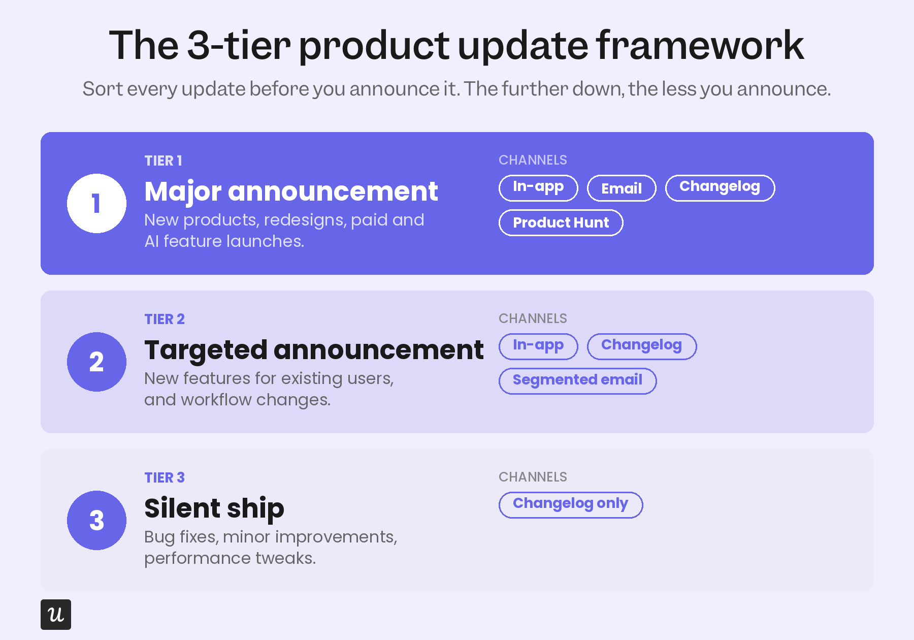
The rule of thumb I keep coming back to is simple: If the update does not change how the app or a feature works, it does not need an announcement. Silent shipping the small stuff is a discipline, and it is what keeps your Tier 1 announcements worth opening.
First things first: Why are you announcing, and who even cares?
Once you know an update deserves an announcement, two things decide whether it lands: Who you send it to, and what you want it to do.
Narrow your target audience
Different users come to your product with different jobs to be done, so a feature that matters to one segment is irrelevant to another. Segmenting your audience lets you tailor each product update announcement to the people who asked for it or will benefit from it, which lifts both engagement and adoption.
You can build the right segment for each user based on their JTBD, plan tier, in-app behavior, and past feedback. Targeting the update this way keeps the message relevant, so the announcement reads as helpful rather than another interruption.
Define your goal
Every product update announcement needs one specific goal: adoption, re-engagement, upsell, or awareness. Without one, you are just adding to the pile of messages users already skim past. Pick the goal first, and the channel and copy will follow.
Where to announce your product update (and why it’s not always a Product Hunt campaign)
Choosing the right channel for a product update announcement means meeting your target audience where they already are. And that starts with a place most older guides skip entirely: a public changelog that everything else points back to.
A public changelog is the foundation. It is a single, permanent record of what shipped, written in plain language that both humans and AI agents can scan. Linear, Stripe, Loom, and Notion all run on this model, and it is what lets you silent-ship small updates without hiding them.
- In-app messaging: The best way to reach active users in context, right where the new feature lives. See real in-app messaging examples for patterns that work.
- Email digests: A periodic roundup of what shipped, segmented by who it affects, for users who are not in the app every day. This replaces the old habit of a standalone product update email for every release.
- Push notifications: Mobile only, useful for time-sensitive nudges and easy to overuse, so segment hard before you send.
- Social media: For acquisition-focused updates, where the audience is potential customers rather than existing ones.
- Product Hunt: Major launches only, where a strong showing generates buzz beyond your existing user base.
These channels work best in sequence rather than all at once. The changelog holds the full record, and in-app, email, push, and social each pull from it to reach a specific audience at the right moment.
How to announce your product updates in-app?
Here are the five best practices for product update announcements that carry the most weight, ranked by how much they move adoption.
1. Lead with user impact, not the feature name
This is the single most-repeated announcement principle in 2026, and most teams still get it backward. Instead of “New: batch operations for issues,” write “Move, label, or close multiple issues at once.” The first version describes your internal roadmap, while a user cares only about the second because it tells them what they can do now.
2. Use modals for major updates and tooltips for contextual ones
Modals sit in the center of the screen and interrupt on purpose, which makes them right for a major release that the user needs to stop and read.
They are too heavy for small changes, so reserve them for Tier 1 and Tier 2 announcements that genuinely warrant the interruption.
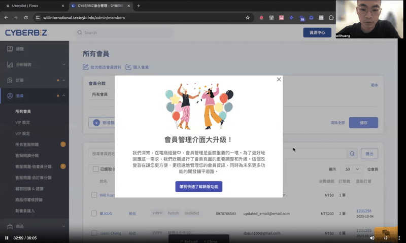
💡 For example, CYBERBIZ used Userpilot modals and walkthroughs to announce a major admin panel redesign. By guiding users step-by-step inside the app, they improved feature adoption and reduced confusion, without overwhelming users with standalone announcements.
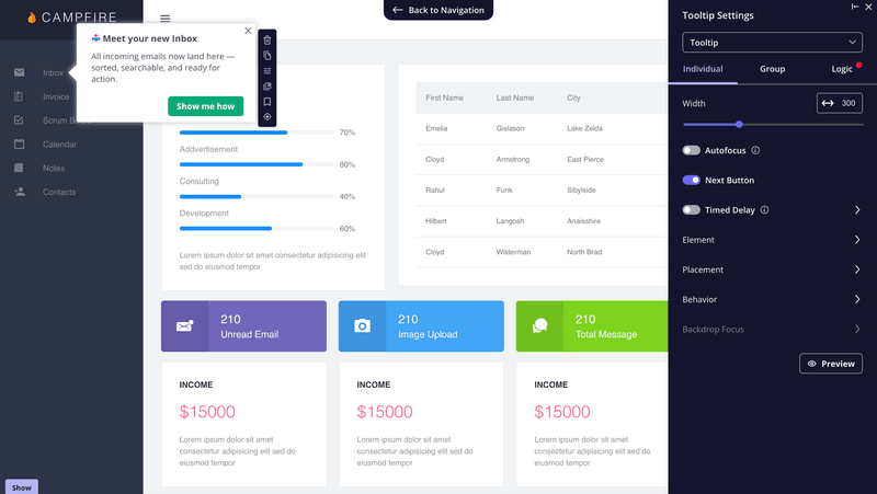
3. Use in-app messages to announce new features to existing users
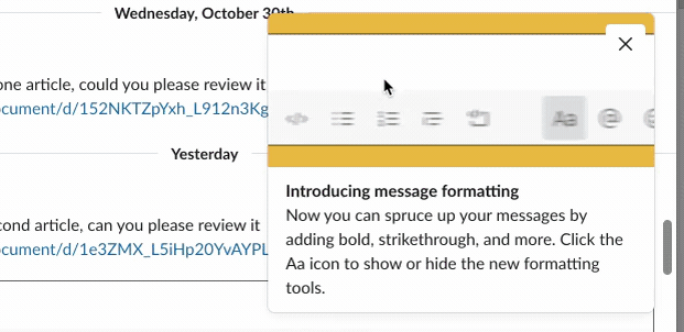
Tooltips are a simple way to announce product updates without interrupting users. Because they’re small and tied to specific UI elements, they help users discover new features naturally as they work.
They’re also useful for onboarding users to a release. A short tooltip flow can explain key actions and help users get value from the feature right away.
💡 Cledara used in-app tooltips and modals with Userpilot to announce new features. The result was much faster feature adoption, with users engaging with new releases in days rather than months.
4. Show what changed with a GIF or short video
People rarely stop to read long feature announcements. A short GIF or micro-video can communicate the same message much faster while showing users exactly what changed.
Visuals are especially useful for demonstrating new workflows or UI updates. Users can see the feature in action and quickly understand how to use it.
Slack does this well. In this example, it uses a simple GIF to preview its new messaging interface, giving users an instant feel for the update before they try it themselves.
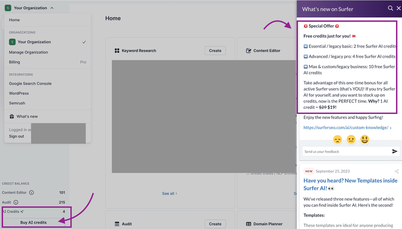
5. Keep an accessible “What’s New” page or button
The simplest way to make sure users never miss an update is a visible “What’s New” repository they can open on their own terms, which is a quiet but reliable way to drive engagement. It should hold everything from fixes to major features, each with a short note on the benefit and how to use it.
SurferSEO does this with a gift-icon “What’s NEW?” button that opens an in-app modal of release notes, easy to find and easy to dip into.
Real examples of how top SaaS companies announce product updates
Here are three top SaaS companies worth studying, each showing a different way to announce product updates without burying users.
Linear
Linear’s changelog is a masterclass in clarity, where every update gets a short headline, a single visual, and a concise note on what changed and why it matters. Instead of dumping release notes, Linear helps users grasp the value of each update at a glance.
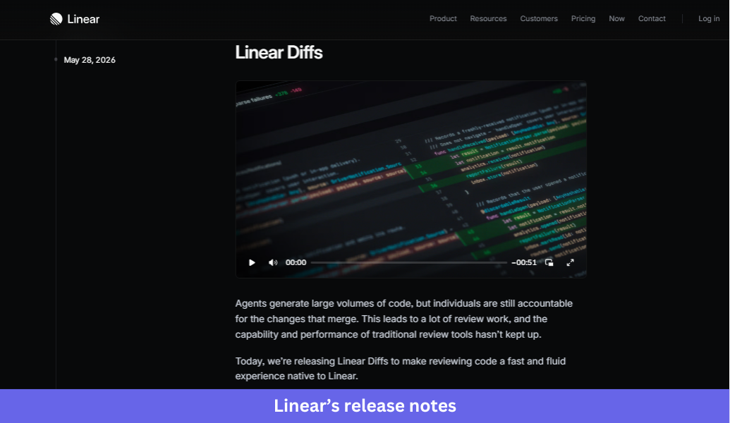
What Linear does well:
- Leads with the outcome, not the feature name, so headlines describe what users can now accomplish rather than internal product terminology.
- Uses one screenshot or short video to show the update in context, making new functionality easy to understand quickly.
- Tucks technical details, bug fixes, and API changes into expandable sections so the main announcement stays easy to scan.
- Writes in plain language and gets to the point, with no lengthy intro or marketing-heavy copy.
The takeaway:
Effective product announcements do not need to be long. A benefit-driven headline, a strong visual, and a short explanation are usually enough for users to understand and adopt a new feature.
Notion
Notion takes a more editorial approach in its release notes, announcing small improvements with a screenshot and a few sentences while giving major launches dedicated posts with richer storytelling, visuals, and customer examples. The result reads as informative without treating every release as a milestone.
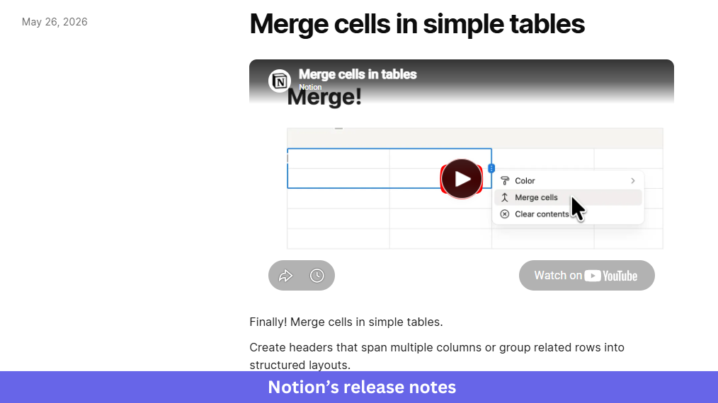
What Notion does well:
- Matches the depth of the announcement to the release’s importance, keeping routine improvements concise and giving major launches more context.
- Shows users where to find new features with clear navigation paths and practical guidance inside the announcement itself.
- Uses customer stories for larger releases to demonstrate real-world value and build credibility.
- Keeps a conversational tone that feels like advice from a teammate rather than a formal press release.
The takeaway:
Not every update deserves the same level of attention. Reserve richer storytelling for major launches, and keep smaller updates short, practical, and easy to consume.
Segment
Segment announces upcoming features inside the product with a paginated in-app modal. In one example, it introduces two releases, profile sync and Reverse ETL, through a short multi-step walkthrough that lets users opt into the beta without disrupting their work.
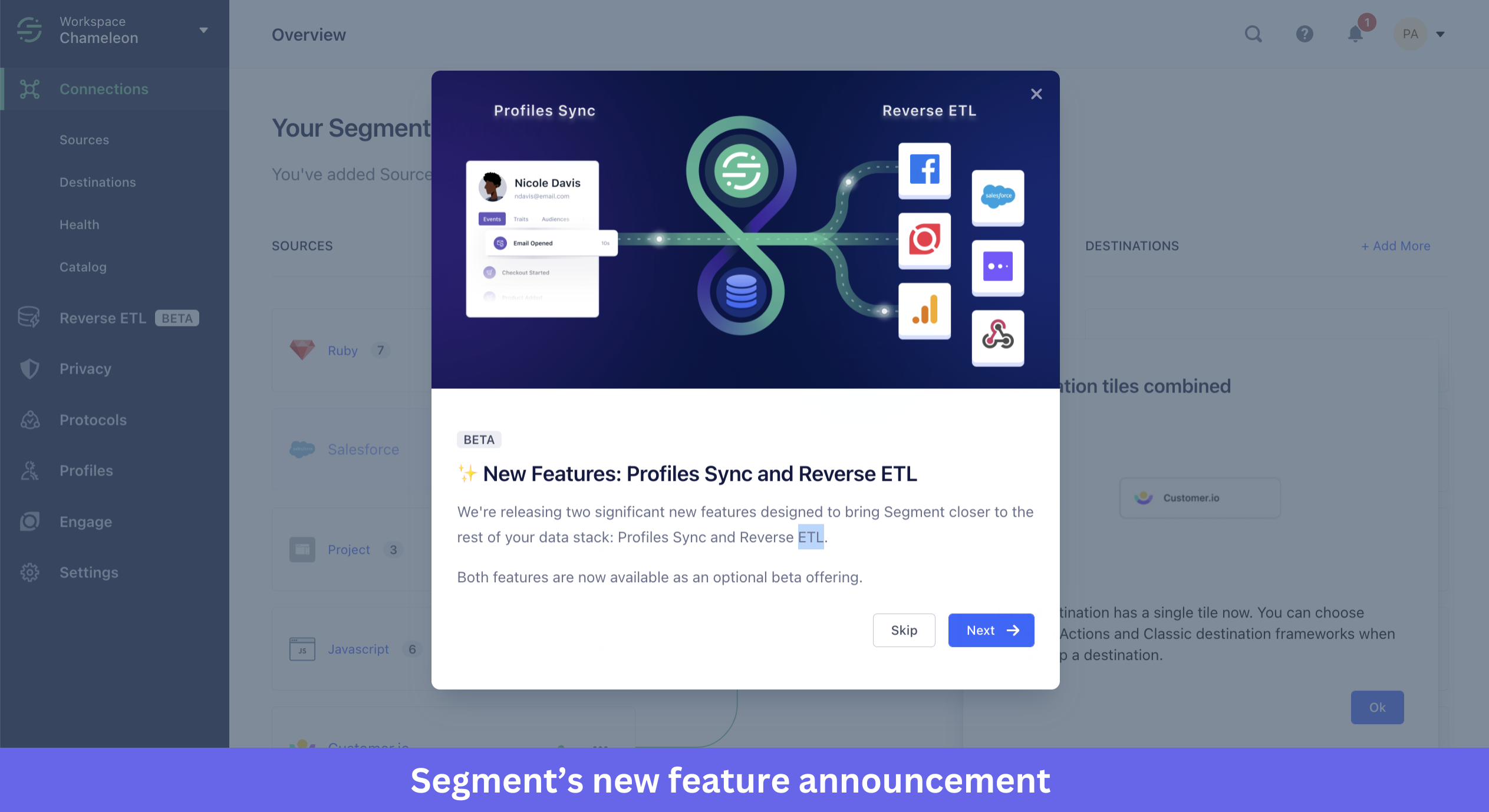
What Segment does well:
- Frames the announcement as an invitation rather than a directive, so an optional beta removes pressure and signals that loyal users are being included.
- Breaks information across multiple slides instead of one crowded screen, using “1 of 3” pagination so users can digest one update at a time.
- Translates technical concepts into outcome-focused language.
- Keeps the design minimal so the announcement informs without interrupting the core experience.
The takeaway:
In-app announcements can introduce complex updates without overwhelming users. Delivering information in small, digestible steps and letting users choose whether to participate builds awareness without adding friction.
The takeaway: Announce less, route smarter
Before announcing your next release, take a step back and ask three questions: Does this update deserve an announcement? Who needs to hear about it? Which channel gives it the best chance of being seen and acted on?
Answering those questions upfront helps you avoid announcement fatigue and gives important updates the attention they deserve.
Once you have a process in place, the challenge becomes execution. Userpilot helps product teams announce features in-app, target the right user segments, collect feedback, and track adoption so every release has a better chance of succeeding.
Book a Userpilot demo to see how to announce your next update without becoming noise.
About the author