Analytics Dashboard Examples in 2026: How AI is Changing What SaaS Teams Track


The analytics dashboard has become SaaS’s version of a junk drawer. I’ve worked on product analytics setups across SaaS teams of all sizes, and most of them have four or five dashboards open in pinned tabs, none of which gives a quick answer to the question they’re actually trying to answer that day. The data is usually present, but surfacing a usable signal from it takes far longer than it should.
Dashboards were designed for a world where features shipped quarterly and someone had dedicated time to study reports carefully. In 2026, most SaaS product teams ship weekly, user cohorts fragment fast, and the questions that matter most change month to month.
AI is making the underlying tension worse. As Yazan Sehwail, Userpilot’s CEO, has noted, as building features gets cheaper, teams shift from shipping one or two things per quarter to shipping seven or eight. Every release needs tracking, and manually reviewing a separate dashboard for each one stops being a workflow and starts being a bottleneck.
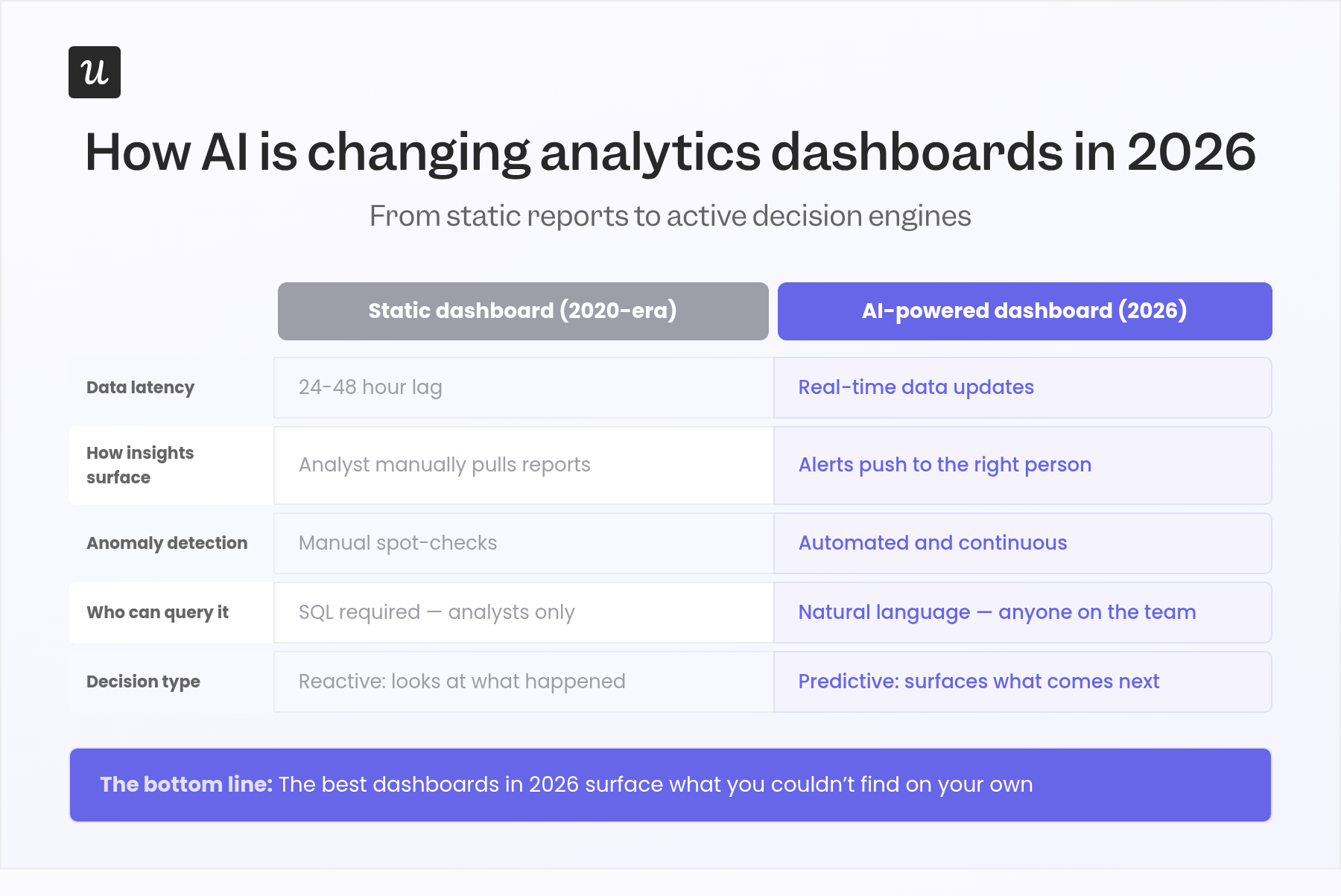
The best analytics dashboards in 2026 don’t wait for you to go looking. They surface what needs attention, flag anomalies before you notice them, and let non-analysts ask questions in plain language rather than exporting to a spreadsheet. That’s the shift this guide covers: from dashboards as passive reports to dashboards as active decision engines.

What makes an effective analytics dashboard?
Most advice on building an analytics dashboard still reads like it was written in 2019: be “clear,” be “intuitive,” be “customizable.” Those things are still true, but they’re table stakes now. The characteristics that differentiate a useful dashboard in 2026 go further.
Real-time data used to be a differentiator. For operational dashboards especially, a refresh cycle longer than a few hours means you’re making decisions on outdated information, which is particularly costly when you’re tracking user behavior across a fast-moving product launch or a campaign in flight.
Intelligent alerts separate dashboards that inform from dashboards that act. Rather than waiting for someone to notice that a metric spiked or dropped, alerts push the relevant signal to the right person automatically. I use this in Userpilot daily: when activation drop-offs or NPS score shifts hit a threshold, the alert finds me rather than the other way around.
Interactive filters and drill-down capabilities are what turn a status report into an investigative tool. Being able to segment by cohort, time period, or user property, and then drill down into individual events, is how you move from knowing a metric is off to understanding why. Dashboards that show only important metrics at the top level, without letting you explore data underneath, capture maybe 20% of their potential value.
Customizable layouts also matter because different roles need different views of the same underlying data. A customer success manager and a VP of Product are looking at the same product usage data for entirely different reasons, and a single rigid layout serves neither of them well. Custom dashboards per role or per use case aren’t a luxury; they’re the difference between data that gets used and data that gets ignored.
Two more characteristics worth calling out: data accuracy and minimalist design. Setting up data validation processes and running regular audits on the inputs to any dashboard is what keeps it trustworthy over time. And keeping each view to 5-7 key performance indicators maximum helps users act on the insights faster.
When you’re building your own analytics dashboard, start by defining the audience: who will use this, and what decision are they trying to make? That clarity shapes every subsequent choice, from which specific metrics to include to how frequently data integration needs to refresh. Combining data from multiple sources without a cleaning step will introduce inaccuracies that compound quietly over time.
The three types of analytics dashboards (and what AI does for each)
Before walking through specific examples, it’s worth establishing a framework that most analytics dashboard guides skip entirely. Not all dashboards serve the same purpose, and building one without knowing which type you’re building usually results in something that works for nobody. The three types map to three different audiences, three different cadences, and three different questions.
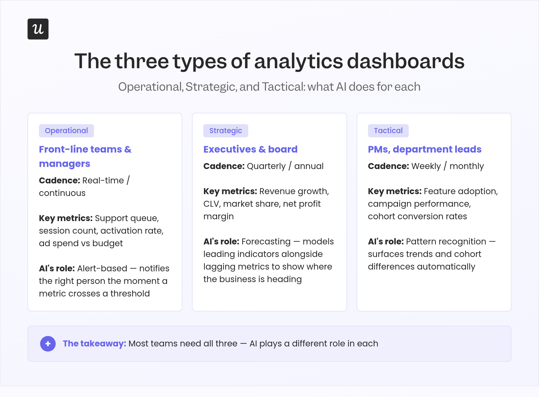
Operational dashboards
Operational dashboards provide real-time updates on the key metrics and KPIs that require immediate action. They’re built for front-line employees and managers who need to respond to what’s happening right now, not last quarter. Think: live support ticket queue, active session count, real-time feature activation rate, or current ad spend versus daily budget.
AI’s role in operational dashboards is primarily alert-based. A well-configured operational dashboard connected to an AI layer stops being a display you check and starts being a system that notifies you. When a key metric crosses a threshold or the system detects an anomaly in normal patterns, the right person gets the signal before the situation compounds.
The limitation of operational dashboards is context. They show what’s happening in real time but rarely explain why. That’s where the other two types come in.
Strategic dashboards
Strategic dashboards align with the overall objectives of a business and surface the high-level key performance indicators executives use to measure progress toward long-term goals. They’re not built for daily decisions; they’re built for quarterly reviews, board meetings, and strategic planning sessions. Typical metrics: revenue growth, customer lifetime value (CLV), market share, and net profit margins.
AI’s contribution to strategic dashboards is forecasting. Rather than showing where the business is, a well-built strategic dashboard with predictive analytics shows where it’s heading. Leading indicators, which predict future performance, sit alongside lagging indicators, which measure past results, giving leadership a full picture of current status and trajectory rather than just a report card.
Most companies I’ve worked with have solid lagging indicator tracking and weak leading indicator visibility. That imbalance is exactly where AI-assisted strategic dashboards are starting to close the gap, and it’s where the Userpilot SaaS Product Metrics Benchmark Report becomes useful as a reference for what “normal” looks like across 547 SaaS companies.
Tactical dashboards
Tactical dashboards sit between operational and strategic. They’re built for mid-term decision-making focused on specific projects, initiatives, or departments rather than the entire business or a single live metric. A product team tracking feature adoption over a quarter, or a marketing team reviewing a campaign’s performance over six weeks, is working at the tactical level.
AI’s role in tactical dashboards is pattern recognition. When you’re analyzing user behavior over weeks rather than seconds, the interesting questions are about trends, cohort differences, and correlations that would take an analyst hours to surface manually. An AI layer can find those patterns in the background and flag them inside the dashboard view.
Most SaaS teams need all three types, and they serve different audiences. The mistake I see most often is building one multi-purpose dashboard that tries to serve everyone and ends up being useful to nobody in particular.
12 Analytics dashboard examples for SaaS
The following examples span the three dashboard types above. Each one includes the key metrics it tracks and a note on how AI is starting to change how teams use it in 2026.
1. Web analytics dashboard
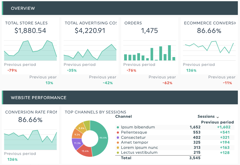
A web analytics dashboard transforms raw visitor data into the essential metrics that tell you how your website is performing: traffic sources, sessions, bounce rates, unique pageviews, new users versus returning users, and conversion rates. It’s the foundational layer for understanding how people find you and what they do when they arrive.
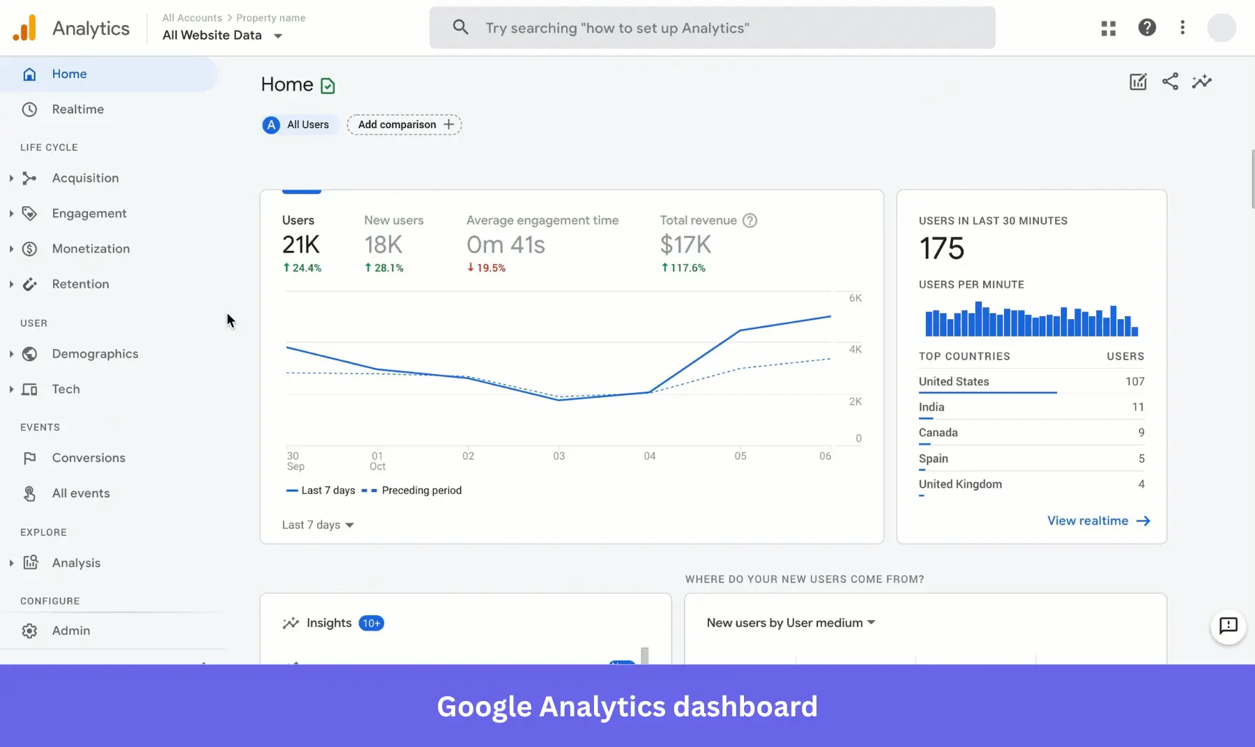
Google Analytics dashboards give the most thorough view of website activity, covering conversion rates, organic search performance, and engagement metrics across landing pages. The critical 2026 caveat: with 30-40% of conversions now untrackable due to browser privacy protections, Google Analytics data alone is no longer enough for accurate attribution. Triangulating it with CRM records and implementing first-party tracking where consent allows is becoming standard practice for any team making budget decisions from this data.
AI’s contribution to web analytics: automated anomaly detection. Rather than manually checking whether a traffic source spiked or whether a landing page’s bounce rate changed, an AI layer flags these shifts in real time and often offers a likely explanation alongside the alert.
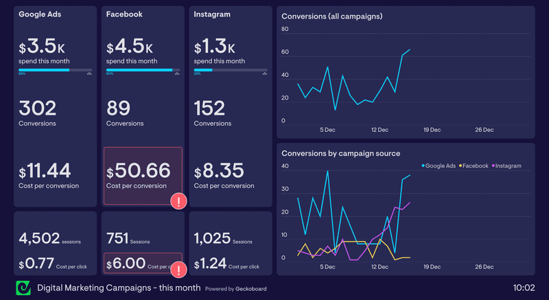
2. Digital marketing dashboard
While web analytics covers overall site performance, a digital marketing dashboard zooms into the performance of specific marketing campaigns across multiple platforms. It connects ad spend to outcomes: which channel drove the most conversions, what cost per conversion looks like by platform, and how marketing efforts across email, paid, and social are working together or against each other.
The classic example: you’re spending $1,000 more on Facebook than Google Ads, but Google Ads is generating three times as many conversions at a lower cost. A digital marketing dashboard makes that visible at a glance, so the budget reallocation is obvious rather than buried in export files from separate platforms. It also surfaces the relationship between channels, which combinations of touchpoints drive pipeline, which social media platforms contribute to conversion even when they’re not the last click.
For marketing teams in 2026, the AI upgrade here is automated budget reallocation recommendations. Some tools now suggest where to shift spend based on real-time performance data rather than making the marketing team do that math manually at the end of a campaign.
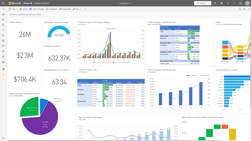
3. Business intelligence dashboard
A business intelligence dashboard aggregates key datasets based on overall business objectives rather than a single function or channel. It’s where data analysts and product growth managers go to select the key performance indicators that define success for the business as a whole. Power BI is the standard tool here for teams with complex data integration needs across multiple sources.
The value of a BI dashboard is cross-team transparency. When product, marketing, and finance are all looking at the same centralized view of business performance, it’s harder for siloed metrics to create conflicting narratives at planning meetings. It also supports informed decision making at the leadership level by providing a single source of truth rather than six competing spreadsheets, each built on slightly different assumptions.
Data accuracy is the core challenge here. Setting up data validation processes and running regular data audits on BI inputs is what keeps these dashboards trustworthy over time. A dashboard that pulls from multiple sources without a cleaning step will accumulate errors quietly, and decisions built on dirty data are worse than decisions built on no data at all.
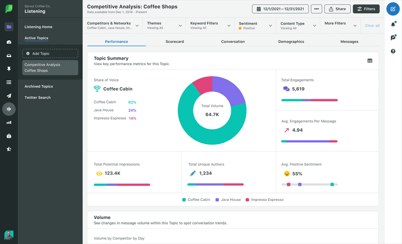
4. Social media dashboard
A social media dashboard pulls analytics from multiple platforms into one view: reach, impressions, engagement metrics, and link clicks without logging into four separate platform dashboards. Rather than tracking each channel in isolation, a consolidated social media analytics view lets you compare which platforms and which content types are actually moving your audience toward conversion.
The useful question a social media dashboard answers isn’t “how many impressions did we get?” It’s which content type on which platform drives the highest conversion rate, and how does that differ by audience segment. Filtering by digital engagement type and breaking down performance by platform lets teams invest in what’s actually working rather than what feels active or looks impressive in isolation.
AI is most useful here in content performance prediction. Some tools now surface which posts are likely to underperform based on historical patterns, before you spend budget promoting them.
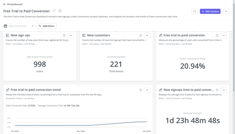
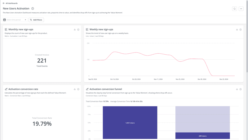
5. Trial to paid conversion dashboard
A trial-to-paid conversion dashboard tracks every step from a user’s first login to their conversion to a paid plan. It shows where users are dropping off in the conversion funnel, which activation milestones correlate with conversion, and which user segments are converting at the highest rates. For any PLG or trial-led SaaS business, this is the most operationally important dashboard in the stack.
The classic failure mode: teams look at overall conversion rate and miss the specific step where most users are abandoning. Step-level drop-off visibility is what makes the difference between knowing your conversion rate and understanding why it is what it is. Drop-off points, when made visible at the funnel step level, become fixable problems rather than aggregate mysteries.
AI’s role here is to surface which behavioral signals in the first 7 days predict whether a trial user will convert. That’s a pattern-recognition problem that would take an analyst weeks to solve manually, and that a trained model can answer on an ongoing basis in the background.
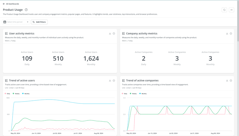
6. Product usage analytics dashboard
A product usage analytics dashboard shows how users interact with your product: which features they use, how often, during which sessions, and where they get stuck. For a product manager, this is the most important operational view in the stack because it connects user behavior directly to product decisions. It’s also the dashboard I rely on most in my own day-to-day work at Userpilot.
When we launched Userpilot’s email feature, the funnel showed a sharp drop-off at the domain verification step. Within a few hours, I built a targeting tooltip directly inside Userpilot and pushed it to users at the exact point where they were getting stuck. The drop-off closed within days, without an engineering ticket.
That’s what a well-built product usage dashboard enables: you see the problem in the data, and you fix it in context, without waiting for a sprint cycle.
In 2026, AI layers on top of product usage dashboards are starting to automate the first pass of feature health analysis. Rather than manually reviewing each new feature’s adoption curve after launch, the system flags the ones underperforming against historical baselines and surfaces them for review. As Yazan put it: “It becomes even harder for product teams to manually have to track each one and understand usage for each one.” Automating that first-pass analysis is exactly what Userpilot’s AI suite is being built to do.
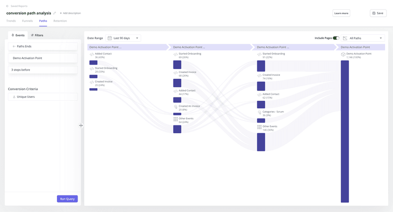
7. User journey analytics dashboard
A user journey analytics dashboard tracks how individual users move through your product over time, from sign-up through activation, engagement, and ideally referral. It maps the path users actually take, not the path you assumed they’d take when you designed the onboarding flow. The gap between those two paths is often where churn starts.
The most useful view inside a user journey analytics dashboard is the drop-off map: where users stop progressing toward the next activation milestone. Combined with session data, that view gives enough context to understand whether friction is a UI problem, a messaging problem, or a product problem, and each of those has a different fix.
AI’s role: automatically segment users by journey pattern rather than requiring manual cohort definition. Users who reach activation in 3 days behave differently than users who take 14 days, and a model can surface that distinction without requiring you to predefine it.
8. User behavior analytics dashboard
A user behavior analytics dashboard tells you what users are doing inside your product at the event level: click patterns, session activity, feature frequency, and path sequences. Where the user journey dashboard shows the arc of a user’s life in your product, the behavior dashboard zooms into specific interactions. This is where you find the happy paths that power users take and the friction points that keep other users from finding value.
Behavioral analytics also surfaces churn signals before they show up in retention numbers. A user who opened a core feature three times a week and is now opening it once a month hasn’t churned yet, but the signal is clear. A well-configured user behavior analytics dashboard surfaces that cohort without waiting for the subscription to lapse, giving customer success teams enough runway to intervene.
In 2026, session replay is often connected directly to behavior dashboards, giving teams the ability to watch actual sessions behind an anomalous data point. That combination of quantitative signal and qualitative context is what makes behavioral data something you can act on, not just report on.
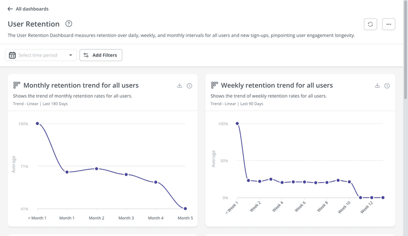
9. User retention dashboard
A user retention dashboard shows how well your product keeps users active over time. The core metrics are retention rate, churn rate, and customer lifetime value (CLV), each calculated per cohort and filterable by segment. Most SaaS teams know their overall retention number; fewer have it broken down by acquisition channel, pricing tier, or activation milestone, which is where the actionable data actually lives.
Two formulas worth having in the dashboard: retention rate is calculated as the number of customers at the end of a period minus new customers acquired during that period, divided by customers at the start of the period, expressed as a percentage. Churn rate is the number of customers lost during a period divided by the number of customers at the start of that period. User retention dashboards that surface these metrics at the cohort level, not just in aggregate, are what make the data usable for deciding where to intervene.
The AI use case here is proactive churn scoring. Rather than reviewing retention curves after users have already disengaged, a model trained on your behavioral data can score individual accounts for churn risk on an ongoing basis and surface the highest-risk cohorts to customer success before the drop-off becomes a cancellation.
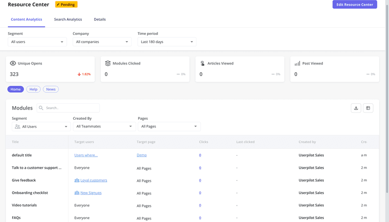
10. Knowledge base engagement dashboard
A knowledge base engagement dashboard tracks how users interact with your self-service content: which articles they read, how long they stay, where they exit, and whether they open a support ticket afterward. For SaaS teams investing in self-service, this is the dashboard that tells you whether that investment is working. Cross-referencing it with support ticket data is the key move: if users are reading an article and immediately opening a ticket anyway, that article needs rewriting.
Most teams I’ve worked with treat knowledge base analytics as an afterthought. The symptom is a resource center full of articles that nobody reads and a support queue full of questions those articles were supposed to answer. The knowledge base engagement dashboard makes that gap visible and quantifiable rather than leaving it as a vague suspicion.
AI is starting to automate the audit cycle here. Tools that monitor support ticket content and cross-reference it with knowledge base gaps can generate a prioritized list of articles to create or update, without someone needing to manually compare two data exports.
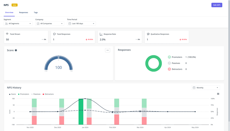
11. NPS analytics dashboard
An NPS analytics dashboard shows your Net Promoter Score alongside the breakdown of promoters (9-10), passives (7-8), and detractors (6 and below). More usefully, it tracks NPS trends over time and correlates score changes with product releases, so you can measure whether a specific launch improved or hurt sentiment. Detractors are your highest churn risk; surfacing who they are and what they have in common is the dashboard’s most important output.
The standard NPS dashboard in Userpilot includes sentiment analysis charts, trend charts, and distribution charts, all filterable by segment. The connection between NPS score and product usage patterns is what makes it actionable: a user with high product usage and a low NPS score is a very different problem than a user with low product usage and a low NPS score, and treating them the same way is a mistake I see frequently.
AI’s contribution here: automatically cluster detractors by themes in their open-ended responses, surface the most common complaints without manual tagging, and flag accounts whose scores dropped sharply between surveys as high-priority follow-ups for the customer success team.
12. Sales performance dashboard
A sales performance dashboard tracks the metrics that drive revenue: pipeline value (in dollar value by stage), win rate, sales cycle length, quota attainment, and conversion rates by stage and rep. For SaaS businesses running a sales-assisted motion alongside PLG, this is the operational dashboard that keeps the revenue team focused on the right deals at the right time rather than on manual reporting cycles.
The most useful view isn’t a leaderboard. It’s a pipeline health view that shows where deals are stalling by stage, which reps are consistently losing at a specific step, and which deal sizes are converting at the lowest rates. That view connects CRM data to actual coaching decisions rather than just tracking whether quota was hit at the end of the quarter.
In 2026, AI-powered sales dashboards combine historical data with live pipeline signals to produce revenue forecasts that update in real time. That’s a meaningful shift: from dashboards that reflect what happened to dashboards that project what’s coming, giving sales leadership enough runway to course-correct before the quarter closes.
How AI is changing analytics dashboards in 2026
Everything in the 12 examples above points in the same direction: the clearest shift in analytics dashboards right now isn’t about design or new metric types. It’s about who, or what, does the analysis.
The traditional workflow: a PM or analyst opens a dashboard, scans the numbers, spots something unusual, digs deeper, and eventually surfaces an insight that informs a decision. That workflow holds up when you have one product with a handful of core features. It breaks down when you’re shipping seven features a quarter, tracking dozens of events per user, and managing multiple customer segments with different behavioral profiles.
Here’s how Yazan described the core problem:
“As producing and building features becomes a lot cheaper, instead of every quarter you’re releasing one or two features, now you’re releasing 7, 8, 9. It becomes even harder for product teams to manually have to track each one and understand usage for each one.”
AI-powered dashboards invert this workflow. Rather than requiring a human to go looking for the signal, they surface it automatically. The four capabilities that matter most are: automated anomaly detection (the dashboard notices when a metric moves unusually), intelligent alerts (the right person gets notified without checking), predictive analytics (leading indicators are modeled, not just reported), and natural language querying (non-analysts can ask questions directly without SQL).
The market is pricing in how fast this is moving. Precedence Research projects the global predictive analytics market will grow from $17.49 billion in 2025 to $100.20 billion by 2034, a 21.4% compound annual growth rate. That’s not a niche upgrade to existing tooling; it’s the market recognizing that data-driven decisions are about to look fundamentally different from how they looked even two years ago.
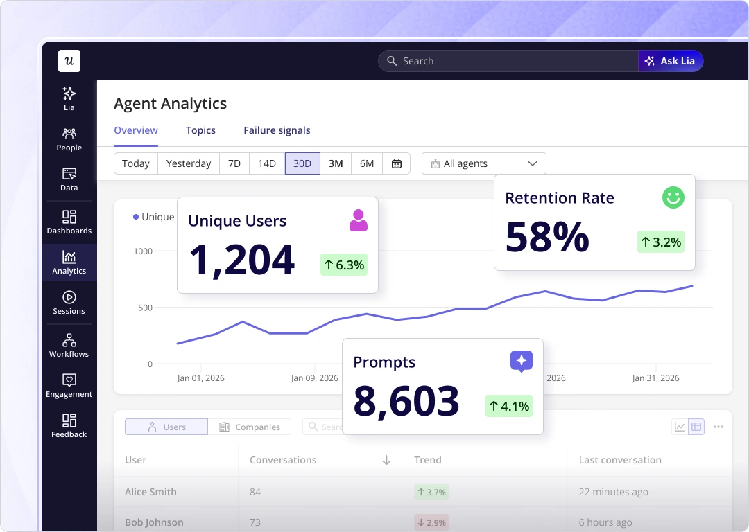
At Userpilot, we’re building toward this with Lia, our AI agent. Instead of opening a dashboard and manually searching for where an adoption metric dropped, a PM can ask Lia directly: “Why did domain verification drop-off increase this week?” and get an answer that combines product usage data, session patterns, and cohort information in a single response. The dashboard becomes a surface for conversation with the data, not just a read-only report.
Yazan framed the broader shift in a way that applies directly to how dashboards are evolving: “You’re no longer operating. The AI is operating. You’re just basically evaluating and monitoring the agent workflow.”
For analytics specifically, that means your job as a PM shifts from pulling reports to reviewing what the AI surfaced and deciding what to act on. The dashboards being built now, including what we’re shipping at Userpilot, are being designed around that model from the start.
The dashboards that survive this shift will be the ones that earn their place by surfacing what you couldn’t have found on your own. If your current analytics dashboard requires 30 minutes of manual review to tell you anything useful, that’s not a data problem. It’s a dashboard design problem, and 2026 is a reasonable time to fix it.
If you’re ready to move past static reporting, Userpilot’s analytics suite brings product usage dashboards, NPS tracking, user journey analytics, and retention analysis into one place, with Lia surfacing insights from your data on demand. See it in action.
About the author