Using a Progress Bar (UI) in SaaS: 5 Types + Examples
The humble progress bar is often neglected, but it’s a key ingredient in shaping user perception and boosting satisfaction. Today’s post explores why progress bars are so important for your SaaS product, and provides inspiring examples for your next design.
What are progress bars?
Progress bars are visual indicators that show the completion status of a task or process.
They help users understand how far along they are in completing an action, such as importing a file, installing software, or filling out a long survey.
What is progress in UI?
In user interface design, “progress” refers to the movement or advancement toward completing a specific task, goal, or process.
For example, if a user is completing an onboarding task that’s divided into sections, a progress indicator might show that they’ve completed 60%, meaning they’re over halfway done.
When is the best time to use progress bars?
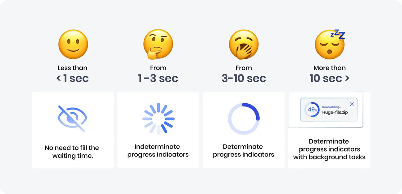
Short answer: It depends on how long the user has to wait.
Long answer: If the load time is less than three seconds, you can simply display quick animations or microcopy like “Loading, please wait.” However, anything above three seconds will make users anxious and leave them wondering how long they have to wait—this is when to display a progress bar.
Why use a progress bar in SaaS?
Most people become impatient and think of exiting an unresponsive page after 3 seconds without feedback. However, introducing a progress indicator reassures them that your platform is working fine and they won’t need to wait long.
The same principle applies when you use progress bars for in-app processes like filling out forms or completing onboarding steps—visualizing advancement motivates users to continue the process.
Another key benefit is perceived control. By providing a clear indicator and an estimated time to completion, users feel more informed and empowered.
All these benefits directly contribute to higher user engagement, reduced churn, and, ultimately, greater customer satisfaction.
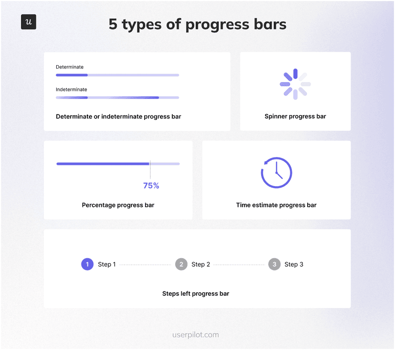
5 Types of progress bars explained
Now that you’ve seen why a progress bar is of utmost importance in UI design, let’s explore the various types and their nuances.
1. Determinate or indeterminate progress bar
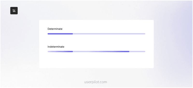
A determinate progress bar displays completion status as a bar that fills from 0% to 100%. This type relies on the system having access to data about the task’s progress, such as the number of files uploaded, the percentage of data downloaded, or the steps completed in a process.
On the other hand, an indeterminate progress bar is used when it’s impossible to predict how long a process will take.
For example, an analytics tool might use an indeterminate progress bar when generating a report that analyzes data across multiple projects.
Since the time required to generate the analytics report depends on factors like the amount of data, server load, and report complexity, it’s impossible to give an accurate estimate upfront. An indeterminate bar like the one below lets the user know the system is working on their request without setting a potentially inaccurate expectation for completion.
2. Looped animation or spinner progress bar
Looped animations are progress indicators used for quick actions, typically those taking one to three seconds. Avoid using traditional progress bars for such short durations, as they can confuse users by appearing and disappearing too quickly.
A spinner progress bar is a specific type of looped animation that uses a rotating element, like a circle or an icon, to visually represent ongoing activity.
While other looped animations might use pulsating bars or bouncing dots, a spinner distinctly features this rotating motion. It’s best suited for situations where progress is unknown or difficult to quantify.

3. Percentage progress bar
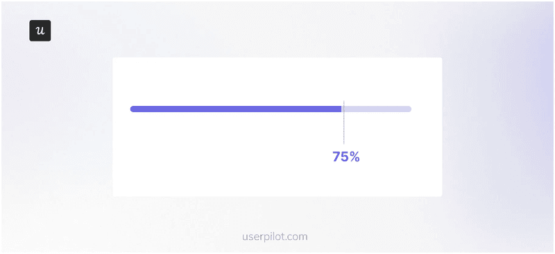
A percentage progress bar displays the exact proportion of a task that has been completed, giving users three key pieces of information:
- Progress so far: The percentage value clearly indicates how much of the task has been accomplished.
- Current position: The filled portion of the bar visually represents where the user stands in the overall process.
- Work left: The remaining empty space in the bar shows how much more effort is needed to reach the goal.
What makes percentage progress bars so effective is the transparency they offer. By displaying numbers, they eliminate uncertainty and make users more comfortable with waiting.
Research supports this: a study by Jane Worlitz et al. found that customers report higher satisfaction with digital services when clear progress information is provided.
4. Time estimate progress bar
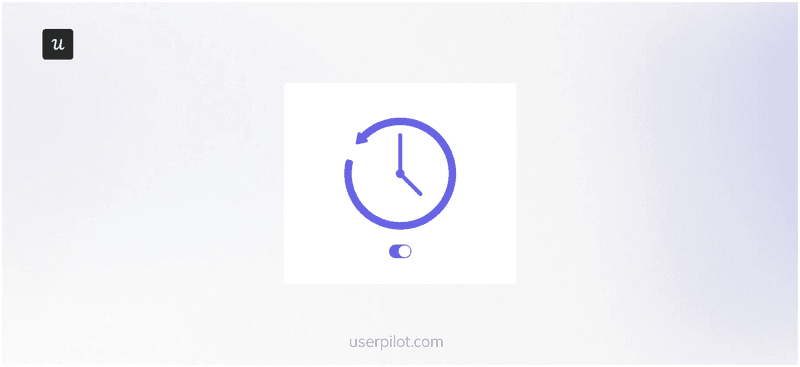
Instead of counting upward like a percentage indicator, a time estimate progress bar counts down, providing an estimated remaining time in minutes or hours.
Typically, the estimate is calculated based on the current progress and the average completion rate. Since this is a variation of determinate indicators, it means the system needs access to historical data or the ability to make reasonable predictions about the remaining time.
These progress bars are particularly useful for tasks that take a significant amount of time, such as large file transfers and software updates.
5. Steps left progress bar
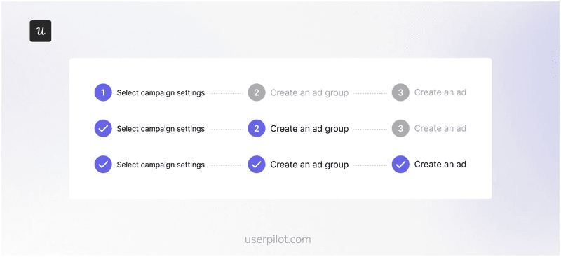
This type of progress bar focuses on the remaining steps or stages in a multi-step process. It’s ideal for complex tasks with a clear sequence, such as onboarding flows and multi-part surveys.
To clearly illustrate progress, the indicator divides the process into distinct segments, each representing a step. Users can easily track their advancement as they complete each step and see the corresponding segment fill or get marked as done:
Top SaaS progress bar design examples
Ready to see examples from SaaS brands? Here are six great ones:
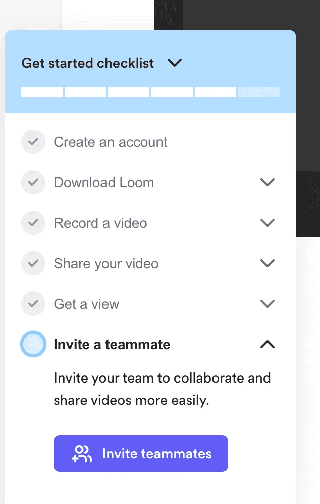
2. Loom uses the steps left checklist progress bar
Loom employs a steps-left and a checklist bar to onboard new users.
As users complete each step, a checkmark provides visual confirmation of their progress, creating a sense of accomplishment and motivating them to continue.
Loom provides clear guidance by using checkmarks and highlighted circles to distinguish completed steps from what’s left undone.
Furthermore, dropdown arrows next to some steps hint at further actions or information, allowing for progressive disclosure and preventing information overload.
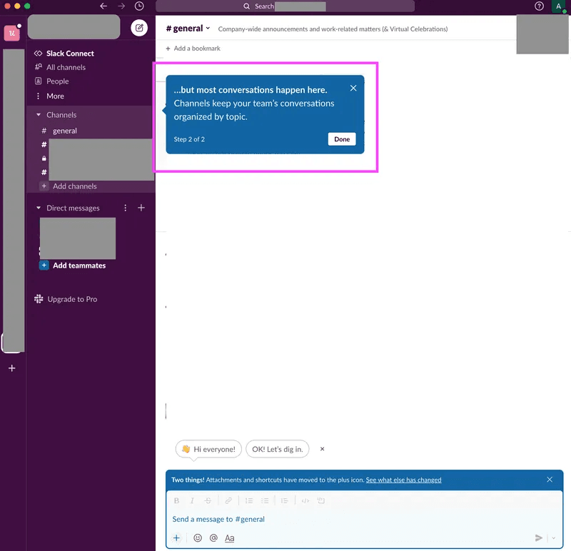
3. Slack’s numbered steps progress bar for onboarding
Unlike the previous examples, this progress bar appears within a tooltip, providing just-in-time guidance without disrupting the user’s flow.
The clear numbering (e.g., “2 of 2”) provides instant clarity on the user’s progress and the number of steps left in that particular flow.
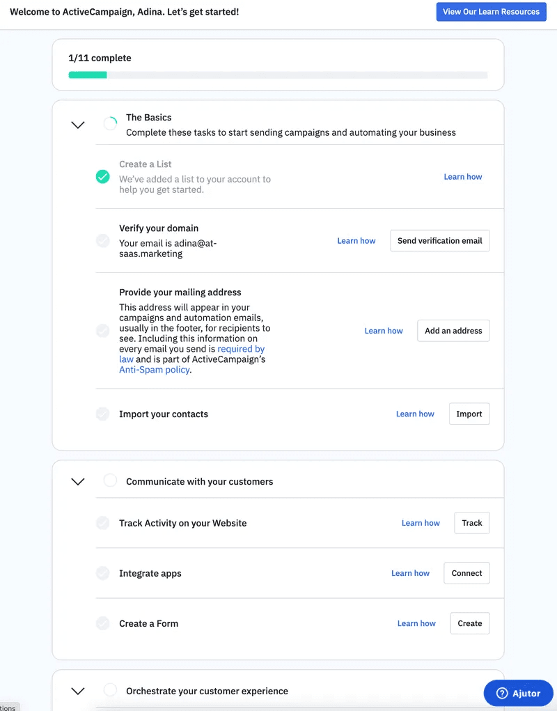
4. ActiveCampaign combines a spinner, steps left, and a linear progress bar
Instead of relying on a single progress bar, ActiveCampaign incorporates a spinner, a steps-left checklist, and a linear progress bar. This strategic decision caters to different user preferences and learning styles, providing a holistic view of the onboarding journey.
The checklist format effectively breaks down the potentially overwhelming setup process into smaller, manageable tasks to motivate completion. Clear headings, numbered steps, and a consistent color scheme further enhance the visual organization and user experience.
Each step also includes a concise description and a helpful “Learn how” link, offering additional self-service support. The spinner (also known as a progress circle) provides dynamic feedback for tasks with uncertain durations, while the linear progress bar offers a more granular view of the overall progress.
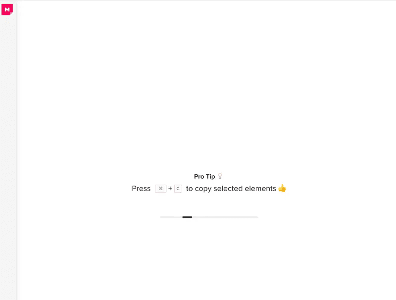
5. Mural’s skeleton screen adds tips while the app loads
Mural’s whiteboards can be large, complex pages with many elements that take a while to load.
Knowing this, the company effectively combines a skeleton screen and an indeterminate progress bar to create a positive user experience even while the app is loading.
The skeleton screen gives users a sense of what to expect and reduces perceived wait times. Its visual consistency with the actual Mural canvas ensures a seamless transition once the content loads.
In addition, Mural uses simple microcopy to offer pro tips that users will find useful when they start engaging with the platform.
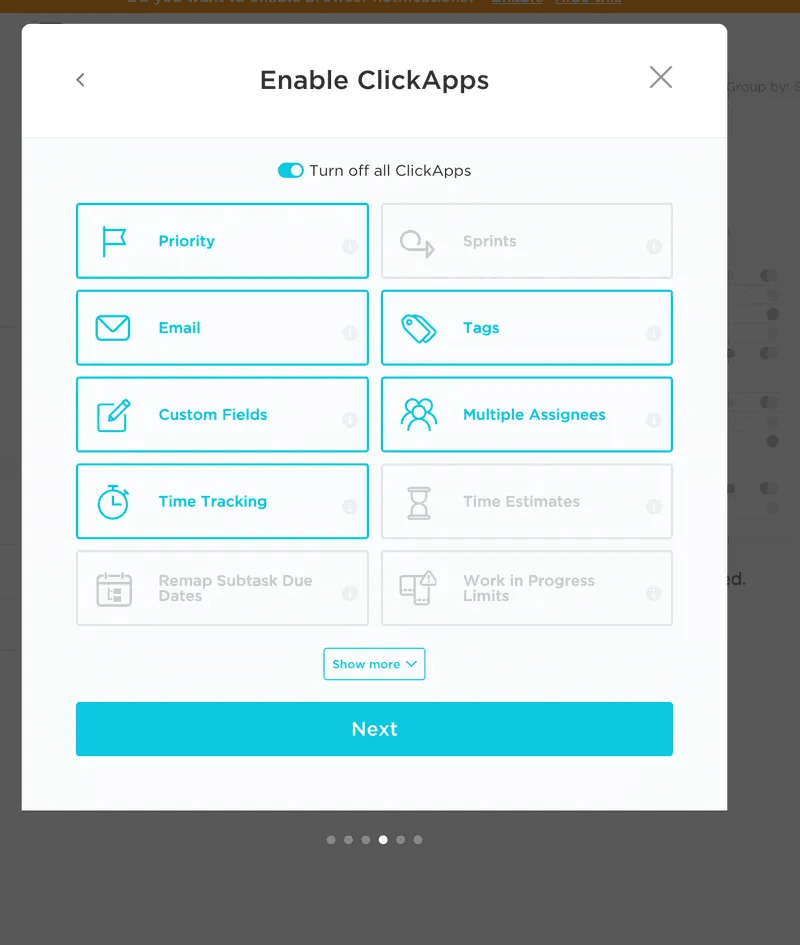
6. ClickUp progress bar highlights steps using ”ball progress”
Instead of the regular indicator, Clickup utilizes steps left progress bar with a unique ball progress design. This minimalistic UI design ensures the progress indicator remains unobtrusive and allows users to focus on each step without unnecessary distractions.
Despite its subtlety, the ball progress design effectively communicates the user’s current position within the multi-step process, guides them through the setup, and prevents overwhelm.
