Progressive Disclosure Examples to Simplify Complex SaaS Products


Progressive disclosure gradually exposes users to information over multiple screens. In complex SaaS products, it’s one of the most effective design patterns to prevent the overwhelm that drives early churn. Most user onboarding failures trace back to too many features surfaced too early, before users have the context to use any of them. Progressive disclosure solves this by controlling the pace at which new information reaches users, keeping cognitive load manageable across every step.
A 2026 study by Ariful Islam Anik and Andrea Bunt found that progressive disclosure enhanced perceived learning, meaning people felt they understood the system better when information was revealed progressively rather than all at once. That effect held even when controlling for cognitive load, making it a strong argument for applying this pattern during onboarding, when the learning burden on new users is highest.
Progressive disclosure also streamlines the first-time user experience by slowing the rate of information to a more absorbable level, provides a cleaner user interface by surfacing only what the user needs at a given moment, and shortens the learning curve by breaking complex tasks into manageable steps. This makes users less error-prone because knowledge that arrives in the right order at the right pace sticks better than a feature firehose on day one.
Below are 13 progressive disclosure examples that take you from principle to practice!

13 Progressive disclosure examples and best practices for SaaS
We’ve carefully curated the examples below to ensure they each highlight a progressive disclosure best practice that you can apply within your own SaaS product.
Empty states that prompt action
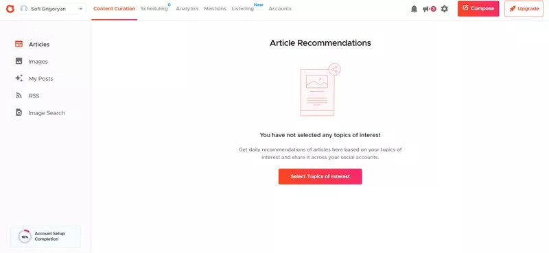
An empty state is the design term for a screen inside your product that’s almost completely blank. Empty states most commonly occur when users have just signed up to a new platform. Rather than leaving it blank (which could confuse users or lead them away from your SaaS), use empty states to prompt immediate action. A well-designed empty state tells users exactly what to do next, turning a moment of potential confusion into the first concrete step forward.
Crowdfire makes good use of its empty state and shows the next step a user should take by selecting topics of interest.
A signup flow that walks users through getting started
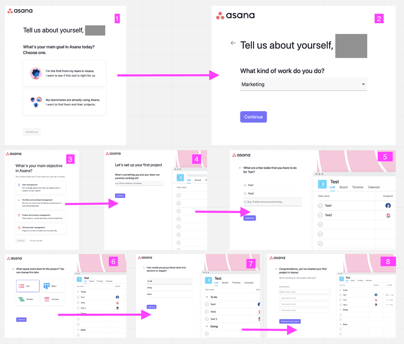
A signup flow for SaaS applications can be used to collect the necessary data to ensure that users entering the app see an interface that matches their goals. Rather than throwing a user headfirst into your SaaS without any context, a well-structured signup flow walks them through using the app and configures settings before they ever reach the main UI.
Asana is a classic example of a signup flow that doubles as effective progressive disclosure, tailoring what users see in their first session by collecting role and goal information upfront.
Multiple screens vs. a one-page overload
Cramming everything your users need onto a single screen can overwhelm them. A better approach is to split tasks across multiple screens, reducing the number of options in any single view and helping users make one decision at a time. Multi-step forms are a common application of this, where each screen handles one question rather than a single long form that users must fill out in full before they can proceed. You can also combine these multi-screens with progress bars to show users where they currently are in a sequence.
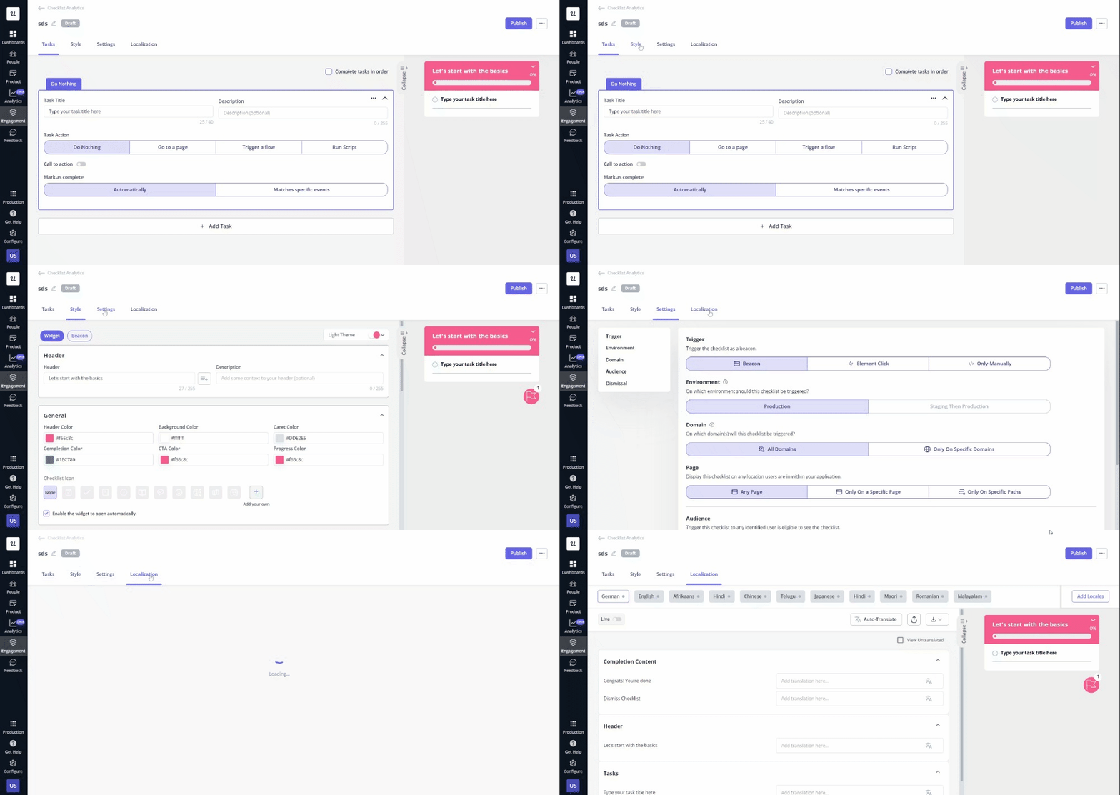
Userpilot uses a secondary screen when you set up a checklist, allowing users to reveal screens by selecting different buttons, making configuration feel manageable rather than overwhelming.
Multi-layer menus
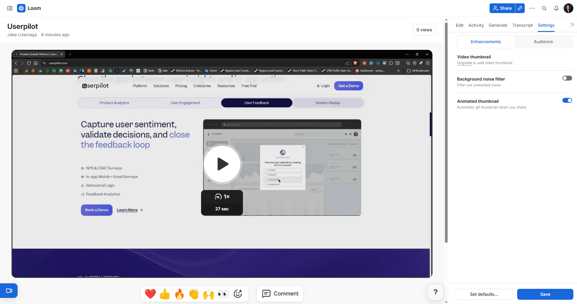
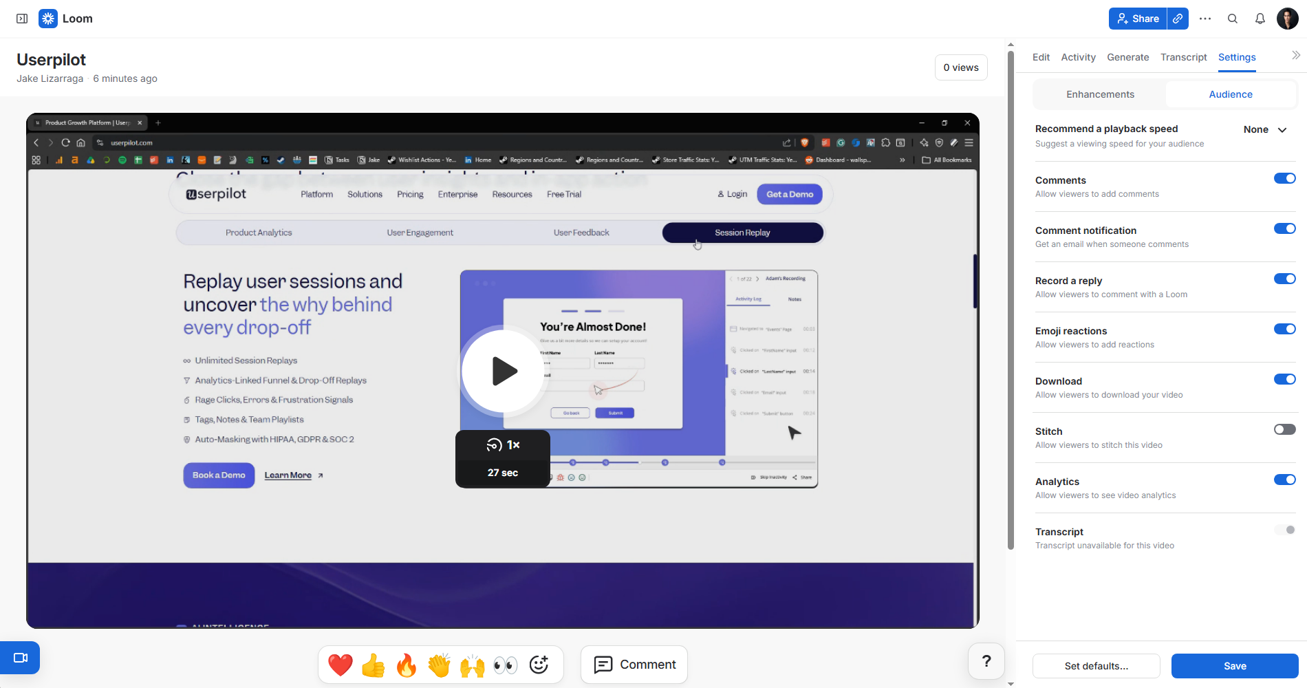
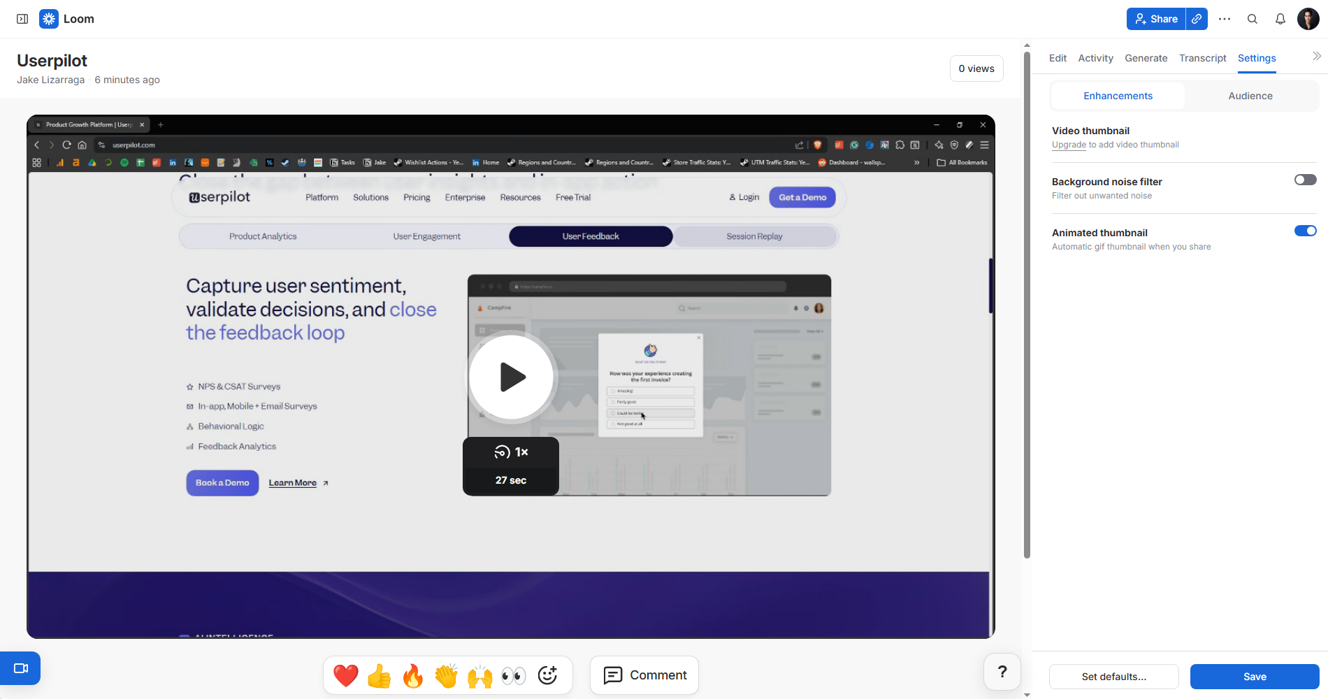
Multi-layer menus can help you implement progressive disclosure at the navigation UX. They reduce the number of visible elements so users can focus on what they are doing with as few distractions as possible. The dropdown menu shows only what’s needed, with a click revealing the next level of options. Loom uses this as part of its progressive disclosure strategy. When you want to configure your video, Loom only exposes key settings (e.g., thumbnail and noise) by default.
Loom then reveals more extensive audience settings once users click on the toggle.
Step-by-step interactive guides and wizards
Progressive disclosure can also be applied by building interactive walkthroughs that lead users through complex workflows one action at a time. You can hide certain options to help users focus on the most important details, reducing visual noise that causes new users to hesitate or click the wrong thing. Wizards are particularly useful for setup flows where the order in which steps are completed matters. By revealing each step only after the previous one is complete, you prevent users from skipping ahead and ending up in a broken state.
Userpilot uses this technique for part of its HubSpot integration configuration. Short guiding messages walk users through each required input while secondary steps remain hidden.
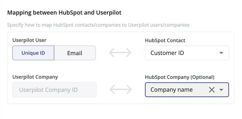
Use checklists for progressive onboarding
Checklists are one of the most effective tools for progressive onboarding. They break down complex features into a sequence of small tasks, giving users a clear sense of forward momentum and preventing the overwhelm that comes from trying to understand an entire product all at once. You can use an user onboarding checklist with each item opening a new screen to guide users through one core feature, showing them only what they need to know for that step before moving to the next (while driving adoption of features they might not have discovered).
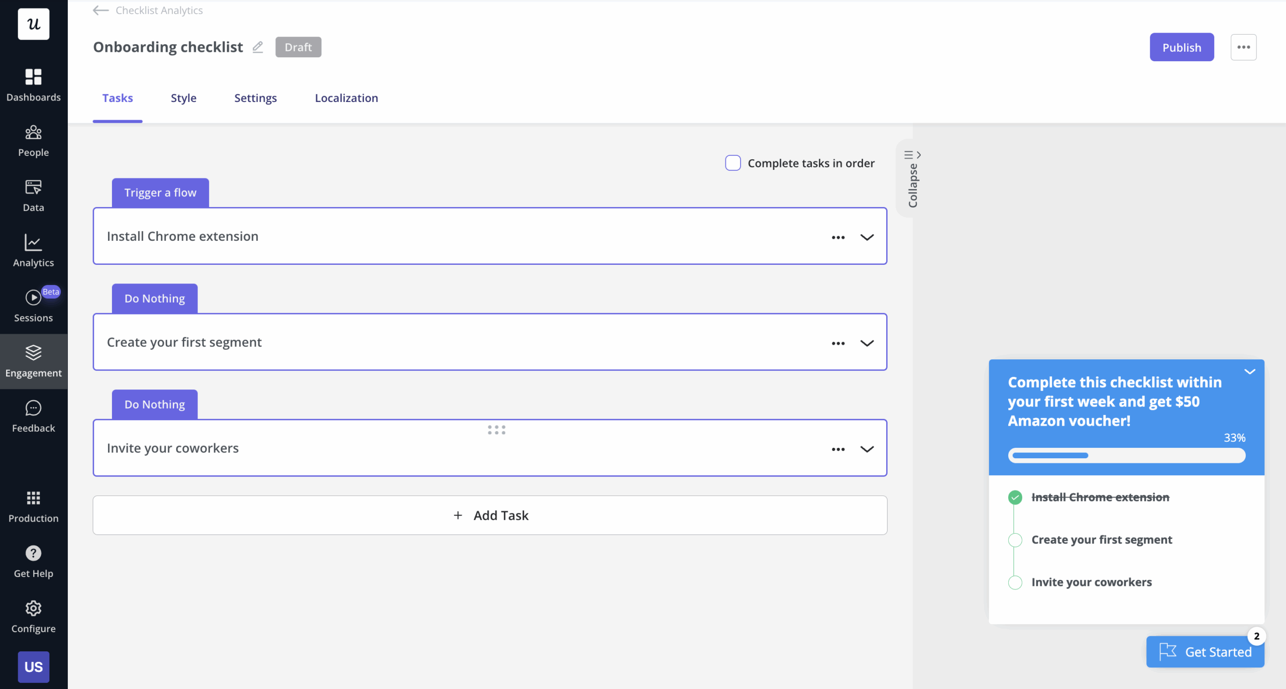
Use tooltips as part of interaction design
Tooltips are a crucial part of your progressive disclosure toolkit. As part of user onboarding, you can trigger tooltips for new users to introduce features at the moment when those features become most relevant (rather than frontloading explanations during a setup flow the user is rushing through). Most of all, they let you provide information without adding visual clutter to the main interface. The key is triggering tooltips contextually.
A tooltip that fires when a user first hovers over an unfamiliar button is progressive disclosure done right.
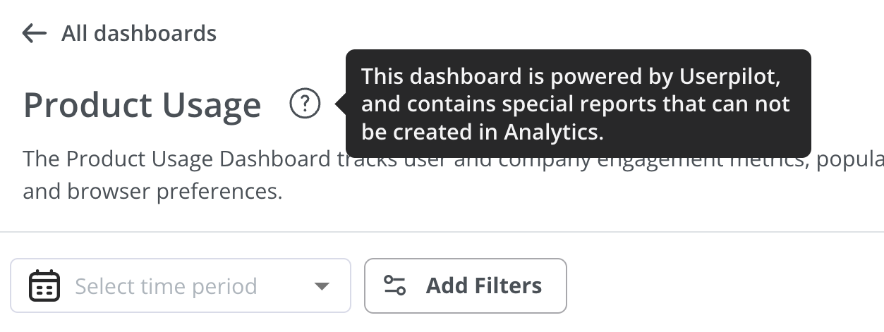
Categorize and group content in resource centers
A knowledge base is where users go to find answers when they get stuck. In a complex SaaS product, that can mean navigating hundreds of articles. If the resource center structure isn’t clear, users either open a support ticket or give up. As part of progressive disclosure, the goal is to make the right resource accessible in as few clicks as possible. Categorizing and grouping content while building your resource center means users only have to navigate one taxonomy layer at a time, instead of parsing an endless list of results.
Userpilot’s in-app resource centers let you show resources to specific segments and hide them from others to ensure only relevant information is displayed to users.
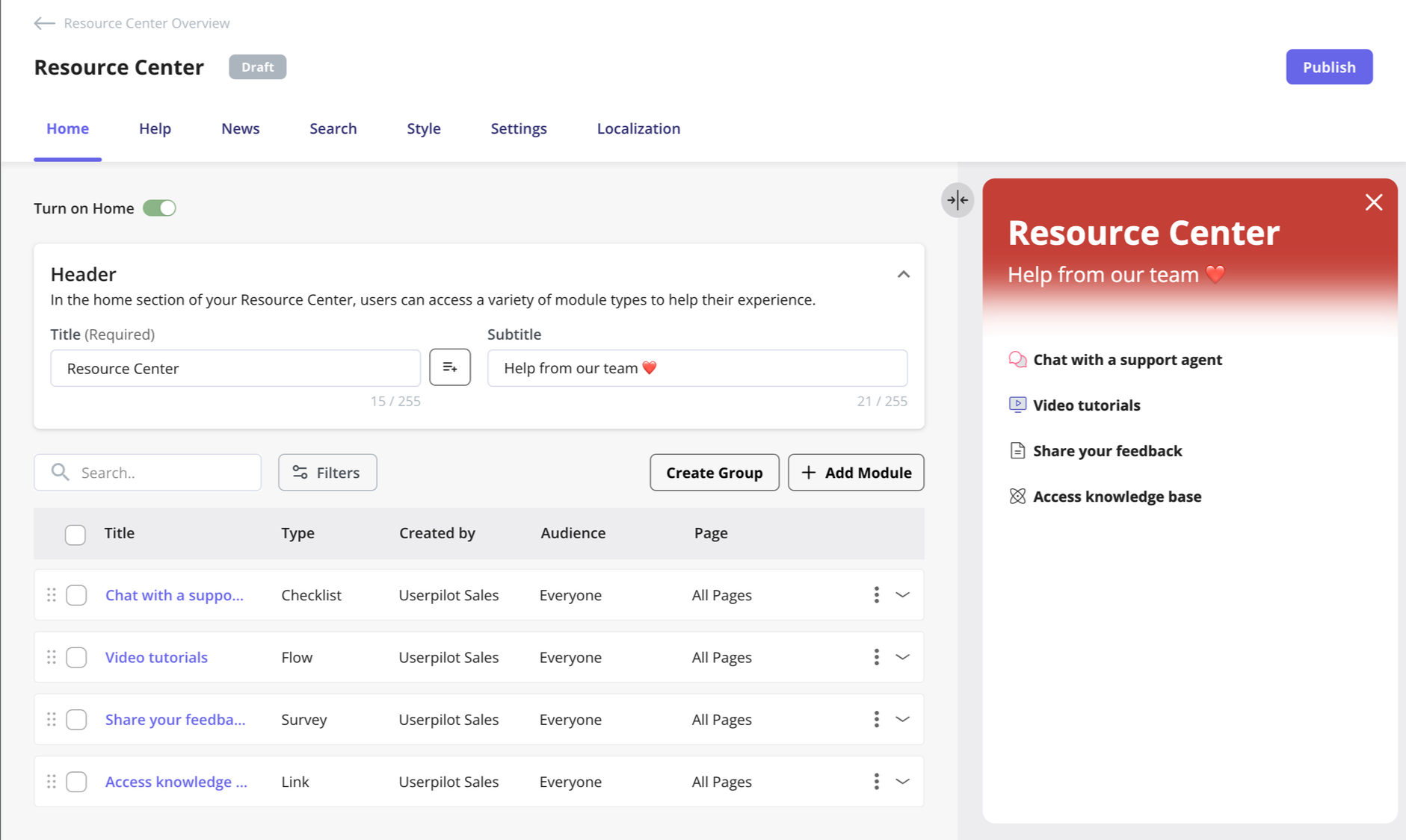
A side benefit is a measurable reduction in support tickets, since users can find answers on their own without relying on your representatives.
Segment users with similar JTBDs
Each user has their own goals when they join your product, and those goals should determine what they see first. Implementing progressive disclosure at scale requires segmenting users before they reach the main UI, so the information hierarchy you surface to each group matches what they actually came to do. Segmenting users by their jobs-to-be-done (JTBD) lets you build different progressive disclosure flows for each segment.
Userpilot lets you create segments for users and companies based on multiple criteria or triggers.
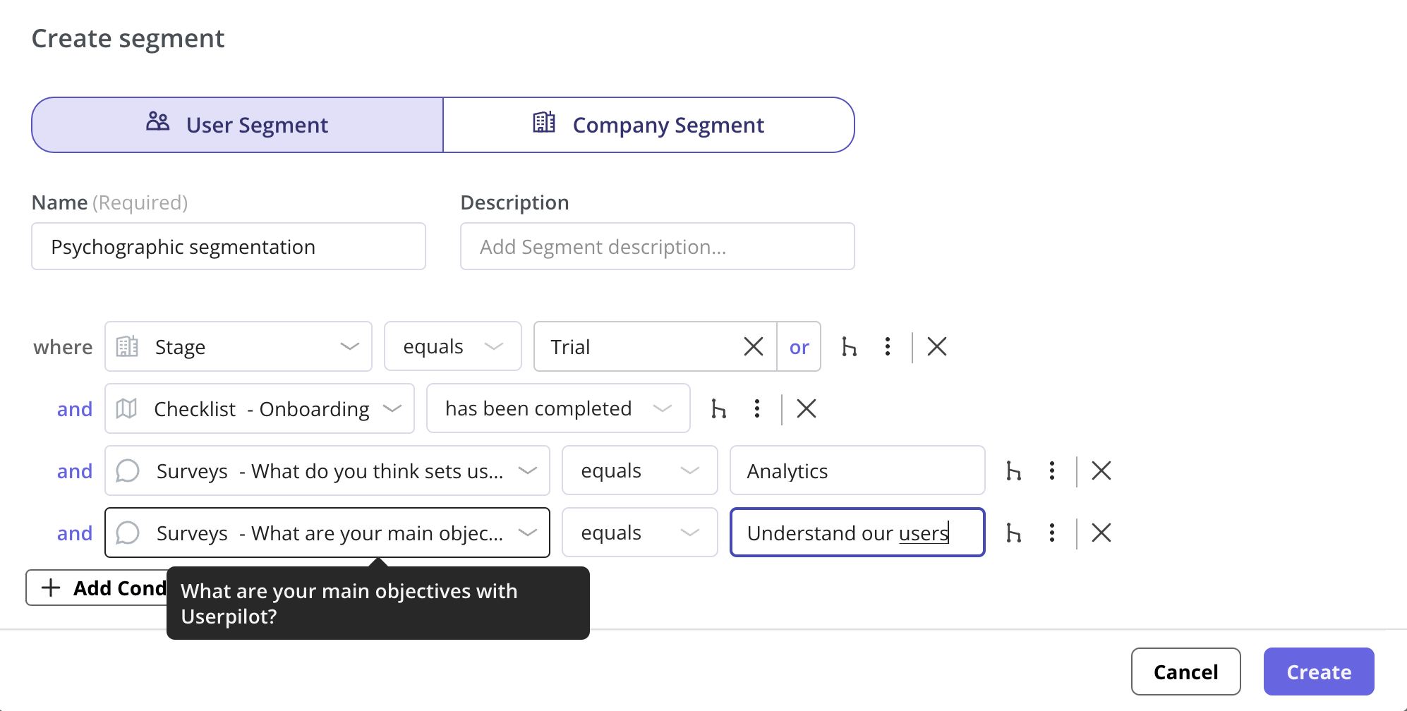
There’s no point showing advanced settings to a user who’s still trying to complete their first task, just as there’s no point gatekeeping features from a power user who already knows what they want. With segmentation, you can ensure users discover new features when they’re ready, instead of throwing the whole product at them and overwhelming them right at the start of their journey.
Prioritize core and secondary features
Some SaaS products are genuinely complex and have a large range of features. A core principle of progressive disclosure is deferring advanced features to later sessions, limiting what you show during the initial experience to the features that create immediate value. There’ll be plenty of time to surface other functionality to users once they’re familiar with the basics and already getting value from the product.
Userpilot’s flow editor gives users four choices for the type of in-app experience they’d like to create, making the decision simple rather than paralyzing.
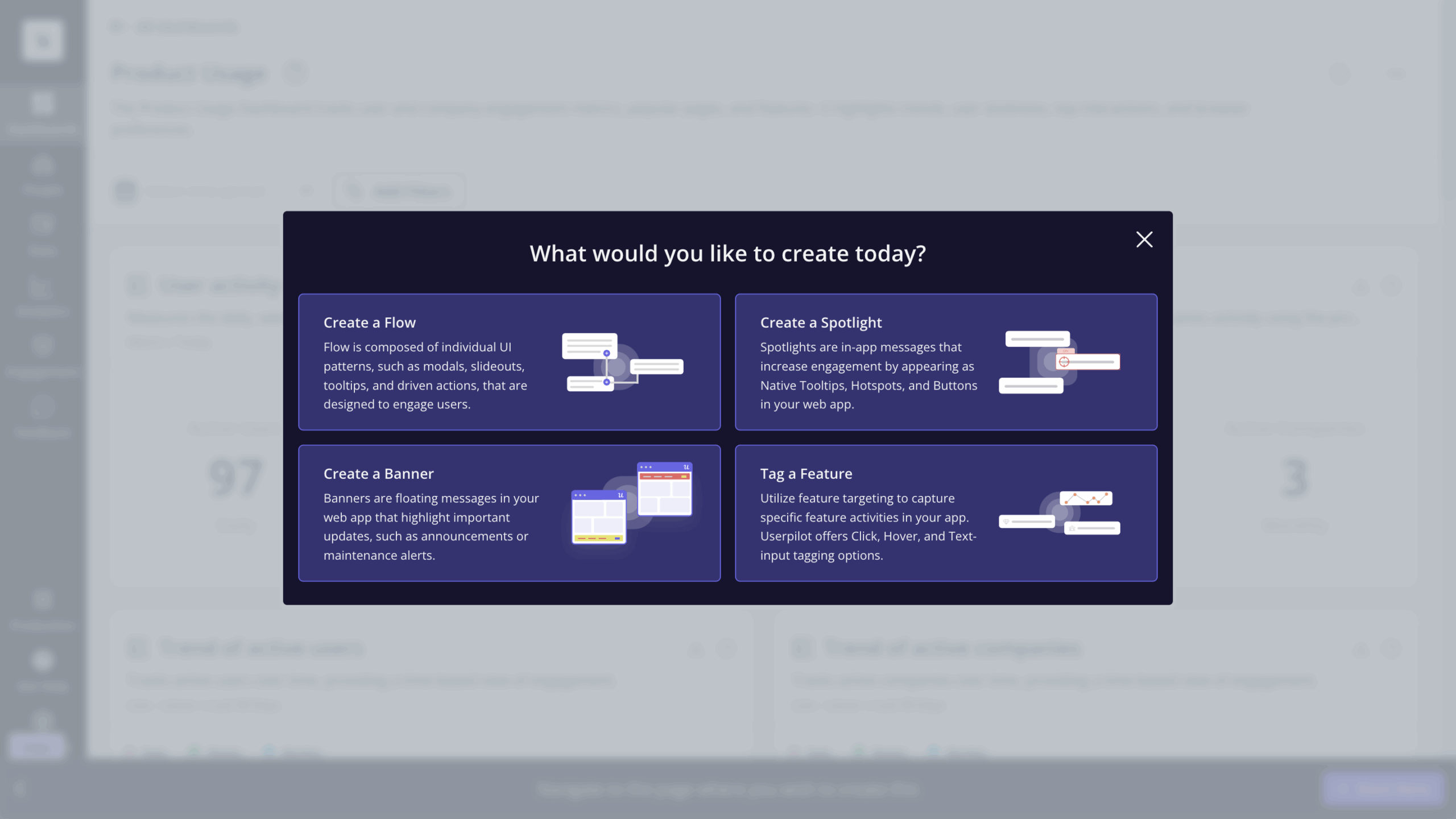
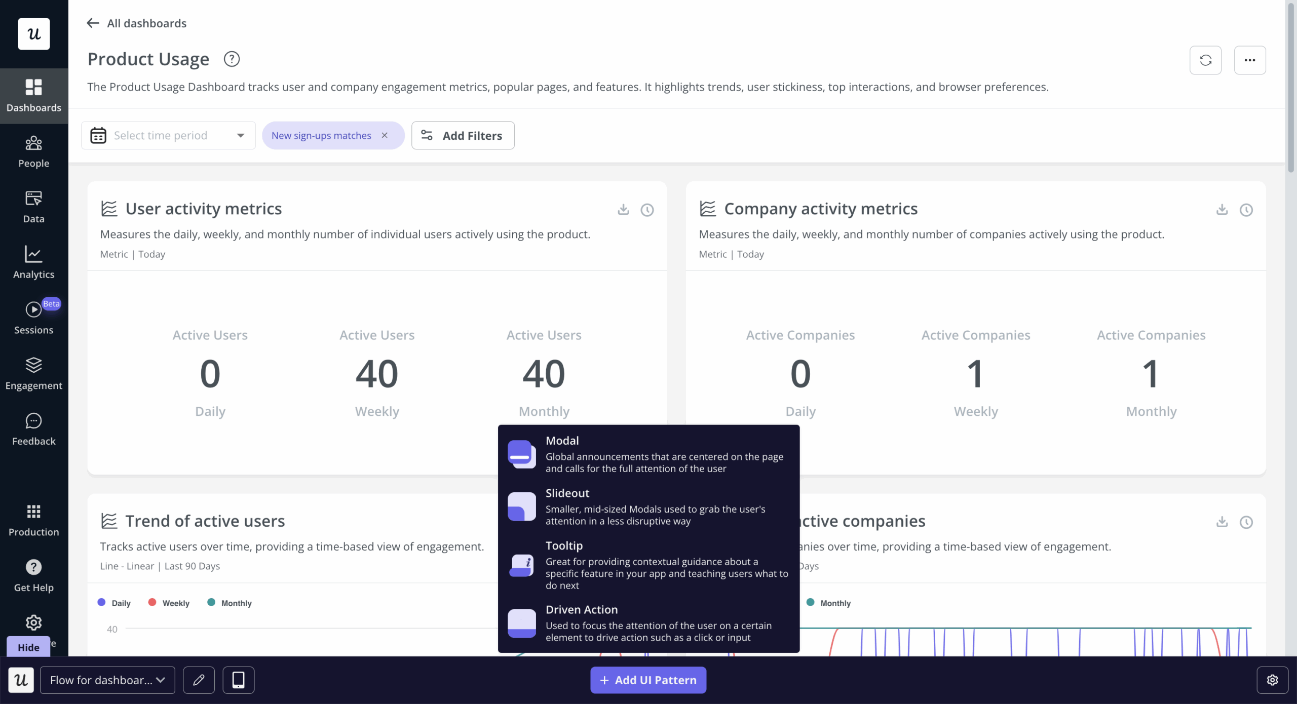
Once the user has chosen one option, they’re presented with the sub-choices. If the user chooses a flow, they’re presented with the choice between modals, slideouts, tooltips, and driven actions.
Create effective onboarding flows with branched experiences
Rather than showing a generic onboarding flow that may not be relevant to a given user, you should offer branched experiences where user responses determine which path they’ll take. This turns a linear walkthrough into a personalized experience because each user sees only the content that applies to their situation. It also feels less like a low-effort boilerplate experience and more like something that was made specifically for that user.
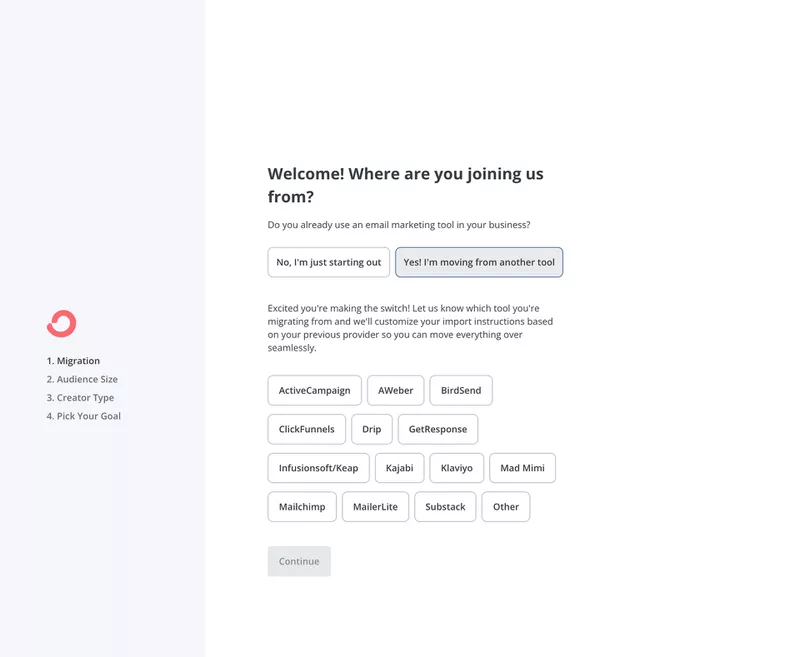
ConvertKit does this well in its signup flow by first asking where the user is joining from.
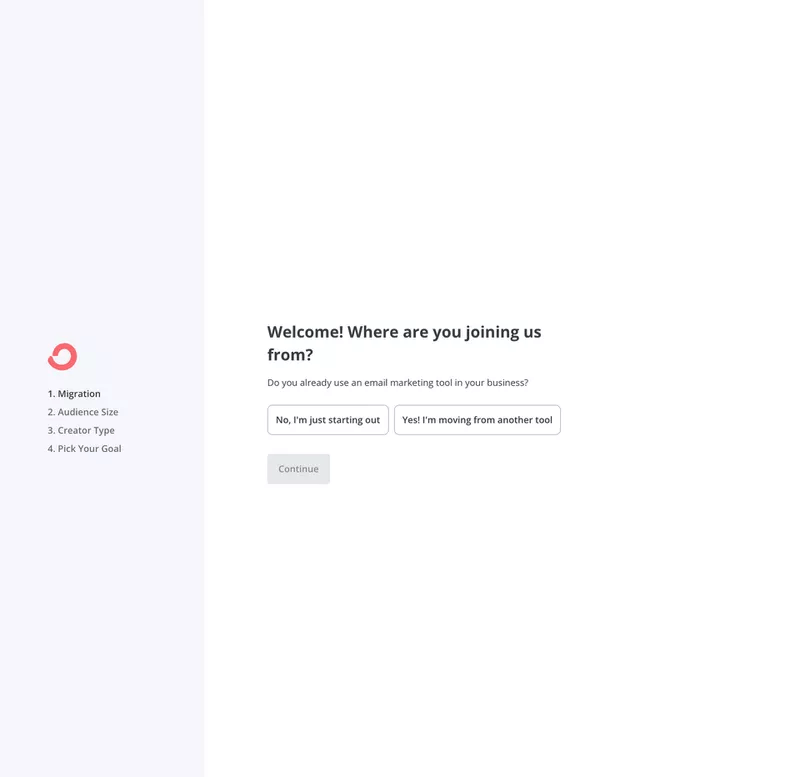
Depending on what the user selects, a different screen opens to match their starting point rather than sending everyone through the same sequence regardless of where they’re coming from.
Set goals to see how new users use the product
Setting goals is one of the more underused progressive disclosure strategies. You can set goals for different segments, letting you see how each user group engages with features over time rather than watching aggregate numbers that mask what’s actually happening at the cohort level.
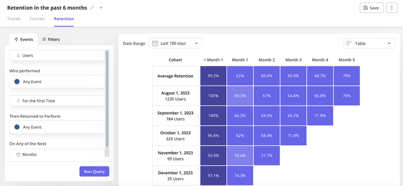
Micro and macro goals serve different purposes here. The former tracks discrete actions such as completing a checklist item or triggering a specific feature for the first time, while macro goals track outcomes when users reach activation milestones and complete workflows.
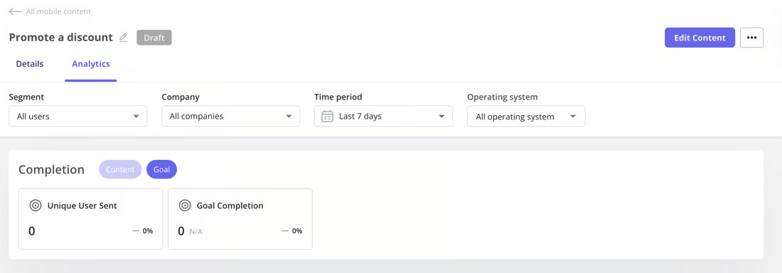
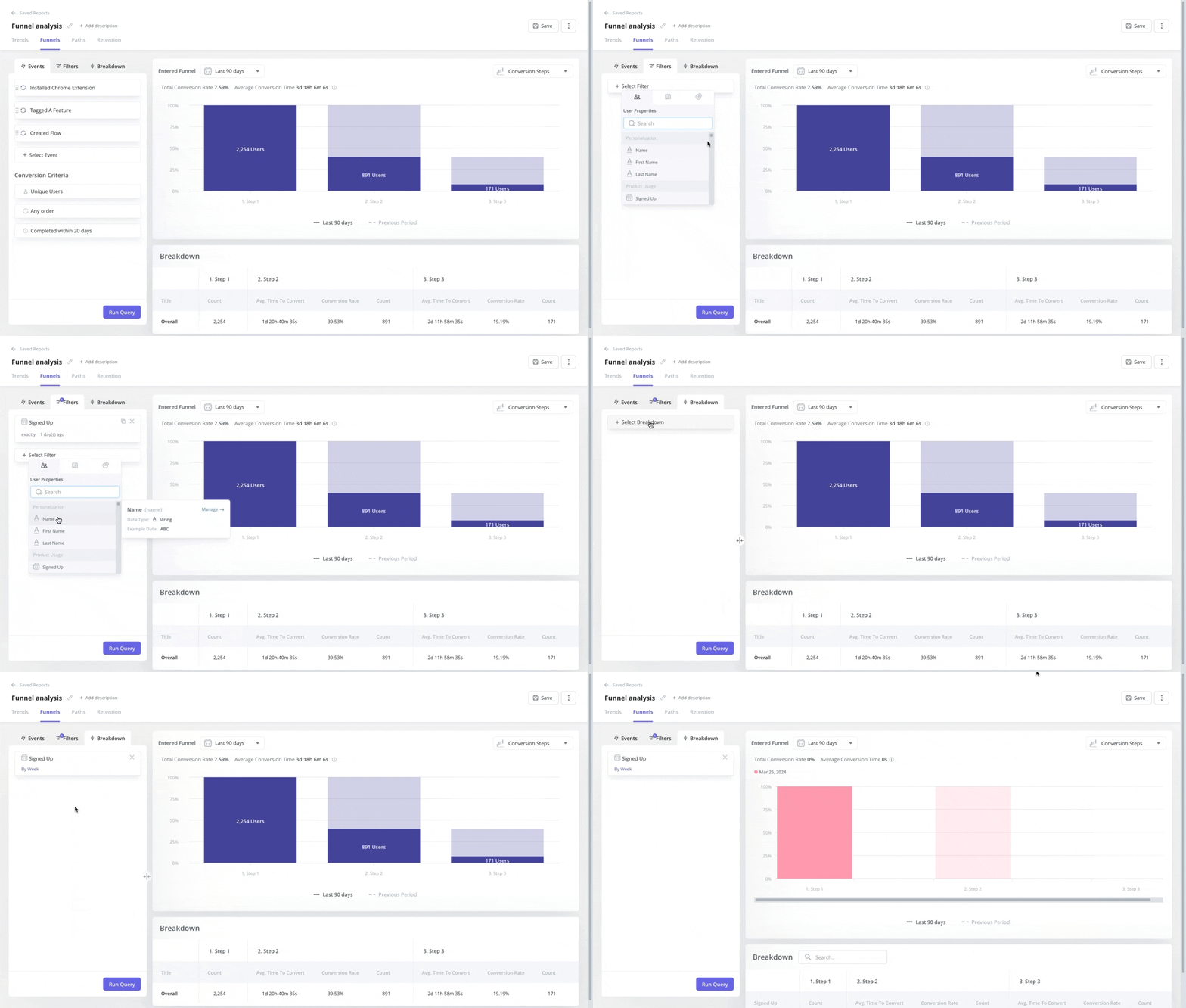
The goal-tracking product dashboard shows you whether users adopted a feature and got meaningful value from it. Funnel analysis takes that a step further by letting you identify patterns in usage that reveal where users are getting stuck. Drop-off at a specific step could reveal a feature that almost no one in a given segment has ever found.
Prototype and A/B test for improvements based on feedback
Testing your progressive disclosure strategy before fully committing to it is the difference between iterating on evidence and going by gut feel. You can create simple prototypes for any change to the disclosure flow and test them against your existing experience to see which version performs better. A/B testing works particularly well for progressive disclosure when combined with friction logs that let users identify the exact points in a flow where they felt confused or stalled.
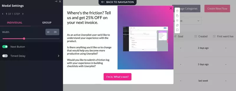
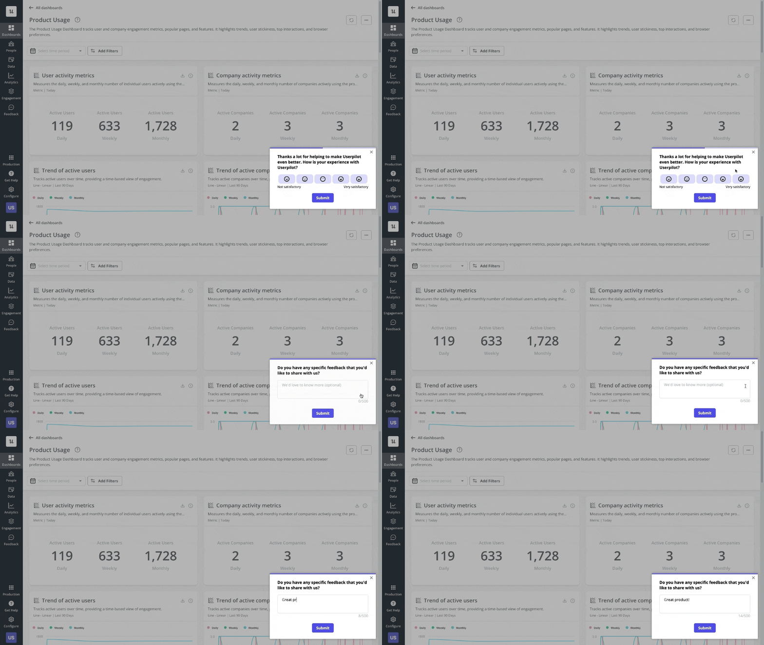
That data gives you a precise list of what to test rather than requiring you to guess what the problem might be. You can also use experience surveys to collect feedback from users who completed a flow and those who didn’t, giving you a qualitative signal to pair with the quantitative patterns in your analytics. This combination of friction logs, in-app surveys, and A/B testing is how you turn progressive disclosure from a design intuition into a measurable system.
Conclusion
Progressive disclosure makes complex SaaS more consumable by delivering information at a pace users can actually absorb. The 13 examples in this article give you a practical toolkit for implementing it across your product, from UI/UX designs like empty states or multi-layer menus to onboarding techniques like checklists and tooltips, with empirical measurement through goal dashboards and A/B testing.
Userpilot gives you everything you need to execute a progressive disclosure strategy with user segmentation, resource center organization, interactive walkthroughs, checklists, tooltips, and analytics that show exactly where users are getting stuck so you can intervene. All this comes together to create experiences that guide users towards activation without overwhelming them. Get a Userpilot demo to see how it works in practice!
About the author