SaaS Onboarding Email Best Practices + Templates and Examples


SaaS, poor onboarding comes at a steep price: 70% of customers churn within 90 days when onboarding falls short. Following onboarding email best practices can help reduce that churn.
As Yakov Carno, Founder of Valubyl, notes in our SaaS Product Metrics 2024 Benchmark Report, the key is guiding users to experience the value they signed up for:
Understand why they signed up, identify what they need to do to get there, and design a journey that makes it as quick and easy as possible.
That requires a structured onboarding email, not just a welcome email.
But what does this look like in practice?
After analyzing hundreds of onboarding flows, studying top SaaS companies, and speaking with marketers, I found eight onboarding email best practices to help reduce churn.
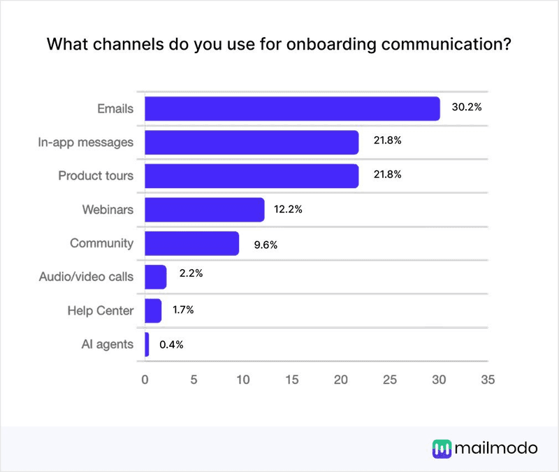
Why are onboarding email campaigns important?
Onboarding email campaigns are important because they boost user engagement, customer satisfaction, and conversions. That’s why 37.9% SaaS companies prefer the channel over alternatives like in-app messages and product tours.
Let’s break these reasons down to understand their impact better.
- User engagement: Onboarding emails encourage users to take key actions (like setting up an account, trying a feature, or completing their profile) that drive adoption. Without them, users stall at sign-up. With them, you increase active usage and customer retention.
- Customer satisfaction: A well-designed user onboarding process anticipates user questions and provides timely answers. This reduces frustration, builds trust in your product, and creates a smoother first experience. Customers who feel supported are more likely to stick around and recommend your product.
- Conversions: Onboarding campaigns bridge the gap between free trial (curiosity) and paid plan (commitment). By showing value at the right moment, they nudge users toward upgrading. For SaaS teams, this means better trial-to-paid conversion rates and a clear path to sustainable growth.
The importance of onboarding emails also lies in what happens if customers ignore them. What if too many users drop off, or you miss key product feedback?
Let’s do the math.
The true cost of high user drop-off
Suppose your SaaS has 1,000 sign-ups monthly, a 50% drop-off, $40 CAC, and $400 LTV. What’s at risk?
Value of drop-off (per month) = Lost LTV + Wasted CAC
- Lost LTV = Signups x Drop off% x Expected LTV = 1000 × 0.5 × $400 = $200K
- Wasted CAC = Signups x Drop off% x CAC = 1000 × 0.5 × $40 = $20K
- Total = $220K/month
That’s $2.6 million wasted per year.
And that’s not all. Unsatisfied customers may spread poor reviews and negative word of mouth. Left unchecked, this compounds into higher churn and less product feedback, even from loyal users.
The solution? A sound onboarding strategy, starting with email campaigns.
The 5 kinds of user onboarding emails you need to know + templates
I handpicked emails that address different steps in the customer lifecycle. Select based on where users are in your onboarding process.
My selection:
- Warm welcome emails
- Activation and feature highlight emails
- Social proof and customer success story emails
- Trial expiry and upgrade nudge emails
- Check-in and re-engagement emails
TL;DR:
| Types of onboarding emails | What they do |
|---|---|
| Warm welcome emails | Set the tone, reassure users, and guide them to the next step. |
| Activation and feature highlight emails | Nudge users to engage with features and reach value quickly. |
| Social proof emails | Show how peers succeed in reducing uncertainty to build trust. |
| Trial expiry and upgrade nudge emails | Create urgency, reinforce value, and convert free trials into paid accounts. |
| Check-in and re-engagement emails | Reactivate inactive users and prevent churn with supportive guidance. |
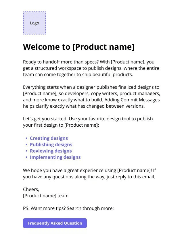
1. Warm welcome emails
A welcome email sets the tone for the onboarding process. As the first email users see, it reassures them that they made the right choice.
So, keep this email personal, confirm sign-up, highlight one immediate next step, and remind users of your product’s value.
Use this template as a guide:
Welcome email onboarding email template
2. Activation and feature highlight emails
While activation and feature announcement emails may sound alike, they serve different purposes. Feature announcements inform users about what’s new, but activation emails bridge the gap between knowing and actually using. And from my experience, activation is the more impactful lever.
Why focus on activation?
Our 2024 Product Metrics Benchmark Report reveals that the average SaaS activation rate is 36% (median: 30%), leaving considerable room for improvement.
In other words, nudging users toward activation early directly improves retention.
Take a look at this Zapier activation email.
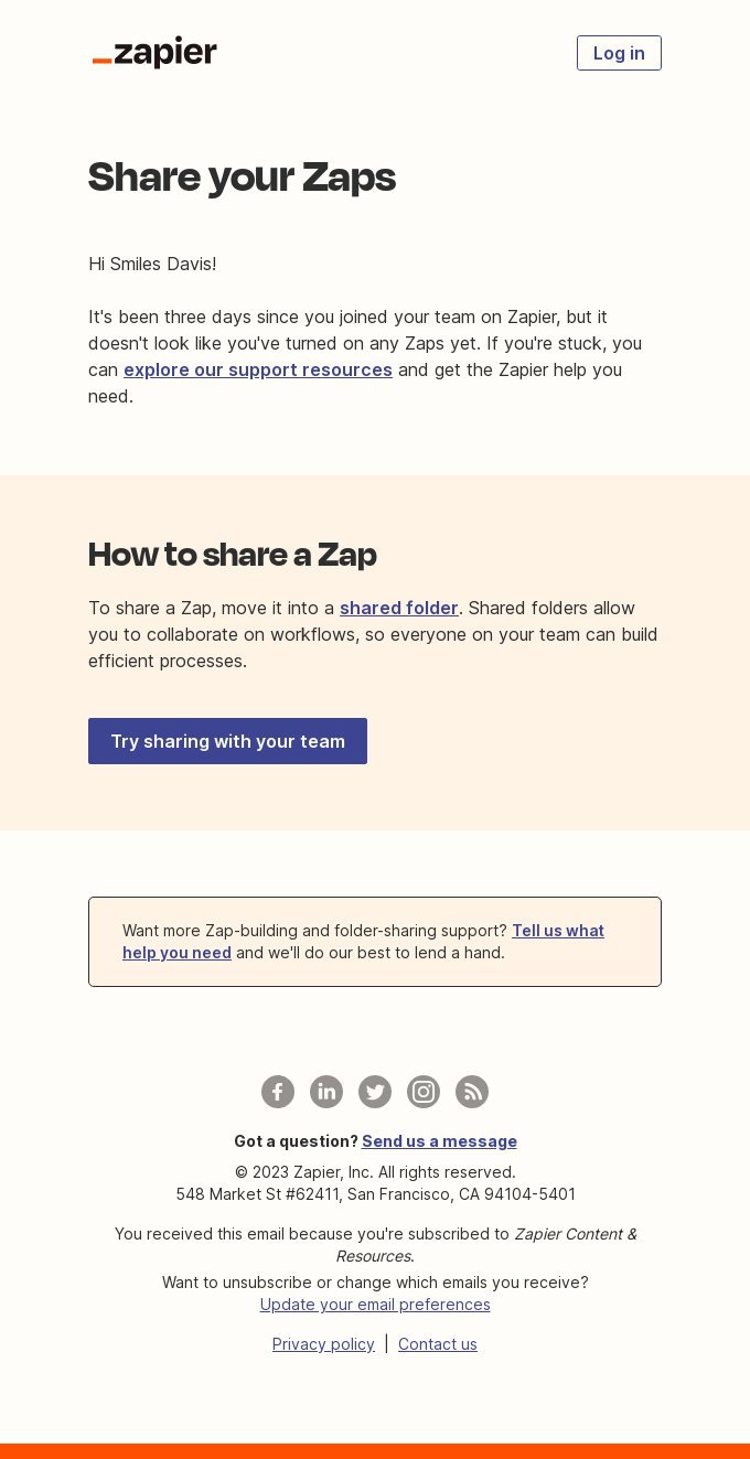
Rather than merely announcing functionality, Zapier includes a clear CTA, “Try sharing with your team,” prompting users to experience collaboration first-hand and hit their “Aha!” moment.
Activation and feature highlight onboarding email template
3. Social proof and customer success story emails
In his book Influence: The Psychology of Persuasion, Robert Cialdini explains:
Social proof is most powerful for those who feel unfamiliar or unsure in a situation and who, consequently, must look outside of themselves for evidence of how best to behave.
The same applies to SaaS onboarding.
New users are often uncertain about committing to paid tiers. Social proof emails show how peers achieve success, providing reassurance.
These proofs include case studies, testimonials, or quick customer spotlights. Whichever one you use, keep your email short, make it relatable, and tie it directly to product benefits.
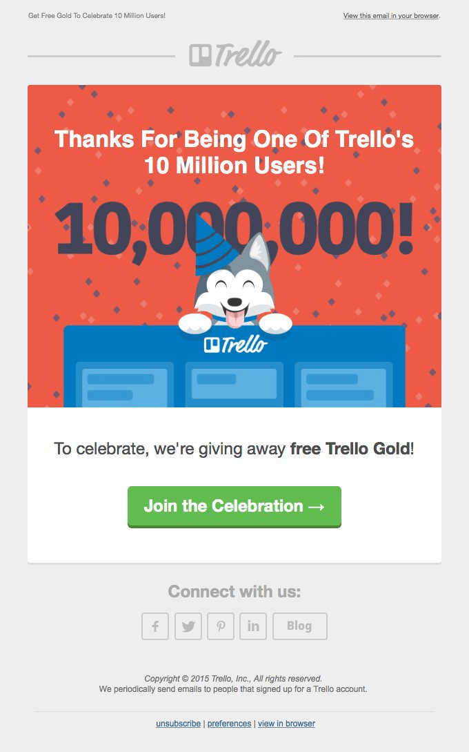
This email from Trello, celebrating 10 million users, is a good example.
Social proof onboarding email template
Subject: Meet [Client Name]
Hi [First Name],
[Client Name] used [Product Name] to overcome [common pain point]. Within 3 months, they:
Increased [metric] by X%
Saved [Y] hours/month
“[Short testimonial quote]”
[Client Name] is in good company. # users are getting results with [Product Name].
[Tie the product to a relatable benefit]
[CTA: Join the team]
[Your Name]
[Your Role] at [Company Name]
4. Trial expiry and upgrade nudge emails
I’ve found that free trials can backfire for trial-based SaaS models. While they showcase products, users often delay upgrading or forget to do so. Expiry and nudge emails reduce drop-off by reminding users what’s at stake.
These emails work because they combine three elements:
- Momentum: Showcase what users have already achieved, e.g., “You’ve created 3 projects and invited 5 teammates.”
- Urgency: Point to benefits they’ll lose soon, e.g., “In 3 days, your saved projects will be archived.”
- Value proposition: Reinforce benefits with social proof, e.g., “95% of trial users who upgraded completed their first workflow in under a week.”
When crafted well, trial expiry and upgrade nudge emails serve as supportive reminders that guide users toward conversion.
Squarespace, for example, sends clean, supportive reminders that highlight what users will miss without sounding overly salesy.
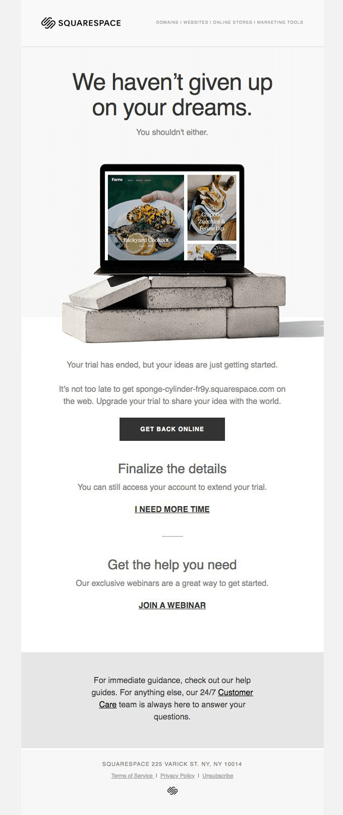
Trial expiry and upgrade nudge onboarding email template
5. Check-in and re-engagement emails
Even with solid onboarding, some users go inactive due to being stuck, overwhelmed, or unsure about next steps. Ignored, inactivity leads to churn.
Check-in and re-engagement emails rekindle interest. They offer clarity, reassurance, and a path forward at key times like:
- A 5–7 day window of no login.
- When users abandon a milestone in the onboarding flow.
- When users keep using one minor feature but avoid the product’s core functionality.
Timing aside, tone also matters. So, I recommend being supportive, not pushy.
Additionally, highlight a simple next step, along with links to relevant tutorials or support resources. Buffer does this well. See how one of their re-engagement emails gently reminds users of unfinished tasks and links to a guide.
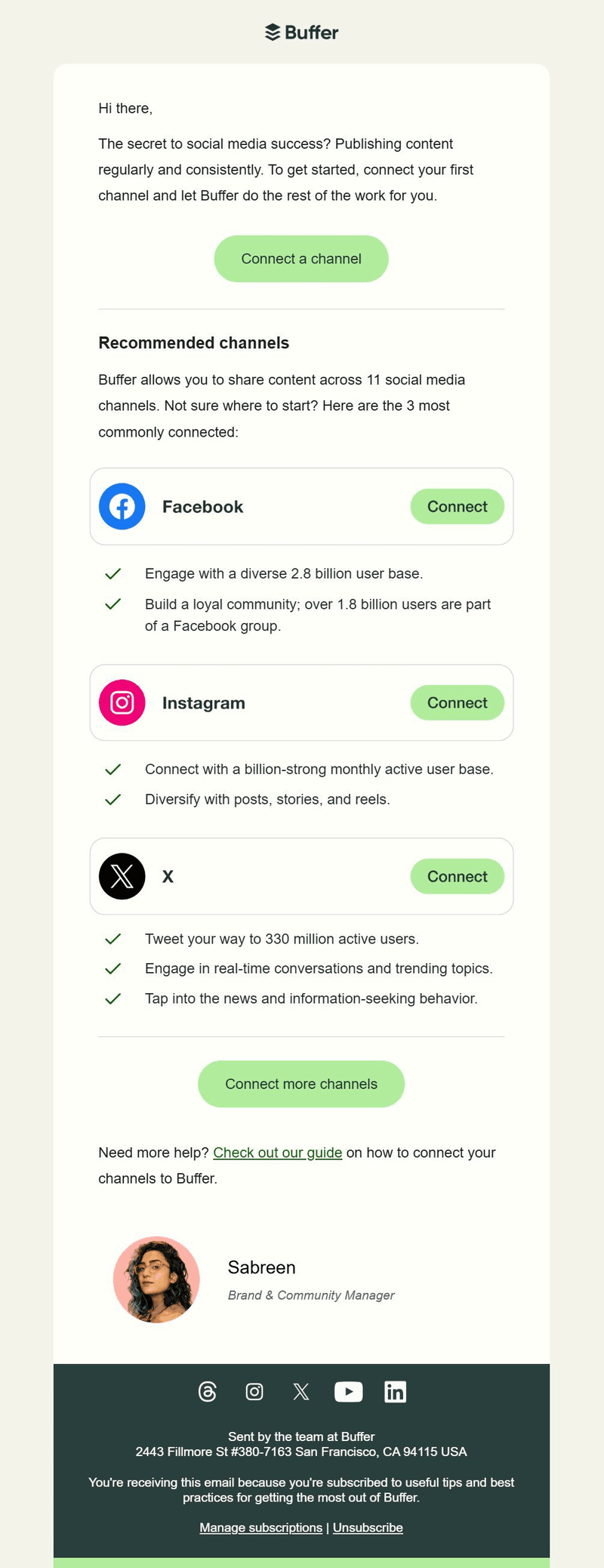
Re-engagement onboarding email template
8 Onboarding email best practices + examples
Below, I outline some of the best onboarding email practices, highlight what distinguishes their approach, and demonstrate key takeaways you can apply to your strategy.
1. Use behavioral segmentation to hyper-personalize the customer experience
True personalization in onboarding comes from understanding what users do inside your product, not “Hi [Name].” That’s where behavioral segmentation comes in.
Instead of relying only on demographics like age or job title, group customers based on actions and engagement patterns. Some key data points you can segment by include:
- Sign-up data: User’s role, industry, or goals captured during onboarding forms.
- Product usage patterns: Frequency of logins, features used, or milestones achieved.
- Engagement levels: Who opens emails, joins webinars, or interacts with support.
- Decision stage: Whether they’re exploring, comparing, or ready to upgrade.
This approach makes every email feel timely and relevant.
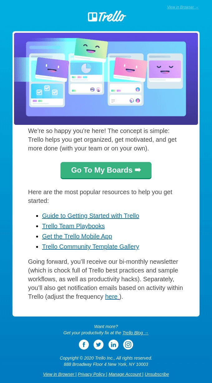
For example, Trello’s welcome email delivers a single, simple call-to-action, perfect for new users starting fresh.
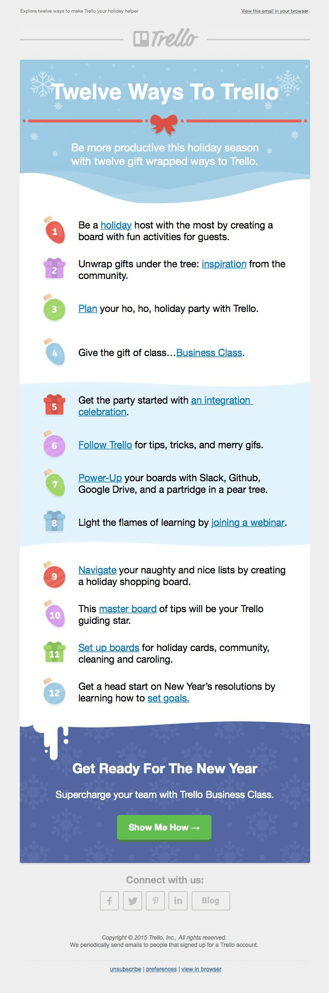
Later, when Trello noticed inactivity during the holiday season, they sent a re-engagement email offering twelve practical ways to use the tool during that period.
Two very different user segments; two very different emails.
What I love:
- The short line in Trello’s welcome email about how often users will hear from them stood out to me. I knew I wouldn’t be overwhelmed with messages, and that builds trust.
- Both emails use a warm, conversational tone with a personal touch.
- The “12 tips in the 12th month” is a thoughtful way to engage users like me with helpful, seasonal content.
2. Strategize timing and cadence to deliver when it matters most
Timing and cadence refer to when and how often you send onboarding emails. Together, they shape the entire customer journey.
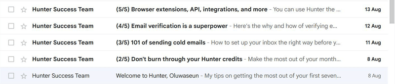
Send too many emails too soon, and you risk overwhelming users. For instance, Hunter started a five-part onboarding series immediately after sign-up. That felt rushed to me, and I didn’t open their other emails.
Wait too long, and users may lose momentum or forget about your product altogether.
Both extremes fail, which makes timing and cadence crucial.
So, what’s the sweet spot? It depends on two factors:
- Product complexity: Simple tools may only need 3–5 onboarding emails within the first week. More complex SaaS products might require 8–10 emails, spaced over two or more weeks.
- User activity: Track whether users log in, explore features, or stall at a key step. Behavioral triggers help you adjust cadence based on real-time engagement, not guesswork.
Apollo nails this balance with its onboarding checklist. Rather than bombarding new users, they send a well-timed nudge two days after the welcome email, tying rewards to each step and encouraging quick wins.
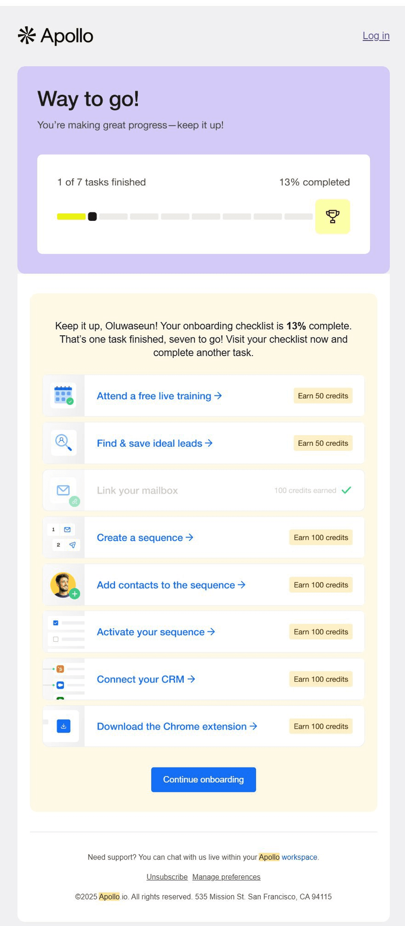
What I love:
- The two-day gap respects my headspace while keeping momentum.
- Rewards tied to each step make me feel that progress is achievable, and I love the personal touch that the personalized greeting adds.
- The cadence adapts to my actions, not arbitrary scheduling.
3. Create urgent and benefit-driven subject lines
Subject lines directly affect open rates: 47% of email recipients say they open an email based on the subject line alone. And when open rates are low, the value in your onboarding email often goes unnoticed.
To avoid this, use benefit-driven, attention-grabbing, and personalized subject lines.
- Benefit-driven: Emphasize the value the user will gain. For example, Grammarly’s onboarding email used: “Write better in minutes—here’s how.” It conveys the benefit (better writing) and speed (minutes), giving readers a reason to open.
- Attention-grabbing: Use curiosity or urgency to make a lasting impression. Notion often sends “Your first workspace is waiting 👋.” This creates anticipation, making users feel like something valuable is already in place for them.
- Personalized: Speak directly to the individual. Trello sent: “[Name], ready to organize your first project?” Personalization works best when it quickly reinforces value—in this case, Trello’s core promise of organization.
Other elements to include are numbers and emojis.
Numbers help users quantify value and act faster (“3 tips to hit your first milestone”). Emojis (🎯, 🚀, ✅) can make your email stand out in an inbox sea of sameness. But overusing them can backfire and feel gimmicky.
This example from Semrush illustrates an effective subject line. It highlights value, adds immediacy, and makes the process look easy. Users know what to expect and are compelled to act soon to enjoy the benefits.
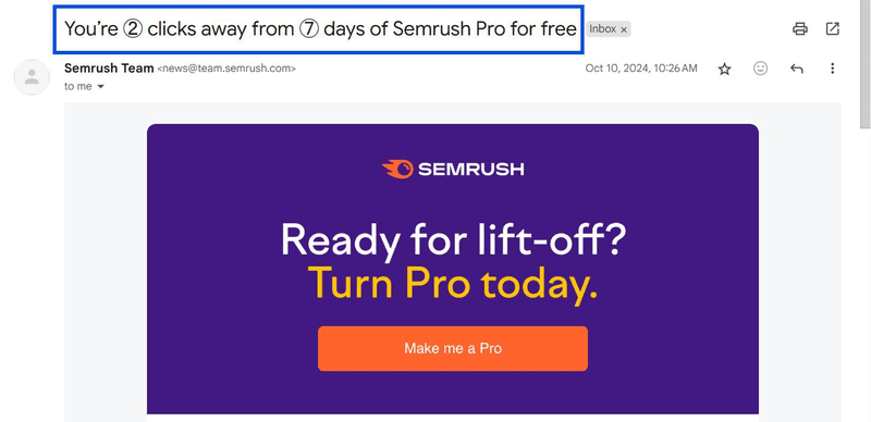
What I love:
- Semrush combines benefits and numbers, showing me the payoff clearly while making the next steps approachable.
- The subject line feels genuinely helpful because it shows me exactly what I’ll get and signals how easy it is.
4. Optimize layout and visuals for better accessibility
Mobile-first design isn’t a passing trend. According to Validity’s 2025 Email Deliverability Benchmark Report, mobile devices continue to dominate email opens, underscoring the critical need for responsive design.
That means if your onboarding emails aren’t designed responsively, your audience may struggle to read or interact with them.
But what does “optimized design” really look like? It comes down to four non-negotiable principles:
- Mobile-first, responsive layout: Text, buttons, and images should resize fluidly across devices, allowing users to easily scan and take action without needing to pinch or zoom.
- Clear hierarchy: Use headings, bold text, and concise copy to guide readers. Most users skim, so clarity beats cleverness.
- Accessible multimedia: Use visuals like GIFs, product screenshots, or short video clips to enhance clarity while keeping load times fast. Also, include alt text and high-contrast designs to make your content inclusive for all users.
- Whitespace and balance: Avoid cramming in too much text or imagery. The proper spacing provides content with breathing room, enhancing readability and comprehension.
Miro’s onboarding emails nail these principles. Their welcome email is lightweight, mirrors the look and feel of the Miro interface, and is designed to be consumed in seconds on mobile. The visuals do most of the talking, while a single CTA button “Start creating” makes the next step obvious.
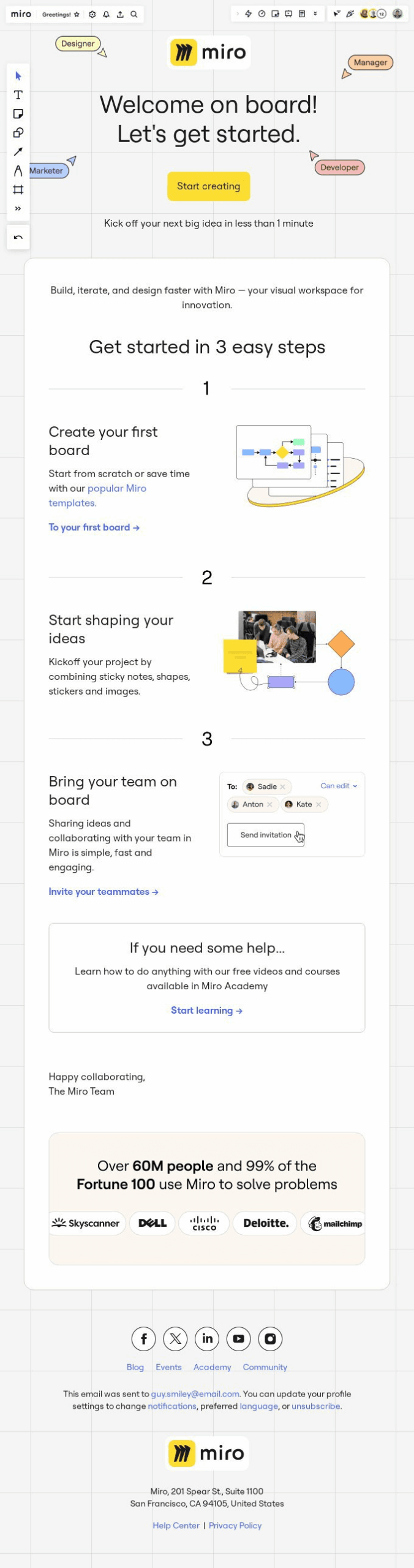
What I love:
- The zero-clutter design immediately drew me in to explore Miro.
- By focusing on a clean, product-like layout instead of heavy copy, the experience feels effortless and engaging.
- In addition to all that, it includes social proof, making it one of the best onboarding email examples I’ve seen.
💡Pro tip: Save your best-performing emails as templates so you don’t have to start from scratch each time + your marketing team can save hours on content creation.
5. Integrate emails with in-app messaging
Onboarding emails are most effective when they complement your in-app experience. If users see an email about a feature they’ve already activated inside the app, it creates confusion and friction.
So, use your emails to reinforce in-app actions, guide users back into the product, and encourage them to complete unfinished tasks.
There are three ways to align the two channels:
- Reference in-app tooltips or guides: For example, if your product tour introduces a key feature, your follow-up email can remind users where to find it and what to do next.
- Drive users back to empty states: An email can highlight the value of filling out an empty dashboard, linking directly to that screen so they can take action.
- Trigger based on in-app behavior: If a user dismisses an in-app prompt, an email can follow up later with additional context, examples, or encouragement.
-
Grammarly does this well. When users miss their weekly goals, they receive a re-engagement email prompting them to “Sign In.” It references the user’s writing streak and badge.
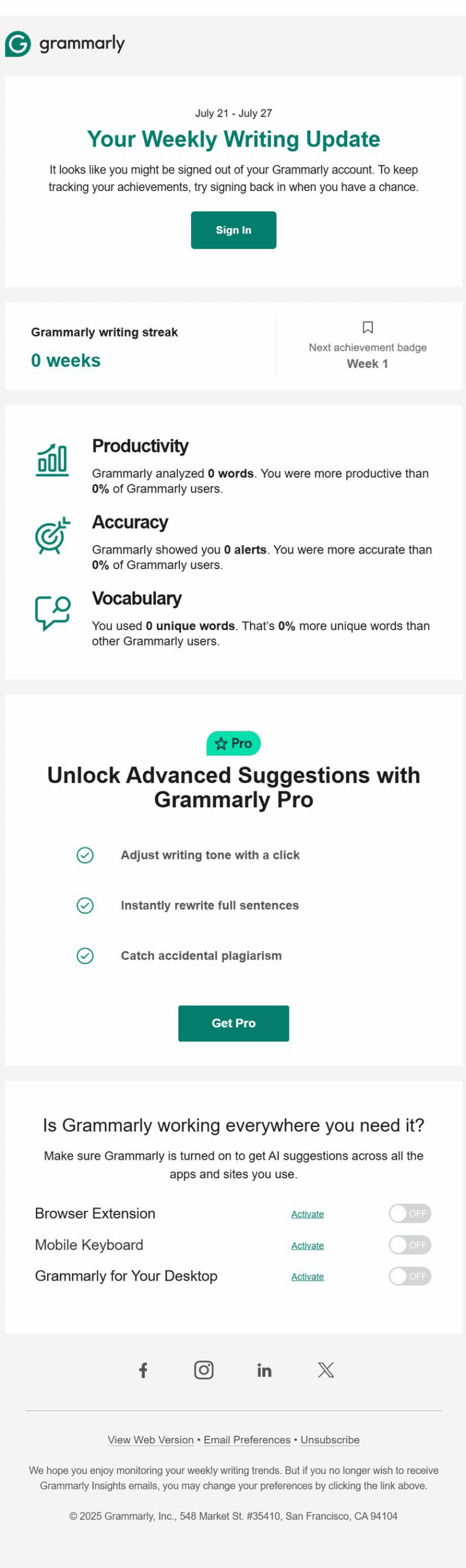
What I love:
- The email doesn’t rehash the product tour.
- The CTA linked directly back to my unfinished tasks, making the transition from inbox to app feel seamless and purposeful.
6. Proactively address common FAQs and roadblocks
New users often encounter the same hurdles, like trouble connecting integrations, confusion about billing, or uncertainty about next steps. If you wait for them to raise tickets, you risk churn before they ever get value.
Instead, anticipate these friction points and provide solutions before frustration sets in. Here’s how you can design emails that do this well:
- Mine support data: Review standard help desk tickets or feedback from product tours to identify where users typically stall.
- Bundle FAQs into bite-sized tips: Instead of lengthy manuals, send focused emails that tackle one specific question at a time.
- Embed helpful resources: Link to your knowledge base, video walkthroughs, or even a dedicated “Getting Started” guide.
- Offer easy access to the support team: Adding a direct contact or chat link reduces hesitation when users are stuck.
-
Google Workspace excels in this area with its welcome email. Instead of just saying “Welcome,” they preemptively answer common questions. Each FAQ comes with a summary and a clear CTA, so users can immediately apply what they’ve learned.
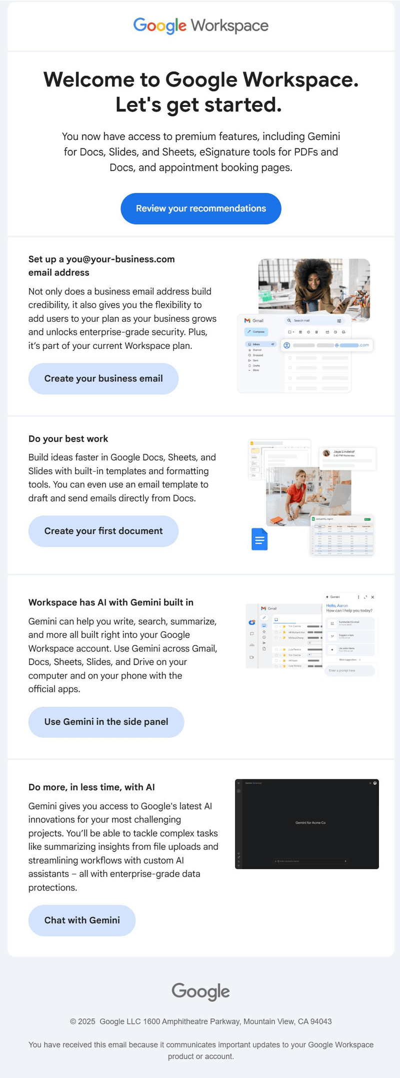
What I love:
- The email anticipated my exact questions and paired each with an actionable next step.
- The whole email feels like a personalized starter guide just for me.
7. Optimize your call to action
Your call to action (CTA) is the most critical part of your onboarding email. If it’s vague or buried, users won’t know what to do next.
A strong CTA should:
- Be concise and action-oriented: Use clear language that tells users exactly what to do, e.g., “Invite your team” instead of vague phrases like “Get started with collaboration,” which may feel unclear or non-urgent.
- Focus on one explicit action at a time.
- Stand out visually: Use contrast and whitespace so the CTA is immediately noticeable.
-
PartnerStack does this brilliantly in their onboarding email sequence. Their CTA says “Join for free.” It’s concise, value-driven, and communicates what will happen when users click.
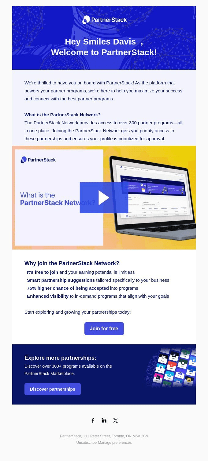
What I love:
- The CTA left zero guesswork. It told me what I’d get, where it would take me, and why I should act now.
8. Test, track, and tweak
Onboarding emails aren’t “one-and-done.” A set-it-and-forget-it approach will fail because user needs, product features, and even market conditions evolve constantly.
Furthermore, an email that drives clicks today might underperform tomorrow if users expect different guidance or if your product flow changes. That’s why continuous experimentation is critical.
Track how users interact with each email and optimize your campaigns with data-driven insights. For example, you can:
- Measure which CTAs drive clicks.
- Compare subject lines to see which boosts open and click-through rates.
- Monitor where engagement drops off within the sequence.
- Run A/B tests for timing, tone, visuals, and structure.
-
Even minor tweaks, like changing a CTA from “Get started” to “Connect your calendar,” can have a measurable impact.
Invest in onboarding for lasting customer loyalty
Onboarding emails guide trialists to experience real value quickly and effortlessly, helping them become loyal customers.
By combining hyper-personalization, timely cadence, benefit-driven subject lines, accessible design, in-app integration, proactive FAQs, and clear CTAs, you create a seamless path from sign-up to long-term adoption.
The secret to a smooth onboarding experience? Continuous testing, tracking, and optimization.
And with Userpilot, you can do all this without writing a single line of code.
FAQ
What is an onboarding email thread?
An onboarding email thread is a series of connected emails guiding new customers through your product. Each email focuses on specific actions or value points, helping users engage gradually while reducing confusion and boosting adoption.
What is the email onboarding sequence?
An email onboarding sequence is the structured, timed rollout of emails sent to a user after they sign up. It introduces features, provides tips, addresses FAQs, and encourages key actions, ensuring users reach milestones efficiently and experience value quickly.
Are onboarding emails transactional?
Not usually. Onboarding emails are primarily educational and engagement-focused, rather than confirming a purchase or account change. They aim to guide users, highlight product immediate value, and drive activation, rather than serve transactional purposes.
About the author