6 Tooltip Best Practices To Remove Friction and Guide Users


Tooltip best practices sound simple until you’re watching a funnel die at a step nobody explained. When Userpilot’s email feature shipped, our data showed a sharp drop at domain verification, with some accounts stuck there for sixty days. That same afternoon, I built a targeting tooltip and a guided checklist inside our in-app support tools.
The drop-off started closing within the week, and it never touched engineering’s backlog.
That experience captures the value of a good tooltip: closing a small gap between a user hitting friction and understanding what to do next, without changing the underlying product UI.
Getting there means knowing when a tooltip is the right pattern, how to keep it accessible and unobtrusive, when to trigger it, what changes on mobile, and how to tell whether a tooltip helped users move forward.
Executive summary
These are the six practices I rely on to decide whether a tooltip helps or gets in the way:
- Use tooltips only for small, supplemental gaps in understanding, saving multi-step workflows for a guided flow or checklist.
- Make tooltips dismissible, hoverable, persistent, and accessible through keyboard focus.
- Keep tooltip copy short, useful, and out of the way.
- Trigger tooltips from specific, observable user behavior.
- Give touch users an explicit way to access tooltip content without hover.
- Measure whether the tooltip helped users get past the friction it was meant to solve.
1. Use tooltips for small gaps in understanding, not whole workflows
A tooltip should carry one small piece of context a user is missing right now, small enough to read at a glance and specific enough to answer one question. Anything bigger, such as a multi-step process, means you’ve picked the wrong pattern before writing a word of copy.
Reserve tooltips for supplemental information. If users need information to complete the task, keep it visible in the interface instead of making them discover it through hover or focus. That includes required-field instructions and error messages, which are better handled directly in the UI than in a tooltip.
The downside becomes obvious when a tooltip tries to carry an entire workflow. Imagine connecting an integration that requires users to choose an account, authorize permissions, configure settings, and confirm the connection. Breaking that process into tooltip after tooltip forces users to follow guidance around the screen instead of helping them complete the task, and a guided flow or checklist fits that kind of sequence better.
Once you know the user only needs a short, supplemental explanation, the next question is which pattern fits:
| Pattern | Best for | Avoid when |
|---|---|---|
| Tooltip | A short explanation tied to one UI element | The user needs actions or several connected steps |
| Coach mark | Drawing attention to a feature or teaching one action | The information needs to remain continuously available |
| Popover | Richer contextual information or actions | A short explanation would do |
| Hover card | Previewing metadata or source context | The same information isn’t available through a touch-accessible trigger |
We make a similar distinction in Userpilot: our Native Tooltips and Hotspots both live under Spotlights, with Native Tooltips providing contextual help on hover or click while Hotspots draw attention to new features or a specific element. When users need step-by-step guidance through a task, we use Flows, which can combine tooltips with modals, slideouts, and driven actions.
2. Make every tooltip usable for everyone
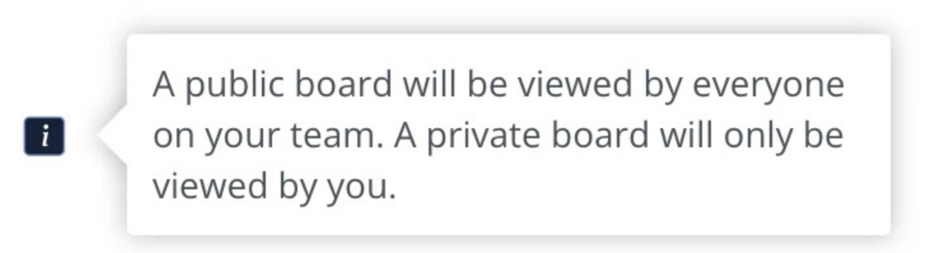
A tooltip should never make the interface harder to use than it was before you added it. Content triggered by a hover or focus can create several accessibility problems:
- People using screen magnification can have important page content obscured by an unexpected tooltip.
- Users with limited pointer control can trigger additional content accidentally or struggle to move the pointer without making it disappear.
- Anyone who needs more time to read or process content can lose access if the tooltip disappears as soon as hover or focus moves.
To avoid these issues, follow these three requirements for content that appears on hover or keyboard focus:
| Requirement | What it means in practice |
|---|---|
| Dismissible | Users can remove the tooltip without moving their pointer or keyboard focus away |
| Hoverable | Users can move the pointer onto the tooltip itself without it disappearing |
| Persistent | It stays visible until hover or focus leaves, the user dismisses it, or the information is no longer valid |
Those requirements describe the accessibility outcome. The ARIA Authoring Practices tooltip pattern adds practical guidance for implementing it:
- Keyboard focus should reveal the tooltip just as hover does.
- Focus stays on the element that triggered it.
- Assistive technologies can access the tooltip as a description of the element that triggered it.
- Users can dismiss the tooltip with the Escape key.
Once the tooltip is visible, normal-size text should also meet WCAG’s minimum 4.5:1 contrast ratio against its background, which matters most for readers with visual impairments or low vision. This requirement is about readability, since contrast makes the content legible but doesn’t guarantee that users will pay attention to it.

3. Keep tooltips short, relevant, and out of the way
Once a tooltip is accessible, the next failure mode is noise. That might be text that runs too long, copy that repeats the label sitting right next to it, or a box that adds more UI without adding more clarity. To keep your tooltip from becoming the friction it’s supposed to remove:
- Keep the copy short enough to read at a glance.
- Avoid repeating anything the nearby label already says.
- Use tooltips only when they earn their place.
- Use tooltips consistently.
- Don’t stack several tooltips on screen at once.
- Make sure your tooltips don’t cover or block elements the user needs to see or interact with.
- Leave enough white space to keep the content within the tooltip readable.
- Use an arrow when it’s not otherwise clear what the tooltip applies to.
For example, a button labeled “Add new line” doesn’t need a tooltip that also says “Click here to add a new line.” That adds another UI element without adding any new information. Remember that tooltips can interrupt the user, so use them sparingly unless they add clear value to the task the user is trying to complete.
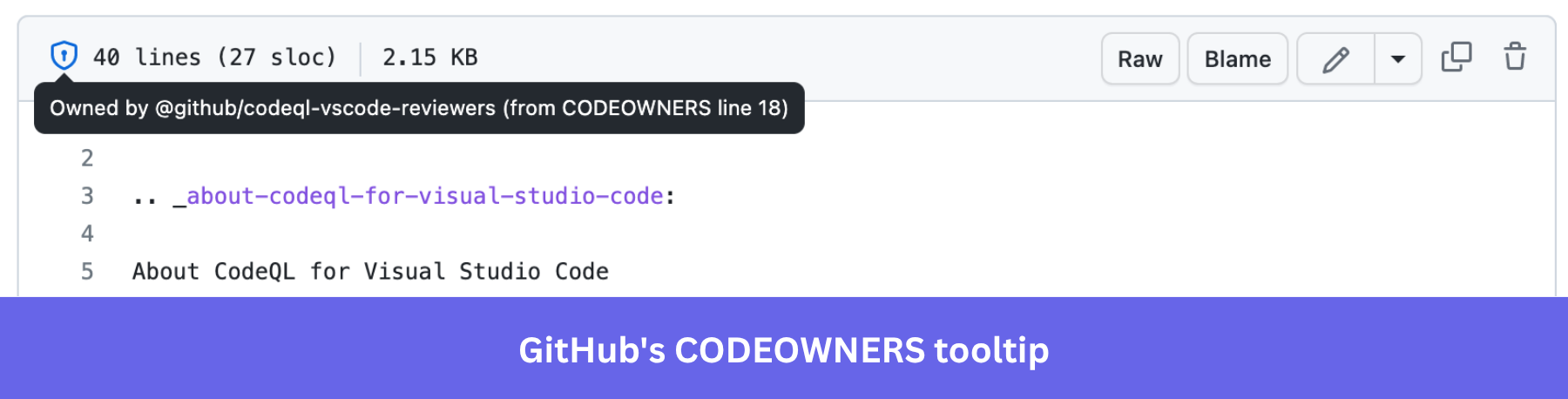
Example: GitHub CODEOWNERS
GitHub lets repository teams assign responsibility for specific files through a CODEOWNERS file. When you hover over the shield icon beside a file, GitHub shows who owns it and which CODEOWNERS rule assigned them. It’s a strong example of supplemental context: you don’t need the tooltip to read the file, but it answers one specific question without cluttering the interface.
For a longer gallery of real tooltip screenshots across more SaaS products, our tooltip examples roundup covers a dozen more.
4. Show help when users are most likely to need it
Trigger tooltips from specific, observable events based on how a user interacts with your product, such as when they:
- Repeatedly hit a tracked validation error.
- Open an unfamiliar feature for the first time.
- Reach a tracked state associated with friction.
Don’t infer confusion from a pause or hover alone. Treat dwell time and rage clicks as candidate signals to investigate, not proof that a tooltip is the fix.
| Weak trigger | Better trigger |
|---|---|
| Five seconds after page load | User opens an unfamiliar feature for the first time |
| Every user sees the same prompt | Only eligible or relevant segments see it |
| User paused for three seconds | A tracked error or failed action repeats |
| Generic “Did you know?” message | Guidance tied to the next task they’re trying to complete |
Userpilot lets you easily use all of these trigger conditions to ensure your tooltips come at just the right moment. That might mean only triggering them when a user is in a specific segment, has a low NPS score, etc. Triggers can be instant or be delayed by minutes or even weeks. That precision keeps the guidance in front of the users who need it instead of everyone who happens to be logged in.
A short, informative message such as “Recommended because you imported Salesforce data” can work in a tooltip tied to the active element that triggered it. Additional explanation belongs in a popover, resource center, or documentation. Google’s People + AI Research (PAIR) recommends tying AI explanations to user actions and using partial explanations or progressive disclosure, rather than trying to explain the entire system at once.
Consent, the consequences of a destructive action, and other critical information about an AI feature’s limitations should stay in your product’s main UI rather than depend on a tooltip. If users need the information to make a consequential decision, make it directly available and don’t hide it behind a transient or discoverable interaction.
5. Make tooltip content accessible on touch devices
Touch devices don’t have a reliable hover state, so give mobile users a visible tap target, info icon, or inline alternative for accessing tooltip content. If the only way to reveal a tooltip is by hovering over a UI element, users on mobile devices or tablets may never discover it. Touch interfaces don’t provide the same hover interaction as a mouse pointer on desktop computers, so a desktop-only trigger doesn’t automatically translate.
That doesn’t mean tooltip-like help can’t work on touch. Don’t treat hover as the default discovery mechanism or assume touch inherits it automatically. If the information matters on mobile, give users a visible, touch-operable way to access it.
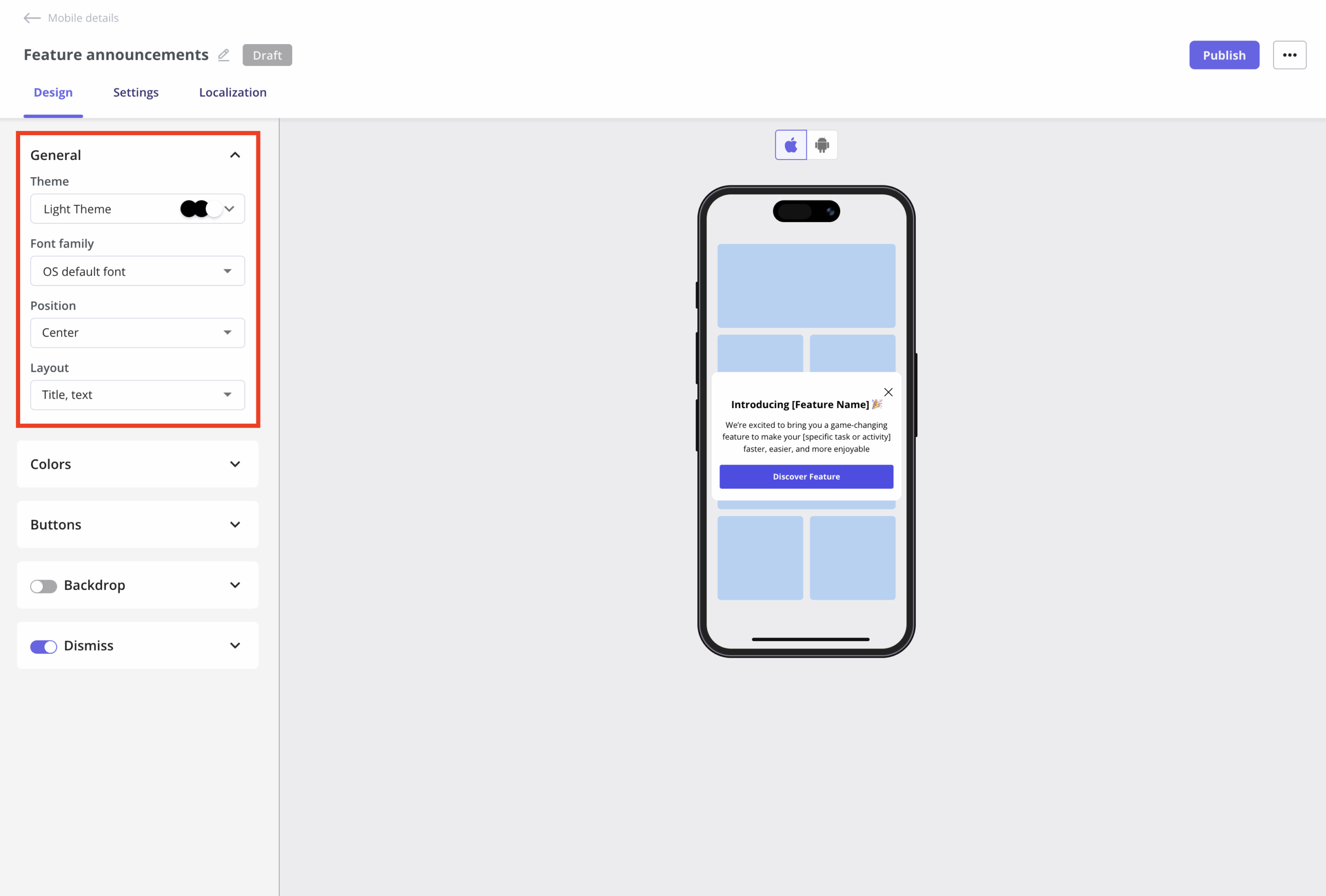
When the message needs more room than a tap-triggered tooltip can comfortably provide, switch to a mobile pattern built for richer guidance. In Userpilot, a Mobile Slideout gives you a single-step overlay for contextual tips, feature announcements, or prompts without taking over the whole screen, while a Carousel suits multi-step onboarding or guided tours.
6. Check whether the tooltip helped users reach the next valuable action
Exposure and engagement can tell you whether users encountered the guidance, but they don’t tell you whether the underlying friction changed. Focus on the downstream behavior instead: did more users complete the step, and did fewer return to the same friction point?
For example, if a tooltip explains a setup step, compare completion at that step before and after you introduce the guidance. If users still abandon at the same point, the tooltip may be answering the wrong question or the underlying problem may need a different fix.
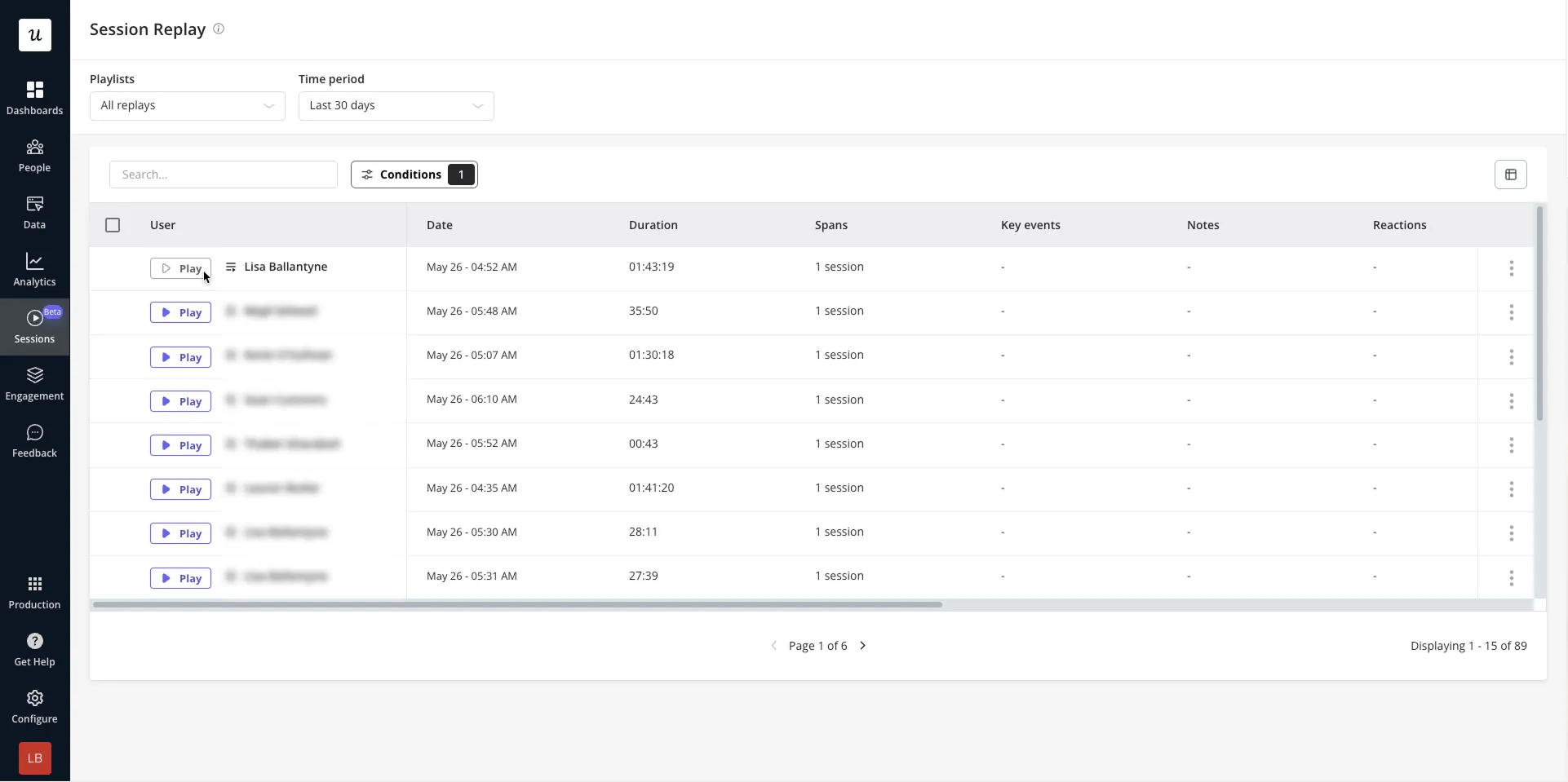
Userpilot’s session replay helps you investigate that friction in context. You can filter recordings by user or company attributes, segments, dates, and event activity to find sessions where users encountered the relevant step and inspect what happened around it. That helps you see whether users retried an action, hit an error, navigated away, or took an unexpected path instead of treating a pause or hover as proof of confusion.
You don’t need a universal tooltip benchmark to judge whether the intervention worked. Results from another product don’t tell you what success should look like in yours. Compare the before-and-after behavior at the specific friction point you set out to improve and measure the change in your own funnel.
Where tooltips fit in SaaS products
One of the major takeaways from these tooltip best practices and examples is that you need to find the right time and use case for them. In the products I’ve worked on, tooltips show up across a handful of recurring moments:
| Use case | What the tooltip does |
|---|---|
| Onboarding | Explains an unfamiliar element at the moment users encounter it |
| Feature discovery | Draws attention to a relevant feature users may overlook |
| In-app support | Provides contextual clarification without sending users to documentation |
| Contextual upgrade guidance | Explains why an unavailable feature is restricted when a relevant user encounters it |
From friction to value: Putting the principles into practice
The big takeaway here is that finding the friction is only half the job. Getting the most out of tooltip best practices requires getting the right guidance in front of the users who need it. Then, check whether it helped them move forward.
Userpilot brings all of those steps into the same workflow. Product analytics and session replay help you identify where users get stuck. Meanwhile, segmentation and event-based targeting let you narrow the intervention to the people experiencing that friction.
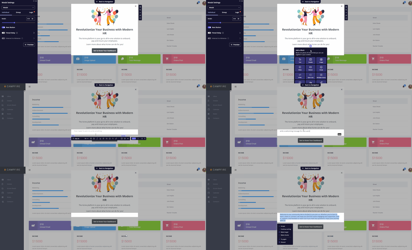
Once you know where to intervene, you can build Native Tooltips or guided flows without writing code. You can also use our AI writing assistant to refine the tooltip copy. Then, validate the experience through testing and downstream product behavior rather than treating exposure as success.
If your product has a similar gap between what users need to know and what the interface currently tells them, book a demo to see how Userpilot can help you close it.
FAQ
What should be in a tooltip?
A tooltip should carry one piece of supplemental information or brief, actionable advice tied to a specific element, such as a short explanation, definition, or hint about what an icon does. It shouldn’t be the only place users can find information they need to complete a task. Keep that information visible in the interface.
What is the best tooltip position?
Position tooltips close to the element they explain without covering that element or the next control the user needs. Test them across screen sizes so they never get cut off. It’ll help users move the pointer between the trigger and tooltip without losing content.
Should tooltips be triggered by hover or click?
On desktop, a tooltip that appears on hover should also be available through keyboard focus. Hover alone isn’t enough for keyboard users. On touch devices, provide an explicit tap-accessible way to reach the same help instead of relying on hover.
What's the difference between a tooltip and a coach mark or popover?
A tooltip gives a short, non-interactive explanation of one element and appears on hover or keyboard focus. Coach marks draw attention to a feature or help teach an action, often as part of onboarding. Popovers can hold richer content and interactive elements such as buttons or links, which makes them a better fit when users need to do more than read a brief explanation.
About the author