SaaS UX Design in 2026: Why the Classic Playbook is Breaking


For the first generation of software as a service, the standard SaaS UX design playbook produced results. It worked because most SaaS products were simpler, users tolerated learning curves that matched the value they expected, and the pace of feature shipping was slow enough that design teams could absorb the complexity before the next release landed.
None of that holds in 2026. AI has accelerated feature delivery to a pace that design systems can’t keep up with. SaaS companies in enterprise have stacked tools on top of tools until no single team controls the user experience, and dark UX patterns have quietly corroded the baseline trust users bring to any new piece of software they try for the first time.
Ask any product designer operating in the SaaS space, and you’ll hear the same uncomfortable diagnosis. What passed for good SaaS UX three years ago may now be actively making products worse to use.
In this article, I’ll talk about where the model is breaking. and how to design better products within the new ruleset.

Onboarding has become the biggest UX battleground
The standard user onboarding model (a product tour, a setup checklist, tooltips at key moments, maybe an email sequence) is practically broken in 2026. The reason is that it takes too much time for the users before they can reach any value.
I found this take on a Reddit post that conveys exactly what I had in mind: “The biggest time to value killer is asking people to configure stuff before they see any value. Best products I’ve used show me something impressive with zero input, then let me customize after I’m already hooked.”
The well-intentioned onboarding checklist, designed to build momentum and reduce drop-off, in many products has become the thing users have to survive before they reach value.
The point of simplifying onboarding is to lead users to a quick win aligned with their user goals, rather than aligned with the product’s full feature list. A well-designed onboarding process will minimize friction, accelerate time-to-value, and connect users to early, meaningful achievements. What’s changed is the expectation that users now read every extra setup step as a sign that the product hasn’t done its own work yet. They expect that basic functionalities will be ready out of the box for them.
From instruction-based to inference-based onboarding
What the most interesting onboarding flows in 2026 have in common is that they’ve stopped asking upfront. Wes Bush, founder of ProductLed, documented this pattern after signing up for 100 SaaS products. The products that felt lightweight inferred context from the user’s URL, existing data, and behavioral signals, instead of running a questionnaire upfront. The setup happened without the user feeling like they were doing heavy labor.
With AI, it’s getting easy to implement inference-based onboarding. Instead of asking users what kind of account they want to configure, the product reads what the user does in the first session and adapts around that behavior. Better yet, you can make the onboarding fully customized by letting the user ask the chatbots for help.
Progressive disclosure is the design pattern that makes this possible by allowing users to encounter complexity when they need it. For onboarding, it involves gradually revealing information and features as users move through the product, with concise instructions at each step. It helps lower the learning curve and enhances the onboarding experience. This design approach shouldn’t be confined to the first session, because it’s also the right architecture for the full product lifecycle, revealing advanced features as users demonstrate readiness for them.
The empty state problem
A specific friction point that comes up repeatedly in design discussions is the empty dashboard, which is the experience a new user gets when they arrive and see nothing. There’s no signal that the product can solve their problem, just the anxiety of a blank interface. That experience disproportionately affects the users most likely to churn, because they’re already uncertain whether the product is worth the setup investment.
The teams are getting this right by designing empty states as demonstrations, not placeholders. The goal is to answer the question the user is asking when they arrive, see nothing, and think to themselves, “Is this product even going to solve my problem?“
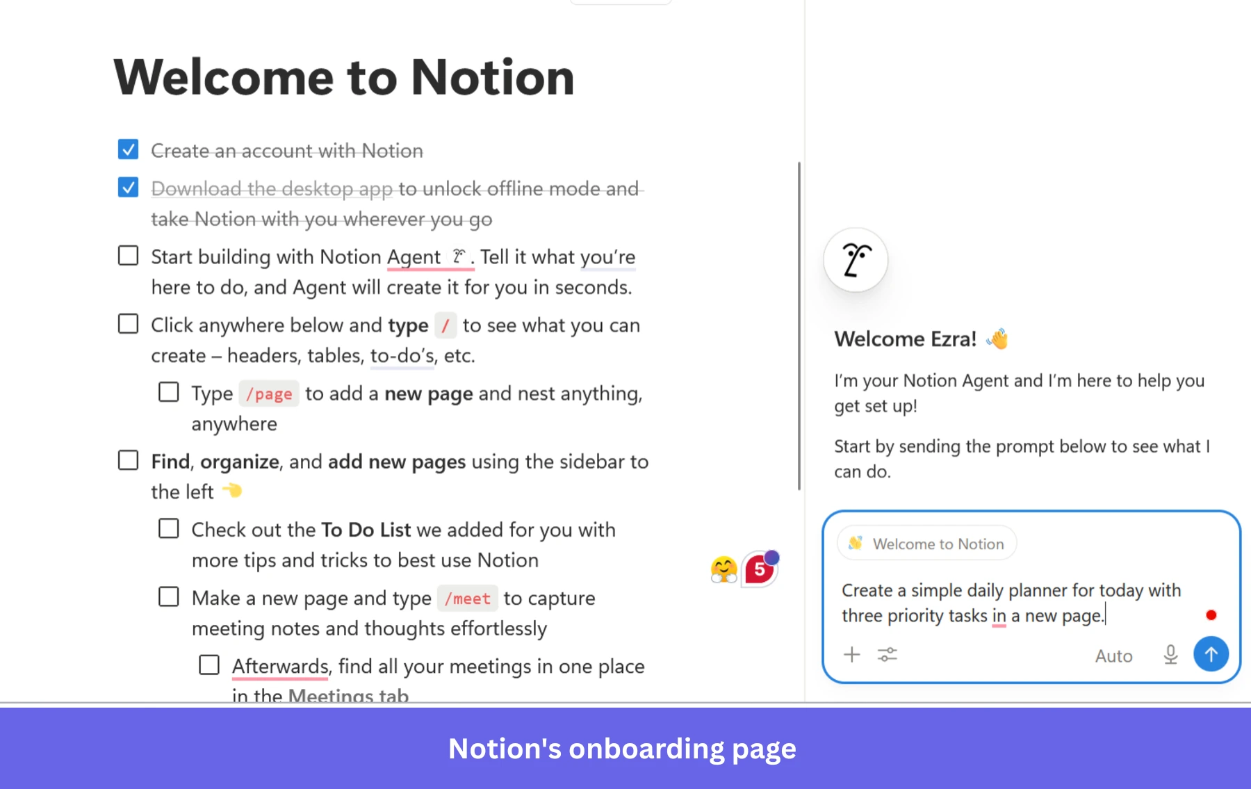
Notion does this with its template gallery on new workspaces. Rather than confronting a new user with an empty page, Notion immediately surfaces a populated example of the product working in the form of a project tracker with sample records, a meeting notes template with existing structure, and a roadmap with real-looking entries.
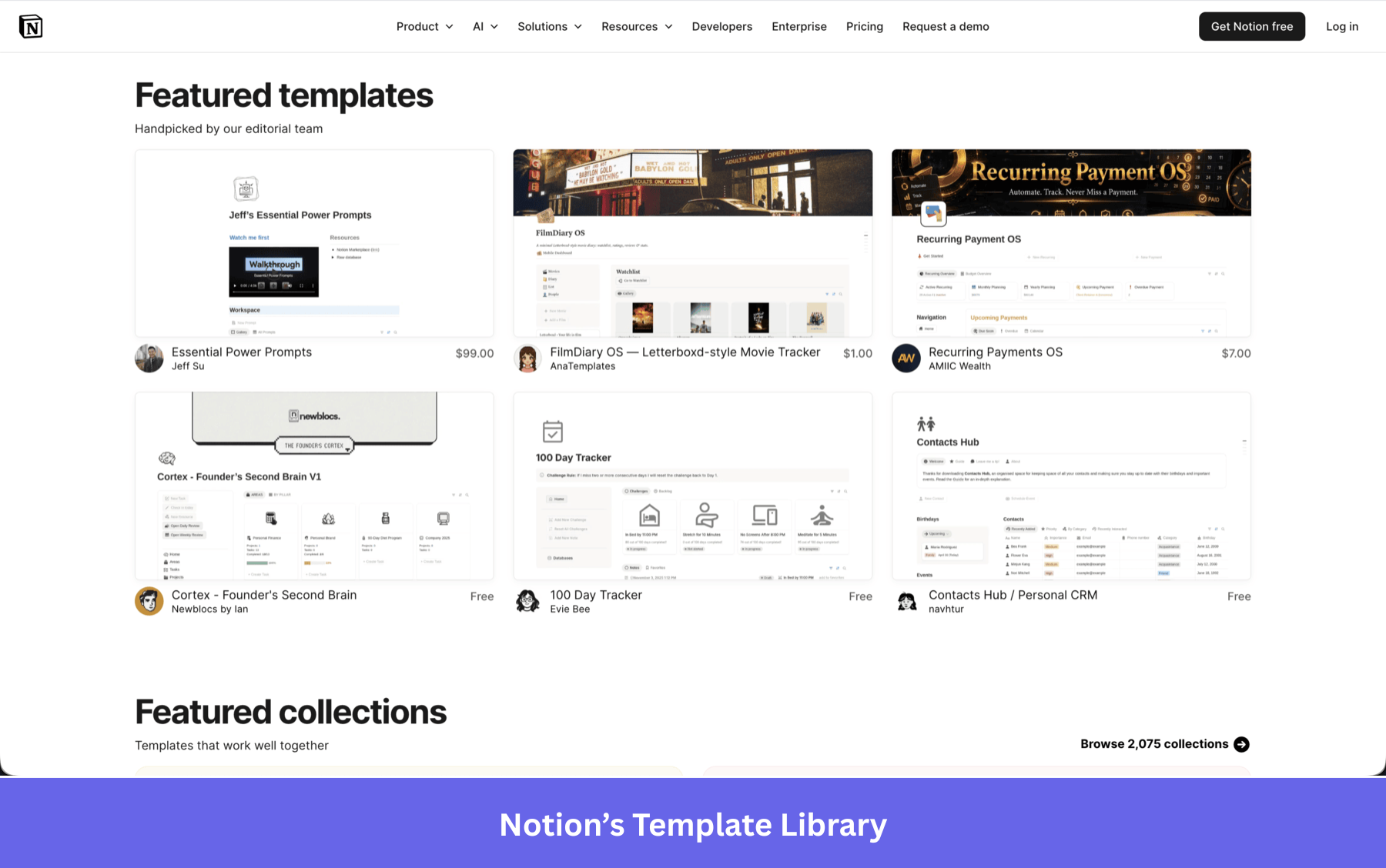
The user sees the product as it looks when it has data, before they’ve provided any. That single design decision changes the emotional experience from “I have to figure this out” to “I can see exactly where this goes.”
The principle isn’t unique to templates. Any empty state can serve this function if it’s designed around one clear next action tied to the user’s most likely goal, rather than a generic welcome message or a list of everything the product can do.
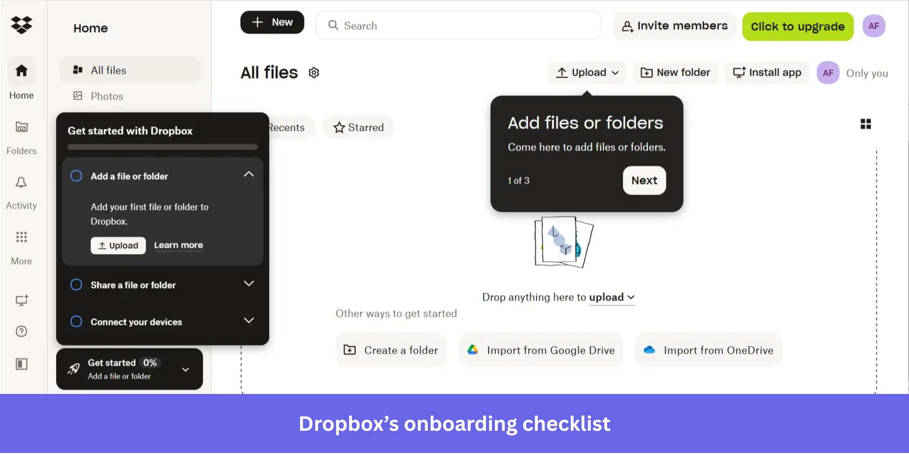
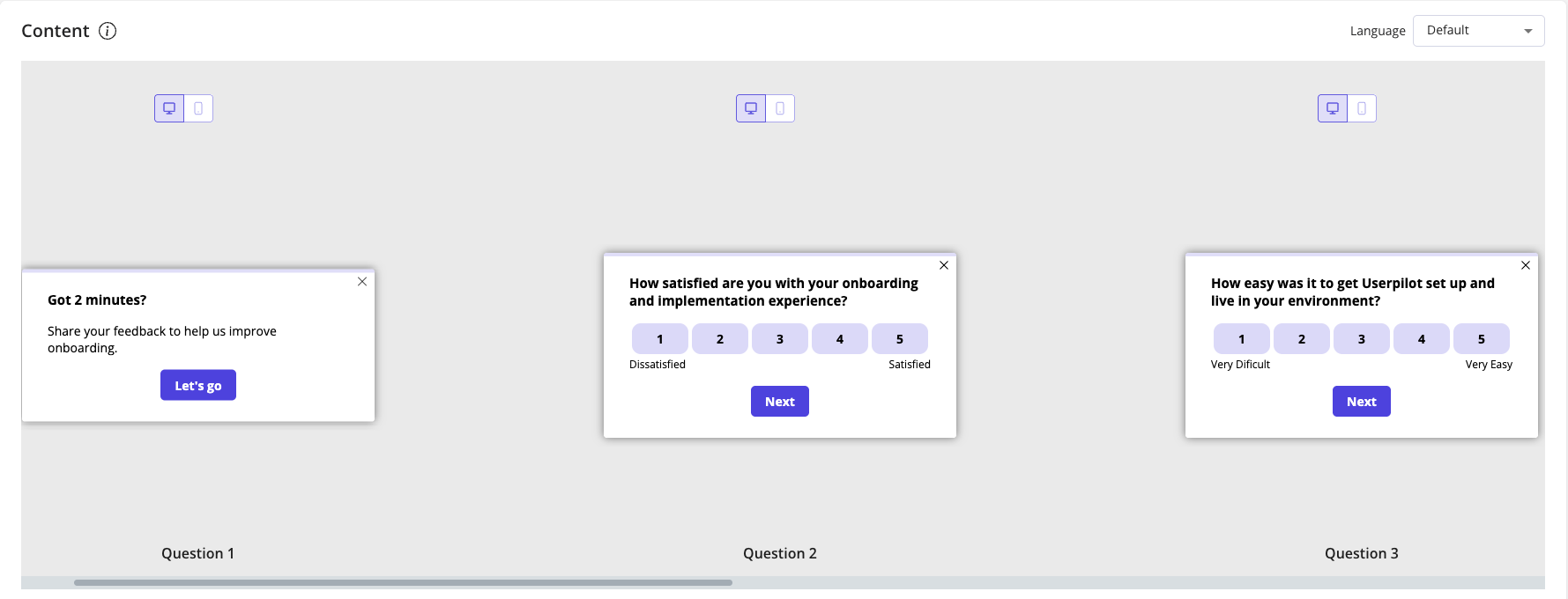
Checklists still work, with the right constraint
I’d push back on any narrative that says checklists are dead as a design pattern. Onboarding checklists work when they’re scoped to the user’s actual goal, not to everything the product can do.
Progress bars within checklists give users a clear sense of forward momentum. Onboarding checklists remove the guesswork from getting started by guiding users through clear, step-by-step actions that build momentum and reduce drop-off.
The constraint that makes checklists effective in 2026 is ruthless scoping. Every item should connect directly to the user’s first meaningful outcome, and each step should give clear and concise instructions rather than sending users to a separate help doc. Interactive walkthroughs that do this well share one characteristic: they end when the user has experienced value, not when the product has finished explaining itself. The product exists for the user’s goal, not the other way around.
Feature bloat is not a growth signal
For a long time, “we have more features than our competitors” was a legitimate sales argument. In product communities in 2026, it’s increasingly a warning sign. The pattern I keep seeing discussed is.
A SaaS product starts simple, gets traction, adds enterprise features for larger customers, and five years later has multiple user modes, advanced customization panels, loyalty systems, deep integrations, and a settings page that nobody fully understands, including the people who built it.
The result is that cognitive load becomes the primary experience of using the product, ahead of any specific task the user came to do.
A product that solves one use case with genuine elegance now reads as more sophisticated than a product that shows you everything it can do on first login.
A well-structured information architecture is what makes this work in practice. Organizing content, features, menus, and navigation so they’re easy to find and use is essential, and good information architecture goes well beyond clean menus. It also considers user roles, permissions, and logical grouping so the right user sees the right things at the right time, rather than confronting the full complexity of a product built for many different use cases at once.
I try to bring one question into roadmap conversations that I’ve found focuses the decision well. Does adding this feature clarify the product for the user who’s trying to accomplish their primary goal, or does it add a new job they didn’t ask for? Designing for specific user jobs, surfacing key features at the right moment, and keeping the interface clean are what distinguish SaaS applications that earn user trust from those that demand user patience.
Enterprise UX is collapsing under system fragmentation
Most writing about SaaS UX assumes you’re talking about a product that the design team fully controls. Enterprise SaaS blows that assumption apart quickly. Enterprise designers describe their work as designing around vendor-imposed constraints rather than crafting end-to-end user experiences. Many report working inside ecosystems dominated by platforms such as Salesforce, ServiceNow, and Microsoft, where customization is limited, and experiences become fragmented.
Another described it as “systems held together with duct tape.” That description maps to a Salesforce, ServiceNow, and Microsoft stack that no single design decision can fix, because the real problem is the seams between the products, not the products themselves.
The practical problem is that procurement-driven interfaces, built to satisfy buying requirements rather than user needs, create patchwork experiences where the user has to switch mental models every time they cross a tool boundary. Enterprise designers repeatedly describe having no control over the core UX they’re trying to improve, because the systems they’re working inside were never designed to be a coherent experience. No amount of thoughtful in-product design fixes a broken transition from one system to another.
Modern SaaS UX is increasingly cross-tool, fragmented, API-driven, and workflow-dependent. SaaS users in enterprise environments switch between multiple systems on various devices throughout their day, and no single SaaS platform controls that experience end-to-end. And because of that, the challenge has shifted from “how do we make our screens better” to “how do we make the transitions between our product and everything around it coherent.”
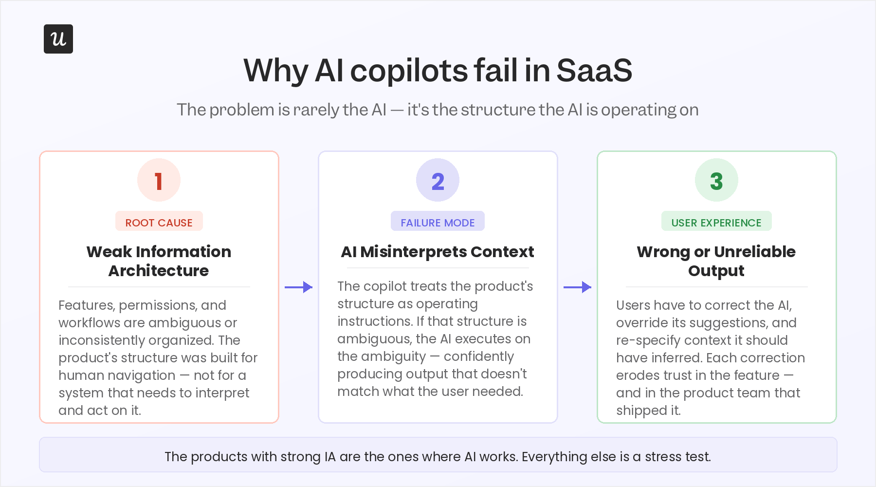
AI copilots are exposing a weak information architecture
When an AI copilot gets added to a SaaS product with messy underlying workflows, unclear permissions, or fragmented information architecture, the result is a copilot that confidently produces the wrong output.
The AI doesn’t know it’s operating in ambiguous territory, so it acts on whatever structure the product gives it, and if that structure is messy, the copilot’s behavior is either wrong or unpredictable at exactly the moments that matter.
I found research on AI personalization published in 2025 identifies preference alignment and contextual adaptability as the central problems in AI copilot UX, and both of those problems are downstream of information architecture, not AI capability.
The paper frames personalization as “a critical factor for improving usability, effectiveness, and user satisfaction” in AI copilots – which means products failing at AI aren’t failing because the AI is bad. They’re failing because their underlying structure was never built to be legible to a system that needs to interpret and act on it.
If the product can’t tell the AI what context the user is in, the AI can’t adapt to it. The app’s structure becomes the AI’s operating instructions. If that structure is ambiguous, the AI executes on the ambiguity. When real users try to accomplish tasks through a copilot that doesn’t have a clean underlying structure to work from, the experience breaks in ways that feel personal, even though the problem is architectural.
AI as an unintentional UX stress test
The practical implication is that adding a copilot to your product is one of the fastest ways to find out whether your information architecture is sound. If the AI can navigate your product and accomplish specific tasks without any confusion, it means you passed the test.
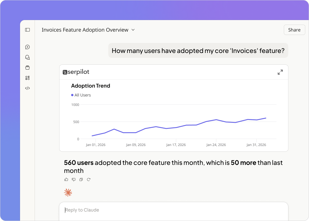
At Userpilot, we use session replay to watch how users interact with in-product AI suggestions because the sessions reveal whether users trust the output, whether they’re reading suggestions carefully or skimming past them, and whether the context the AI was given actually matched what the user needed.
That observational layer is becoming essential as copilots ship into products that weren’t designed with conversational interaction in mind.
What good AI UX design actually requires
The teams designing AI copilots well in 2026 are building two things simultaneously:
- A clean product experience for human users, and a legible data structure that the AI can reason over. These aren’t the same project, but they can’t be separated.
- A product with clear, well-defined task flows, explicit permissions, and a coherent information architecture is also a product where AI can do useful work.
The design debt that was tolerable when humans navigated around it becomes intolerable when an AI system tries to execute on it programmatically. Understanding user behavior at a structural level – not just tracking events, but modeling what users are trying to accomplish and how the product is organized to support that – is what makes AI integration work. That’s the real design challenge of 2026, and most design teams aren’t framing it that way yet.
Dark UX patterns are becoming a reputational risk
The design community has been aware of dark patterns for years. What’s changed in 2026 is the professional cost for designers who implement them and the reputational cost for products that rely on them. Some specific patterns showing up in UX design discussions are ones that most B2B SaaS products have shipped in some form.
Fake urgency, hard-to-dismiss modals, notifications timed to exploit habit loops, permission requests placed before any trust has been established, and AI-generated suggestions that steer users toward upgrades rather than toward the right answer for their actual goal.
Across the industry, the direction is shifting from conversion-first UX toward trust-preserving UX. Keeping users engaged through genuine value is what builds brand loyalty over time.
User feedback reveals this distinction over time. Products that use dark patterns to improve short-term metrics tend to see the damage show up in later data.
- In support tickets from users who feel confused or deceived.
- Lower NPS scores, in churn concentrated among users who felt coerced rather than served.
- In word-of-mouth that suppresses trial rates among new users who’ve heard about the experience secondhand.
The designs that look like wins in a quarterly review sometimes read differently in retention data six months later.
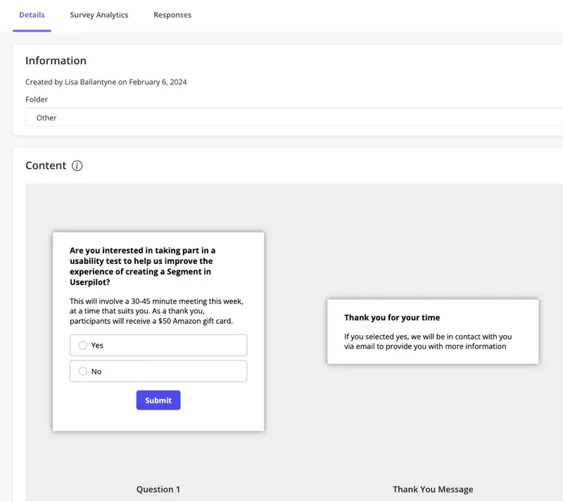
You can collect feedback through in-app surveys at friction moments, through session data that reveals hesitation before specific UI interactions, and through user interviews that ask users what made the product feel trustworthy or what made them feel pushed rather than helped. The signals are there if teams decide to look for them.
Personalization is now expected out of the box
There was a period when role-adaptive interfaces were a genuine differentiator. A product that showed a sales rep a pipeline view and showed a marketing manager a campaign dashboard was doing something noteworthy. Building user-centered experiences requires accepting that a design treating all users identically will frustrate everyone.
Research in product marketing communities confirms what most design teams are already aware of. Users expect adaptive UX to be baseline product behavior, but not a premium feature. The expectation has shifted from “the product can be customized” to “the product configures itself around me.” Personalization and customization drive user engagement in genuinely different ways, and users increasingly want the former without having to do the work of the latter.
Personalization and customization are not the same thing
Customization means giving users controls to configure the product themselves. For example, drag-and-drop dashboards, notification preferences, filter presets, etc. That’s still worth building, but personalization is different.
It’s the product making inferences from behavior and adjusting the experience automatically, without requiring any configuration work from the user.
UX research that captures behavioral signals over time, not just a role selection at signup, is what makes genuine personalization possible.
The modern dashboard should highlight anomalies, trends, and next-best actions rather than just displaying raw data. That is a personalization decision presenting the most relevant signal for this user at this moment – not a data decision. The best SaaS teams are designing for this from the architecture level, not retrofitting it as a dashboard widget.
The UX metrics need to reflect the built-in inconsistency of AI products
The classic UX measurement toolkit (System Usability Scale, Net Promoter Score, task completion rate) was designed for deterministic products. A user clicks a button, something happens, and the outcome is consistent every time.
AI-powered products don’t work this way. Researchers are now questioning whether traditional UX metrics remain valid for AI-powered interfaces, according to a 2025 research paper examining measurement frameworks for AI systems. The concern is that these metrics were designed to measure consistency, and AI systems are inherently inconsistent. The same user performing the same action can get a different response depending on context, session history, and model state.
Usability testing is also showing the strain. Classic moderated sessions, where real users complete user testing tasks, work well when the interface is deterministic. When the interface generates different outputs based on AI state, the same task can feel smooth in one session and confusing in the next. But neither outcome fully represents what the product reliably delivers.
Most SaaS teams aren’t going to abandon NPS tomorrow, and they shouldn’t. The teams designing AI-heavy products are supplementing classic metrics with signals that capture quality, accuracy, and trust. Watch whether the user accepted the AI suggestion or overrode it, whether they hesitated before acting, and whether they later reversed an action the AI had recommended.
These behavioral signals are visible in session replay in ways that a post-task survey never reaches. Real-world examples from teams shipping AI-heavy products show that data-driven optimization using session recordings, heatmaps, and A/B testing needs to become a core part of the design process rather than an afterthought.
Because the interaction layer has grown significantly more complex. The teams getting ahead of this are building measurement frameworks that treat AI interaction as a separate layer from human interaction, because the design principles that govern each are genuinely different.
An honest position for most design teams right now is to acknowledge what they can measure well (funnel completion, retention, NPS trend) and what they can’t measure well yet (AI interaction quality, trust formation, the cumulative effect of probabilistic outputs on user confidence). Acknowledging the gap is more useful than pretending the old metrics still cover the new territory.
What the best design teams are doing differently in 2026
I’ve covered a lot of what’s breaking. The more useful question is what the teams getting this right are actually doing – not in theory, but in practice.
#1 They treat UX as a systems problem: The design teams navigating 2026 well aren’t asking, “How do we make this screen better?” They’re asking, “What is the user trying to accomplish across our product, our email communications, our integrations, and our AI interactions – and is the full path coherent?” That systems-level framing is where the highest-value design decisions live, and it requires designers to operate beyond their traditional scope.
#2 They use behavioral data to make design decisions: One example from our own product is that I watched session replays of users on the events analytics page and noticed that around 90% of sessions showed users scrolling straight past the event occurrence distribution chart to the table below. Our assumption had been that this chart wasn’t valuable, and the session data initially seemed to confirm it.
But 10% of sessions showed users hovering on the chart – which, at scale, is a meaningful cohort that we almost ignored. That session data stopped us from making a drastic call to remove the chart entirely, leading us instead to build a collapsible view that serves both user types. A decision like that doesn’t happen without session replay informing the design team directly, rather than filtering through a PM’s interpretation of the data.
#3 They design onboarding for the job the user came to do: Impala built personalized interactive walkthroughs for different user segments, routing users to different sections of the product based on their specific role. The result was a 100% increase in activation.
The key wasn’t a better product tour – it was showing each user only what was relevant to their actual job on day one, rather than walking everyone through the same generic flow.
#4 They collect user feedback at the moment of friction: In-app microsurveys triggered by behavior (appearing right after a user abandons a flow, completes a key action, or revisits a section they struggled with) capture qualitative data that a quarterly survey never reaches. User research improves fastest when it uses in-product behavioral signals to find the right participant at the right moment, rather than relying on email sequences that catch users when they’re no longer in the context that matters.
#5 They measure UX impact on customer retention, not just task completion: Reducing churn rates is one of the most significant outcomes of good SaaS UX design. A well-designed, intuitive UX minimizes user frustration, leading to higher customer satisfaction and loyalty, which directly reduces churn. The design teams with real discipline in 2026 are connecting their design decisions to retention data. They are tracking whether UX improvements in onboarding, information architecture, and in-app guidance translate to users still being active 30, 60, and 90 days later.
Prepare your UX design for the modern user and the agentic future
The SaaS products that will retain users in 2026 are the ones that treat UX as an ongoing systems problem rather than a launch deliverable.
If your team is trying to close the gap between where your UX is and where it needs to be, Userpilot’s onboarding and in-app engagement tools give you the infrastructure to find friction, fix it at the point of occurrence, and measure whether the fix worked. Book a demo to see how the design teams we work with are applying these patterns in 2026.
About the author