50 Sign-Up Page Design Examples to Inspire You


Sign-up page design directly impacts whether users take the first step into your product or abandon the flow. The most effective pages reduce friction, build trust, and guide users toward activation without unnecessary distractions.
Below, you’ll find 50 sign-up page design examples from leading SaaS companies that show how thoughtful design choices can improve conversions and set users up for successful onboarding.
What is a sign-up page?
A sign-up page is a registration page built to collect essential customer information like name or email address before they can use your product.
Such a page consists of a sign-up form and may include elements like:
- Single Sign On (SSO) buttons enabling users to sign-up with their existing accounts.
- Testimonials and customer logos providing social proof and reassurance to new users.
- Visual elements reinforcing company branding.
How can a sign-up page design improve conversion rates?
The sign-up page is as important as any other aspect of the user interface (if not more). A well-designed sign-up page can significantly improve conversions by reducing friction, inspiring user trust, and encouraging them to take action.
For example, SSO can improve conversions by 20-40% while a testimonial—by a third. And, signup forms with three fields convert the best, according to Omnisend.
The idea is to get new users into the product as quickly as possible to reduce time to value, and increase adoption.
Having said that, not all companies choose to create frictionless sign-up experiences. Many intentionally add friction, for example, by asking for credit card details to pre-qualify leads.
50 Sign-up page design examples to take inspiration from
We’ve divided these 50 examples into four categories so you can pick and choose what interests you the most. If you’re looking for a shorter, curated list of real-world registration page designs that convert, you can also explore our guide to sign-up page examples, which highlights high-performing layouts from leading SaaS companies.
Trust-building sign-up pages
Trust-building sign-up pages include essential elements like clear privacy policies, social proof through testimonials or user reviews, and recognizable security badges. These features help reassure potential users that their data is safe and that they are making a sound decision by signing up.
Here are my top picks:
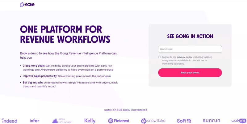
1. Gong: Slick, modern sign-up with a focus on user benefits
Gong’s entire page focuses on highlighting the product value.
The headlines present Gong as the ultimate sales platform, and the list of benefits clearly demonstrates how the platform can contribute to business success.
The bold “Book your demo” CTA button stands out, and the logos of prominent customers at the bottom build trust.
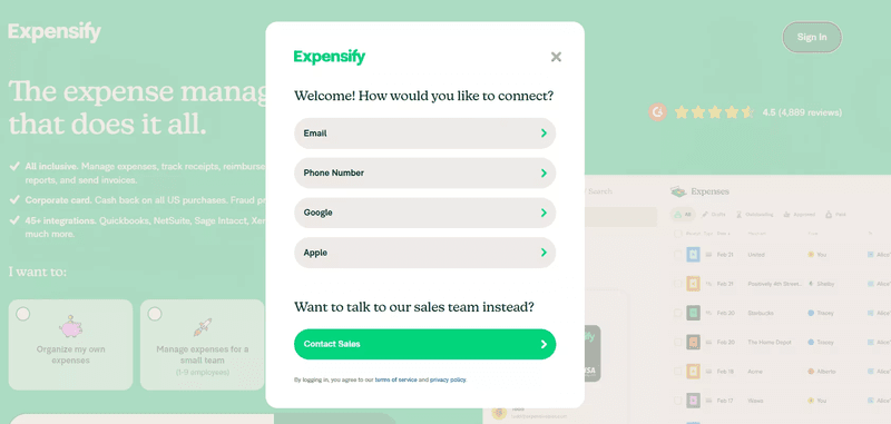
2. Expensify: Simple, user-friendly sign-up with minimal steps
This Expensify sign-up form allows users to choose between multiple sign-in methods—email, phone number, Google, or Apple—offering flexibility and convenience.
There’s also an option to contact sales for a more high-touch experience.
The prominent 4.5-star rating with thousands of reviews in the background reinforces trust and credibility.
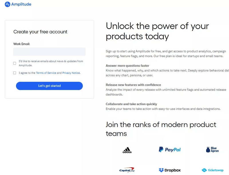
3. Amplitude: Straightforward sign-up with helpful onboarding tips
The right side of this sign-up page emphasizes the power of Amplitude’s product analytics by listing the benefits of using the platform.
Including the logos of trusted brands like PayPal and Dropbox lends credibility and compels users to join successful product teams.
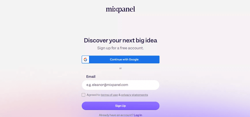
4. Mixpanel: Clean design with easy navigation and clear instructions
Mixpanel’s sign-up form keeps things simple by allowing quick access through Google or email, which enables users to quickly “discover their next big idea.”
The “sign-up for a free account” CTA button encourages users to take action and explore the product without risk.
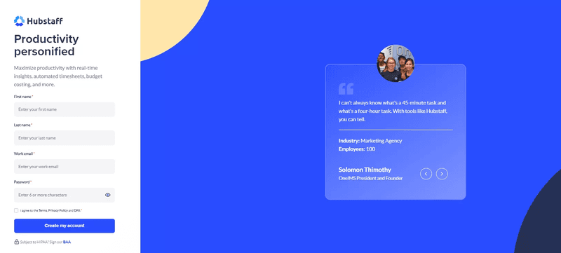
5. Hubstaff: Clean, clear, and efficient sign-up flow
The visual on the right side of Hubstaff’s sign-up page includes a customer testimonial highlighting how the tool enhances time management. Paired with the customer’s image, it builds trust and credibility.
This reinforces the message conveyed through the catchy headline—”Productivity personified”—and the subheading (“Maximize productivity…”).
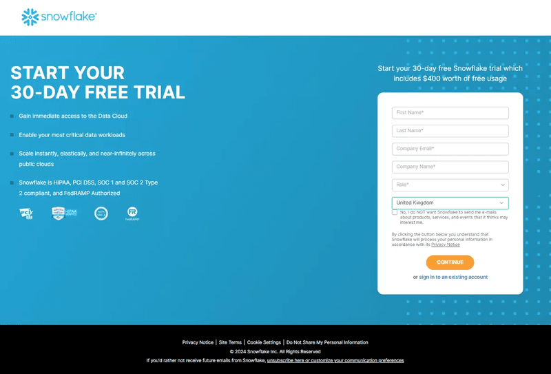
6. Snowflake: Modern, streamlined sign-up with clear instructions
The Snowflake page follows a clear and organized structure to guide users through their free trial sign-up.
On the left, you can find a list of Snowflake’s benefits and accreditation badges highlighting the product’s compliance with various standards.
On the right, the sign-up form requests basic information such as name, email, company, and role. The dropdown for selecting a country reduces the time needed to enter it manually.
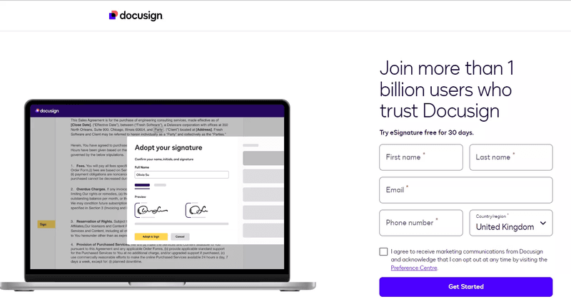
7. DocuSign: User-friendly, simple, and efficient sign-up design
This DocuSign sign-up page features a screenshot of the tool in action to demonstrate its value and intuitive design.
On the right, the headline “Join more than 1 billion users…” highlights its trustworthiness.
The form asks for the user’s name, email, phone number, and country.
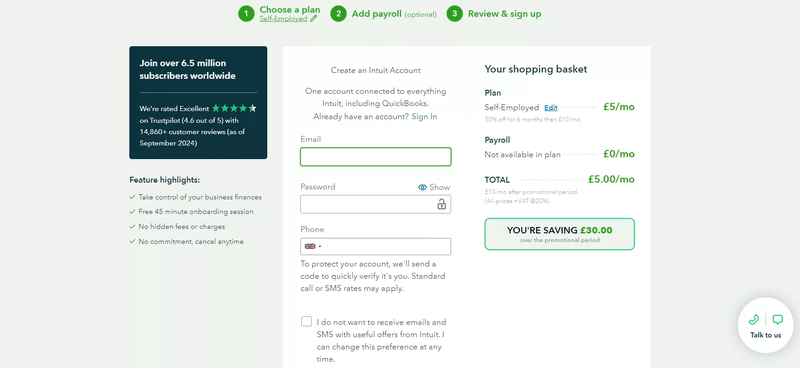
8. QuickBooks Online: Clean, guided sign-up with helpful steps
Just like Ahrefs, Quickbooks takes users to the sign-up page through their pricing page—you need to pick the pricing plan first.
Users create an Intuit account by entering their email, password, and phone number for verification.
On the right, there’s a clear breakdown of the selected plan and any associated costs and discounts. Such design ensures transparency with pricing and commitments. The social proof on the left builds user trust.
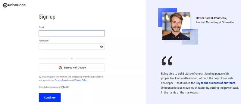
9. Unbounce: Straightforward sign-up with an emphasis on ease of use
The right side of this Unbounce sign-up page features a customer testimonial that emphasizes how Unbounce empowers marketers to create high-quality landing pages quickly and efficiently without relying on web developers. This reinforces the value of Unbounce and increases its credibility.
The sign-up form is simple and gives you the option to sign-upwith your Gmail account.
Benefit-driven sign-up pages
Benefit-driven sign-up pages focus on clearly communicating the value users will gain by registering. By highlighting key features and advantages, these pages effectively motivate visitors to complete the sign-up process.
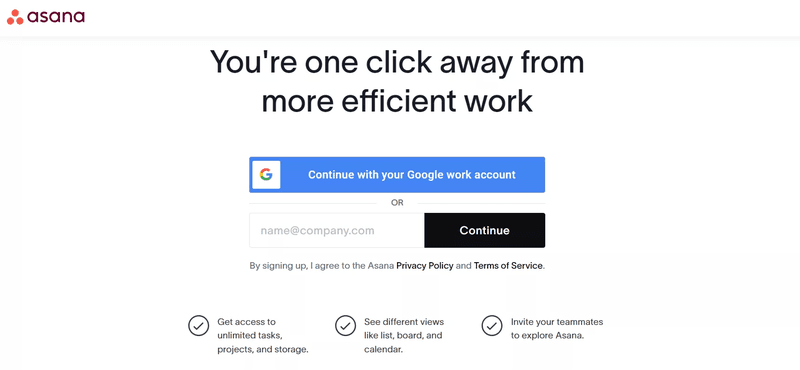
10. Asana: Minimalistic sign-up with clear CTAs
Asana’s sign-up page focuses on highlighting its value with a strong headline, “You’re one click away from more efficient work” and reinforces the message by listing three key benefits below the sign-up form.
The sign-up form is minimalistic and offers SSO (with a Google work account).
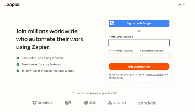
11. Zapier: Easy navigation with clear form fields and quick sign-up
Zapier’s sign-up page focuses on building user trust and credibility.
Its headline, “Join millions worldwide,” reassures potential users that the platform is widely trusted, and the customer logos reinforce the message.
The page also highlights Zapier’s benefits—easy setup, no coding required, and a 14-day trial—to reduce any doubts about signing up.
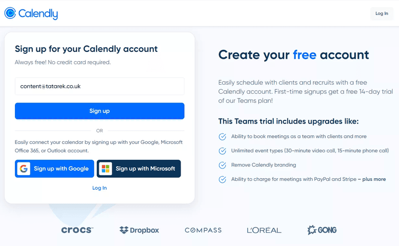
12. Calendly: Simple, efficient sign-up that focuses on user convenience
Calendly’s sign-up page leverages trust signals—recognizable logos from well-known brands— and offers instant appeal through a free 14-day Teams trial.
The clear mention of upgrades, such as team booking and payment integration via PayPal and Stripe, highlights the immediate value for business users looking to streamline scheduling.
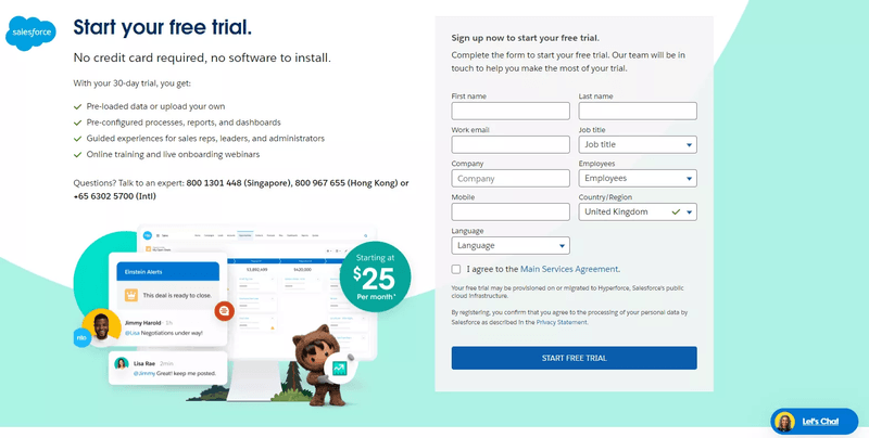
13. Salesforce: Professional, well-guided sign-up experience
Salesforce’s sign-up form is longer than others: it asks for details like job title, company size, or language. These additional details likely help Salesforce segment users and customize the user experience to their specific business needs.
The page highlights the value of the 30-day trial by mentioning benefits like pre-configured dashboards, onboarding webinars, and pre-loaded data. This makes Salesforce a comprehensive offer for businesses looking to streamline operations.
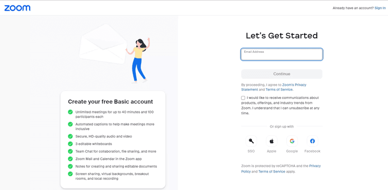
14. Zoom: Easy, fast sign-up with SSO options
Zoom’s sign-up form clearly highlights the benefits of their free Basic account by listing key features like unlimited meetings, HD-quality audio and video or collaborative tools.
Registration requires minimal input (only email address) and offers SSO options to give users an easy start.
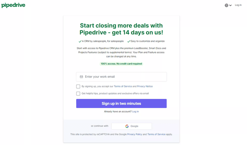
15. Pipedrive: Easy-to-follow sign-up with a focus on quick onboarding
Pipedrive’s sign-up page headline highlights its sales-driven value proposition, “Start closing more deals…” and offers a 14-day free trial during which users can experience it themselves.
The form requires no credit card, and reassures users they get full access during the trial.
Clear messaging about time commitment (“sign-up in two minutes”) encourages quick engagement and minimizes hesitation.
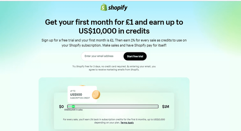
16. Shopify: Easy sign-up with clear CTAs and smooth navigation
This sign-up page emphasizes the financial incentives of using Shopify by offering a compelling sign-up bonus: a low first-month cost and the potential to earn up to $10,000 in credits.
The design effectively conveys customer value, focusing on the monetary benefits users can unlock by getting started with Shopify.
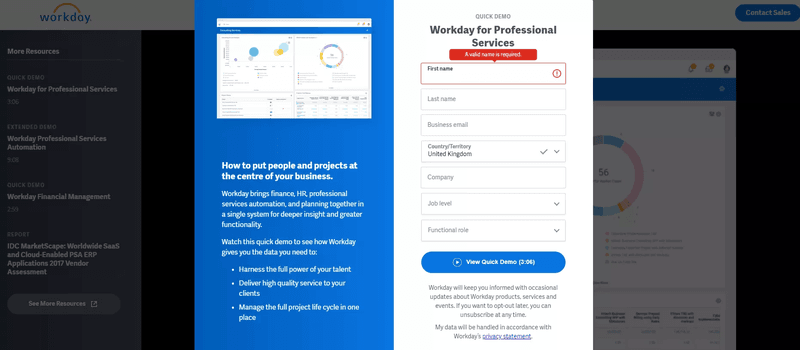
17. Workday: Professional, clear, and easy-to-follow sign-up
This sign-up page for Workday emphasizes how the platform integrates finance, HR, and project management into a single system. It does it by including a demo highlighting Workday’s core benefits.
The form itself is straightforward but requires more information than other similar tools, and there’s no SSO option.
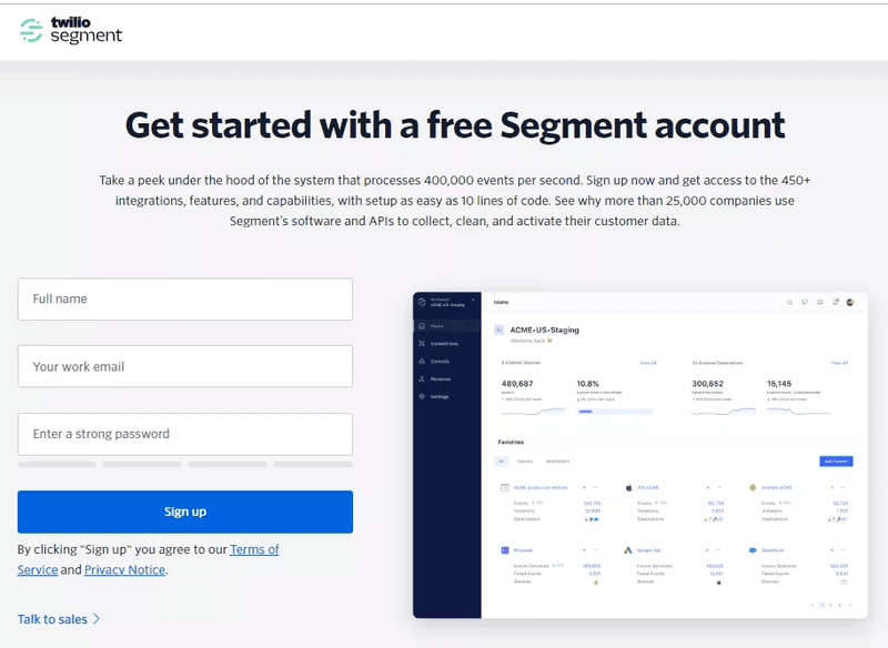
18. Segment: Modern sign-up with a focus on ease of use and clear guidance
Segment’s sign-up page highlights its powerful data processing capabilities.
The copy also focuses on the value of accessing Segment’s 450+ integrations and advanced features.
The snapshot of the Segment dashboard gives users a glimpse of the user experience they can expect.
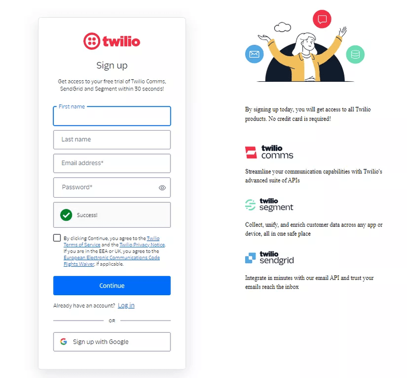
19. Sendgrid: Simple, clear, and easy-to-follow sign-up process
Sendgrid shares the sign-up page with other Twilio products. And once you create the account, you can use it with Comms and Segment.
The sign-up form is straightforward. It asks for only essential details: first name, last name, email, and password. A success check mark provides instant feedback when the email meets the criteria.
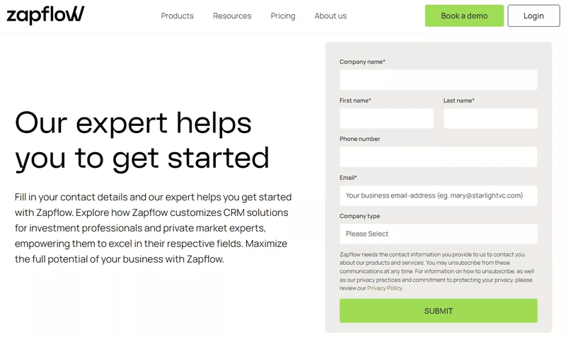
20. Zapflow: Interactive, with a clean design and clear guidance
Zapflow is a fairly complex product, so it offers a high-touch demo and onboarding experience to its target audience.
To set them up, it collects personal and company information through an intuitive form. The beige background for the form contrasts softly with the white page, making it more prominent without being overwhelming.
Well-designed sign-up pages
Well-designed sign-up pages prioritize user experience with intuitive layouts, engaging visuals, and straightforward navigation. By combining aesthetics with functionality, these pages make the registration process seamless and inviting for potential users.
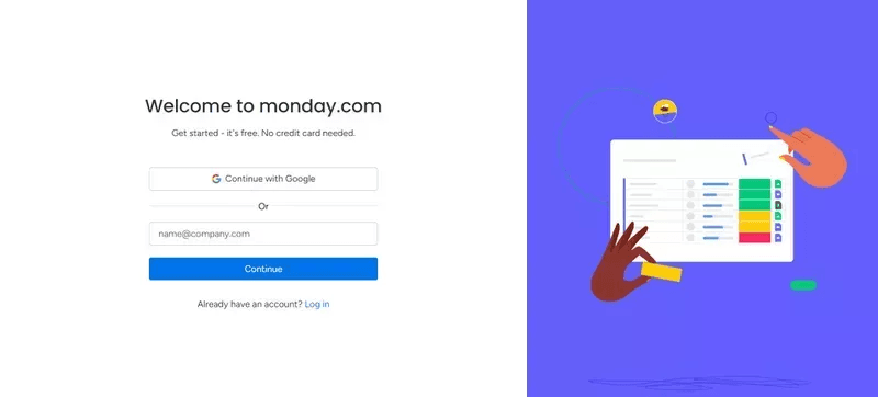
21. Monday.com: Interactive and visually engaging sign-up process
Monday.com’s sign-up page is simple and inviting, with a clear headline that reassures users: “Get started – it’s free. No credit card needed.”
The page offers a Google sign-in option, which makes the registration process faster, and an email field for those who prefer to sign-up manually.
The minimalist layout keeps the focus on the form, while the illustration on the right adds visual interest without distracting from the sign-up process.
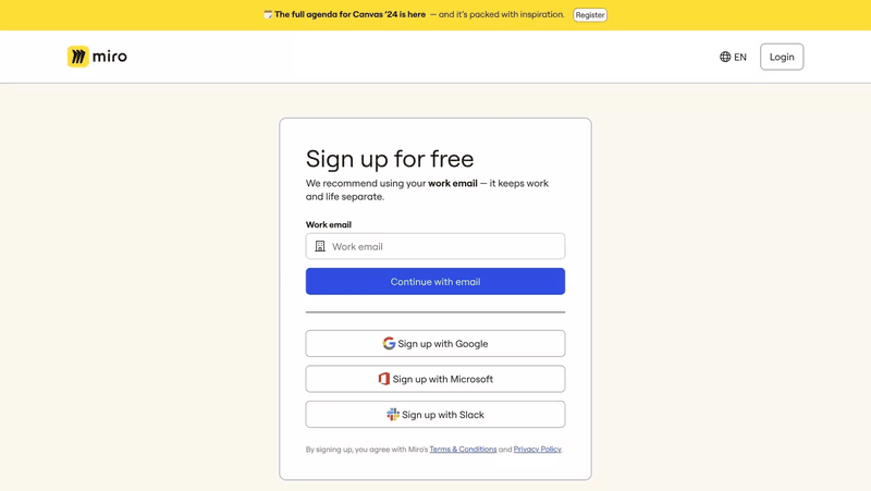
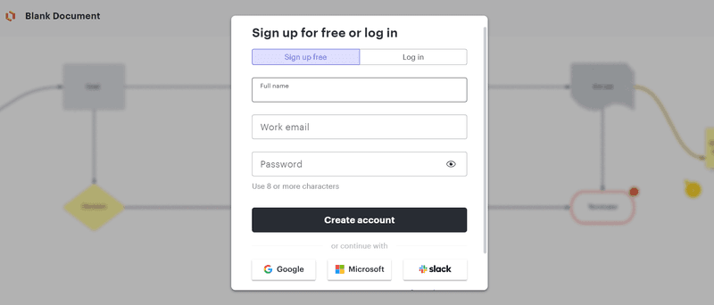
22. Miro: Friendly and visually appealing sign-up process
Miro’s sign-up page is clean and simple.
It recommends using a work email, which helps users separate work and personal life and provides multiple sign-up options, including Google, Microsoft, and Slack, which adds flexibility.
The overall layout is minimalist, keeping the focus on the sign-up process.
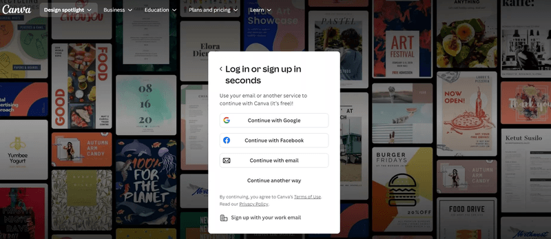
23. Canva: Intuitive sign-up with clear CTAs and SSO
Canva’s sign-up page promises a quick and efficient experience with the headline “Log in or sign-up in seconds.”
This is achieved through SSO: users can log in with Google and Facebook. Or email if they prefer not to link their accounts.
The background showcases designs created with Canva, which subtly reinforces the platform’s value proposition and creative character.
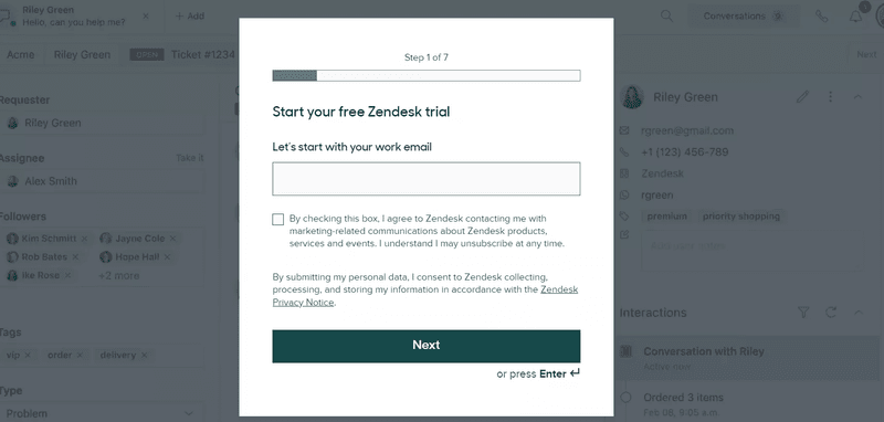
24. Zendesk: Straightforward sign-up with easy navigation
Zendesk’s sign-up form leverages progressive disclosure.
The first step requires users to provide an email address and elicits additional information over the next 6 steps.
By breaking down the sign-up process into manageable steps, it improves user focus and reduces the perceived effort.
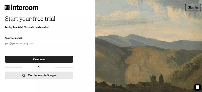
25. Intercom: Modern design with a focus on a quick start
Intercom’s sign-up page immediately invites users to a 14-day free trial without asking for a credit card, which lowers the barrier to entry.
The form asks for a work email, emphasizing a focus on business users.
Cherry on the top?
The artwork on the right adds a calming and sophisticated visual contrast to the form and creates a delightful sign-up experience.
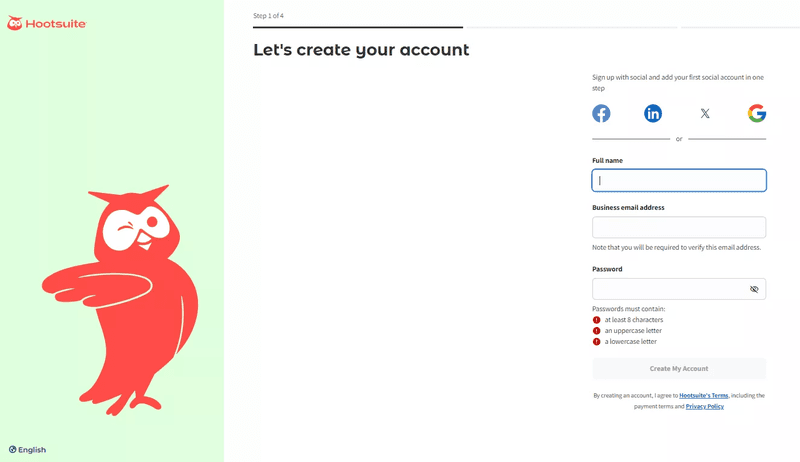
26. Hootsuite: Clear, step-by-step sign-up with helpful prompts
Hootsuite’s page guides users through the sign-up process step-by-step, starting with the basics like full name, business email, and password.
The explanation of password requirements reduces the risk of error, and the inclusion of social sign-ups (Facebook, LinkedIn, Google) removes friction.
The image on the left is a friendly and welcoming touch and reinforces Hootsuite’s branding.
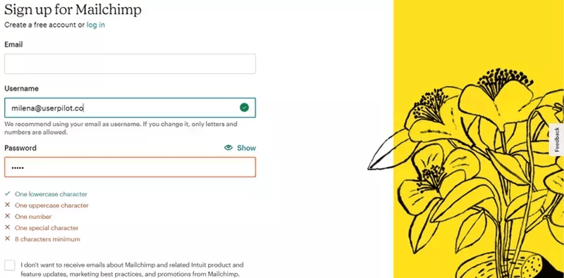
27. Mailchimp: Visually appealing sign-up with a friendly approach
This Mailchimp sign-up form emphasizes security by guiding users through the process of creating a strong password with specific character requirements.
The page includes a visual element—illustrated flowers—consistent with Mailchimp’s branding, which makes the sign-up process feel less intimidating.
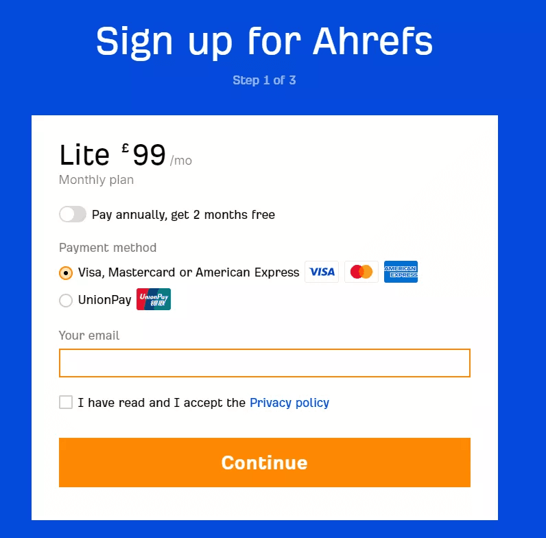
28. Ahrefs: Easy-to-follow, minimalistic design with direct CTAs
To get to the sign-up page, prospective Ahrefs customers have to go through the pricing page and choose one of the paid plans.
Stressing that there’s no free trial intentionally introduces friction and discourages users who have no intention or budget to pay.
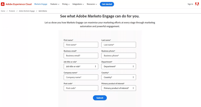
29. Marketo: Professional and informative sign-up experience
The Adobe Marketo Engage form collects detailed information, including contact details, job title, department, and product interest. This enables the team to personalize the demo experiences to specific customer needs.
Despite its length, the form remains well-structured and user-friendly.
Frictionless sign-up pages
Frictionless sign-up pages minimize distractions by streamlining the registration process with minimal fields, single-sign-on options, and clear calls to action. These pages make it quick and easy for users to get started without unnecessary steps.
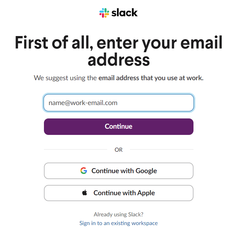
30. Slack: Streamlined, simple sign-up with SSO options
Slack’s sign-up page is a great example of simplicity and focus.
It only asks for the user’s email address, which minimizes friction in the initial step. Offering Google and Apple sign-in options has the same effect: it streamlines the entire process and makes it faster and more user-friendly.
The clean layout and prominent CTA button make it easy to navigate.
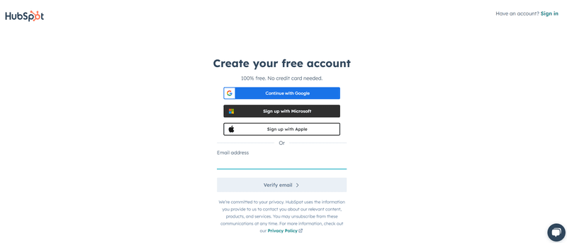
31. HubSpot: Clean, guided sign-up with helpful tooltips
HubSpot’s sign-up page stands out for its simplicity and clarity.
It emphasizes that the account is “100% free” with “no credit card needed,” which reduces user anxiety.
Multiple sign-up options (Google, Microsoft, Apple) make the signup process easier, and the minimal form design keeps users focused on the primary task.
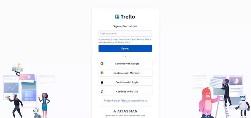
32. Trello: Quick sign-up with visual appeal and clear steps
Trello’s sign-up page is clear and concise.
It focuses on ease of access by providing multiple login options (Google, Microsoft, Apple, Slack). The page highlights that one account works across all Atlassian products, which reduces friction for users already in the ecosystem and may encourage them to explore other tools.
The colorful illustrations add a touch of playfulness without overwhelming the clean design.
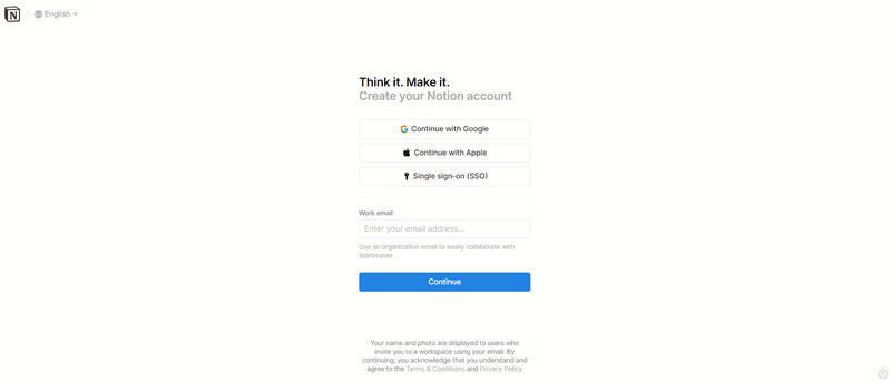
33. Notion: Smooth and engaging sign-up flow with onboarding guidance
Notion’s sign-up page features a clean design centered around the headline, “Think it. Make it.”
The form offers multiple sign-in options (Google, Apple, and SSO), which reduces friction, or sign-up with work email.
The simple page layout and bold “Continue” CTA button keep the user’s attention on completing the form quickly.
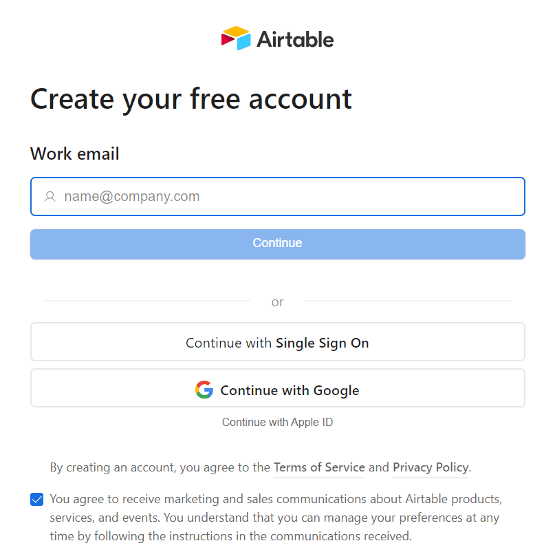
34. Airtable: Simple sign-up with excellent UI/UX design
Airtable’s sign-up page focuses on simplicity and efficiency.
With just one form field and options to sign in via Single Sign-On, Google, or Apple, it allows users to quickly get started without unnecessary steps.
The minimal design and clear CTA keep the process straightforward and user-friendly.
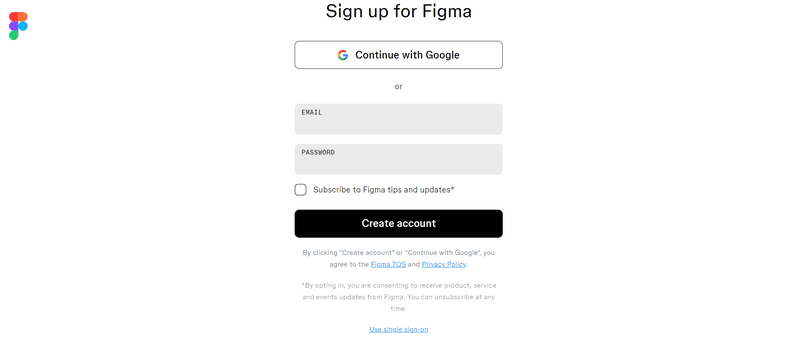
35. Figma: Modern design with seamless SSO options
Figma’s sign-up page is straightforward and user-friendly, offering a Google sign-in option that speeds up the process. For manual sign-ups, only email and password are required, which keeps the form minimal.
The large “Create account” button stands out clearly and guides users through a simple and efficient sign-up experience without unnecessary distractions.
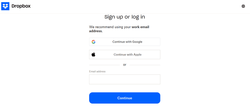
36. Dropbox Business: Clean design with a focus on usability
Dropbox’s sign-up page encourages the use of work emails, which hints at its professional focus.
Offering convenient options like Google and Apple sign-in reduces friction and makes creating an account faster and easier.
The large “Continue” button clearly guides users towards the next step.
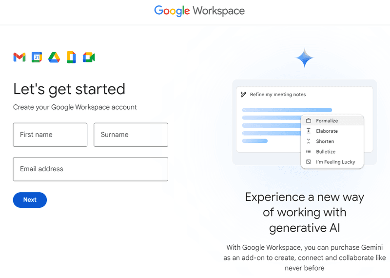
37. Google Workspace: Well-structured sign-up with clear instructions
Google Workspace’s sign-up page consists of two parts: a simple registration form on the left and a visual showcasing its innovative AI-powered features, available as an add-on.
Such a layout design allows users to quickly start using the product while promoting the added value of Workspace’s advanced capabilities and driving potential account expansion.
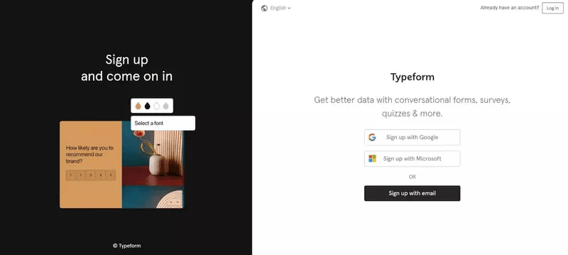
38. Typeform: Visually engaging with minimal friction
Typeform’s sign-up page draws attention with a visual showcasing the product in action, which communicates product value and builds anticipation.
On the right, the sign-up form allows users to log in with their Google or Microsoft account. Or email if they prefer so.
This design effectively balances engagement with convenience. It makes it easier for users to imagine the product’s potential and quickly gets them started.
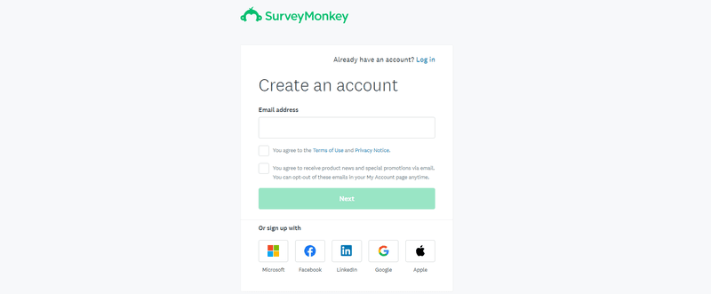
39. SurveyMonkey: Simple, direct sign-up with good UI
SurveyMonkey’s sign-up form provides a straightforward way for users to create an account.
It offers multiple sign-up methods, including social login via Microsoft, Facebook, LinkedIn, Google, or Apple.
If users choose to continue with email sign-up, they have to agree to the Terms of Use and communications from Survey Monkey, which is necessary for compliance and communication transparency.
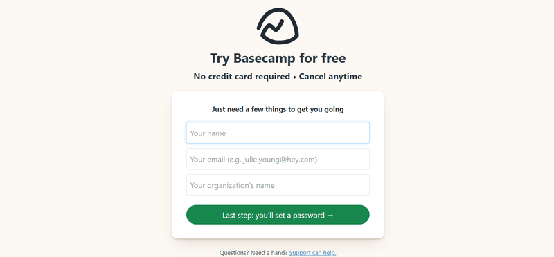
40. Basecamp: Minimalistic and friendly sign-up process
Basecamp’s sign-up form focuses on removing friction and puts users at ease by stating that no credit card is required and that they can cancel anytime.
The form asks for only three basic details—name, email, and organization—before leading to the final step of setting a password. This facilitates quick registration without unnecessary steps.
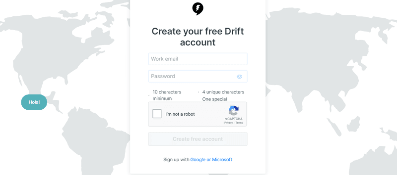
41. Drift: Clean design with a focus on conversational onboarding
Drift’s sign-up page focuses on ease of use by offering quick sign-in options through Google and Microsoft.
The minimalistic design keeps the form streamlined, requiring only basic details: email and password.
The global map in the background adds a subtle visual appeal without overwhelming the user or distracting them from account creation.
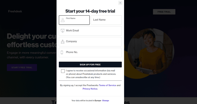
42. Freshdesk: Clean design with focus on user navigation ease
This Freshdesk sign-up highlights the 14-day free trial with a headline and the CTA.
The form doesn’t offer SSO but collects only essential information like name, email, company, and phone number.
Its placement over a subtle background image communicates the brand’s focus on customer relationships.
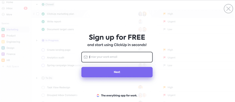
43. ClickUp: Interactive, engaging sign-up with immediate onboarding guidance
ClickUp’s sign-up form emphasizes the speed at which users can get started. The promise of starting “in seconds” reinforces the idea that onboarding will be fast and hassle-free.
To reinforce this message, ClickUp uses progressive disclosure: in the first step, users provide only their email.
The background showcases a real user interface, giving users a sneak peek of what to expect once they’re inside the platform.
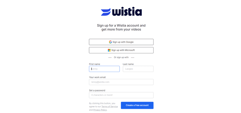
44. Wistia: User-friendly sign-up with engaging visuals
Wistia’s sign-up page ensures ease of access by providing SSO options with Google and Microsoft to make it simple for users to get started.
The minimalistic form includes essential fields only so that users can create an account without unnecessary friction, which reinforces the platform’s focus on user-friendliness.
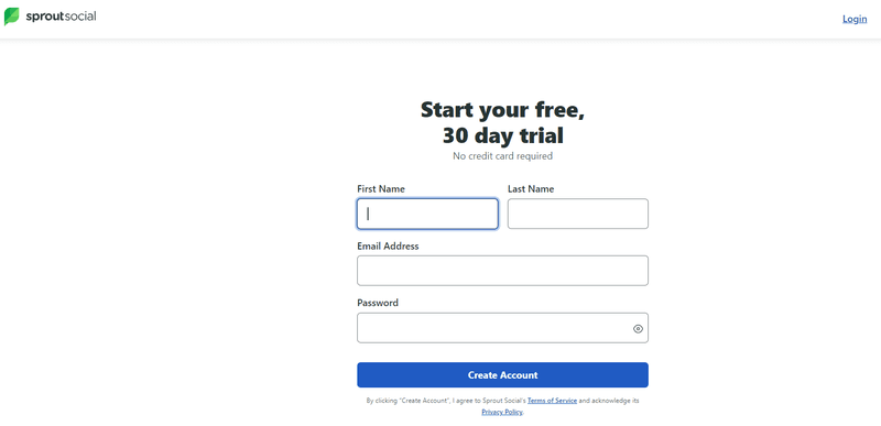
45. Sprout Social: Clean and simple, with a focus on user clarity
The Sprout Social sign-up page provides a direct offer of a free 30-day trial with no credit card requirement, which reduces potential doubts or resistance from users.
By keeping fields limited to essential information like name, email, and password, the form lowers the barrier to entry and encourages users to quickly start exploring the platform.
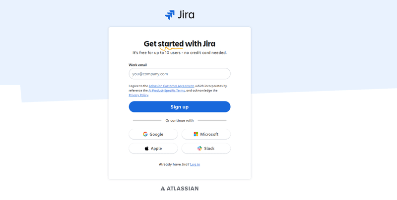
46. Jira: Visually appealing, professional, and easy to navigate
Jira’s sign-up form highlights its freemium model for up to 10 users, which appeals directly to small teams.
The minimalistic form design and the option to sign-up using platforms like Google, Microsoft, Apple, or Slack facilitate the ease of sign-up.
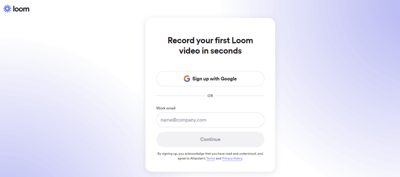
47. Loom: Modern, engaging sign-up with quick start options
Loom’s sign-up form is well-streamlined: users can sign-up quickly with Google or via email.
The page’s clean, minimal design and language (“Record your first Loom video in seconds”) reflect the product’s promise of efficiency and ease of use.
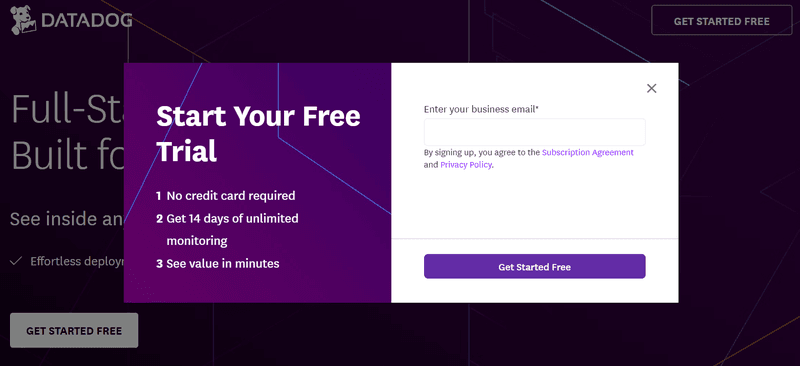
48. Datadog: Professional, straightforward, and user-centric design
Datadog’s sign-up form focuses on its free 14-day trial with no credit card required and promises instant value.
To experience it, users only have to enter their email address. It couldn’t be any simpler or quicker.
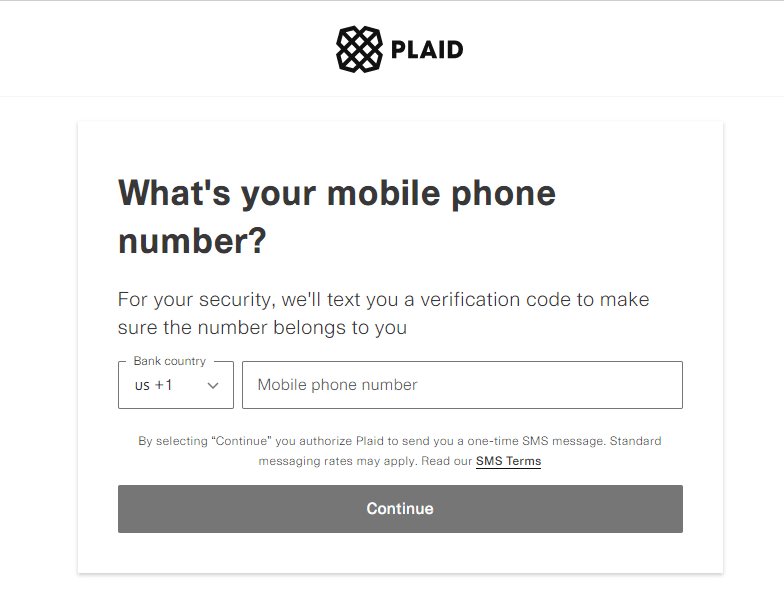
49. Plaid: Easy navigation with a focus on a secure sign-up experience
This Plaid ensures the security of the sign-up experience by verifying a user’s mobile phone number with a verification code via SMS. That’s how it makes sure the number provided belongs to the user.
The form is clear and concise, offering a drop-down for selecting the country code and a text field for the phone number.
50. Lucidchart: Visually engaging and easy-to-follow sign-up
The Lucidchart sign-up form is straightforward and asks for essential information like name, email, and password. Users can also get quick access through Google, Microsoft, or Slack.
In the background, you can find a sample flow diagram created for the product, reinforcing Lucidchart’s value proposition.
About the author