How to Identify and Remove Friction Points to Stop Churn


Whenever I try to fix churn problems, the source is almost always the same: small, compounding friction points that make users feel lost, frustrated, or stuck.
Think of a long sign-up flow, a feature buried three clicks too deep, or a help center that requires users to leave the product. None of these are dramatic failures, but they quietly push users toward the “cancel subscription” button.
In this article, I’ll walk you through how to spot these friction points, what the most common ones look like, and how to eliminate them to prevent churn.
What are friction points?
A friction point is any variable that slows down customers as they use your product. Attrition is quite common in SaaS, and can result from a plethora of friction points, from bugs in your product, unclear in-app messaging, to a terrible payment process.
What are the common friction types in the customer journey?
All forms of friction have one thing in common: they hinder users from accomplishing goals in your product.
These goals can range from setting up an account to using a feature successfully. In fact, according to our benchmarks with SaaS companies:
- The average core feature adoption rate is just about 24.5%
- Average activation rates are 37.5%
- Onboarding checklist completion rate is 19.2%
This means that, out of all the users who sign up, only a fraction of them will stick with your product. That’s why understanding friction is key to improving product growth.
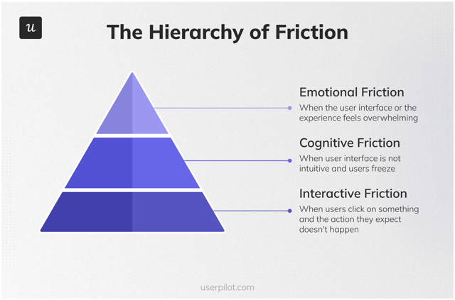
Now, broadly speaking, friction can be categorized into three types: emotional, cognitive, and interaction friction.
- Emotional friction: Results from the emotions users feel when using your platform. It’s often the hardest to spot and deal with, but highly essential to keeping users engaged. Customers often experience emotional friction when completing a task on a site or app that is difficult due to bad UI/UX. To eliminate this friction, always prioritize positive emotions (can be as simple as a warm greeting when a user logs in) and reduce stress to zero.
- Cognitive friction: Cognitive friction occurs when users exert much mental effort to complete tasks. Situations like that make the customer’s mind freeze/block due to too much cognitive load. A common example is empty screens where users have no idea where to start, or having too many UI elements on the same page, and so on.
- Interaction friction: Interaction friction is every engagement with UI elements that results in something unexpected for website visitors or app users. The solution to interaction friction is to provide contextual guidance and strive to make the UI intuitive.
How to identify customer friction points?
You can’t fight an enemy you don’t know. Hence, the next step is knowing how to identify friction in your product.
Talk to your customer service team
Customer service teams are constantly interacting with customers. When they’re not actively chatting with a user, they’re busy solving customer problems in some way. This makes your support team the first point of call in uncovering user friction. They can give you customer insights that you couldn’t find anywhere else.
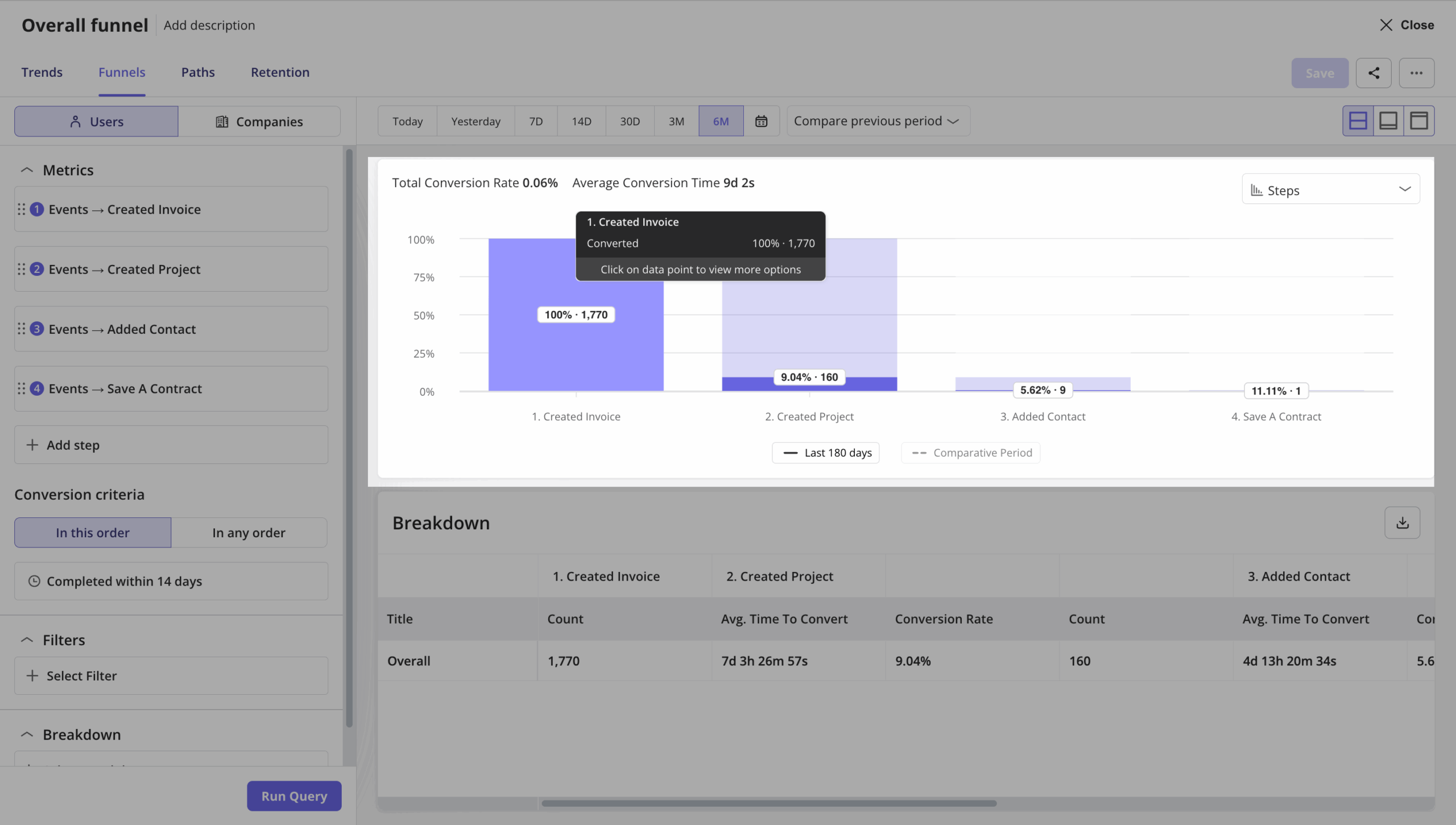
Run path or funnel reports
Path and funnel reports let you visualize how users interact with your product step by step. It shows drop-off rates between steps, overly branching paths where users wander, and stages where the average time to convert is unusually long.
For example, if your onboarding funnel shows 60% of users completing the first step but only 15% reaching step three, that gap could mean there’s a UX problem. You can also analyze the average time between each stage (so you can catch friction even when users don’t fully drop off).
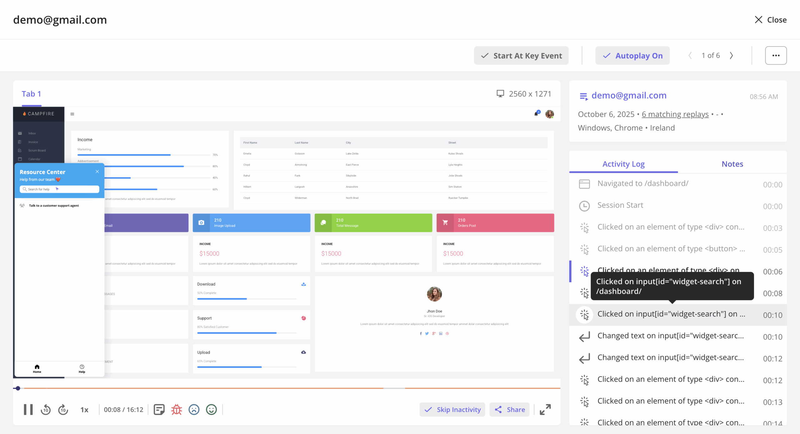
Watch session replays
Session replays give you the qualitative “why” behind what the numbers show. Instead of guessing why users drop off at a particular step, you can watch their hesitation, the rage clicks, and moments of confusion. Think of repeated back-and-forth navigation, cursor hovering over non-clickable elements, and sessions ending right after encountering a specific screen or modal.
For instance, if you notice users are consistently closing a modal and then immediately leaving, that modal is causing friction.
Conduct in-app surveys
Triggering in-app surveys at key moments (e.g., right after onboarding or during user testing) can spot friction that analytics alone might miss. They’ll let you analyze low satisfaction scores at specific touchpoints, repeated mentions of the same pain point, and gaps between what users say they want vs. what they’re doing.
For instance, a user might rate your product a 6/10 and mention in the follow-up that they “couldn’t figure out how to set up integrations.”
What are the most common friction points in the customer journey?
When implementing the strategies above, you’ll find that most friction points are pretty common to all SaaS companies.
Here, I’ll focus on the top-most common friction points in SaaS and how to deal with them.
Too many steps in the sign-up process
Long sign-up forms are boring and frustrate customers. The user is just getting started with your platform, and any hint of stress will make them assume that’s how the rest of the product is.
So to minimize friction, you want to avoid new users thinking that way at all costs.
How to reduce signup friction
Your signup flow should be in the most distilled form possible.
However, some products require lengthy onboarding, meaning the sign-up process will always be long, no matter how hard you try.
For situations like that, it’s best practice to add gamification elements like a progress bar to maintain customer interest.
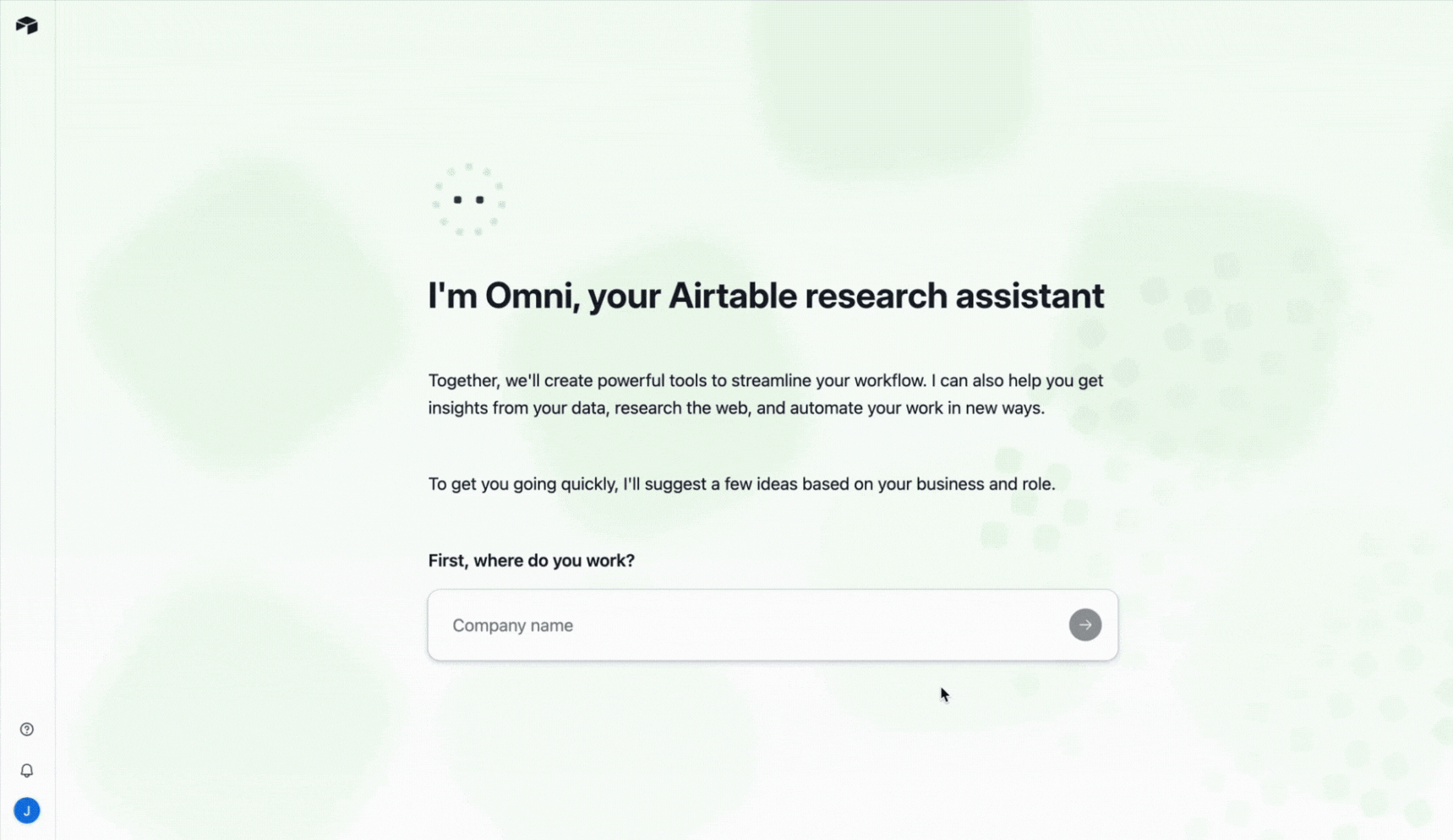
You can also implement AI in specific ways to automate the sign-up and setup process. Airtable, for example, embedded an AI agent directly in their onboarding flow to help users set up their first project without starting from scratch. Instead of asking users to manually configure fields, views, and templates, the AI walks them through the process conversationally, leading to a short time to value.
Too complex or too simple user onboarding process
There’s a sweet spot between onboarding that overwhelms and onboarding that leaves users stranded.
On the “too complex” end, you’ll find product tours with 10+ stale steps (just click “Next” over and over) and welcome surveys that ask 7+ questions without any of them actually influencing what happens next.
For “too simple” onboarding, you’ll see empty states with no guidance, a bare dashboard with no clear first action, and barely a single welcome message that says “Get started!” without explaining how.
Both extremes create friction, and you should avoid them, too.
How to improve your onboarding process
Start with an audit. Go through your own onboarding as if you’re a new user, and ask yourself these questions:
- How many steps does it take before the user reaches their first “Aha!” moment?
- Are there any steps that don’t directly move the user toward value?
- Would a user understand what to do if the product tour didn’t exist?
- Are you showing features the user hasn’t asked for yet?
- Does each survey question directly influence what happens next in the onboarding?
- What do you do with the survey answers? Does it actually change the experience?
- At what step do most users drop off?
- Does the onboarding feel like it’s for the user, or for the product?
Tip: If you have issues with doing an audit or investing time in it, feel free to hop on a free UX audit call with our team.
Once you’ve identified the gaps, here are a few practical solutions:
- Use an onboarding checklist: Checklists give users a clear path without flooding them with information. They show help only when users need it and let them progress at their own pace (enhancing customer satisfaction).
- Build interactive walkthroughs instead of passive tours: The difference between a product tour and an interactive walkthrough is that the latter forces users to take action (i.e., clicking a button, filling in a field, completing a task, etc.). That “learning by doing” approach improves customer retention far better than reading tooltip after tooltip.
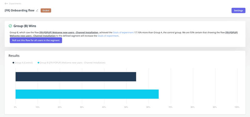
- A/B test to see what actually works: Test with valid data instead of guessing. For instance, one of our clients (Smoobu) used Userpilot’s A/B testing to test if triggering a walkthrough after sign-up would improve activation. The result was, indeed, a 17% increase in conversion rates in the French market.
“I’d definitely recommend Userpilot. It allows us the flexibility to move fast, experiment, and really understand what users need. It’s helped us speed up processes and create a smoother user experience.” – Dasha Frantz, Product Designer at Smoobu
Users are unable to complete their goals
Customers sign up to use your tool with predefined goals and jobs-to-be-done (JTBDs). Thus, one major source of friction is not being able to grasp how your product can help them.
This can happen due to unclear UIs, lack of guidance, and even technical issues like bugs or server errors.
How to improve goal completion
Provided the customer is a good fit, the only thing that can stop them from accomplishing their goals is the lack of in-app guidance and knowledge in using your product.
Here’s how to bridge this information gap:
- Guide users with interactive walkthroughs: Instead of passively reading what a feature does, walkthroughs help users learn about your product by taking action and completing real tasks.
- Support users with mobile messaging: Use mobile in-app messaging to offer guidance on features users might not be familiar with.
- Use tooltips/nudges: This UI element is excellent for providing contextual and helpful content about features that your customers need to complete their JTBD.
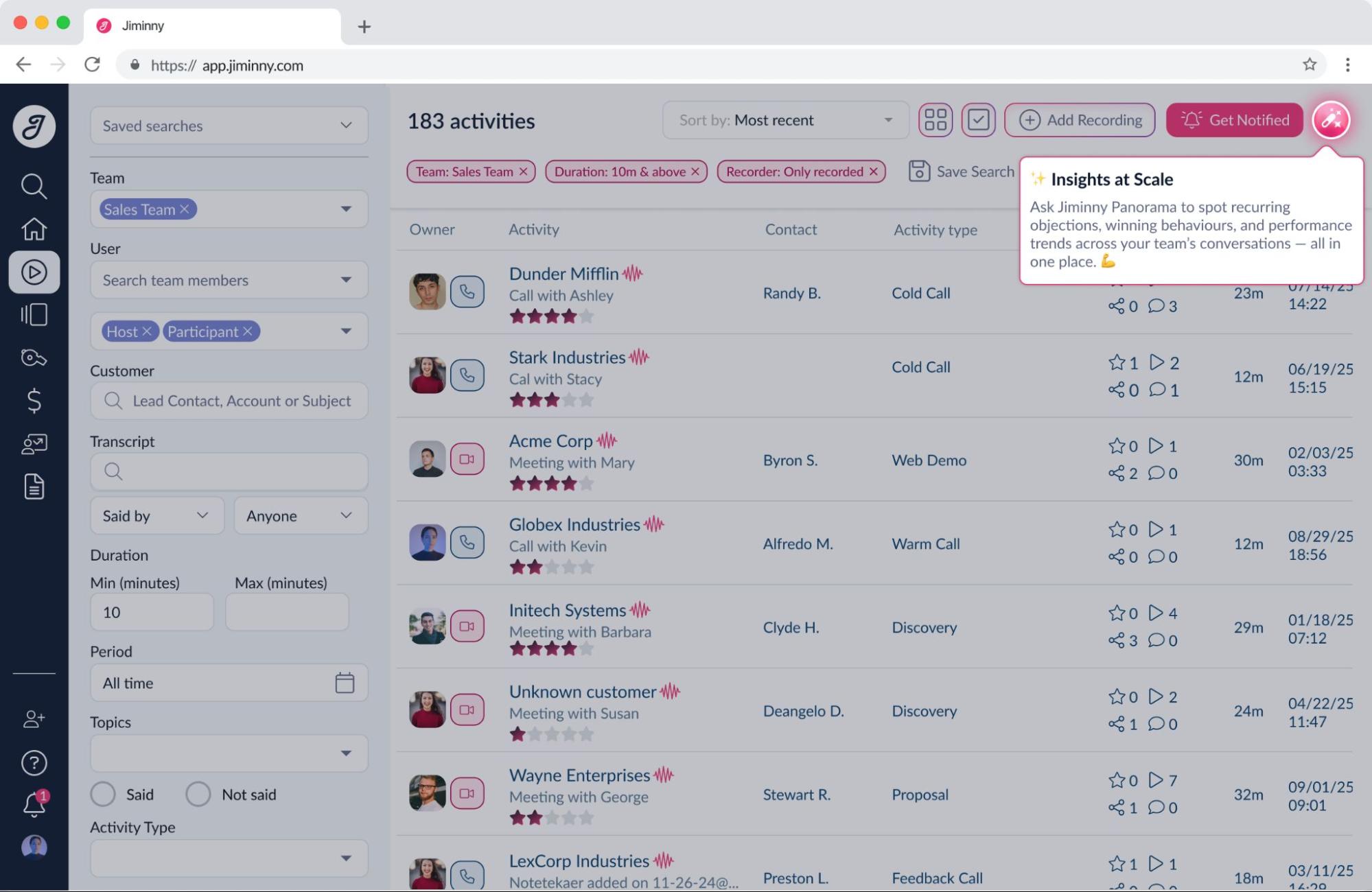
For instance, Jiminny (a market intelligence platform) used Userpilot’s in-app flows to guide users through new features and drive feature adoption. They found that tooltips produced a spike in engagement because they encouraged users to explore features without interrupting their workflow.
“Userpilot has become an important part of how we launch new features. With in-app flows, we can make sure users actually discover and try them. Tooltips in particular create an immediate spike in engagement because they encourage users to explore what’s new.” – Galya Dimitrova, Head of Product at Jiminny
Bad UX
Beyond lacking guidance or having too many obstacles inside the product, simply having a bad customer experience can cause enough friction to motivate churn.
Common bad UX examples include a cluttered UI with numerous popups, forms with text that users must delete before typing, modals that don’t let users exit without clicking the CTA, and navigation that requires too many clicks to reach core features.
How to reduce friction with UX
“Fixing” UX problems might turn more complicated without enough experience.
However, if I had to simplify it, there are two powerful tips that are likely to improve any product:
- Trigger your popups contextually: Nobody likes a modal that hijacks their screen without warning. If your pop-up appears at the wrong moment (or worse, can’t be dismissed without completing an action), you’re creating friction. Contextual triggers based on user behavior (e.g., showing a tooltip after a user has visited a page three times without taking action) are far more effective than blanket popups.
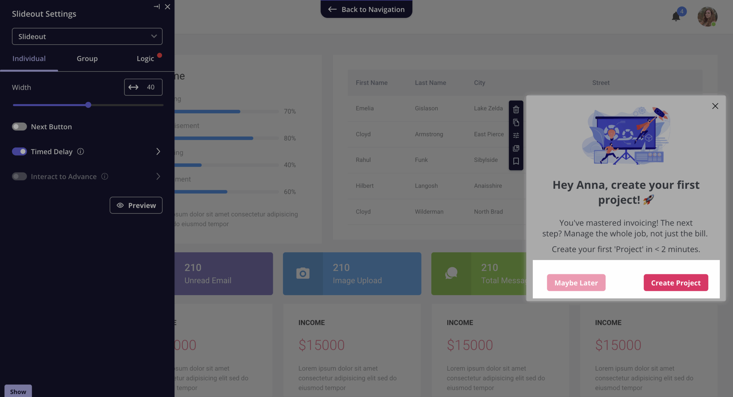
- Always have usability top of mind: Before adding any new element (whether it’s a banner, a slideout, or a notification badge), ask yourself: Does this increase users’ overall success? Or does it serve our internal priorities? If it’s the latter, reconsider.
Bad customer service
According to Zendesk’s benchmark data, about 73% of customers switch to a competitor when they experience poor customer service repeatedly.
Bad customer service manifests itself in different forms, ranging from too much wait time to customers not having their queries replied to.
How to reduce customer service friction
You can try to solve this by hiring more people for the team. But that can be pretty expensive, and frankly, customers prefer to solve basic issues on their own.
Self-service support is proactive, convenient, and leaves everyone happy. So ideally, you should at least have an extensive knowledge base with written or video tutorials, user guides, infographics, etc.
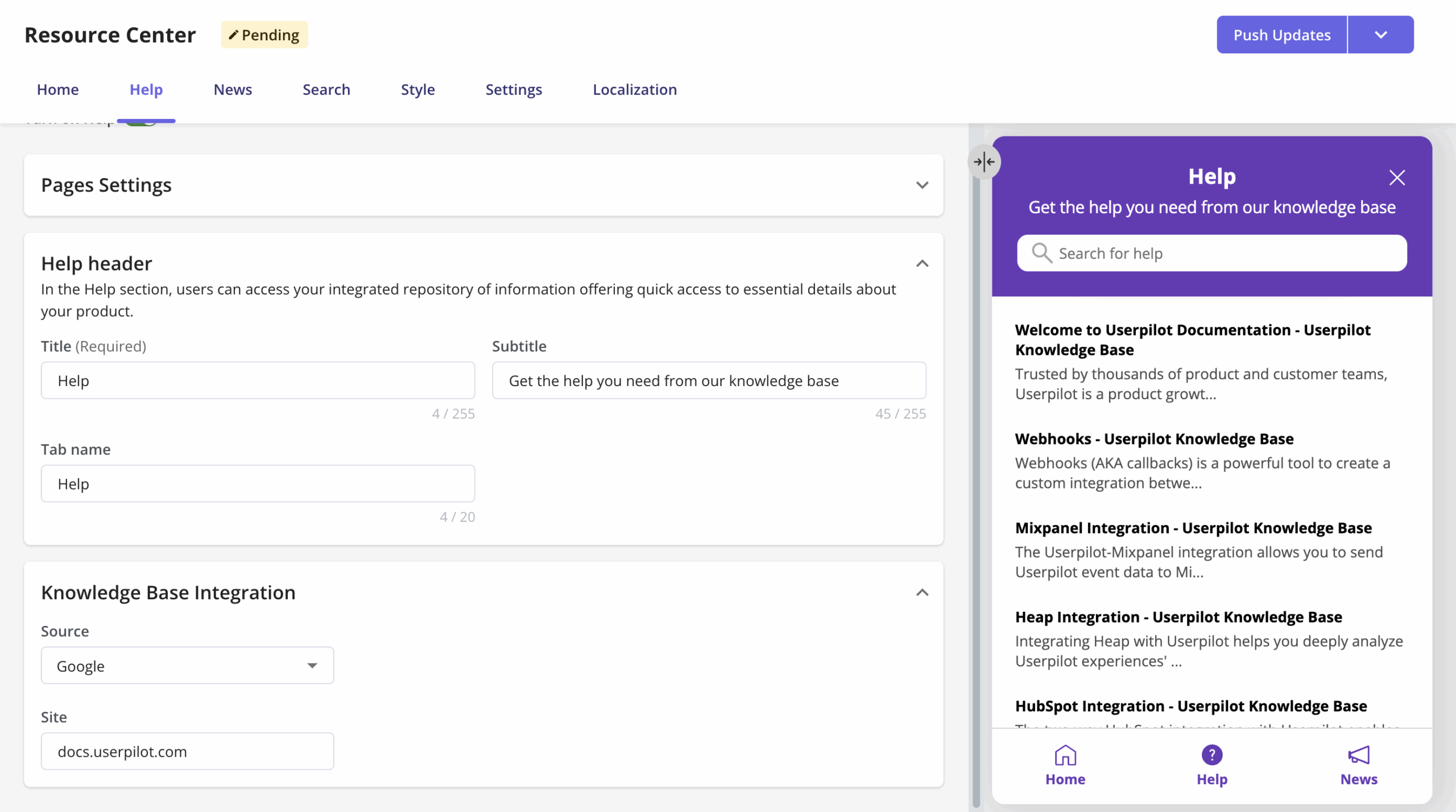
Now, there are many ways to deliver this kind of support, but I personally always advise our customers to implement an in-app resource center. At this point, it’s a standard practice for reducing the volume of support tickets in SaaS.
Here’s how Userpilot enables self-service support:
- Supports different types of learning materials: You can add video tutorials, text articles, external links, in-app flows, and even custom JavaScript functions to your resource center.
- Knowledge base integration: Connect your existing knowledge base from HubSpot, Zendesk, Salesforce, Freshdesk, Intercom, Document360, or Zoho Desk so users can search for help articles without leaving the product interface.
- Search analytics: Track what your users most frequently search for in the resource center. This tells you where your documentation has gaps and what topics generate the most confusion.
- Advanced segmentation: Show or hide specific resources depending on which segment a user belongs to. This way, they’ll only see what’s relevant to their role or use case.
Eliminating friction with Userpilot!
Friction is inevitable, but letting it go undetected is a choice.
With Userpilot, you can both identify where friction lives and address it in one platform to drive user engagement. The analytics side helps you pinpoint exactly where users get stuck. While the engagement side lets you guide users past those friction points.
We’re about to make it even faster. Lia (our upcoming AI Product Growth Agent) is designed to continuously analyze your product data, detect anomalies and drop-offs, and automatically create the flows (in-app messages, tours, or surveys) needed to solve the issue.

Want early access to Lia? Join the beta to see how Userpilot helps you turn friction into growth.
About the author