User Journey Map Examples That Drive Decisions


Every customer success review I’ve been part of has had a user journey map on the slide deck. Most of them were built before anyone pulled a session recording or looked at funnel drop-off data, which meant they mapped the journey the team hoped users were taking, not the one customer behavior would eventually reveal. This gap typically drives churn because it doesn’t consider user actions and just adds them theoretically.
Most user journey maps are design hypotheses dressed up as facts. They show what teams hoped the experience would look like, rather than what users actually do. A user journey map only becomes useful when it is grounded in real behavioral signals: session data, support escalations, and funnel analytics tell you which parts of the map are wrong.
The examples here are worth learning from because you can trace each one back to a specific decision it enabled. After the examples, there’s a question: What do you do when a growing share of your users are AI agents, a question worth exploring in the AI-agentic era.

User journey map examples that produced decisions
The question I kept returning to when evaluating those user journey maps was: “Can you trace it back to a specific decision it enabled?”
Visual design, the number of lanes, and the emotional curve all matter less than whether the map made something visible that wasn’t visible before, and whether that visibility changed what the team built.
1. Spotify’s music-sharing user journey map

Spotify’s journey map for the music sharing experience is useful because it maps two personas simultaneously: the person sharing and the person receiving. Most journey maps follow a single user through their stages. This one shows that the sharing experience breaks down in two separate places at once, on the sender’s side and the receiver’s side, which a single-persona map would have missed entirely.
What it revealed: Users felt anxious about being judged for their taste in music, and many were unaware that the sharing feature existed at all. Those are two distinct problems requiring two different interventions, one in UX communication and one in emotional design. Mapping both user types in the same artifact reveals opportunities that single-persona maps cannot surface, and it brought both key insights into the same conversation.
How to apply it: Any time your product has a sharing or collaboration feature, map both sides of the interaction. The sending and receiving experiences have different customer pain points, emotions, and often different friction points that don’t show up unless you’re tracking both simultaneously.
2. Uber’s first experience user journey map

Uber’s new user journey map anchors the emotional arc to actual UI screenshots at each stage, rather than to generic emotion labels. Most journey maps describe how users feel with words like “confused” or “excited.” Uber’s map shows you the exact screen the user was looking at when they felt that way, which changes how product teams read the friction.
The bottom layer of deeper insights is where the decision-making material lives: what CS and marketing teams need to gain a deeper understanding of the customer experience at each stage. It earns its keep by making the connection between what users see, what they think, and what the team should change explicit rather than implied. The verbatim user thoughts, alongside the emotion tags, are what set it apart from a generic journey stage diagram.
How to apply it: When documenting customer behavior at key touchpoints, pair emotion labels with the actual interface moment that caused them. “User feels frustrated during onboarding” is not a finding. Pinning it to the domain verification screen turns a vague emotional label into a specific fix.
3. Dropbox’s customer journey map

The most valuable structural choice in the Dropbox map is the “cast” section: a profile of everyone affected by the decision to use Dropbox, not just the person who signed up. Cloud storage adoption cascades across teams. A map limited to the primary user misses the friction a secondary user encounters when trying to open a shared file without an account.
This reframe turned an individual user journey into a product-qualified expansion problem. By mapping everyone the decision affects, including secondary users who were never directly onboarded, the team could see where adoption stalls among users who were never part of the initial buying process. This approach helps you uncover pain points that wouldn’t show up in standard user research.
How to apply it: For any product where decisions ripple to secondary users (shared documents, collaborative tools, team dashboards), add a “cast” section to your map. Those secondary users are often the reason adoption stalls at the account level, even when the primary user is fully activated.
4. Mailchimp’s day-in-the-life customer journey map

Mailchimp’s map captures everything Dani does over the two weeks leading up to sending a marketing email, including tasks unrelated to Mailchimp. That’s the point: it shows where the product fits inside a daily context where 20 other things are competing for the same person’s attention. A map limited to in-product interactions would have missed why Dani deprioritizes the task in the first place.
The map includes digressions, competing priorities, and emotional transitions that occur entirely outside the product. This is what day-in-the-life mapping does that other types can’t. It captures what it takes to meet customer expectations at the moments when, from the user’s perspective, a dozen competing tasks feel more urgent than opening your product. The insight is about where the product sits in someone’s actual day.
How to apply it: Before mapping the in-product journey, map 48 hours of your user’s day at the granularity level Mailchimp used here. You’ll likely find that the friction in your product is secondary to the friction of getting users to engage with your product in the first place.
5. HubSpot’s customer journey map

HubSpot’s map starts when a user becomes dissatisfied with their previous tools, though you’d think it starts when they discover HubSpot. Starting your map with awareness of your product rather than the problem is one of the most common ways teams build maps that don’t help them understand why users actually show up.
The map documents all customer interactions from initial dissatisfaction to becoming a paying user, capturing the factors that lead to positive or negative experiences at each critical moment. Including the actors involved at each stage and the internal processes supporting each touchpoint is what makes this a useful operational artifact rather than a communication deck.
How to apply it: Push the start of your map back to where the problem first appears in the user’s world, not where your product first appears. Ask: What was happening in their workflow before they searched for a solution like yours? That’s where the real customer journey begins, and it’s where your best onboarding insight lives.
6. Netflix’s customer journey map

Netflix’s map is useful because it explicitly maps a failure case: Jen ignores the recommendation algorithm and searches for an alternative. Most user journey maps document the happy path, the journey the product was designed for. This one treats a common deviation as the map’s subject, which is where the real decision-making material lives.
When your product’s core value proposition is being bypassed at scale, that’s a product strategy question, and the map makes it legible. Analyzing Jen’s pain points, motivators, and negative experience at each stage creates a clear brief for what “better customization” and “friend recommendations” would actually need to solve. The map identified the friction and defined the scope of the fix.
How to apply it: Map the most common deviation from your intended user journey. Where are users going when they don’t follow the path? That deviation shows what’s eroding user satisfaction: the thing the product fails to deliver often enough that users have built a workaround.
7. Canva’s user journey map

Canva’s map for Laura, a small business owner representing a specific target audience, is tightly scoped to a single scenario from start to export, and that scoping is the point. Narrow maps are more useful than comprehensive ones because a narrow scope means every customer pain point in the opportunities column can be traced to a specific step. “The design creation experience needs improvement” is not actionable. “Step three of creating a new design causes drop-off” is.
How to apply it: Resist the urge to map everything at once. One persona, one scenario, one goal. If you find yourself qualifying every insight with “it depends on what the user is trying to do,” the map is too broad to be useful. Scope it down until the opportunities column produces specific interventions rather than general directions.
8. Zoom’s user journey map for teachers

Zoom’s map for online lectures breaks the journey into five action buckets, and that granularity is what makes it useful. “Starting a lecture” turns out to involve more distinct user actions than most product teams account for in their flow design. Friction that looks like a single step is often five steps collapsed under a single label, and this map makes each of those steps visible, with its own emotional state attached.
The emoji-based emotion tracking lets you read the emotional arc of the entire journey in seconds without processing paragraphs of qualitative description. At scale, that makes the map useful in conversations where there’s no time for detailed walkthroughs.
How to apply it: Break every broad action in your journey stages into its component tasks. If a user has to “set up the integration,” ask how many distinct steps that involves, and map the emotion at each step separately. Emotional drop-off almost always happens inside a step that looks simple from the outside.
9. HeartiCraft’s user journey map

HeartiCraft’s map separates “delights” from “pain points” within each stage, and that structural choice is what makes it actionable rather than just diagnostic. Most journey maps document friction well and ignore what’s working. Knowing what users genuinely like at each stage matters because any fix has to preserve those moments, and because the things that delight users are often what drives customer satisfaction and helps the product retain customers even when other parts of the experience are rough.
How to apply it: Add a “delights” row to your map alongside the pain points row. When you’re designing fixes for friction, check whether the fix could accidentally remove a moment users like. And look at the delight column across all stages: those are your product’s strongest arguments for why users should stay.
10. Say Yeah!’s elder care customer journey map

Say Yeah!’s map for an adult child seeking elder care support is built around the human-scale problem. The journey starts where the problem becomes real, which means the map captures user needs and emotions at the most vulnerable and therefore most important moments of the decision process.
The map outlines tasks, actors, emotions, media, and tactics across journey stages, highlighting the relevance of each moment to serving the customer effectively. That last layer is underused in most maps: not every moment requires equal intervention, and a map that weights moments by customer impact is far more useful than one that treats all steps equally.
How to apply it: Before mapping your product’s journey stages, write down the human problem your product solves in the user’s own language. Use that problem description as the starting point for the map. The journey begins where the problem begins, not where your homepage begins.
11. Gartner’s B2B customer buying journey map

This is the map most B2B products and CS teams should study most carefully. Gartner’s B2B buying journey is deliberately non-linear, which is what makes it accurate. Most teams still map B2B purchasing as a sequence: discovery, evaluation, trial, purchase, and onboarding. Gartner’s research shows buyers loop back through journey stages repeatedly, that the person evaluating often isn’t the decision-maker, and that internal buy-in frequently takes longer than the evaluation itself.
The map captures a crucial discrepancy that linear maps hide: the person who meets with your sales team may have no authority to sign, and a journey map that doesn’t account for that handoff is describing a buying process that doesn’t exist. It also shows how teams at the same company can be at different stages of the buying process simultaneously, which is why B2B deals stall in ways that don’t show up in standard CRM data.
How to apply it: If you’re building a B2B journey map, replace the linear progression with a series of interconnected loops. Map the loopback triggers: what makes a buyer go back to re-evaluate? Document the internal handoffs: who needs to be convinced after the initial evaluator? Track the parallel paths: which buyers are running separate evaluation tracks simultaneously? Those are the critical moments where deals actually move or stall.
12. Service blueprint for technical support

This is the example that most clearly shows what a service blueprint reveals that a standard journey map cannot. The user experience of submitting a support ticket and receiving a resolution is mapped alongside the backend systems, employee steps, and internal processes that support it. When you see both layers at once, you find that the stall in the user-facing experience is almost never where the user thinks it is.
The real friction is upstream: in a handoff between systems, a policy the user never sees, or an internal process step that doesn’t match the user’s expected timeline. If your customer support team keeps closing the same ticket only for it to reopen despite front-end fixes, you need a service blueprint because it shows the internal processes that determine what the customer actually experiences.
How to apply it: When a specific customer touchpoint keeps producing complaints despite front-end fixes, build a service blueprint for that touchpoint. Map what the customer does at the top, and below it, map every system, policy, and employee action that runs in parallel.
13. Amazon’s 8-stage customer lifecycle map
Amazon’s lifecycle map structures the online shopping customer journey across eight stages, from passive awareness through post-purchase re-engagement of lapsed customers, and tracks quantitative metrics across journey phases: impressions, CTR, and repeat purchase rates, alongside qualitative journey documentation. That combination is what distinguishes it from most journey maps.
Most journey maps treat emotional states and behavioral metrics as separate artifacts living in separate tools. Amazon’s map bridges them into a single visual representation, so the opportunities column is directly informed by conversion data rather than workshop assumptions. When an emotional state and a drop in CTR appear at the same stage, the team has both the qualitative context and the quantitative signal in one place to diagnose the problem.
How to apply it: Add a metrics row to your journey map, aligned to your journey stages. At each stage, list the one or two behavioral metrics that indicate whether users are progressing or stalling. When those metrics drop at crucial moments, you have the emotional context from the rest of the map to understand why, without having to cross-reference a separate analytics dashboard.
What’s missing from all of these maps is a column that answers the question, “What did the team do about it?” The maps identify pain points and surface opportunities, but the feedback loop, where behavioral data shows whether the fix actually changed the behavior, sits outside the artifact. Session replay and product analytics close that loop, connecting what the map identified as friction to whether the intervention moved user behavior in the direction the team intended.
Templates worth using (and what each forces you to skip)
Most template galleries are neutral. The more useful question is which diagnostic question you need to answer, because that’s what the right template depends on.
Figma user journey map template

Use this when the mapping exercise needs to stay inside the design workflow and connect to actual screen-level detail. The Figma template supports embedding real interface screenshots alongside journey stages, making it the right choice when UX and product are working together on a specific flow and need the map to reference actual UI components. It’s not the right choice for cross-functional operational mapping, because design-tool familiarity becomes a barrier for engineering and support teams who need to contribute.
Miro service blueprint template

The Miro service blueprint connects visible customer experience to internal processes, systems, and backend workflows, which is exactly what a standard journey map leaves invisible. If you’ve been fixing a persistent friction point by adjusting front-end touchpoints and the problem keeps returning, you need this template.
Mural customer journey map template

Mural’s template is well-suited for cross-functional workshops where the goal is shared understanding of the customer journey rather than a specific operational fix. The structure walks teams through defining the customer scenario, mapping user actions, and listing customer touchpoints before moving to solutions. Its limitation: the template is designed for breadth rather than depth, which makes it better as a starting artifact than as a final diagnostic tool.
UXPressia B2B customer journey map template

UXPressia built this specifically for multi-buyer B2B purchasing journeys, and that’s where it earns its keep. The template has structured support for multiple customer personas, customer segments, and motivators across purchasing phases, which matters in B2B SaaS, where the buyer, the decision-maker, and the daily user are often three different people with three different success definitions. If you’re mapping a B2B purchase process, this is the template that has thought through the structure you’ll actually need.
Xtensio future-state customer journey map template

Use this after completing a current-state map and designing the improved journey. Xtensio’s template prompts you to explicitly document how the future state differs from the current one, which forces the team to specify what’s actually changing rather than sketching an idealized version of the same journey with smoother edges.
The honest take on Canva templates: they look the cleanest and are the least operationally useful. They’re designed for visual presentation, which makes them appropriate for a presentation deck where the goal is communication rather than diagnosis. If the deliverable is a report, use Canva. If the deliverable is a decision, use one of the four templates above.
Your map is missing an entire category of your users
AI tools like Miro AI and Figma FigJam AI can generate a draft journey map faster than any workshop. But the quality gate is still human, and the research still has to come from actual behavioral data. AI produces maps that are plausible but shallow, reflecting patterns in the training data rather than your specific users, which means they’re useful for generating structure and not much else.
The more consequential shift: AI has introduced a new category of user that existing journey maps aren’t built to capture. When AI agents access your SaaS product through MCP tools, they don’t click, don’t have emotional states, and don’t experience onboarding friction in any traditional sense. Their “journey” is a sequence of API calls and task completions. Your current journey map has no lane for this, and it needs one.
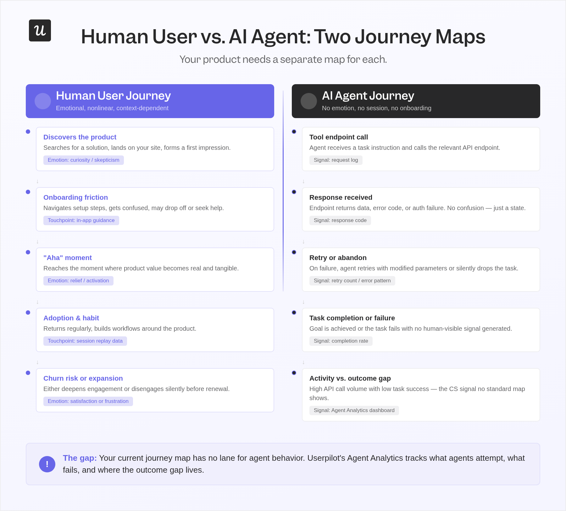
If your product has any meaningful agent adoption, you have a category of users generating behavioral signals that your analytics tools were not designed to interpret. Agents execute tasks without sessions. They don’t scroll, hesitate, or experience the critical moments your onboarding journey was designed to create. The entire interaction model consists of a tool endpoint call, a response, and either task completion or a silent failure.
The pattern I keep seeing in CS work closely mirrors this problem. A customer account shows high login activity and plenty of platform engagement, but the outcomes the customer cares about aren’t materializing. There are many logins, but the behavioral signal beneath them tells a different story. As agents generate more activity signals without achieving user-defined goals, this pattern will become harder to diagnose with the maps currently in use.
If your product has agent users, you need a separate map for the agent journey. Instead of stages like “discovers feature, attempts use, gets confused, reaches out for support,” the agent journey looks like: “calls tool endpoint, receives error, retries with modified parameters, fails authentication, abandons task.” ZipTie.dev’s 6-stage AI user journey framework is one of the first attempts to structure this, and the core argument is correct: the human journey and the agent journey need to be mapped separately before they can be understood together.
Yazan Sehwail, Userpilot’s CEO, frames the broader shift this way:
“You’re no longer operating. The AI is operating. You’re just basically evaluating and monitoring the agent workflow.”
The map that matters for an agent-heavy account is the map of what the agent attempted, what succeeded, what failed, and what the human monitored. Building that map requires different inputs: task completion rates, error signals, endpoint response patterns, and the gap between what the agent was asked to do and what it actually accomplished.
What to track for an agent journey map:
- Task initiation rate: How often do agents attempt to use a specific feature or tool endpoint?
- Completion rate by task type: Which tasks complete successfully and which fail, and at what rate?
- Error signal patterns: What error responses do agents receive, and do they retry or abandon after receiving them?
- Authentication and permission friction: Where do agents fail, not because the task is wrong, but because the access configuration wasn’t built for agent use?
- Goal achievement vs. activity: The gap between agent activity (API calls, events fired) and user-defined outcomes (the actual task the agent was sent to complete).
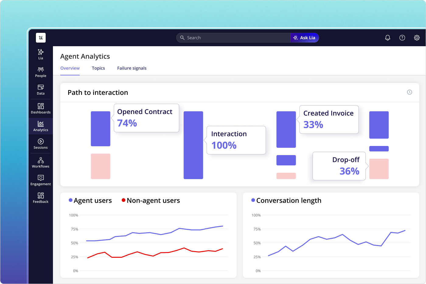
Userpilot’s Agent Analytics is built to track AI agent journeys through your product, capturing conversation logs, task completion rates, failure signals, and satisfaction metrics for agent interactions and human sessions. The MCP Server is the underlying infrastructure that makes agent interactions trackable in the first place. If your product serves agent users and you don’t have a way to map what they’re doing, the CS conversation that eventually surfaces will be about outcomes not materializing, and neither you nor the customer will have the data to explain why.
If the gap between your journey map’s opportunities column and your product data is wider than it should be, book a demo to see what session replay, product analytics, and Agent Analytics look like against your data.
FAQ
What are the key components of a user journey map?
A user journey map typically includes customer personas, journey stages, user actions, customer touchpoints (website visits, in-app events, customer support interactions, and emails), customer pain points at each stage, emotional states tied to specific behavioral moments, and an opportunities column with assigned internal ownership. Touchpoints are the moments where the user interacts with the product, service, or brand, and they’re where most of the decision material lives. Without a specific owner and a specific next step, a map’s opportunities remain as workshop output rather than product work.
How is customer journey mapping different from user journey mapping?
Customer journey mapping covers the full customer lifecycle from initial awareness through renewal and customer loyalty, tracking every way a customer interacts with your brand across all touchpoints and channels. That scope is where journey maps differ most in practice: user journey mapping documents how a specific user navigates a specific feature or flow within your product, informing product and design decisions rather than go-to-market strategy. In B2B SaaS, the distinction matters more because the buyer who chose the product and the daily user who operates it are often different people with different customer expectations and different definitions of success, which is why a single map built for both usually serves neither.
What makes a customer journey map useful for decision-making?
The customer journey mapping process builds a deeper understanding of user behavior only when it is grounded in real behavioral data: session recordings, funnel analytics, and support escalations rather than workshop assumptions. Maps built from customer personas and sticky notes capture what teams hoped the customer experience would look like. If you can’t trace the map back to a specific decision it informed, a specific thing the team built, fixed, or stopped doing, it’s a reference document rather than a tool. To create user journey maps that drive decisions, you need a feedback mechanism: someone accountable for updating it when new behavioral data contradicts what the map assumes.
How do customer journey maps help identify and fix pain points?
Journey maps help identify pain points and surface opportunities by documenting where emotional states deteriorate, where users abandon tasks, and where the gap between what the product expects users to do and what they actually do is widest. Visualizing the customer experience this way surfaces the inconsistencies that drive users to abandon tasks, whether a user encounters friction switching mobile plans, reconsidering a SaaS subscription, or abandoning a checkout, before those patterns appear in aggregate data. Once specific pain points are located within the journey stages, the fix becomes more diagnostic: is the user missing motivation, facing a complexity barrier, or not receiving a clear prompt at the right moment? That question determines whether the intervention is a copy change, a UX simplification, or in-app guidance delivered at the point of friction.
About the author