SaaS Signup Flow in 2026: Why Activation Starts Before Signup


Emplifi’s 2025 report found that 70% of consumers will abandon a brand after just two negative experiences, with nearly a quarter walking after one.
If one of those bad experiences occurs during your signup flow, your chances of activating new users are even slimmer, since they haven’t had a chance to experience value.
This guide will help you avoid some common signup flow mistakes that cause drop-offs. I’ll share the top five mistakes and why they count, then show you examples of companies doing it right and what you can learn from them.

The signup flow most teams ship in 2026 (and why it’s broken)
Here are the five mistakes I see often:
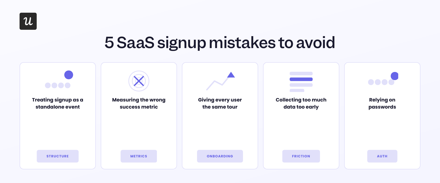
Mistake 1: You’re treating signup as a standalone event
The first mistake most teams make is optimizing the signup process as a funnel that begins at the form and ends when users click the submit button. That frame is too narrow because signup is one beat inside a longer user activation arc.
The user journey starts well before the form appears and continues well after a user inputs their details, which means a clean signup form built into a broken arc still produces a poor activation rate.
Kate Syuma, founder of Growthmates and a Product-led growth advisor who previously ran growth experiments at Miro, explained this clearly in her six-step Holistic Activation and Onboarding framework:
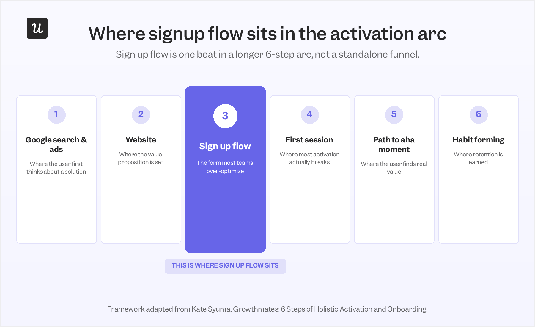
Signup flow sits at step 3 of 6, sandwiched between the website and the first-time user experience. Teams that A/B test step 3 in isolation are tuning the middle of an arc whose two ends they aren’t even measuring.
What to do instead: Treat the signup process as a structural problem inside the activation arc, not as a standalone funnel you A/B test in isolation. Instrument the full arc, starting at the landing page and continuing through the first session.
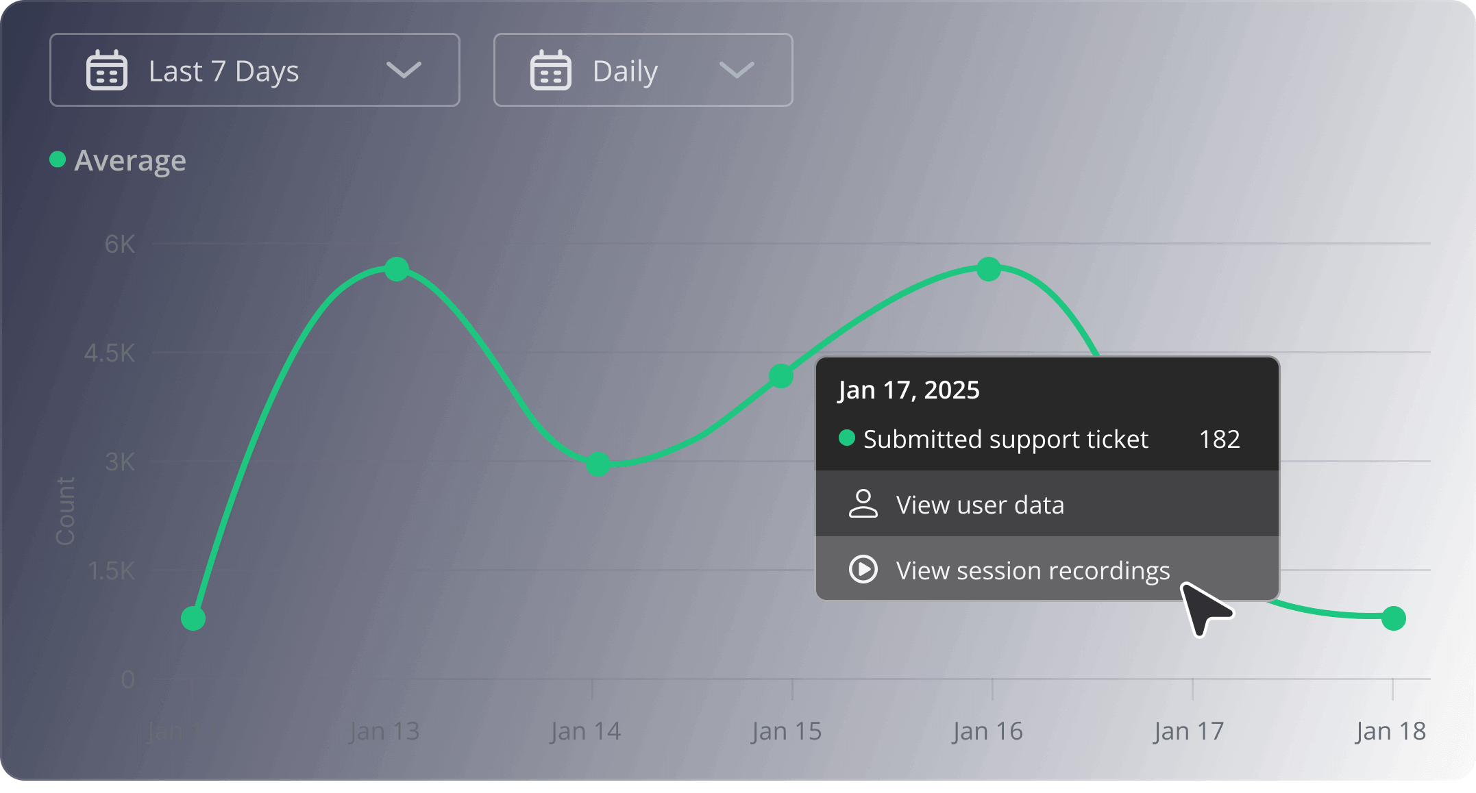
I like session replay paired with funnel analysis here because the funnel shows where users drop, and replays show what happened right before they left.
Mistake 2: You’re measuring the wrong success metric
The second mistake follows from the first. When teams treat signup as a standalone funnel, they also treat signup completion as the success metric, but signup completion by itself doesn’t say much. Here’s how Lenny Rachitsky puts it:
“Often companies define activation as simply completing the sign-up flow, which alone is unlikely to show a user the value of your product, and thus is unlikely to be predictive of long-term retention.”
This distinction is important because activation and signup completion aren’t the same thing. Lenny Rachitsky and Yuriy Timen’s study of more than 500 SaaS products found median activation at just 30%, which means most users who create an account never reach their aha moment.
Userpilot’s user activation rate report tells a similar story, with activation rates averaging 37.5% across 547 SaaS companies.
The reason teams keep reporting signup completion anyway is that it’s the metric that’s easy to pull. Form analytics are cohort-blind by default, so a dashboard that just counts submits looks clean even when each cohort behind it converts to active users at a different rate.
What to do instead: define the first meaningful action a user must take to experience value. This can be anything from inviting a teammate to importing data, creating a project, publishing a workflow, customizing a workspace, or connecting an integration, depending on your product. Then, track activation metrics by signup cohort and source so you can spot patterns faster and make better decisions.
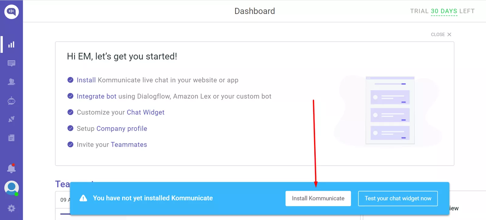
That’s what Kommunicate did. As a chat-based customer support tool, they knew chatbot integration was one of the strongest early signals that a new user had reached value. Instead of treating signup completion as the goal, the team focused on getting more users to that activation point.
They used Userpilot to draw new users’ attention to the integration button with a simple notification bar, and that simple move increased their signup-to-chatbot-integration rate from 40-45% to 55-60% over seven months.
Mistake 3: You’re giving every user the same tour
Generic onboarding tours may save your team time, but they rarely match what each user came to do. A product manager, a customer success lead, and a technical admin can sign up for the same tool and still need completely different first steps.
That mismatch slows time to value. It also creates drop-offs among new users who are still comparing options and haven’t made any real commitment to your product yet.
What to do instead: Use an onboarding survey to collect enough user data upfront to understand their role, company size, use case, and other details that shape the first session. Then use that data to tailor their onboarding experience.
Mistake 4: You’re collecting too much data too early
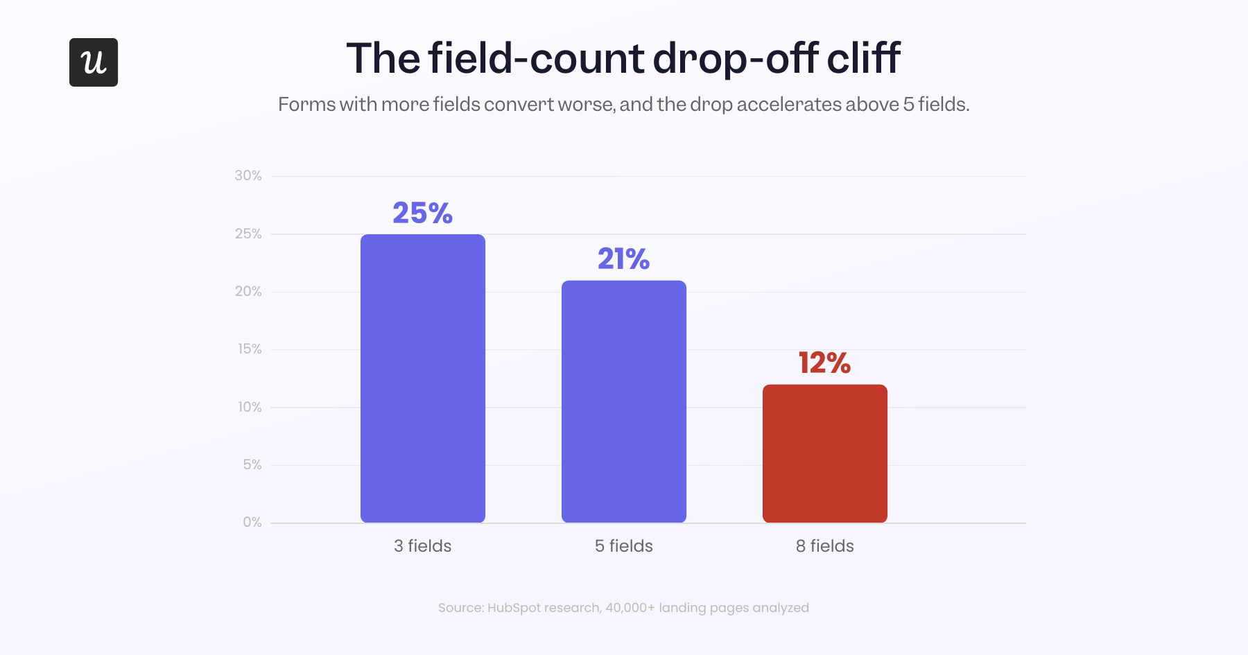
The relationship between sign-up form fields and conversion is non-linear and unforgiving. HubSpot’s research analyzing more than 40,000 landing pages shows that 3-field forms convert at roughly 25%, 5-field forms drop to ~21%, and 8-field forms collapse to ~12%.
Mandatory phone numbers are the most common offender, followed by required company-size and revenue fields. Both ask users for information they have no reason to share before they’ve experienced the product, which is the trade you can’t afford to make at signup.
What to do instead: Run the 30-day test on every field as part of your CRO audit. Pull each field on your signup form, ask who in your company actually uses that field’s data in the next 30 days, and remove every field that fails the test. Most signup forms shed two to three fields the first time this exercise gets run, and the conversion gain shows up the same week.
Mistake 5: You’re relying on passwords
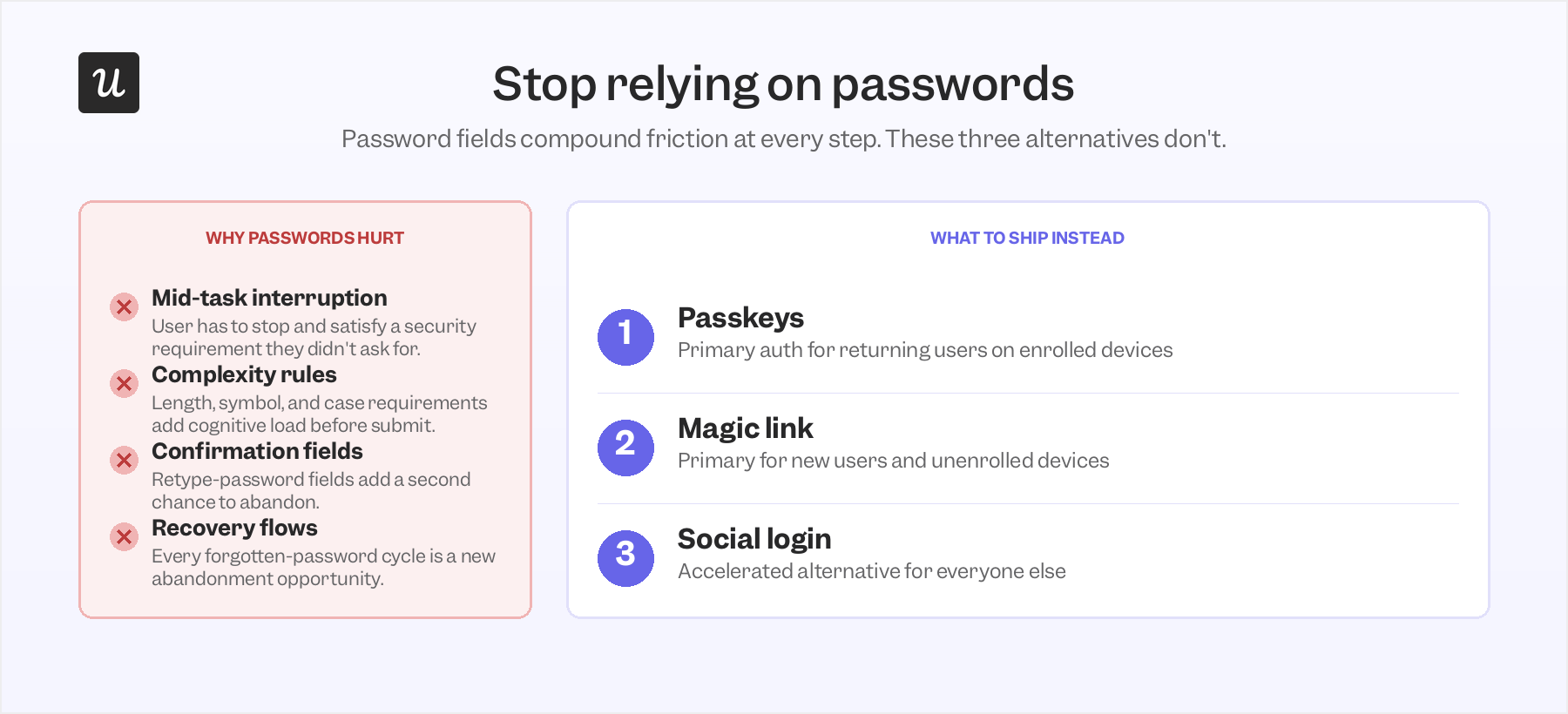
The password field is one of the largest sources of self-inflicted drop-off in any SaaS signup form. Creating one forces users to stop what they’re trying to do and satisfy a requirement that delivers no immediate value. Add complexity rules, confirmation fields, and forgotten-password flows, and the friction points compound quickly.
What to do instead: Ship passkeys as primary auth for returning users on enrolled devices, magic link as primary for new users and unenrolled devices, and social login as an accelerated alternative for everyone else. Shipping that combo removes one of the highest-friction fields on your form and gives users faster ways to create or return to an account.
Your onboarding tool needs its own analytics
The biggest win across all five mistakes is using a customer onboarding tool that can also analyze user behavior. Bolting a flow builder onto a separate analytics stack gives you a flow you can ship and a measurement layer that lives somewhere else, which means three things break:
- Segmenting users for personalized onboarding becomes a manual export.
- Adjusting the flow after UX changes becomes a coordination problem.
- Tracking the flow’s performance against product usage metrics turns into a quarterly report instead of a daily signal.
What you want instead is one system where the flow segments your users, runs the personalized onboarding, tracks its performance, and correlates flow completion with downstream feature adoption.
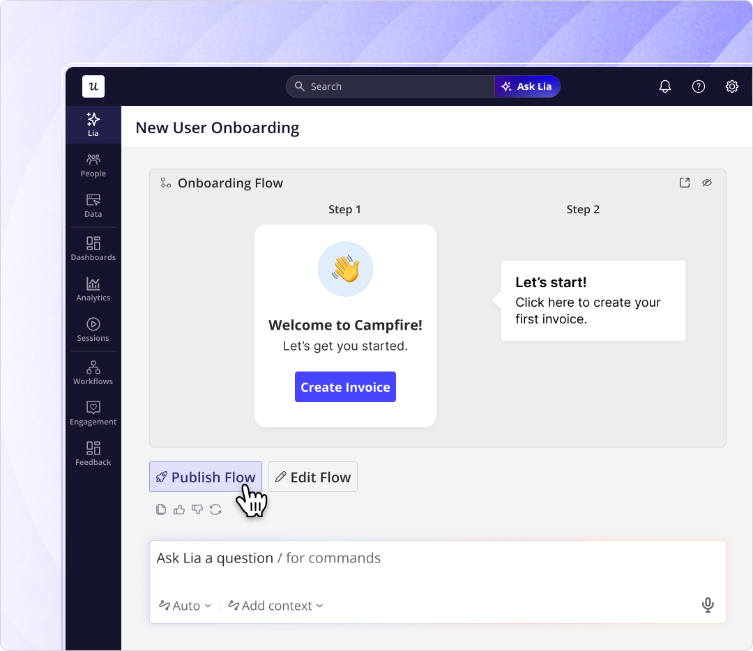
Userpilot’s Product Analytics is tied to Workflows, and Lia is built specifically for this loop: the same system that builds the onboarding path also measures whether it leads to real activation. And because it’s no-code, your team can build, test, and adjust the whole flow in one place.
Six SaaS signup flows worth studying
Now that we’ve covered the common mistakes and what to do instead, let’s look at six sign-up page examples worth studying.
1. Rive: The product-as-proof signup flow
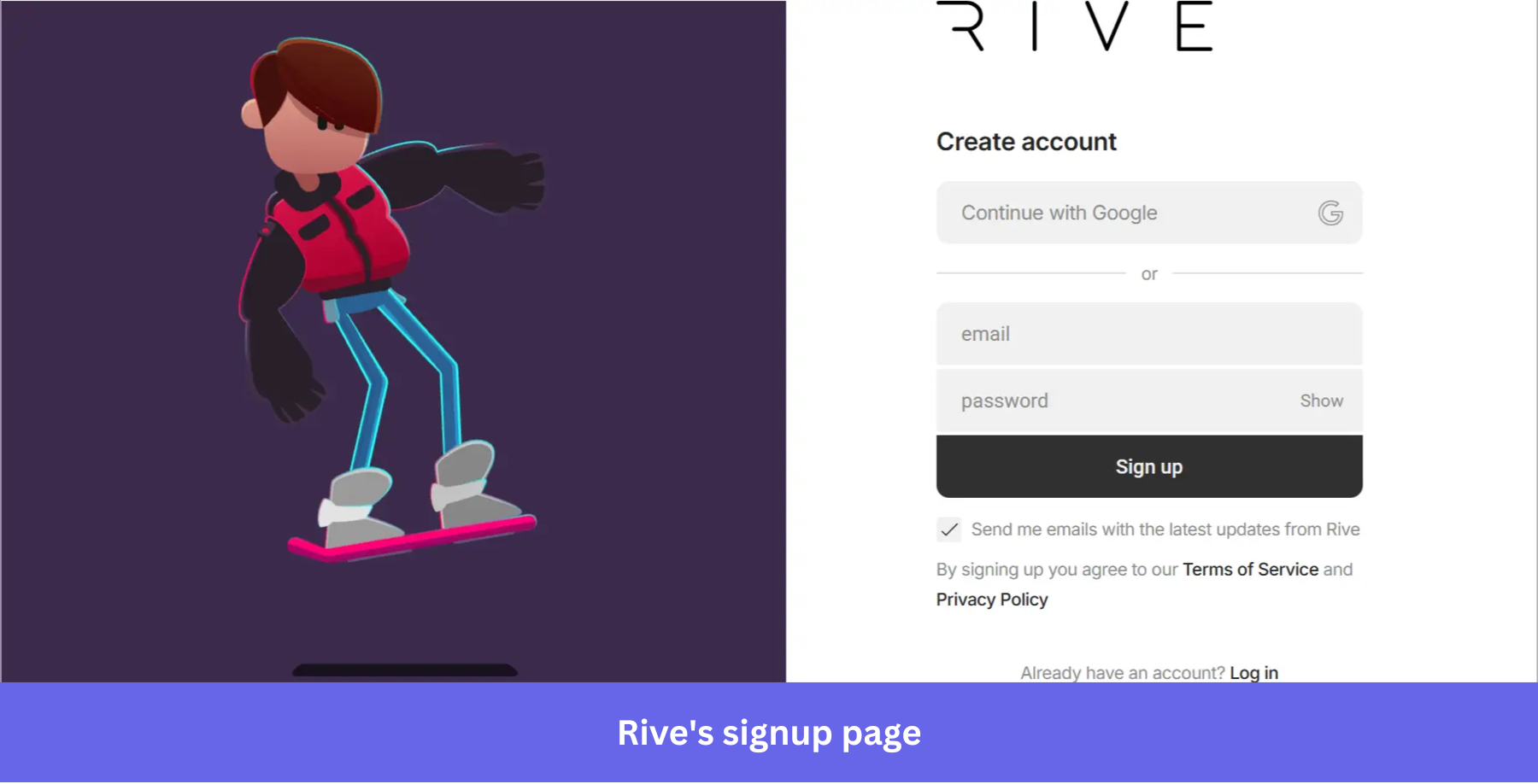
Rive is an interactive animation tool, and its signup form puts that capability on display through a Rive-built animation on the left side of the page.
The signup page itself becomes a small product demo, which is a smart move for any SaaS product with a visual or interactive surface.
Key lessons:
- If your product has an interactive surface (animation, data viz, design canvas), use the sign up form itself as the proof-of-concept demo. It earns trust before the password field appears.
- Google SSO sits above email signup, giving users a faster path while keeping the manual email option available.
- The form is simple, but the page still has personality. That balance is important because a sterile signup page can feel forgettable, while a heavy one can slow users down.
2. Asana: The single-promise signup flow
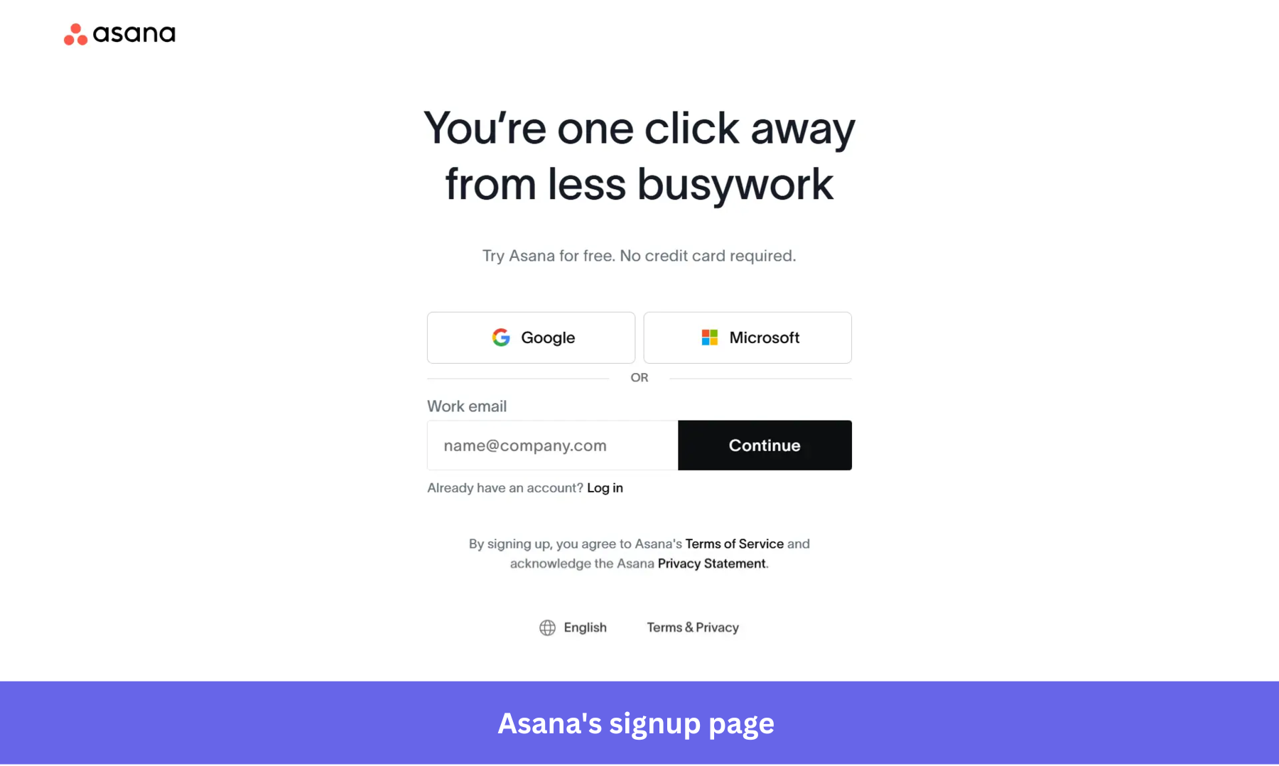
Asana’s signup page does one thing very clearly: it gives the user a simple promise and removes the obvious reasons to hesitate.
The headline says, “You’re one click away from less busywork,” the subtext says there’s no credit card required, and the form provides quick ways to sign up.
Key lessons:
- If your product is already familiar to the market, the signup page doesn’t need to carry the whole value proposition. One clear promise can be enough.
- Making it obvious that no credit card is required removes a common source of hesitation before the user starts.
- Offering Google, Microsoft, and work email gives users fast paths without making the page feel crowded.
3. Miro: The work-email-first signup flow
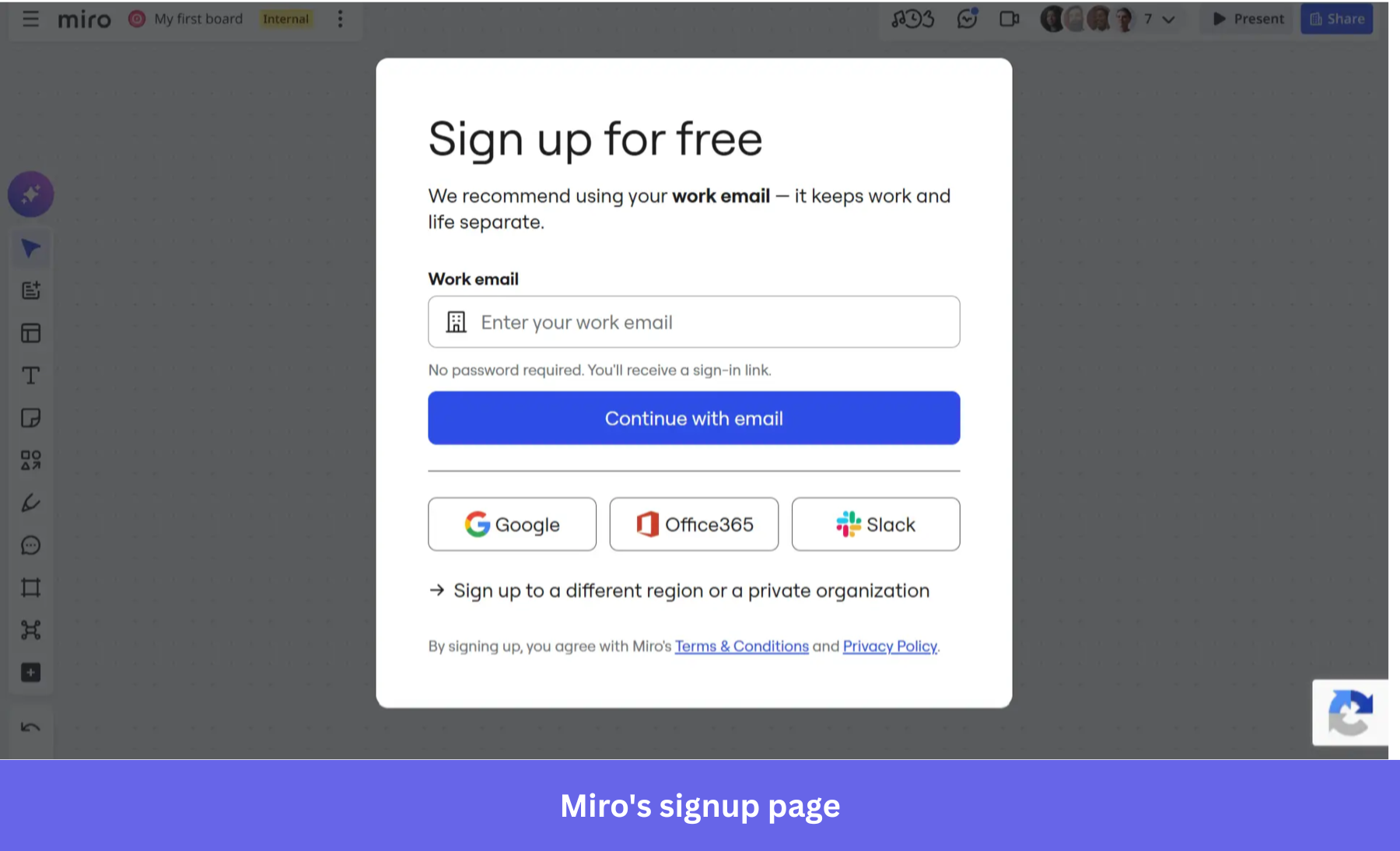
Miro builds its signup flow around a work email. The email address a user provides becomes both the account identifier and a source of company-level context, while the password requirement disappears entirely through sign-in links.
The signup modal also sits on top of a blurred Miro board, which matters. That makes signup feel like the last step before using the product, not a separate gate.
Key lessons:
- Use work email when company context matters, but explain why you’re asking for it.
- Passwordless sign-in reduces friction without losing the company-level signal that comes from a work email address.
- Let the signup page preview the product environment when possible. A visible workspace can make the form feel like an entry point instead of a wall.
4. Stytch: The auth platform that demos its product in its own signup
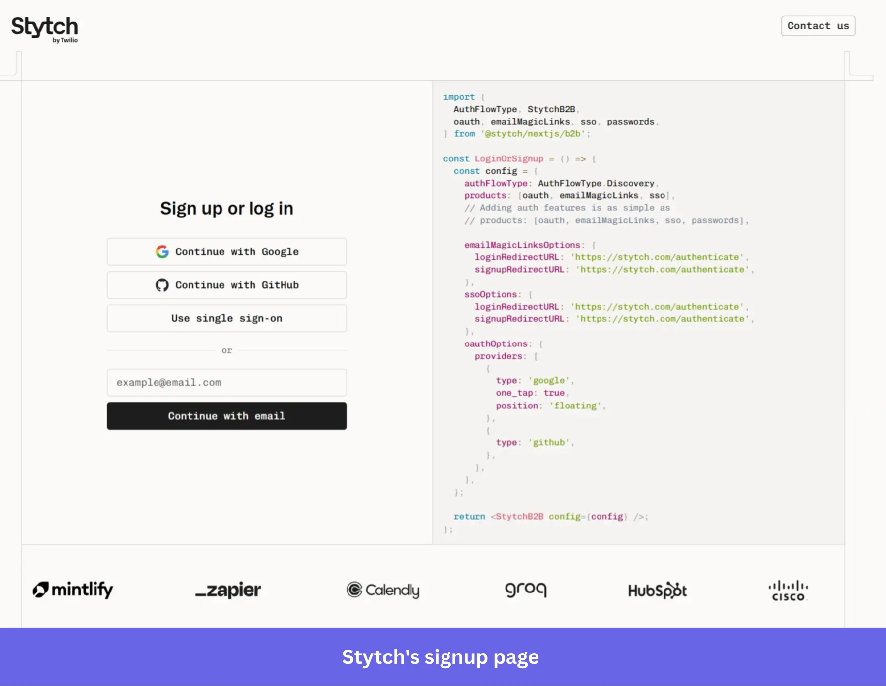
Stytch is an authentication platform, and its signup page demonstrates that capability instead of describing it. The left side contains the live signup experience, while the right side shows the authentication code powering it.
Key lessons:
- Your signup flow can double as a product demo when the signup experience itself is part of the value proposition.
- If your audience is technical, show the product in action instead of explaining what it does.
- Social sign-on, enterprise SSO, and email authentication are all visible in one place, helping users immediately understand the range of authentication methods the platform supports.
5. ClickUp: The one-field signup flow
ClickUp removes nearly every possible source of friction between intent and account creation. The page has one field, one action, and one outcome.
Like Miro, the signup form also sits on top of a blurred view of the product, giving users a glimpse of the workspace they’re about to enter without distracting them from the signup itself.
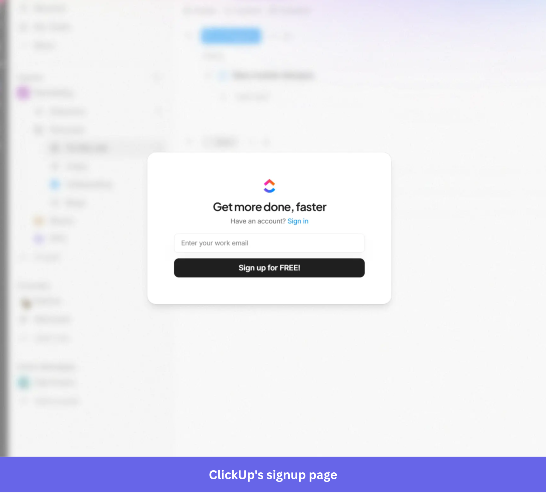
Key lessons:
- If you don’t absolutely need a piece of information at signup, collect it later.
- The headline, form, and CTA all reinforce the same idea: speed. When every element on the page supports the same message, users know exactly what to expect after they sign up.
6. Lovable: The AI-first signup flow
Lovable is one of the clearest examples of where AI-driven user onboarding is going. Its homepage has a prompt box that invites prospective users to describe what they want to build.
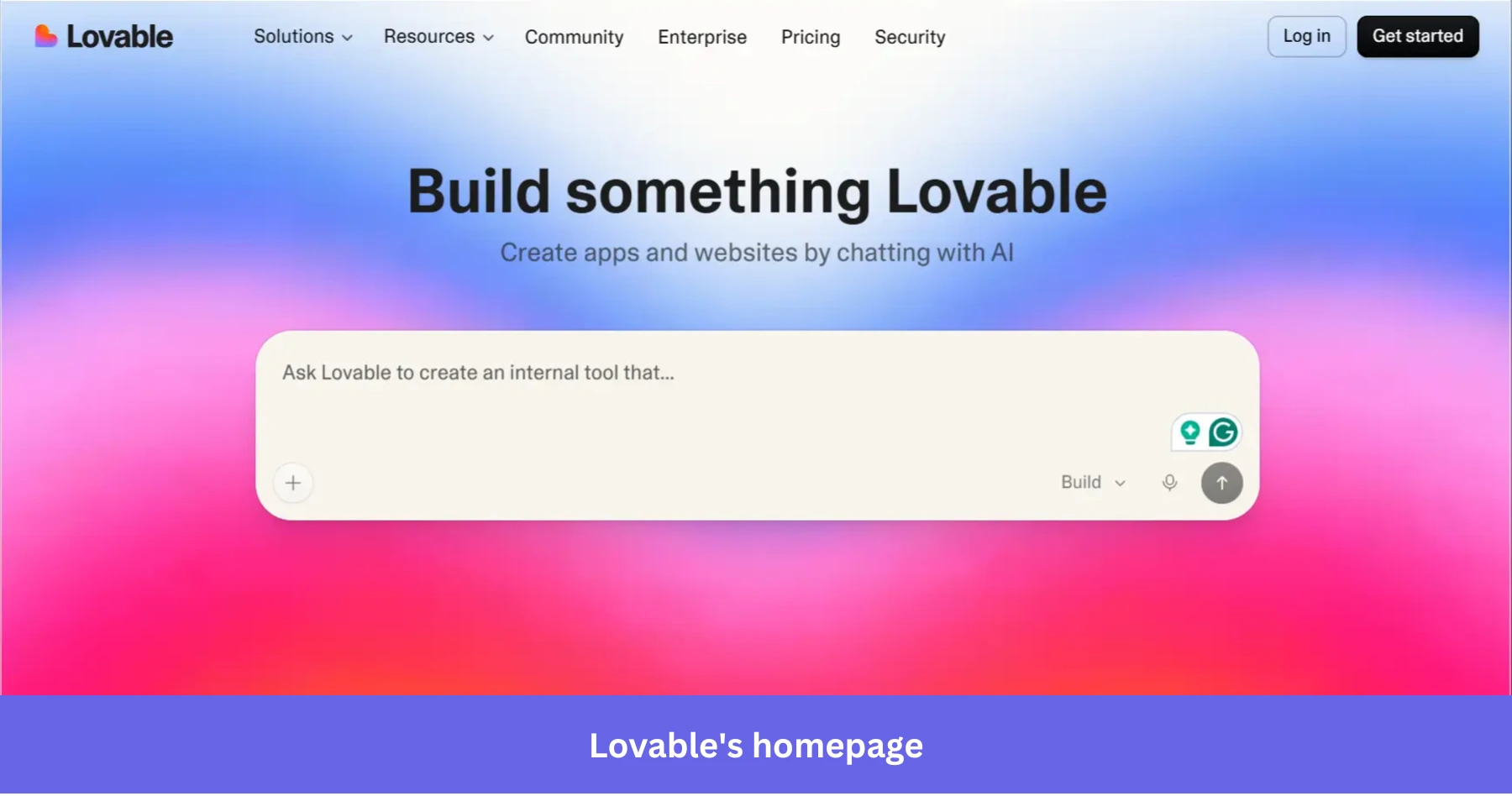
After the user communicates intent, Lovable asks them to create a free account before viewing the output. By the time the signup modal appears, the form feels like the next step in the workflow rather than a wall in front of it.
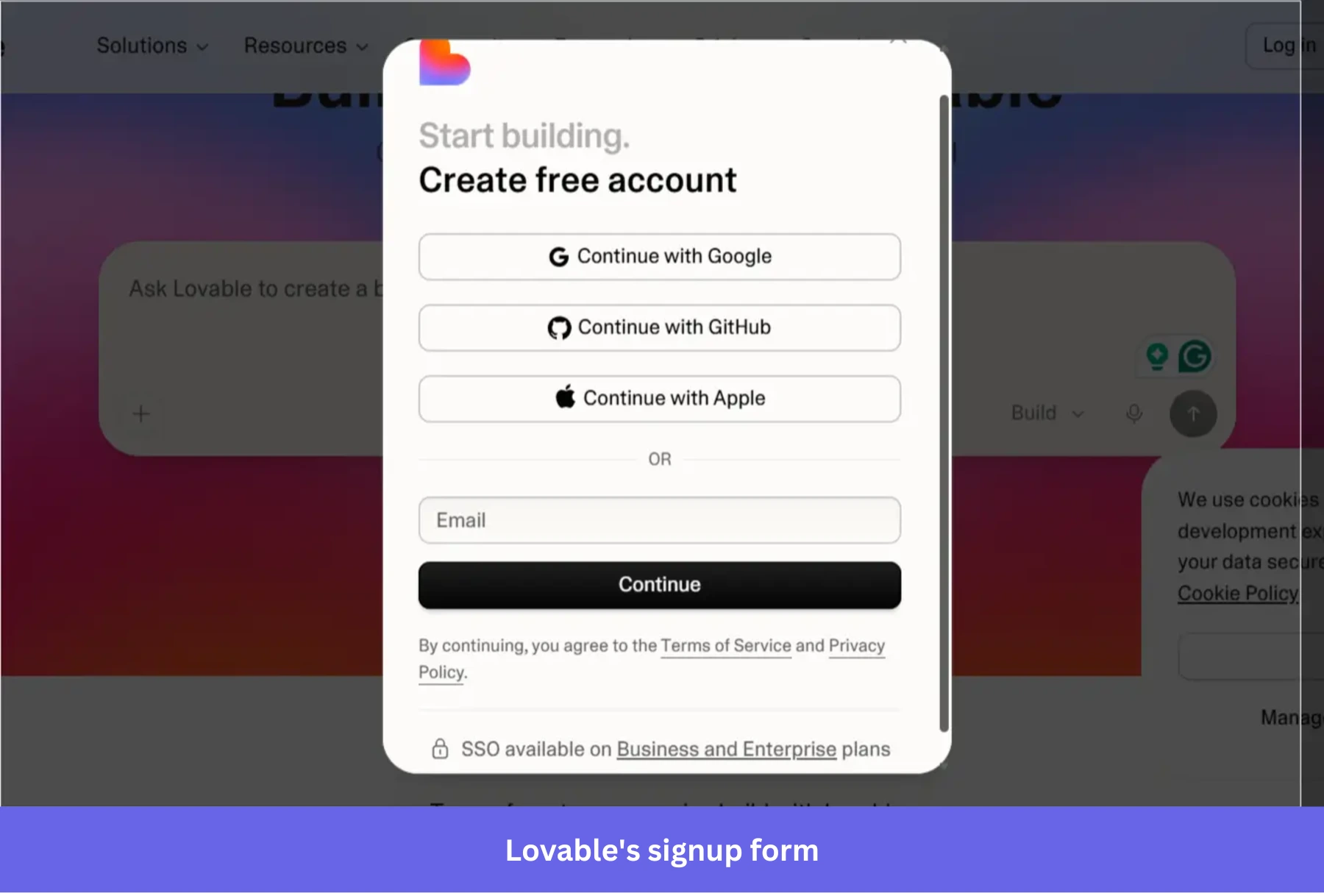
Key lessons:
- If AI can help the user express intent before signup, put that interaction before the form. This will boost new user engagement while giving you data to tailor the onboarding experience.
- When possible, make the signup modal feel like an extension of the task the user already started, not a separate account-creation chore.
The user class your signup form was never designed for
Cloudflare Radar data published in June 2026 shows that automated systems now account for 57.5% of HTTP requests across the web, compared with 42.5% from humans. That doesn’t mean agents already dominate SaaS signups, but it does show where site traffic patterns are moving. Gartner also predicts that 40% of enterprise applications will include task-specific AI agents by the end of 2026, up from less than 5% a year earlier, which means more products will need sign-up and access paths built for software acting on a user’s behalf.
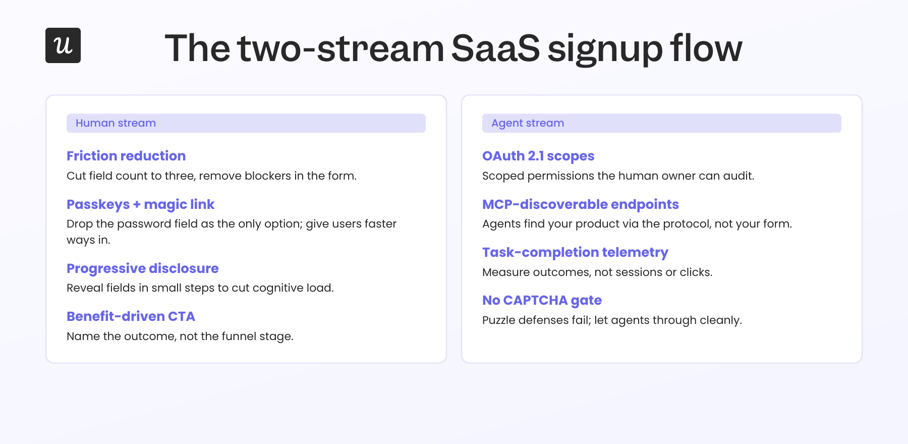
Agents care about different things, like whether your auth supports OAuth 2.1, whether your endpoints are MCP-discoverable, and whether the agent can complete its assigned task without a CAPTCHA blocking the workflow.
Yazan Sehwail, our CEO, framed the deeper shift bluntly:
“You’re no longer operating. The AI is operating. You’re just evaluating and monitoring the agent workflow.”
If the human is monitoring instead of operating, your signup flow needs to let the agent complete the task and let the human owner see what happened. With that in mind, here are three pieces of work I’d prioritize before the end of the year:
- An MCP-compatible OAuth path at signup: When an agent shows up at your registration endpoint, give it OAuth 2.1 scopes that map to tasks the human owner has approved, not a password meant for a single user.
- A distinct agent account model: Track which actions came from an agent versus the human owner, and give the owner an audit log they can act on.
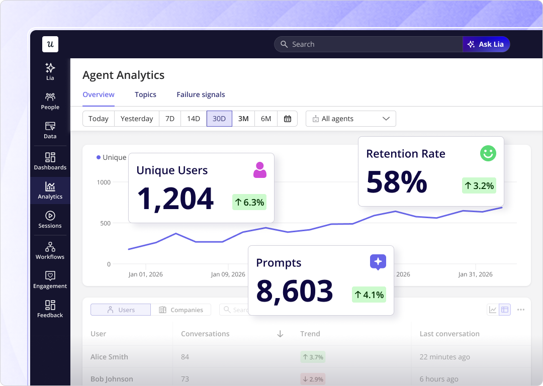
- An agent analytics layer that measures task completion, not sessions: Measure human users with user behavior analytics, such as duration, clicks, pages viewed, and drop-off points. Judge agents by outcomes, such as whether they completed the task, where they failed, and what they did before handing control back to the human owner. Userpilot’s AI Agent Analytics is built for this exact measurement problem:
What to ship in your signup process this quarter?
The signup flow you’re A/B testing was probably solving a problem that stopped being the bottleneck three years ago. The teams winning in 2026 and beyond are scoring activation rate, not form completion, and they’re treating the agent stream as a serious second user class instead of a noise category.
On the human side, the practical work is mostly subtraction. Cut field count to three, default to passkeys with magic link fallback, replace generic CTAs with benefit-driven ones.
On the agent side, the work is more architectural: ship MCP-compatible auth, build a distinct agent account model, and add an analytics layer that measures task completion instead of sessions. Userpilot can help if you want a head start on either stream. Book a demo, and we’ll show you what the dual-stream signup flow looks like end-to-end for a product like yours.
FAQ
What is the goal of a SaaS signup flow in 2026?
The goal of a SaaS signup flow in 2026 is to route a new user, human or agent, to a real product outcome inside the first session, not to collect data or maximize form completion. Signup completion is a secondary diagnostic at best. Activation rate measured against a value event your team has defined is the metric that predicts retention.
Should I require email verification before product access?
Email verification before product access is often unnecessary. Mandatory verification at signup interrupts users at the highest-momentum point of the funnel, slows time to value, and pushes them to leave the product to check their inbox. Allow immediate product access after signup and prompt verification asynchronously, except for products with regulatory, security, or compliance reasons that require pre-verified accounts.
How do I know if my SaaS signup flow is actually working?
Measure activation rate by signup cohort and source, not just form completion.
Use session replay and funnel analytics to watch what happens right after submit, because a lot of activation drop-off happens there rather than on the form itself. Correlate flow completion with feature adoption inside the same analytics system, because users who finish your onboarding without ever opening the feature it taught are a false positive your team keeps celebrating.
About the author