Product Dashboard in 2026: Build For the Decision, Not the Sprint Review


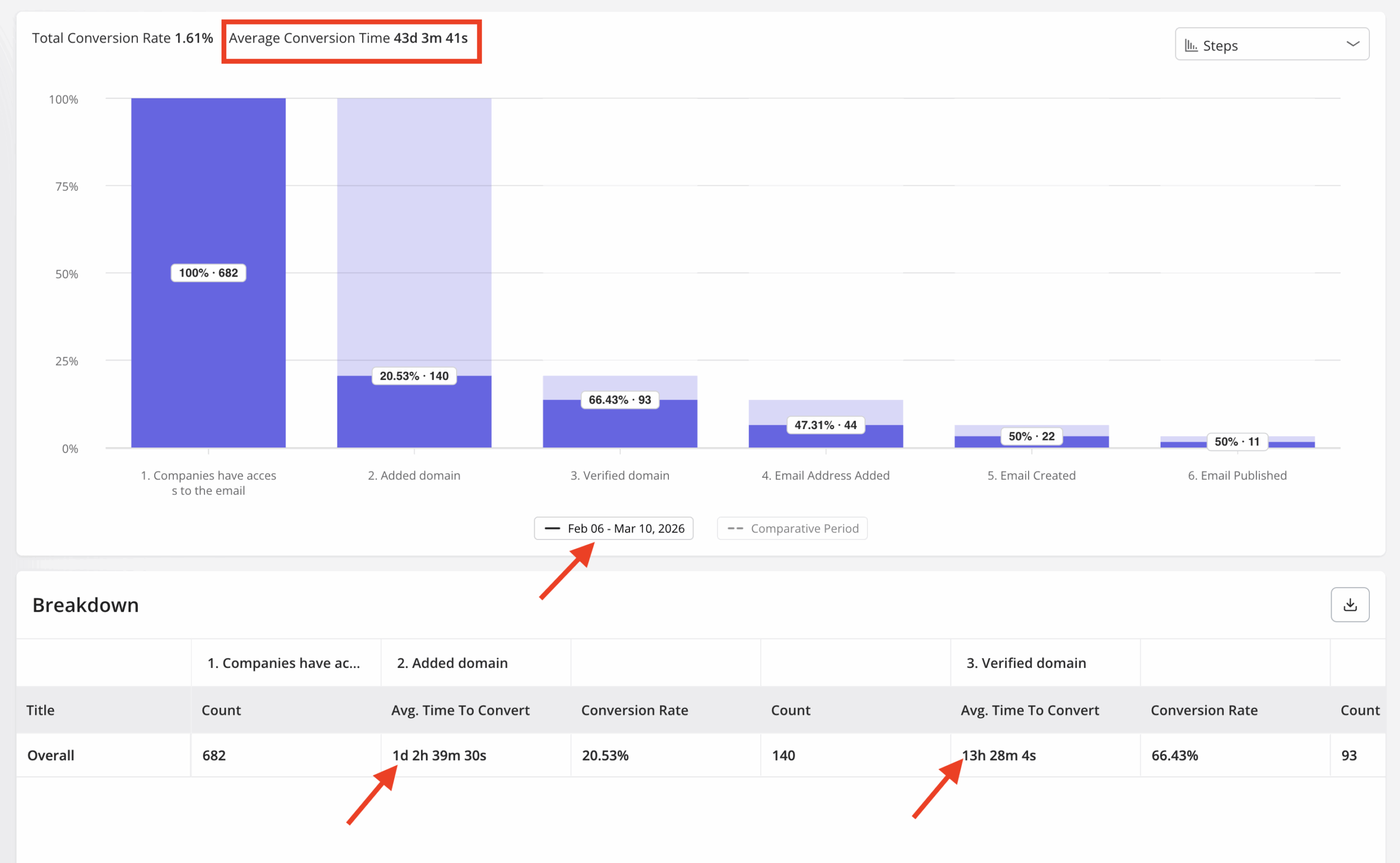
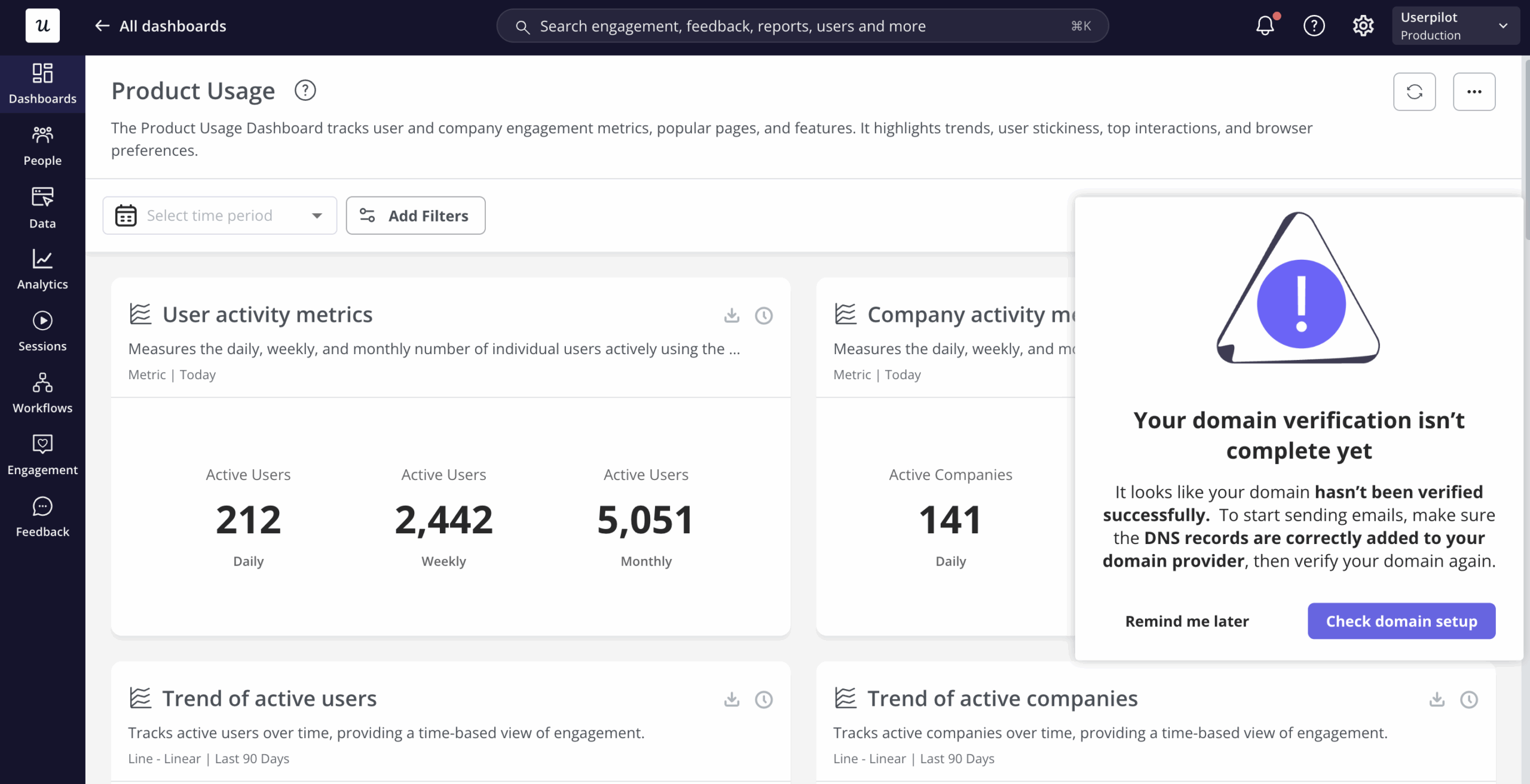
The product dashboard for our email feature launch showed a sharp drop-off at domain verification, and I knew exactly what to look at next. Users were stalling at that step: about 70% of them, consistently, across three days. I confirmed the funnel data in Userpilot’s product analytics, built a tooltip and onboarding checklist that afternoon, and closed the drop-off without a single engineering ticket.
That story only worked because the product dashboard was built around a specific question: where are users getting stuck in this feature, and what does the team do about it. Nothing in that view was there for stakeholder reporting. It was a decision trigger, and it triggered one.
Too many product dashboards I see as a PM, do the opposite. Velocity, story points, TTV, NPS, MRR, ARPU, uptime: all in one view, all treated equally, none of them tied to a specific call the team needs to make. That kind of dashboard gets checked at the sprint review and ignored for the rest of the week.
This post covers the argument I’ve landed on after running product at Userpilot: a product dashboard only works when it’s built around the decision it’s supposed to trigger, and when its metrics match the actual stage the product is in. I’ll cover why most dashboards fail this test, how to match your setup to your lifecycle stage, what the 2026 AI context changes, and how to choose the right tool without overbuilding your stack.

A product dashboard has one job: Trigger a decision
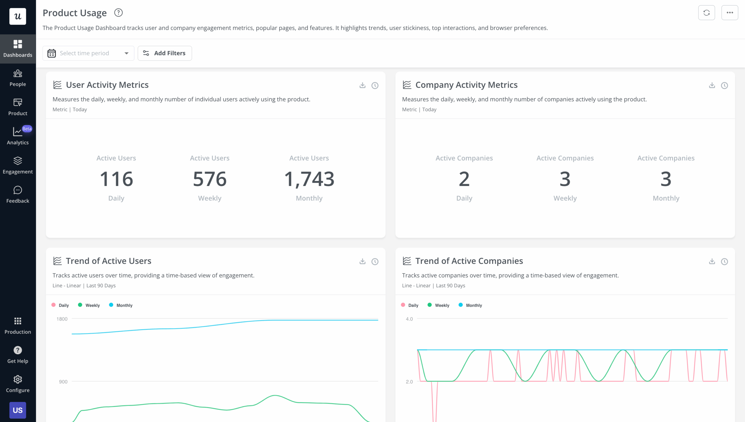
A product dashboard is a visual interface built around the decisions a product manager needs to make, not the metrics an executive wants to see in a report. It answers questions like: is this feature being adopted by users who can actually access it, where in the flow are users dropping out, and is this sprint’s delivery on track to hit the outcome the team committed to. The distinction from a BI reporting tool matters: BI dashboards aggregate historical data for stakeholder review; product dashboards surface current signals for team-level action.
Distinguishing a product dashboard from a customer engagement dashboard matters just as much. Engagement dashboards track health signals (DAU/MAU, NPS, health scores, churn risk) and their job is to tell you whether users are staying or leaving. A product dashboard tracks delivery health, feature performance, and lifecycle signals; its job is to tell you what to build, fix, or kill next.
Both are legitimate and both are necessary. They answer different questions for different audiences, and the problem comes when one dashboard tries to do both jobs, ends up doing neither well, and gets abandoned after two sprint cycles.
Why most product dashboards don’t change anything
The failure mode isn’t bad metrics. Most product teams have access to the right numbers. The failure is that no one on the team has decided what action each metric is supposed to trigger when it changes.
Product decisions were sometimes a drive-by in earlier stages of my career: following what competitors shipped, or adding a metric to the dashboard because it was easy to pull, without anyone asking whether crossing a threshold would change anything. That produces dashboards that feel comprehensive and make no one act differently.
Apptension’s 2026 analysis of AI-era PM practice named this precisely. Output metrics are easy to check off; outcome metrics force a decision.
“The PM sees ‘usage’ go up, but churn does not go down. That gap happens when you measure output (features shipped) instead of outcomes (tasks completed, time saved, fewer tickets, higher retention).”
— Apptension, SaaS product management in the AI era, Feb 2026
The sprint-review dashboard is the most common version of this failure. A team builds a view with ten charts, reviews it on Fridays, notes that DAU went up and velocity slipped, and moves on. No one asks what a 15% slip in velocity means for the roadmap commitment, or what an uptick in DAU among trial users signals about the conversion workflow.
Ellie Fields, co-founder of analytics platform Ridge AI and former VP at Tableau, put the sharpest version of this problem I’ve seen in 2026. Her observation came from renewal conversations where a customer couldn’t show their finance team that the product created measurable value.
“The CFO is going to be asking, is anyone even using this?”
— Ellie Fields, co-founder, Ridge AI
A dashboard built around activity instead of decisions can’t answer that question. Renewal conversations have nowhere to go without evidence of actual value delivered.
The lifecycle framing: Which dashboard for which stage
The most useful reframe I’ve made in how I build dashboards at Userpilot is this: the right metrics depend entirely on the question the team is trying to answer, and that question changes completely depending on where the product is in its lifecycle. A pre-launch feature needs a different dashboard than a feature in growth, which needs a different dashboard than a mature feature, earning its maintenance cost.
Most generic dashboard guides miss this. They hand you a list of twelve metrics and tell you to pick the important ones, but “important” is not a property of a metric in isolation. It’s a property of the decision you need to make at a given moment.
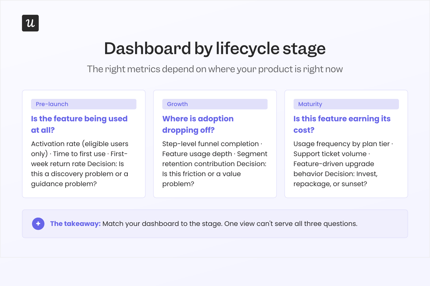
Pre-launch: Is the feature being used at all?
The only question worth answering at pre-launch is whether the feature is being discovered and activated by users who can actually access it, not all users, but eligible users. This is the denominator mistake that makes pre-launch features look like failures when the feature is fine and the measurement is broken.
When I fixed the denominator for our scheduled-send feature from total MAU to “users on a plan that includes scheduled send,” the adoption rate jumped from 11% to 47%. Nothing about the feature had changed. That adoption rate had been calculated against the wrong population the entire time.
The three signals worth watching at pre-launch: activation rate among eligible users, time to first use, and first-week return rate. If activation is low but time to first use is fast for the users who do activate, the feature is probably fine but missing a better discovery moment. If time to first use is slow across the board, the fix is nearly always in-app guidance rather than engineering.
Growth: Where is adoption dropping off?
Once a feature clears initial activation, the growth-stage dashboard shifts to funnel health. The question moves from “are users finding this?” to “where are users dropping out of the intended workflow, and is the drop-off a friction problem or a value problem?” Both look the same in funnel data until you watch the sessions.
Our email feature had a friction problem at domain verification, not a value problem. A funnel view in the dashboard pinpointed the step, and session replay confirmed the confusion users were running into.
Once we released the email feature, I checked where users were stalling and which step was causing drop-off. The culprit often isn’t engineering; it’s in-app messaging, and that’s a fix measured in hours, not sprints. Within a few hours, I just created a targeting modal and showed it to users and highlighted the correct steps for them to make it clear what to do next. That helped a lot on reducing friction and supporting users in real time without involving our dev team.
Distinguishing friction from value matters because the fix is completely different: friction calls for in-app guidance and onboarding, while a value problem calls for a harder conversation about whether the feature belongs on the roadmap at all.
The three signals for the growth-stage dashboard: step-level funnel completion rates, feature usage depth (are users going beyond the first interaction?), and segment-level retention contribution. That last one is your causal hypothesis, which needs confirmation through experimentation, but it tells you which funnel step to prioritize fixing first.
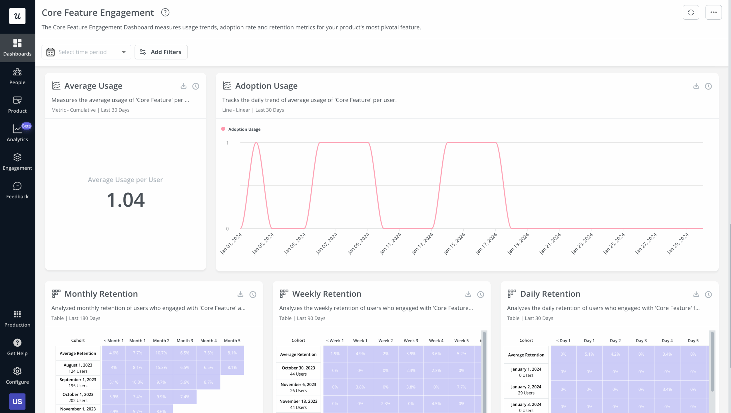
Maturity: Is this feature earning its maintenance cost?
A mature feature heavily used by your free tier but barely touched by paying customers is a pricing signal, not a success signal. Declining usage in a growing user base is a sunset candidate, not a growth opportunity. The maturity-stage dashboard answers one question: is this feature worth the ongoing cost to maintain and support it?
At maturity, the signals worth tracking: usage frequency by plan tier, support ticket volume attributable to the feature, and whether the feature drives any measurable upgrade or expansion revenue behavior. When usage is flat, support load is high, and the feature isn’t differentiating in competitive deals, the next conversation is about sunsets, not sprints.
Ellie Fields’ renewal-proof question is the maturity-stage acid test: can a customer’s CFO see, from your dashboard, that this feature created measurable business value? A feature that’s used but not valued shows up in renewal conversations before it shows up in usage data.
How to set up a product dashboard that triggers decisions
The process has four steps, and the first is the one most guides skip. Before picking any metrics, name the specific decision the dashboard is supposed to support. Not “monitor product health” but something concrete: “decide whether to invest more engineering in the email feature this quarter,” or “catch any new feature whose activation is behind plan by week three.” That specificity determines which three metrics belong on the dashboard and which twenty don’t.
Step two: Pick three metrics that move that decision, not five or ten. More metrics means more reading time, more discussion time at the sprint review, and lower signal density per minute spent. Three is not a rule; it’s the ceiling I’ve found that keeps a dashboard actionable rather than comprehensive.
Step three: Set a threshold that triggers a review. “Feature X has fewer than 40% activation among eligible users by day seven” is actionable; “Feature X has low activation” is not. The threshold doesn’t need to be perfect on first use; you can revise it after one quarter, but it needs to exist before the dashboard goes live, not after a problem has already become obvious.
Step four: Assign an owner for each threshold. A metric with no owner is a metric no one acts on. The owner doesn’t need to build the fix; they need to call the review when the threshold trips.
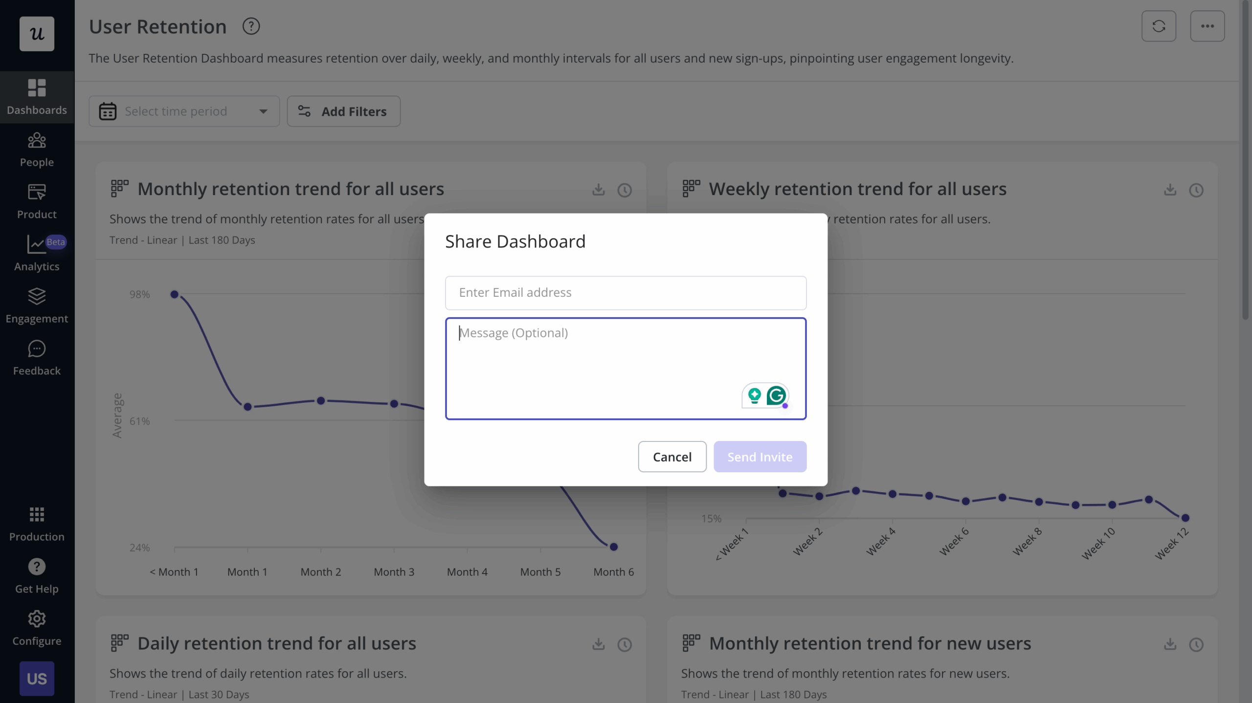
Once the events are tagged and the thresholds are set, the sharing step matters more than most teams expect. A dashboard with no designated owner and no shared view for the cross-functional team doesn’t trigger reviews; it gets screenshotted into a Slack message once a quarter and forgotten.
Product dashboards in the AI era: What changes when agents ship features too
The lifecycle framing above still holds in 2026, but two things make it harder to execute manually. First: shipping velocity. Yazan Sehwail, CEO of Userpilot, described the tracking problem that follows when AI-assisted engineering changes the pace of delivery:
“As producing and building features become a lot cheaper, instead of every quarter, you’re releasing one or two features, now you’re releasing 7, 8, 9. It becomes even harder for product teams to manually have to track each one and understand usage for each one.”
— Yazan Sehwail, CEO, Userpilot
When your team ships seven or eight features per quarter instead of two, a weekly dashboard refresh cycle will always be one release behind the latest adoption curve. The manual monitoring process has to compress, or it stops being useful.
Adding to this: the definition of “user” is getting complicated. AI agents interacting with your product through MCP servers and APIs don’t generate click events, session duration records, or hover data. A product dashboard built entirely around click-stream analysis will misread any account where agents are handling a meaningful share of the workflows.
For agent traffic, the metrics that matter are task completion rate, intent resolution, and tool-call accuracy: did the agent complete the task end-to-end, did it correctly understand the user’s goal, and did it call the right API endpoint with the right parameters? These replace session-based metrics for agent-heavy flows. The click-stream layer doesn’t disappear; it stops being the full picture.
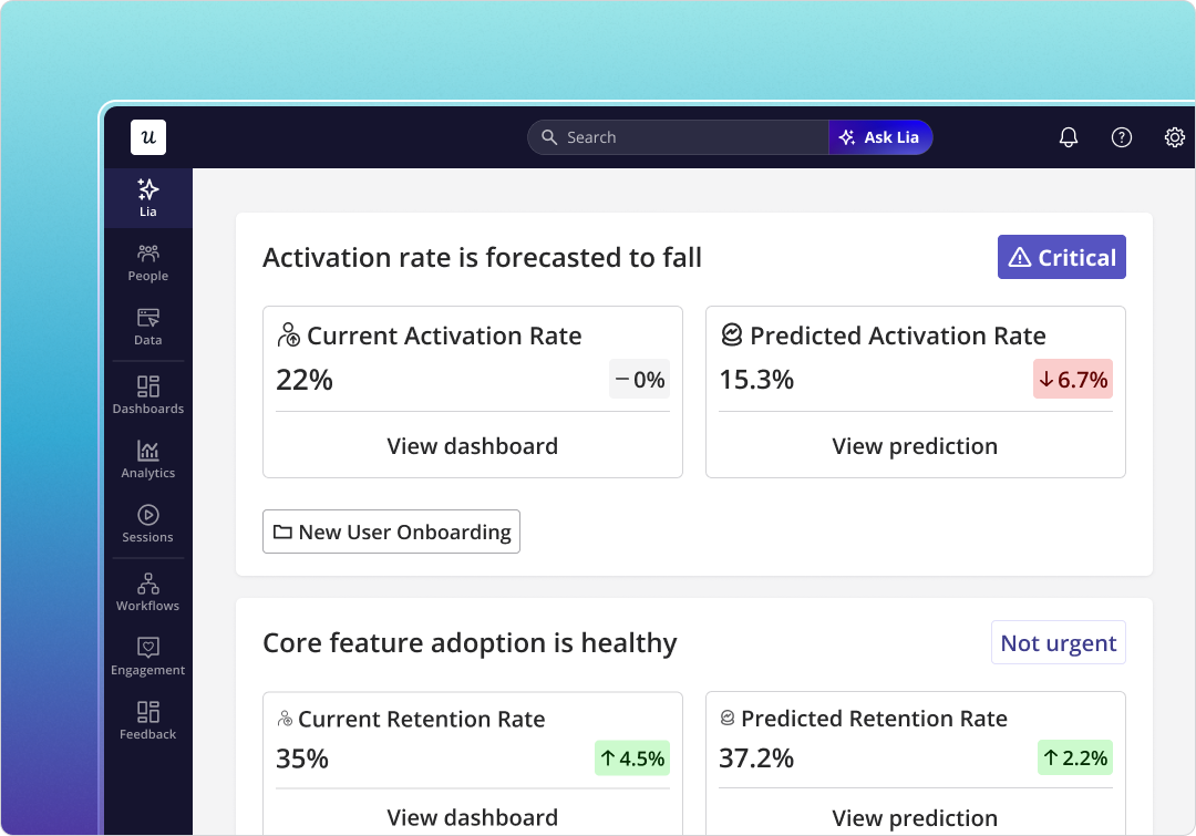
Userpilot’s Agent Analytics dashboard tracks both streams in the same place: agent task usage, intent resolution, satisfaction rate, failure signals, and outcome quality alongside the human behavioral data. You don’t need to build a separate stack for agent-side monitoring; the same platform that shows you where human users drop off also shows you where your agents are failing.
Over 70% of PMs now use AI-powered tools daily for tasks including data analysis, according to ChatPRD’s March 2026 research. Yet most product dashboards are still built to measure human click behavior. That gap is where misread adoption numbers live.
The framing I use for AI-surfaced signals applies to this new metric layer too. Every pattern the system surfaces (an anomaly flag, a task failure spike, a usage drop it caught before the weekly review) is a hypothesis that needs testing. Whether the AI is right or wrong, I treat every suggestion as an experiment whose results I need to evaluate before acting.
Yazan described the shift in operating model when I asked about how AI changed his view of product monitoring:
“It was just basically individual employees chatting with it, and you couldn’t systemize it. You couldn’t measure the impact of AI on ROI and your processes. Now it’s changing with the capabilities that are happening. It actually is good enough now to automate a whole process from A to Z.”
— Yazan Sehwail, CEO, Userpilot
Our AI agent Lia handles most of the operational monitoring layer now. Instead of pulling feature health reports manually before a sprint review, Lia surfaces what’s changed across active features before I’d catch it in a weekly scan of the dashboards.
Tools: How to choose for your product stage
The generic tool comparison (Mixpanel, Amplitude, Heap, Userpilot, Tableau in a feature matrix) doesn’t tell a PM what they actually need to know. What a PM actually needs to ask is: which tool fits where my product is right now, and does it let me act on what I see without switching platforms?
At pre-launch, you need clean event tracking and funnel analysis. Mixpanel and Amplitude handle this well, and Userpilot’s no-code analytics means engineering doesn’t need to instrument every event manually from day one. The right choice at pre-launch is whatever your team will actually use consistently, because inconsistent tracking is worse than imperfect tooling.
At growth stage, the question changes. You need behavioral analysis, but you also need to act on what you see without a context-switch to a separate platform. Mixpanel and Amplitude show you the drop-off; Userpilot Analytics shows you the drop-off and lets you build the in-product fix (tooltip, checklist, guided flow) in the same place, without an engineering ticket.
At maturity, you often need portfolio-level aggregation rather than feature-level behavioral data. Tableau and Looker handle this well. If you’re already using Userpilot, the Data Sync feature exports behavioral data to your BI warehouse so the stack doesn’t need to be rebuilt; the layers connect.
| Stage | Primary question | Right tool layer | Userpilot’s specific role |
|---|---|---|---|
| Pre-launch | Is the feature being discovered and activated by eligible users? | Event tracking + funnel analysis | No-code auto-capture via Chrome extension; no engineering instrumentation required |
| Growth | Where in the flow are users dropping off, and is it friction or value? | Behavioral analysis + in-product intervention | See the drop-off and build the fix in the same platform |
| Maturity | Is this feature earning its maintenance cost and supporting renewals? | Portfolio aggregation + BI integration | Data Sync exports behavioral data to your existing BI warehouse |
One note on Mixpanel specifically: if you’re already using it for behavioral analysis and want to add in-product guidance on top, the Userpilot-Mixpanel integration connects both layers without replacing either. You keep the analytics depth you’ve already built and add the ability to act on what you see.
Tableau remains a strong choice for mature-product portfolio reporting and executive dashboards, particularly when the audience is finance or leadership rather than the product team itself. Its setup cost is front-loaded but the ongoing maintenance is low once the data sources are connected.
Build the dashboard around the decision, not the metric count
A product dashboard that covers every possible metric is not a comprehensive tool. It’s a decision-avoidance mechanism. The teams I see getting real value from their dashboards are the ones who started with a question (one specific call the team needs to make) and built backward from there.
Match the signals to the stage, set thresholds that trigger reviews, assign owners, and keep the view narrow enough that everyone on the team knows what action a given number is supposed to prompt. That’s it. That’s the whole practice.
If you want to see how this works inside Userpilot (the funnel data, the in-app fix, the threshold alerts, and Lia surfacing what’s changed before your weekly review), book a demo and we’ll walk through the actual setup rather than describing it.
About the author