How to Measure New Feature Success in 2026: Humans, Agents, and Adoption Drop


You ship a new feature in 2026, and you measure its success the way you always have. Adoption rate over the first 30 days. NPS. Drop-off. DAU/MAU. Retention. The numbers technically move, but the story they tell about new feature success doesn’t match what you see when you open product analytics and dig into who actually used the thing.
I am Userpilot’s Head of Product Design, and my team owns the launch read on every feature we ship. I have personally reviewed several thousand session replays in the last 18 months, looking for what the dashboards missed. The 5-metric checklist I trained the team on in 2023 (adoption rate, NPS, drop-off, DAU/MAU, retention) is the one I am now telling them to stop trusting on its own. That isn’t a recommendation I make lightly, and the data behind it is not subtle.
Engineering velocity went vertical. AI-assisted development means a team that shipped one or two features a quarter in 2024 is now shipping seven or eight. Natalia, our PMM, surfaced an industry benchmark recently in our internal newsletter that captures what that did to the user side: average product adoption rate fell from roughly 20% to 6%. Six percent of the features you shipped this quarter are getting used. The user’s hours did not expand to absorb the new features.
The second change is harder to see in the dashboard. A growing share of your active accounts isn’t human. AI agents now reach into SaaS through MCP servers, invoke a function, get a result, and leave. They do not click your tooltip. They do not trigger your modal. They never appear in a session replay. The metrics built for human eyeballs misread their activity entirely, and in agent-heavy accounts, “feature adoption rate” is becoming a fiction.
The metric set hasn’t changed. The user has, the shipping cadence has, and the meaning of “adoption” has come apart underneath us. There are now two streams of new feature success to measure: human signals and agent signals. The five-metric checklist most teams use today measures the first one shallowly and the second one not at all. New feature success measurement is no longer a product analytics function. It is a whole-team operating problem with a 30, 60, and 90-day clock attached to every launch.
So this guide does four things, in this order:
- Names the two pressures actually breaking the legacy 5-metric checklist, with the 20% to 6% shift the playbooks were not built for.
- Lays out an Outcome-First ladder that replaces the flat metric list with a hierarchy: reach, adoption, outcome, business impact.
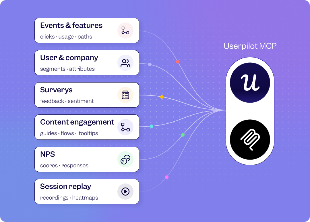
- Splits measurement into human signals and agent signals, with concrete metrics for each stream and Userpilot’s own Agent Analytics as the operating layer.
- Calls out two metrics worth deprioritizing on a per-feature basis (yes, including DAU/MAU), and the playbook for retiring them without losing the read on retention.

Measuring new feature success in 2026: A summary
Here’s a quick summary of this post:
The new definition of new feature success
- Feature success in 2026 is an outcome produced for the user, not a click recorded in your analytics tool.
- Two pressures are breaking the legacy adoption metric: AI-assisted shipping velocity (more features per unit of user attention) and agent users (more activity per non-clicking actor).
- The product-led growth shift is now framed as PLG 1.0 (User-Led), 2.0 (Agent-led), 3.0 (Headless). Read the full PLG 2026 guide here. Each stage measures feature success differently.
- Wes Bush, founder of ProductLed, sums up the underlying shift: when the user changes from human to agent, the product still has to prove value. It just proves it through outcomes the agent can verify, not through interfaces the human can read.
Your feature-success measurement model in 2026
The Outcome-First ladder
- Reach: Did the right segment ever encounter the feature? (replaces raw adoption rate as the entry metric)
- Adoption: Did they invoke it? (the legacy metric, demoted to mid-tier)
- Outcome: Did the feature produce the result it was built to produce? (the new spine)
- Business impact: Did that result move retention, expansion, or activation? (the metric that gets the feature kept or killed)
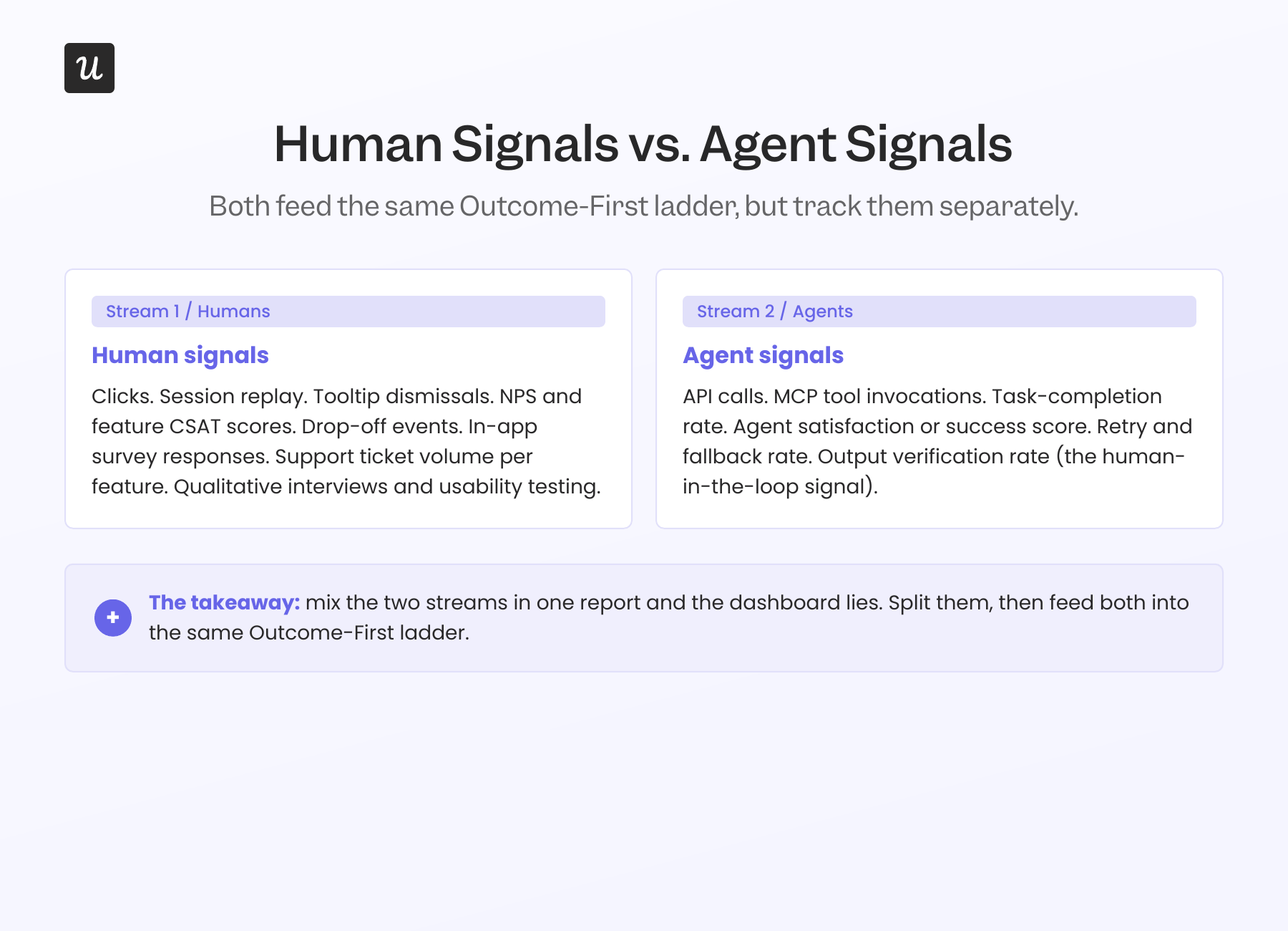
Two streams to measure separately
- Human signals: Clicks, session replay, tooltip dismissals, NPS, drop-off, qualitative survey responses.
- Agent signals: API calls, MCP-tool invocations, task-completion rate, agent satisfaction or success rate, retry rate, fallback rate.
Two metrics worth deprioritizing on a per-feature basis
- DAU/MAU stickiness for one feature: A high-value feature used once a week beats a low-value one used daily. James from customer success calls this failure mode “high logins, zero outcomes.”
- Raw click-based adoption rate: Especially for any feature also exposed via API or MCP. Agents skew it both directions, depending on which way you cut it.
Readiness checklist: Is your feature-success program ready for 2026?
- Have you defined an outcome event for every new feature, not just an invocation event? If you only track “user clicked X,” you are measuring adoption, not feature success.
- Can you separate agent traffic from human traffic in your reports? If not, agent-heavy accounts are quietly distorting your dashboards.
- Do your dashboards distinguish between “feature shipped, never reached” and “feature reached, never invoked”? The fix for those two is different.
- Do you have at least one named anti-pattern metric the team agrees to ignore? If everything counts, nothing does.
- Is feature success reviewed by the people who shipped it, not just by analytics? The diagnostic happens fastest when the PM and designer watch the data themselves.
Why measuring new feature success matters more in 2026, not less
Half the teams I talk to assume that with AI doing more of the building, measurement matters less. The opposite is true. Feature performance, feature retention, and feature-level business impact are the work now, not a finishing pass.
When a team shipped two features a quarter, you could afford to read each launch by feel. When the same team ships eight, you cannot. The cost of a misread is higher because there are more launches to misread, and the cost of measuring well is lower because the data tooling has caught up.
What measurement actually does for new feature success in 2026:
- Validates the product-market fit of a feature, not the product: I have seen product managers fall for a feature idea only to have it killed because no one needed it. Early data tells you whether to invest more or pivot.
- Reallocates engineering hours to where they earn back: Eight features a quarter does not mean eight times the value. Knowing which two are pulling weight is how you reassign the rest.
- Reduces friction before it becomes churn: Smooth feature launches protect the customer relationship. User session analysis tells you exactly where users get stuck.
- Earns the next budget cycle: Hard data turns a feature launch from a guess into a documented win. Easier headcount conversations follow.
- Surfaces the second iteration faster: No first launch is perfect. Detailed reads of user behavior show whether users dropped off immediately or after repeated use, which is a different fix.
The two pressures breaking the legacy 5-metric checklist
To measure new feature success in 2026, start by understanding why the old way is failing. Two forces compound.
Pressure 1: Shipping velocity has outpaced human attention
Yazan Sehwail, Userpilot’s CEO, named this on a recent internal product review: AI is writing the code now, so teams that shipped one or two features a quarter are shipping seven, eight, nine, and product teams are no longer able to manually track each one.
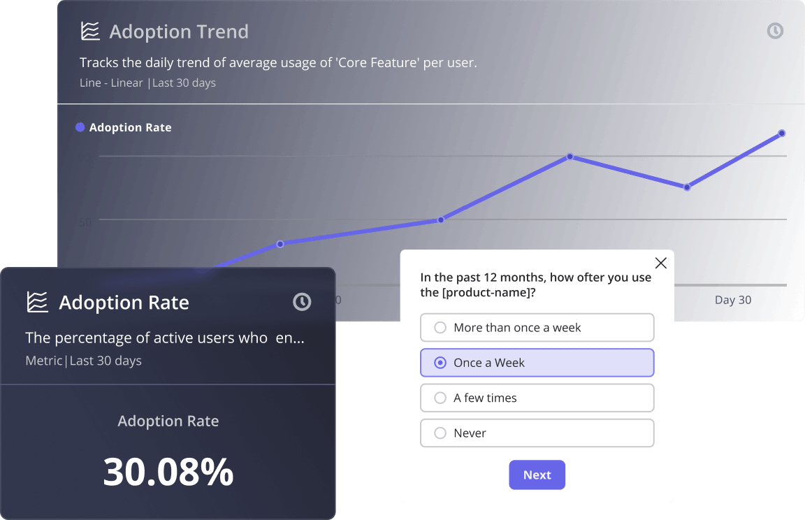
The user’s calendar did not expand to match. The Userpilot Product Metrics Benchmark Report from 2024 set the average feature adoption rate at 24.5%. By 2026, an industry benchmark Natalia surfaced in Userpilot’s newsletter, pegs the average product adoption rate at 6%. Same product, more shipping, less attention to go around.
What this does to the legacy metrics:
- Adoption rate inflates the denominator artificially: “What % of monthly active users used feature X” looks low when 30 active features compete for the same hour.
- Drop-off rate flags the wrong things: A user who tried the feature, decided it was not relevant to their workflow, and went back to the one they came in for is not a failure. Most legacy drop-off rate instrumentation cannot tell that apart from genuine friction.
- NPS captures sentiment about the product, not the feature: Asking “how likely are you to recommend us” after the seventh tooltip in a month produces noise.
Pressure 2: Agents are now a real share of feature usage
The second pressure is harder to see in the dashboard because it shows up as activity that does not match the metric definitions. AI agents using SaaS through data integrations and MCP servers do not click. They do not dwell on a tooltip. They invoke a function, they get a result, they move on.
Kyle Poyar, author of Growth Unhinged and a former operating partner at OpenView Venture Partners, put it bluntly when asked about the shift in our newsletter exchange:
“AI-driven, zero-click purchases feel like an inevitability, likely beginning with developer tools and commodity products. The question is: will you be ready when AI agents start buying?”
Buying decisions need outcome-quality signals. Click-based adoption will not get you there. The implication for new feature success measurement is concrete: for any feature also exposed through an API or an MCP tool, click-based adoption rate misses the agent half of usage. Worse, it skews in non-obvious ways. Agents invoke the feature far more frequently per unit time than humans, so if you count agent calls, adoption looks heroic; if you filter them out, adoption looks dead.
The outcome-first feature success ladder
The legacy 5-metric checklist treats adoption rate, NPS, drop-off, DAU/MAU, and retention as five horizontal sibling metrics. They are not siblings. They live at different levels of cause and effect, and treating them as a flat list is what makes a feature look successful when it is not.
The Outcome-First ladder reorganizes them into a hierarchy. Higher rungs depend on lower rungs, and the highest rung is what the feature was built to do.
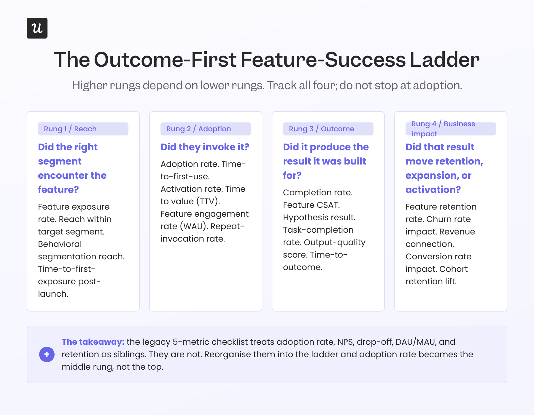
Rung 1: Reach (was raw adoption rate)
Before you ask whether someone used the feature, ask whether the right segment ever encountered it. A feature that 6% of accounts used might have only reached 12% in the first place, in which case the real adoption rate is 50%. That is a different problem (a distribution problem) than 6% adoption out of 100% reach (a value problem).
Abrar Abutouq, one of our product managers, walked through this exact reframe with a mobile feature. Instead of saying only 10% of all customers were using mobile content in Userpilot, he said, the honest framing was that 25% of customers who actually had a mobile app were using mobile features. Same data, different denominator, different decision. User segmentation hygiene is the first measurement upgrade most feature-success programs need.
Specific metrics worth tracking at this rung:
- Feature exposure rate: Eligible users who saw the announcement, modal, or in-product prompt.
- Reach within target segment: The denominator that actually matters, sliced by role, plan type, and use case.
- Behavioral segmentation reach: Instead of grouping by who the user is, group by what they do. Existing customers are already active in the related feature, power users in the same workflow, and free users on a relevant plan type. Report reach within each behavioral segment separately.
- Time-to-first-exposure post-launch: How quickly the feature surfaced to its target audience.
Rung 2: Adoption (the legacy metric, demoted)
Adoption rate still matters, but it sits in the middle of the ladder, not at the top. The question it answers is “given that the right people saw this, did they try it?” That is useful. It is not feature success on its own.
Track feature adoption at this rung as:
- Adoption rate: The percentage of total users who try the new feature in a defined time frame.
- Time-to-first-use: How quickly users discover and activate the feature. Faster is better. For strategic features, measure this in days, not weeks.
- Activation rate: The speed and success with which users integrate the feature into their workflow, not just the speed of first contact.
- Time to value (TTV): How long it takes a user to realize the value of the feature, measured from first exposure to first useful result. TTV is the bridge metric between Rung 2 and Rung 3.
- Feature engagement rate: The percentage of users who used the feature within a defined time frame. Useful for spotting weekly active users (WAU) patterns specific to the launch, separate from product-wide DAU/MAU.
- Repeat-invocation rate: One use is curiosity; three is habit.
Rung 3: Outcome (the new spine)
This is where most teams stop measuring and where the actual signal lives. Did the feature produce the result it was built to produce? If you shipped a “schedule report” button, the outcome is not that someone clicked it. The outcome is that someone got a scheduled report delivered they did not have to manually re-run. Those are different events. Track the second one.
Outcome instrumentation is the work the legacy 5-metric checklist quietly skipped. Our newsletter put it in one line: replace feature discovery with outcome clarity, guide users to goals, not UI. Translated to measurement: every feature ships with an outcome event, not just an invocation event.
General outcome metrics that work for any feature:
- Completion rate: The percentage of users who finish the intended end-to-end workflow of the feature. Not “did they start it”; “did they finish it.”
- Feature CSAT: A customer satisfaction score scoped to the feature, calculated as satisfied responses divided by total responses to a post-outcome survey. Pair it with feature NPS where the question fits.
- Hypothesis result: Did the launch hit the success threshold the team set before shipping. If you wrote the hypothesis down, this metric is binary.
Sample outcome metrics by feature type:
- Reporting feature: scheduled-delivery success rate, report-opened-by-recipient rate.
- Collaboration feature: cross-user action completed (the @mention got a reply, the shared doc got an edit).
- Automation feature: end-to-end run-to-completion rate, manual-rework rate after the run.
- Search or AI feature: result-accepted rate, follow-up-prompt rate, task-completion rate.
Rung 4: Business impact (the metric that decides whether the feature lives)
The top rung is where feature success connects to user retention, expansion, and activation. This is what the executive review actually wants to know. Did the feature move the metric the company gets paid on?
The metrics that matter at this rung:
- Feature retention rate: The percentage of users who continue using the feature in successive periods (daily, weekly, or monthly cohorts), tied back to the feature’s activation event so the cohort definition is honest.
- Churn rate impact: Whether existing customers who adopted the feature show lower overall product churn than those who did not. This is usually the strongest indicator that the feature is doing real work.
- Revenue connection: Direct or indirect revenue attributable to the feature, including upgrade rate, expansion ARR, and trial-to-paid conversion lift.
- Conversion rate impact: How the feature affected the existing conversion funnels you already report on, not a new funnel you invented to make the launch look good.
The reason Rung 4 earns the budget conversation: research from Bain & Company on customer loyalty, building on Frederick Reichheld’s work, has long held that increasing customer retention rates by 5% can lift profits by roughly 29% to 95%, depending on the segment. Most of that compounding is invisible at the per-feature level until you build cohort retention measurement into the launch process. Without it, every feature looks neutral on revenue.
This is also where you have to be honest about attribution. Most teams overclaim here, and getting it right requires either holdout cohorts (a segment that did not get the feature, often delivered through feature flags for a controlled rollout) or pre-and-post comparisons with a control variable. James Mitchinson, Userpilot’s head of customer success, has the most honest version of this measurement: high logins, zero outcomes is a dashboard pattern that looks great until you realize the customer is not getting anywhere. The inverse holds, too. A feature with mediocre invocation can quietly carry retention if its outcome rate is high.
Human signals vs. agent signals: Measuring both feature-usage streams
The Outcome-First ladder is the vertical structure. The horizontal split is the two-stream model. To measure new feature success in 2026 honestly, instrument both human-driven and agent-driven invocations of the same feature, and report them separately. Mixing them is what is currently making dashboards lie.
Human signals
The legacy stack still works for this stream, with one important upgrade: tie every signal to a Rung 3 outcome event, not to invocation alone.
- Click and event data: Invocation, repeat-invocation, abandonment within the flow.
- Session replay: Where the user got stuck, what they tried before they tried the new thing, what they did after. Kevin O’Sullivan, Userpilot’s head of product design (and the author of this post), saved a feature this way once. A distribution chart his team was ready to retire turned out to have 10% of users actively hovering on it. Session replay is what caught it.
- NPS, CSAT, and in-app surveys: Deploy after a Rung 3 outcome event, not after Rung 2 invocation. “How likely are you to recommend Userpilot” right after a feature actually worked is a different signal than the same question fired at random. Feature CSAT (satisfied responses divided by total responses, scoped to the feature) is often the cleanest qualitative read.
- Support ticket volume per feature: A spike in tickets tagged to a new feature in the first 30 days post-launch is a usability signal that telemetry tends to surface last. Tracking it per feature, alongside a simple feature-sentiment tag on each ticket, catches issues click data misses.
- Qualitative interviews and usability testing: Still the gold standard for understanding why a Rung 3 outcome did not happen.
Agent signals
This is the new stream most measurement programs are not capturing yet. The instrumentation surface lives at the API, the MCP tool, and the agent’s own telemetry.
- Tool-invocation rate per agent run: How often does an agent reach for the feature, given a task it could be relevant to?
- Task-completion rate: Did the agent finish the workflow the human asked for, using the feature?
- Retry and fallback rate: Agents that retry or fall back to a different tool are signaling friction the human user would have abandoned silently.
- Agent satisfaction or success score: Many AI orchestration platforms now expose a per-call score. If yours does, log it against the feature.
- Output verification rate: Did a human reviewer accept the agent’s result? This is the human-in-the-loop rate, and per industry data, it is the most operationally honest agentic metric available.
Two metrics worth deprioritizing on a per-feature basis
The product analytics literature already deprioritizes DAU/MAU and session length at the product level. At the per-feature level, two more deserve a hard look.
DAU/MAU stickiness for a single feature
The argument against using DAU/MAU as a per-feature health metric has been kicking around the analytics world for two years now: frequency does not equal value. A reporting feature used once a week to generate a high-stakes board deck is worth more than a dashboard widget glanced at daily. James, our head of CS, watched a customer rack up huge logins on a feature their team was supposed to depend on, while the actual outcome the feature was meant to produce never materialized. High logins, zero outcomes. That is the failure mode.
Raw click-based adoption rate, for any feature with an API or MCP surface
If your feature can be invoked by an agent, click-based adoption rate will lie to you in one of two ways depending on how you slice it. Include the agent calls and human adoption looks heroic; filter them out and human adoption looks dead. Neither number tells you whether the feature is doing its job. Move adoption to Rung 2 of the ladder, instrument outcomes at Rung 3, and split the two streams in your reports.
How to actually measure new feature success: A 2026 playbook
The strategies I have seen work, in the order I would run them. Each one maps to a rung on the ladder and a stream in the two-stream model.
1. Define the outcome event before you write the spec
The single biggest measurement upgrade is also the cheapest. Before engineering writes a line of code, write the outcome event for the feature. Not “user clicked X” but “user got Y as a result of X.” If you cannot articulate Y, you cannot measure feature success and you probably should not ship the feature.
Abrar described how the Userpilot product team treats this as a non-negotiable: once we release the feature, we create a report and track meaningful events to see the feature’s health, whether they interact with it or not. The report exists before the launch announcement does.
2. Instrument the funnel and use feature flags for controlled rollouts
By “the funnel” I mean Reach, Adoption, Outcome, and Business impact, with an event at every transition. The most expensive measurement mistake is shipping the feature, watching adoption look low, and only then setting up the events to figure out why. By that point you have lost two weeks of usage data.
Pair the instrumentation with feature flags. Shipping to 10% of eligible users first, then 50%, then 100% gives you a built-in holdout cohort, lets you collect feedback from a smaller segment before the launch goes wide, and makes the post-launch attribution analysis at Rung 4 honest rather than aspirational. Feature flags also let you target specific user segments for a controlled rollout, which is the cleanest path to behavioral segmentation analysis once the feature is live.
Abrar walked through a concrete version of this with our email feature. A sharp drop-off appeared at the domain-verification step, well before users could create their first email. Because the events were already wired up, he shipped a checklist fix in hours, no engineering ticket required. The fix worked because the measurement was in place to catch the problem.
3. Write the hypothesis before the announcement, then tie the announcement to the outcome event
Before the announcement goes out, write down what you expect to happen. “We expect 40% of power users in segment X to invoke the feature within 7 days, and 25% to hit the Rung 3 outcome within 14 days, with feature CSAT above 4 out of 5.” That is a testable hypothesis, and the post-launch read becomes a yes-or-no answer instead of a vibe check.
Then make sure the right users encounter the feature, and measure whether the announcement actually drove the outcome, not just the click. A modal on first login followed by a tooltip pointing to the new element is fine. What matters is whether the cohort that saw the announcement reached Rung 3 at a higher rate than a control cohort that did not.
If you cannot run a holdout, at minimum compare the post-announcement adoption-to-outcome conversion rate against the pre-announcement baseline. If the announcement raised adoption but not outcome, the announcement is the wrong signal to celebrate.
4. Guide users to the outcome, not the UI
This is the operational version of guide users to goals, not UI. A two-step contextual walkthrough that points to the date selector and the “Generate Preview” button is fine. A walkthrough that ends when the preview generates, not when the buttons get clicked, is better, because the second one ties the guidance to Rung 3.
For features an agent will also use, the equivalent move is to ship a clean MCP tool definition and structured outputs the agent can verify. Yazan has been pushing this internally: as teams deploy their own AI agents, those agents tap on existing infrastructure that powers all the product-usage data. The cleaner your tool definition, the more reliably an agent can verify whether the feature actually worked.
5. Segment your measurement, not just your messaging
Smart user segmentation is usually framed as a way to send the right tour to the right user. It matters more as a measurement frame. Power users hit Rung 3 outcomes faster but generate fewer Rung 1 invocations per feature. Trial users do the inverse. If you do not segment when you measure, you will average them out and learn nothing.
6. Close the loop with feedback at the outcome event
After a Rung 3 outcome, fire a two-question NPS survey or its equivalent: “Did this work the way you wanted?” and “What would have made it better?” The timing matters more than the wording. Surveying after invocation tells you whether the feature was tried; surveying after the outcome tells you whether the feature delivered.
For agent traffic, the equivalent is the result-accepted rate. If a human reviewer rejects the agent’s output that depended on your feature, that is the feedback signal, even if the agent itself reported task-completed.
7. Run a feature post-mortem at 30, 60, and 90 days, with a performance-stability check on top
One review at the 30-day mark is the standard practice. It is not enough. The 30-day read tells you about Rung 1 and Rung 2 (reach and adoption). The 60-day read tells you about Rung 3 (outcome retention). The 90-day read tells you about Rung 4 (business impact, via cohort retention or expansion). Most teams kill features too early because they only ran the 30-day read.
Layer one operational metric set on top of the rungs: performance stability. Latency, load times, and error rates do not belong on the ladder, but a Rung 3 outcome that fires on a slow or flaky page is not a real outcome. Watch the technical performance of the feature for the same 30, 60, and 90-day windows, and gate the next iteration on it.
Where new feature success measurement is heading
Two threads from this post are about to converge. The shipping-velocity pressure means more features per quarter, which means measurement has to be cheap and automatic, not expensive and manual. The agent-traffic pressure means a growing share of feature usage will never appear in human-centric analytics, which means new instrumentation surfaces have to come online quickly.
Userpilot’s AI Suite, including Lia (our in-product AI agent) and Agent Analytics, is what we are building for the convergence. Yazan described the design principle on a recent internal review: instead of you operating the analytics tool, you start a project (improve trial-to-paid conversion, increase adoption of feature X), and Lia builds the reports, runs the predictive models, surfaces the segments, and tells you what to do. The shift is from operator to reviewer.
The bigger shift behind that one is the MCP server. As foundational models become the place work happens, your product-usage data needs to be reachable from them. Someone in finance who has never logged into Userpilot should be able to ask their AI agent, “Is product usage trending up or down for accounts in the renewal window?” and the agent should answer using your data. This is why we are treating the MCP server as the infrastructure layer of feature adoption metrics, not as a feature.
The two-pressure problem this article opened with is not getting easier. It is getting harder, faster. The teams that move now to outcome-first measurement and two-stream instrumentation will be the ones whose feature launches in 2027 still tell a coherent story. The rest will keep shipping features into a 6% adoption baseline and wonder why the dashboards stopped meaning anything.
Ready to turn every release into a reliably successful feature launch? Book a demo today.
FAQ
What metrics should you track to measure the success of a new feature launch?
Define the outcome the feature is meant to produce, then instrument the four rungs of the ladder: reach (did the right segment see it), adoption (did they try it), outcome (did it produce the result), business impact (did the result move retention or expansion). For features also exposed to AI agents, instrument the agent stream separately: tool-invocation rate, task-completion rate, retry and fallback rates, output-verification rate.
What is a good adoption rate for a new feature in 2026?
The Userpilot Product Metrics Benchmark Report (2024) put the average across SaaS at 24.5%. Industry benchmarks surfaced in 2026 put the median closer to 6%, reflecting the shipping-velocity pressure. Both numbers are diagnostic, not targets. The right comparison is the segment-level adoption rate among users for whom the feature is actually relevant, not the global average.
What are the 3 As of metrics?
Actionable, accessible, and auditable. Actionable: provides clear insights that directly inform the next step. Accessible: easy for everyone on the team to find and use, not gated behind specialized skills. Auditable: traceable to a reliable data source so accuracy can be verified at any time.
How do you measure feature success for AI features specifically?
Use the same Outcome-First ladder, but instrument the agent stream from the start. The Rung 3 outcome metric for an AI feature is rarely the click; it is the result-accepted rate (did a human verify the output) and the task-completion rate (did the workflow finish without manual rework). Most legacy AI feature instrumentation stops at Rung 2 (invocation), which is why so many AI feature dashboards look healthier than the actual feature.
About the author