Slack Onboarding Flow: 6 Best Practices to Copy


Have you ever been through Slack onboarding?
I went through it recently as part of a new project I’m working on, and I really like how instructive Slack’s onboarding process is.
So let’s look at the flow as a case study and see what other SaaS businesses can glean from it.
What does Slack’s onboarding flow consist of?
I broke it down into 9 steps, from the homepage to the prebuilt channels a new user sees once they’re in.
A quick note: the screenshots that follow reflect Slack’s onboarding at the time of writing, and Slack tends to tweak the small details as it goes.
The home page
One best practice I always push teams toward is to articulate their value proposition clearly and repeatedly. Slack does this exceptionally well.
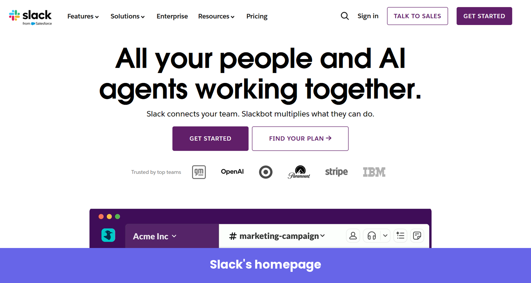
The headline leads with the outcome rather than the feature set: people and AI agents working together. Beneath it are recognizable customer logos that serve as social proof, showing that top enterprises are using the product.
The page carries more than one call to action. The primary button pushes you to get started. A secondary one sends you to compare plans. When I checked, both CTAs led to a frictionless sign-up flow because Slack’s goal here is to shorten the time to value and get you inside the product as fast as possible.
Away from those buttons, a separate “Talk to Sales” option sits in the top navigation. That one is aimed at the enterprise buyer, who often has a more involved use case and wants a conversation before committing.
The signup page
Click “Get Started,” and you land on a simple signup page.
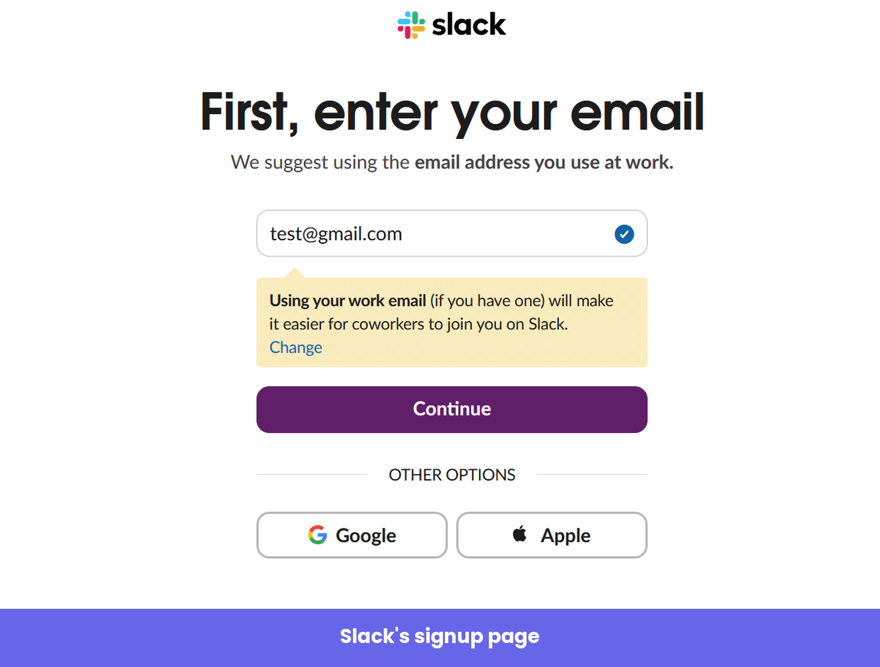
All you really do here is enter your email. If you would rather not, Slack offers a lazy sign-up through Google or Apple instead.
What I find smart is the deliberate nudge toward your work email, spelled out right under the field. That single instruction does two jobs at once: It helps Slack connect you later to others on the same domain, and it positions the platform in your mind as a work tool.
Email verification
Next, Slack emails you a six-digit code and asks you to type it in or tap the button in the email.
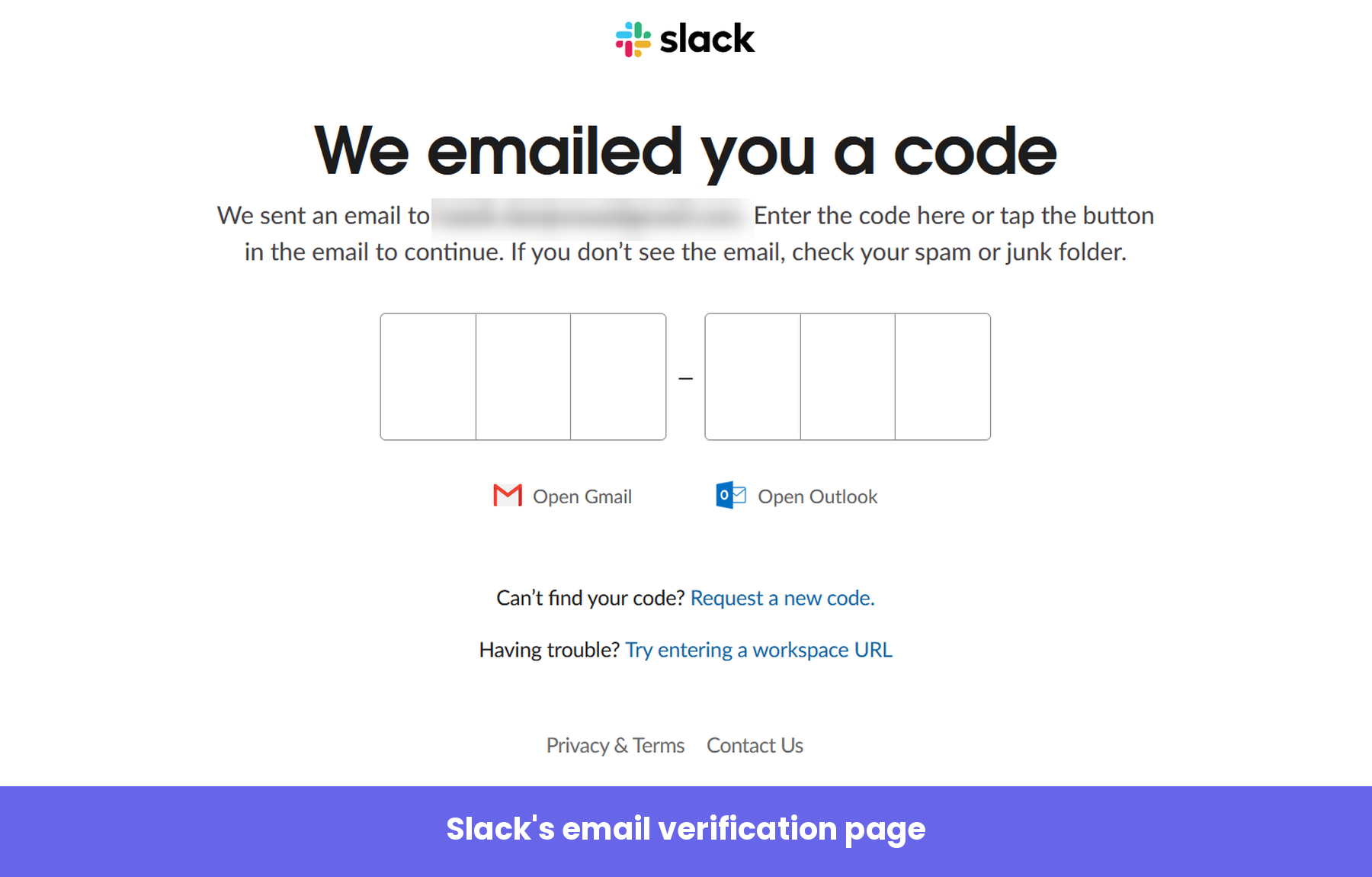
It’s a small step, but the “Open Gmail” and “Open Outlook” shortcuts save you the tiny hassle of leaving the flow to dig for a code. Removing micro-friction like this is exactly the sort of detail that keeps a new user moving forward instead of drifting off.
Creating your workspace
Once you’re verified, Slack confirms the basics and lets you create a new workspace.
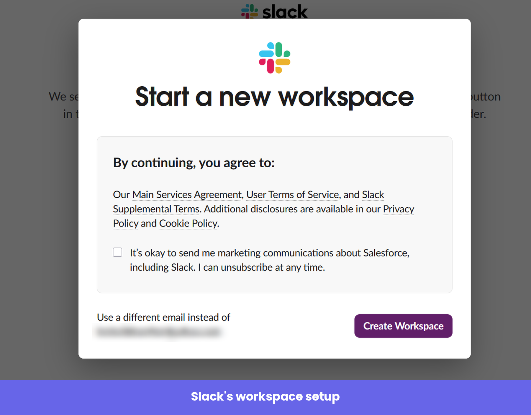
The legal and marketing consents are right inside a tidy modal, so they never interrupt the momentum. You agree, you click “Create Workspace,” and you’re through.
Naming your workspace
From here, Slack wants to learn a bit about you so it can personalize the rest of the experience. The first question asks you to name your workspace.
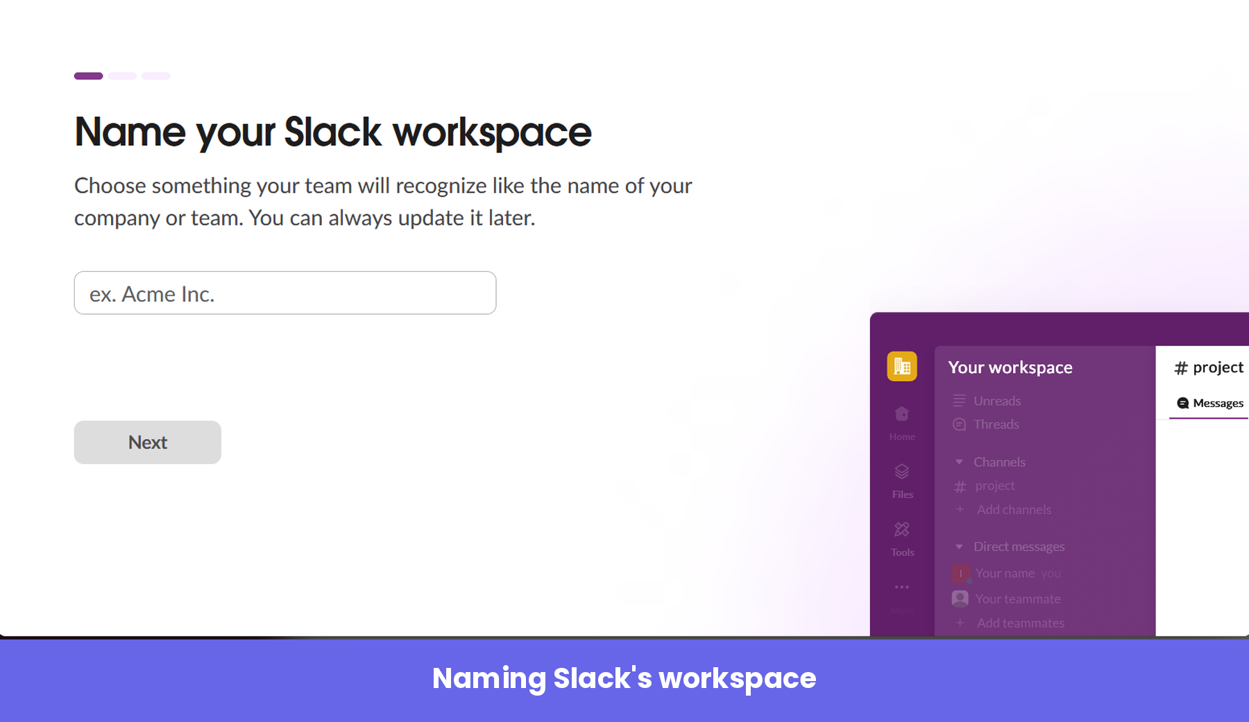
The progress bar at the top sets a clear expectation: three short steps, and you can see exactly how far along you are. Naming the workspace also makes the product feel like yours almost immediately. The second question in the three-step flow is about your name and profile picture. The third asks you to invite your teammates.
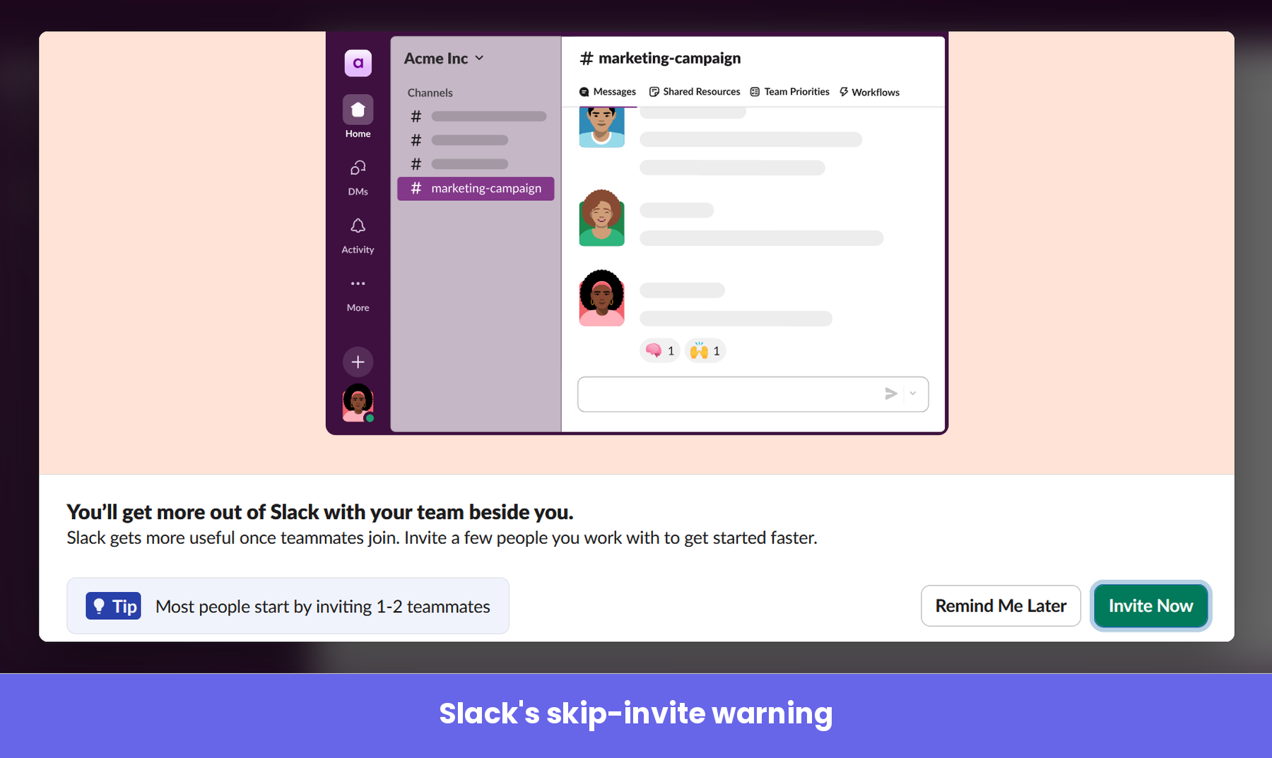
Inviting your teammates
Slack is really keen for you to bring the rest of your team along, which makes sense, since the product only shows its value once others are in it. Using Slack entirely on your own is pretty tedious.
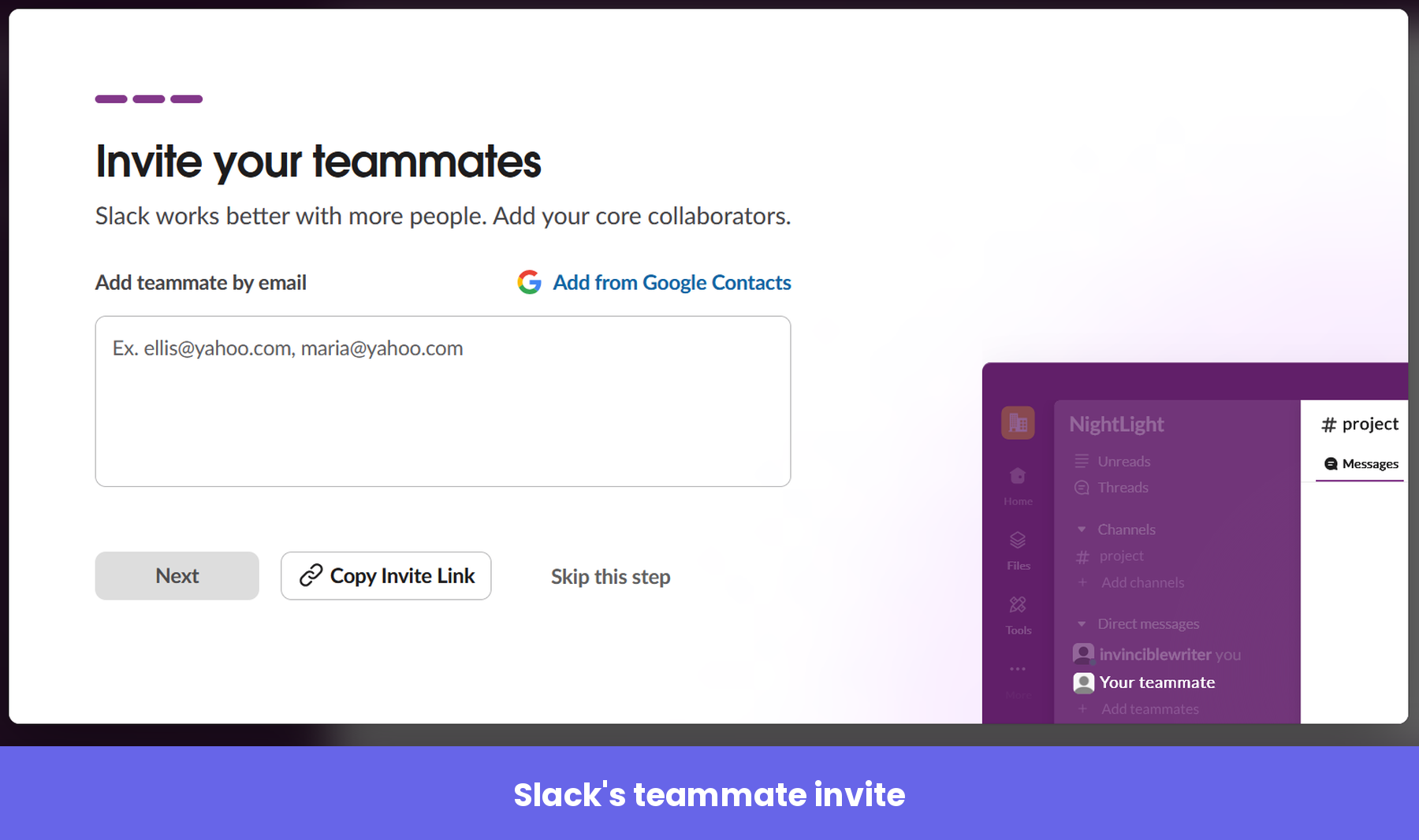
If you try to skip this step, Slack pops up a modal that gently talks you out of it, and even tips you that most people start by inviting just one or two team members.
The bright green “Invite Now” button is the obvious option, while the way out hides behind a “Remind Me Later” button, nudging you to reconsider before you walk past one of the most important actions in the whole flow.
The upgrade prompt
The moment your workspace is created, Slack throws a little confetti (“Workspace created”) and immediately offers you Pro at a discount.
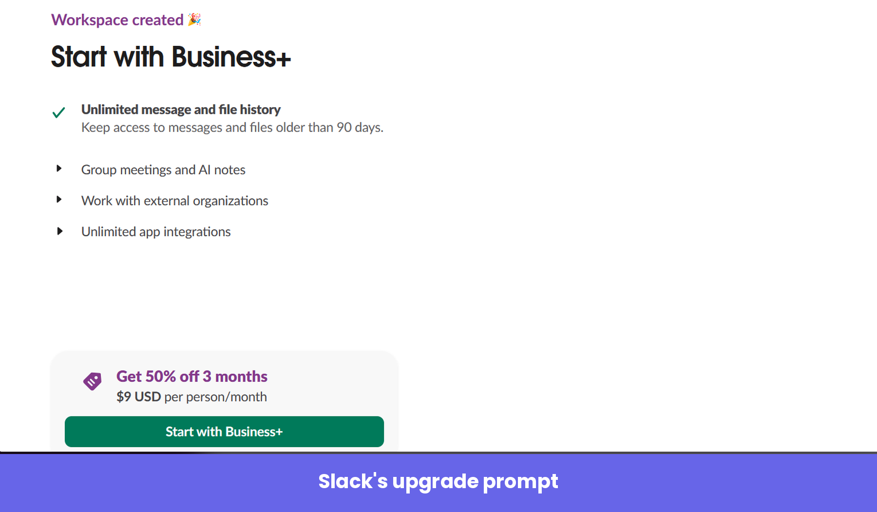
That celebratory beat is useful here. The small dopamine hit of “you built something” is a good way to lead people toward a next step that genuinely benefits them. In this case, the next step Slack wants is an upgrade, and you’re free to take the discount or keep going on the free plan.
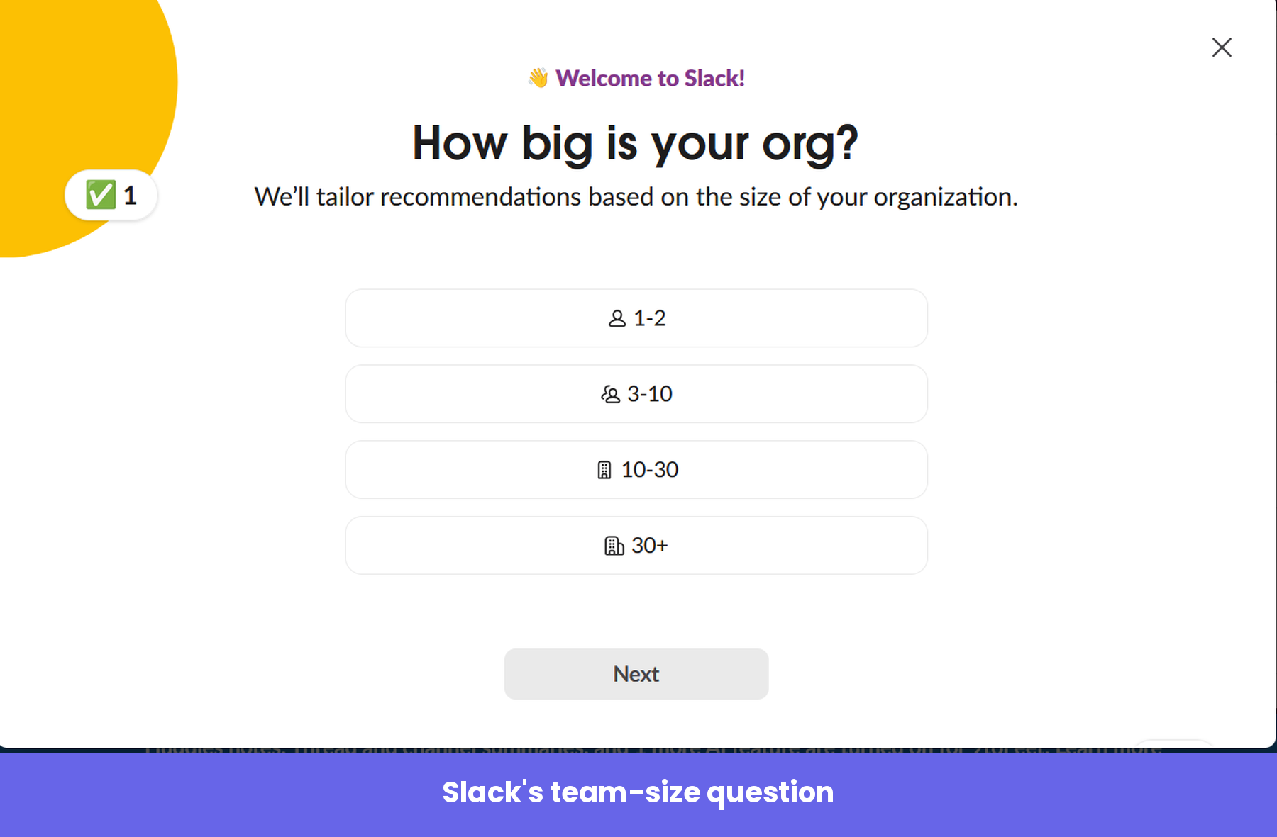
The welcome survey
I skipped the upgrade prompt. The next two screens were modals that asked two questions, beginning with how big my organization is.
The second asks how you plan to use Slack.
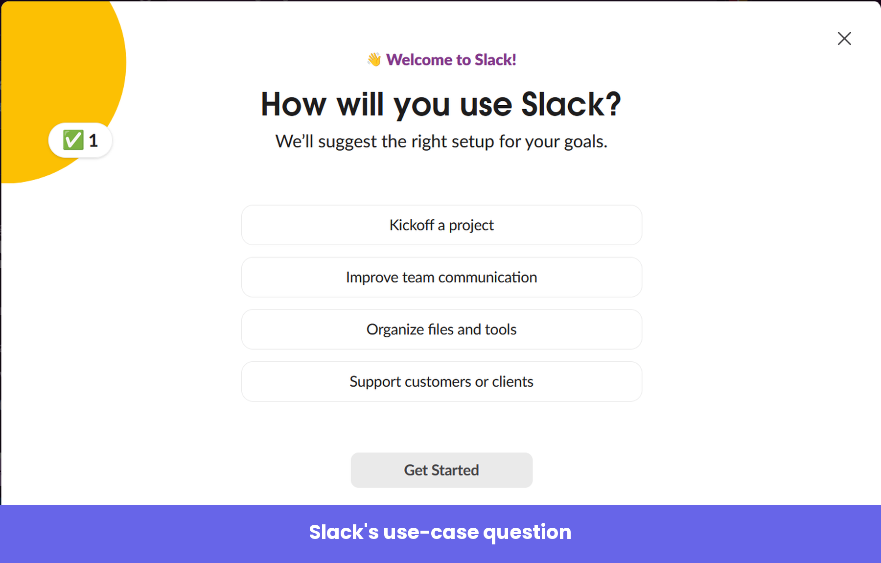
Both questions provide Slack with useful segmentation data, and they shape the screens you see next.
Inside the workspace
Instead of dropping you into an empty workspace and layering tooltips on top, Slack hands you a workspace that’s already set up. It auto-creates a handful of Slack channels for you: one named after your company, a general “new-channel,” and a “social” channel for the lighter stuff.
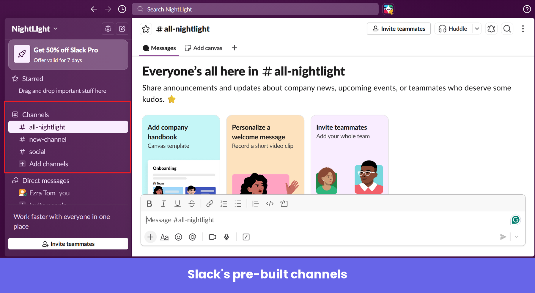
Each channel opens with a short welcome message that explains what it’s for, then offers two or three native task cards, prompting you to perform onboarding tasks like inviting teammates or creating a quick welcome message for team members. The tasks read like part of the channel rather than a regular onboarding checklist, so they guide you without ever blocking you.
The onboarding flow ends with a message from Slack that lets you know your workspace has been put on a free trial of the paid plan.
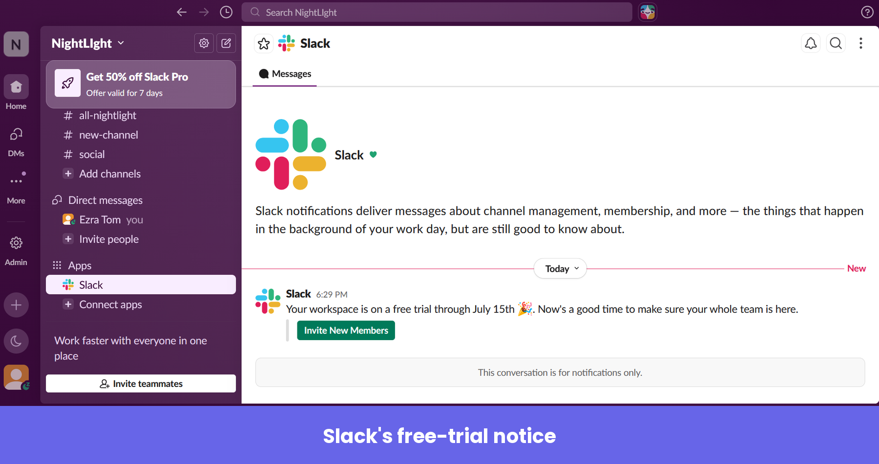
That’s a reverse-trial move. I’ll go in-depth on it in the next section, but here’s something worth mentioning now: the trial only showed up after I told Slack my team had 30 or more people, and when I skipped the team-size question, it never appeared. That was smart, because you benefit more from Slack’s paid plans when you have a lot of team members.
How to put Slack’s onboarding plays to work in your own product
Now that you’ve seen the flow, let’s pull out the plays underneath it. I’m less interested in which UI patterns Slack used and more interested in the strategic moves you can copy or modify for your SaaS.
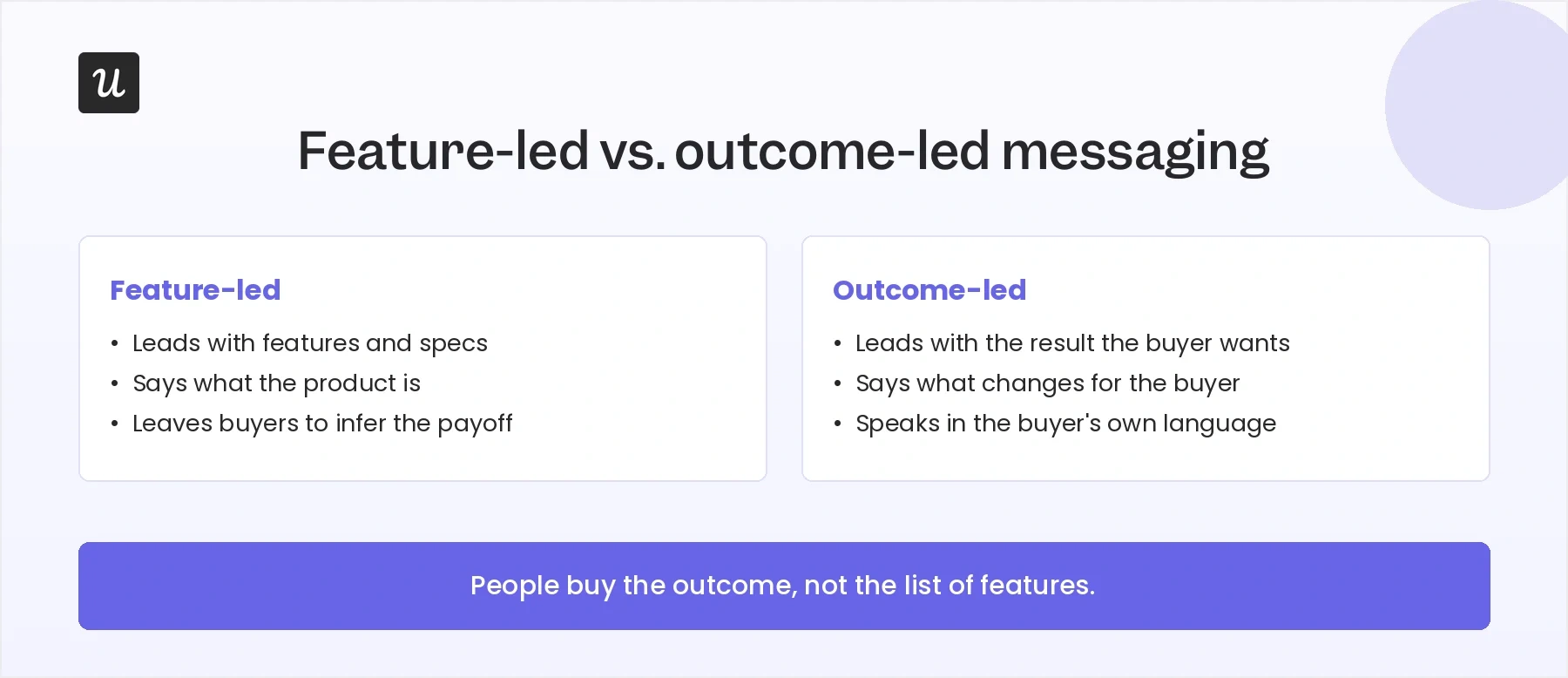
Play 1: Sell the transformation
Slack’s home page immediately paints a clear picture of what to expect when you start using the product.
The philosophy behind this mirrors the oldest idea in the company’s playbook. Before launch, founder Stewart Butterfield wrote a now-famous memo to his team explaining what they were actually selling:
“What we’re selling is organizational transformation. The software just happens to be the part we’re able to build and ship.”
Applying this to the homepage is important because, contrary to what many people think, customers don’t buy features; they buy the outcome those features create.
A homepage that makes outcomes clear does the translating for the buyer, while one that merely lists capabilities leaves them to connect the dots on their own. So, the lesson here is to lead with the change your product makes and say it in the language your buyer already uses.
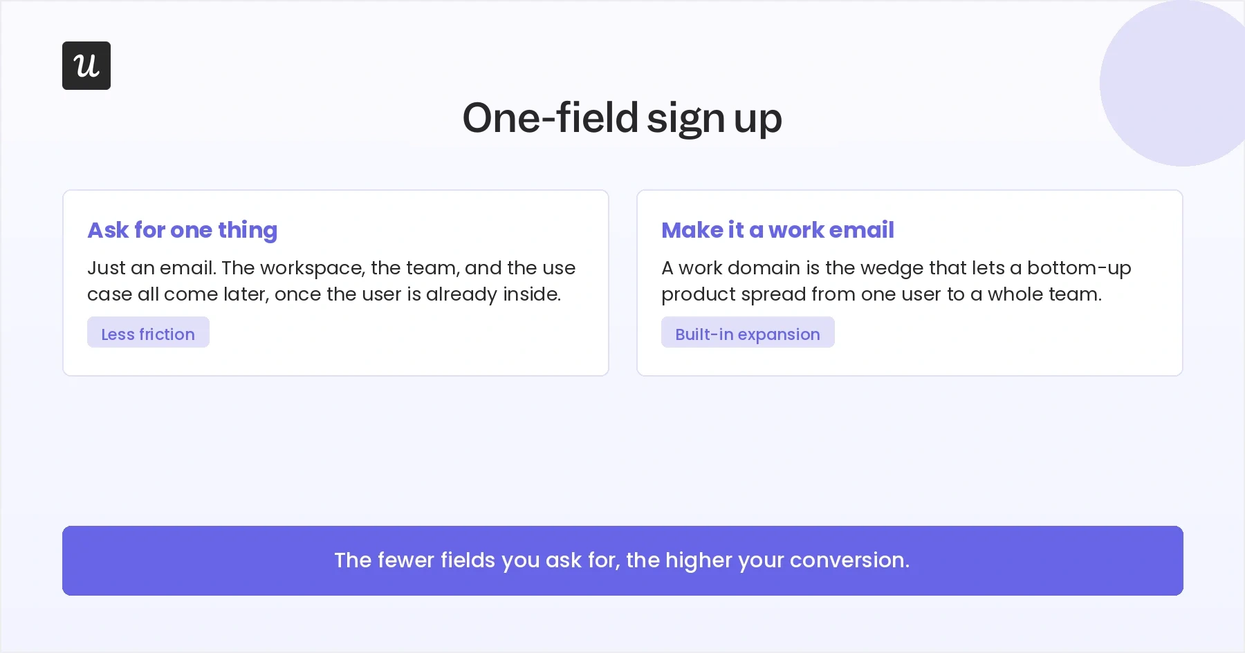
Play 2: Strip your signup down to a single field
Slack’s signup page asks for one thing: your email.
Everything else, like your name, workspace name, use case, and team invitation, comes once you’re already inside and invested.
This is the right default for most products, and the data backs it up. HubSpot’s analysis of more than 40,000 forms found that conversion rates fall as fields pile up, with the steepest drops coming from demanding fields like dropdowns and multi-line boxes. The lesson is to ask for the minimum a person needs to get started, and defer everything else until the product has earned the right to ask.
Slack’s push for work email, without making it an absolute requirement, is also worth copying if you serve businesses. It helps you connect users from the same company later, which turns a single signup into a possible team rollout.
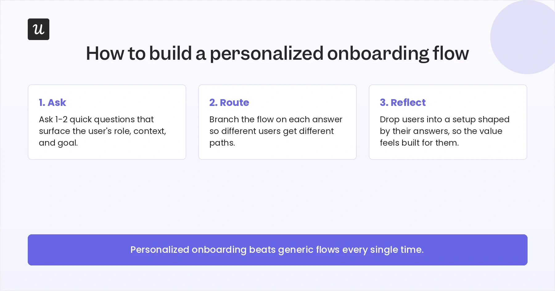
Play 3: Let the new user’s answers configure the product
Slack’s welcome survey asks about your organization’s size and how you plan to use the tool. The move I would steal is not the question itself, but what happens to the answer: Slack routes it straight into your setup, so the workspace you land in is shaped by what you said you came to do.
Done well, this strategy can boost onboarding engagement and new user activation rates. For example, Kontentino used Userpilot to build an onboarding flow that opens with a welcome survey, then tailors the user’s onboarding path based on their response. The result was almost instant: about 10% increase in activation rates within the first month.
Takeaway: Ask one or two questions you will actually act on, then use them to personalize the user’s experience.
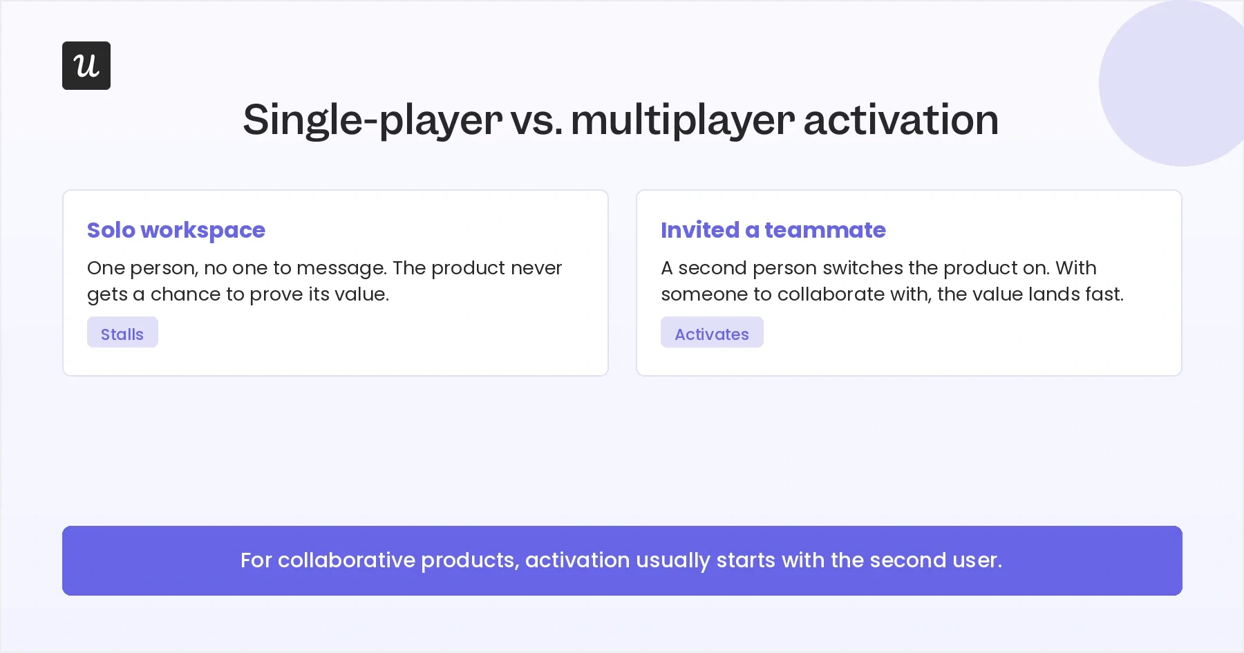
Play 4: Make the team-invite moment hard to skip
For a collaborative product, the single highest-value onboarding action is getting a second person in. Slack treats it that way, which is why skipping the invite triggers a warning modal instead of a silent pass.
The discipline that makes this work is knowing exactly which action you’re optimizing for. Fareed Mosavat, who ran growth at Slack, made that point in a session with NextView:
“I think it’s important to define your activation metric really precisely and really just take a bet that if you improve that it will result in more people discovering the other things down the line.”
If your product is only valuable with other people in it, make it the action the whole flow nudges hardest toward.
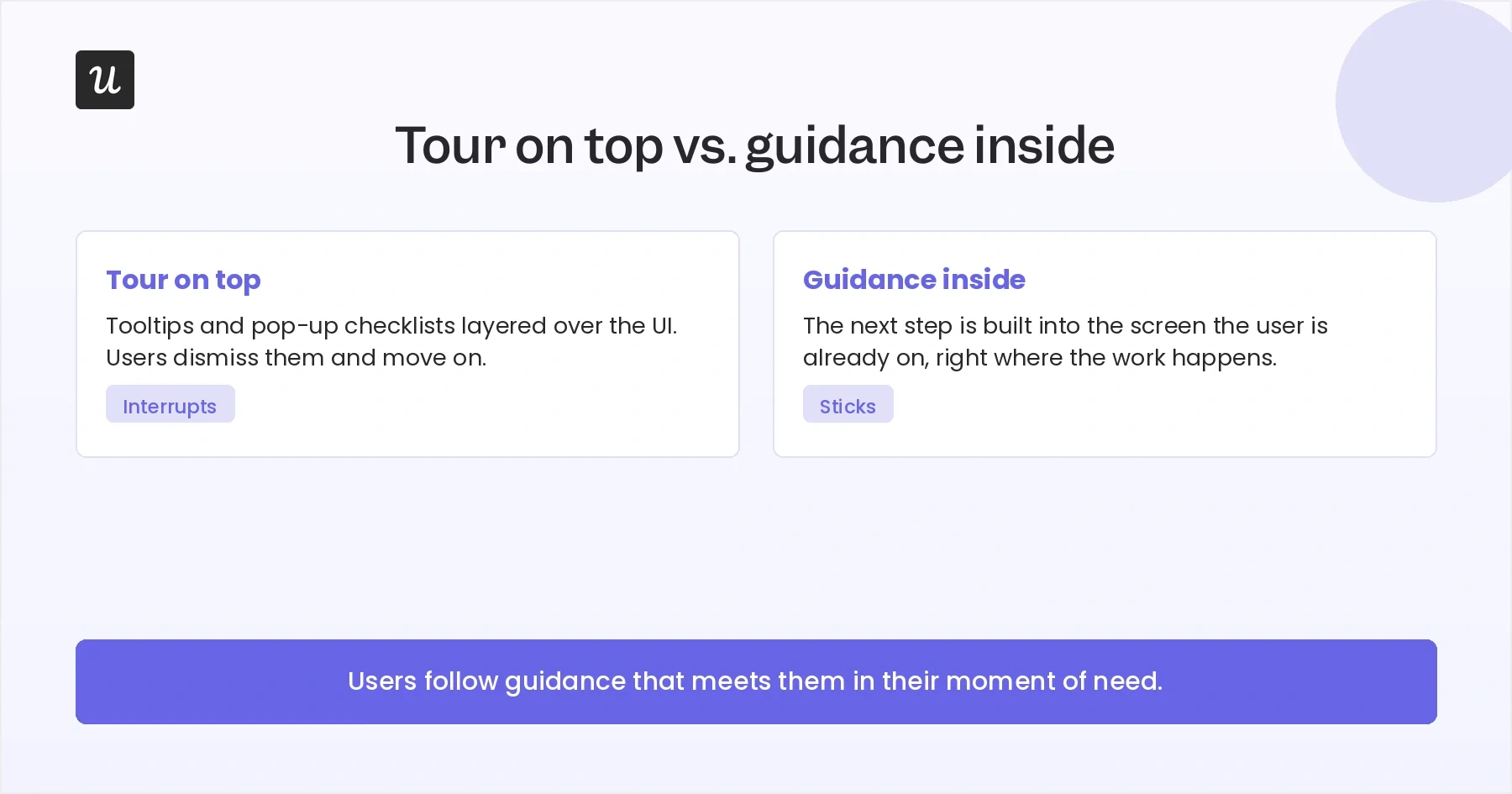
Play 5: Guide people inside the product, not on top of it
The most copyable thing Slack does after signup is what it doesn’t do: it doesn’t bury you in tooltips and pop-ups. Instead, Slack gives you pre-built channels with next actions written as native cards, so the guidance lives where the work happens.
Some products will still need interactive guides and other onboarding UI patterns. But the idea here is to make guidance feel like part of the product experience, not a separate layer. The closer your prompts are to the action the user is already trying to take, the more useful they feel.
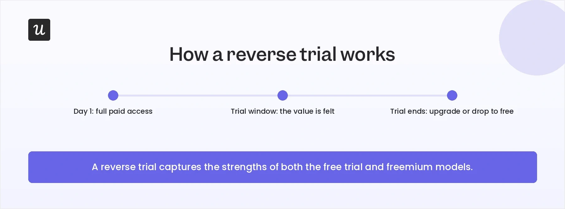
Play 6: Run a reverse trial, then meter it
Watch what happens the second your Slack workspace is born. The paid AI features like huddle notes and thread summaries are enabled, a 50%-off Pro offer appears, and a 30-day free trial countdown begins. You get the full product first, then you decide.
This is a reverse trial, and it’s one of the more underused monetization plays in SaaS. It works because users get to experience premium features before they’re asked to pay for them. By the time the trial ends, they understand what they would lose by staying on the free plan.
If you have a premium tier, consider switching it on during onboarding and metering it afterward. The downgrade itself can become the upgrade pitch.
Improve your onboarding experience with Userpilot!
Slack has a great onboarding experience, and there’s plenty to learn from the flow we’ve walked through here.
You might implement the lessons to build a sharper signup, a survey that tailors the product experience, a harder-to-skip invite, or a reverse trial of your own. Whatever you choose, the point is to borrow the strategy behind Slack’s onboarding, not copy the interface.
FAQ
How fast should a new user reach value during onboarding?
As quickly as the product allows, and faster than most teams think.
In self-serve SaaS, every extra step before the first useful outcome gives users another chance to drop off. The Slack approach of pushing you toward a real channel and a first message quickly is a good model for compressing that window.
Is a frictionless signup always the right call?
A frictionless signup is the right default for most SaaS products, but there are situations where adding friction makes sense.
Some examples include:
- A complex integration that must be completed before the product delivers value.
- A heavily regulated industry with compliance requirements.
- Products where incorrect setup can lead to serious consequences.
In cases like these, the extra steps help users succeed. Outside of them, every additional field, screen, or requirement creates another opportunity for people to abandon the signup process.
About the author