What is User Analysis: A Complete Guide with Methods & Tools
Understanding how users interact with your product is key to improving their experience and driving growth. User analysis helps you uncover patterns in behavior, identify friction points, and make data-driven decisions to enhance engagement and retention.
Let’s learn how to perform user analysis.
What is user analysis?
User analysis is the process of collecting and interpreting data to understand how users experience the product, what they like, and why they churn.
Companies that value human-centered design value the user analysis insights for creating a customer-centric experience.
Why is user analysis important?
For UX and product teams in SaaS companies, developing a solid user analysis process is an essential pillar for closing the feedback loop and improving the user experience based on data.
This leads to many benefits for both your customers and product success beyond just “offering a good user experience”. These include:
1. You eliminate bias and guesswork
Instead of relying on whoever argues the loudest, you rely on actual product discovery techniques. You can cut through the noise of different teams’ requests and correctly prioritize user requests.
2. You spot and remove friction
Every product has roadblocks. Maybe your checkout form is too long, or your settings menu is confusing. When you analyze how people use your app, you can identify and eliminate user friction before it causes people to abandon your software entirely.
3. You drive adoption and retention
When you know exactly what your most successful users do, you can push new users down that same path. This is how you drive feature adoption and keep people paying for your software month after month.
Different types of user analysis you can perform
User analysis is a broad term that covers many different types of analyses for specific business cases and industries. This means any method you choose will highly depend on your goals, your users, your user analysis strategy, and so on.
However, in the context of B2B SaaS, my favorite analyses range from conducting market research to diving into behavioral data to understand how users interact with our product. These include:
User research analysis
User research analysis involves studying user behavior, preferences, and pain points through methods such as:
- Usability testing: Helps assess how easily users can accomplish specific tasks within the app.
- First click testing: Focuses on the first click users make, revealing initial impressions and navigational challenges.
- Card sorting: Helps understand how users categorize information, aiding in intuitive information architecture and a user-centered design process.
- Customer feedback surveys: Collect user opinions, preferences, and suggestions, providing valuable qualitative data.
Goals include understanding user motivations, uncovering usability issues, and identifying opportunities for product improvement.
Task analysis
Task analysis breaks down the steps (i.e., “tasks”) required to complete a job-to-be-done (JTBD) with your product. It turns what would otherwise be complex workflows into smaller tasks.
This method helps you understand user actions and motives. You’ll learn what motivates users to begin a task, how long it takes them to perform it, and if/where the friction occurs.
You’ll also learn how much effort is required to reach the desired outcome when using your product.
Altogether, it prevents you from making false assumptions about how users see your product and what value they derive from it. This knowledge, in turn, helps you enhance product design, in-app experiences, customer onboarding, etc.
User behavior analysis
User behavior analysis gives you a deeper understanding of your target audience, speaking from a product standpoint.
For example, you can track product usage and see when users reach certain milestones. You can also see the sequence of activities users perform to complete a task in real time.
Understanding different user behaviors helps you stay ahead in marketing by directly meeting your audience’s needs.
User sentiment analysis
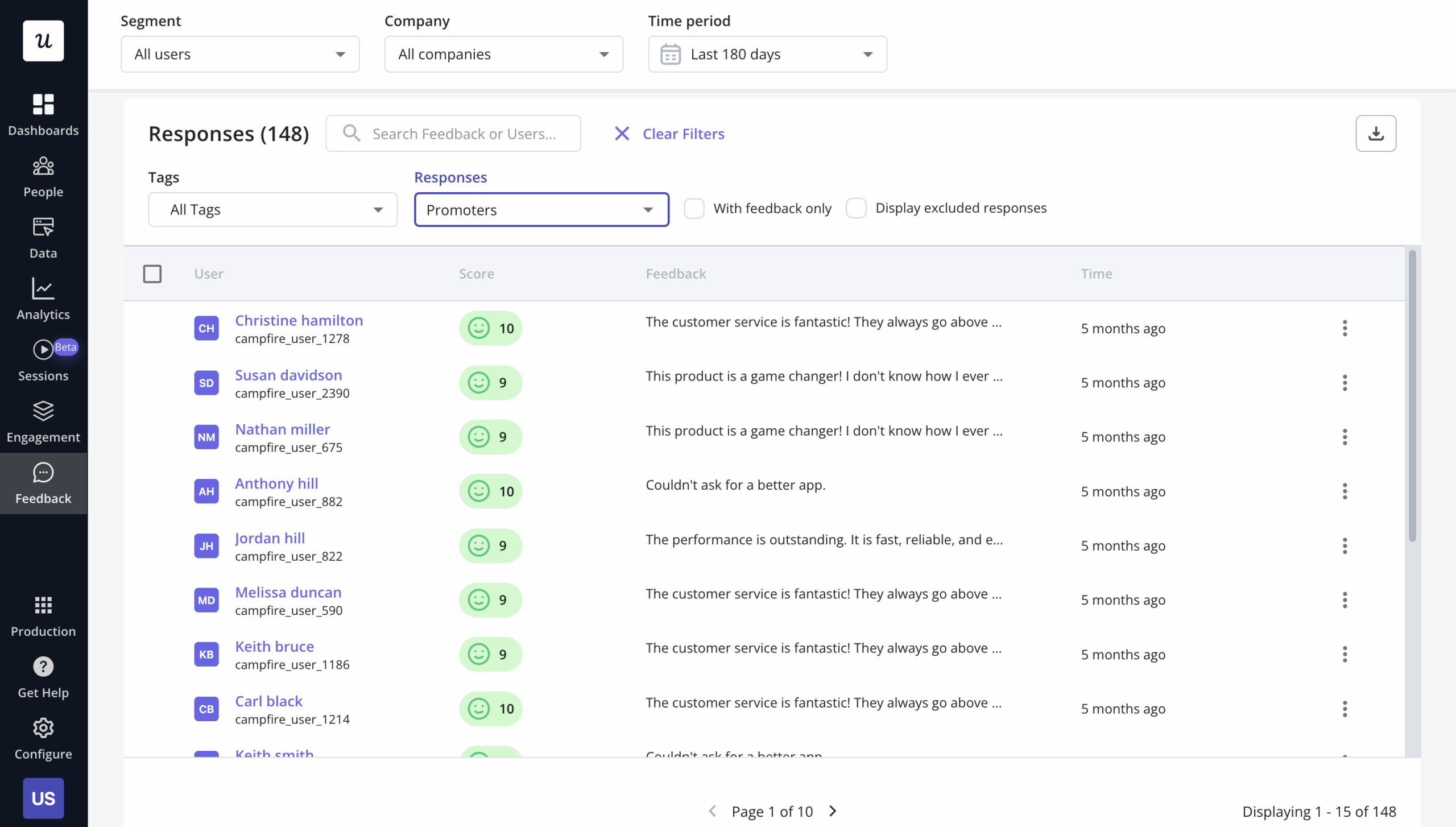
Customer feedback analysis is the process of understanding user sentiment and needs to boost satisfaction and decrease churn.
To understand user sentiment, you must analyze both qualitative and quantitative data. Common feedback sources for qualitative data include:
- Onboarding surveys: To explore different customer personas and the goals they are trying to achieve.
- User interviews: To give a comprehensive understanding of specific user behavior and preferences.
- CSAT surveys: To show the overall customer satisfaction.
- NPS surveys: To uncover promoters and detractors and how they feel about your company.
💡 Tip: Don’t forget to close the feedback loop. For that to happen, you need to act on feedback and make changes based on the insights gathered. Even if you don’t make changes, still acknowledge (and appreciate) that you received the feedback.
Funnel analysis
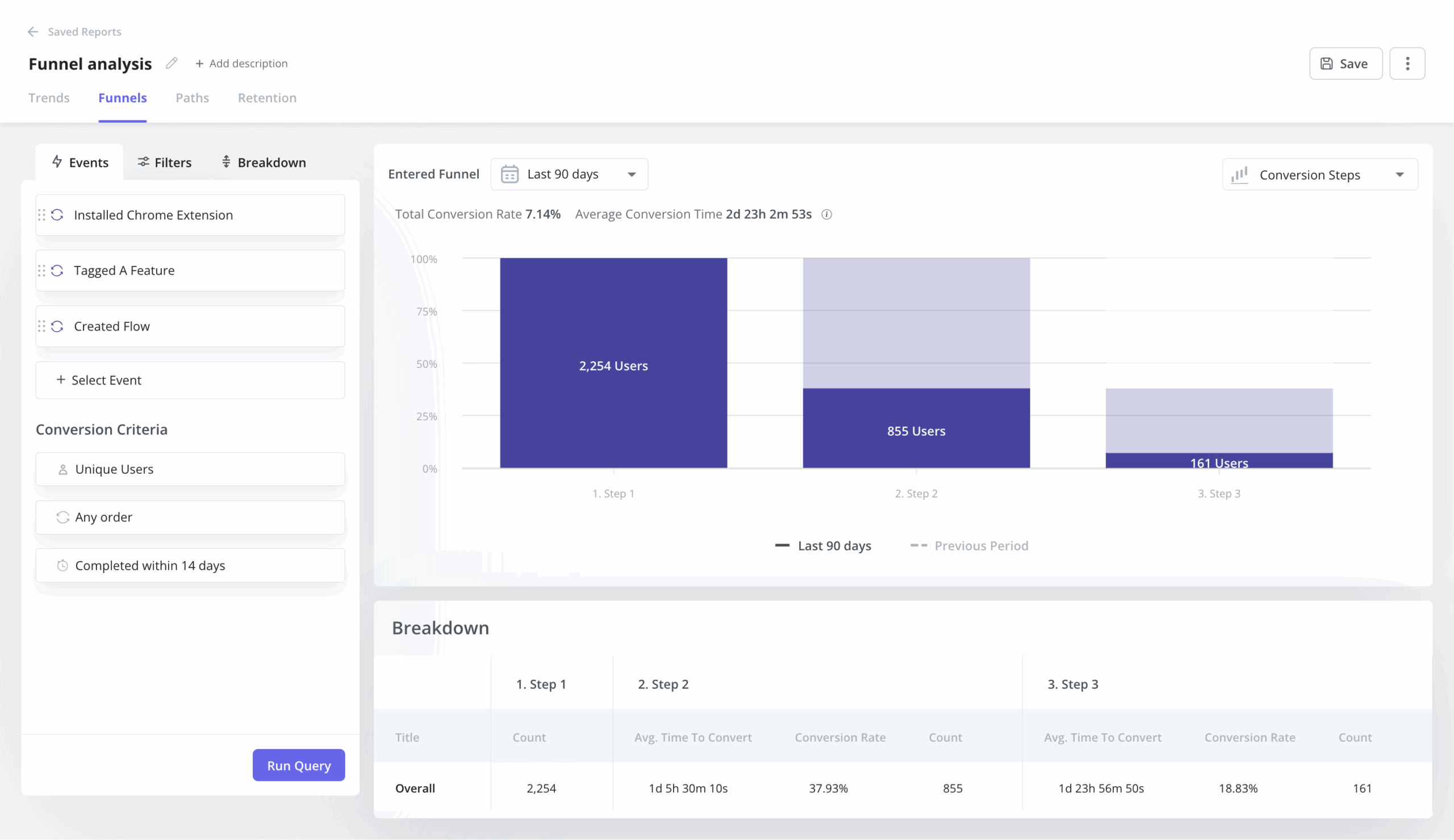
Tracking user funnels is key to carrying out user journey analysis and pinpointing drop-offs at each stage.
By visualizing conversion rates, funnel analysis reveals where users disengage and highlights opportunities to enhance the experience and boost conversions. It also helps with stages of concern, allowing you to prioritize features and updates that improve usability.
Path analysis
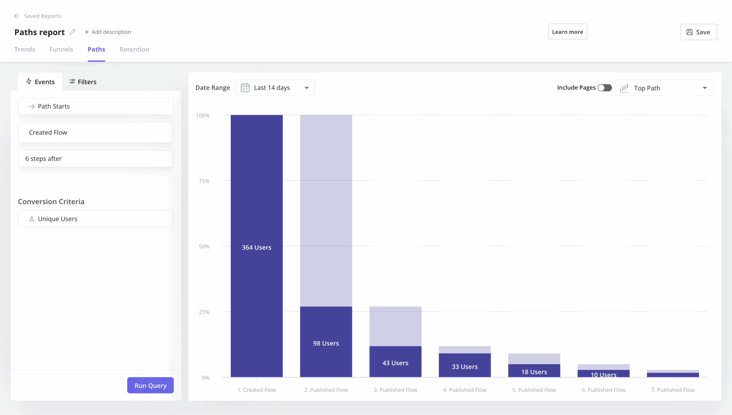
User path analysis is an exploratory model used to track and analyze the sequence of actions and steps users take when navigating through your website or app.
This type of analysis helps understand user behavior in greater detail, identify any user friction and bottlenecks, and optimize the user experience.
Performing a user path analysis has several advantages, such as reduced churn, increased retention and customer satisfaction, and greater lifetime value.
Cohort retention analysis
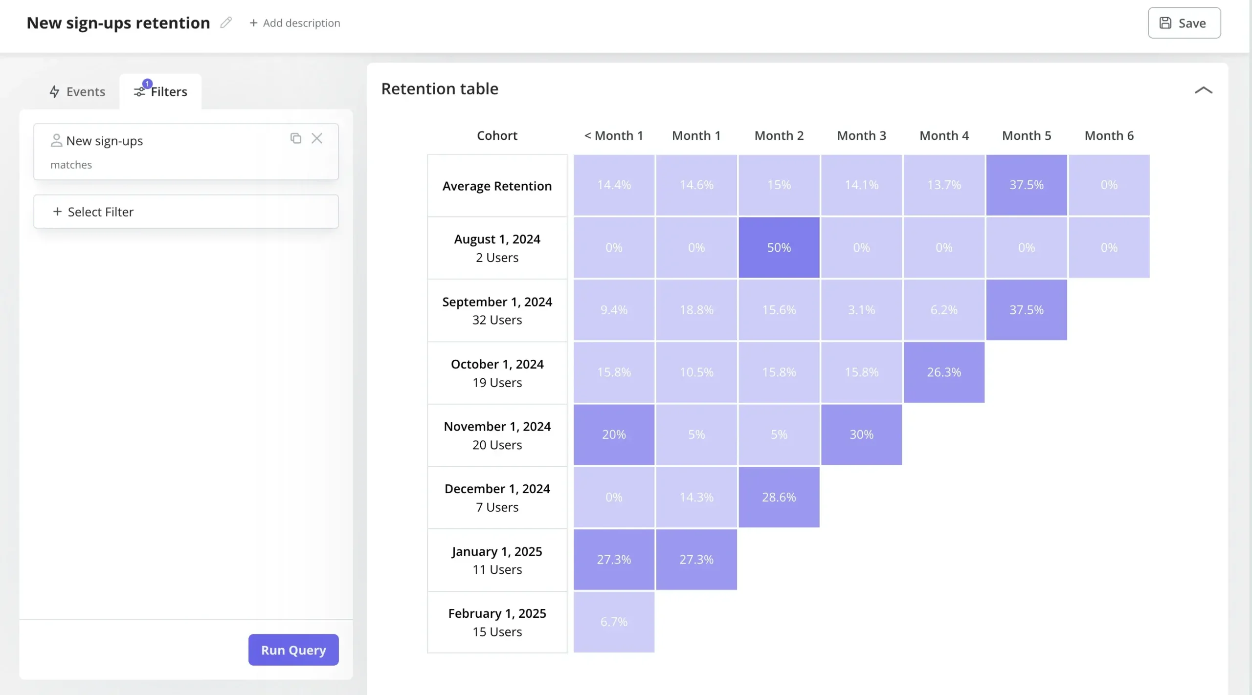
Cohort retention analysis is the process of tracking user engagement with the product over time. However, instead of looking at the user population as a whole, it looks at specific user groups linked to specific events or timeframes.
By measuring how well different groups are retained, cohort analysis helps you evaluate your retention strategies, identify the most successful ones, and make data-driven decisions to improve your retention efforts.
How to perform user analysis step-by-step? (+ best tools)
This part will guide you through the step-by-step process and best practices for user analysis. Let’s dive right in!
Step 1: Define your goals
Companies tend to collect more data than they’ll ever use. So to perform an efficient user analysis, you must have a clear goal that aligns with your business needs and main KPIs.
I recommend sticking to a simple goal-setting framework like SMART (Specific, Measurable, Achievable, Relevant, and Time-bound). It’s simpler and thorough enough to do targeted improvement to the user experience.
For example, if your goal is to “increase activation rate by 15% during Q3”, you know you should focus your analysis around it. Not just measuring activation rates, but also sensitive metrics like time-to-value, task completion rates, number of dead clicks, session duration, clicks per session, and so on.
Step 2: Segment your users based on user personas
Your next step in user data analysis is to create user personas and group customers by different criteria or shared characteristics. This will help you compare user experiences and behaviors in different segments to tailor product experiences.
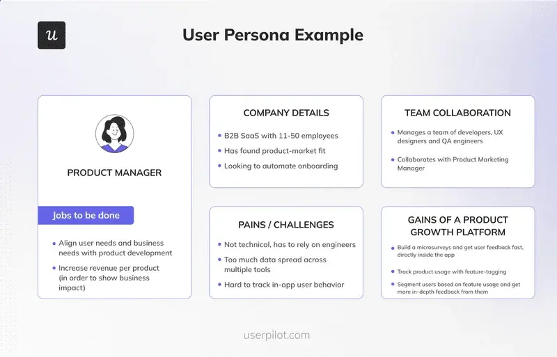
Here’s what we include in our user personas:
- Job role: E.g., product manager, UX researchers, marketers, sales reps, etc.
- Jobs-to-be-done (JTBDs): The specific tasks they need to get done during a regular workday.
- Goals and desires: What they aim to achieve in their job, both in the long-term and short-term.
- Pain points and challenges: Common obstacles that prevent them from achieving their goals and desires.
- Stakeholder collaboration: The team members the user needs to collaborate with, as well as their bosses and employees.
To gather this information, we must perform some market research (via customer interviews, demographic data, etc.). This ensures that our personas are based on validated data instead of wild assumptions.
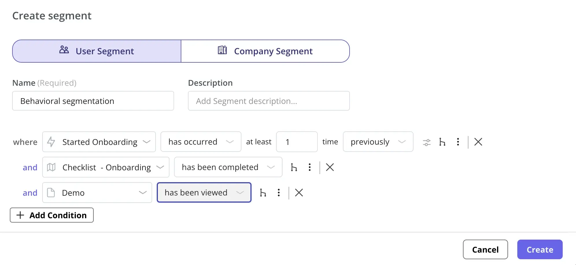
Then, we use user segmentation to group customers based on specific criteria such as location, NPS scores, user activity, company size, etc.
Step 3: Create user journey maps for different personas
After segmentation, create specific goals for each user segment and map out their journey.
A user journey map outlines every touchpoint from the moment they discover your app to the moment they become a paying, active customer.
Ask yourself these questions:
- What is the first action a user takes after signing up?
- How do we welcome them on their first login?
- What specific steps must they complete to see the core value of the product?
Outline all the possible stages. This gives you a clear baseline, so you know what behaviors to measure in the next step.
💡 Pro tip: You can use path analysis to understand how users navigate your product and create a more solid journey map. I recommend reading our journey mapping process to dig deeper into this.
Step 4: Collect user analytics data
Track product usage and engagement data to understand how users interact with different features. This helps identify which features drive engagement, where users drop off, and how to improve the overall experience.
To perform complete analyses, you’ll need both quantitative (e.g., product metrics, funnel charts, cohort analysis, etc.) and qualitative data (e.g., user feedback, session replays, heatmaps, etc.).
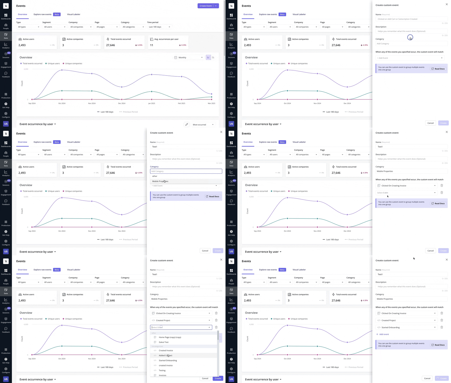
For quantitative data, it usually starts with tracking event data that reflects users’ behaviors and feature usage patterns, along with tools that can put this data together into a chart for analysis. Many no-code tools can streamline this process via autocaptured events (which need no instrumentation by devs) and user-friendly reports that any non-technical user can use.
On the other hand, qualitative research requires more customer-facing methods, such as:
- User interviews for hearing directly from your users about their experience with your product.
- In-app surveys for measuring NPS, PMF, CES, and CSAT, as well as open-form responses with detailed feedback.
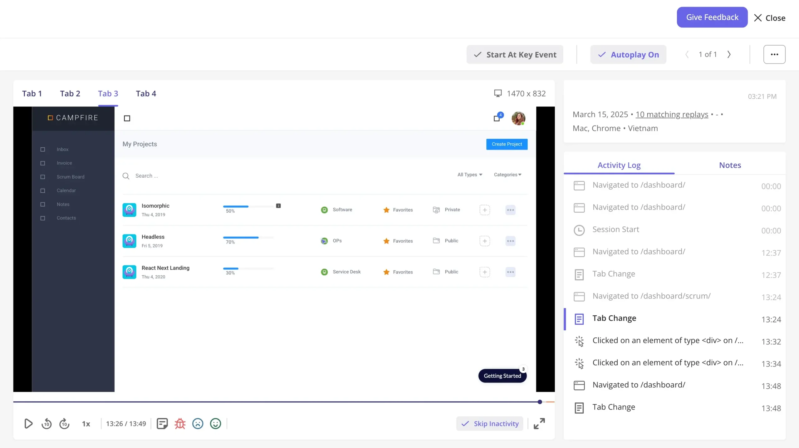
- Session replays and heatmaps to watch exactly how users interact with UI elements and understand the reasons behind their behaviors.
💡 Pro tip: Choose analytics software that lets you combine both. For instance, some tools let you create a funnel chart and watch the sessions of users who dropped off between specific steps. To learn more about how to combine them, check our guide for collecting engagement data.
Step 5: Analyze user data
As I mentioned before, most SaaS companies are already drowning in data points. This means that a good analysis is more about how you visualize and act on the data, rather than the collection methods.
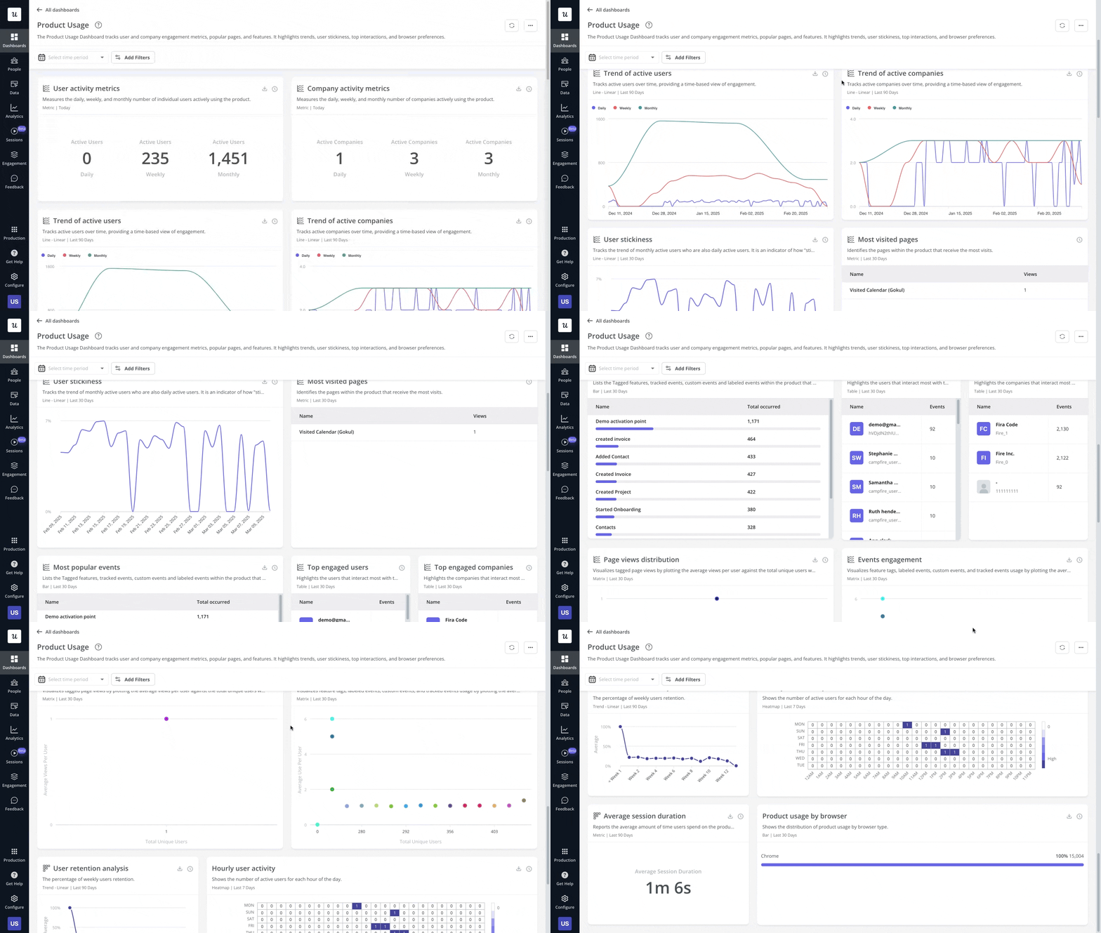
This step is where you have to choose your analysis method based on your overall goals and research methods. So, for a SaaS company whose revenue depends on activation rates, for example, you might want to choose to combine behavioral analyses (e.g., funnels, cohorts, or paths) with session replays.
With this said, your analysis must result in an actionable decision (e.g., revamping the onboarding process). You can also use methods such as root-cause analysis (RCA), heuristic evaluation, 5 Whys, fishbone diagram, etc.
💡 Pro tip: If you don’t have a dedicated analytics team, then look for tools with no-code features for reporting and customizing dashboards. They usually let filter data granularly without having to learn Python or use SQL.
Step 6: Act on insights
Once you complete the initial steps of user analysis and validate your hypotheses, it’s time to start taking action.
For example, if your funnel analysis showed that users can’t set up their account correctly before trying a core feature, then you can add an onboarding checklist that includes account setup.
However, you’ll rarely need to do just one thing. So my recommendation is to prioritize implementation strategies based on a scoring model or an impact-effort matrix. This will let you focus on strategies that lead to bigger returns while minimizing investment.
💡 Pro tip: If you have a lot of changes lined up, then you can roll out small updates to test their impact and minimize risk. For a plan, check our guide for launching new features.
Step 7: Test and measure your changes
After you’re in the flow of analyzing user data and implementing strategies, it’s indispensable to measure if you made the right decisions.
This is because, even if your decisions are data-driven, it doesn’t mean they’re flawless. You must continue observing the metrics and see if the changes affect the conversions, reduce churn, or drive engagement.
To do this, use A/B testing software to serve the old design to half of your users and the new design to the other half. Look at the data after a few weeks. Did the new design increase completion rates? Did it reduce support tickets? If the data proves your change worked, roll it out to everyone.
One thing to remember is that user analysis is an ongoing process that requires a lot of testing. Keep analyzing, refining, and updating your product roadmap based on what you learn.
Which types of user analytics tools should you consider?
Combine different analytics tools for accessing product and website data to deepen the understanding of user behaviors. Here are my top recommendations:
Mixpanel and Amplitude: Recommended for heavy-duty analytics
If you need a highly complex event tracking and analytics deep-dive, you should look at dedicated product analytics tools like Mixpanel or Amplitude.
These tools allow you to analyze data across massive datasets. They are excellent for tracking cross-platform journeys if you have a complex ecosystem of mobile and web apps.
Their standout features include:
- Web and mobile analytics: Mixpanel and Amplitude can track user behavior on both web and mobile apps, allowing you to do cross-platform analyses in one place.
- Feature flagging: These tools can let you “tag” your product’s features and control their rollout. You can target them to specific audiences, release them granularly, or even A/B test them.
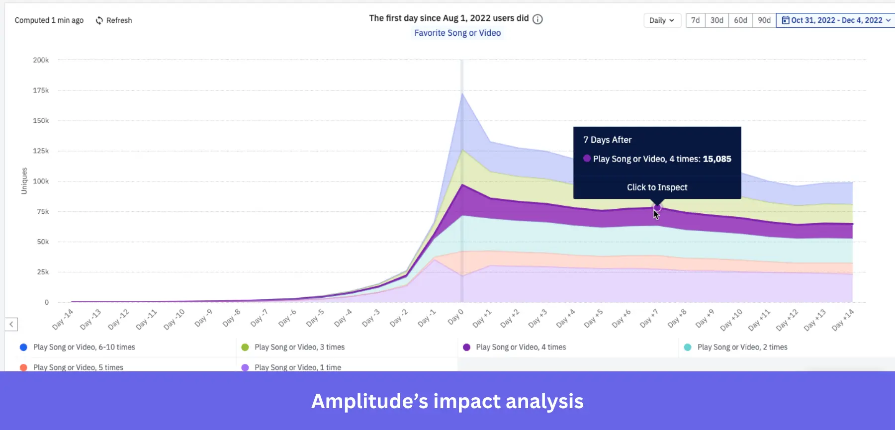
- Causal inference (Impact Analysis and Signal): Beyond mere data correlation, these tools can calculate which behaviors cause specific results (e.g., conversions, retention, activation, etc.).
Amplitude’s impact analysis example.
Userpilot: Recommended for tracking in-app user behavior
Userpilot is a product growth platform designed to track user behavior and act on it immediately. It combines data collection and analytics with user engagement and feedback to minimize time from insights to action.

Userpilot’s top features for user analysis include:
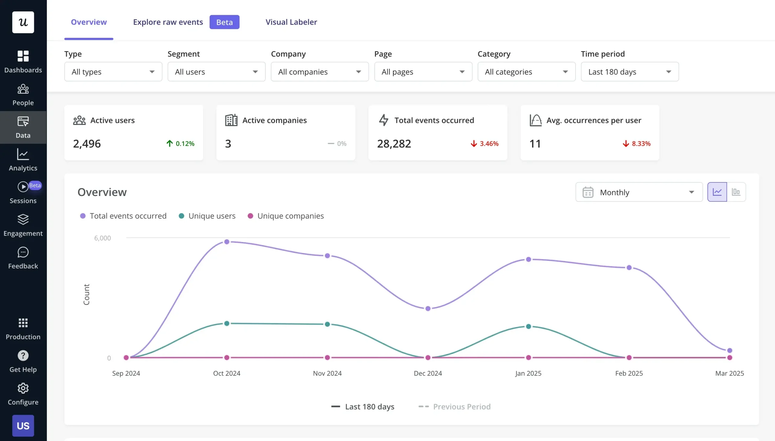
- No-code event tracking: Userpilot’s autocapture feature tracks in-app events automatically right after installing its SDK. All you need to do is label the events you need at the moment on a visual interface.
- Conditional segmentation: Userpilot’s segmentation allows you to group users based on specific behaviors, attributes, or in-app actions. This helps you deliver personalized experiences, trigger targeted flows, and analyze engagement patterns more effectively.
- Analytics reports and dashboards: With Userpilot, you can create funnels, trends, cohort retention, and path reports to track user behavior, identify drop-offs, and optimize engagement. Plus, you can mix and match these reports on customizable dashboards (e.g., for user activation) and add all the metrics you need.
- Session replay and in-app surveys: Userpilot’s session replay lets you watch real user interactions in your product, helping you see where they get stuck, what confuses them, and how they navigate. Plus, you can customize and trigger in-app surveys to track user satisfaction or receive feedback on features.
FullStory and Hotjar: Recommended for deep visual tracking
If your main goal is to understand the visual experience of your app, FullStory and Hotjar focus heavily on heatmaps and session recordings.
They show you exactly where users move their mouse, how far they scroll down a page, and which elements they click on the most.
Their most impactful features include:
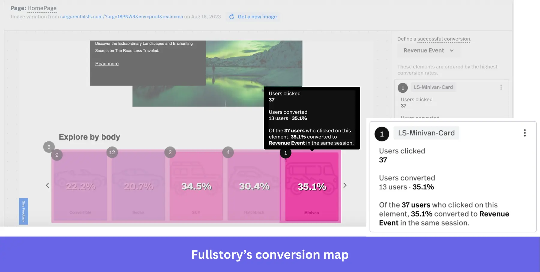
- Session replays: These tools can record user sessions so you can watch how they interact with your product (showing rage clicks, dead clicks, drop-offs, etc.). Fullstory’s sessions are pixel-perfect, meaning that they have higher fidelity for more intricate analyses.
- Heatmaps: Both tools can show you what parts of a page have the highest activity, so you can identify the most engaging elements. Fullstory even supports a “conversion heatmap” that shows which page elements lead to higher conversions.
- Surveys: They let you customize and trigger in-app surveys to collect qualitative responses from users directly. Hotjar’s surveys are more advanced (thanks to Contentsquare integration) since they can use AI to generate surveys, analyze common themes, and trigger them contextually.
Google Analytics: Recommended for website analytics
Businesses use Google Analytics to analyze user actions, website traffic, and product achievements. Here are some ways SaaS companies can use Google Analytics for user analytics:
- Event tracking: You’ll find several auto-collected events that are mainly for marketing analytics and conversion purposes. But if you need to track product events, you have to define events and set trigger conditions in Google Tag Manager, which is often a bit complex for non-tech users.
- Product data import: The product data import feature is excellent for tracking user behavior and conversions. This simplifies and reduces the amount of data you need to send by importing product data.
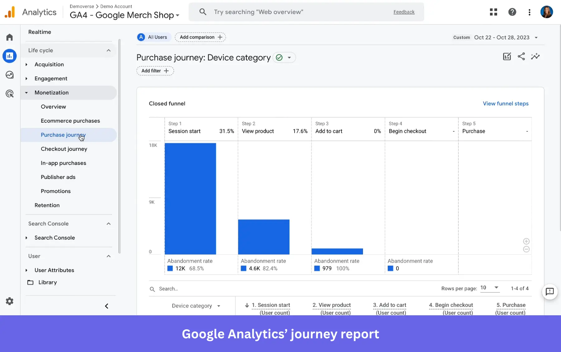
- Customer journey report: With charts like funnels and paths, it allows you to visualize and analyze the steps users take before completing a desired action.
Ready to collect actionable insights from user analysis?
User analysis helps you spot what’s working, what’s not, and where users struggle. By collecting the right data, you can refine your product, enhance customer satisfaction, and drive growth.
But this all starts with choosing the right tool. Give Userpilot a try, as it not only analyzes user behavior in detail but also enables you to act on the insights and test their effectiveness. Book a Userpilot demo to learn more.
FAQ
How does user analysis help different teams?
User analysis helps teams understand what users need, how they behave, and what they care about – making it easier to create better experiences.
- Product managers use user analysis to prioritize features and ensure the product roadmap aligns with user expectations.
- Product marketing managers utilize user analysis to develop targeted messaging and effective go-to-market strategies.
- Customer success managers start leveraging user analytics to anticipate challenges and enhance user satisfaction and retention.
- UX designers rely on user analysis to create intuitive interfaces and delightful user experiences that meet user needs effectively.
When should you carry out user analysis?
There are four primary situations where you can conduct a user analysis:
- When designing a new product: User analysis will help you create a human-centric product design and a seamless user journey.
- When designing a new feature: Track how your users interact with this feature in beta and find insights on how you can make it better. This way, you can measure new feature success.
- When working on an update for an existing product: Detect friction points in the user experience and product drawbacks, and then solve them with a new update.
- When optimizing retention and reducing churn: Analyze in-app behavior to spot disengagement early and use targeted nudges or in-app messages to keep users active.

