12 SaaS Tooltip Examples That Work (And When a Tooltip Is the Wrong Call)


Good SaaS tooltip examples all do the same thing: they explain one specific UI element, at the exact moment a user hesitates on it, in under two sentences. But knowing when not to reach for one matters just as much as the design.
That second part gets skipped a lot. Most tooltip roundups show you a dozen screenshots and call it done. They don’t explore which pattern you’re actually looking at or when a tooltip is the wrong tool for the job. I’ve grouped twelve real tooltips below by what they’re solving, added the accessibility and timing standards worth building to, and included a section on when a different UI pattern beats a tooltip outright.
These examples aren’t interchangeable: which one applies depends on where in a user’s relationship with the product a given tooltip is doing its work. In these examples, a tooltip is typically:
- Getting someone through onboarding.
- Helping them notice something they’ve missed.
- Nudging them toward a paid feature.
Executive Summary
- What makes a tooltip work: One element, one or two sentences, gone the moment it’s read. If the copy needs three sentences, or the reader can’t finish their task without it, it’s the wrong pattern.
- The four types aren’t interchangeable: Native tooltips, hotspots, masked overlays, and modals each fit a different moment, and mixing them up is the most common mistake in this list.
- Accessibility isn’t optional: Contrast needs to hit 4.5:1, tooltips need to work by keyboard alone, and a 300 to 500 millisecond delay keeps them from firing on every accidental hover.
- When to use one: A tooltip is for optional context only. Anything a user needs to finish a task belongs inline, in a banner, or in a modal instead.
- The proof is in three real rollouts: Kommunicate, Attention Insight, and Impala moved real activation numbers (86%, 47%, and 100%, respectively) with tooltip-driven onboarding, not clever copy.

4 SaaS tooltip examples for onboarding walkthroughs
An onboarding walkthrough uses a tooltip to explain one step of a larger sequence right as a user reaches it, rather than trying to cover everything before they’ve even started.
1. Kommunicate: Guiding new users through chat widget customization
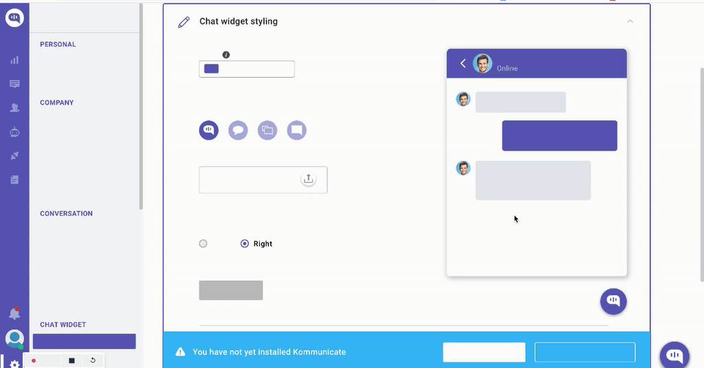
The clearest case for this comes from Kommunicate.io’s onboarding flow, a chat-based customer support platform. Its team kept hearing the same complaint from customer success: users were asking for features that already existed in the product. Rather than write another help article, they used Userpilot to add small in-app cues, including a tooltip-driven walkthrough, at the exact point where users customize their chat widget.
The tooltip only appears once a user reaches the customization screen, answering a question the interface has just raised rather than interrupting an unrelated task. Since that cue shipped, 86% of users have completed the customization goal, a 3% lift in the feature’s overall usage.
Parth Shrivastava, Senior Product Marketing Manager at Kommunicate, put the business impact in plain terms:
“It’s a substantial increase for us as well, even if it’s just a 5% increase, it then translates into a 2-3% increase in revenue, which has a substantial impact on our MRR.”
2. Impala: Explaining unfamiliar concepts during activation
Impala’s activation results come from a platform where the core workflow depends on vocabulary a new user has no reason to already know. Its Userpilot-driven interactive onboarding experience opens with a modal that sets context for the screen the user is about to see. It then hands off to two chained tooltips rather than trying to explain everything inside the modal itself. The first tooltip explains what a “prospect” is on screen.
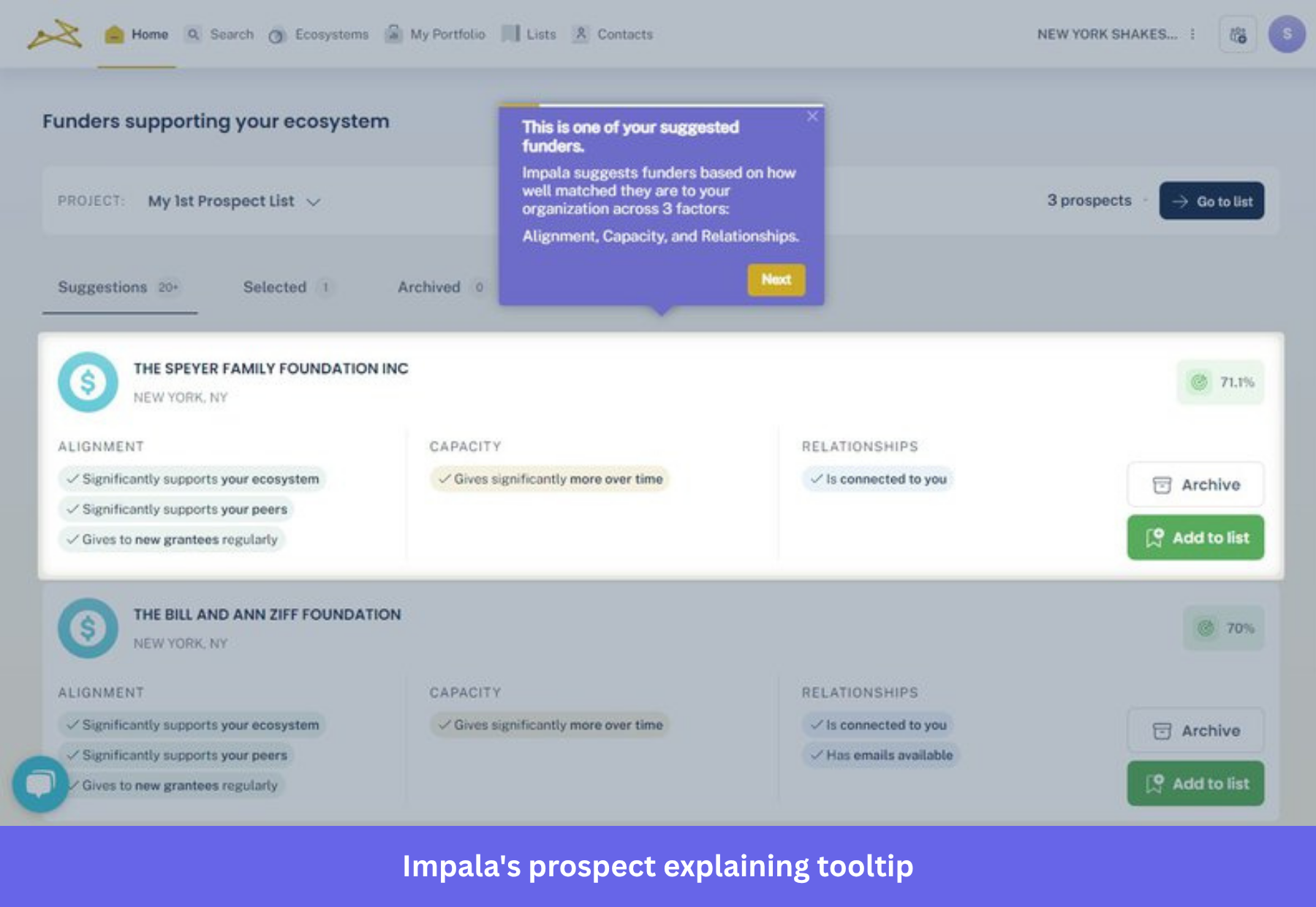
A second tooltip builds on that first one, explaining the match score sitting right next to it. Splitting the explanation into two tooltips instead of one dense one keeps each piece scannable. It also means a user who already understands “prospect” isn’t forced to read past it to get to the part they don’t understand yet.
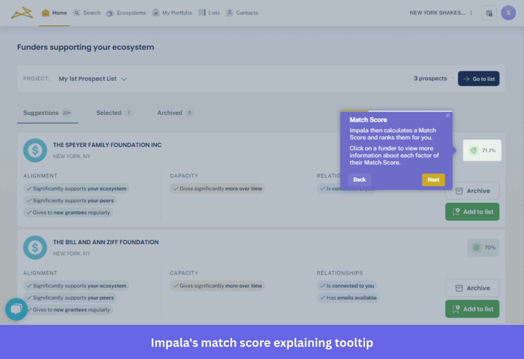
Comparing users who completed that walkthrough against those who didn’t, Impala found 46% of completers went on to add a funder to their prospect list, against 23% of everyone else. That’s a 100% relative increase from just a bit of in-app guidance.
3. Attention Insight: Turning a stalled trial into a completed heatmap
Attention Insight’s results started from a specific, measurable problem. Most trial users never created a heatmap, and barely any touched the “Areas of Interest” feature that made the tool worth paying for. Darius Jokubaitis, CMO at Attention Insight, described the starting point:
“Quite a low percentage of new free trial users created at least one heatmap analysis during their free trial period, only 47%. Also, only 12% of all free trial users engaged with [Areas of Interest], one of the main features of our platform.”
Attention Insight stopped assuming the interface was self-explanatory. Instead, they introduced a guided walkthrough that clarified each step of the heatmap-creation flow as the user reached it. That distinction matters for a technical, visual tool like this one, where an unclear step can be enough to stall a trial user.
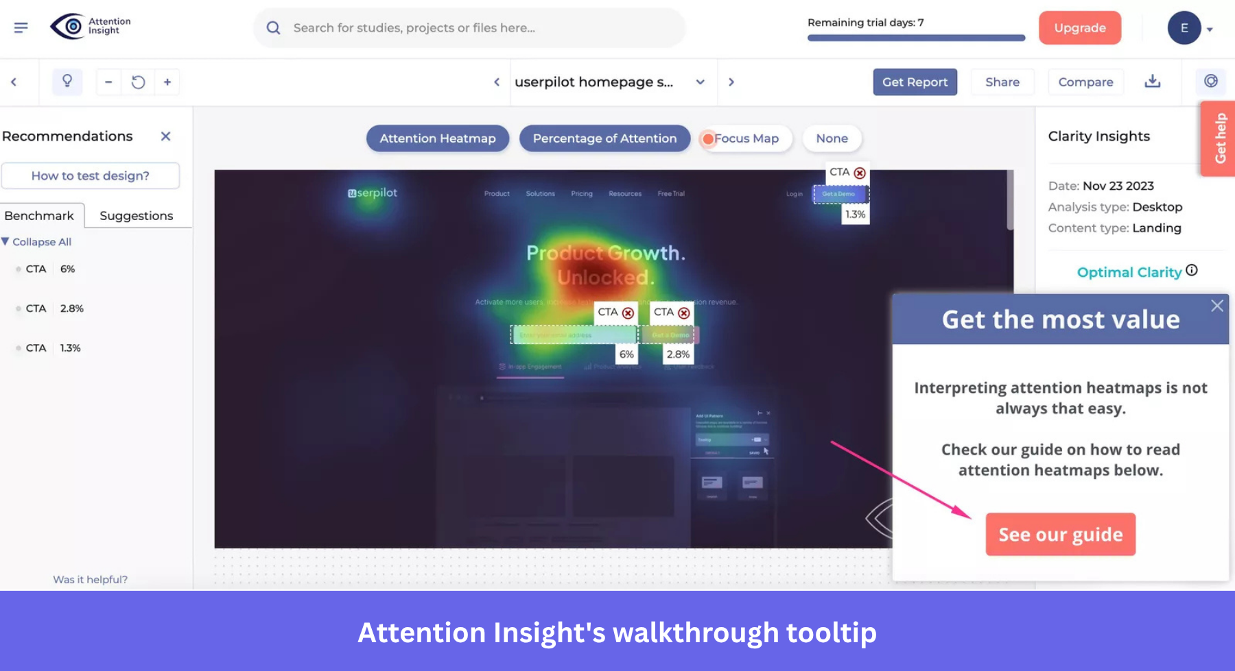
Adding the walkthrough with Userpilot brought heatmap creation up to 69% of trial users and Areas of Interest engagement up to 22%. These were increases of 47% and 83%, respectively, over the starting rates.
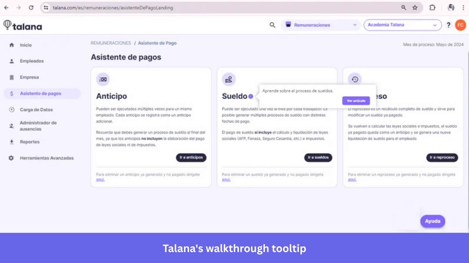
4. Talana: Explaining fields as users reach them
Talana, an HR platform, used Userpilot to pair step-by-step walkthroughs with tooltips that explain individual fields at the moment a user reaches them. Doing so avoids front-loading every explanation into a single tour before anyone has touched the interface.
That sequencing choice is worth copying even outside HR software. A walkthrough that tries to explain five fields before the user has seen any of them asks people to remember instructions they can’t yet apply. Splitting the explanation across the fields themselves means each tooltip only has to carry the context relevant to what’s on screen right now.
6 SaaS tooltip examples for feature discovery
A tooltip here points at something a user already has access to but hasn’t noticed, rather than explaining a step in a sequence. The examples in this category are about surfacing what’s already sitting in your product.
5. Asana: Surfacing a secondary setting without disrupting the core workflow
Asana uses a tooltip to point at its dark mode toggle. That setting is tucked into account preferences rather than anywhere in the task-management flow a customer uses daily. Because it sits outside the core workflow, it’s the kind of setting a user could go a long time without discovering on their own.
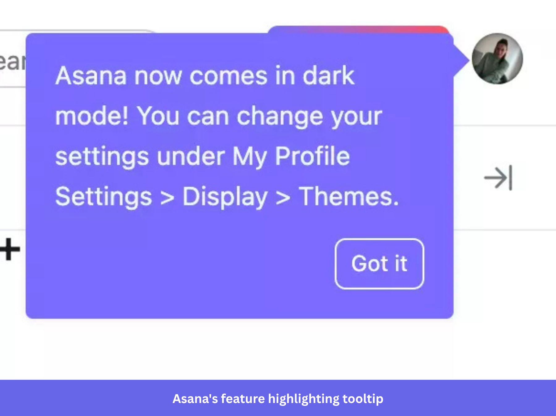
A contextual tooltip is better suited to this kind of secondary setting because it keeps the guidance close to the control itself. It avoids the need for a separate announcement or help article to explain a feature that becomes most relevant when users are exploring their preferences. Settings and secondary preferences are a strong use case for contextual guidance when they add value without warranting an interruption to the core workflow.
6. Slack: Placing feature guidance beside the control it explains
Slack lets users schedule a message from the control menu beside the send button. The tooltip draws attention to an option that’s otherwise easy to overlook.
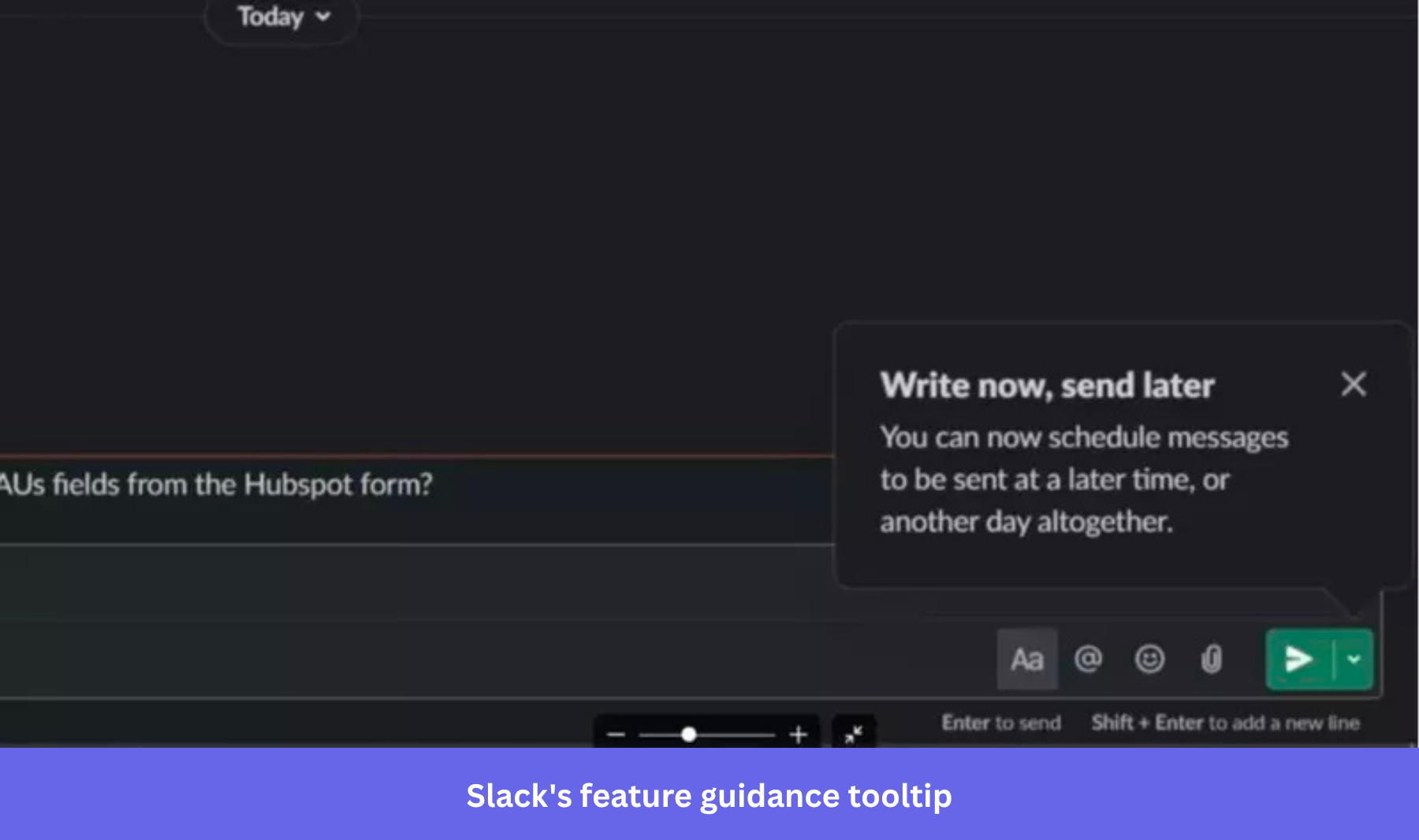
Placing the guidance directly beside the control it explains, rather than in a help article or a separate announcement, shortens the distance between learning a capability exists and being able to use it immediately.
7. HubSpot: Lowering the perceived cost of experimentation with a practice environment
HubSpot pairs a demo or practice environment with tooltips that walk new users through key actions, like importing contacts. At the same time, the tooltip reminds the user that the space is meant for learning rather than production use.
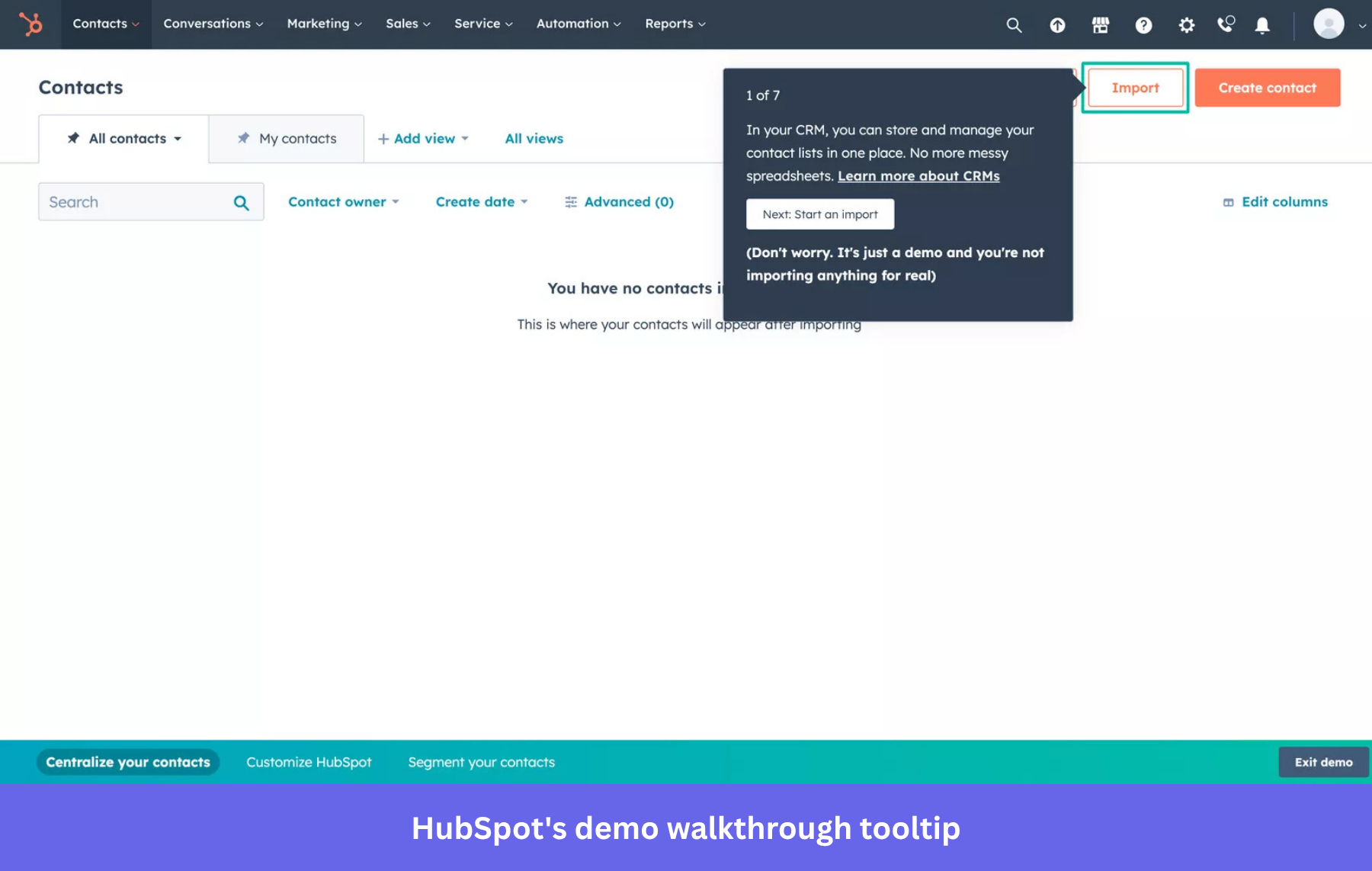
Framing an environment as a space for practice, separate from a live account, can change how a piece of guidance gets read. The same instruction can feel like an invitation to try something rather than a step that has to be done exactly right the first time. That’s a useful design pattern for any product where a first action, like a bulk import, might otherwise get put off until a user feels more confident.
8. Miro: Tying an invitation to the product’s network value
Miro nudges users toward inviting teammates with a tooltip built around a high-contrast CTA button. They know a collaborative whiteboard becomes more useful as more people are actually using it together.
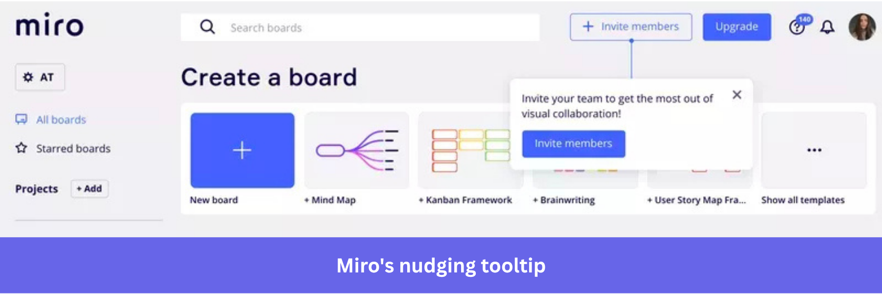
The contrast is the notable design choice, as the invite button inside the tooltip is visually louder than the rest of the interface. That trade-off makes sense for a prompt tied directly to the product’s core value proposition rather than a secondary feature.
This pattern applies to any product where value scales with the number of active users on an account. The tooltip asks the user to do the one thing that makes the product itself more valuable to them rather than promoting a specific feature.
9. Grammarly: Introducing deeper customization without crowding the core workflow
Grammarly surfaces a tooltip pointing at its writing-style customization options. Their example is styled consistently with the rest of the product so it reads as part of the interface rather than an interruption. It continues to offer writing-style and tone customization, including writing preferences, tone features, and organization-level style guidance.
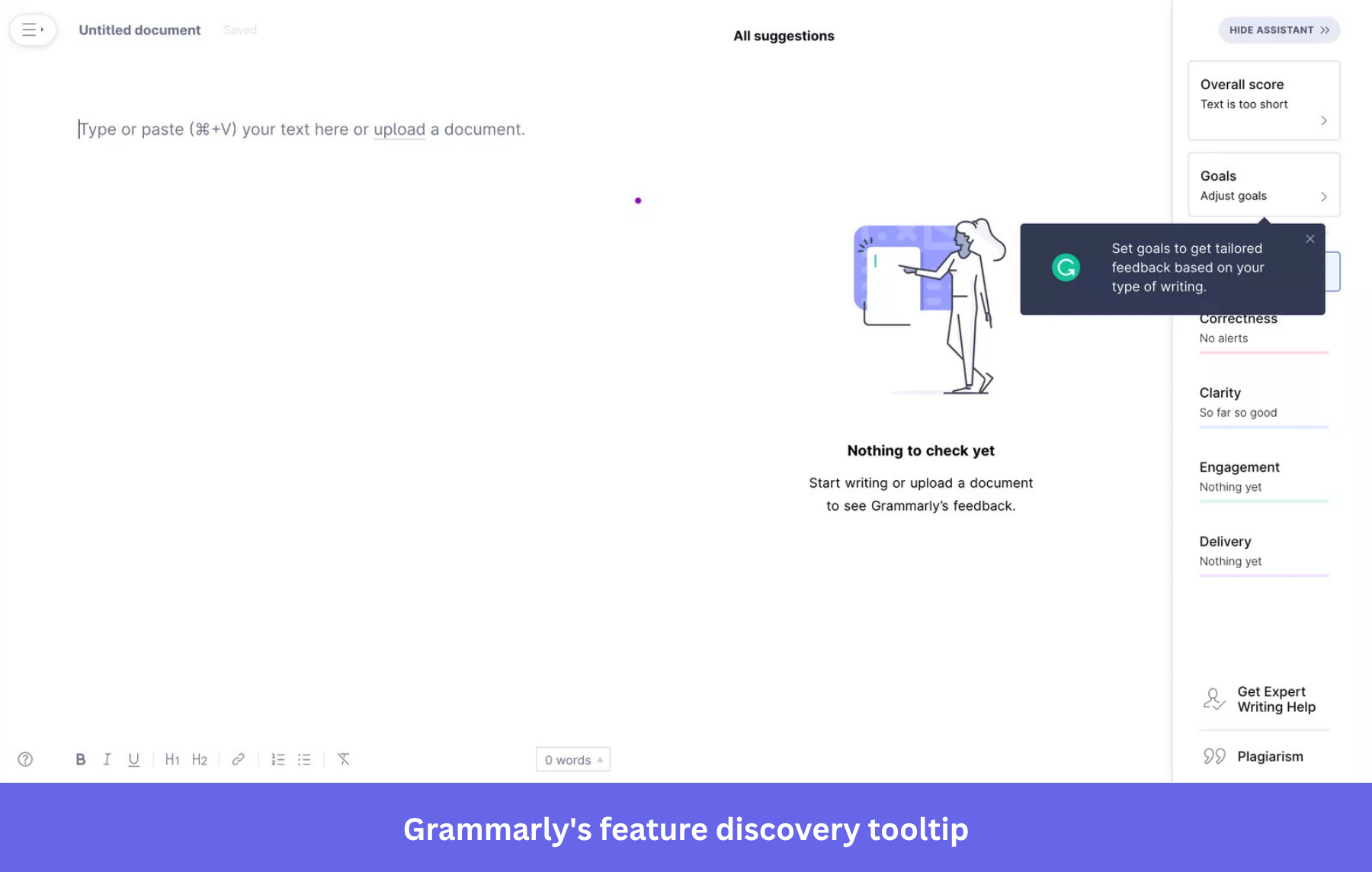
Style customization is a deeper, more advanced capability than catching a typo. Surfacing it through a tooltip rather than the main interface keeps it available without drawing attention away from the core experience. Advanced-capability tooltips generally work best once the basic value of a product is already clear to the user. When introduced too early, they can compete with the thing a user came to understand first.
10. Ahrefs: Explaining a technical metric in context
Ahrefs uses a tooltip to explain a technical metric, such as Domain Rating, directly inside the report where it appears. Instead of sending users to a separate help article to look up the definition, they get the information when they can use it.
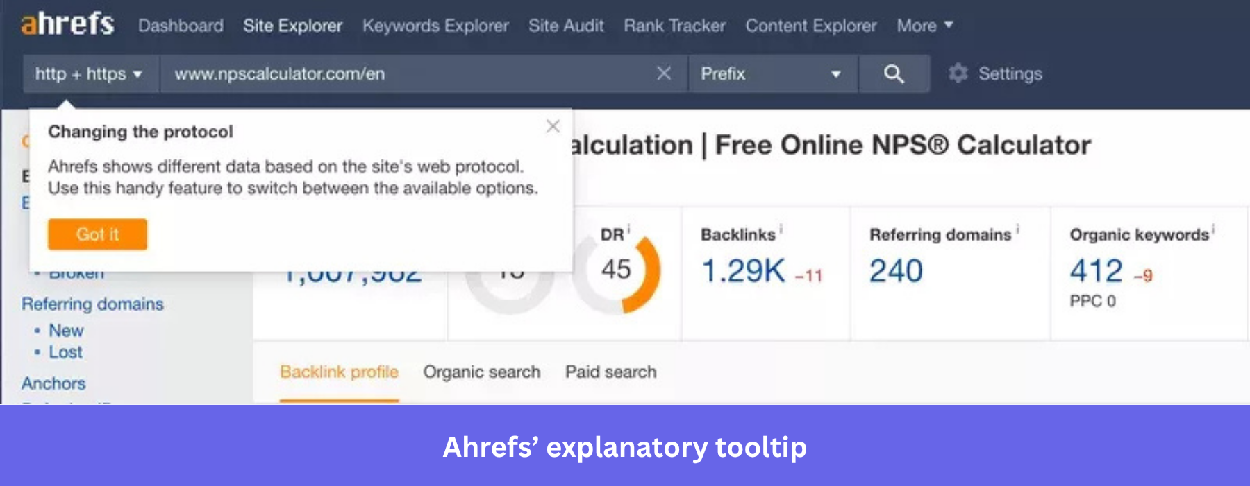
Technical, domain-specific metrics are a useful tooltip use case because a precise definition, delivered without leaving what’s being analyzed, matters more than a simplified explanation aimed at a first-time user. Keeping the definition attached to the exact metric it describes, rather than a general glossary, is the detail worth borrowing for any product with its own specialized terminology.
2 SaaS tooltip examples for account expansion
The same pattern works for revenue, and it’s a core part of any freemium-to-premium playbook.
11. Rocketbots, now respond.io: Connecting the tooltip to the activation step
Rocketbots rebranded as respond.io in 2020, so the tooltip discussed here reflects the product’s earlier interface. I included it as a historical example of a specific, well-scoped design decision rather than a current screenshot of the live product.
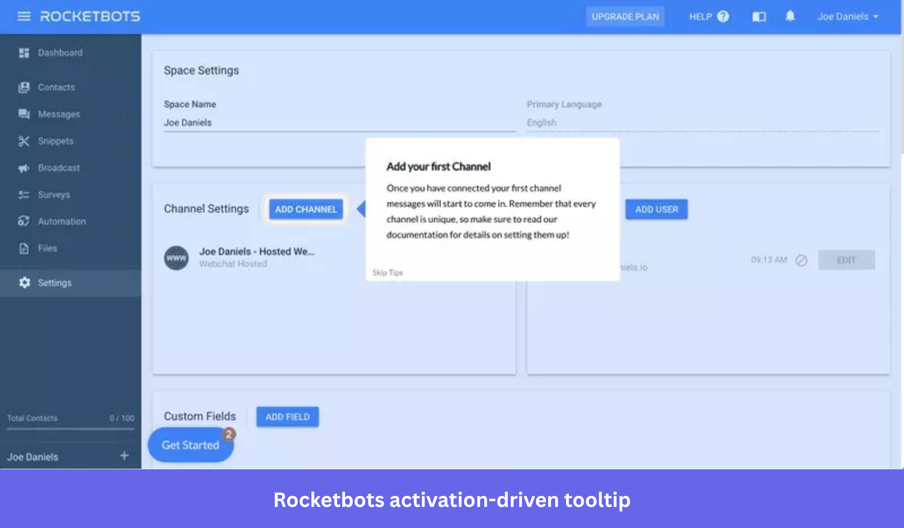
The original tool, a unified-inbox platform, used a tooltip to push new users toward connecting their first messaging channel. It presented that step as the one the rest of the product depends on. Without a connected messaging channel, users had little of the core inbox workflow to experience.
Any team with a similar single-point-of-failure activation step can apply the same idea. Attach the guidance directly to that action rather than spreading the instruction across a longer onboarding sequence.
12. Intercom: Prompting an upgrade at the moment a feature gap becomes visible
Intercom’s tooltip appears when a user clicks a feature outside their current plan. This prompts an upgrade at the point the gap becomes visible. (Intercom changed their plan names and packaging since we first captured this example, so don’t read the specific tier here as current pricing terminology.) It’s one of the more direct upselling examples in this list, and the interesting part is when it appears rather than what it says.
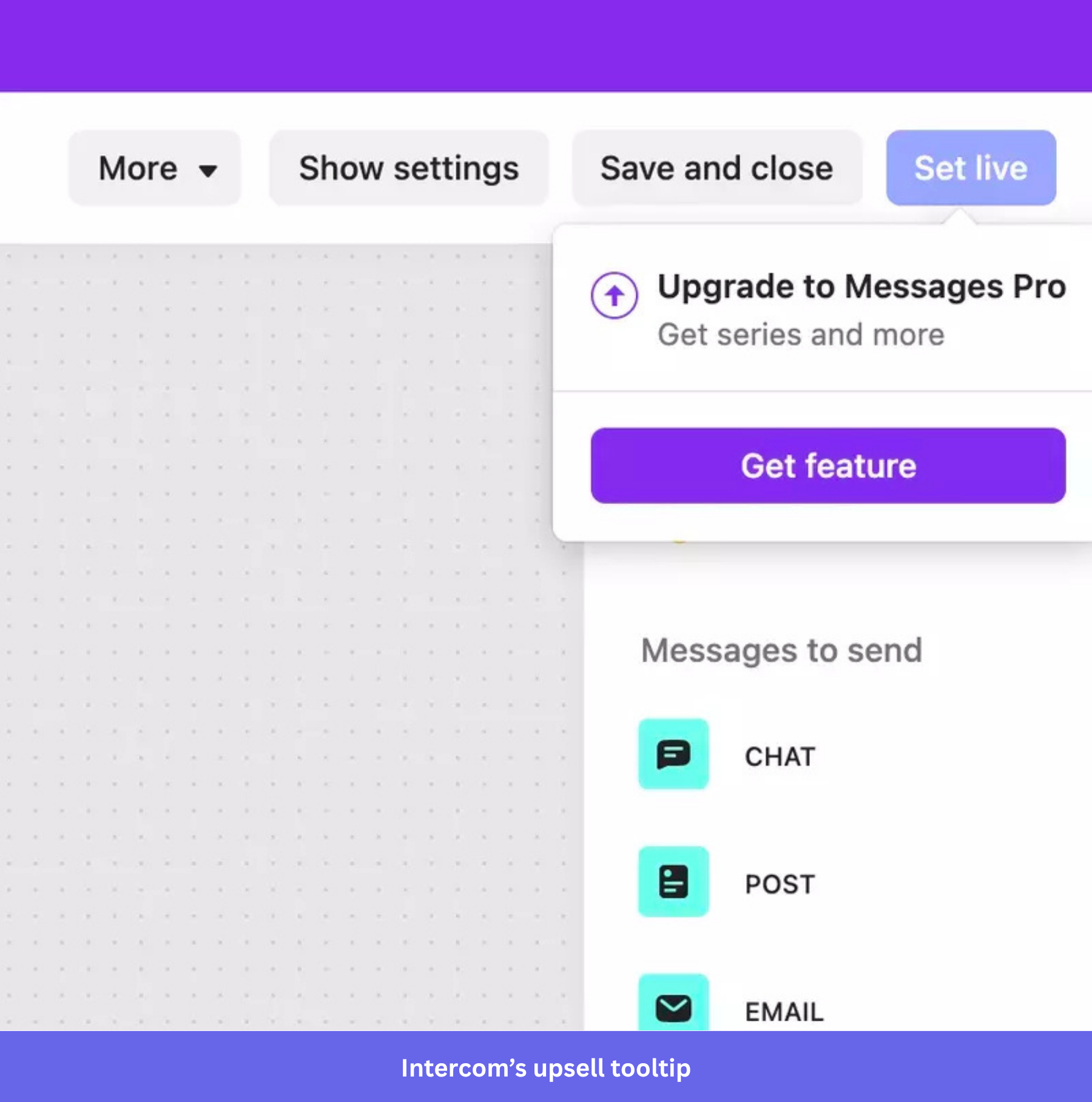
A user who clicks on a feature they don’t have access to has indicated some interest in it. This enables Intercom to show the upgrade prompt at that moment. It’s now responding to interest the user has already expressed, rather than trying to generate it. Gating the prompt behind the action that signals interest, rather than a timer or a page visit, is the principle worth carrying into an upgrade path of your own.
None of this has to stay confined to a single channel.
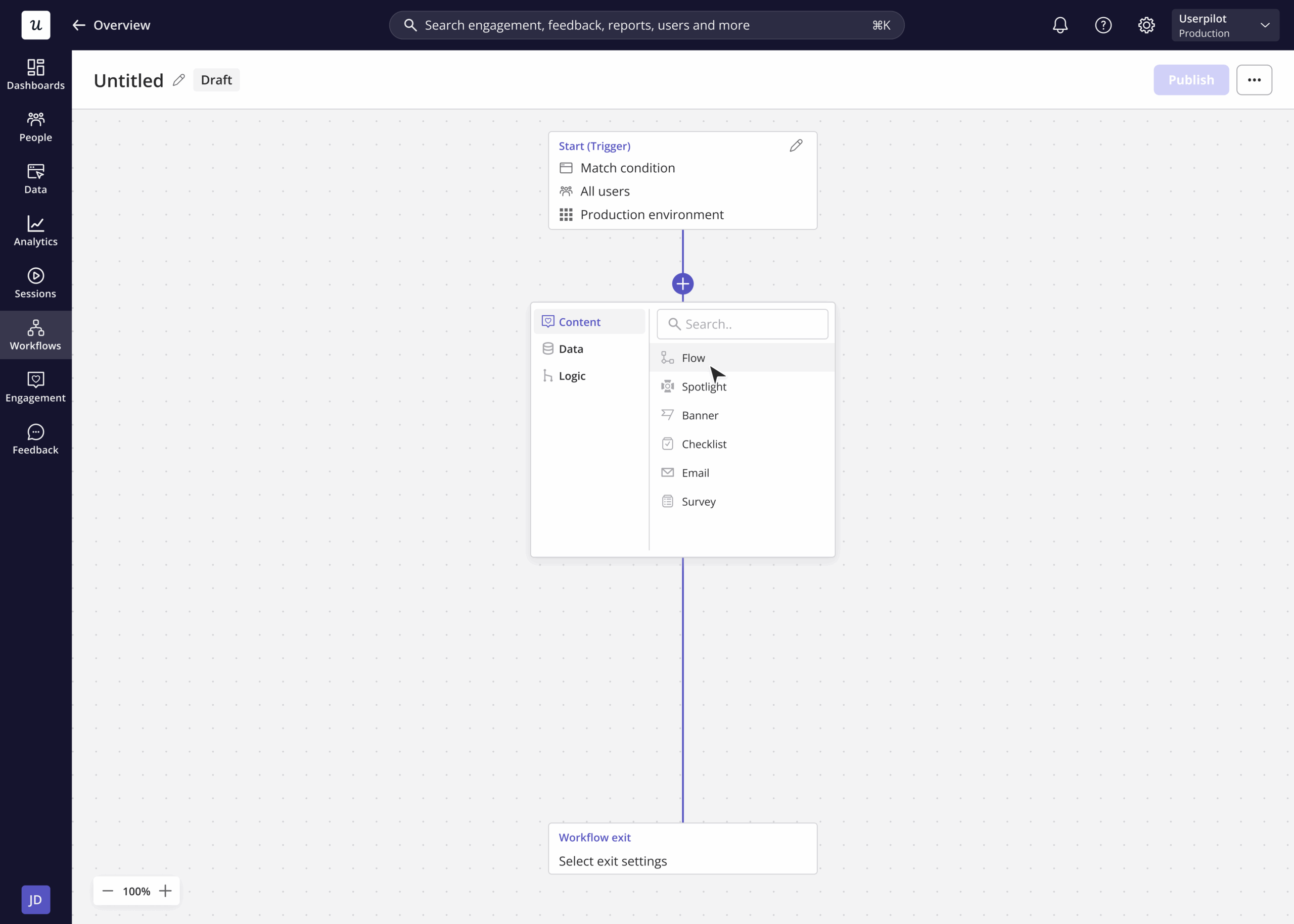
Userpilot’s Workflows feature lets a tooltip used for activation or account expansion become one step in a longer sequence rather than a standalone moment. A workflow can branch based on whether a user acted on the tooltip, wait a set number of days, then follow up by email if they didn’t, or hand off to a mobile push notification if the user’s device changes.
The same logic applies further up the funnel to onboarding tooltips like Kommunicate’s. A tooltip that goes unnoticed in-app no longer has to be the end of the attempt to reach that user.
Tooltip types: Native, hotspot, masked, and modal
“Tooltip” gets used loosely to cover four different patterns from our onboarding UX examples. Mixing them up is how a lot of these roundups end up vague and even confusing. Here’s the difference:
- A native tooltip is the classic version of a small box that appears when a user hovers over or clicks an element, explains it, and disappears.
- A hotspot is a small icon, often animated, that sits on an element until a user interacts with it, drawing attention rather than explaining anything directly.
- A masked or spotlight tooltip dims the rest of the screen and cuts a highlight around one element, forcing focus onto it.
- A modal isn’t technically a tooltip at all. It’s a dialog that interrupts the screen entirely, but it often shows up in the same walkthroughs as tooltips, usually as the opening step before the tooltips get specific.
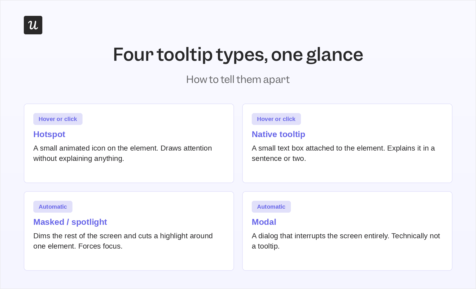
The way a tooltip is triggered matters more than you might imagine. Hover doesn’t exist on a touchscreen, so a tooltip built around mouse hover alone simply never fires for a mobile user. When you’re creating a native tooltip, it triggers on either a hover or a click per element. That matters if the same flow needs to work on desktop and mobile without a separate build for each.
| Type | Typical trigger | Best for | Example below |
|---|---|---|---|
| Native tooltip | Hover or click | Explaining one specific element | Kommunicate, Talana |
| Hotspot | Hover or click, until dismissed | Drawing attention to a feature a user hasn’t noticed | Asana, Miro |
| Masked / spotlight | Automatic, on trigger | Forcing focus during a critical first step | Not directly shown below |
| Modal | Automatic, on trigger | Setting context before a walkthrough begins | Impala |
Accessibility standards for tooltip design
Most advice about contextual help patterns stops at copy and placement, but the standards worth building to are more specific than that. They’re also easily checkable. Contrast needs to hit at least 4.5:1 for normal text and 3:1 for large text, per WCAG 2.1’s Level AA guidance. Those are the same standard most accessibility audits are measured against.
Tooltips also need to be reachable by keyboard, not just a mouse. In WebAIM’s survey of users with motor disabilities, the keyboard was the primary way of interacting with a web page for about a third of respondents. They also need screen reader support, meaning the element has a label describing what it does, not just a visual box that a sighted user happens to notice.
Timing matters too: a tooltip that fires the instant a cursor grazes an element reads as noise. That’s why most guidance settles on a short delay, in the 300-500 millisecond range, before it appears. A tooltip should also never sit on top of the thing it’s explaining, since a box covering the button means nobody can act on what they just read.
None of this needs custom engineering to get right. Userpilot’s in-app messages, including native tooltips, align with these best practices by default. Keyboard navigation, ARIA labels, and color contrast checking are all built into the theme editor rather than left for a user to bolt on afterward. If a product also switches between light and dark mode, tooltip styling can follow automatically through the same theme API.
When to use a tooltip (and when a different pattern is better)
A tooltip is for optional context, never for something a user has to know to finish what they’re doing. Getting this wrong shows up directly in activation rate benchmarks, since a tooltip nobody sees might as well not exist. It’s another reason to think about tooltips as a part of a broader in-app messaging strategy.
A good way to use a tooltip is to explain an unfamiliar icon. A tooltip shouldn’t carry a legal disclosure, a pricing detail, or a step a user can’t skip because it becomes a hover-triggered box that’s easy to never see. On mobile, it may not exist at all. In that situation, the information belongs inline, in a banner, or in a modal that has to be dismissed on purpose.
| Scenario | Use a tooltip? | Better pattern to use instead |
|---|---|---|
| Explaining what an icon does | Yes | None needed |
| A step inside a required onboarding flow | Sometimes | Checklist or driven action, so progress persists |
| A legal disclosure or pricing detail | No | Inline text or a banner |
| Something a user must act on to continue | No | A modal that requires dismissal |
| Announcing a new feature broadly | Sometimes | A banner or an email, since a tooltip only reaches users who visit that screen |
Building tooltips that meet the moment
Every example on this list works for the same underlying reason. A specific pattern (a native tooltip, hotspot, or modal) is matched a specific moment. The three case studies above increase user activation by deciding what kind of interruption, if any, the moment called for. Then, you can begin building and measuring that decision instead of guessing at it. That’s also the part that’s hardest to get right without testing it against real users first.
Our Chrome extension builds native tooltips, hotspots, and full walkthroughs directly on your live product without writing code or sending an engineering ticket. You build it, watch how people respond, and decide whether to keep or scrap it. Book a demo, and we’ll walk through which moments in your product need a tooltip so you can improve user engagement.
About the author