App Walkthrough Best Practices For 2026


What is an app walkthrough?
An app walkthrough is a guided flow that walks your users through a small number of key features and helps them use these features to achieve their goals.
Those are usually the specific features that a particular user needs to get acquainted with in order to derive maximum value from your product.
Once your user has finished their walkthrough, they will have experienced the value of your product in a first-hand, visceral way.
This means that they have been activated, making them significantly less likely to churn.
Given just how much activation correlates with retaining users for a long period of time, activation should be the goal of your app’s walkthrough.
Your app’s walkthrough is not a product tour!
When some SaaS executives hear the word “walkthrough,” they start to think of an extensive, blow-by-blow guide to all the app features they offer.
This type of guide is called a “product tour,” and it’s very different from an app walkthrough.
Where a walkthrough is interactive, encouraging simple actions on behalf of your users, a product tour is passive.
Put another way, the content of a product tour is determined by SaaS executives in advance. It’s a top-down, linear process.
Whereas, the content of an app walkthrough is based on the responses of your users and their actual actions.
They are an active part of the process.
It’s essential that you understand the distinction between a walkthrough and a product tour before we go any further.
It doesn’t matter how pretty the design is: if your walkthrough is actually a product tour in disguise, no one will want to use it.
You have been warned!
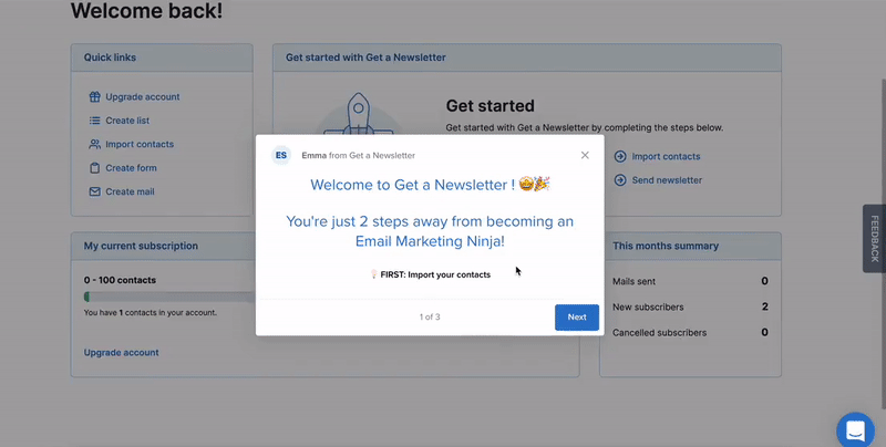
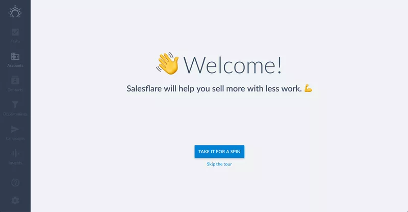
App walkthrough tip #1 – Start with a welcome screen to guide users
Your app’s walkthrough should begin with a welcome screen.
This is where you formally greet your new users for the first time and welcome them to your app.
From a design perspective, the welcome screen is normally what’s known as a “dedicated UX pattern.”
This means that since the welcome screen is one of the many important app walkthrough elements, the entire screen is dedicated to it to prevent your user from getting distracted.
Alternatively, the welcome screen can be designed as an embedded UX pattern, with the space around it greyed out, like this example from the social media app Postfity:
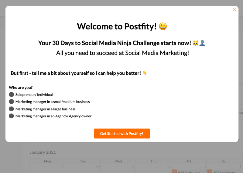
Regardless of which type of UX pattern you choose, you’ll want to make sure that your welcome screen contains the following design elements:
Greet your user by their first name
Ideally, you will have asked your user to record their name during the sign-up flow that precedes your app’s walkthrough.
The walkthrough is a great time to mention the user’s name. People love feeling like the product they’re using is personalized to their needs and speaking to them as an individual.
Include a photo of one of your team
A successful app onboarding experience should get your user feeling like you’re greeting them personally and that you really care about them.
In a digital world, a picture of a real person is often more emotionally engaging than some dry words on a screen.
The more friendly and smiley, the better.
Introduce your business
If your marketing department has created a pithy, one-sentence description of what your app does, the welcome screen is a great place to include that.
You don’t want to come across as too sales-y, but you do want to remind the user why they signed up and what value they can expect to derive from your app.
App walkthrough tip #2 – Assign your users to a segment
You may recall from earlier that we said you need to make your app’s walkthrough as personalized to the needs of the individual user as possible.
A crucial step in the walkthrough process is therefore to assign your user to a customer segment.
The content that the user sees in the rest of the walkthrough will be determined by what segment they are assigned to.
And since a walkthrough can be shown at different stages of the user onboarding process, you must segment them considering where they are on the user journey map.
Segment using a micro survey
From a design point of view, the best way to set up your UX to segment your users is by using a microsurvey.
This is a survey with 1-3 questions that pop up in-app and display as an embedded UX pattern.
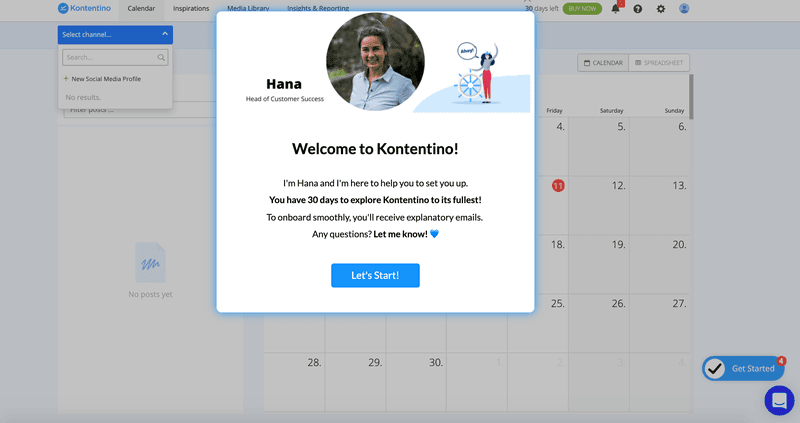
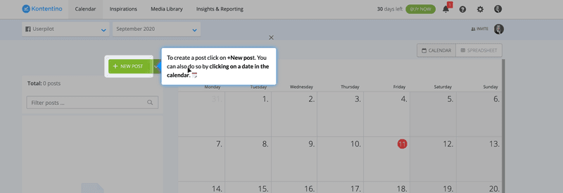
Here’s a micro survey that the social media scheduling app Kontentino built with Userpilot:
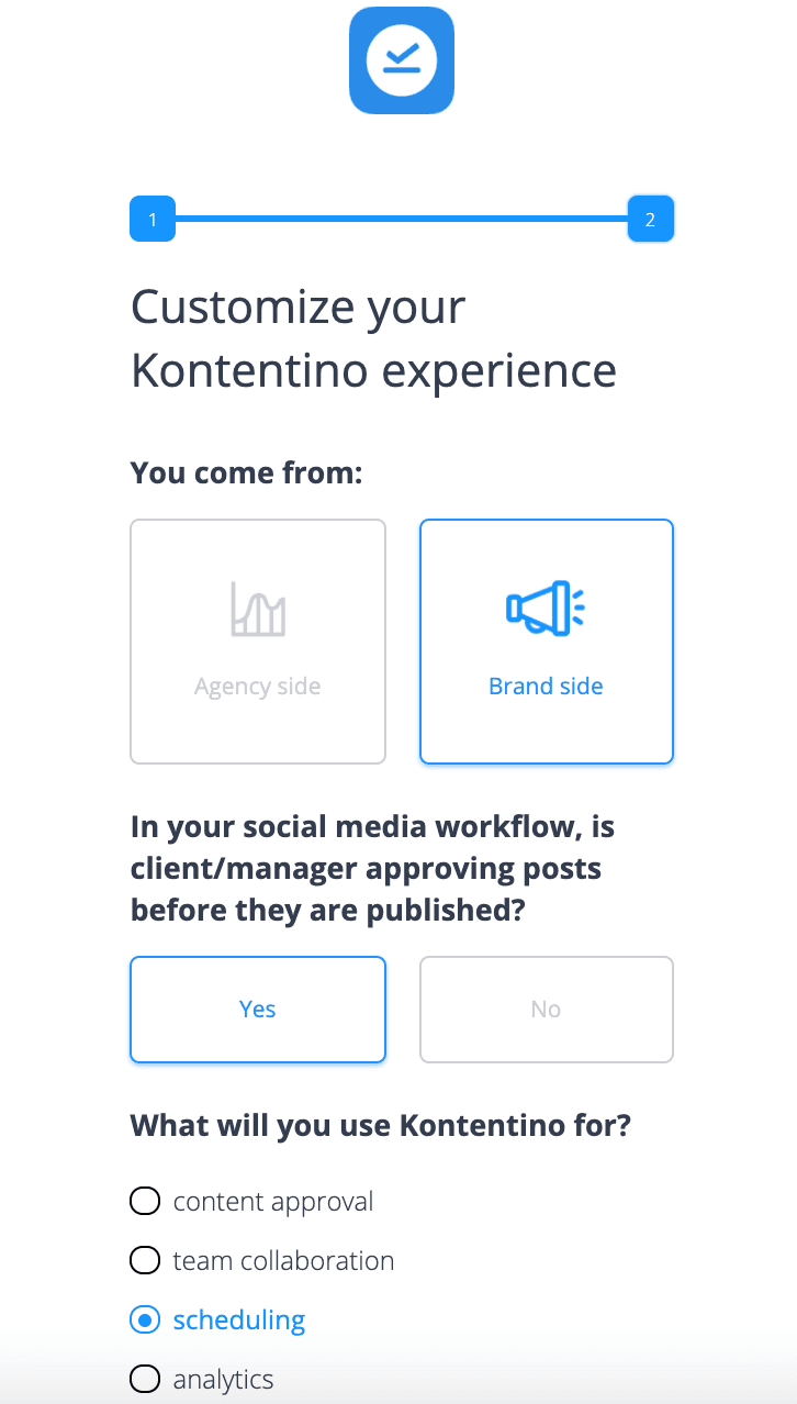
Kontentino has two main user personas:
- The brand has one set of social media accounts to manage and post from.
- The agency manages multiple sets of social media accounts from multiple clients and needs to get approval from each client before posting on their behalf.
It wouldn’t make much sense to provide a single brand with an app walkthrough that shows how to post from multiple client accounts.
Kontentino, therefore, uses this microsurvey to figure out which segment their users belong to ahead of time.
Hopefully, you can see that the welcome flow of an app walkthrough is not just a place to be cutesy and share smiley pictures.
In fact, if you were to view it that way, your customers would probably just feel resentful that you put another barrier in the way of them using your app.
Rather, your welcome flow is an opportunity to learn more about your user, and then customize the remainder of their product experience accordingly.
App walkthrough tip #3 – Aim your app’s walkthrough towards activation
Once you know what segment the user belongs to, you should have an intuitive sense of what value they want to see from your app if they are going to stick around.
For example, for a project management tool, if your user is:
- A project manager: probably wants to see features that help them keep all the projects organized.
- An accountant: they’re likely most interested in viewing financial information for each project.
- The CEO: they probably want to use features like a Gantt chart to have a look at the big picture of their business.
You can see from these examples that value is subjective. In other words, what one user cares about is often of no interest to a different type of user.
It’s your job to create multiple interactive walkthroughs that really speak personally to the individual needs of each customer.
If you really don’t know what value a particular user cohort needs in order to activate, look at your product analytics.
That’s probably what you want to design the walkthrough for your app around – the features used by the “successful” user cohort.
Remember that your users really need to experience the value of your product if they are going to activate and a good app walkthrough will make this possible.
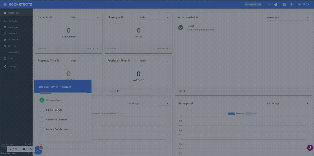
App walkthrough tip #4 – Create a checklist containing 2-3 activation steps
The checklist is the point where you pull together all the work you’ve done so far.
You should serve each user with a checklist containing the 2-3 key actions they will need to take to activate, based on the answers they provided in your microsurvey.
The checklist should be displayed as an embedded UX pattern so that it’s disruptive enough to get the user’s attention but doesn’t take up the entire screen.
Look at how Postfity does it:
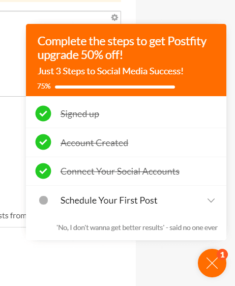
Postfity requires customers to take two actions in order to activate:
- Connecting their social media account
- Scheduling a post
Note that Postfity already gives users credit for signing up and creating an account.
That’s bound to make them feel good. It’s less overwhelming to think about completing a checklist that you’ve already started than it is to start from zero.
The rest of the checklist is designed with a psychological principle called the Zeigarnik effect in mind.
The Zeigarnik effect states that humans are more likely to remember tasks that are incomplete than those they’ve already finished.
So by making a checklist containing steps towards activation, Postfity is ensuring that those steps remain top of mind for their new customers.
App walkthrough tip #5 – Build experience flows for your app’s walkthrough
Now we’ve reached the core of the walkthrough.
For each item on the checklist you made, you should design an experience flow that guides your customers through the activation step they need to take.
The word “flow” in this instance comes from the fact that an experience flow consists of multiple UX elements, and your customer flows between them seamlessly while they learn to use your app.
Custom events
If there are multiple checklist to-dos that need to be completed in a certain order, you can use custom events to ensure that the second to-do only displays to the user after the first one is complete.
For example, Kontentino’s walkthrough asks the user to first connect their social media account…
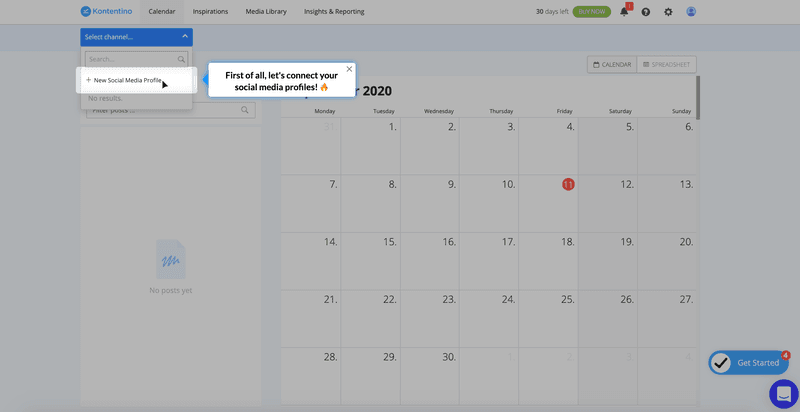
… and only then make their first post.
There wouldn’t be much sense in asking the users to make a post before connecting their accounts. Instructions like that would only lead to churn.
You can read more about custom events here.
The following design elements are commonly used in experience flows to show the customer what to do:
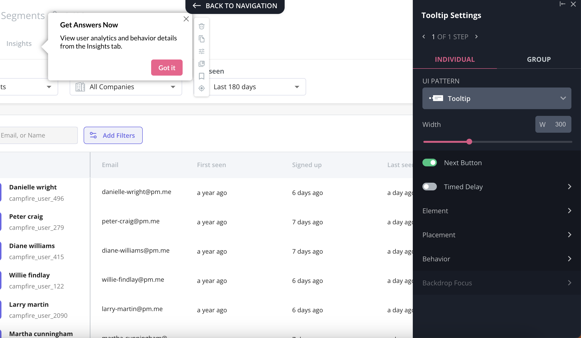
Tooltips
Tooltips are an annotated UX pattern often used to draw attention to a section of the user interface that is not immediately intuitive.
They are generally not visible by default. Instead, they appear when a user hovers or taps on a particular part of the walkthrough.
As well as using tooltips as part of experience flows during user onboarding, you might also consider using them elsewhere in your app as a standalone help tool.
Demo content
Demo content is made-up placeholder data that shows your customers what your app could look like once filled with their data.
It’s often used in walkthrough design as a substitute for white space, which is called an “empty state” in the walkthrough world.
That’s because it’s less overwhelming for the user to start using a tool that already has some data in it than it is to start from scratch.
When you design your demo content, just make sure that it’s something that’s actually relevant to your customer’s use case.
For example, if a digital marketing company is using your project management app and it’s filled with fake data about swimming pools, your walkthrough will probably confuse users more than it enlightens them.
It should also be obvious from how the app creates it that your demo content is fake data and that it will vanish once the user adds their own real data — either during or immediately after the walkthrough.
Slideouts
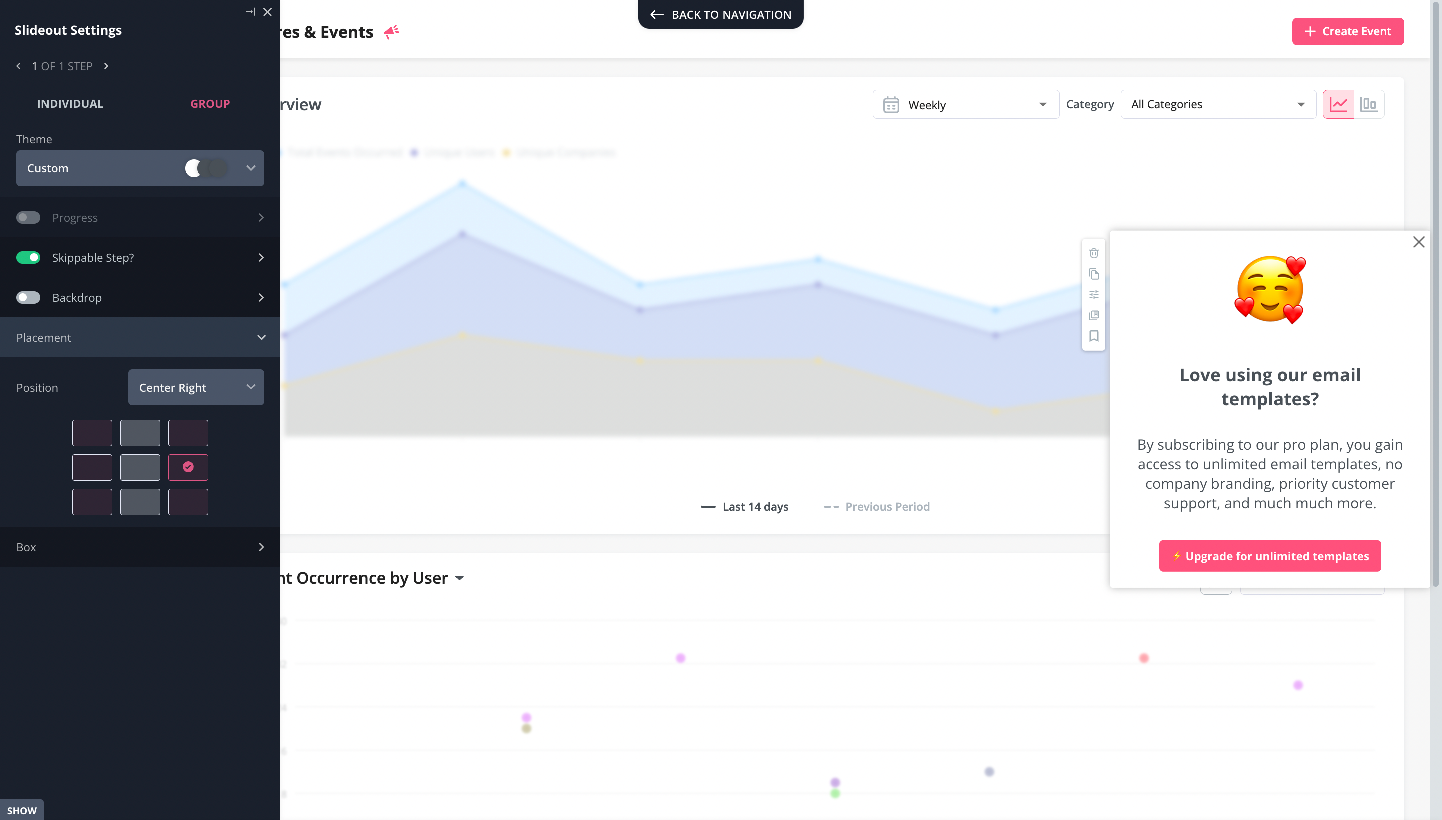
A slideout is a small panel or modal that slides onto the slide of the screen when you want to highlight an action that you want to drive.
It’s an embedded UX pattern, so smaller and less aggressive than a modal that would take up the whole screen.
Nevertheless, the size and motion of a slideout are normally enough to get the attention of most users.
Hotspots
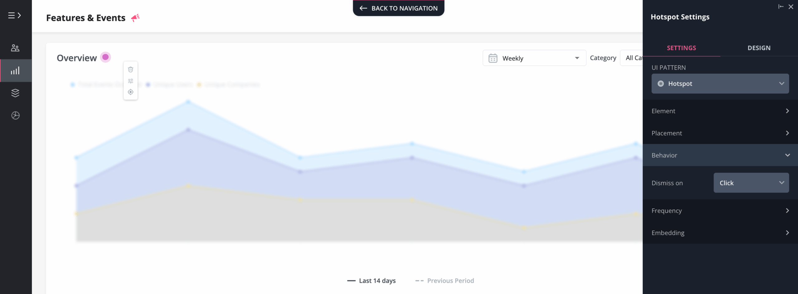
A hotspot is a small dot that pulsates softly on top of the user interface.
As an annotated UX pattern, it’s often used to draw attention towards one particular action that you want your user to take as they proceed through their app walkthrough checklist.
It’s important that you only highlight one action at a time.
If you use too many hotspots, your user won’t know where to click, and you’ll just end up confusing them.
Is it possible to code your app’s walkthrough yourself?
The answer to this question will depend on your level of technical prowess.
Bear in mind that you need a lot of code to build even the simplest of design elements for your app walkthroughs.
So for a simple tooltip that looks like this…
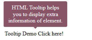
You’d need this much code:
<html>
<head>
<title>HTML tooltip</title>
</head>
<style>
.arrowpopup {
position: relative;
display: inline-block;
cursor: pointer;
}
.arrowpopup .tooltiptext {
visibility: hidden;
width: 160px;
background-color: #856;
color: white;
text-align: center;
border-radius: 4px;
padding: 9px ;
position: absolute;
bottom: 150%;
left: 50%;
margin-left: -85px;
}
.arrowpopup .tooltiptext::after {
content: “”;
position: absolute;
top: 100%;
left: 50%;
margin-left: -5px;
border-width: 5px;
border-style: solid;
border-color: #856 transparent transparent transparent;
}
.arrowpopup .show {
visibility: visible;
}
</style>
<body style=”padding:100px;”>
<div class=”arrowpopup” onclick=”myFunction()”>Tooltip Demo Click here!
<span class=”tooltiptext” id=”tooltipdemo”>HTML Tooltip helps you to display extra information of element.</span>
</div>
<script>
function myFunction() {
var tt = document.getElementById(“tooltipdemo”);
tt.classList.toggle(“show”);
}
</script>
</body>
</html>
Yikes.
And to be honest, this tooltip is not especially visually appealing either. The more aesthetically pleasing the tooltip, the more code you’ll probably need.
So it’s up to you: if you’re a coding wizard, or your development team has lots of spare time on their hands, you could build your walkthrough yourself.
In practice, we’ve found that most of the SaaS teams we’ve worked with use a walkthrough tool to reduce the amount of labor.
A code-free walkthrough
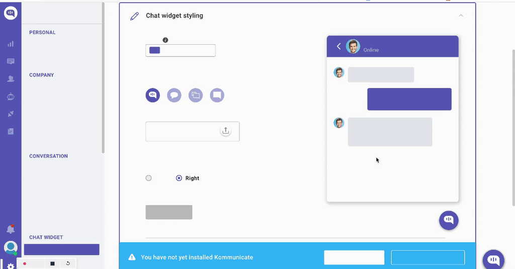
The great thing about app walkthrough tools like Userpilot is that you generally need no coding experience to use them. And you can still build beautiful walkthroughs, like this example:
It’s easy to customize any part of your UI to fit your brand’s unique personality and color scheme.
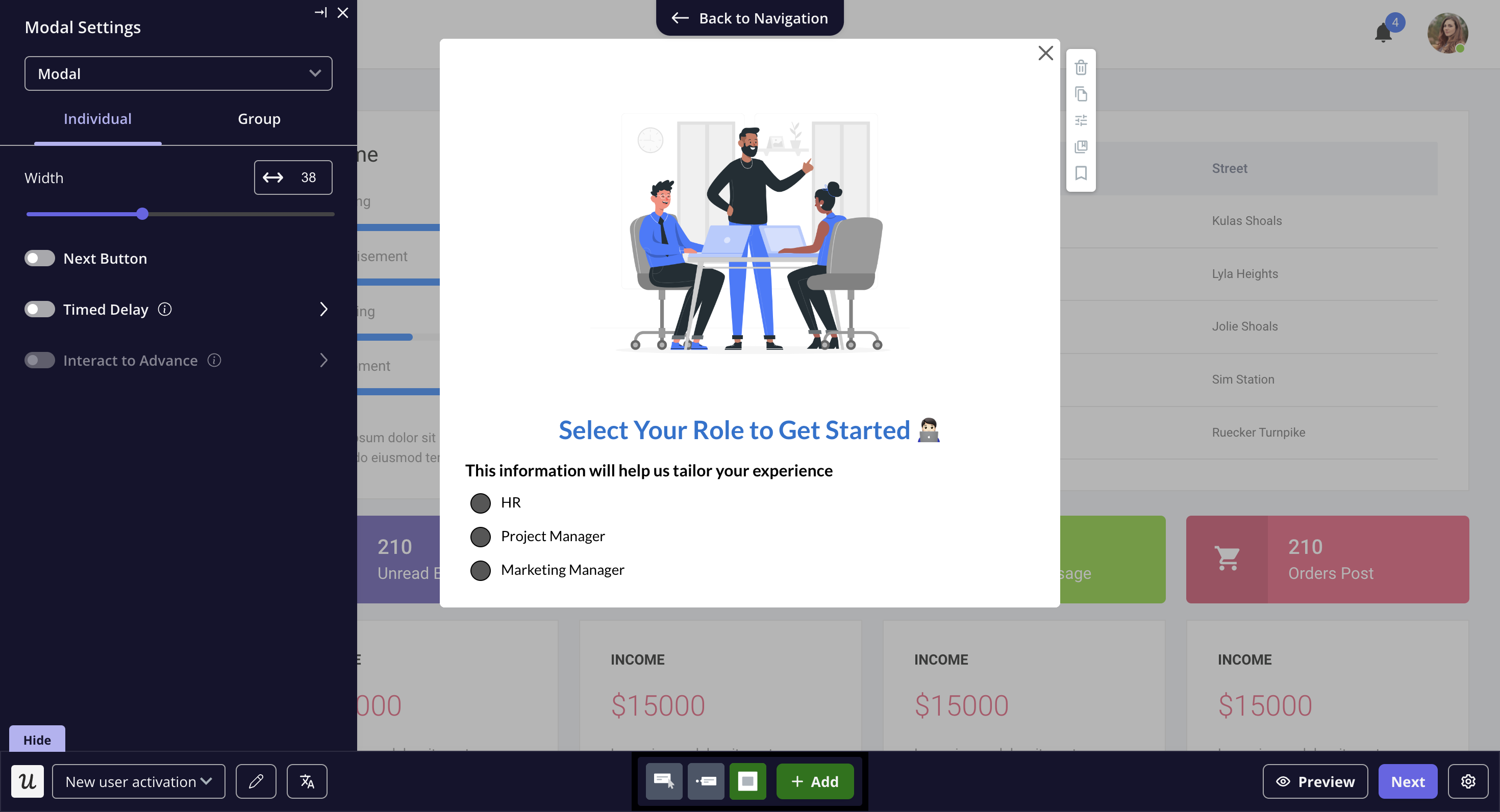
In terms of coding, all you need to do is install Userpilot’s JS snippet. After that, there’s literally zero additional code required.
Conclusion
Having read this article, you should now be in a position to build a walkthrough for your own SaaS product.
Remember that the most important components of your app’s walkthrough are the:
- Welcome screen
- Microsurvey that segments users
- Checklist of activation tasks
- Experience flows for each activation task
If your walkthrough contains all of these elements, and your users complete it, they will activate it every time just by finishing the walkthrough.
And what’s even better is: that you don’t even need to be a coding genius to build a walkthrough like this!
About the author