Onboarding UX Examples: 10 Best Flows and What AI is Changing about First User Experiences


Looking for onboarding UX examples to inspire your next flow? Done well, onboarding can improve user activation and long-term engagement. In our SaaS Product Metrics research, we found that most drop-offs happen during the first session. And with the average time-to-value sitting at just over a day, even small moments of friction can push users away quickly.
To see what actually works, I tested the onboarding flow of 30+ SaaS tools. Only 10 stood out as onboarding examples worth stealing. In this guide, I’ll break down what each flow gets right, the UX principle behind it, how AI-powered onboarding is changing the first user experience, and where AI personalization can still get in the user’s way.
User onboarding evolution: From feature tours to first useful outcomes
User onboarding has gone through several changes over the years, but the goal has stayed the same: help new users reach value before they lose momentum.
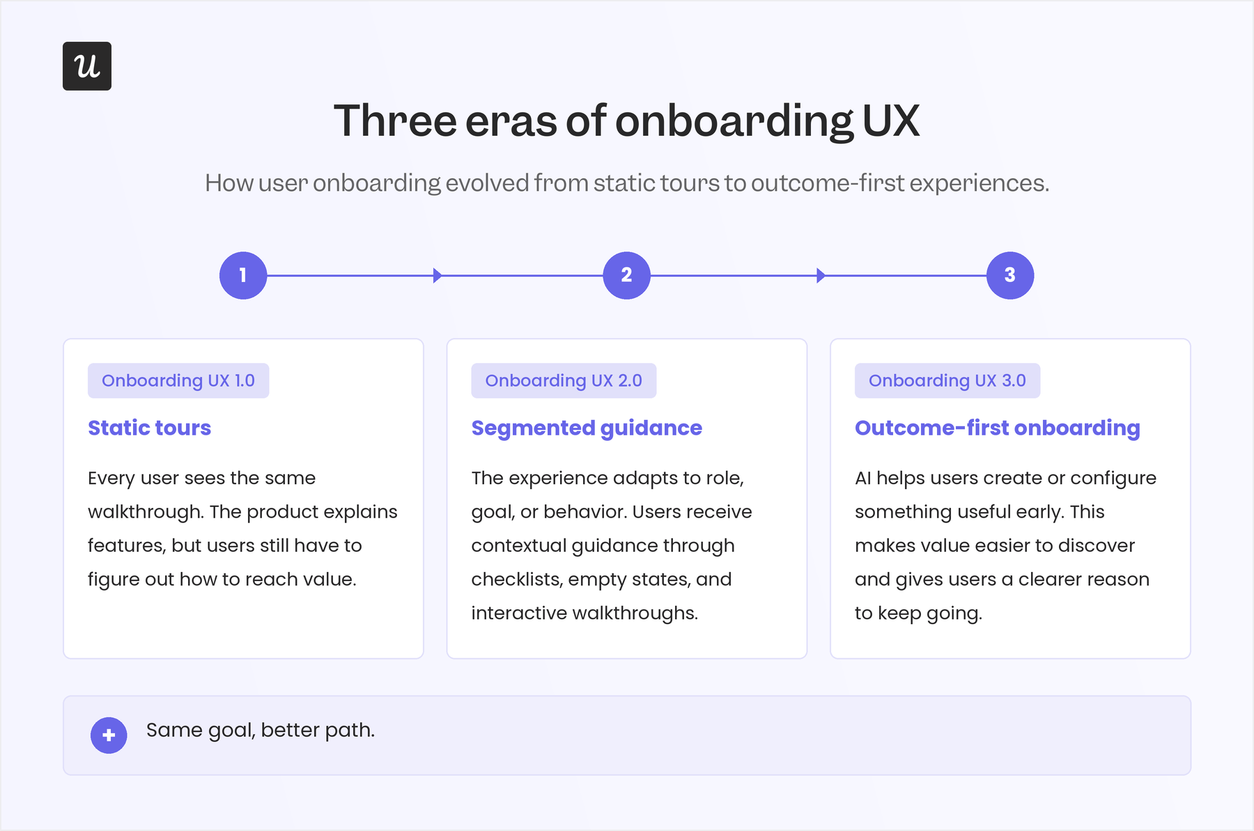
I like to think of this change in three eras:
- Onboarding UX 1.0: This was the early phase, when teams built onboarding around static tours. The product showed users around with tooltips, welcome modals, and step-by-step feature explanations. This worked when products were simpler, but it often treated onboarding as a lesson instead of a path to value.
- Onboarding UX 2.0: To address the limited personalization that static guides provided, SaaS teams moved toward segmentation and in-app behavior. Instead of showing every user the same walkthrough, products started asking about role, use case, and goals, then used empty states, checklists, and contextual prompts to guide the next action. This worked well because it lines up with long-standing UX principles like recognition over recall and progressive disclosure.
- Onboarding UX 3.0: This is where we are now. AI tools and product growth agents are making onboarding more outcome-driven. AI can help users create, configure, or organize something useful before they fully understand the product. Wes Bush, founder of ProductLed, argues that the AI onboarding benchmark is around 60 seconds to value, with the strongest flows giving users useful output from very little input. That expectation is already shaping customer experience strategy: Adobe’s 2026 AI and Digital Trends report found that 80% of organizations want future customer experiences to be highly personalized and anticipatory in real time, while Rocketlane’s 2025 State of Customer Onboarding report found that nearly 90% of onboarding and implementation teams planned to use AI and automation in their flows.
10 Onboarding UX examples to inspire your own
To put this list together, I signed up for each tool and went through the interactive onboarding flow step by step. The examples below come from that hands-on app experience and show how different products make the next step obvious and help users get to value without friction.
1. Slack turns a new workspace into guided action
When you first land inside Slack, the product doesn’t leave you with an empty workspace and a long tour to complete. It creates a few starter channels and uses those spaces to show you what to do next.
In the first channel, Slack explains what the channel is for and gives users practical next steps, like inviting teammates, connecting files, connecting a calendar, or adding apps. The guidance sits inside the workspace itself, so users learn what Slack can do while looking at the exact place where that work will happen.
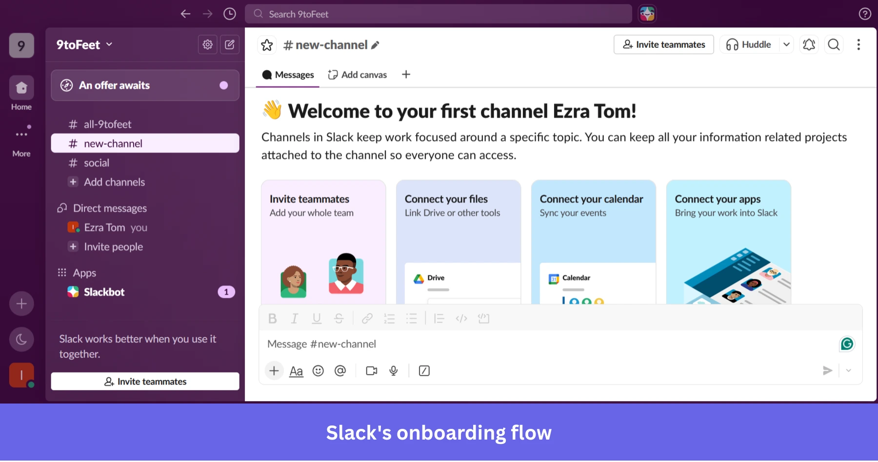
The same pattern shows up across other starter channels, too. A company channel may suggest adding a handbook, recording a welcome message, or inviting teammates. A social channel may suggest sending a GIF or starting a casual conversation. Each channel teaches a different behavior without pulling the user into a separate tutorial.
Why this works
Slack makes the first workspace feel active before the user has done much. It reduces the awkward blank-state moment and gives users clear actions that match the context they’re already in.
💡 The takeaway
Use your first screen to guide real action, not just explain features. If a new user visits an empty product area, fill that space with useful context, suggested next steps, and actions that help them understand what the product is for.
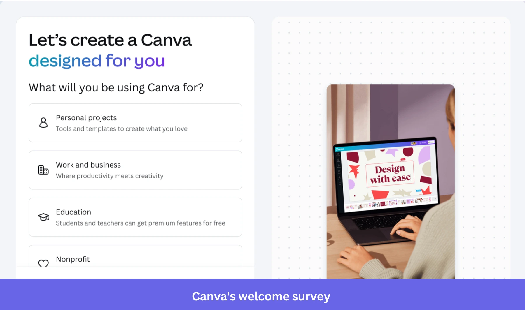
2. Notion personalizes onboarding based on user intent
When users sign up for Notion, one of the first things it asks is how they plan to use it, whether it’s for work, personal use, or school. It also asks about their role.
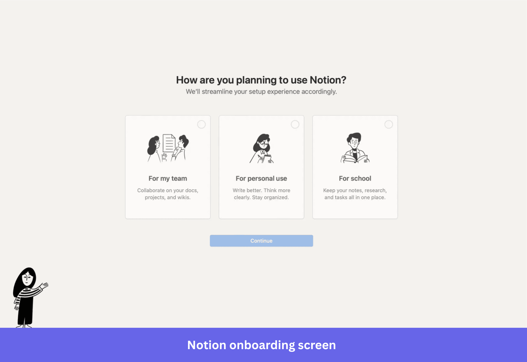
This welcome survey shapes the onboarding flow from the first screen because Notion uses the answers to create a more relevant starting point for each user. For example, if a user says they’re working in a team, Notion sets up project boards, meeting notes, and docs. It also pre-populates them with example content, so users can see how everything fits together without starting from scratch.
Why this works
This strategy leans on recognition over recall, which makes it easier to start using the product right away.
💡 The takeaway
Use segmented onboarding. Ask 1 to 2 focused questions upfront, such as use case or role, and map each answer to a specific starting point inside the product. Pre-load that experience with relevant templates or examples so users can start working without setting things up from scratch.
3. Duolingo gets users to learn by doing from the first interaction
After choosing a language and a daily goal, Duolingo moves you straight into a short activity. You see a simple prompt with visual options, and you’re expected to respond right away.
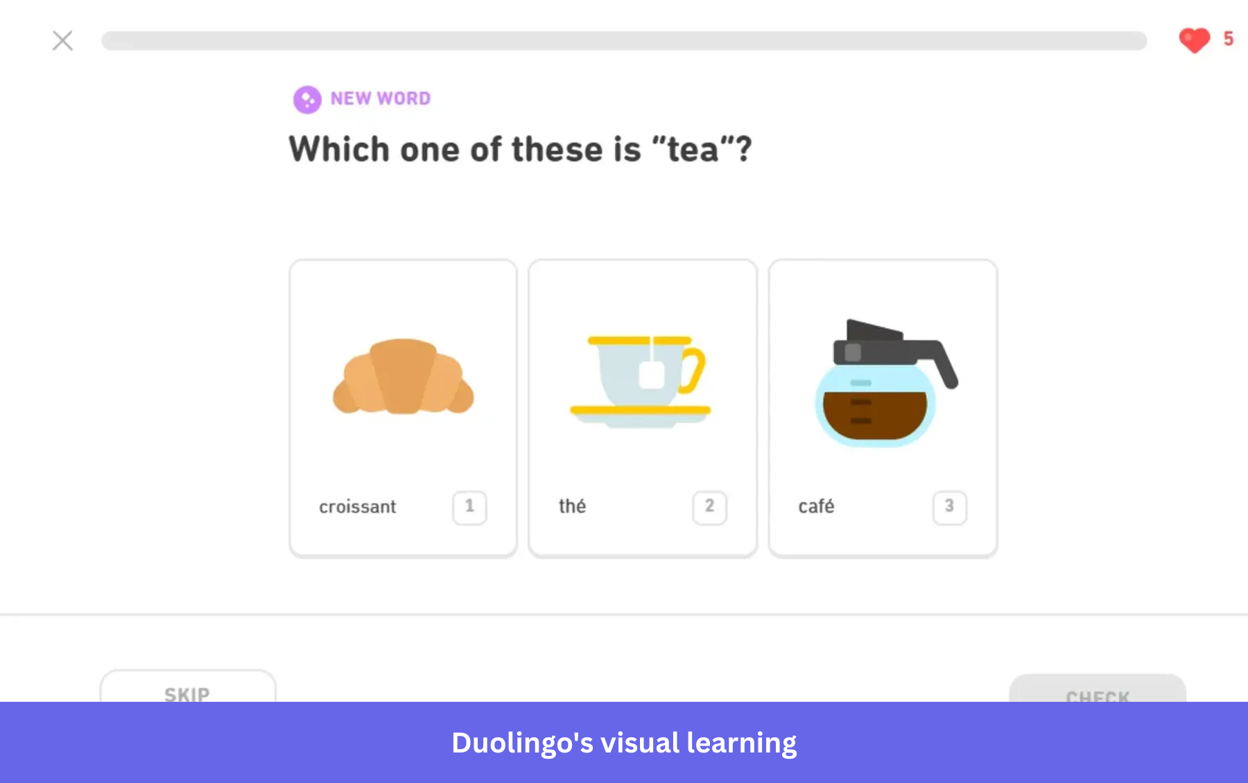
There’s no moment where you’re figuring out what to do next. The interface makes it obvious. You tap, get feedback, and move forward. Within a few seconds, you’re already translating words and matching phrases, which is the core action Duolingo is built around.
Why this works
Duolingo’s strategy helps users learn by taking action. The immediate feedback loop also provides quick wins that push users to continue.
💡 The takeaway
Design onboarding around time-to-first value. Aim to get users to a real outcome within the first session, ideally within minutes. Top-performing products hit value in under 5 minutes, and even small delays reduce conversion and retention.
4. Calendly guides users to create and share their first event quickly
The first thing you notice in Calendly is a ready-made event with the meeting type, timing, and shareable link already in place. Even if you haven’t explored anything else, you immediately understand what the product does and how to use it.
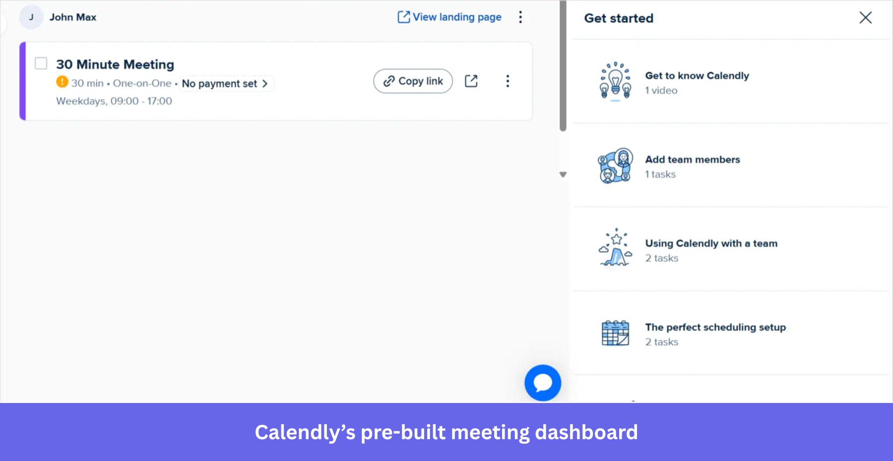
You can copy the link, open the booking page, and experience the flow from the other side within seconds.
I’ve seen many onboarding experiences focus too much on setup. Calendly flips that. It brings you close to the outcome first, then lets you adjust things if needed.
Why this works
The strategy builds goal clarity and reduces cognitive load, since the next step is already visible.
💡 The takeaway
Make the outcome visible early so users can see what they’re working toward. When the end result is clear from the start, users move forward without second-guessing the next step.
5. Dropbox nudges users to upload their first file right away
Dropbox doesn’t leave you staring at an empty dashboard.
The moment you land inside, the interface points you toward one thing: adding your first file. There’s a large upload area in the center, and an onboarding checklist on the side that breaks down what to do next.
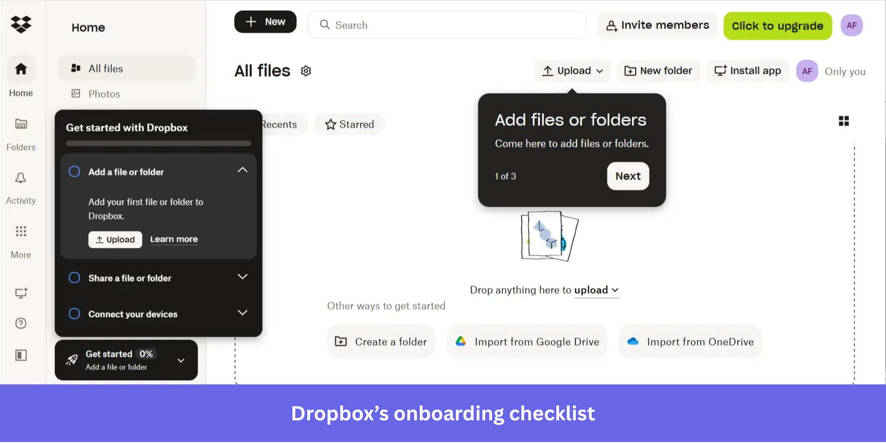
What I like here is how everything reinforces the same action. The empty space, the upload button, and even the checklist all push you in the same direction. It’s hard to miss what you’re supposed to do.
Why this works
The approach reinforces a single onboarding goal across the interface, which keeps users focused instead of splitting attention across multiple actions.
💡 The takeaway
Make the first action obvious and reinforce it. If users know exactly what to do when they land in your product, they’re more likely to take that step. In my experience, good onboarding doesn’t leave users guessing, but points them forward.
6. Canva personalizes onboarding with template-driven workflows
Canva is a massive design platform with hundreds of tools. Trying to explain every feature during the signup flow would risk overwhelming users on day one. Instead, Canva asks for your primary use case.
Based on your choice, Canva drops you into the editor with a relevant template already loaded. They use subtle interactive walkthroughs to point out the specific tools you need for that template. If you choose an Instagram post, they show you where the photo filters are. They don’t bother showing you the chart-making tool until you actually click the charts tab.
This is the essence of contextual user engagement. Give the user the exact information they need, at the exact moment they need it, and nothing else.
Why this works
Canva narrows the experience based on user intent and reveals features only when they’re needed, so users stay focused on one task at a time. This uses progressive disclosure, which reduces decision fatigue by limiting how much information users see at once.
💡 The takeaway
If your product has multiple use cases, don’t try to explain everything at once. Start with what the user wants to accomplish and guide them from there. Remember, when users can achieve something tangible early on, they’re more likely to stay engaged and explore further.
7. Mural guides users inside the canvas with contextual prompts
When you open Mural for the first time, you’re dropped straight into a blank canvas. Mural places small, focused prompts directly inside the workspace. You’ll see short tooltips like how to move around the canvas or zoom in and out, right when you need them. The instructions are tied to the exact action you’re trying to take, so you don’t have to pause and think.
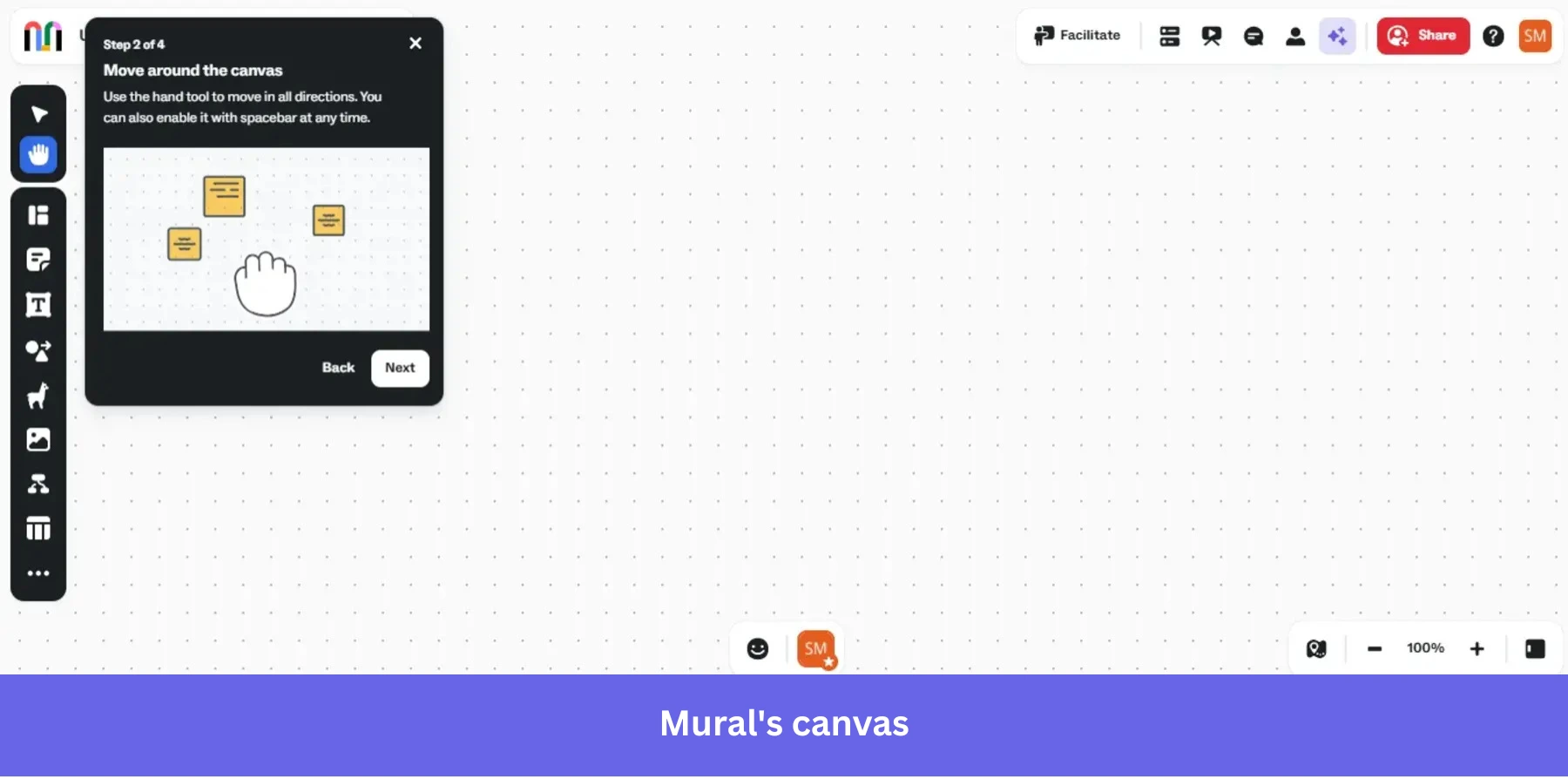
At the same time, the toolbar sits right next to you with clear visual icons like sticky notes, shapes, and text, which makes it easy to start interacting immediately.
I like this approach because it respects how people actually learn. When you’re on a visual board, the fastest way to understand it is by moving, clicking, and placing things, not by going through a long tutorial.
Why this works
The flow teaches users inside the workspace itself, which makes the learning process feel natural and low-friction.
💡 The takeaway
If users need to interact with a complex workspace, teach them inside the interface instead of pulling them into a separate tutorial. Small prompts tied to real actions are often more effective than long onboarding tours because users apply the guidance immediately.
8. Perplexity gets users straight to the core action
Perplexity uses an onboarding pattern that is becoming increasingly common among AI tools. There is no welcome flow or onboarding tooltip. The first screen after signup is already the product experience: a large search bar, search modes, model options, and suggested tasks.
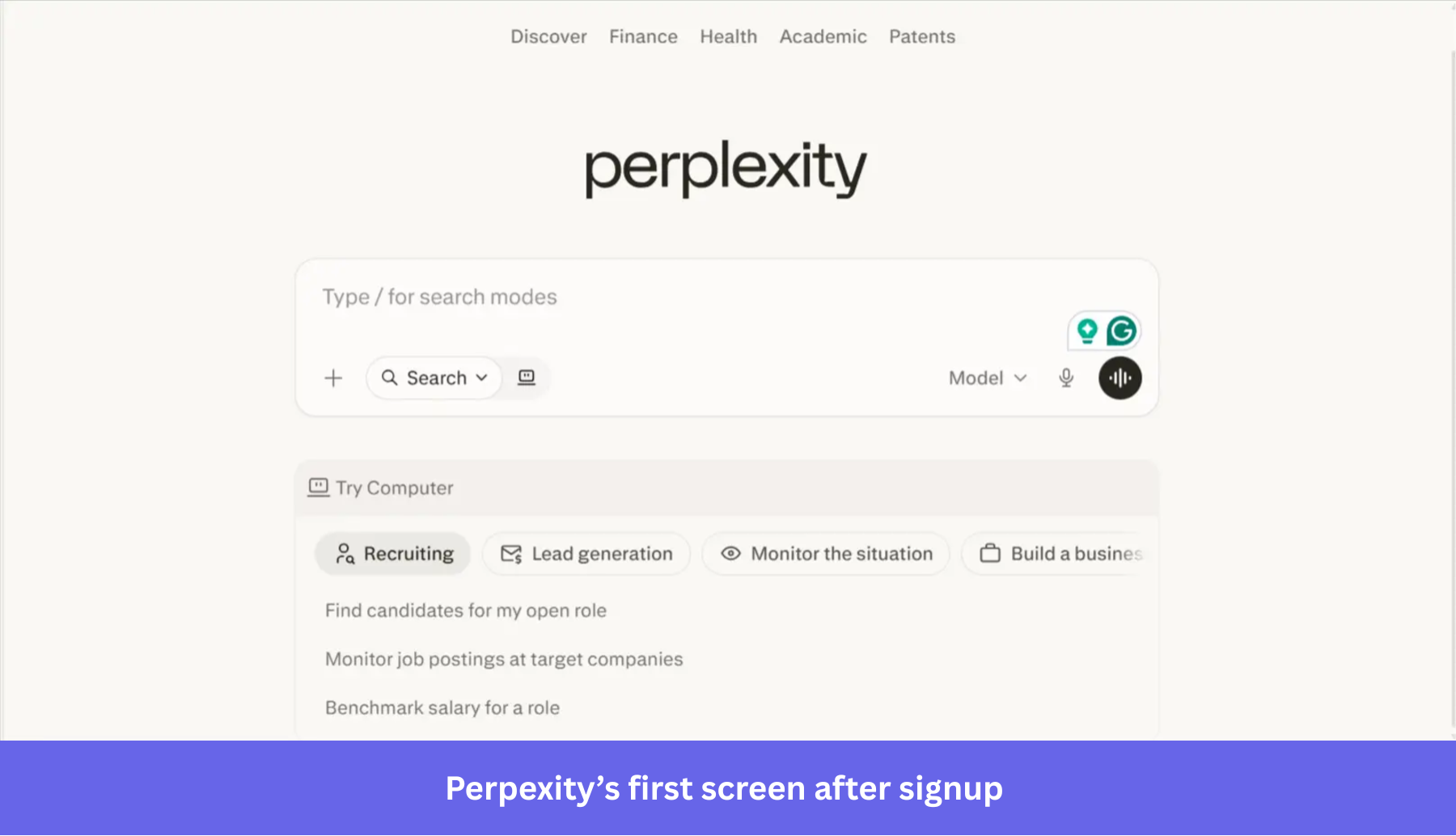
This matters because Perplexity’s value is not something users need to study first. They understand it by asking a question and seeing what comes back.
The surrounding suggestions also help without feeling like a tour: They show different ways to use the product, from recruiting to lead generation to monitoring a situation, while leaving the user free to start with their own query.
Why this works
The onboarding flow provides a faster path to engagement by allowing users to discover the product’s value through fluid interaction rather than rigid instruction.
💡 The takeaway
This will not work for every SaaS product, but if users can understand your product by interacting with it directly, avoid slowing them down with unnecessary setup. Bring the core action forward, then use prompts, examples, or suggestions to help users explore the product naturally.
9. Gamma uses AI to turn prompts into a usable first draft
Unlike Perplexity, Gamma does not drop users directly into the product experience. The onboarding flow first asks what kind of work the user wants to create and collects a small amount of context about their use case.
Once that setup is complete, Gamma moves users to a prompt-based workspace rather than an empty editor. Users can choose what they want to generate, add a prompt, adjust a few settings, and start from suggested examples rather than a blank page.
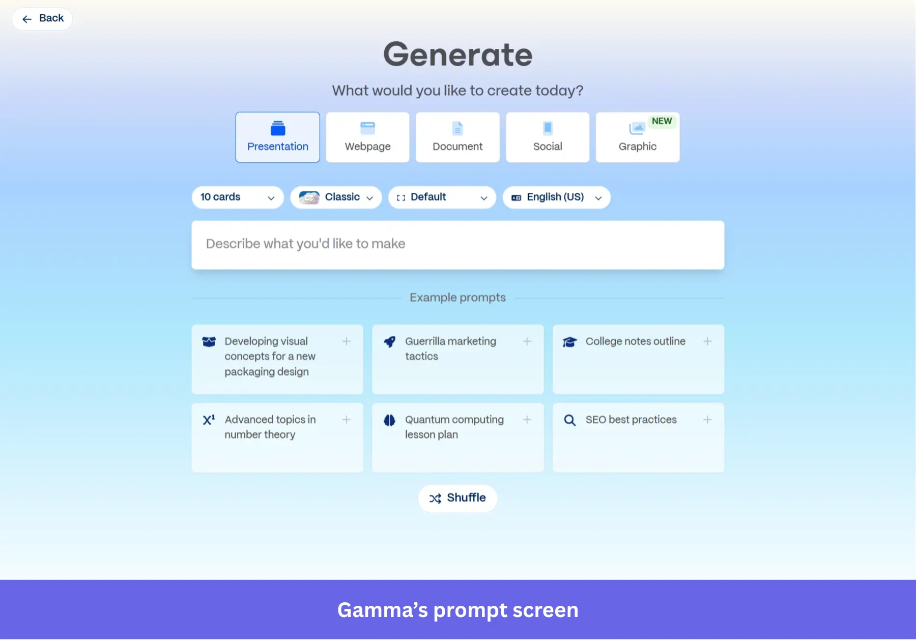
This strategy creates a very different kind of onboarding momentum: The user arrives as an editor shaping an idea, not as someone staring at an empty canvas, wondering where to begin.
Why this works
The onboarding flow creates enough structure upfront that users can focus on refining ideas instead of figuring out how to begin.
💡 The takeaway
If your product suffers from the blank-page problem, use AI to generate a useful starting point. Templates help, but generated drafts can reduce activation friction even further because users react faster to something editable than to a completely empty workspace.
10. Airtable uses AI to turn business intent into a working system
For Airtable, the challenge is not generating content from a prompt. It is helping users set up a structured workflow without forcing them to build everything manually.
Traditionally, getting started in Airtable meant creating fields, statuses, views, records, automations, and relationships before the product became useful. For many users, that setup work was the biggest activation barrier.
Now, Airtable’s AI-powered onboarding flow asks what the user wants to build and generates a working base around that goal. In the example below, the product already understands that the user is part of a marketing team and suggests a campaign tracker with timelines, metrics, and content planning workflows already mapped out.
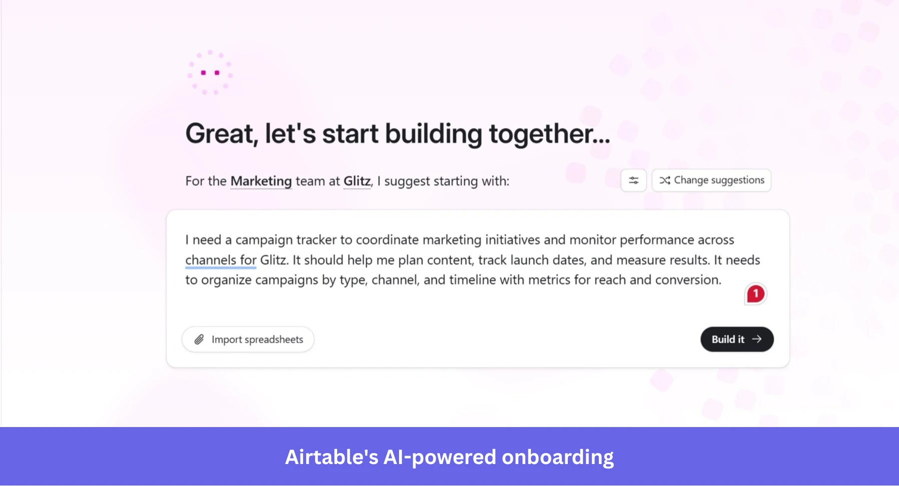
What I like about this approach is that the onboarding flow behaves more like a solutions consultant than a product tutorial. The user does not need to understand Airtable’s structure before getting started. The structure is created for them, and they can refine it from there.
Why this works
It allows users to start with a usable system immediately, rather than learning the product configuration layer first.
💡 The takeaway
If your product requires significant setup before users can experience value, AI can help bridge that gap. Use it to give users a configured workspace that reflects their goal, then let them shape it around their real process.
What do the best user onboarding experiences have in common?
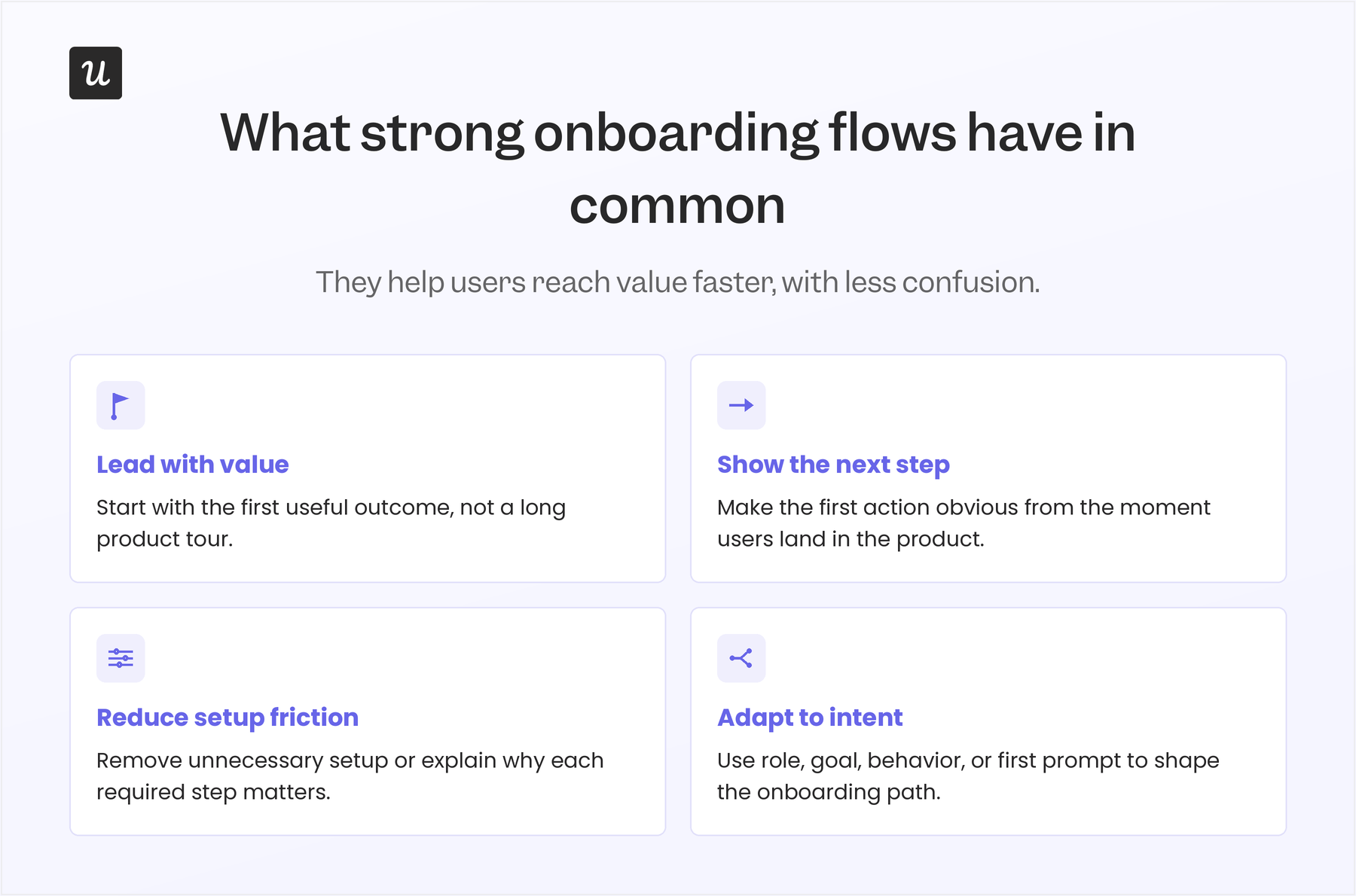
Across these user onboarding examples, the strongest flows all do the same basic job: they help users move from signup to a meaningful outcome with as little confusion as possible.
The tactics vary, but the pattern is consistent.
- They lead with the first useful outcome: Good onboarding does not make users finish a tour before they see value. It gets them to the first message, file, issue, board, event, or generated draft as quickly as possible.
- They make the next step obvious: Empty states, prompts, templates, and checklists work best when they point to one clear action instead of asking users to explore everything at once.
- They remove setup work that delays activation: The best flows either skip unnecessary configuration or explain why a required setup step matters before asking users to complete it.
- They adapt to the user’s goal or behavior: Strong onboarding changes based on role, use case, first prompt, or in-product actions instead of sending every user through the same static walkthrough.
That is also how Abrar Abutouq, one of our PMs at Userpilot, thinks about activation:
“If users don’t immediately understand why they should care, they’re less likely to engage. Most users prefer onboarding that’s short, simple, and to the point. Some products force their users to go through the onboarding before they can use the feature, and I think that actually hurts activation.”
Build AI-powered onboarding flows that shorten time-to-value
Good onboarding gets users to value quickly. It keeps the first session focused, removes unnecessary setup, and gives users the right prompt at the moment they need it.
That’s where Userpilot comes in. Our platform equips teams to build personalized onboarding flows, behavior-triggered in-app guidance, checklists, resource centers, funnel analysis, and session replays that show where users get stuck.
With Lia, Userpilot’s upcoming product growth agent, teams will also be able to spot friction faster, get next-best-action recommendations, and create more adaptive product experiences with less manual work.
Ready to see how Userpilot can enhance your onboarding flows and drive faster activation? Book a demo to begin!
FAQ
What is onboarding in UX?
Onboarding in UX is the process of helping new users understand what to do first and reach an “Aha!” moment quickly.
It starts from the signup page and continues through the first key actions a user takes inside the product.
What are some unique and cool app onboarding experiences?
Some of the best app onboarding experiences come from tools that have found ways to shorten time to value and keep users engaged throughout the onboarding process.
What does AI-powered onboarding still get wrong?
AI-powered onboarding tends to boost activation rates better than traditional onboarding flows, but there are a few mistakes to be mindful of:
- Asking for too much information too early: Your welcome survey should not turn into a long intake form. Every question should clearly improve what the user sees next, or it should be removed.
- Creating outputs that do not help users activate: A generated draft or setup is only useful if the user keeps editing it toward their real goal. If users delete the output and start over, the AI is creating a demo moment, not an onboarding moment.
- Making product personalization feel invasive: AI onboarding should be transparent, relevant, and easy to skip. Show users what was personalized, explain why, and give them a simple way to start clean if they prefer.
About the author