Imagine opening a new app, eager to explore its features, only to be bombarded with confusing menus and endless options.
Frustrating, right?
That’s where interactive walkthroughs come into play. It guides users through the initial setup, making the user onboarding experience smooth, engaging, and even enjoyable.
In this article, we’ll show you nine inspiring app walkthrough examples, how to build your own, and which tools to use.
Get The Insights!
The fastest way to learn about Product Growth, Management & Trends.
Examples of the best interactive walkthroughs for user onboarding
Building a good walkthrough can be challenging. You run the risk of losing the user if you make it too long. If you keep it brief, people might not learn enough about your essential features.
Too dull? Gone. Too showy? Distracted.
Here are nine successful interactive walkthrough examples to help you understand what to do:
Example 1: Attention Insight improved its user activation by 47%
Attention Insight had a solid product—a heatmap analysis tool with one-click trial signup. But there was one problem: users weren’t activating.
Instead of crossing fingers, they rebuilt onboarding with Userpilot.
So what changed? They launched a guided walkthrough that used driven actions (interactive prompts that actually make users take action) instead of static tours.

The flow walked new users through setting up their first heatmap, celebrated small wins, and helped motivate users toward the next step: defining Areas of Interest.
That small shift had a big impact. Activation rates jumped by 47%, and 69% of users now complete the key onboarding steps.
And it wasn’t just the walkthroughs. According to Darius Jokubaitis, CMO at Attention Insight
Userpilot offered us the most content creation possibilities combined with the most extensive analytics for an affordable price.
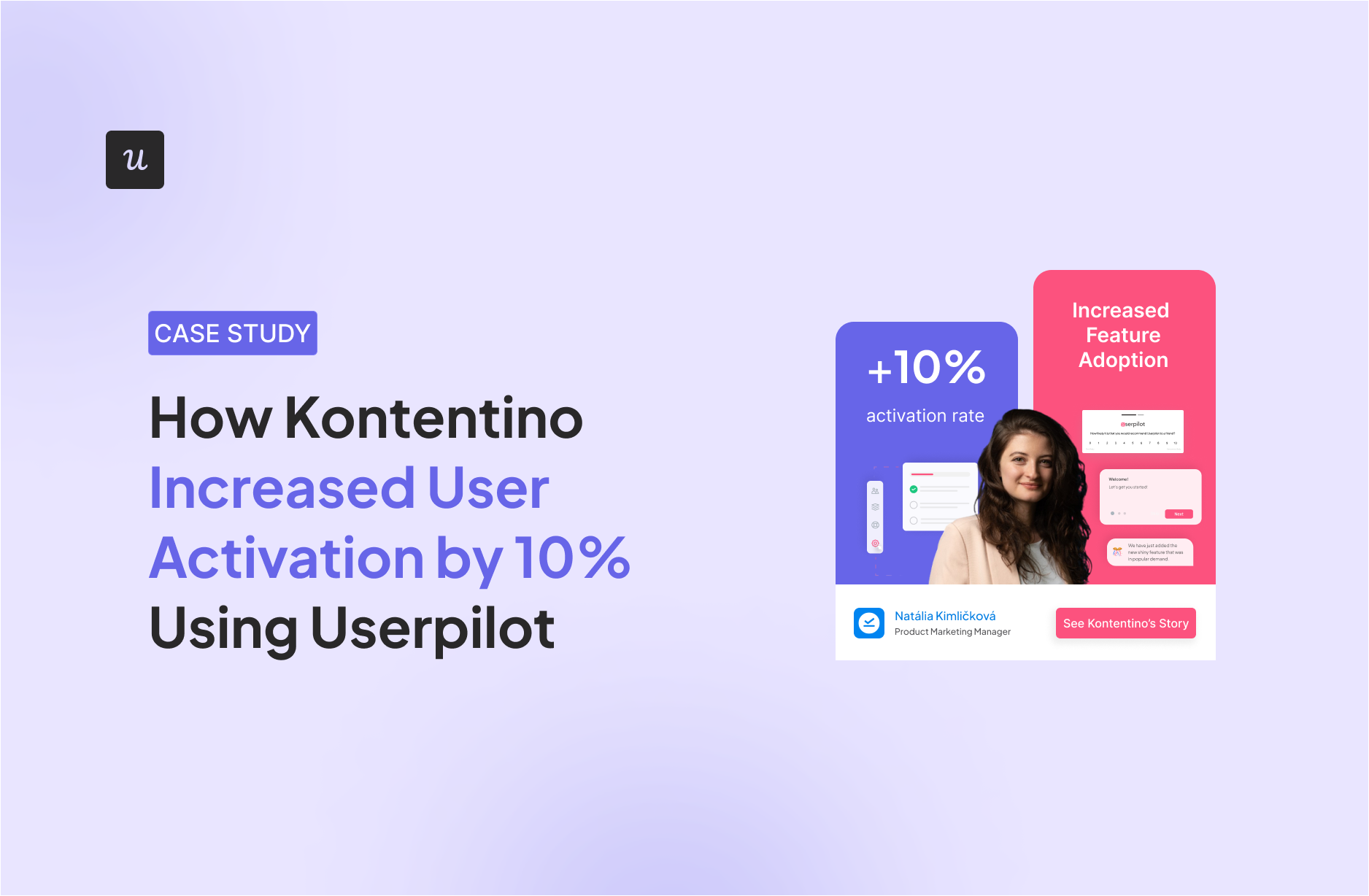
Example 2: Kontentino increased user activation by 10%
Kontentino, a social media management tool, increased user activation by 10% in the first month of installing Userpilot. How, you ask? They created an interactive walkthrough instead of an ineffective product tour.
Kontentino first shows a welcome survey that allows them to segment their users and personalize their experience:

Then, there is a modal with a personal welcome from Hana:

After that, Kontentino gently guides its users toward the two key activation points (linking the accounts and scheduling the first post) through a combination of tooltips and driven actions:

Once the first account is linked, a funny celebratory message pops up to gamify the experience:

The next step, scheduling the first post, is made equally easy with an interactive walkthrough:

Example 3: Kommunicate.io increased feature usage by 3%
Kommunicate.io, a chat-based customer support tool, noticed something disturbing—their customers kept asking for features that were already there, showing that their users hadn’t realized the full value of the product. They decided to solve this problem by improving their onboarding with Userpilot.
Apart from adding a notification bar and an onboarding checklist, they created an interactive walkthrough to help and educate users on how to customize their chat widget.

Since its introduction, 86% of users have completed the chat widget customization step, which translates into a 3% increase in this feature’s usage.
Example 4: RecruitNow saved thousands of training hours a year
RecruitNow, an applicant tracking system, experienced significant growth, which brought a host of new challenges, such as onboarding all new customers and localizing its support resources for the other markets.
With Userpilot, they created an interactive walkthrough, complemented by a resource center with video tutorials and automated localization.

The result? Face-to-face training time went from hundreds of hours a month to only four, significantly reducing strain on their customer success team and freeing them up for high-touch support.
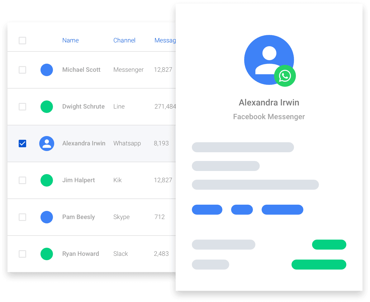
Example 5: Rocketbots’ saw a 300% increase in MRR
Rocketbots is a messaging platform that enables users to connect all of their inboxes in one app. Their challenge was that users didn’t experience the “aha!” moment fast enough.
They decided to solve this problem with Userpilot, which helped them create a checklist and an interactive walkthrough. When a user first signs up for Rocketbots, they are greeted with this screen:

This welcome screen prompts them to take their first action. In this case, the first action is setting up a “space.” This is crucial to the running of the app, so Rocketbots makes sure you do this.
The user is taken to the dashboard. There’s quite a lot going on here, but fortunately, Rocketbots provides contextual guidance through a handy onboarding checklist:

The new user onboarding checklist contains a couple of key events that Rocketbots wants new users to complete. First of all, they are shown a quick tutorial so that they know their way around messages.
The “aha!” moment for Rocketbots, however, is realizing you can add practically any messaging service. The interactive walkthrough takes users to the relevant page and then points them to the button they need to press to add a service.

Rather than simply showing users the product, Rocketbots’ interactive walkthrough leads them to the “aha!” moment.
Adding this interactive walkthrough doubled Rocketbots’ activation rate from 15% to 30%, with a 5% conversion rate and a 300% increase in MRR!
Example 6: Salesflare’s interactive walkthrough
Salesflare is a CRM enterprise software that automates most of the work involved with keeping your contacts up to date.
CRMs can be complicated, but the strength of Salesflare is its simplicity. Its user-friendly interface is enhanced by its walkthrough, which keeps things simple and intuitive.
Their onboarding flow starts by asking the new users to take the product walkthrough.

Giving users the choice works well, as it means those who prefer to find their own way around won’t have to sit through a tour and risk switching off.
Once users start the tour, they are introduced to some of the key components of Salesflare:

As users progress through the app, an interactive walkthrough explains the benefits of Salesflare. But it also shows them how easy it is to use by pushing users to do it themselves.

Once users complete the interactive guide, they are prompted to connect different services and web apps.

Example 7: Demio’s product tour and interactive walkthrough
Demio is a webinar hosting service designed to make it even easier to share your webinars with the world.
When you first sign in to Demio, you actually receive a product tour. Then, there is a webinar set up for you to join.

When you join the room, a Demio employee explains via a video that this is an example of the kind of webinar you can host.
After a brief introduction, she hands the reins over to you. You are now in charge of this fake webinar. You can share your webcam or even use the slides that Demio has added for you.

Demio’s “aha!” moment is realizing just how simple it is to host a webinar with them. By letting you experience and try the product with an interactive walkthrough, Demio makes sure you’re ready to activate.
Demio is a great example of how you can utilize walkthroughs and a product tour and create something entirely different from traditional training methods.
Example 8: Trello’s interactive walkthrough
Trello is a task management app that lets you organize your tasks and collaborate with other team members. With its app walkthrough, Trello guides new users through setting up their first board so they can get started right away.
When users first sign up, Trello asks them to name their first board.

Next, it explains how Trello boards are structured in Lists. But of course, it doesn’t simply tell users, it empowers them to create some of their own.

It then explains the concept of Cards and how they form the Lists, encouraging users to create some and driving feature adoption.

At this point, new users understand the hierarchy of a Trello board. They now know how it works. Not only that, they have also been working to create their first board. After they’re asked to invite some team members, Trello takes users to the Trello board they just created:

Example 9: Asana’s product walkthrough helps users create their own project
Project management tool Asana helps teams organize, track, and manage their workload. Similarly to Trello, Asana’s product walkthrough starts by showing new users how to create their first tasks.

Then, it lets you choose from different visualization options, reassuring you that you can change this later:

The product walkthrough ends with the option to invite teammates and download Asana for all your screens.

This easy-to-follow interactive walkthrough is effective because it nudges the user to make use of key features without overloading them.
Our top picks for interactive walkthrough software
To create product walkthroughs, you need a robust digital adoption platform. Here are our top picks:
- Userpilot: As you’ve seen, Userpilot helped companies create walkthroughs without coding, which led to increased user activation, improved product adoption, reduced training hours, and higher MRR. Our interactive walkthrough software allows you to create highly customized UI elements, A/B test them, and automatically track their performance. And now, leveraging our native mobile app SDK, you can also create targeted onboarding flows for mobile apps using slideouts, carousels, and push notifications—all without writing extra code.
- Pendo: Pendo also allows you to create no-code product walkthroughs, but it’s not as customizable, and there is no event-based triggering, spotlights, or localization.
- Walkme: Walkme is a great interactive walkthrough tool for large enterprises looking to create walkthroughs mainly for employee onboarding. However, it has a steep learning curve and a long implementation time.
How do you create interactive product walkthroughs with Userpilot?
It’s super easy to build product walkthroughs with Userpilot. And you won’t need any code to do it!
Here’s how our no-code tools help:
1. Decide on your product’s key activation events leading to an “aha!” moment
The key is to stick to two to three central events—the so-called key activation events. These will lead your users toward activation—the “aha!” moment when they actually derive value from your product.
For example, our client Kontentino, a social media management tool, chose two key events: connecting the accounts and scheduling the first post.
2. Segment users to personalize their experience
As Kontentino did, you can create welcome surveys to collect customer data and segment them accordingly to deliver a personalized experience.
Userpilot offers a wide range of factors by which you can segment customers, including:
- User data (name, email, signup date, web sessions, etc.).
- Company data (name, plan, industry, number of employees, etc.).
- Net Promoter Score.
- Location and browser language.
- Whether a user has performed a specific event or seen a specific page, etc.

With this scope of segmentation, you can create interactive walkthroughs for new and existing users across touchpoints in their user journey, i.e., when introducing new features for enterprise users.
With userpilot I can segment my users to onboard them into new features and ask a review about it in-app. It’s very nice to engage users in the product and know what they think about the release.
– Pedro A.,Product Manager
3. Create interactive walkthroughs with different UI elements
To create interactive product walkthroughs, you just need to go to Engagement, choose Flows, and click Create Flow.

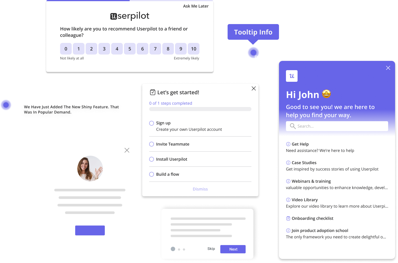
Userpilot allows you to build flows that guide users with clear, step-by-step instructions using tooltips, modals, and more.

Where Userpilot really excels is through the level of customization it allows in your walkthroughs—from background and button colors to adding images or videos and auto-localizing text.

All of these elements are interactive, and you can even combine them in branched sequences as well.
4. Adjust settings to decide how the interactive walkthrough should appear
After you create an interactive walkthrough for your SaaS, you can go to Settings and choose:
- Flow trigger: Whether the walkthrough will appear when a user visits a specific page, performs an event, or only manually.
- Domain/Page: Whether the walkthrough will be triggered on all or specific domains/pages.
- Audience: Whether the walkthrough will be shown to all users or specific customer segments.
- Goal: Which action should users perform so that you can measure the effectiveness of your walkthrough?
- Frequency: Whether the walkthrough will appear only once, time-based, or until a goal is achieved.

5. Analyze the impact of your interactive walkthrough
Our Flow Analytics lets you see how different segments (users or companies) interact with your walkthrough for the time period you choose.
You can see the number of shown, completed, and dismissed walkthroughs, and the average time it takes to complete them. Plus, you can visualize this data in a bar or line chart.
We really benefit from the analytics so we know what our users are interacting with. Also, product tours are very easy to build.
– Irina C., Product-Led Growth Marketer at 123FormBuilder
Not only that, but you can see the breakdown of each of your UI elements, whether it’s a modal, tooltip, slideout, or something else, to understand what is causing friction.

6. Collect customer feedback to understand the user experience more deeply
Creating the perfect walkthroughs that don’t bore customers and provide enough guidance for them to reach your product’s “aha!” moment takes time.
To improve your efforts, simply trigger a survey once the walkthrough is over and collect user feedback on their onboarding experience. Remember to leave a space for them to add their concerns. Afterward, use this information to improve your walkthroughs accordingly.
Userpilot’s user feedback features let you customize your user surveys how you wish: add videos or long forms, change the design to match your brand, and much more.

Enhance user onboarding experience with Userpilot!
We hope the product walkthrough examples from our article motivate you to create your own. As a product growth solution, we’re proud to help hundreds of clients enhance their onboarding experiences and adoption rates. As one of our customers put it:

If you want to increase activation, adoption, user retention, and MRR like our clients did, book a free demo today to learn how Userpilot’s valuable features can help you.




![9 Practical Strategies to Reduce App Churn [+ How to Measure Churn Rate] cover](https://blog-static.userpilot.com/blog/wp-content/uploads/2025/06/9-practical-strategies-to-reduce-app-churn-how-to-measure-churn-rate_87f6e28e73dfeceea8751264731d1406_2000-1024x670.jpg)
