Best Product Tour Tools 2026: Feature Comparison and Pricing


If you’ve ever tried evaluating product tour tools, you know the surface-level comparisons don’t tell you much. Every tool claims to be a no-code tool and “easy to use,” but few support multi-step onboarding, flow targeting, mobile support, or analytics that go beyond step views.
This guide breaks down what matters in choosing product tour software: which tools work across web and mobile, what kind of logic and testing you can build in, how granular the targeting gets, and whether you’re paying extra for basic features. I’ve tried these platforms myself and pulled in real customer feedback so you can make a faster, smarter call.

Best product tour tools in comparison
When evaluating the tools, I looked at the following criteria:
- No-code capability: Can I build and publish a flow without asking engineering for a sprint slot? If I need a developer to change a tooltip color, the tool is useless to me.
- Segmentation and personalization: Can I show this unique tour only to new users who signed up on the Enterprise plan?
- Analytics: Does the tool tell me where users drop off? Product analytics are essential to iterate tours and optimize onboarding performance.
- Value for money: Is the pricing transparent, or will I get hit with a massive bill once I scale?
Based on these criteria, as well as actual user reviews and opinions, I shortlisted the tools for this guide. Below, I’ll go more in-depth into each, but first, here’s a quick comparison table:
| Tool | Tour features | Channel | Starting Price | G2 Rating |
|---|---|---|---|---|
| Userpilot | Multi-step interactive tours using modals, slideouts, tooltips, and carousels on both web and mobile apps, with full support for segmentation, custom events, and no-code flow building. | Web apps: ✅ Mobile: ✅ Desktop: ❌ |
$299/mo (billed annually) | 4.6/5 |
| Appcues | Product tours with checklists, tooltips, and modals using a drag-and-drop builder. | Web apps: ✅ Mobile: ✅ Desktop: ❌ |
$249/mo (billed annually) | 4.6/5 |
| UserGuiding | Onboarding flows across web apps, designed for small to mid-sized teams. | Web apps: ✅ Mobile: ❌ Desktop: ❌ |
$174/mo (billed annually) | 4.7/5 |
| Chameleon | Customizable web-based product tours with advanced targeting, A/B testing, and microsurveys. | Web apps: ✅ Mobile: ❌ Desktop: ❌ |
$279/mo (billed annually) | 4.4/5 |
| WalkMe | Product walkthroughs across web and desktop with full user segmentation, personalized paths, and in-app guidance for enterprise environments. | Web apps: ✅ Mobile: ❌ Desktop: ✅ |
Custom Quote | 4.5/5 |
| Userflow | Fast-loading web-based tours with branching logic, tooltips, and onboarding checklists. | Web apps: ✅ Mobile: ❌ Desktop: ❌ |
$240/mo (billed annually) | 4.8/5 |
#1 Userpilot
Suitable for: Mid-market PLG companies looking to consolidate user onboarding and product analytics across both web and mobile apps.
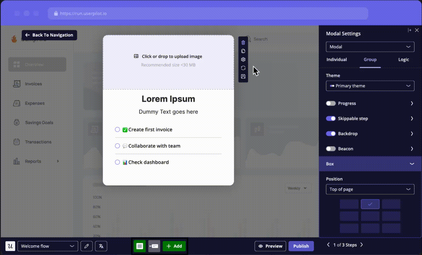
Userpilot offers a comprehensive suite for launching interactive product tours with advanced personalization. It eliminates the need to manage multiple disjointed tools or to procure bloated enterprise packages just to add tooltips.
Userpilot’s main features for building a product walkthrough
- No-code product tours: Creating tours in Userpilot starts with the no-code Chrome extension. It can build onboarding flows on top of your app using multiple UX patterns such as tooltips, modals, slideouts, hotspots, and banners.
- Flow targeting and triggering: Userpilot can trigger different flows for new or existing users based on their lifecycle stage. Thus, you can personalize a tour based on page URL, user interactions, or custom events (like “skipped checklist” or “clicked feature X but not Y”).
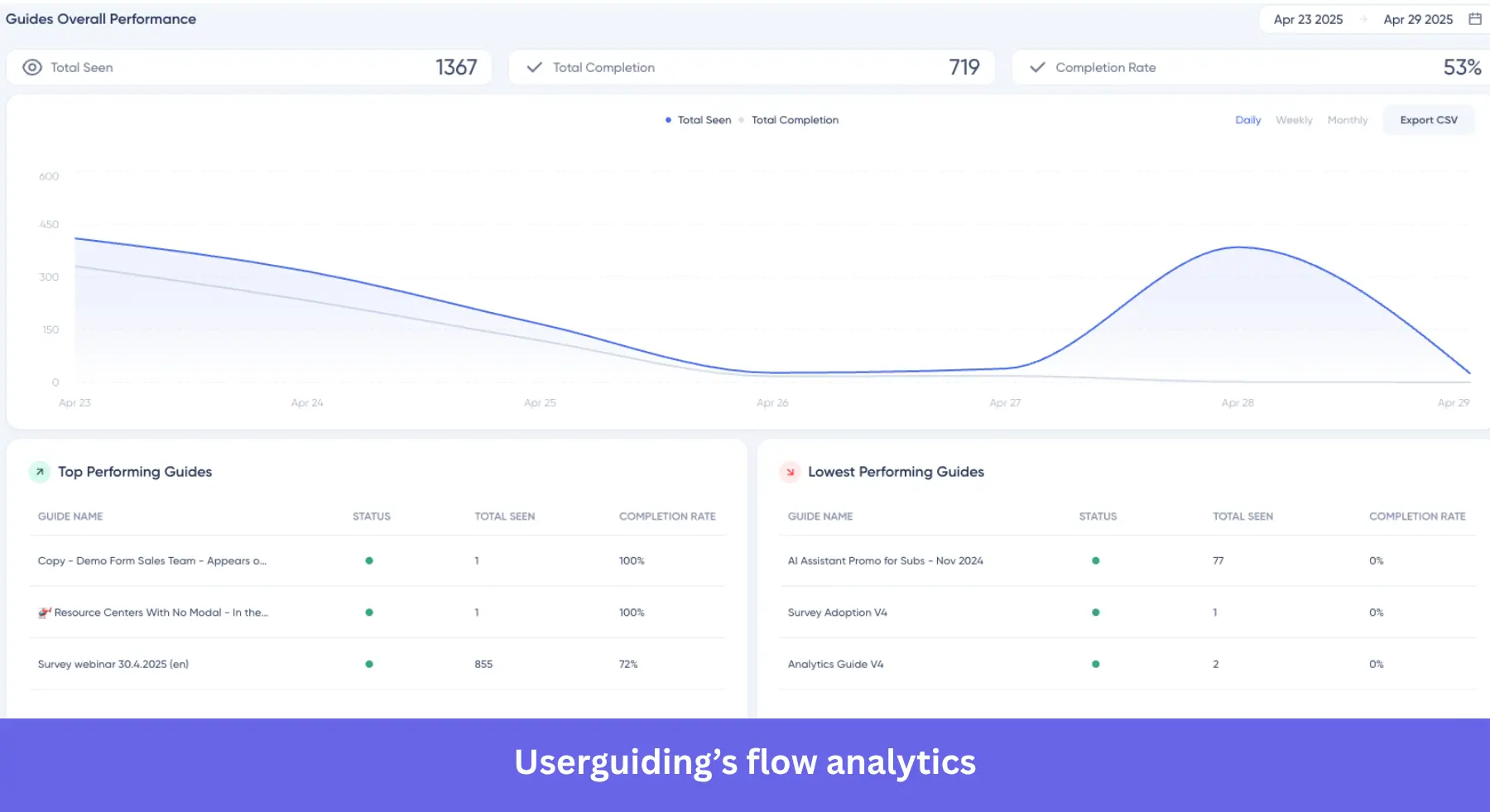
- Testing and performance tracking: The A/B testing lets you optimize onboarding by monitoring the success rate of different versions. You can then track performance using our built-in flow analytics with metrics like step completions, drop-off rates, and time to finish.
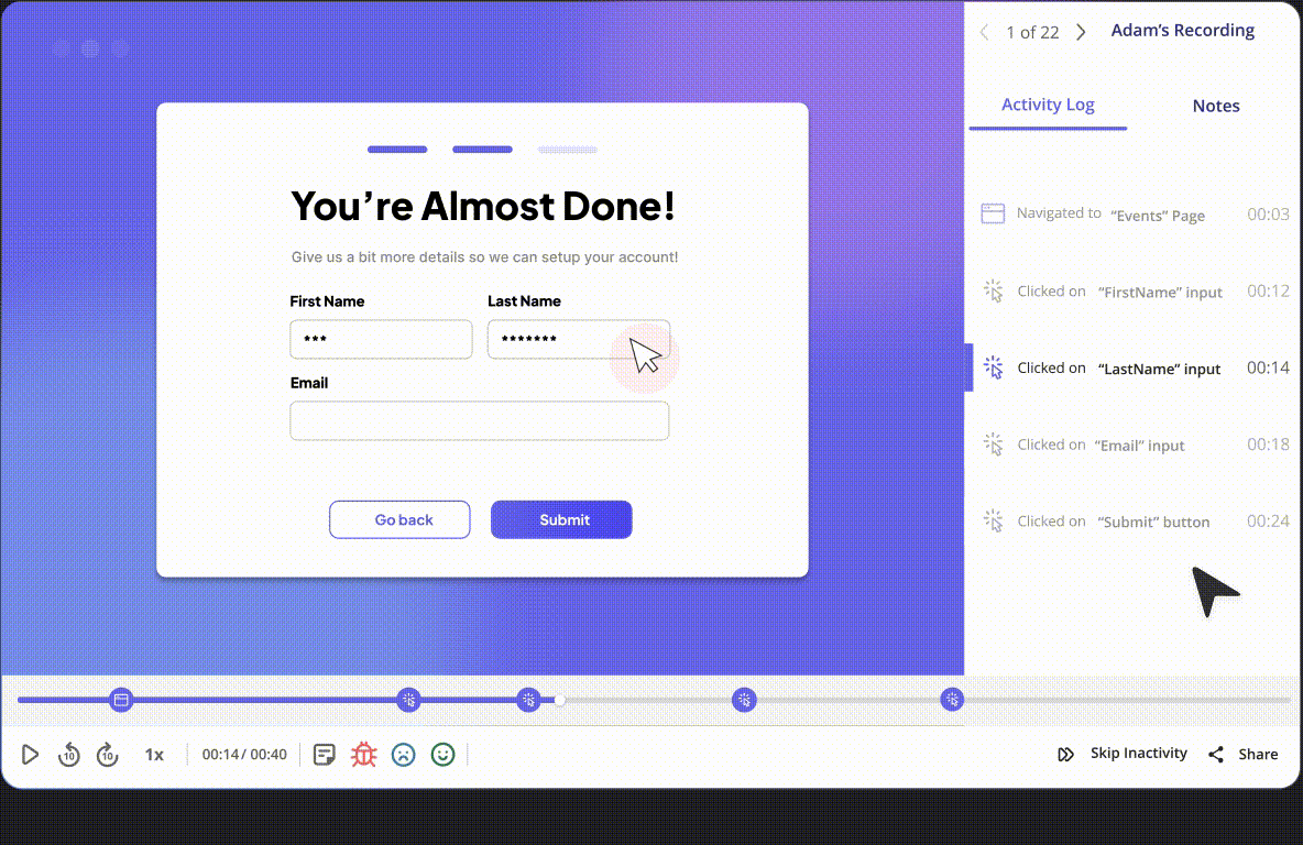
- Product analytics with autocapture: The platform automatically gathers data on how users engage with each in-app element, including tooltips, modals, and checklists (without any manual setup). This data can then be visualized through customizable dashboards, where you can track product metrics, compare user segments, and generate reports to share with your team.
- Deep behavioral analytics: Besides tracking onboarding performance, you can dig deeper into user behavior with reports like funnel analysis, paths, trends, retention cohorts, and session replays.
- Mobile product tours: Userpilot has native support for iOS and Android apps with mobile analytics built in. That includes mobile-first patterns like carousels, slideouts, push notifications, and in-app surveys.
- Emails: You can trigger specific emails based on in-app activity. Then, track the performance of your email onboarding sequences and cross-reference it with in-app events for more realistic insights.
- Growth agent: Userpilot’s AI agents can analyze data to highlight friction points, automate playbooks (for customer success, support, marketing, etc.), and generate personalized flows.
Userpilot pricing
Prices are based on Monthly Active Users (MAUs) and potential add-ons, with a predictable lower-tier plan for starters. These include:
- Starter plan: Begins at $299/month (billed annually) and supports up to 2,000 MAUs. It includes core in-app user engagement tools, user segmentation (capped at 10 segments), trend analysis, and NPS surveys.
- Growth plan: It removes the segmentation cap and unlocks advanced product analytics, event autocapture, resource centers, and A/B testing. Mobile engagement and unlimited session replays become available as optional add-ons. While the price becomes customizable based on MAUs and add-ons.
- Enterprise plan: Also custom. It introduces premium CRM integrations, bulk data export/import, data warehouse sync, custom roles and permissions, and SAML SSO.
✅ Pros and ❌ cons of Userpilot
| Pros | Cons |
| ✅ Intuitive no-code builder: The no-code builder empowers non-technical teams to build complex flows without coding. | ❌ Customization limits without CSS: Achieving ultra-polished, pixel-perfect native branding requires custom CSS coding. |
| ✅ Advanced segmentation: Can target personalized in-app messages based on complex behaviors and user attributes. | ❌ High pricing for small startups: The $299/month minimum entry point can represent a barrier for pre-revenue or early-stage businesses. |
| ✅ Deep native analytics: Combines behavioral data, autocapture, and session replays with engagement tools. |
What users say about Userpilot
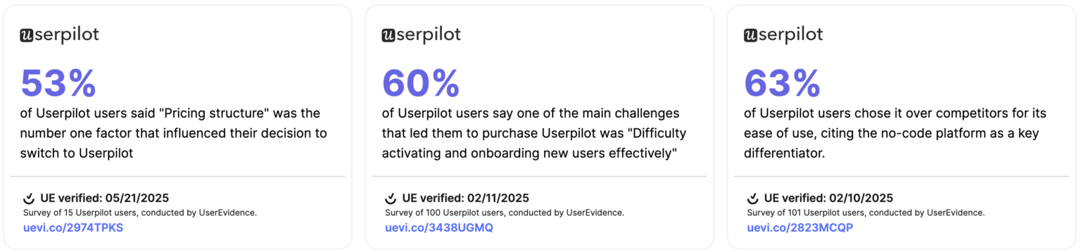
Userpilot customers consistently mention two things: it’s easier to use than other tools they’ve tried, and the great customer service makes sense for what you get. In fact, 63% of users chose Userpilot simply because of how simple it is to build onboarding flows with no code.
At the same time, pricing is also a core factor. Over half of users said the pricing structure was the main reason they switched. And once they made the switch, 60% said it solved their top challenge: getting new users activated and onboarded effectively.
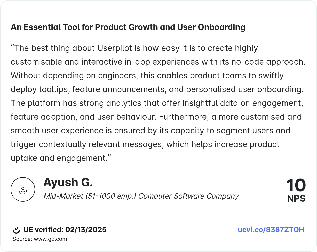
The testimonial below says it better than I could. Product teams can create highly personalized, interactive in-app experiences without depending on engineers, and use advanced segmentation and analytics to continuously improve how they guide new users.
#2 Appcues
Suitable for: Product marketing teams who need mobile onboarding without requiring continuous engineering support.
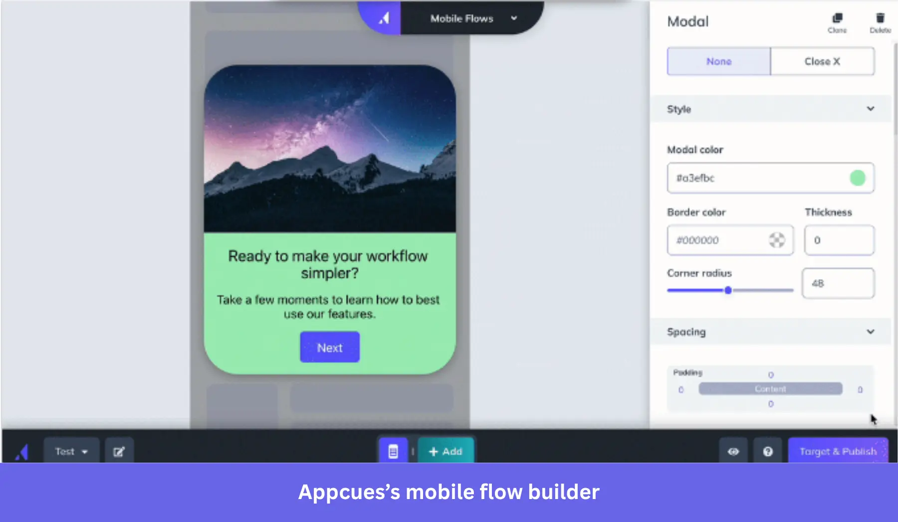
Appcues is a user onboarding tool that creates personalized guidance across web, mobile, and email channels. It has a mature mobile SDK and drag-and-drop builder, which prevents non-technical teams from relying on engineers to implement in-app guidance.
Appcues product tours features
- Mobile-first onboarding: You can build modals, tooltips, checklists, and slideouts directly inside your iOS or Android app. These UX patterns look native and don’t require any coding skills to implement.
- Personalized flows: Mobile tours can be shown based on app screens, user actions, or profile data (e.g., role, plan, or multiple languages).
- No-code web builder: The Google Chrome extension allows you to build flows on your site without technical knowledge. It supports all the standard patterns, but creating complex, multi-path web tours might require custom CSS code.
- Cross-channel engagement: Beyond standard tours, Appcues supports multi-channel flows involving mobile, web, and email messaging to provide a consistent user experience.
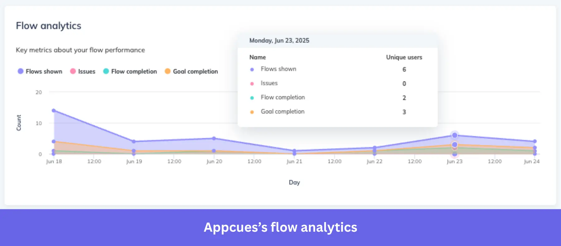
- Flow performance analytics: You can see flow views, completions, drop-offs, NPS scores, and A/B testing results. But for funnel or retention reports, for instance, you’ll need to connect tools like Amplitude or Mixpanel.
Appcues pricing
There’s a single plan based on Monthly Active Users (MAUs) and add-ons, plus an enterprise plan for the advanced governance features.
- Growth plan: Starts at $750/month (billed annually) for a baseline of 1,000 MAUs. It starts with native mobile app support, advanced behavioral targeting, unlimited audience segments, A/B testing, and premium CRM integrations.
- Enterprise plan: Operates on custom pricing tailored for large organizations. This tier adds advanced security controls, multi-language support, and a dedicated CSM.
Pros and cons of Appcues
| Pros | Cons |
| ✅ Superior mobile support: Mature iOS and Android SDKs can deliver native-looking onboarding flows in mobile apps. | ❌ Basic analytics: Teams looking for deeper data will need to integrate a separate analytics tool like Amplitude or Mixpanel. |
| ✅ Technical independence: Intuitive drag-and-drop builder allows marketing teams to launch and test experiences without developer assistance. | ❌ Web builder friction: Constructing complex, multi-path interactive tours may not be possible without coding or making the app too slow. |
| ❌ Lack of automated alerts: The system fails to natively alert if a live flow breaks due to a UI update. |
What do users say about Appcues
Many users say Appcues is a strong fit for non-technical teams launching onboarding flows. They call out the ability to build, test, and preview in-app experiences without writing code, and mention how it has helped reduce engineering bottlenecks. Customer support and onboarding documentation also get positive feedback.
But several reviews flag limitations in the web builder and testing tools. For instance, some users say complex flows take longer to set up than expected.
#3 UserGuiding
Suitable for: Early-stage startups seeking an affordable and agile tool for web-based onboarding.
UserGuiding is a no-code user adoption platform that provides essential onboarding features (e.g., interactive walkthroughs, checklists, and centralized resource centers) for smaller businesses. Its main appeal is that it doesn’t require the complexity or sky-high prices of enterprise-grade tools, so any business can start creating in-app tooltips within hours.
UserGuiding main features
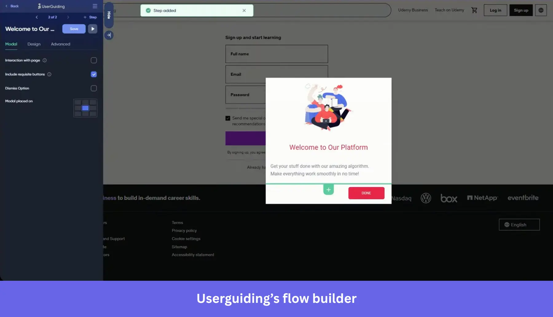
- No-code onboarding elements: The Chrome-based builder can create tooltips, modals, and interactive hotspots without any dev help. This means product teams can map out linear product tours and publish in-app guides within hours.
- Targeted flows: You can personalize experiences based on specific page URLs, in-app user actions, or predefined behavioral segments. This ensures that new users can experience the “Aha!” moment faster.
- Onboarding checklists: You can bundle multiple tours into an onboarding checklist that walks users through key activation steps (such as account setup or first use of core features).
- Flow performance and NPS survey analytics: The native analytics lets you track completion rates, user drop-offs, and NPS survey response data.
UserGuiding pricing
UserGuiding provides one of the most transparent MAU-based pricing models in the market, making it highly attractive for budget-conscious startups. Here are the plans:
- Support essentials: A free-forever tier that provides baseline access to the knowledge base, product updates page, and an AI Assistant (limited to 50 free resolutions). However, it excludes access to the core product tours and checklists.
- Starter: Starts at $174/month (billed annually) for up to 2,000 MAUs. This plan includes 25 active guides, 2 checklists, basic segmentation, NPS surveys, and the core Chrome onboarding builder.
- Growth: Starts at $349/month (billed annually) for 2,000 MAUs. Upgrading to this tier unlocks 100 active guides, unlimited checklists, custom CSS capabilities, localization, goal tracking, and premium ecosystem integrations.
- Enterprise: Custom pricing for organizations requiring unlimited material creation, SAML SSO, personalized coaching, and strict compliance standards (SOC2, GDPR, HIPAA).
Pros and cons of UserGuiding
| Pros | Cons |
| ✅ Highly cost-effective: Provides a comprehensive suite of onboarding tools at a fraction of the cost of enterprise competitors. | ❌ Web-only ecosystem: The platform strictly supports web browsers and doesn’t offer native SDKs for iOS or Android apps. |
| ✅ Fast time-to-value: The intuitive, no-code Chrome builder enables non-technical teammates to design interactive guides in a matter of minutes. | ❌ Limited customization: Achieving brand-compliant design in your guides requires manual CSS coding, which is locked behind the Growth plan. |
| ❌ Basic analytics: You’re limited to tracking the performance of your flows and measuring NPS scores. |
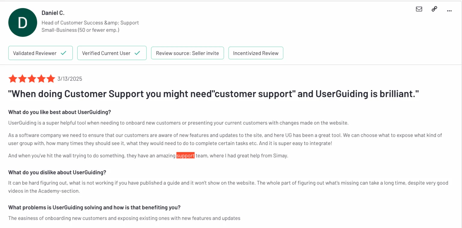
What do users say about UserGuiding
UserGuiding is often praised for being simple, fast, and accessible for small teams without engineering support. PMs and founders say they were able to launch guided product tours and onboarding flows in days. The product interface is easy to learn, and the team behind it is responsive.
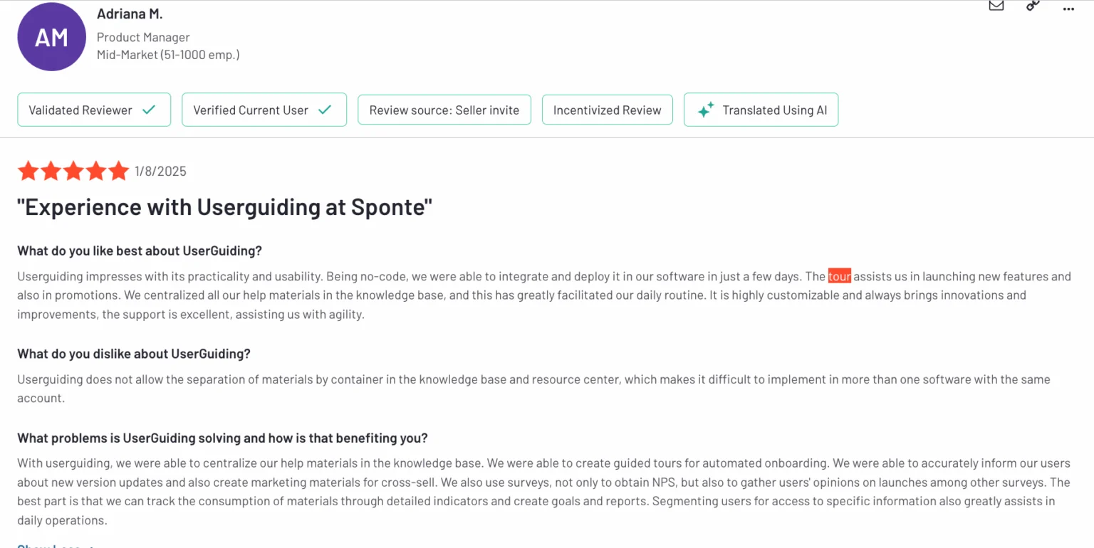
Users also point to helpful use cases like announcing new features, automating onboarding, and collecting NPS feedback. However, some reviews mention challenges when scaling, such as managing flows across apps or debugging why a tour didn’t launch as expected.
#4 Chameleon
Suitable for: Mid-market SaaS companies that rely on interactive product demos and onboarding for web-based products.
Chameleon is a product adoption platform that creates interactive product tours and demos. Its main strength is the capacity to generate UI prompts (i.e., contextual tours, microsurveys, checklists, etc.) that look hard-coded into the app rather than acting as intrusive overlays.
Chameleon main features
- Pixel-perfect UI prompts: Chameleon gives you control over CSS and UI design directly within its WYSIWYG editor. Modals, tooltips, and banners can be customized to match the exact typography, padding, and hex colors of your app.
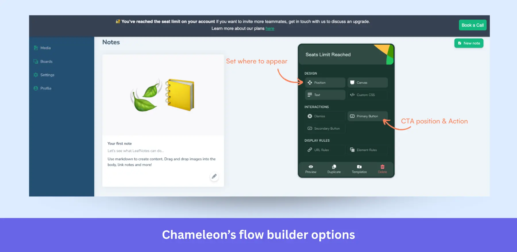
- Advanced targeting and triggering: You can trigger flows based on in-app behavior, custom events, or user attributes. Great for multi-role and multi-plan products.
- Experimentation and optimization: With A/B testing built in, you can test different messaging strategies and track performance against defined goals.
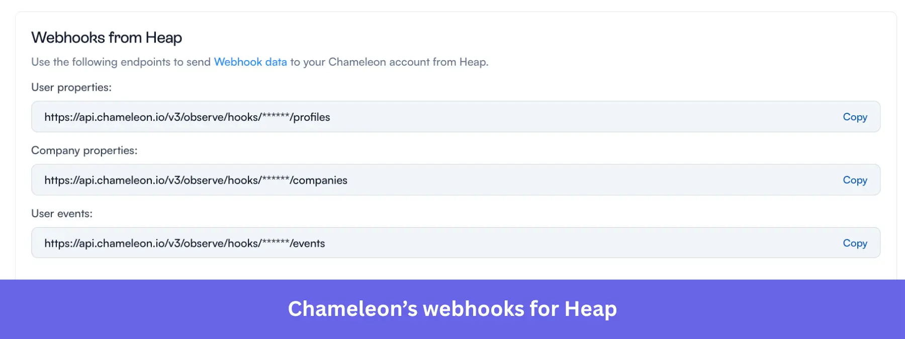
- Integration with analytics tools: While the built-in analytics includes basic engagement metrics, Chameleon also has two-way integrations with tools like Mixpanel, Amplitude, and Segment. This means it can pull behavioral data for advanced onboarding personalization.
Chameleon pricing
Chameleon utilizes a Monthly Tracked Users (MTU) pricing model, with three plans to choose from:
- Startup: Starts at $279/month for up to 2,000 MTUs. This plan offers unlimited tours, 5 microsurveys, 1 launcher, and full custom CSS support.
- Growth: Jumps significantly to $15,000/year (approximately $1,250/month). It unlocks unlimited experiences across all UI patterns, native A/B testing, goal conversion tracking, and granular rate limiting.
- Enterprise: Custom pricing for organizations requiring complex security, multi-region localization, account switching, and strict Role-Based Access Control (RBAC).
Pros and cons of Chameleon
| Pros | Cons |
| ✅ Complete design control: Product tours feel natively built into your app. | ❌ Steep learning curve: Navigating advanced filters, complex targeting rules, and detailed customization features isn’t friendly for non-technical users. |
| ✅ Sophisticated targeting: Deep integrations with Customer Data Platforms (CDPs) allow for highly contextual, data-driven onboarding. | ❌ Massive pricing gaps: The leap from $279/mo to $15,000/year forces teams to overpay for features like A/B testing or Hubspot integration. |
| ✅ Comprehensive UI patterns: Supports a wide range of engagement formats, including non-intrusive embedded cards, interactive demos, and microsurveys. | ❌ Web-only: Does not support native mobile apps. |
What do users say about Chameleon
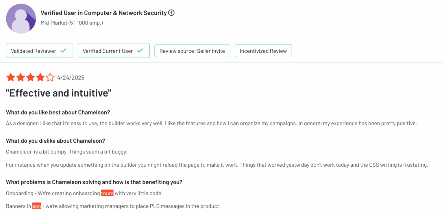
Teams enjoy using Chameleon for how quickly they can launch in-app tours and microsurveys without writing code. One customer success lead said they had “product tours and feedback live in days,” and praised how well it integrated with their existing analytics tools.
Designers and non-technical users highlight the builder’s flexibility and ease of use, especially when styling experiences to match their UI. Microsurveys and behavior-based targeting also get called out as helpful for onboarding and feature adoption.
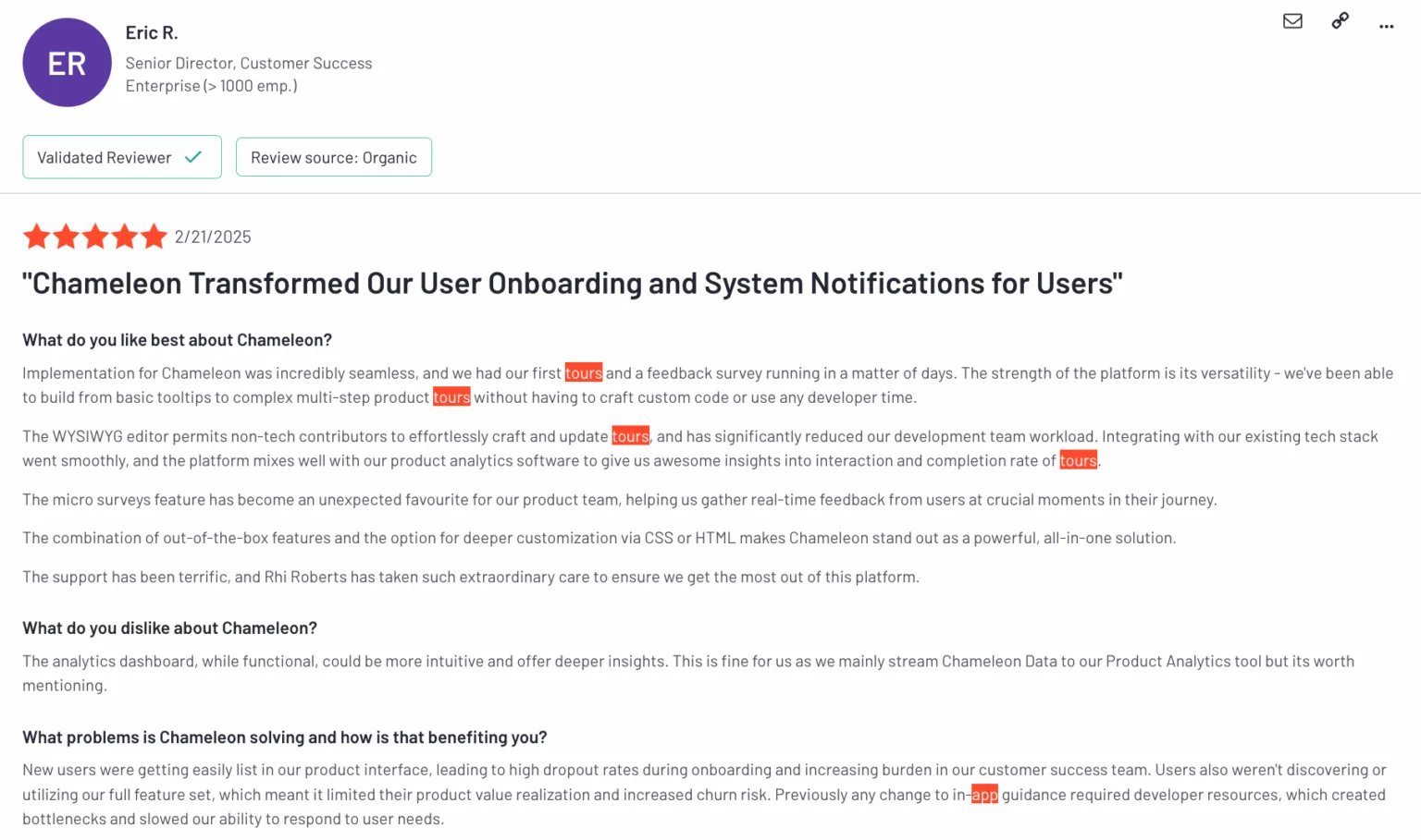
Most of the critique centers around the analytics dashboard, which some users say lacks depth unless you integrate with tools like Amplitude. Others mention minor bugs or quirks in the builder, especially when editing or updating flows.
#5 WalkMe
Suitable for: Enterprise IT departments focused on employee training and enforcing internal adoption of software.
WalkMe is an enterprise Digital Adoption Platform (DAP) that supports both web and desktop software products. Companies typically use it for onboarding employees to complex tools (such as SAP or ERP systems), optimizing internal workflows, and driving the adoption of third-party software across large organizations.
WalkMe product tour features
- Smart Walk-Thrus: These are advanced, multi-step onboarding flows that help support users in completing tasks across multiple pages or tools. You can embed these flows inside desktop apps, SaaS tools, or even legacy software.
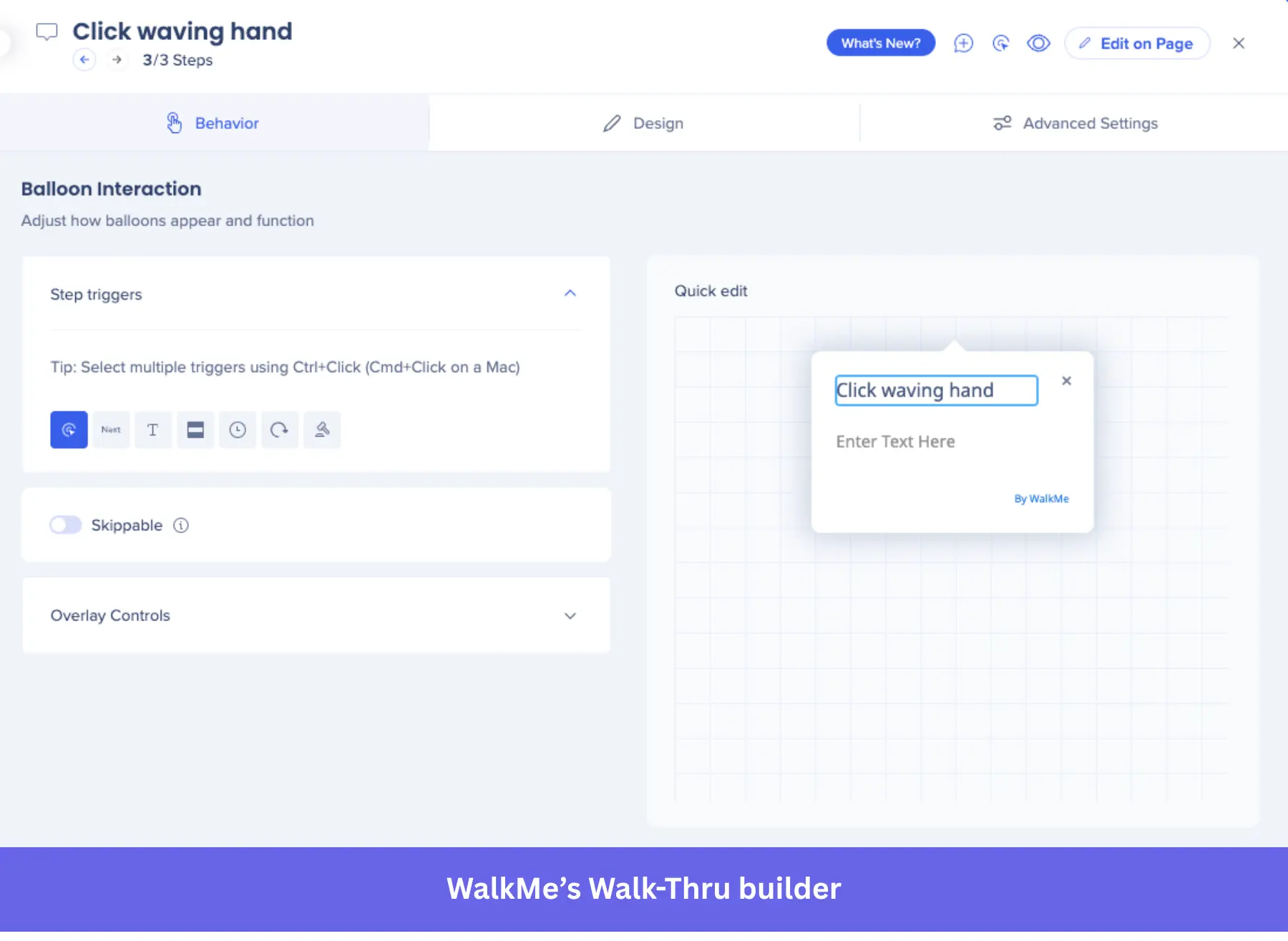
- Logic-based flow builder: WalkMe lets you build personalized product tours with conditional branching. That means you can guide specific user segments through different workflows based on their actions, roles, or access levels.
- Desktop + Web support: Unlike the rest of the list, WalkMe supports employee onboarding inside desktop apps. Users access WalkMe flows without switching between tools or opening external resources.
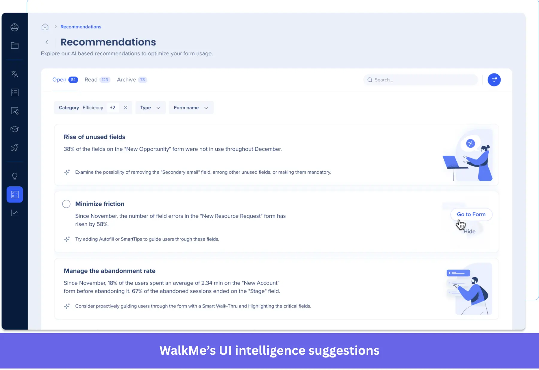
- Engagement analytics (UI intelligence): It tracks user interactions inside your product. Showing flow completions, drop-offs, and engagement across different segments. It also provides AI-powered analytics dashboards to identify friction points.
- ActionBot: An AI-powered chatbot that your employees can use to ask questions and automate certain tasks (e.g., asking for time-off, filling forms, or opening support tickets). It integrates with Gmail, HR platforms, CRMs, calendars, and more.
WalkMe pricing
Since it offers high-end enterprise applications, WalkMe doesn’t make any of its prices public. Pricing is determined by the number of employee licenses (or MAUs for customer-facing apps), the number of apps, and the add-ons included.
As a reference, Vendr’s pricing guide shows that the median annual price of WalkMe is $43,828, with a whopping maximum of $493,650.
Pros and cons of WalkMe
| Pros | Cons |
| ✅ Desktop + Web support: Provides interactive guidance across web-based SaaS and legacy desktop applications. | ❌ Enterprise pricing: The pricing range is expensive even among other enterprise products. |
| ✅ Employee onboarding: Its flows allow you to standardize complex workflows to improve productivity. Plus, features like ActionBot can help automate recurrent tasks. | ❌ Intense technical maintenance: Implementation, training, and daily tasks take a lot of time. You’d need a full-time employee to own and maintain the content. |
| ✅ Deep analytics: UI intelligence and session playback tools provide enough context to optimize tour performance. | ❌ Highly technical: Requires coding skills in order to use properly. |
What do users say about WalkMe
Enterprise teams value WalkMe for its flexibility and depth. Reviewers say it handles complex onboarding well and lets you launch tours across multiple platforms without needing custom development. One team mentioned they were able to reduce support tickets and guide users through complex workflows with minimal friction points.
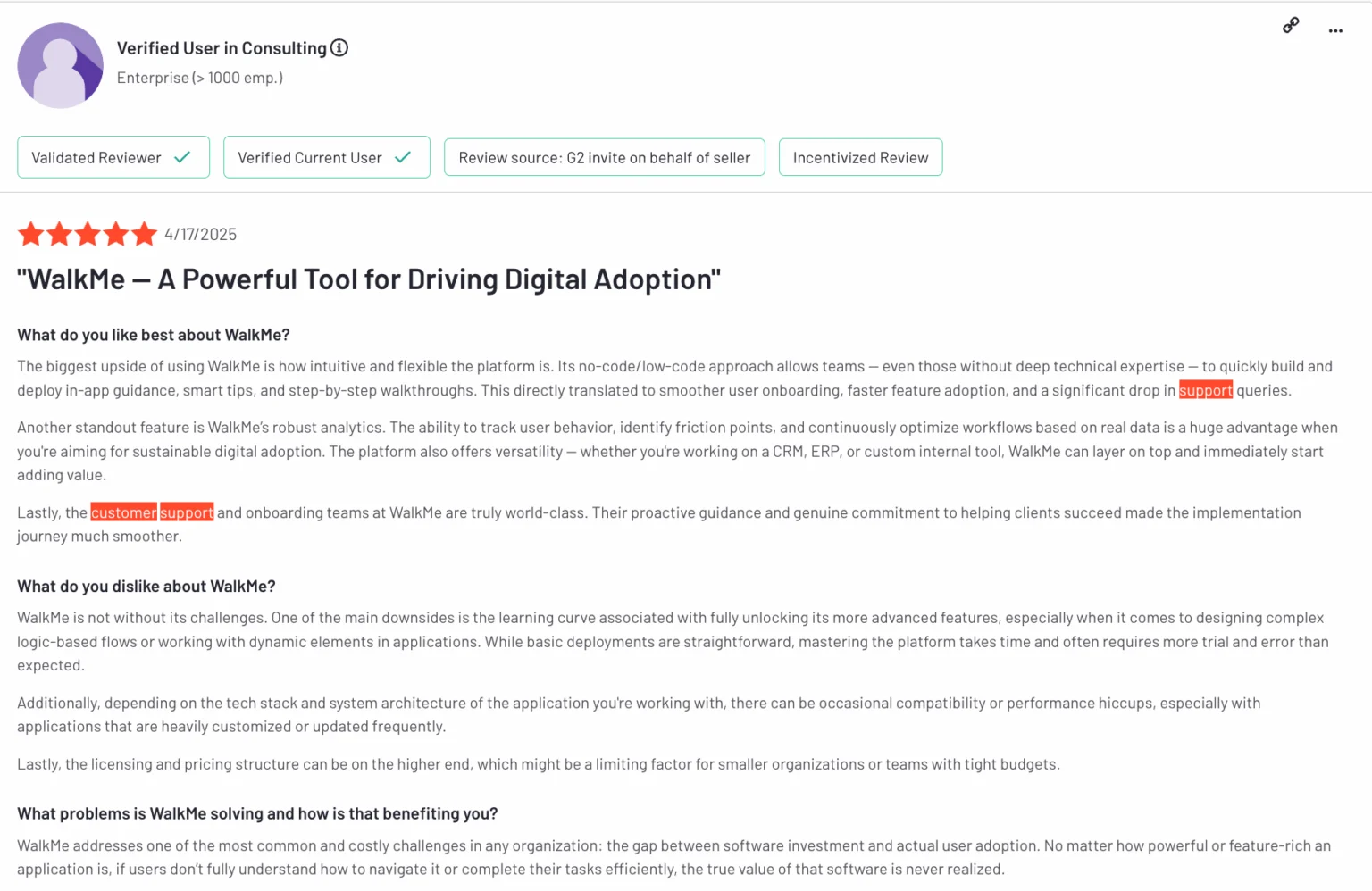
Several users also praised the support team for being proactive and helping them make the most of their rollout. The platform’s analytics were another highlight: teams said it gave them visibility into user behavior and task completion across internal systems.
That said, many reviews also mention the learning curve and high pricing. Some teams found it difficult to master WalkMe’s logic-based flows without developer help, and flagged the license cost as a barrier for smaller departments.
#6 Userflow
Suitable for: PLG teams seeking a fast and easy onboarding tool with complex branching logic for web apps.
Userflow is one of the best no-code, lightweight tools for user engagement in web apps. It offers a canvas-style flow builder with advanced branching logic, while integrating with top product analytics tools that can power up its personalization features.
Userflow main features
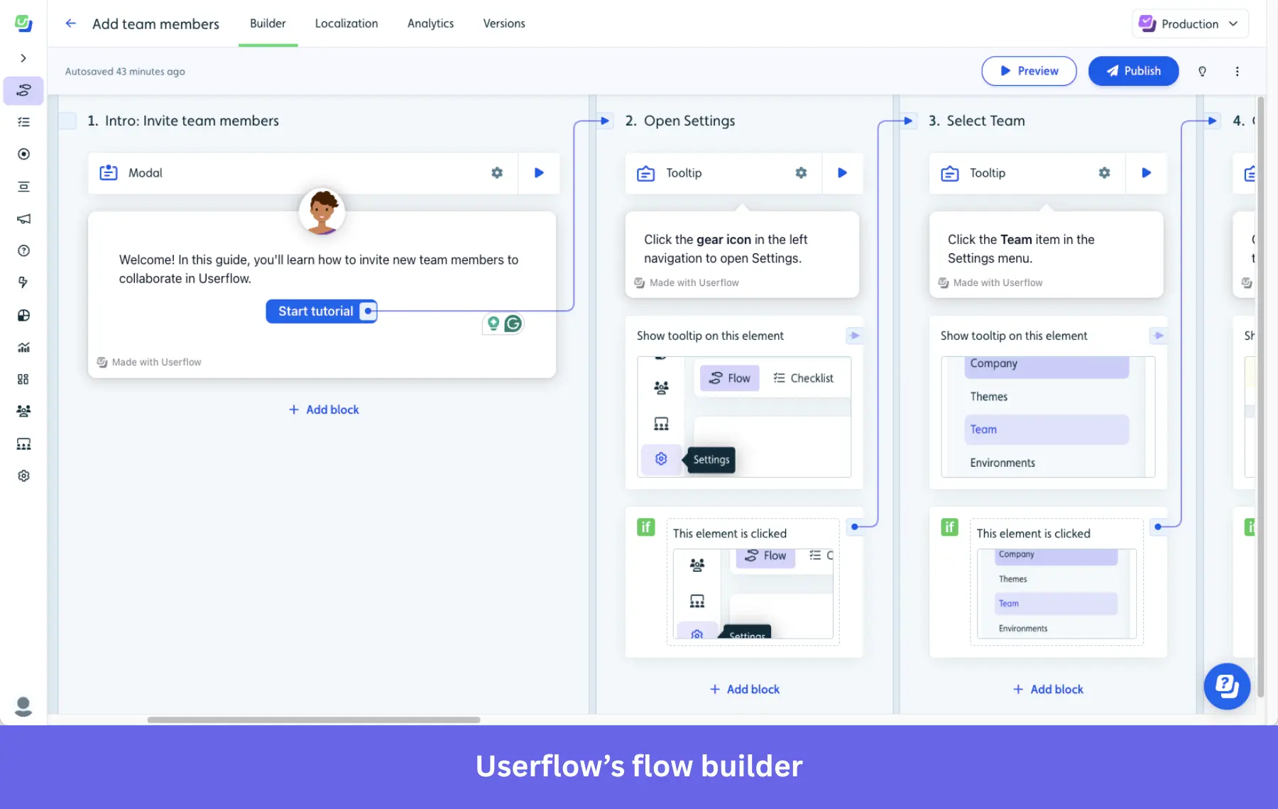
- Visual flow builder: Instead of a Chrome extension, Userflow lets you design flows on a drag-and-drop interface with many types of UX patterns (i.e., modals, tooltips, checklists, surveys, and launchers). It supports complex conditional logic, attribute evaluations, and multi-path onboarding journeys.
- Personalization: It can segment your users based on attributes and in-app behavior, which you can use to trigger personalized flows.
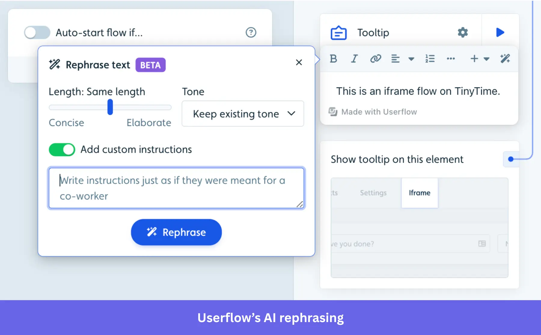
- FlowAI Suite integration: The Smartflow feature translates raw user clicks into editable experiences. Meanwhile, the AI Rephrase and Translate tools respectively optimize and localize tooltip copy.
- Flow analytics: Built-in analytics show completions, drop-offs, and interaction rates (with FlowAI Insights helping spot friction points). For deeper behavior tracking, you’d have to sync with tools like Amplitude or Segment.
Userflow pricing
Userflow operates on a transparent MAU-based pricing model, including the following paid plans:
- Startup: Starts at $240/month (billed annually) for up to 3,000 MAUs. Includes unlimited flows, checklists, basic integrations (Segment and Zapier), and 3 team member seats.
- Pro: Jumps to $680/month (billed annually) for 10,000 MAUs. Unlocks unlimited team members, custom CSS, white-labeling, unlimited surveys, company-level targeting, and all integrations.
- Enterprise: Custom pricing. This tier introduces SAML SSO, advanced role permissions, and dedicated concierge support.
Pros and cons of Userflow
| Pros | Cons |
| ✅ Fully no-code builder: The canvas-style builder excels at mapping out multi-branching user journeys. | ❌ Web-only: No support for native iOS or Android mobile applications. |
| ✅ High performance and stability: The lightweight script architecture ensures faster loading times without disrupting your UI. | ❌ Lacking analytics depth: It only tracks flow performance such as completion rates and drop-offs. You’d need a dedicated tool for analytics. |
| ✅ Advanced branching logic: Its integration with Mixpanel and Amplitude allows it to personalize tours based on more complex data. | ❌ Steep pricing tiers: Getting access to essential branding features like custom CSS represents a big jump in price ($240 to $680). |
What do users say about Userflow
Users consistently call out how fast and flexible Userflow is once you get used to the builder. The no-code platform makes it easy for non-technical teams to launch onboarding flows without relying on devs. Several reviews also mention how well it handles surveys, notifications, and tooltips all in one place.
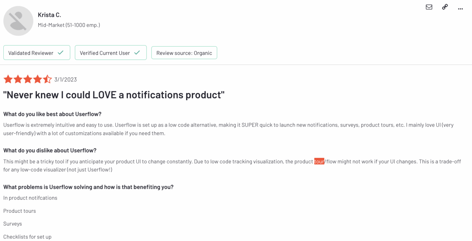
That said, there are caveats. Some users noted that the canvas-style builder has a learning curve and that flows can break when the underlying UI changes. While the customer support team gets strong feedback, a few users mentioned that pricing for the Pro plan is higher than expected.
Which product tour tool should you go for?
If you’re building onboarding across both web and mobile, want full control over your flows, and don’t want to pay extra just to unlock basic features, Userpilot is the tool that checks all the boxes. It’s easier to use than most platforms, scales with you, and comes with built-in analytics, A/B testing, and mobile support from day one.
However, Userpilot is not the best product tour software for everyone. That’s why we developed a checklist for finding the ideal user engagement platform for your business. So watch our no-bs guide to choose the best tool for you!
Userpilot strives to provide accurate information to help businesses determine the best solution for their particular needs. Due to the dynamic nature of the industry, the features offered by Userpilot and others often change over time. The statements made in this article are accurate to the best of Userpilot’s knowledge as of its publication/most recent update on March 31st, 2026.
FAQ
What is a product tour?
A product tour is an interactive walkthrough that shows users how to use key features inside a product. It guides new users step by step during the customer onboarding process to help them understand the actual product’s value and complete important actions early.
Why is a product tour important?
There are several reasons to implement product tour software:
You could build all the key features and tours in-house from scratch, but who has the time or spare tech resources for that? This is an arduous process that will just drain time and energy from your development team.
By contrast, using product tour software tools would allow you to build product tours for your SaaS company code-free! And it comes with a few benefits:
- It’s a much more agile approach because you don’t need to bug your devs every time you want to make a change to your experience onboarding flows.
- It frees up time to run product experiments and conduct A/B tests, which is what drives the quality of your product tour.
- Using product tour software is just a more scalable approach than doing everything yourself.
- It’s easy to build new tours or customize and iterate on the old ones without needing developers.
The million-dollar question is: with so many tools on the market, which product tour software should you choose, and why?
What is product tour software?
At its core, product tour software allows you to build overlays on top of your application without changing the underlying code. These overlays guide users through workflows, highlight new features, and drive product adoption.
However, “product tour” is a bit of a misnomer. In the early days, this meant a linear, 15-step tour that forced users to click “Next” until they inevitably hit “Skip.” Today, the best tools offer dynamic, non-linear experiences. We are talking about:
- Interactive walkthroughs: Guides that wait for the user to perform an action (like clicking a button) before showing the next step.
- Checklists: In-app widgets that gamify the user onboarding process.
- Resource centers: Always-on support widgets that house documentation and video tutorials.
- Native tooltips: Subtle hints that appear when a user hovers over a complex element.
What are the must-have features of product tour tools?
So when we talk about the best software for building better product tours, we’re going to be quite specific about what makes a product tour worthwhile and what important features a tool needs to achieve those things.
Here’s what to look for before picking a product tour software:
- Access to different onboarding UI elements to build your product tours the way you want.
- You should be able to trigger these contextually to user segments. So, segmentation and triggering options are important.
- Since no product tour is perfect the first time you build it, being able to A/B test results based on performance data is really helpful.
- Product tours analytics are important too, as you need to be able to track their performance against your onboarding and activation goals.
- If the tools lack proper analytics, they should at least offer integrations with other analytics tools so you can leverage relevant data in one platform.
There’s more functionality you could be looking at, of course. For example, localization, but we’ve listed the most important functions a product tour software should offer.
About the author