How to Build Website Notification Banners Code-Free (Examples + Best Practices)


According to HubSpot, personalized CTAs perform 202% better than generic ones. That means when users see a message that matches their intent, they’re far more likely to act.
Website notification banners bring that same level of personalization into the product experience.
They tailor both the message and the CTA based on where users are, what they’re doing, and who they are, making it easier to surface the right prompt at the right moment during a product launch without interrupting their flow.
In this guide, I’ll break down how to use them effectively, with real use cases, examples, best practices, and a step-by-step process to build your own notification bar without code.

What is an announcement banner on a website?
A website announcement banner is a compact, non-intrusive strip of text placed at the top or bottom of a webpage or landing page that communicates a focused, time-sensitive message without interrupting the user experience. Also called a sticky bar, notification bar, or hello bar, it stays visible as users browse and pairs a short message with a call-to-action button.
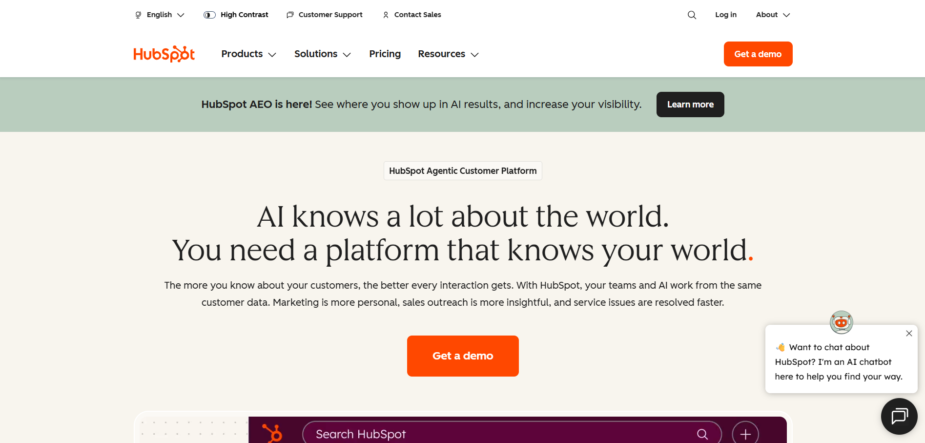
For example, HubSpot uses an announcement bar at the top of its homepage to announce a new feature, “HubSpot AEO is here!” with a “Learn more” CTA directing users straight to the feature update.
What are the top notification bar use cases?
Notification banners can lift conversions by up to 35%, but that depends on how you use them across these four key use cases:
Operational alerts
Operational alerts are time-sensitive messages that inform users about changes that can disrupt their workflow, such as downtime, delays, or service issues. Website notification bars work well because they show updates in real time, helping users understand the impact and adjust their actions accordingly.
The goal is to convey what is happening, how it impacts users, and what they should do next. Examples include:
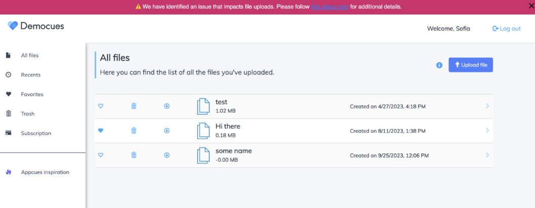
- System issue alertAppcues alerts users to an ongoing file‑upload issue right where they manage their files. It explains the impact in plain language and links to a status page, reducing confusion and unnecessary support requests.
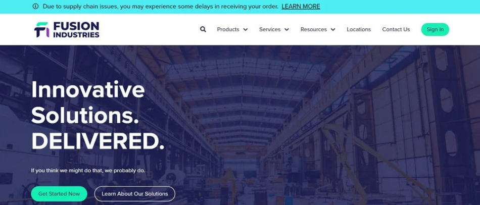
- Shipping delaysFusion Industries adds a top-of-page banner to alert customers about possible order delays due to supply chain issues. Sharing this upfront, before checkout, sets honest expectations and reduces uncertainty. It also helps deflect support tickets related to delivery times.
Lead generation
Lead generation banners turn passive website visitors into active prospects by presenting an offer such as a discount, a free resource, or a newsletter signup at the moment they are already engaged with your site. There are no interruptions or aggressive takeovers, just a persistent, visible prompt.
Examples include:
- Get started for freeThis banner promotes a free product experience in a slim, persistent strip that stays visible without interrupting browsing. It highlights a low‑friction offer and nudges engaged visitors toward sign‑up as they explore the page.
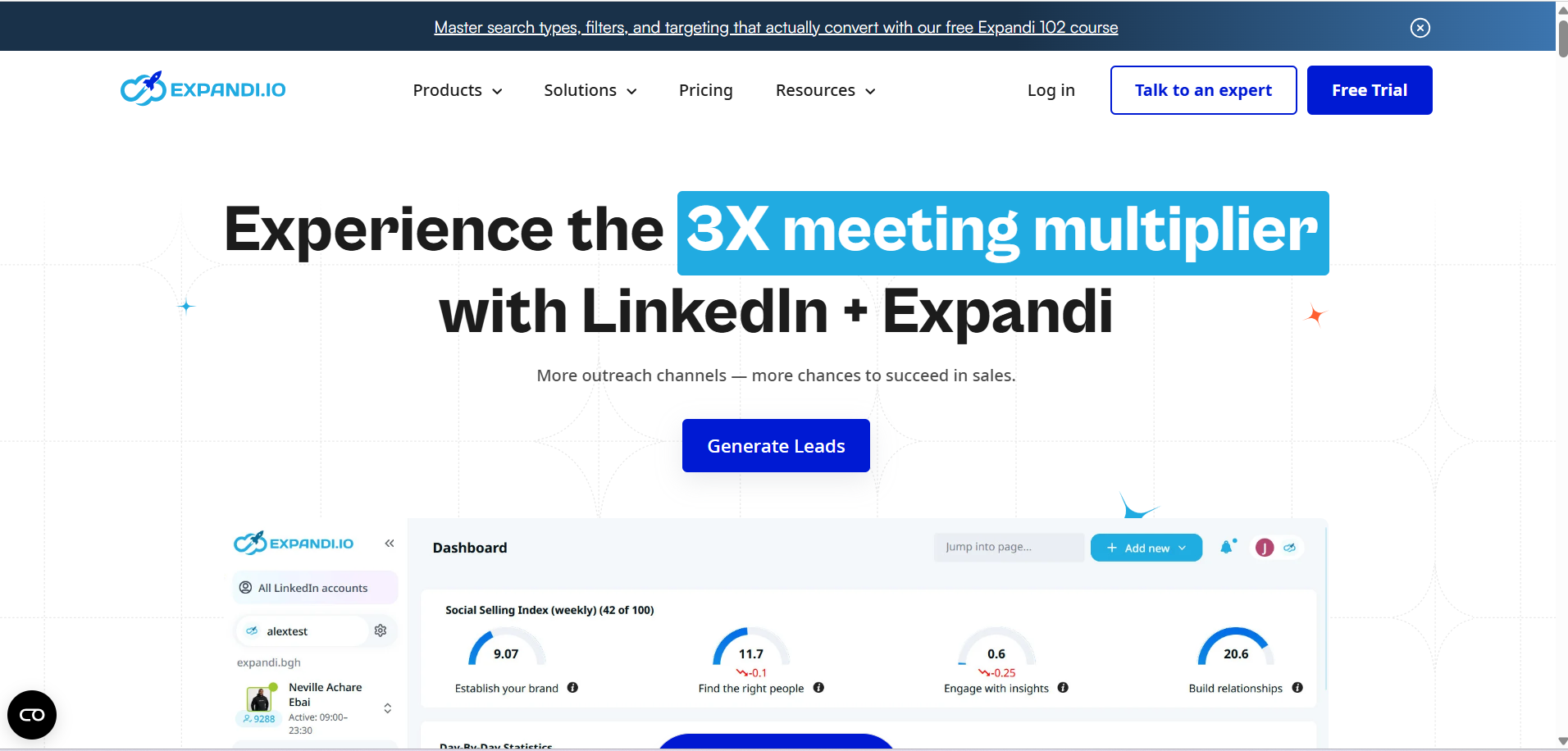
- Offering a free resourceExpandi offers a free educational resource that directly relates to what visitors are trying to achieve. By featuring it in a prominent site-wide banner, it consistently invites interested users to explore the course and share their details in just a few clicks.
Urgency and sales
Urgency and sales banners tap into the scarcity principle: when an offer feels limited in time or availability, people see it as more valuable and feel a stronger push to act. By turning discounts into time-bound deals or adding a “Final hours” countdown, banners create enough pressure to move users from browsing to taking action.
Examples include:
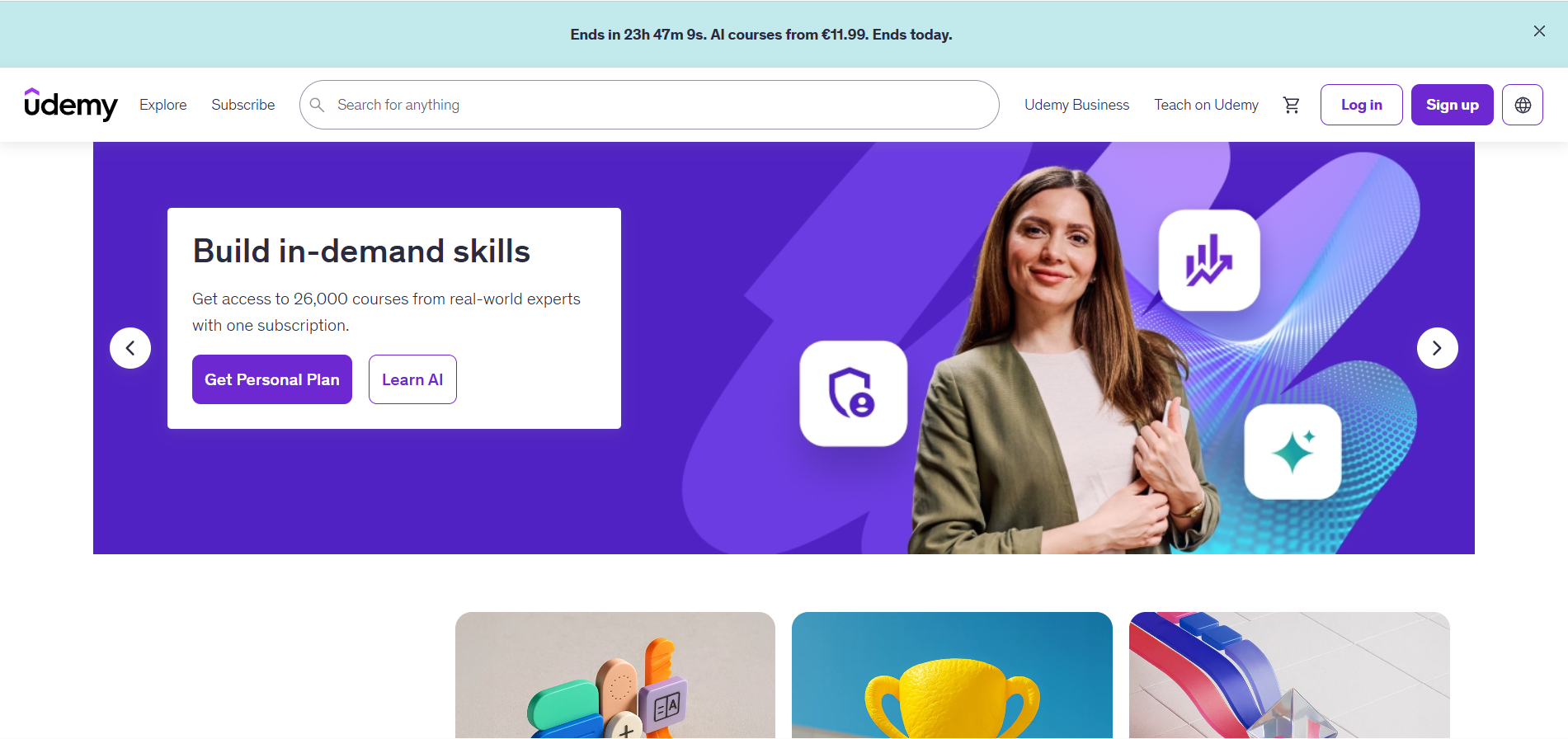
- Countdown saleUdemy places a countdown banner at the top to highlight a time-bound offer on AI courses. The visible timer makes the deadline explicit, which creates urgency and encourages visitors to act now instead of dropping off.
- Time‑bound discount bannerThe banner highlights a limited‑time discount on a paid plan while visitors explore the page. The copy highlights the percentage to lure in customers without a countdown timer. A clear “Learn more” link gives interested visitors a path to check out the offer and upgrade to premium features.
Product or feature discovery
Product or feature discovery banners surface new or important features directly within the product. They guide users toward what to try next, whether it is a new release, a major update, a detailed blog post, or a core feature they haven’t explored yet. These updates help users reach value faster and increase feature usage.
Examples include:
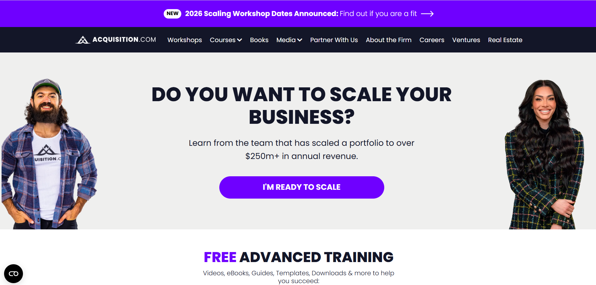
- Workshop discoveryAcquisition.com uses a high-contrast purple banner above the navigation to announce new workshop dates with a “NEW” badge and a focused message. The CTA, “Find out if you are a fit,” builds curiosity and takes users to an opt-in form for more details.
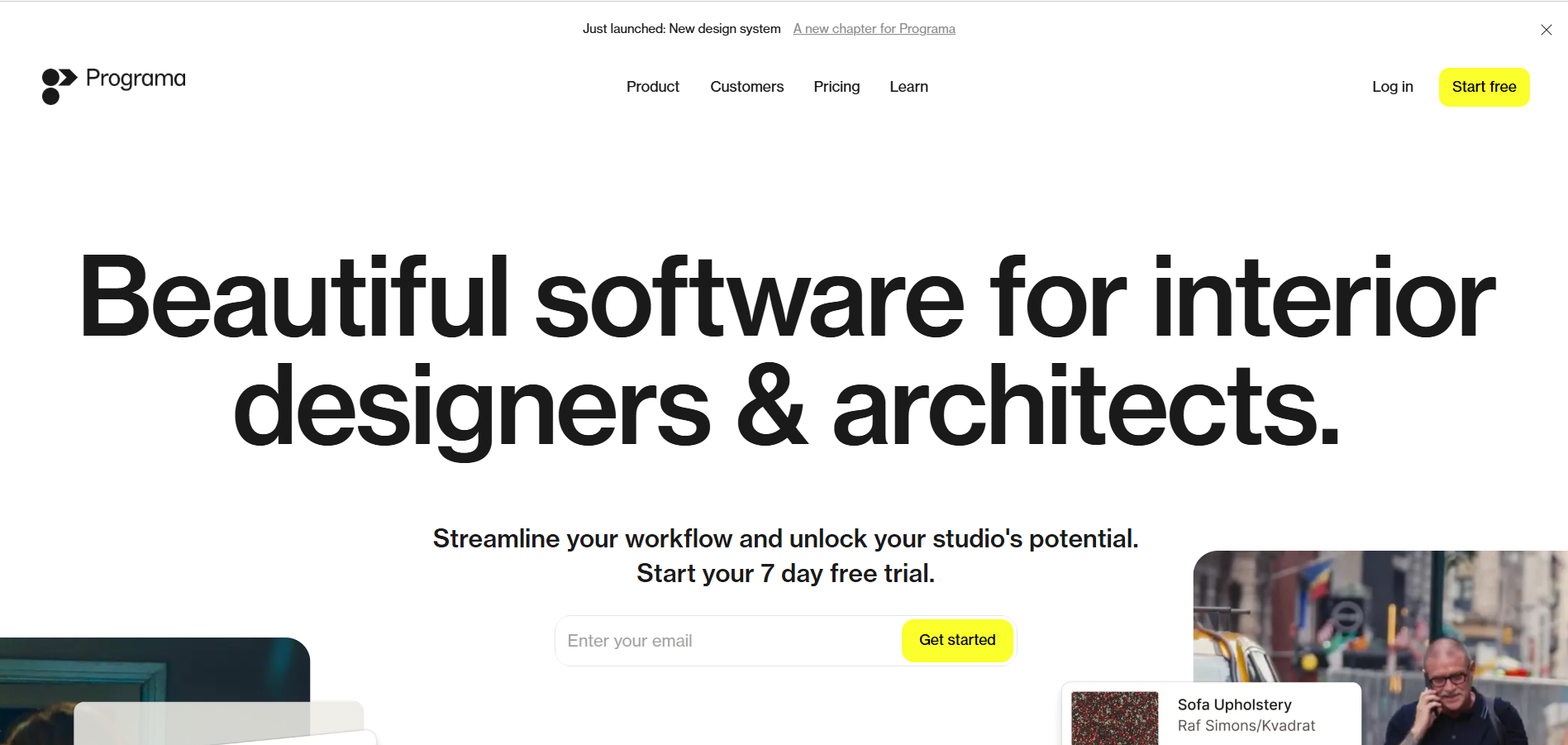
- Feature announcement bannerPrograma’s notification bar appears at the top with clear text: “Just launched: New design system. A new chapter for Programa.” The linked CTA lets curious users learn more, while the dismiss button keeps the visitor’s experience smooth. It shows that a feature announcement banner does not need heavy styling to be effective.
These four use cases show how notification banners fit into various moments of the user journey, but their impact becomes clearer when you see how teams apply them in practice.
7 Really good notification bar examples to learn from
Below are seven real-world notification bar examples hand-picked by me:
1. ApproveMe drives urgency with a countdown timer
On opening ApproveMe’s, the first thing you’ll notice is the flash sale banner at the top. It’s layered into two parts: a slim strip at the top announces the limited-time savings, and right below it, a full-width bar displays a live countdown timer, a bold “Get the Deal” CTA, and social proof featuring top brands.
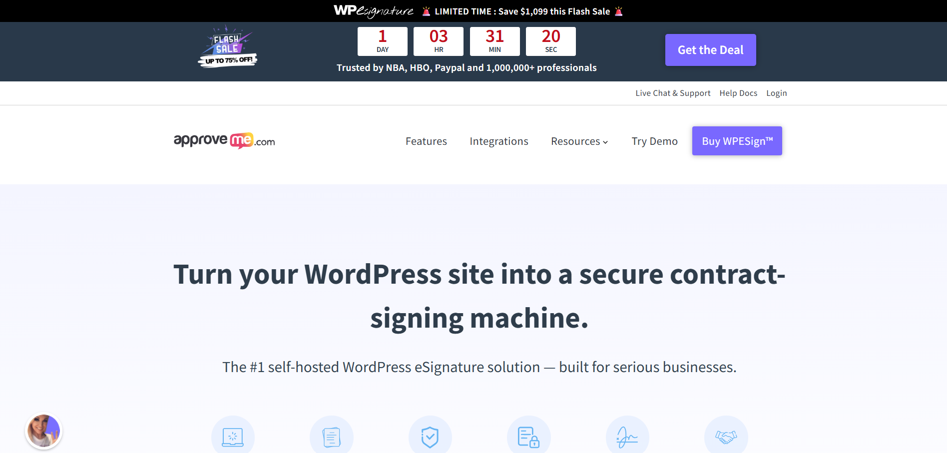
Each element does a specific job. The top strip sets the stakes, the countdown makes the deadline real, the social proof builds trust, and the CTA gives a clear next step.
You can see the value, the time left, and why the offer is credible in a single glance, which removes hesitation and increases visitor engagement.
👉 Best practice: Make urgency measurable and instantly scannable
Don’t rely on “limited time” language alone. Show the exact time left, quantify the value upfront, and keep the entire offer readable at a glance. Shopify cites that limited-time offers with clear CTAs increase conversions by up to 332%, which is why a focused, clear message with immediate visibility matters the most.
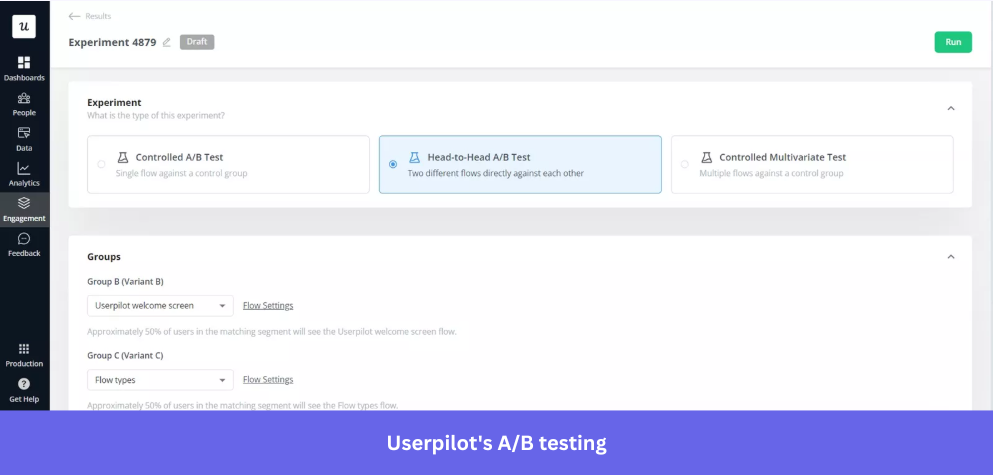
But the banner’s impact varies by audience. With Userpilot’s A/B testing, you can compare a standard discount bar with a countdown version to see which drives more checkout clicks.
Here’s how:
- Test flows against real user behavior: Compare different banner or flow versions and measure their impact directly inside your product.
- Control vs. variant testing: Run a controlled A/B test where one group sees your banner (the flow) and another group sees nothing so that you can compare conversion rates, not just clicks.
- Head‑to‑head comparisons: Show two different banner versions to similar user segments to identify which messaging or design performs better.
- Multivariate experimentation: Go beyond A/B by testing multiple elements at once, like UX microcopy, CTAs, timing, and design combinations.
2. MADX hooks visitors by leading with their pain point
MADX opens with a direct question, “Want to boost your brand visibility in AI models?” followed by “Learn how you can win” and a bordered “Kick Start AI SEO 🚀” CTA on a black strip.
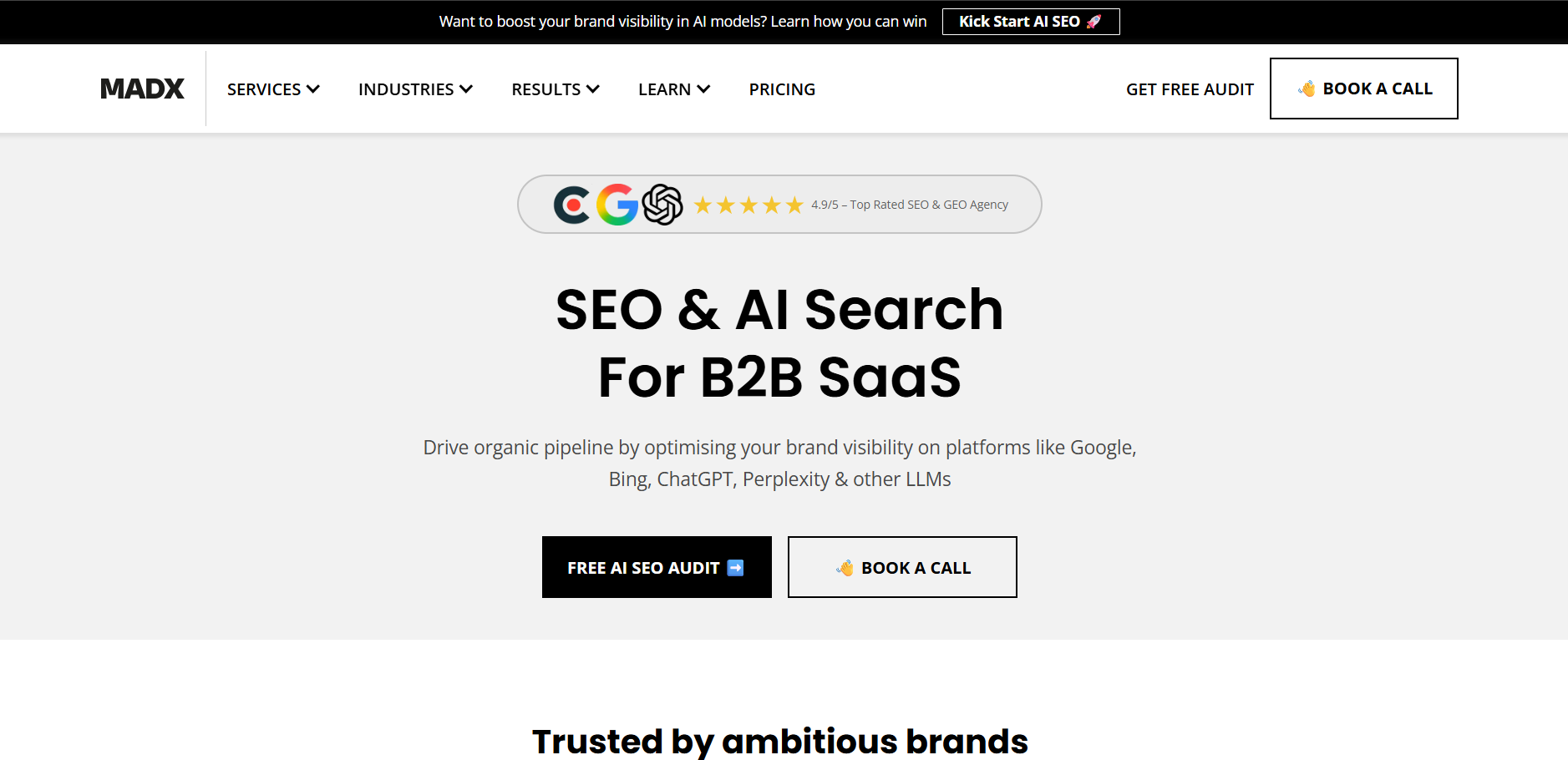
The banner doesn’t try to introduce the brand; it surfaces a pain point that their target audience, B2B SaaS marketers and founders, often think about. AI search visibility is still new and unclear for many companies, and the banner makes the problem explicit from the start.
The follow-up line shifts the tone from problem to possibility, while the CTA gives that problem a category, AI SEO.
👉 Best practice: Name the problem before you name the product
Lead your banner with a pain point your audience is already experiencing.
When visitors recognize their own problem in your copy, they self-select instantly. HubSpot’s 2024 B2B Buyer survey found that 75% of B2B buyers prefer to research independently, which makes your banner the first pitch before users decide to stay or leave.
But as you scale this approach, the pain points must feel personal to each visitor. Userpilot lets you personalize banner copy using dynamic variables like role, company, or plan type, while its AI assistant generates and refines personalized in-app copy.
You can use:
- Custom user properties: Use any tracked data (industry, role, account type) to personalize beyond names.
- Fallback text: Set default values so banners display cleanly when data is missing.
- Preview before launch: Check how personalization performs for different user segments before going live.
3. Loom generates leads with a live webinar banner
You’ll notice a blue website notification bar at the top announcing a live webinar with an important message, a specific date, and a “Register now” CTA, along with a dismiss option.
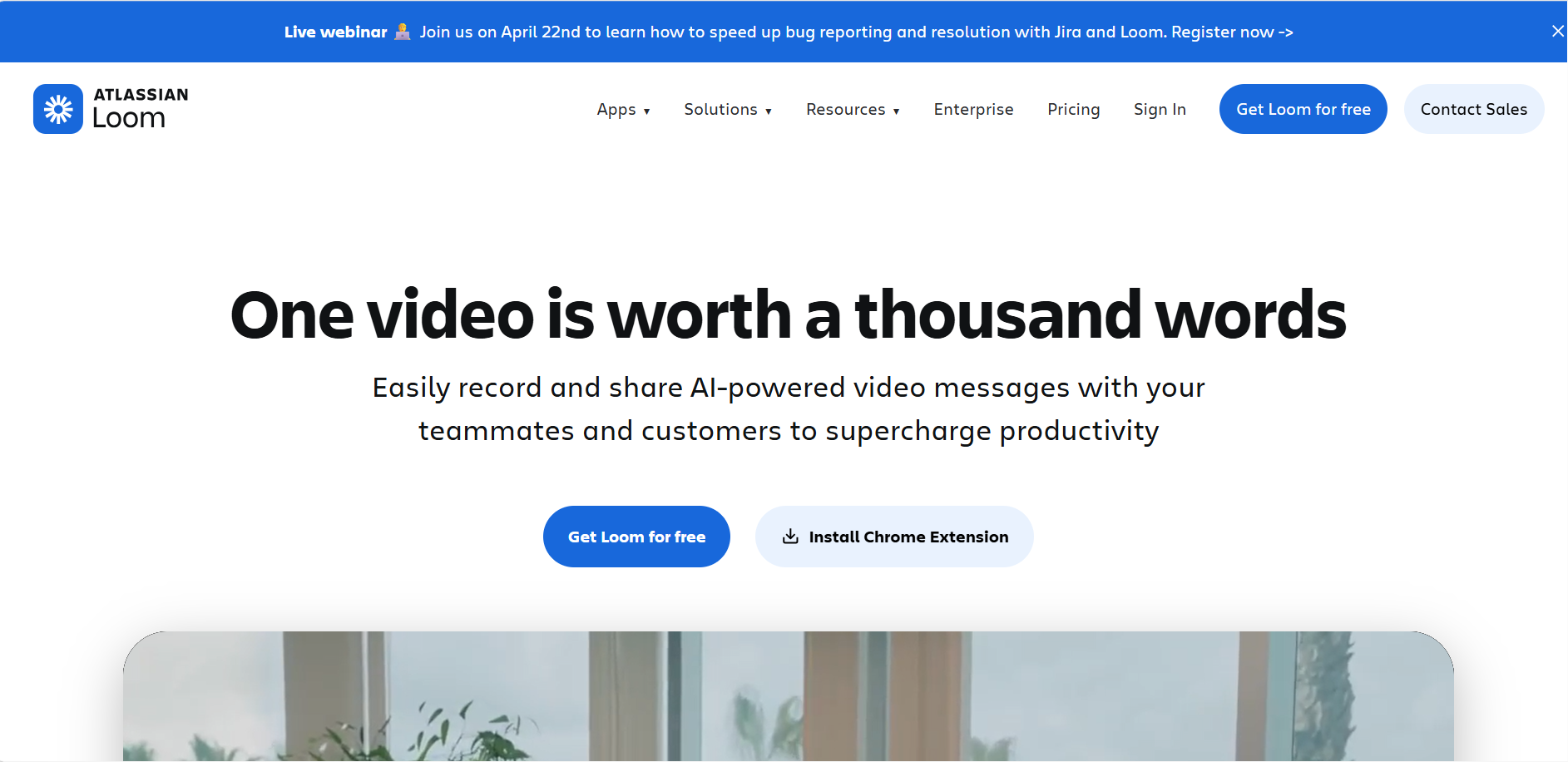
By naming Jira alongside Loom, the banner is co-branding with a tool their core audience already uses daily. It is not just announcing a webinar; it is telling developers and product teams that this session is built specifically for their workflow.
The text “speed up bug reporting and resolution” does the same job. It mentions a real, recurring pain point rather than a broad theme. You don’t need to click through to figure out if it’s for you; the banner tells you in one line.
👉 Best practice: Answer what, when, and why in one line
ON24’s 2026 Digital Engagement Benchmarks Report shows a 60% registration-to-attendee rate, meaning the challenge is getting users to register. Avoid vague copy like “Join our webinar” and state the topic, date, and outcome clearly so users know exactly what they’re signing up for.
However, when a webinar banner has a hard expiry, it becomes irrelevant once the date passes. And fixing that requires control.
In Userpilot, you can build and launch banners like this without code, customize their placement, and design actionable CTAs. You can even control the dismissal button with three behavior options, which we’ll cover in the step-by-step notification bar creation process later.
4. Gusto builds trust with a cumulative update banner
Gusto’s banner highlights volume: “Gusto Showcase returns! Nearly 75 small improvements that add up to big progress.” It frames the update around steady progress, not a single headline feature.
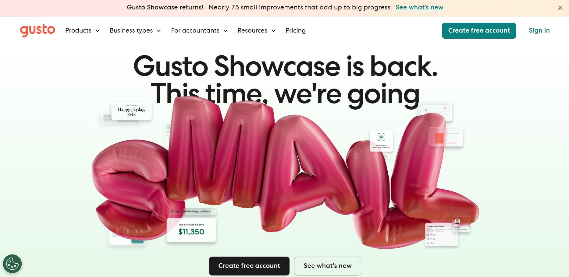
“Returns” gives the update a recurring identity, and “Nearly 75” feels both specific and meaningful, while “small improvements that add up to big progress” openly admits that none of these changes are dramatic on their own. That honesty builds more trust.
With a soft background, no urgency, no countdown, and a simple text link instead of a pushy button, the notification bar signals continuous improvements of the product.
👉 Best practice: Make consistency your headline
Highlight the consistency of improvements rather than one standout update.
Specific, tangible messaging builds credibility and signals ongoing product care. PwC’s 2025 Customer Experience Survey found that 52% of consumers stopped using a brand after a bad experience, reinforcing that consistent improvements build long-term trust.
While a single banner announcing improvements is a good start, you can take it further with Userpilot Workflows. Instead of surfacing all updates at once, you can design a multi-step user journey that introduces improvements to users contextually.
- Multi-channel triggers: Trigger banners, flows, tooltips, checklists, or emails at each stage of the journey, so users discover improvements as they interact with the product.
- Conditional branching: Route users into True/False paths based on behavior, segments, and prior content engagement.
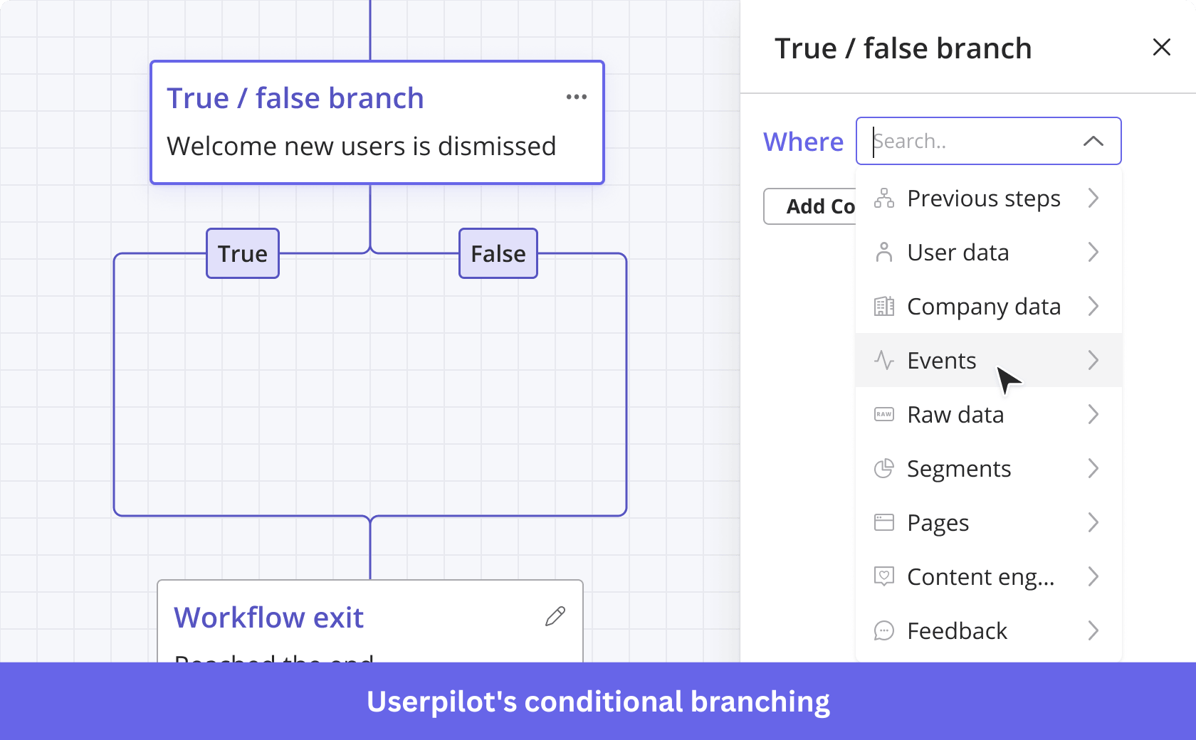
- Time delays: Space updates over time with scheduling and frequency caps to avoid overwhelming users.
5. Salesforce promotes event discovery with a contextual banner
At the very top of Salesforce’s homepage, a full-width dark purple banner introduces the Agentforce World Tour with just one line, “Join us in an Agentforce World Tour event near you. Register now.” paired with the event logo and a simple arrow CTA.
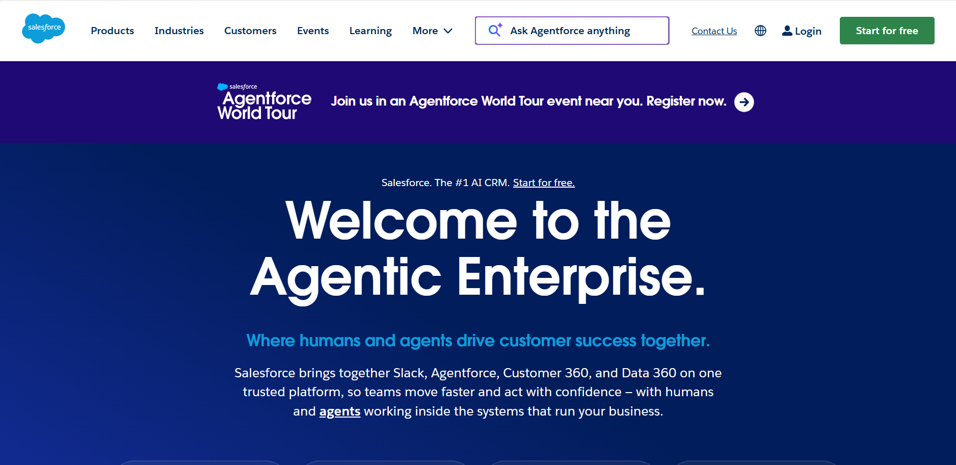
What’s interesting here is you won’t see a date, location, or agenda. The website notification bar leans on brand strength and event identity. “World Tour” signals scale, “near you” adds relevance, and the Agentforce logo does the product storytelling without extra copy.
This is a confidence play. For high-recognition brands, a simple, high-visibility banner like this can drive clicks without over-explaining.
👉 Best practice: Make visitors feel it’s for them
Before adding more copy, ask if a single phrase is enough for personalization. A cue like “near you” signals relevance without geo-targeting. Attentive’s 2025 Consumer Trends Report found that 81% of consumers ignore irrelevant messages, so sounding relevant upfront matters.
If you want a more targeted approach, Userpilot’s audience targeting lets you show different website notification bar versions to specific user segments.
- User attribute targeting: Show banners based on plan type, role, signup date, or any custom user property.
- Page and domain targeting: Control exactly which pages or subdomains a banner appears on.
- Combined conditions: Stack multiple filters together, for example, free plan users in a specific region who have not completed onboarding.
- Audience segmentation: Target pre-defined segments or build custom ones, so every banner feels like it was made for a specific user.
6. Superhuman filters its audience with a question-led banner
Superhuman greets you with a prompt at the very top: “Looking for Superhuman Mail?” paired with a simple “Learn more →” CTA.
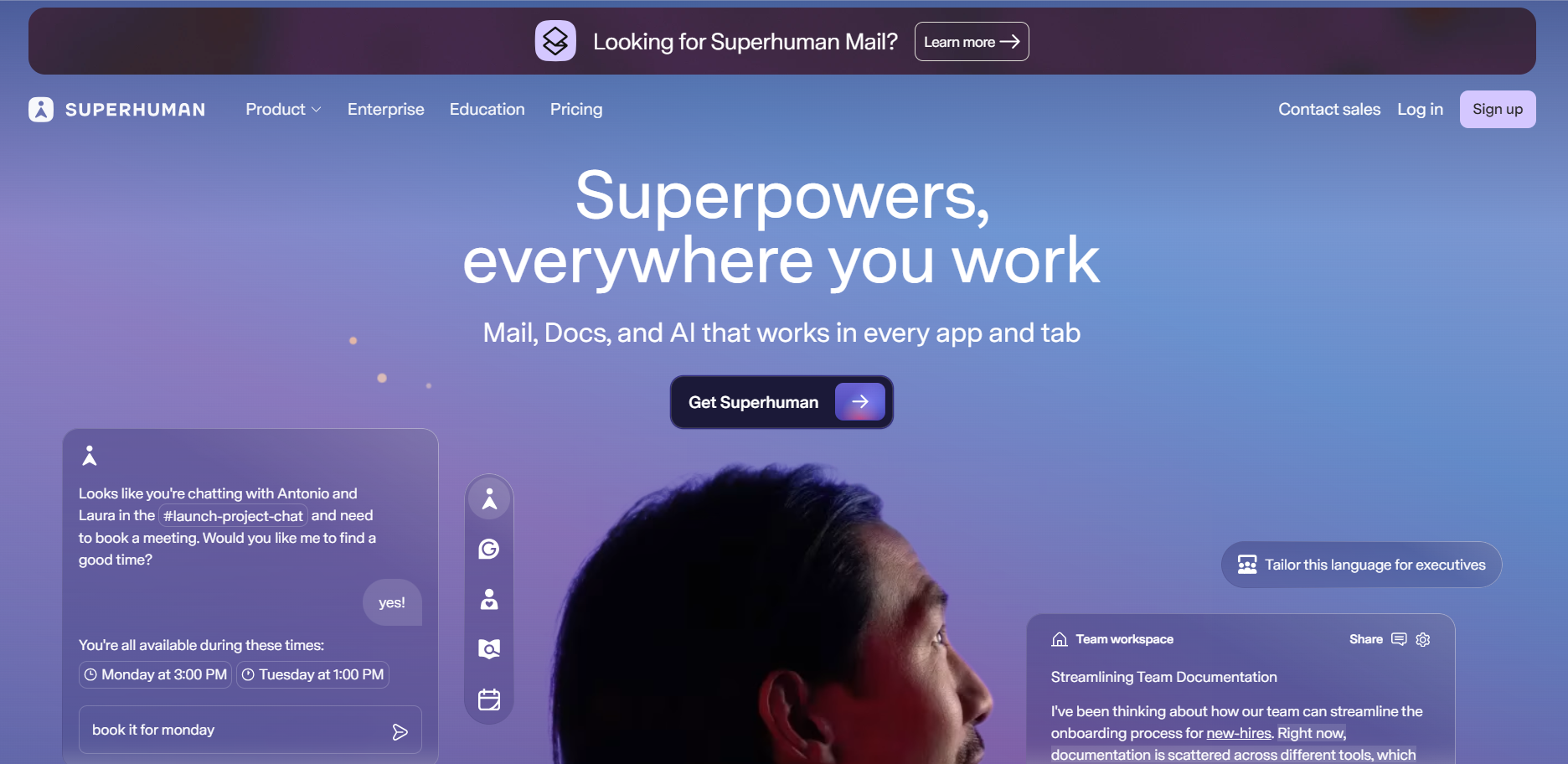
The notification bar speaks to a very specific visitor, someone already familiar with Superhuman Mail and actively looking for it. As Superhuman expands into Docs and AI, this small nudge removes confusion and redirects them instantly without friction.
There’s no urgency, no offer, no extra messaging. It identifies a narrow intent and resolves it in a single line.
👉 Best practice: Use the right question to find the right visitor
Use your banner to answer a quick question: “Is this what you came for?” so users can confirm they’re in the right place within seconds. Fast Company cites that 61% of users leave if they don’t find what they’re looking for within five seconds. Write concise messages focused on one intent and one action.
To reach a global audience, translate your banner into 32 languages using Userpilot’s AI-powered localization. Determine which language to show the user based on two parameters:
- Their browser language, which is tracked automatically.
- Or a locale code you pass through your installation.
This means you do not need to build separate banners for different regions.
7. Gong captures high-intent leads with a thought leadership banner
Instead of features, Gong’s website notification bar informs visitors about where the market is heading.
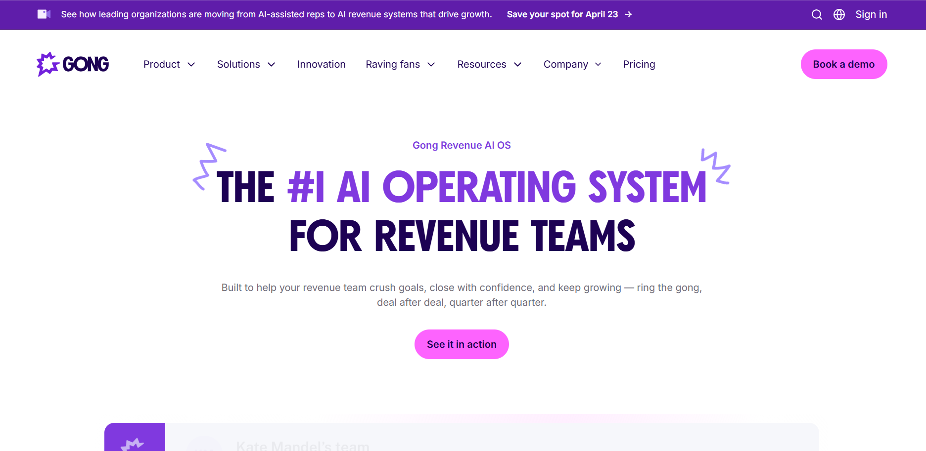
The part “moving from AI-assisted reps to AI revenue systems” frames a broader market transition that revenue teams focus on. It doesn’t explain the product; it positions a POV and invites the audience to explore it further.
The phrase “leading organizations” adds social proof, while “Save your spot for April 23” signals limited availability without sounding pushy. The banner goes beyond promoting an upcoming event and positions Gong as the authority on what comes next.
👉 Best practice: Anchor your banner to a market trend or POV before making the ask
Build your banner around a trend, shift, or challenge your buyer already recognizes, then use the event or offer as proof.
Edelman’s 2024 B2B Thought Leadership Impact Report found that 54% of C-suite executives spend hours each week consuming thought leadership content, indicating that decision-makers engage more with ideas than product pitches.
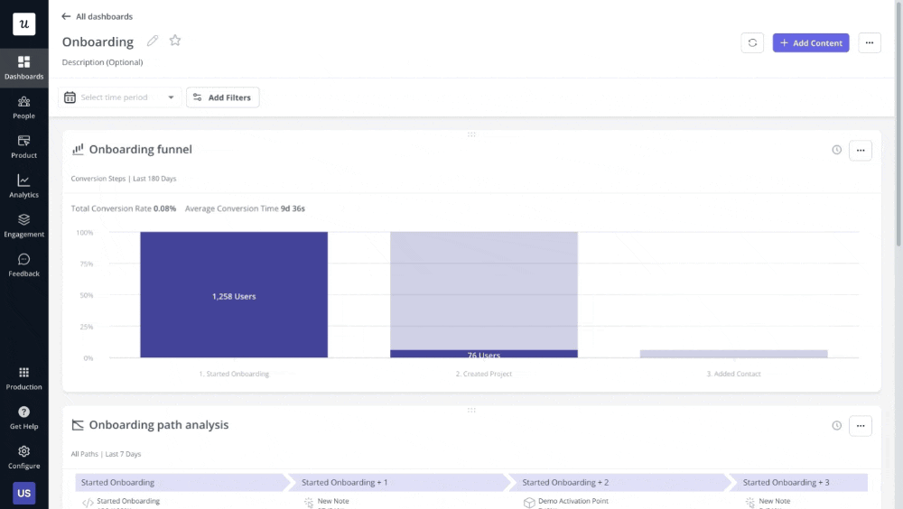
To see whether your banner is delivering on that, you need to track how users respond once it goes live. With Userpilot’s analytics dashboards, you can track banner performance in real time.
Here’s how:
- Banner performance tracking: Monitor views, visitor clicks, and dismissals in real time to see whether your message is resonating or getting scrolled past.
- Custom dashboards: Build a personalized dashboard from scratch or use pre-built templates like feature engagement to consolidate all banner metrics in one place, with sharing options for your team.
- Favorite dashboards: Pin up to five dashboards to your sidebar, keeping banner performance data one click away during a live campaign.
So, the seven examples we discussed show how different teams use notification bars to drive traffic, conversion, and click-through rates. Now it’s your turn to build one that fits your product and use case.
How to build your own notification bar code-free
Here’s a step-by-step walkthrough to create, customize, and launch a website notification bar in Userpilot, directly on your live UI.
Step 1: Launch the Builder
- Install the Userpilot Chrome Extension from the Chrome Web Store.
- In your browser, navigate to the exact page where you want the banner to appear, for example, a dashboard, a pricing page, or any in‑app screen.
Then click the Userpilot Chrome Extension icon to open the visual builder on the page.
Step 2: Create and name
Once the builder is set up, start creating your banner.
- Click Start here in the Userpilot Chrome Extension.
- From the “What would you like to create today?” modal, select Create a Banner.
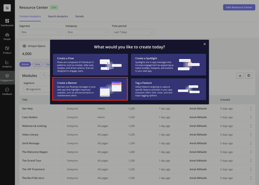
- Give the banner a clear, descriptive name that makes sense for your use case, such as:
- For product launches: “New Analytics 2.0 launch.”
- For discount codes: “New customers LAUNCH10 deal.”
- For onboarding: “Complete billing to go live.”
- Next, add your headline and body text to effectively communicate the core message, include an icon for visual weight, and add a primary CTA to direct the next action.
Userpilot creates a new banner experience and opens the editor on the page you’re viewing.
Step 3: Define placement and embedding
With the banner editor in place, the first thing to configure is where the banner appears on the page and how it interacts with your UI.
From the placement section:
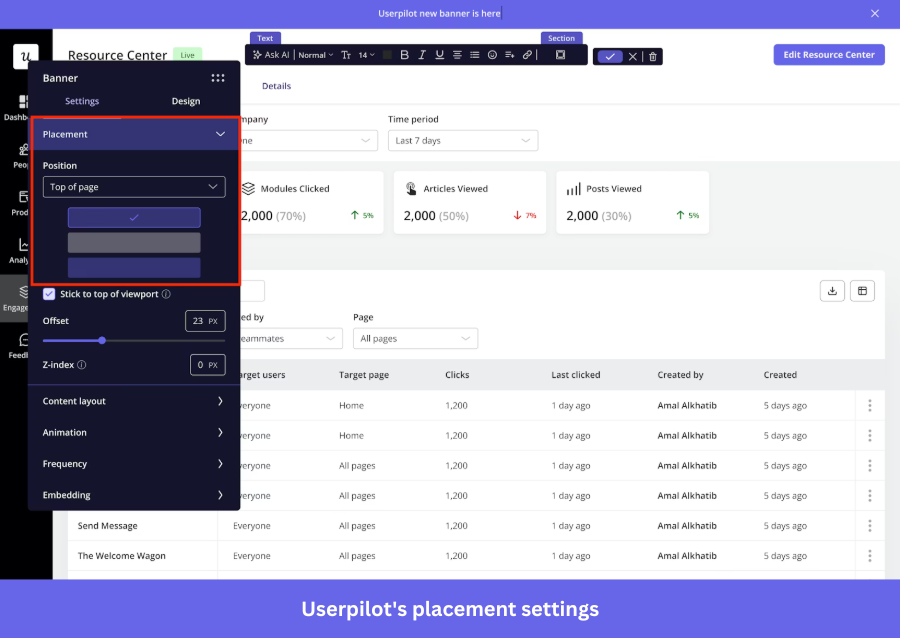
- Select Top for high‑visibility alerts and announcements.
- Select Bottom for more subtle messages like feedback requests.
Go to the Embedding section and configure how the banner interacts with your page content.
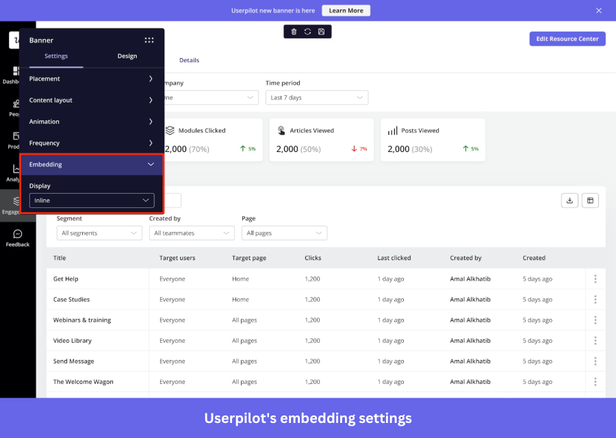
- Choose Inline to place the banner within the page layout as part of the content without covering any UI elements.
- Use Overlay to display the banner on top of the page for higher visibility.
Step 4: Customize content and design
Now that the banner is anchored on the page, tighten the messaging and visuals using Userpilot’s no-code editor.
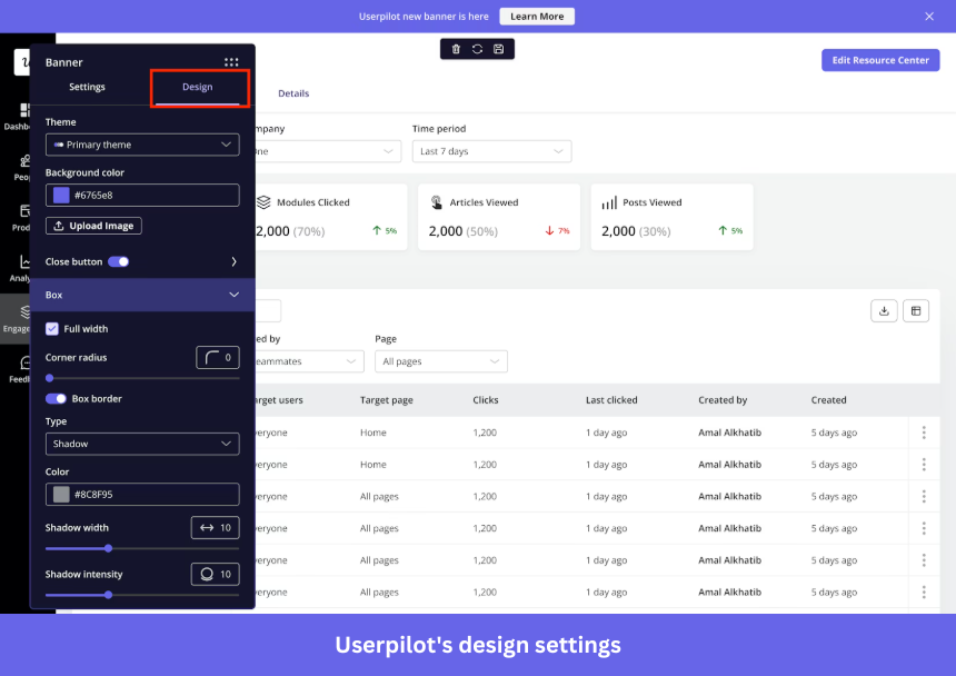
- Select a pre‑built theme that best matches your product’s branding.
- Set the background using a solid color or a custom image so the banner blends naturally with your page.
- Adjust the box settings (width, corner radius, UI padding) to make sure the banner feels balanced and doesn’t overpower your layout.
- Lastly, include a dismiss button for users to opt out without friction.
Userpilot applies your design and content preferences instantly, letting you see the final layout right away.
Step 5: Configure dismissal and logic
After adding the dismiss button, define the outcome when users hit it. In Userpilot, you get three options to control the dismiss button’s behavior:
- Dismiss: The banner re-triggers based on your configured frequency settings (e.g., every time).
- Dismiss and never show again: The banner stops showing permanently after dismissal, ideal for one-time “Aha!” moments.
- Dismiss and show in the next session: The banner reappears after 30 minutes of inactivity.
Step 6: Target the right audience
This is the last step: determine which pages to target, which users to target, and how often to display the banner.
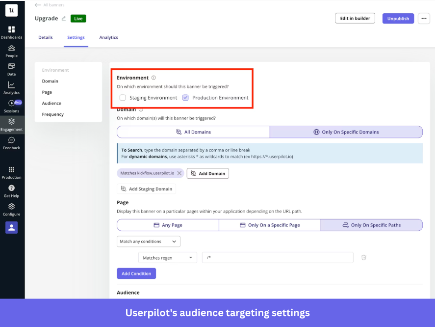
- In the environment setting, choose “Staging” to test the banner safely, or “Production” to show it to live users.
- In domain targeting,
- Keep “All domains” to show the banner everywhere Userpilot is installed.
- Switch to “Specific domain” if you only want it on certain domains or subdomains.
Now, under page targeting, define where the banner should appear:
- Select “Any page” to show it across your app.
- Select “Only on a specific page” for a single URL.
- Select “Only on specific paths” to target defined URL patterns with multiple conditions.
Next, from audience targeting, define who should see the banner, choose:
- “All users” to show it to everyone.
- “Only me” to preview it using the Chrome extension.
- “Specific segment” to target saved segments.
- “Users that match specific conditions” to filter by user properties, segments, form responses, or tracked events.
Finally, control how often it appears using frequency:
- Set “Once” for one-time messages like promos or announcements.
- Set “Every time” for recurring alerts that need visibility.
That is it, save your banner and hit publish. Your first notification banner is ready to go live. 🚀
Master the art of the low-friction conversion
A website notification bar works when it aligns three things: the message, the audience, and the moment. Miss one, and it gets ignored.
Most notification bars take up less than 5% of your screen, yet that small strip can drive webinar signups, recover drop-offs, redirect intent, and surface value users would otherwise miss.
The seven examples we discussed all do the same thing: they pick one clear objective, target a specific user segment, and keep the ask as low-friction as possible. Over time, these small, well-placed touchpoints compound into steady lifts in activation, adoption, and revenue.
And that’s exactly what Userpilot enables. Build and optimize low-friction in-app experiences based on real user behavior, from launching targeted banners to tracking click-through rates and running A/B tests, all without writing a single line of code.
Publish your first banner and see how it performs with Userpilot’s 14-day free trial.
FAQ
How to show notifications on a website?
Notification banners are ideal for showing notifications on a website because they stay visible without disrupting the user experience. This approach aligns with user preference, as a HubSpot survey of 302 users found that 58% say intrusive elements negatively impact UX.
Spotify is a great example:
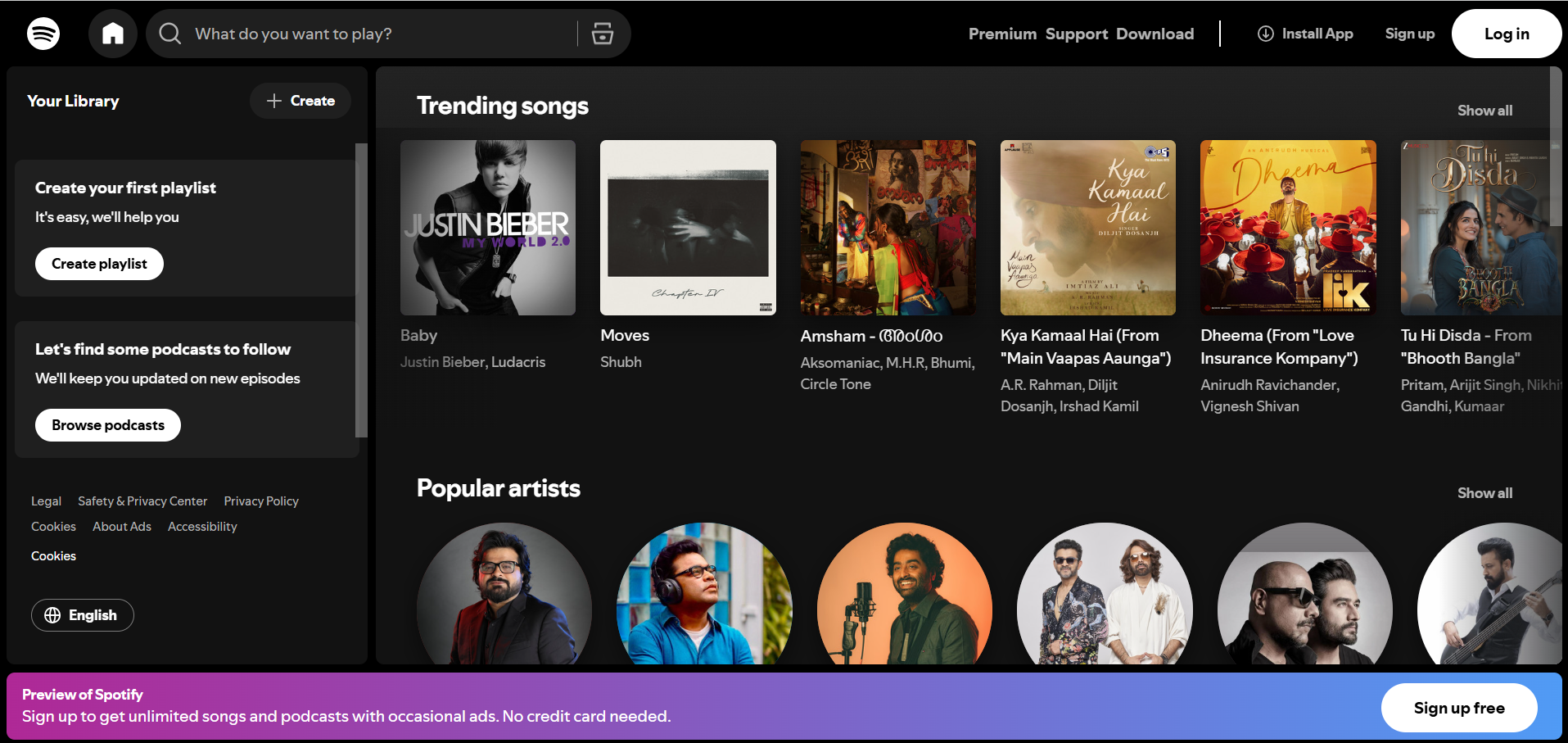
Its banner is placed at the bottom instead of the top to avoid cluttering the header, especially since its homepage already has a sticky navbar with key CTAs. The bottom banner is visible without competing for attention, nudging users to act after engaging with the website.
Other ways to show notifications on a website:
- Pop-ups and modals: Appear as large mid-screen overlays but can feel intrusive.
- Push notifications: Browser alerts sent from your website that appear even after visitors leave.
- Live chat prompts: Triggered messages within a chat widget for real-time support.
How to make a website give you notifications?
Making a website give you notifications requires implementing the Web Push API, which involves three components:
- Service worker: A small background script that runs in the browser, even when your site isn’t open. It signs users up for notifications using PushManager.subscribe() and gives your server the details it needs to send those notifications later.
- Notifications API: Handles permission requests and lets you display notifications on the user’s device. It is best to trigger the prompt through a user action, as browsers may block or quiet prompts shown automatically on page load.
- VAPID protocol: Authenticates your server to the browser’s push service, confirming the message is coming from a trusted source. Once authenticated, the push service delivers the notification to the browser, which passes it to the service worker to display.
There are two non-negotiables: your site must run on HTTPS, and users must explicitly opt in before receiving any push notifications.
What should a website banner look like?
Nielsen Norman Group says banner blindness is a real UX challenge where users ignore ad-like elements in typical ad locations like the top of the page or the right rail. To counter this, design a website notification banner that grabs attention without disrupting the UX.
Here’s what that looks like:
- Keep it short and focused: Use clear, concise text (e.g., “New dashboard is live”) and direct users to a guide instead of explaining everything in the banner. A simple notification bar design keeps the message clear and distraction-free.
- Use high contrast with clean visuals: Make the banner stand out from your UI to draw attention. For example, if your navigation is light gray, use a contrasting color like deep blue or bold orange. You can also consider switching themes to create a clear visual separation.
- Add an action-driven CTA: Include a clear next step with a strong verb, like “Explore feature” or “Get started.”
- Keep the design minimal and on-brand: Focus on the brand’s message, use whitespace effectively, and ensure colors and fonts align with your product.
- Ensure mobile responsiveness: Make sure the banner adapts to smaller screens, with readable copy, a tap-friendly “X” dismiss button, and efficient use of screen space.
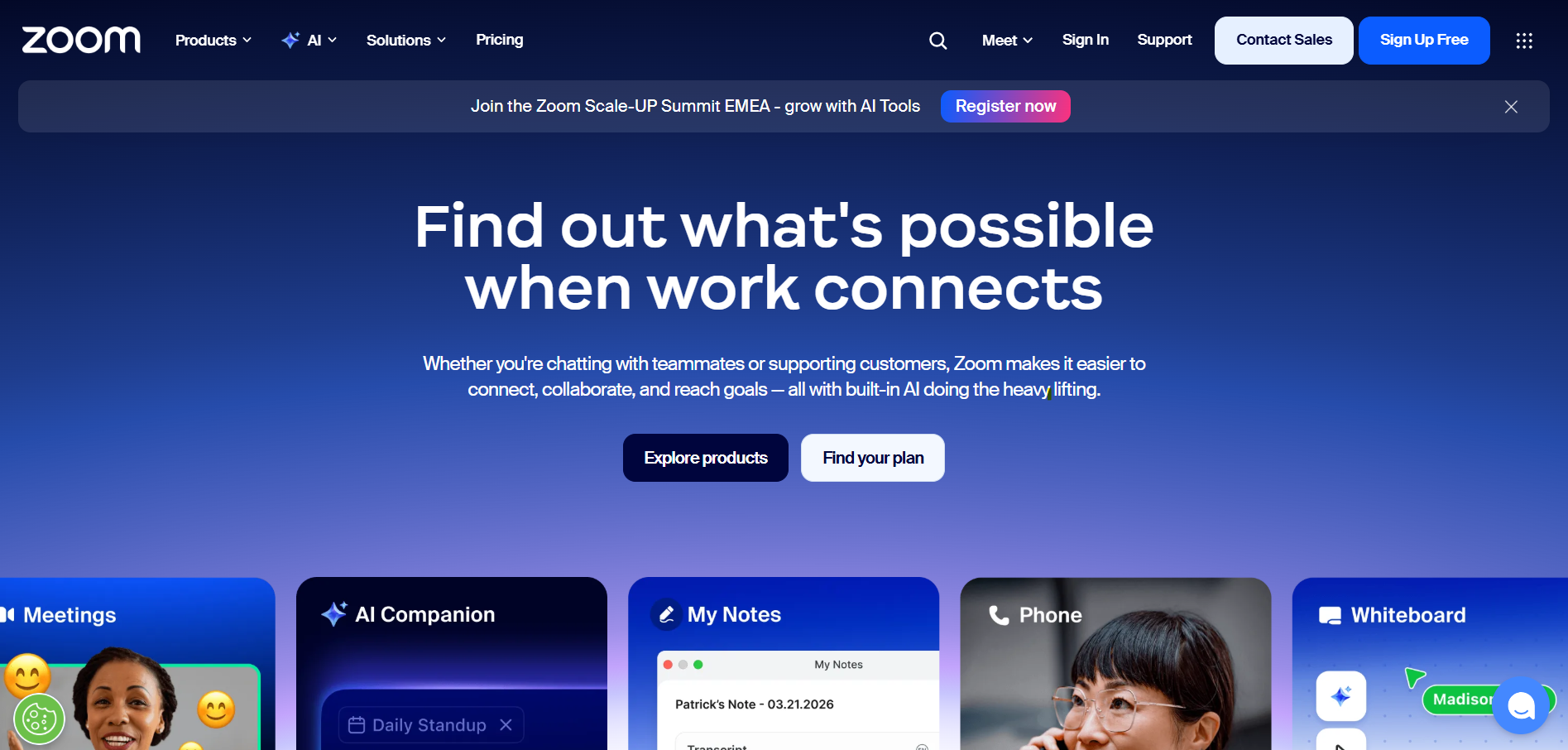
For example, Zoom’s website banner promotes an event with a short message and a high-contrast “Register now” CTA. The banner is placed at the top, includes a dismiss “X” button, and stands out against the dark header, making it visible without disrupting the website’s content.
About the author