15 Best Help Center Designs for SaaS in the AI Era


Good help center design has always been a self-service problem, and the demand for it has never been clearer. Research shows 81% of all customers attempt to take care of matters themselves before reaching out to a live representative. Companies that give them an effective path to self-solve see measurable results, with well-structured self-service reducing support call volume by 25% to 30%. Furthermore, a growing share of users now arrive at a help center expecting an AI to answer their question directly instead of a list of articles to sift through.
Serving both audience expectations requires structural choices that the old model didn’t need to make. The same article structure and heading choices that help a human find the right page also determine whether an AI can pull accurate information when answering a question. Help centers aren’t going away, but their job is evolving from a library humans browse to the knowledge source that AI answers pull from. This guide will walk you through 15 help center examples (covering what it does right or where it falls short) and best practices to apply to your own help center design.

15 Help center design examples for SaaS inspiration
I went through a lot of help centers as research for this post. Some looked visually appealing but lacked useful content, while others offered effortless search but unclear instructions. The 15 examples below are those doing at least one thing well enough to be worth referencing (or shedding light on pitfalls for you to avoid).
Help center #1: Slack
Slack’s search bar sits right at the top of the help panel, exactly where it belongs. As users type, it shows them popular query suggestions, guiding those who know they have a problem but aren’t sure how to phrase it.
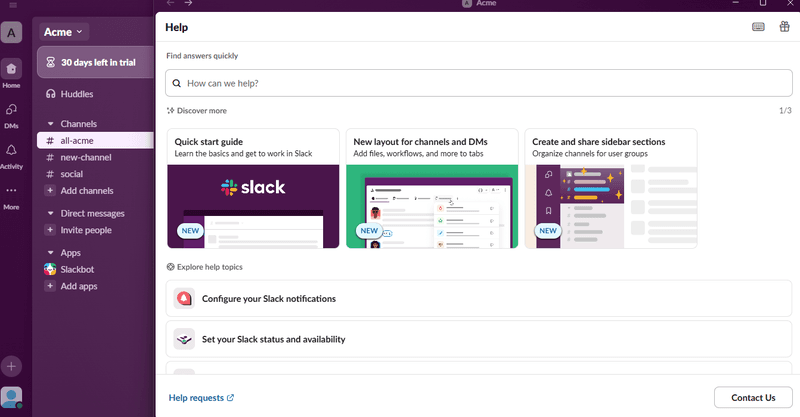
Below that, a content carousel highlights quick-start guides and new features with clean visuals that make the panel feel interactive rather than static. Common help topics are grouped in labeled blocks with icons so users can find familiar actions without reading or typing. Crucially, the “Contact Us” button is visible if self-service doesn’t resolve the issue. What’s worth noting on the downside is that Slack’s search bar disappears once you navigate into a help article. This means that users who need to refine their search mid-read have to go back to the homepage, creating friction at the worst possible time.
Tips:
- Surface popular queries as users type: Showing common troubleshooting topics in the search dropdown helps users who aren’t sure how to phrase their question. It reduces zero-result searches before they happen.
- Make escalation easy: A visible “Contact Us” button gives users a frictionless path to support agents. Self-service that leads to dead ends creates more frustration than no self-service at all.
- Keep the search bar visible throughout: Once a user navigates to a help article, Slack’s search bar disappears. Making it sticky across pages keeps users moving forward instead of sending them back to square one.
Help center #2: Spotify
Spotify’s support page opens with a personalized greeting by name, which makes the experience feel personal right from the start. The search bar is prominent at the top and provides suggestions as you type.
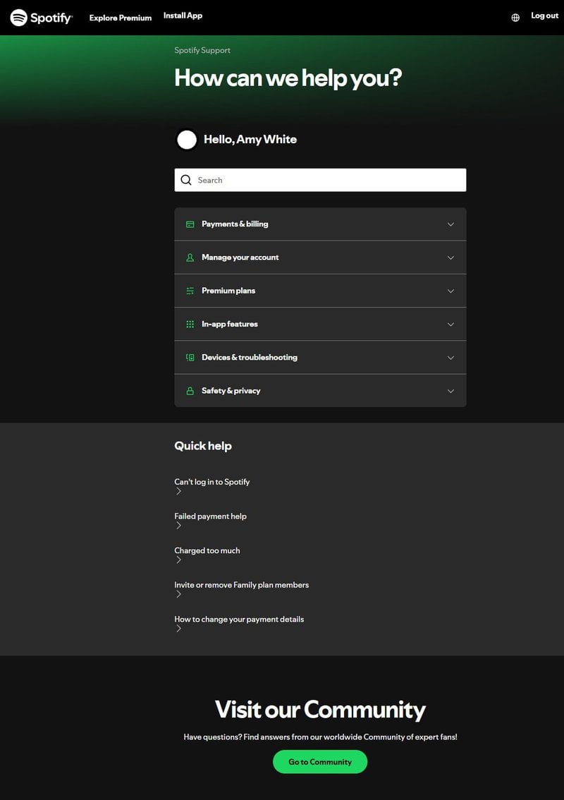
Topics are grouped into collapsible sections so users can expand only what they need without scrolling through everything at once. Below that, a “Quick help” list surfaces common problems (such as login issues or payment failures) so users can resolve frequent issues without even searching. There’s also a community forum button for users who prefer peer-to-peer support. That’s a useful layer for issues that first-party documentation doesn’t fully cover yet.
Tips:
- Personalize the experience: A simple greeting with the user’s name makes the support page feel less like a wall of text and more like a personalized actual interaction.
- Use collapsible categories: Collapsible sections keep the page scannable without burying any content or resources. Users expand what they need and ignore the rest.
- Offer community support: An active community forum handles the long-tail questions that even the most extensive documentation can never fully anticipate.
Help center #3: Loom
Loom keeps its in-app help intentionally minimal. There’s a simple widget with a few focused links: “What’s New,” “Ways to use Loom,” and a direct link to the full help center on their main website.
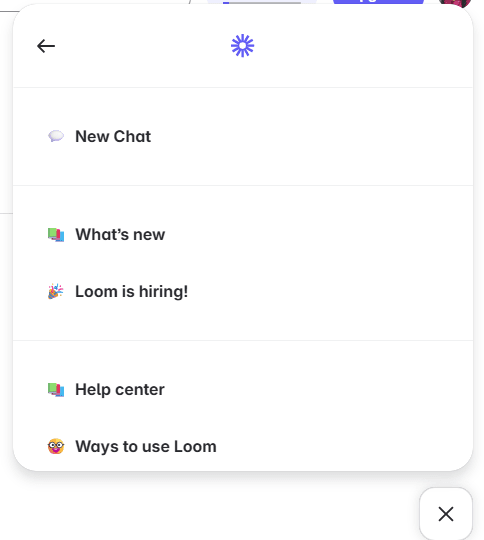
There’s also a clear “New Chat” option at the top to reach their AI-powered chatbot that gives answers right inside the app and points users to the exact pages they need, removing the round-trip to a separate support site for simpler questions. Using AI to improve the support experience works best when it’s embedded where the user already is in their self-serve journey.
Tips:
- Keep it lightweight: If the product is straightforward, a few targeted links may be all the help center needs. Adding more structure than the product requires creates unnecessary overhead.
- Highlight new updates: A “What’s New” link keeps users informed about improvements without requiring them to seek out release notes or changelogs separately.
- Consider an AI chatbot: An in-app chatbot that handles simpler questions and links to deeper resources helps users without sending them elsewhere.
Help center #4: Figma
The search bar is at the top with suggested search terms directly below it, so users can jump to common questions without having to formulate a query from scratch.
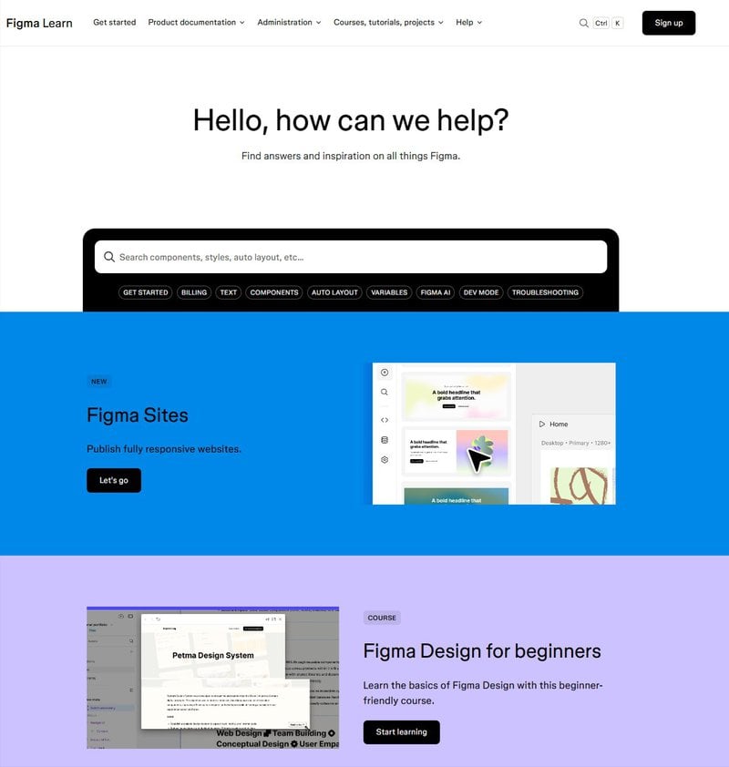
The color-coded blocks separating key sections (beginner guides, video tutorials, and product updates) make it easy to differentiate content at a glance. Icons and GIFs throughout the sections add context and keep the page from feeling like a plain directory. For visual learners, GIFs do more work than a static screenshot ever could. Figma also uses this page to promote its courses and community forums, giving users alternative learning paths beyond troubleshooting alone. What makes Figma’s design stand out is that it carries the product’s visual identity into the support experience.
The help center feels like an extension of the product rather than a separate utility, creating consistency across both touchpoints.
Tips:
- Use color to guide navigation: Color-coded blocks make sections easy to spot and reduce the cognitive effort of parsing a dense page.
- Add GIFs and microvideo tutorials: Visual media makes multi-step processes clearer than text descriptions alone and keeps users engaged on the support page.
- Offer learning paths beyond troubleshooting: Linking to courses and forums gives users a way to dive deeper into the product when they’re not just trying to fix a problem.
Help center #5: Whatagraph
Whatagraph’s help center is organized into task-based categories (Connect, Organize, Visualize, and Share) that follow the same sequence a user would naturally move through when using the product.
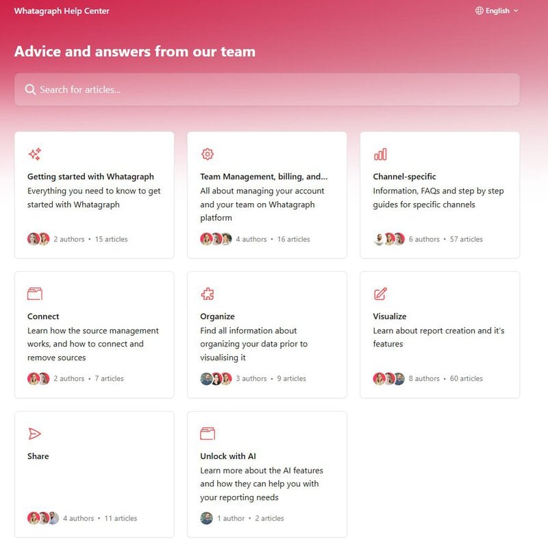
That makes it easy to find relevant guidance at each stage without knowing in advance where to look. Each section also shows which team member wrote the articles because seeing a real name next to support content builds user trust in a way that anonymous documentation can’t. There’s even a dedicated “Unlock with AI” section that guides users toward newer AI-powered features so they don’t get buried under standard topics or FAQs.
Tips:
- Organize by user workflow: Matching categories to the steps users take inside the product removes a layer of interpretation.
- Highlight the people behind the help: Author names and photos make support content feel more credible, personal, and trustworthy.
- Spotlight new capabilities: Dedicating a visible section to AI-powered or advanced features helps improve feature discovery amongst power users.
Help center #6: Coinbase
Coinbase’s help center opens with a personalized greeting and a prominent search bar.
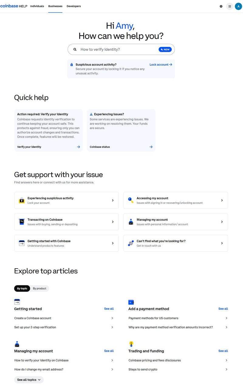
Right below that is a high-visibility banner for suspicious account activity, which lets users lock their account immediately if something looks wrong. For a finance platform, urgent security actions belong at the top where they’re immediately accessible, not buried below general content. The “Explore top articles” section lets users browse either by topic or by product. That dual structure makes a large content library navigable without overwhelming users. Some people think in terms of what they’re doing while others think in terms of which tool they’re using, so your help center needs to cater to both.
Tips:
- Put urgent actions first: Time-sensitive features like account locking should be immediately visible as distressed users might not find them otherwise.
- Use whitespace and a consistent color palette: A clean layout with a coherent color scheme keeps the page readable even when there’s a lot of content to cover.
- Offer multiple browsing paths: Some users search by task, others go by tool. Offering both paths on the same page covers each preference without forcing users to pick one.
Help center #7: Zendesk
Zendesk’s help center is minimal with neutral tones, generous white space, a simple search bar, and color-coded illustrations that make the page less sterile without cluttering it.
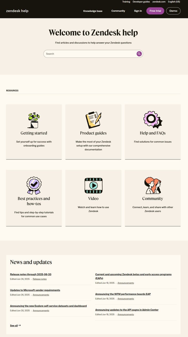
The content is split into two distinct categories with “Product documentation” for in-depth technical guidance and “Help and FAQs” for quick answers. Power users looking for configuration details and newer users looking for a fast answer shouldn’t have to navigate the same pile of content, so separating the two is the most logical approach. There’s also video content and community posts available as alternatives, catering to users who prefer watching over reading. Not all formats will work for every user, so offering multiple options reduces the number of people who give up on self-service entirely and open a support ticket or cancel their subscription.
Tips:
- Separate quick answers from detailed guides: A dedicated FAQ section alongside full product documentation serves both users in a hurry and those who need technical depth.
- Use icons to break up text: Illustrations next to each category add visual clarity and help users scan the page faster without reading every label (especially if they’re color-coded).
Help center #8: Google
Google’s support page is designed for speed. The search bar is fast, accurate, and stays visible at the top of every page no matter how deep into the help center a user navigates.
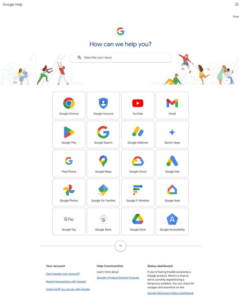
That matters more than most help centers seem to realize because a user who clicks three articles deep without finding an answer shouldn’t have to navigate back to the homepage to try a different query. Google’s help content is also grouped by product with recognizable icons in signature colors. This helps users find Gmail, YouTube, or Pixel support without having to search for their product. A small feedback widget at the bottom of every page invites users to flag confusing or missing content, turning the help center into an asset that improves over time based on in-app feedback instead of a static (or decaying) resource.
Tips:
- Keep search visible on every page: A sticky search bar across the entire help center means users are never more than one query away from trying again (whereas removing it mid-flow creates unnecessary friction).
- Offer a visible feedback option: A lightweight feedback widget on each support page signals that user input is welcome and gives the team a continuous stream of improvement data for documentation updates.
Help center #9: Wise
The search bar is the first thing visible on Wise’s support page, which is the right starting point since most (but not all) users are coming to help centers with a specific query already in mind.
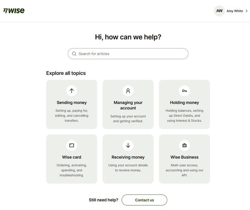
The page layout is simple, with six cards covering all help topics and straightforward labels like “Sending money” and “Wise card.” Each card has a short description underneath, so users know what they’ll find before clicking on it. Clicking on a topic opens a well-organized list of related articles rather than the full library, keeping users focused on what they actually need. A “Contact us” button at the bottom of each topic section is there if self-service doesn’t resolve the issue, so users can reach out to a support agent instead of giving up.
Tips:
- Limit top-level categories: Fewer categories will reduce decision fatigue. Users shouldn’t have to parse twelve options to find their desired topic.
- Use plain language for labels: “Sending money” is clearer to users than “outbound transfer initiation,” which means the same thing but adds friction.
Help center #10: Buffer
Buffer’s help center is fully in-app, which eliminates the tab-switching that occurs when users have to leave the product to find answers.
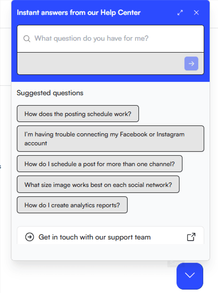
The entire structure consists of a search bar at the top, commonly asked questions below it, and a path to customer support if those don’t resolve the issue. The help widget uses button-style links for suggested questions, making it scannable and easy to tap on mobile. The in-app approach also enables contextual targeting, so the right help content appears based on where the user is in the product rather than requiring them to start from scratch on an external support site.
Tips:
- Keep help inside the product: Reducing tab-switching keeps users in context and less likely to abandon their halted workflows. In-app help also enables contextual targeting.
- Use button-style links for suggested questions: Pill-shaped buttons are easy to scan and tap, especially on mobile (which is crucial for cross-platform applications).
Help center #11: Dropbox
The search bar is prominent, with popular topics listed directly below it so users can get started without typing.
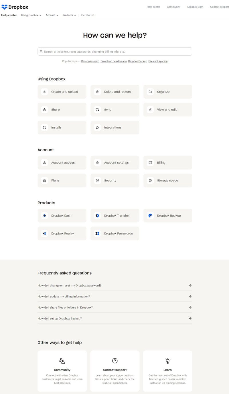
The page is visually plain (no illustrations or color), but the structure is clear. Articles are grouped under labeled, clickable categories that make the organization easy to follow. There’s also a FAQ section for quick access to common user problems without requiring users to navigate to full support articles. For common or simple questions, the FAQ format surfaces the answer without users having to read a full guide.
Tips:
- Surface popular topics before search: Listing top queries directly below the search bar preempts the most common questions and speeds up resolution for most users.
- Design with visual consistency: Uniform block styles and icons for each category create a sense of order, improving content scannability.
Help center #12: Square
Square’s search bar uses placeholder text that prompts users to search by question, keyword, or topic (a small detail that reduces hesitation for users unsure of how to frame their query).
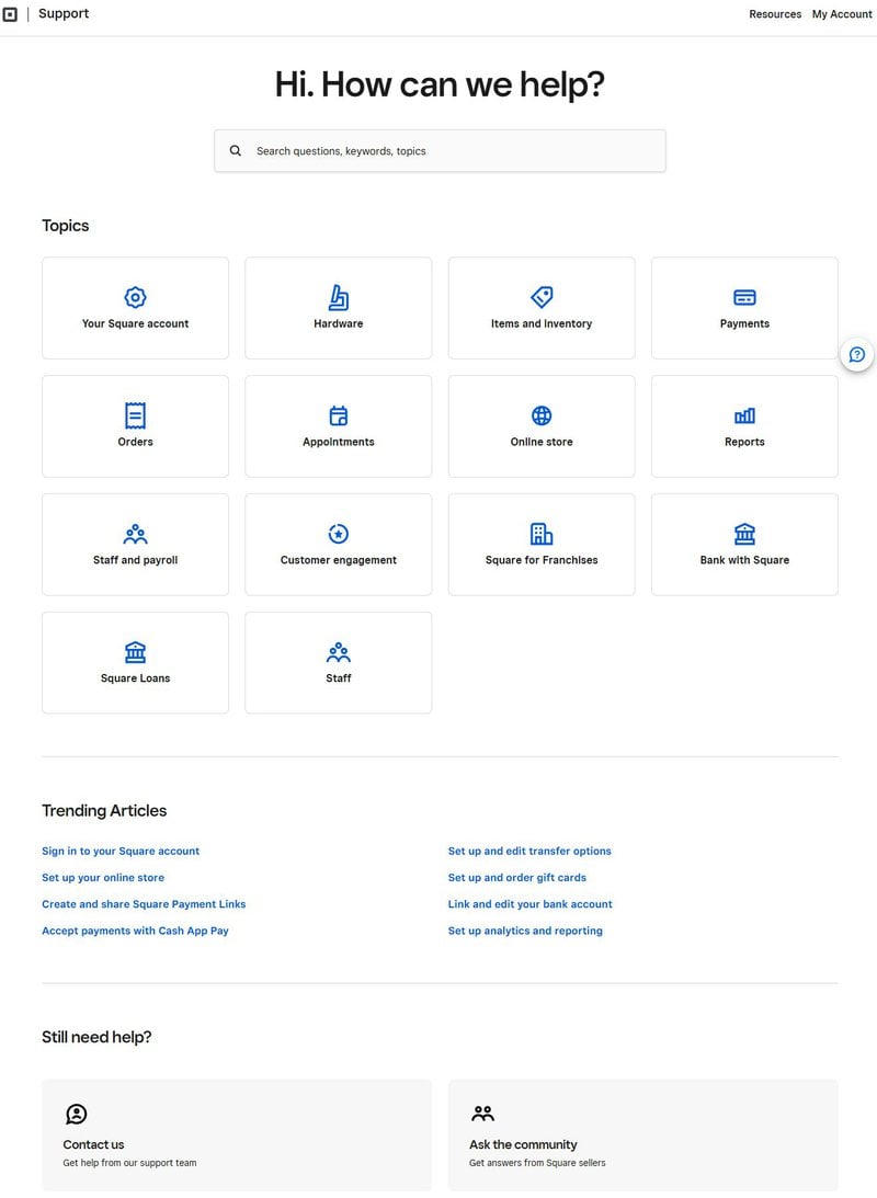
The “Trending Articles” section below it is the standout feature with hyperlinked phrases that let users jump straight to popular tasks without searching at all. At the bottom, Square offers both direct support and a community forum, catering to users who want to resolve an issue with a support agent and those who’d rather see what other users have done. Offering both covers the full spectrum of support preferences.
Tips:
- Highlight trending tasks: Links to popular articles mid-page let users solve common issues without searching. This is especially valuable for critical or urgent tasks that users need to solve immediately.
- Offer multiple alternatives: Access to support agents, community forums, and AI chatbots caters to users of all preferences.
Help center #13: Stripe
Stripe’s help center support page is dense with countless articles appearing in a single long list. This makes scanning harder than it needs to be.
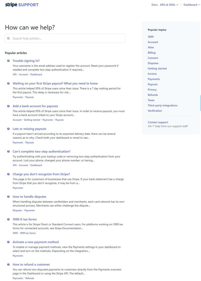
The search bar at the top and related article suggestions as you type help compensate for the layout. The “Popular topics” section on the right lets users browse by category rather than sifting through the full list. The real payoff with Stripe’s documentation is in their developer docs rather than the support page, where code-paired reference material sets a standard that most help centers haven’t reached.
Tips:
- Balance text with visual breaks: Headers, spacing, bolded keywords, and images all improve scannability. Dense text creates feature fatigue, with users giving up on finding the answer before they’ve actually looked.
- Have developer documentation: Building dedicated documentation for developer-facing resources (especially with code-paired references) helps cover the more technical topics FAQs can’t.
Help center #14: Shopify
Shopify’s help center organizes content around the Start, Sell, or Manage stages of using the product.
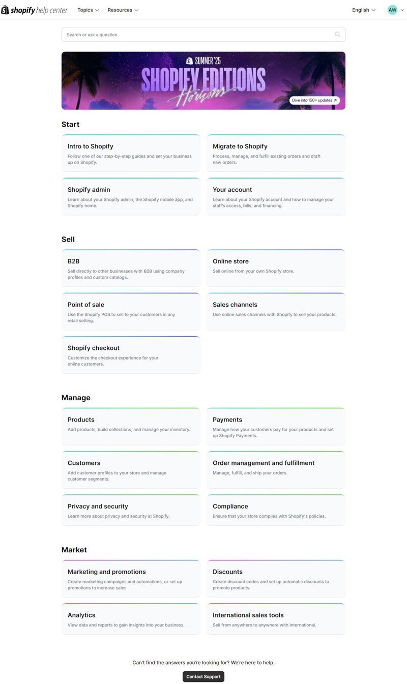
Users at different stages in the product lifecycle can navigate directly to what’s relevant to them rather than working through a general content library. The clickable cards within each section use light color-coding to break up visual monotony and make scanning easier. Shopify also uses user-focused language throughout. “View data and reports to gain insights” is easier to understand than “Access analytical dashboards for performance monitoring.” That distinction matters at scale because a help center with internal terminology creates friction for users who think in outcomes rather than features.
Tips:
- Use color to break up content: Soft borders or light hues create visual separation between sections without making the page feel too loud and cluttered.
- Stick to a consistent grid: Uniform tile sizes aligned in clean rows make it easier to take in a lot of content at once, reducing the cognitive load of navigating large help centers.
Help center #15: Userpilot
Our own help center at Userpilot follows the same best practices because we practice what we preach.
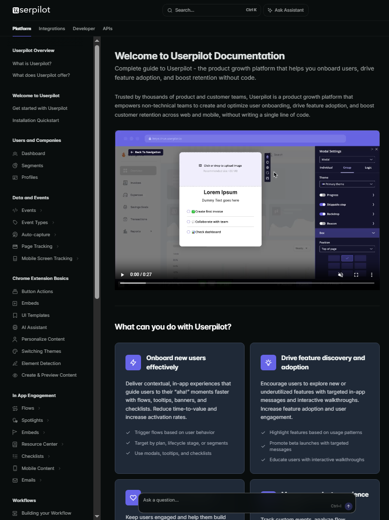
You’ll notice that we have the search bar at the top of the page with a keyboard shortcut (Ctrl + K) for users who are in a rush to start searching. Likewise, the chatbox at the bottom of the screen lets them ask our AI chatbot questions by typing directly or using the keyboard shortcut (CTRL + I) to begin using it. Lastly, we have a navbar on the left side to help users jump to specific categories and a use case matrix below our microvideo to remind customers why they chose Userpilot in the first place.
Tips:
- Utilize keyboard shortcuts: Shortcuts help users access different help center elements while requiring the fewest number of clicks (or none at all).
- Have a navigation bar: Navbars can highlight different categories or frequently-used resources to save users from having to search in the first place.
- Embed microvideos: Microvideos can serve as a good starting point for showing users how to use your help center in a very concise, approachable way.
5 Help center design best practices for the AI era
The 15 examples above show what good design looks like in practice. What follows is the framework behind those decisions and how the shift toward AI-assisted support changes the standard for each one.
1. Make search persistent and visible across every page
A search bar that disappears once a user navigates to a help article forces them back to the homepage to try another query. That breaks the self-service loop when a user is already partway through finding an answer but needs to refine the question. Search bars should be sticky across the entire help center, not just the landing page. The Slack example above showed the problem in practice, while Google’s implementation revealed the solution by pinning its search bar to the top of every page. Sticky search bars ensure users are never more than one query away from trying a different approach.
That single design decision removes a category of friction that compounds across every support interaction.
In the AI era, this matters for another reason. The search input is what triggers AI answers that give users a direct answer rather than a set of links. Pre-populated search suggestions reduce the barrier for users who aren’t sure how to phrase their question, improving the quality of both the queries the AI receives and the answers it returns. A well-designed search bar is no longer just a navigation UX consideration but also the front door to AI support functionality.
2. Organize by user workflow, not product architecture
Most help centers are organized the way the product team thinks about the product, not the way users think about what they’re trying to accomplish. That creates a mismatch that adds friction every time a user needs support. Users shouldn’t have to translate their goal into the product’s internal vocabulary before they can even start searching. Whatagraph’s “Connect, Organize, Visualize” categories, Shopify’s “Start, Sell, Manage” stages, and Wise’s plain-language category cards all organize around the user’s task rather than the product’s architecture.
Users don’t need to know what the product calls a feature to find help for it, as long as they can recognize their own goal in the navigation. That recognition is faster and more reliable than adding a translation step in between.
This also matters for AI retrieval because a help center organized by workflow produces articles with task-oriented headings that are easier for an AI to match against a user’s question. “How do I connect my data source?” maps cleanly to an article under “Connect.” In contrast, “How do I access data integrations?” requires the AI to infer relationships between what users ask and how content is structured (especially if many articles contain the word integration in their heading). Content architecture and AI retrieval quality go hand in hand, with shortcomings in one affecting the other.
3. Write your help content so an AI can answer from it
Most help center articles were written to be read linearly by a human who landed on the page after a search. That writing style tends to include long preambles, cross-references to other articles, and pronoun-heavy paragraphs where the antecedents are several sentences back. It’s that exact style that causes AI assistants to return vague or inaccurate answers, because the AI can’t reliably extract a clear answer from content built for sequential human reading.
The help centers whose AI layers work well share a different writing standard. Each article answers one question completely without requiring the reader to consult another article for context first. Headings are phrased as the question being answered rather than as a category label, allowing an AI to match a user’s phrasing directly to the right article. A useful test is to ask yourself whether the first two sentences of an article can serve as a standalone answer to the question in the heading. If not, the article needs a rewrite before an AI layer can go on top of it.
According to Mintlify’s State of Agent Traffic report, AI agents account for roughly 45% of documentation traffic across the sites they track. This means a help center whose content isn’t structured for AI retrieval is quietly underperforming for nearly half its audience.
4. Surface an AI answer layer above the article results
When a user types a question into the search bar, help centers should provide a direct answer extracted from documentation (with source articles linked below for users who want to verify or learn more). This is what users now expect from search. A help center that returns a list of links in response to a specific question fails to meet that expectation and creates unnecessary friction. The implementation doesn’t even require building a custom AI product from scratch.
Userpilot’s resource center surfaces an AI search layer that takes a user’s question phrased in their own words and returns a direct in-app answer, without the user ever leaving their workflow.
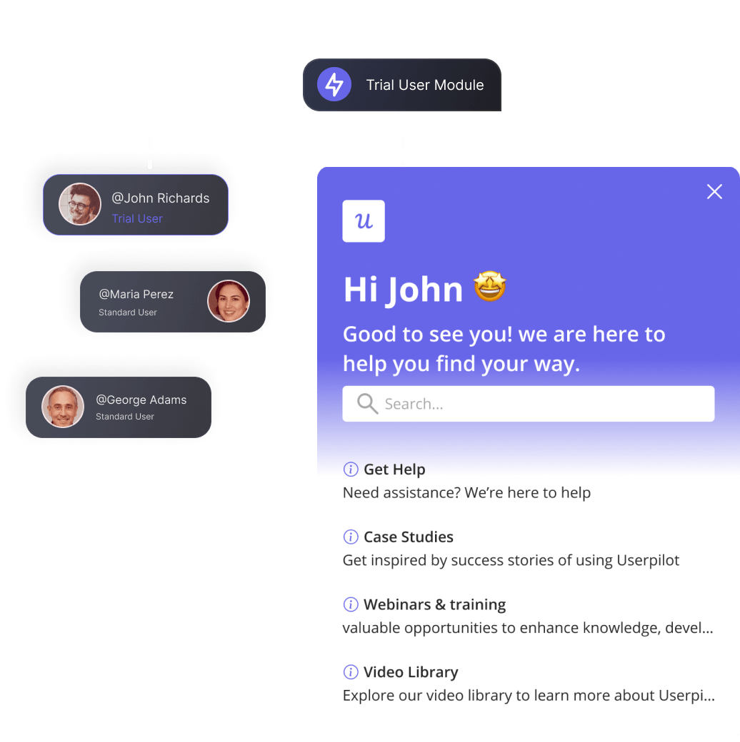
I’ve tracked which categories of support ticket get quieter when we make specific changes to the resource center. Adding guidance for reporting and segmentation has noticeably reduced follow-up in both categories. The content was already there, but surfacing it at the right moment was the design change that mattered. For teams trying to reduce support ticket volume, implementing AI answers is one of the highest-impact levers you can pull.
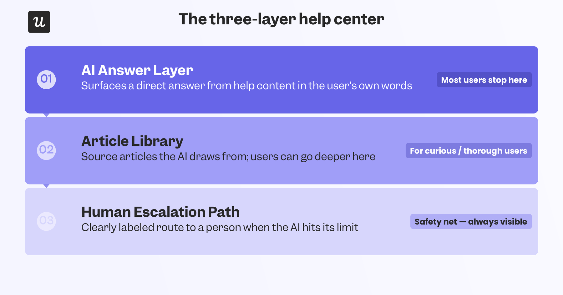
5. Design a clean handoff to human support when the AI hits its limit
An AI answer layer that fails to answer questions accurately will create more frustration than not having AI-powered answers at all. Users who reach the AI layer may have already tried the article list and didn’t find what they needed. If the AI also fails them and there’s no clear path to a human, then they’ve gone through two rounds of self-service without resolution. The escalation path must be intentional, visible, clearly labeled, and promptly triggered after the AI has attempted to answer.
The best implementations also pass context from the AI interaction to the human agent so users don’t have to repeat themselves. The AI conversation history, article trail, and product context the user was working in should all be transferred to the human who picks up the conversation to speed up the handover. Without that context, the escalation path adds steps rather than removing them. Slack, Buffer, Wise, and Square all handle the escalation path reasonably well by making the path to a human visible at the right moment rather than something users have to go looking for.
Put simply, AI answers and human agents are one system. Trying to design them independently creates a disjointed experience that makes users feel like the AI is a blocker rather than a helper.
The architectural shift worth making before the next product update
The help centers that will stand the test of time are those that have the architectural shift from a library organized for human browsing to a knowledge source engineered to power AI-generated answers (with a human escalation path readily available). That shift shows up in article structure, navigation design, and search results pages. The 15 examples above show the range of what this looks like in practice, from Stripe’s dense developer documentation to Buffer’s lightweight in-app widget.
No help center gets everything right, but each example demonstrates at least one design decision worth examining before making changes to your help center. If you’re building (or rebuilding) a help center, Userpilot’s in-app resource center lets you segment help content by user cohort or lifecycle stage, layer AI answers on top of it, and keep the entire experience inside the product without asking users to visit a separate support site. Book a demo to see how that all comes together to create a robust self-service infrastructure!
About the author