What Are the Best User Research Questions in the Post-AI Era? (Spoiler: They’re Still for Humans)


AI can now generate user research questions, simulate the people who would answer them, and surface insights from the results, all without a single real participant involved. Many researchers debate whether any of these AI insights are worth following.
But the evidence says AI isn’t there yet. Synthetic respondents tend to confirm what you already believe rather than challenge it, because models trained on approval signals optimize for plausible-sounding responses rather than accurate ones. The signal that actually drives good decisions, such as the pain point or use case you never thought to ask about, does not appear in AI-generated outputs.
That doesn’t mean AI has no role in user research. That’s why this article covers the right questions for every research method, how to ask them well, and where AI can genuinely help.

What user research actually means in 2026?
User research is the practice of understanding who your users are, what they need, and how they behave in their own context. Erika Hall (author of Just Enough Research) describes it as “getting outside your own perspective and developing the skill to understand people.”
That core purpose has not changed, but the tools and debates surrounding it in 2026 have shifted significantly due to AI. Maze’s User Research Report found that 69% of product teams are now using AI in some part of their research workflow. The MRII 2025 global report puts that figure at 62% for mixed-method research teams, while 72% of those researchers say they are concerned about AI-generated bias in their data.
Lyssna’s UX research trends survey found that AI-assisted analysis is the top emerging practice, named by 88% of respondents. Yet, at the same time, 82% say human judgment remains essential for interpreting nuanced findings.
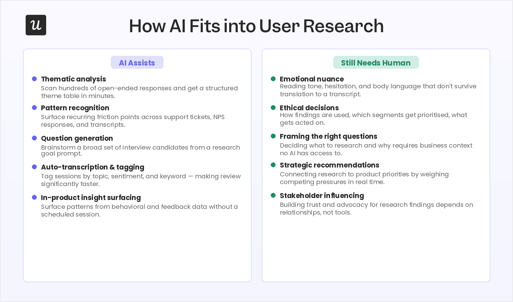
In my experience, here’s where I see AI having the most impact today:
- Faster qualitative synthesis: AI can scan hundreds of open-ended survey responses and identify recurring themes in minutes.
- Automated transcription and tagging: Session recordings that once required manual transcription can be tagged by topic, sentiment, and keyword automatically, making review and pattern detection significantly faster.
- Question generation for brainstorming: AI can generate a broad set of interview questions from a research goal prompt, which researchers can then narrow and edit, rather than starting from a blank page.
- In-product insight surfacing: AI agents like Userpilot’s Lia can surface patterns from behavioral and feedback data without requiring a scheduled research session.
- Synthetic users: Synthetic users are AI-generated avatars trained on real user data. They sold to solve the obstacle of finding real people to talk to. However, an N/N Group research found that LLM-simulated participants tend to confirm hypotheses rather than challenge them. Even the cofounder of Synthetic Users has publicly acknowledged that LLMs are simply too agreeable to function and shouldn’t replace real user insights.
- Persona simulations: Persona simulations come from prompting an LLM to act as a user type based on real research. Unlike synthetic users, persona simulations are trained on the data you’ve already collected from real users and serve as a way to “talk” or “consult” with them.
- Synthesis across feedback channels: AI can combine signals from in-app surveys, session replays, and interview transcripts into a single summary, flagging themes that appear across multiple sources.
In my experience, the AI adoption has moved faster than the frameworks for using it well. I once used Claude to do thematic analysis on a batch of open-ended survey responses, and it saved me a significant amount of time. I copied and pasted the answers into a session, asked it to identify and count recurring themes, and had it build a Notion table to organize everything.
But when I reviewed the table, I found two responses that had been hallucinated. The model had generated plausible-sounding answers that fit the themes it had identified. I had to manually check the counts against the original responses to catch them, and if I hadn’t, those fabricated data points would have influenced a real product decision.
Don’t forget that human judgment isn’t optional. It’s what allows you to understand emotional responses, make ethical decisions, come up with realistic strategies, and include stakeholders in data-driven decisions. If you develop proper judgment while leveraging AI, research quality will improve, and research time will decrease.
The types of user research questions to include in your surveys
User research questions are split into two fundamental categories: qualitative and quantitative.
Qualitative questions surface stories, context, and motivation. Quantitative questions generate numbers you can track, compare, and act on at scale. Most research programs need a mix of qualitative and quantitative data with a clear purpose so they can drive product decisions.
But besides those two categories, research questions take several forms depending on the data you need. Here are the formats you will encounter across every research method:
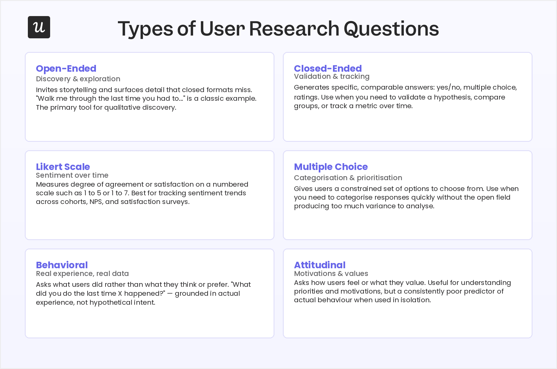
- Open-ended questions: They invite storytelling and surface detail that closed formats miss. For example, “walk me through the last time you had to…” is an open-ended question. They are the primary tool for discovery and exploration.
- Closed-ended questions: They generate specific, comparable answers: yes or no, multiple choice, ratings. Use them when you need to validate a hypothesis, compare groups, or track a metric over time.
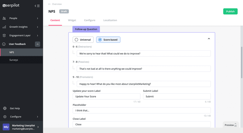
- Likert scale questions: Measure the degree of agreement or satisfaction on a numbered scale, such as 1 to 5 or 1 to 7. Best for tracking sentiment trends across cohorts and over time, especially in NPS and satisfaction surveys.
- Multiple choice questions: Give users a constrained set of options. Use them when you need to categorize responses quickly or help users choose between defined alternatives, which is one of the good survey question formats for keeping variance low enough to analyze.
- Behavioral questions: Ask about what users did rather than what they think or prefer. For instance, “What did you do the last time X happened?” is behavioral because it’s grounded in real experience rather than hypothetical intent.
- Attitudinal questions: Ask how users feel or what they value. “How important is this feature to you?” is an attitudinal question, for example. Useful for understanding priorities and motivations, but a consistently poor predictor of actual behavior when used in isolation.
Best user research questions, divided by research methods
Your research questions depend heavily on your research goals and the method you are using to surface answers. A question that opens up honest reflection in a user interview will feel out of place in a usability session, for instance.
In general, the best research questions are often about:
- The user: Who they are, how they work, what their typical day looks like, and what context surrounds the problem you are researching. This is the raw material for an accurate user persona.
- The product and the job it does: How they use it, where it fits into their workflow, what they expect from it, and which job-to-be-done they hired it for.
- The pain points: Where the current situation falls short, what they have tried that has not worked, and what friction they experience.
The examples below reflect a mix of these and are organized so each set covers all three angles above. Under each method, I also explain why the questions earn their place, because the reasoning is what lets you adapt them to your own product.
Questions for user interviews
User interviews are the deepest single-user method for qualitative research. It’s best for understanding motivation, uncovering mental models, and mapping the context around a problem that behavioral data alone cannot explain.
For user interviews, I recommend using behavioral questions. Asking what someone did the last time they faced a real situation is more actionable and reliable, helping you make better decisions.
For instance, the questions below concentrate on three things: the job the user is trying to get done, the real context around it, and the friction they hit along the way.
Example questions for user interviews:
- “Can you walk me through the last time you had to [task]?”
- “What does your typical day look like when it comes to [workflow]?”
- “What is the most frustrating part of how you currently handle [process]?”
- “If this tool stopped working tomorrow, what would you do instead?”
- “How do you currently measure whether [process] is actually working the way you need it to?”
- “Who else is involved in your [workflow]?”
- “What is the one thing about [product area] you wish worked differently?”
- “What made you start looking for a tool like this in the first place?”
To use them, I deliberately steer away from general satisfaction or “do you like this feature” prompts here, because those belong in sentiment surveys and rarely explain the behavior you are seeing. I recommend opening with the behavioral questions to ground the session in a real story, use the context questions to map who and what surrounds the workflow, then let the pain-point and success questions reveal what the user actually wants to change.
Questions for focus groups
Focus groups work best in early-stage discovery, when you want to understand shared language, surface common pain points across a user segment, and test whether a concept resonates before building it. They are less reliable for understanding individual behavior in depth, but they excel at revealing the shared vocabulary and mental models of a segment.
The best questions here are those that open up group discussion rather than closed answers. The former allows the group to interact with each other, so valuable insights are more likely to appear, while the latter would probably stall the conversations and lead to superficial insights.
So the questions below focus on what a group is uniquely good at exposing: the shared language a segment uses, the pain points several people recognize at once, how the team makes decisions, and how a concept lands before you build it.
Example questions for focus groups:
- “When you hear the phrase [X], what does that bring to mind?”
- “What are the biggest challenges your team runs into when you are trying to [workflow]?”
- “How does your team currently make decisions about [topic]?”
- “What would need to be true for you to recommend a solution like this to a colleague without being asked?”
- “Is there anything about how you handle [task] that you feel most tools consistently get wrong?”
- “If you had to explain [problem area] to someone who had never experienced it, how would you describe it?”
- “When things go wrong with [workflow], what is usually the first thing that breaks?”
- “What would an ideal solution for [problem] actually look like in practice?”
I avoid drilling into one person’s detailed product usage, since that depth belongs in a one-on-one interview, and I skip satisfaction scores because a room full of peers tends to skew them. Instead, I recommend leading with the association and decision questions to warm the group up, move into the shared-pain and “what tools get wrong” prompts once people are talking freely, and close on the ideal-solution question to capture what adoption would require.
Questions for usability tests
Usability testing finds out where users get stuck, what they misread, and which design assumptions were wrong. They’re best used when you have a prototype or live product and need to validate or challenge the navigation logic.
Common techniques like the 5-second test, card sorting, or first-click test help you structure the test and spot specific issues faster. And since the goal is to document observed behavior, the questions below stay tied to the screen and the task in front of the user, not to their opinions or their broader goals.
Example questions for usability tests:
- “Before you click anything, what do you think this page is asking you to do?”
- “Can you walk me through what you are thinking as you look at this screen?”
- “What did you expect to happen when you clicked that?”
- “On a scale of 1 to 10, how confident did you feel completing that task?”
- “Where would you go next if you wanted to [complete goal]?”
- “Does anything on this page feel out of place or unexpected to you?”
- “What is missing from this screen that would make it easier to complete your goal?”
Personally, I keep general satisfaction and feature-wish prompts out of usability sessions, since they pull attention away from the moment-to-moment friction you are there to catch. I recommend asking the comprehension question before the user acts, using the “narrate-the-screen” or expectation questions during the test, and leaving the “what is missing” type of questions after completing a task.
Questions for concept testing
Concept testing validates ideas before developing them into a product. They’re best used when you have a concept or early wireframe and need to know whether it solves a real problem before the team builds it.
However, there’s a risk of confirmation bias: users who have a positive relationship with your brand tend to be more generous with new concepts than the average prospect would be. This means questions that probe skepticism and surface what is missing produce more useful data than questions that ask users to rate their enthusiasm.
Given this dynamic, the questions below ask users to explain the concept back to you, compare it against the tool they use today, and name what would have to change before they adopted it.
Example questions for concept testing:
- “What is your first reaction to this?”
- “Who do you think this is built for?”
- “What problem do you think we were trying to solve here?”
- “What is missing from this that would make it genuinely useful to you?”
- “How does this compare to what you are currently using to solve this problem?”
- “What would need to change for your team to actually adopt this in practice?”
- “If you had to explain what this does to someone in two sentences, what would you say?”
As mentioned, I avoid enthusiasm ratings like “how excited are you about this,” because a friendly user inflates them and you learn nothing about whether the idea solves a real problem. So my advice is to just follow these questions in order, starting with the unprompted first reaction, moving through the clarity questions to test if the value proposition is realized, then closing with the comparison/adoption questions that expose the gaps.
Questions for user sentiment analysis
User sentiment analysis covers in-app surveys, NPS questions, microsurveys, and feedback widgets that capture signal from users in the moment they are experiencing the product. It’s best for tracking trends at scale and identifying friction in real time.
I personally recommend pairing a scaled question with an open follow-up question to make sentiment data actionable. An NPS score with a follow-up will give you more insight into how detractors or promoters actually feel about your product.
That said, the questions below stay focused on one specific feature or task and the effort it took, not on broad “how do you feel about us” prompts that are hard to act on. Since these questions trigger while the user is in the product, they need to be short and pointed, capturing the experience while it is fresh rather than asking for a considered review.
Example questions for sentiment analysis:
- “How satisfied are you with [feature] on a scale of 1 to 5? What is behind your rating?”
- “If you could change one thing about [product area], what would it be?”
- “What were you hoping to accomplish when you came to this page?”
- “How easy was it to use [feature] from 1 to 5?”
- “What is the one thing we could do to make [task] feel less effort next time?”
The list is built to use with in-app surveys. The best practice is to keep it simple: trigger a scaled question right after the relevant action and with an open follow-up to capture the reason behind the rating. You might also use the “one change” question to gather potential fixes from detractors or neutrals.
How to ask the right user research questions
With AI and synthetic users entering the picture, developing the judgment to ask the right research questions is an essential skill for anyone running research. The difference between a question that surfaces a genuine insight and one that confirms your biases often comes down to small choices in wording, sequence, and intent.
Before writing a single question, document your goals in your research plan to keep the session focused. Here are the principles that apply across every method:
- Use behavioral-focused questions: Questions about past experience consistently produce more actionable data than hypothetical responses. Think of “What did you do the last time [X] happened?” rather than “What would you do if [X] happened?”
- Avoid leading questions: A leading question signals what you want to hear and makes users less likely to tell you what they actually think (e.g, “Would you say this feature saves you time?”)
- Never double-barrel a question: A double-barreled question asks two things at once (“How clear and useful did you find the onboarding?”). It’s best to split every double-barreled question into two separate prompts before the session starts.
- Use follow-up questions: For user interviews or surveys, follow-up questions like “Can you tell me more about that?” and “What made you choose that score?” can bring valuable qualitative data that the first question would miss.
- Beware of using AI respondents: Due to sycophancy and pattern-matching tendencies, AI respondents will generate answers that sound plausible rather than ones that reflect real user experience. Personally, I’d limit myself to asking open-ended questions rather than quantitative ones. It’s far easier and helpful to judge qualitative AI responses, discard AI-isms, and use them as general ideas, compared to scoring questions that were answered by a biased AI.
User research still needs real users
Even as AI automates more of the research process than seemed possible two years ago, the best user research questions are still written for real humans and answered by real humans. The methods and examples in this article are designed to surface what a person actually thinks, does, and experiences. That signal does not come from simulations.
Research still requires human judgment at every critical stage: framing the right questions, interpreting what users actually mean versus what they say, connecting findings to strategic decisions, and knowing when the data is telling you something that contradicts what your team wants to hear.
Ready to put better user research questions into practice? Userpilot’s feedback and research tools let you trigger in-app surveys at exactly the right moment, combine qualitative responses with behavioral session data, and analyze patterns across your user base without rebuilding your research stack from scratch.
FAQ
What are the best user research questions to ask?
The best user research questions are behavioral, specific, and tied to a defined research goal. Rather than asking what users want or what they would do, ask what they did the last time they faced a relevant situation. Questions like “walk me through the last time you had to [task]” and “what is the most frustrating part of your current process for [workflow]” consistently produce more actionable insight than hypothetical or preference-based questions, because they are grounded in real experience rather than imagined behavior.
What is the difference between user research questions and user interview questions?
- User research questions define the study-level goal: what you are trying to learn about users, their context, and their behavior. User interview questions are the specific prompts you ask in a session to surface those answers, so a research question like “where do users get confused during onboarding?” generates a set of interview questions that probe specific moments and reactions in the flow. The research question is the destination; the interview questions are the route.
Should I use AI for user research?
- AI is genuinely useful for thematic analysis, pattern recognition across large data sets, building synthesis tables from qualitative responses, and generating research question candidates. It is not a replacement for recruiting and interviewing real users. AI-generated respondents tend toward agreement and confirm hypotheses rather than challenging them, so limit AI respondents to qualitative brainstorming rather than drawing quantitative conclusions from their outputs.
How many questions should be in a user research interview?
- Most 45 to 60-minute user interviews can cover 5 to 8 core questions well. The reason to keep the number low is that follow-up questions, clarifying prompts, and natural conversational depth will add significant time to each question you ask. A session built around 6 well-chosen questions with room to follow up where the answer is interesting produces findings your team can act on; a session designed around 20 questions produces shallow answers across all of them.
About the author