Navigation UX: Pattern Types and Tips to Enhance User Experience


Great part of my team’s job is to ensure users can go from point A to point B without friction. And at this point, I’m confident that navigation UX is the most essential aspect of a product’s design.
No matter how advanced and powerful your product is, terrible navigation prevents users from experiencing its potential, diminishing its value for users.
So for this article, I want to share basic knowledge on product navigation. I’ll define what navigation UX is, explore the different types/patterns in UX, and give some tips for improving product engagement.
Navigation UX TL;DR
- Navigation UX is the design that guides users intuitively through a product’s interface to achieve their goals.
- Effective navigation design improves user efficiency and satisfaction as it offers quick access, enhances engagement, boosts conversions, reduces learning curves, and supports scalability.
- There are three different approaches for designing your navigation UX:
- Object-oriented navigation: Treats each product feature as an independent unit, allowing free navigation, and is effective for apps requiring exploration or creativity.
- Task-oriented navigation: Structures UX around specific user tasks, ideal for apps focused on specific functions. It requires organizing features according to common tasks and understanding users’ workflows through research.
- Workflow-based navigation: Creates a linear path for users to complete tasks or processes, suitable for applications with standardized processes.
- That said, let’s go over 7 UX patterns you can use to improve navigation:
- Tooltip pattern: Offers just-in-time learning with short messages, acting as micro-tutorials for complex features without disrupting workflow.
- Spotlight pattern: Highlights parts of the UI to focus user attention, used during onboarding or feature introduction.
- Breadcrumbs: Provides a navigational trail for users to follow back, useful in complex navigational interfaces.
- Hamburger menu design pattern: A space-saving tool that hides the navigation menu, making it ideal for mobile devices or applications with limited space.
- Customization menu items: Allows users to tailor navigation to their workflow, enhancing efficiency and satisfaction.
- Progressive disclosure navigation menus: Shows essential elements upfront, revealing more information as needed to maintain a clean interface and reduce cognitive load.
- Vertical navigation menus: Utilizes vertical space for navigation, scalable and accommodating many items.
- Additionally, let’s explore four tips to improve navigation UX:
- Improve navigation pattern visibility: Design navigation to be easily discoverable and accessible using contrasting colors, larger sizes, and clear icons placed in familiar locations.
- Write clear UX copy: Ensure navigation labels are clear and descriptive, avoiding jargon and possibly including tooltips for further clarification.
- Add location indicators: Use breadcrumbs, highlight the current menu item, or add interactive walkthroughs to help users know their location within the app, enhancing navigational efficiency and satisfaction.
- Use unique visual design for site hierarchy: Indicate site hierarchy with different visual designs such as font sizes, styles, or icons to distinguish between primary and secondary levels—improving intuitive navigation.
- If you want to revamp the UX design of your app without coding, why not book a Userpilot demo to see how you can implement in-app tooltips, spotlights, checklists, and more?

What is navigation UX?
Navigation UX is a branch of user experience design that guides users through a product’s interface. It involves the creation of intuitive paths for users to achieve their goals, encompassing the layout of navigation elements (such as the user interface), the interaction between them, and the overall flow from one section to another.
Why is navigation design important?
An effective navigation design improves user efficiency and leads to better user satisfaction.
This is because a well-crafted navigation system acts as a silent guide, enabling users to achieve their tasks with minimal friction and enhancing their overall journey within the application.
Moreover, there are multiple benefits to designing a smooth navigation system:
- Facilitates quick access: Enables users to find the necessary features and information quickly.
- Enhances user engagement: Intuitive navigation keeps users on the platform longer by reducing frustration and the learning curve.
- Improves conversion rates: Provides a clear path to take a desired action, increasing the likelihood of conversions.
- Supports scalability: Good navigation allows adding new features and content without overwhelming the user.
What are the most common approaches to designing navigation UX?
Before designing your product’s navigation experience, you should have a clear idea of the design method you’re going to follow.
Here are three of the most relevant ways:
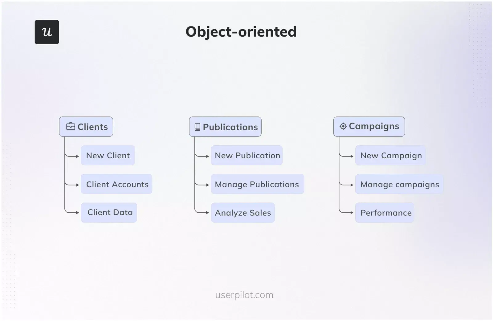
Object-oriented
Object-oriented navigation treats each feature of your product as an independent unit.
This model replaces traditional hierarchy and a dedicated page for a freer structure where users can navigate freely between functionalities (think of navigating between apps on a smartphone or website mega menus).
It’s particularly effective for apps that require a high degree of user exploration to succeed or for platforms where users are required to be creative (e.g., whiteboarding tools, etc.).
To implement it successfully, each object or feature should be self-contained, allowing users to engage with it independently of others.
You can use visual cues like varying shapes, colors, or animations to help differentiate between objects, making the navigation experience intuitive and direct.
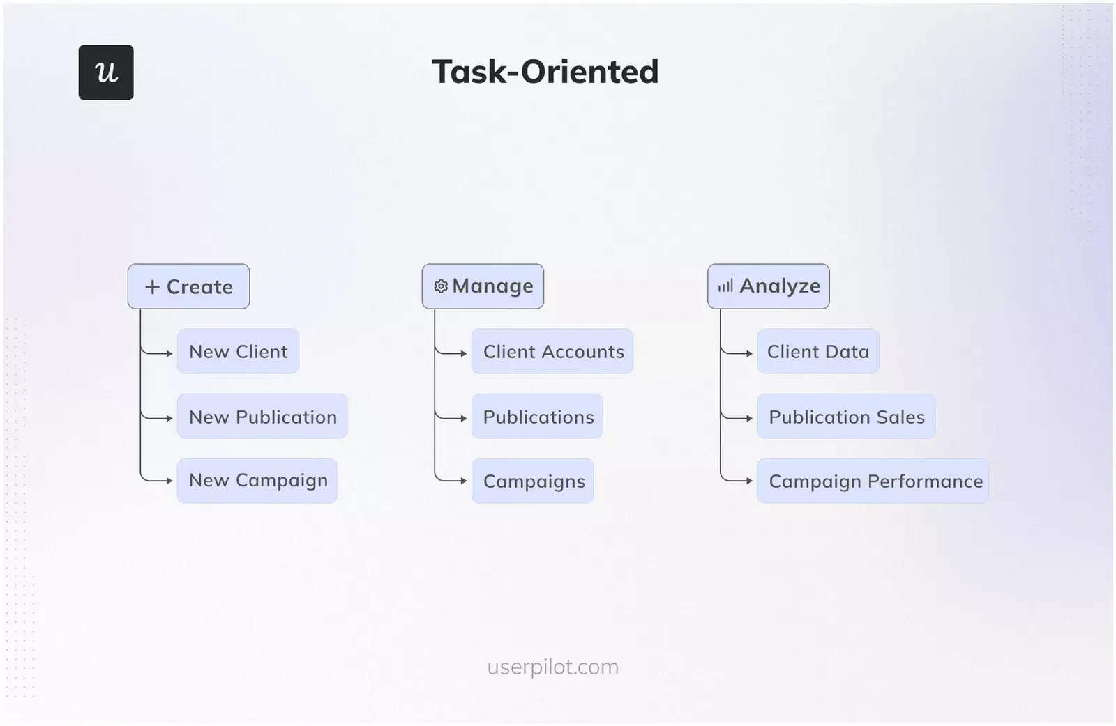
Task-oriented
Task-oriented navigation structures the UX around the specific tasks that users need to accomplish. It works best with apps designed for completing specific tasks (like booking systems, payroll platforms, ecommerce sites, or project management tools).
In practice, this means grouping features and tools according to common tasks within the product’s interface. For example, in a project management tool, task-oriented navigation would cluster features for task assignment, progress tracking, and communication under one navigational element labeled “Project Coordination.”
For this, you need to get an in-depth understanding of the users’ workflows through user research and task analysis.
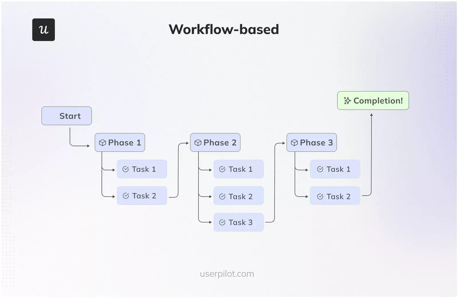
Workflow-based
Workflow-based navigation creates a linear, predetermined path that users follow to complete a sequence of tasks or processes.
This is particularly effective for apps where the process is standardized or where there is a strong benefit to guiding users through a particular sequence of steps (such as in set-up wizards, form submissions, or learning modules).
To implement it, it’s necessary to map out the user journey meticulously from beginning to end. Then, the user interface should be engineered to guide users from one step to the next.
This can be done by, for example, de-emphasizing or hiding non-essential features that are not part of the immediate workflow. Or, by using a clear visual indicator such as progress bars or numbered steps so users know where they are within the process.
What are the common types of navigation patterns?
Now, let’s go over 7 navigation patterns that can help you guide users into performing the desired actions and lead them to success:
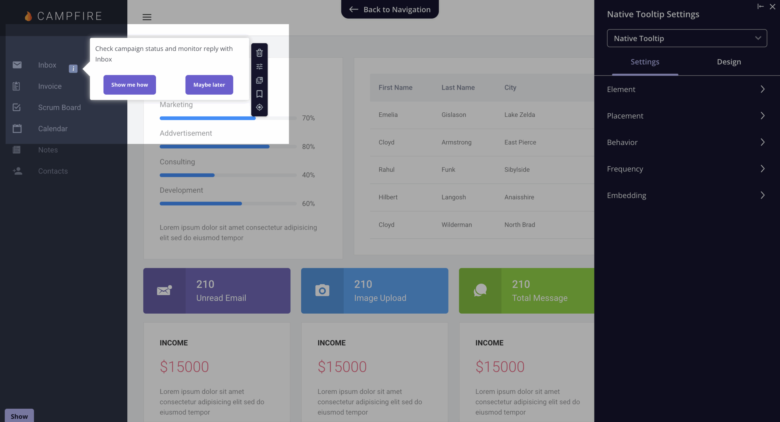
Tooltip pattern
The tooltip pattern is a small in-app tab with short messages in it. They act as micro-tutorials that guide users through tasks without breaking the flow of their work.
However, to avoid annoying users, tooltips should be short, easy to dismiss, and provide relevant information to the current task (such as when a user hovers over a new feature or when a user pauses, indicating possible confusion).
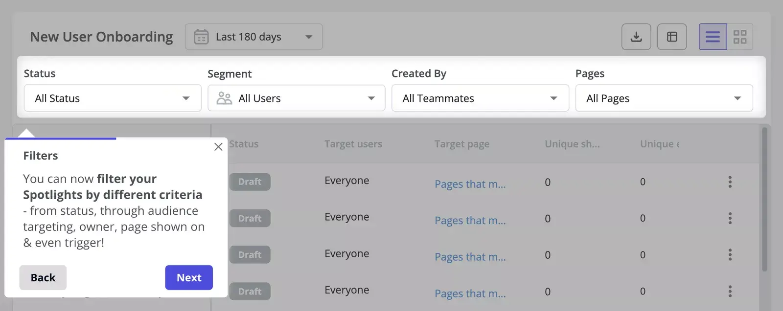
Spotlight pattern
The spotlight pattern highlights specific parts of the UI to concentrate the user’s attention and is normally added along with tooltips.
Therefore, it is ideal to use it when you need users to focus on one thing, such as during onboarding sequences or when highlighting newly released features.
To implement them, you can use a product management tool like Userpilot that allows you to add said effect to your in-app sequences.
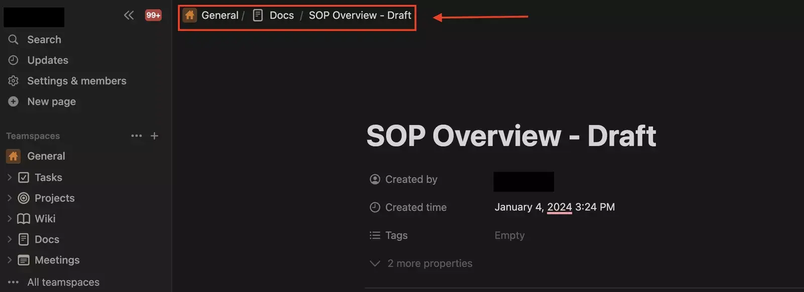
Breadcrumbs
Breadcrumbs provide a trail for the user to follow back to their starting point and are especially useful in websites or apps with multiple levels of navigation and content.
In SaaS, breadcrumbs can prevent the feeling of being lost in complex interfaces by clearly showing the user’s current location relative to the hierarchy of the application.
To implement breadcrumbs effectively, they should be consistent and integrated into the interface without overloading it. Plus, each step in the breadcrumb trail should be clickable, offering a convenient way to return to previous stages.
Hamburger menu design pattern
The hamburger menu is a clickable icon that’s often used to open a menu. It is named for its iconic three-line design, which resembles a hamburger.
It’s ideal for creating a clean and focused user environment, especially for mobile users or applications with limited space.
When implementing it, just ensure that the menu is easily accessible and that its icon is universally recognizable. Plus, consider organizing and prioritizing the menu based on user needs, with the most frequently used items at the top.
Customization menu items
Menu customization is a way to empower users by allowing them to tailor the navigation to suit their workflow. Therefore, it’s useful for apps where each user workflow is unique.
This involves the ability to pin, reorder, or hide features so users can create a personalized interface that prioritizes their needs and usage patterns (increasing efficiency and satisfaction with the platform).
For this, simply provide an intuitive drag-and-drop or selection interface that enables users to easily customize their navigation panel.
💡 Pro tip: Remember to offer the option to reset to default settings.
Progressive disclosure navigation menus
The progressive disclosure navigation menu is about showing only the most essential elements upfront and then providing access to additional features as needed.
Therefore, it helps maintain a clean interface and reduces cognitive overload.
To apply it, you have to design interfaces that intuitively expand to reveal deeper levels of navigation (like the GIF below). Initial menu items should be broad, allowing users to drill down into more specific features.
Plus, animation can be used to help users understand that there are additional layers of navigation (such as ‘more’ buttons or a ‘show less/show more’).
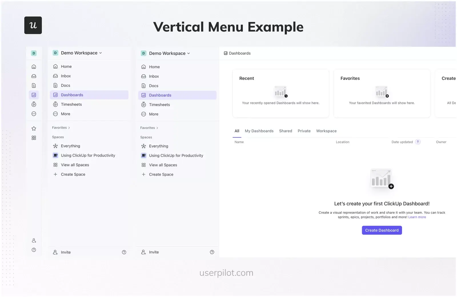
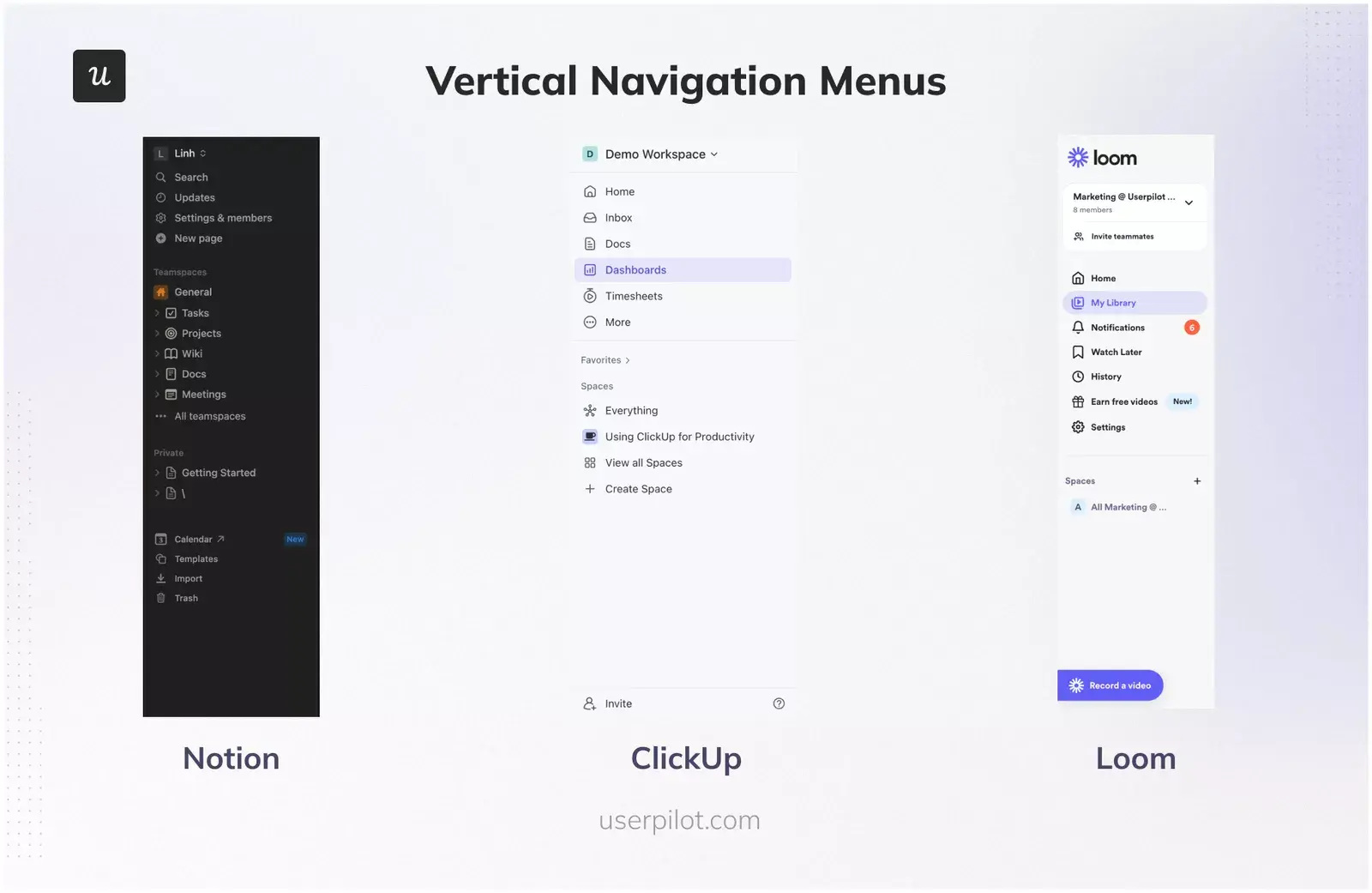
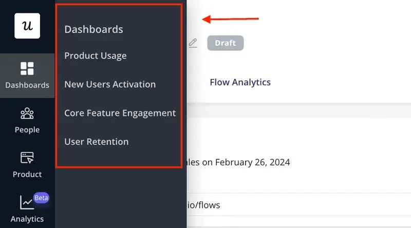
Vertical navigation menus
Vertical navigation menus allow users to browse through a vertical menu that expands and shrinks as needed.
They can accommodate a large number of items while making use of the full height of the screen (working particularly well on desktop).
When designing a vertical navigation menu for SaaS, ensure that it is always accessible and doesn’t interfere with the main content area.
The design should be responsive, collapsing into hamburger menus or similar patterns on smaller screens.
Plus, the visual hierarchy within the menu should be clear, using typography and color cues to denote different levels of navigation and make it easy for users to locate the items they need.
How do you measure and optimize navigation performance?
In SaaS, the best methods for optimizing navigation UX is to perform heuristic evaluations and user research (i.e., usability testing).
However, when working in a PLG company, teams don’t always have the time or budget to do this. So they default to just watching metrics like time on page, session duration, page depth, etc.
What I like to do when investigating a heuristic problem by myself, however, is to combine it with additional analyses, such as:
- Customer effort scores (CES): We use Userpilot to trigger a CES survey after a user finishes a task inside our product. And for me, it’s a great complement to spot workflows that users find more difficult, plus it doesn’t require me to do anything after setting up the surveys.
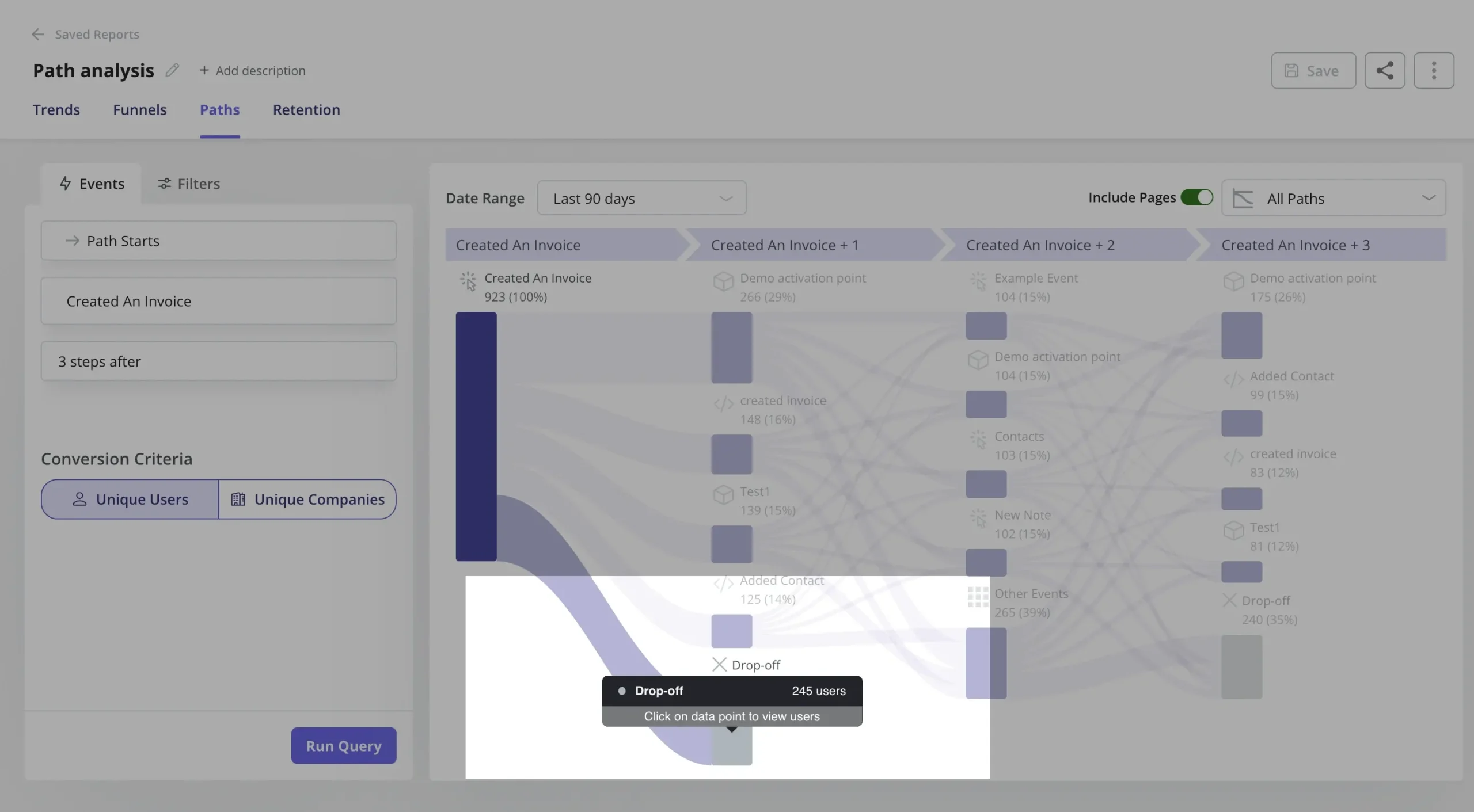
- Path analysis: This report is excellent to show how users navigate the product before and after an action (e.g., clicking a feature, finishing a task, signing up, etc.). It’s perfect for me to evaluate the pages where most users tend to drop off.
- Funnel analysis: The funnel charts are incredibly useful to analyze how many users can complete a task with multiple steps. It’s my go-to method to see what exact step is causing major drop-offs and evaluate the UI in those pages.
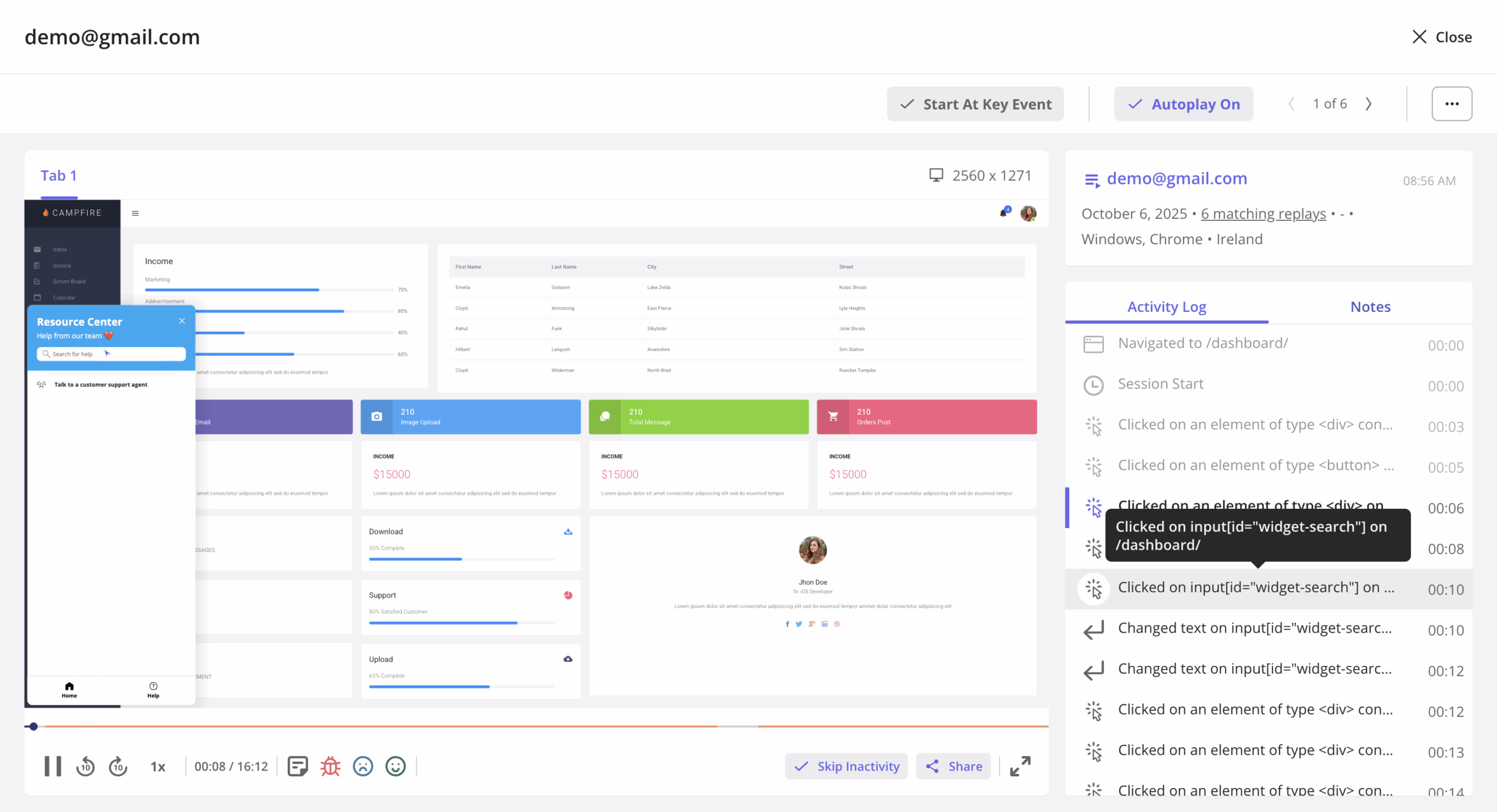
- Session replays: For me, this is the ultimate tool for understanding navigation friction. It lets me see exactly how users are browsing, hovering, and clicking on the interface elements to validate hypotheses. Plus, Userpilot makes it so easy to watch specific sessions (e.g., click on a funnel chart step to see the session of a user who dropped off), it’s hard not to use session replays when solving UX problems.
What are the best practices for navigation in UX?
Now that you’re equipped with tools to shape your product’s navigation UX, let’s go over some tips to improve the UX design of your product:
Improve your navigation pattern visibility
Ensuring that your product’s features are easily discoverable and accessible is key to a positive user experience.
This involves using contrasting colors, larger sizes, and clear icons to improve usability, especially for websites or web applications where users expect navigation menus to be in familiar locations (such as a top navigation bar for a landing page or a sidebar for applications).
That said, experiment with different colors and sizes for your navigation menus. Also, consider placing them where users naturally expect to find them based on common experience.
Write clear UX copy to describe your content and features
Effective UX copy helps users understand where each navigation option will take them. It can be particularly effective to explain complex features and a category page with a very understandable copy.
Here are some tips:
- Make sure to review your navigation items to ensure each label is as clear and descriptive as possible.
- Avoid jargon that may not be universally understood.
- Consider including tooltips or brief descriptions for items that might need further clarification.
Add location indicators to your user interface
As we said, helping users understand where they are within your app at any given moment enhances navigational efficiency and user satisfaction.
Patterns such as breadcrumbs or highlighting the current menu item can serve as effective location indicators, for instance.
You can also implement interactive walkthroughs to tell users where they need to click to perform a task (like in the GIF below). Therefore, they are ideal for onboarding, introducing new interface elements, or launching new features.
Use unique visual design to demonstrate site hierarchy
Varying the design of your product UI to indicate the hierarchy of your site can improve navigation and the product experience.
This involves using different font sizes, styles, or icons to distinguish between primary and secondary navigation.
To improve this, audit your app’s current design and see how visual elements can be adjusted to more clearly represent the site’s structure. For instance, primary navigation items might be larger or more prominently positioned, while secondary options might be smaller or included in a dropdown menu.
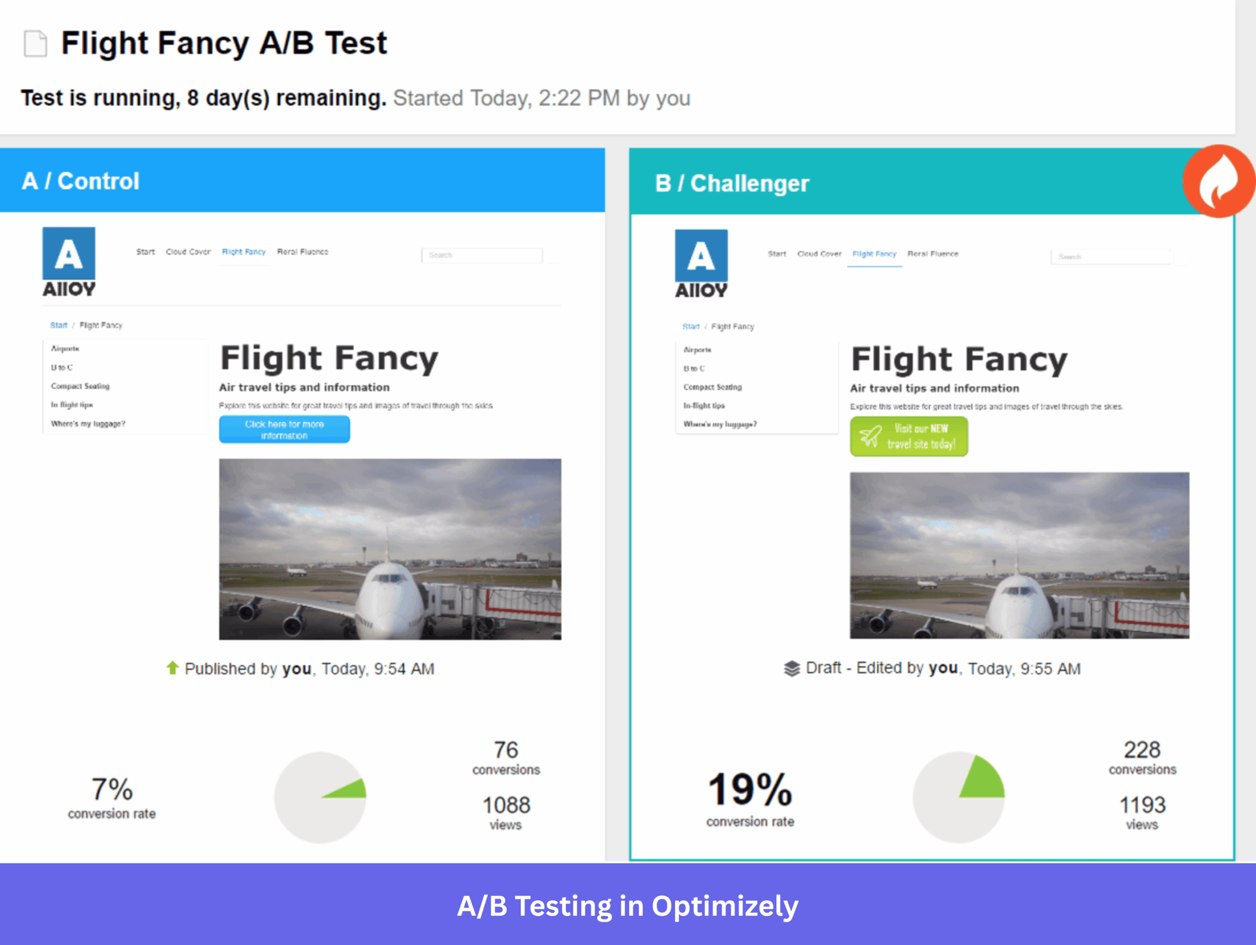
Run A/B test when deploying navigation UI changes
When implementing UI changes, I highly recommend performing A/B tests to make sure that they actually improve conversions, completion rates, etc.
To do this, you can use tools like Optimizely or Userpilot (for in-app UX patterns) to conduct either controlled testing (new design vs. old design) or head-to-head testing (two new elements against each other). These will work in most cases to make smaller improvements in your product.
Alternatively, there’s also multivariate testing, which is the best method for studying what combination of different elements (buttons, colors, shapes, microcopy, etc.) provides the best results.
It’s the ultimate test for optimizing any page. But, it requires extreme volumes in traffic to provide statistically significant results (which means you can’t use it on most parts of your product).
Improve navigation UX with Userpilot!
In SaaS, following navigation UX best practices can make the difference between a product that’s unusable and one that can engage users.
Userpilot is my go-to platform for researching UX issues. It lets me understand navigation patterns (via path analysis, funnels, and session replays), trigger surveys to hear user feedback (and even invite them to usability tests), and even implement in-app guidance for users without writing code.
So if you want to revamp the UX design of your app without bothering engineers, why not book a Userpilot demo to see how you can implement in-app tooltips, spotlights, checklists, and more?
FAQ
What are the 4 types of navigation?
In SaaS products, the most relevant types of navigation include:
- Hierarchical navigation: The most basic type of navigation where vast information is organized in a tree-like hierarchy with categories and subcategories (mostly used for wikis, documentation, content libraries, etc).
- Object-oriented navigation: Where page groups are categorized by “function” (e.g., clients, publications, campaigns, etc), making each feature self-contained in its own group.
- Task-oriented navigation: When the structure is organized based on specific tasks (i.e., jobs-to-be-done), such as “Create flow”, “Manage flows”, “Analyze”.
- Workflow-based navigation: Where the pages and features are put together into linear workflows that help users complete a specific task (usually used in highly vertical SaaS products).
What is the 80/20 rule in UX?
The 80/20 rule (also called the Pareto Principle) says that roughly 80% of outcomes come from 20% of causes. In UX, it means a small slice of your features drives most of the engagement or the revenue, so you need to identify that key “20%” and prioritize your efforts to optimize them.
About the author