Progressive Onboarding 101: How to Improve UX and Drive Adoption With Contextual Onboarding Flows


How can progressive onboarding help you create a personalized user onboarding experience? Is it a better way to onboard new users? How’s it different from function-oriented app onboarding?
This article will guide you through how to use progressive onboarding to boost customer engagement in your app.
We’ll also dive into how to switch to a progressive onboarding process and common mistakes to avoid when getting started.
What is the UX onboarding process?
The UX onboarding process is a set of steps a user goes through when they first start using your product and it continues across the entire user journey. It can be as simple as filling out a form, clicking on a link, or signing up for an account.
The onboarding process is the sum of continuous interactions you have with your users to guide and help them get the most value out of your product.
What is progressive onboarding?
Compared to linear onboarding experiences such as product tours, progressive onboarding is a design approach that helps users gradually learn about a product as they engage with it.
You need to provide an easy-to-digest set of onboarding steps for them to get familiar with the product. This type of user onboarding is great for web and mobile apps.
Function-oriented onboarding process vs. progressive onboarding process
An onboarding process can either be progressive or function-oriented. Although these methods are very similar, they have some slight differences.
While function-oriented onboarding showcases the product in action at once and calls it a day, progressive onboarding lets users discover and engage with the product in a contextual way.
Because of this, function-oriented onboarding feels like an information dump, whereas progressive onboarding makes learning easier for users as they move along their journey.
The main issues with regular function user onboarding methods
In her book, Fundamental UI Design, Jane Portman explains this situation creatively:
“Imagine yourself going to a new gym. You’re standing there awkwardly in your street clothes, and a polite sales rep is showing you around. Are you listening to her carefully, or would you rather change into your brand-new fitness attire and try out that shiny elliptical?”
As in this scenario, long product tours are distracting. It forces new users to sit through unnecessary introductions when they should be discovering the product’s value quickly.
Yet, some product teams opt for this flawed method, which creates a terrible first-time user experience.
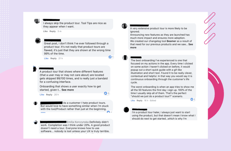
Should you be using long product tours? No. Here’s why:
- They are not contextual: As humans, we learn best in little bits. This trait is ignored with long product tours, which show users everything at once. Ultimately, you end up with users who are confused, can’t recall a thing they learned, and never take action.
- They are ignored: Ask around, and you’ll discover that most people skip product tours. Why? Because they’re awfully long and boring. Plus, they add friction to the user experience.
- They’re too long: Would you sit through minutes of a long product tour? Absolutely not! Most people would also skip it because they don’t help users learn a thing.
- They don’t support complex workflows: If you have a complex product with multiple user segments, a long product tour can’t function. This is because different features will be relevant to different customer segments and user behavior, and this requires a personalized onboarding flow.
How to switch to a progressive onboarding process?
To switch to a progressive onboarding process, start by segmenting your users so you can be very specific about what message and experience you build for them.
For example, when using UI patterns to offer help you need to make sure that message gets to the users that need it. What’s the point in offering to help engage with a feature when the user has already done that?
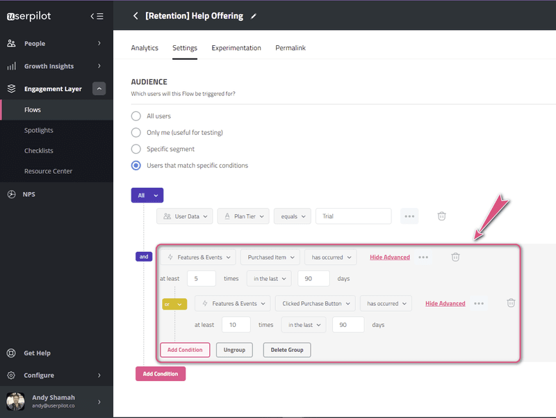
Once you have created different segments, it’s time for action. How can you onboard different users contextually?
Here are a few ways to do it right.
Prompt new users to take action with personalized empty states
An empty state can be one of two things: a reason for users to churn or an avenue to create an amazing product experience.
When a user encounters an empty state, they’re confused about what to do next.
But if personalized, they’re equipped with the right resources to help them experience the product.
To achieve this, use UI elements like modals to grab attention, educational content to keep them engaged, and gamification to make it fun. A blank slate is also a great place to have users interact with your product in real-time.
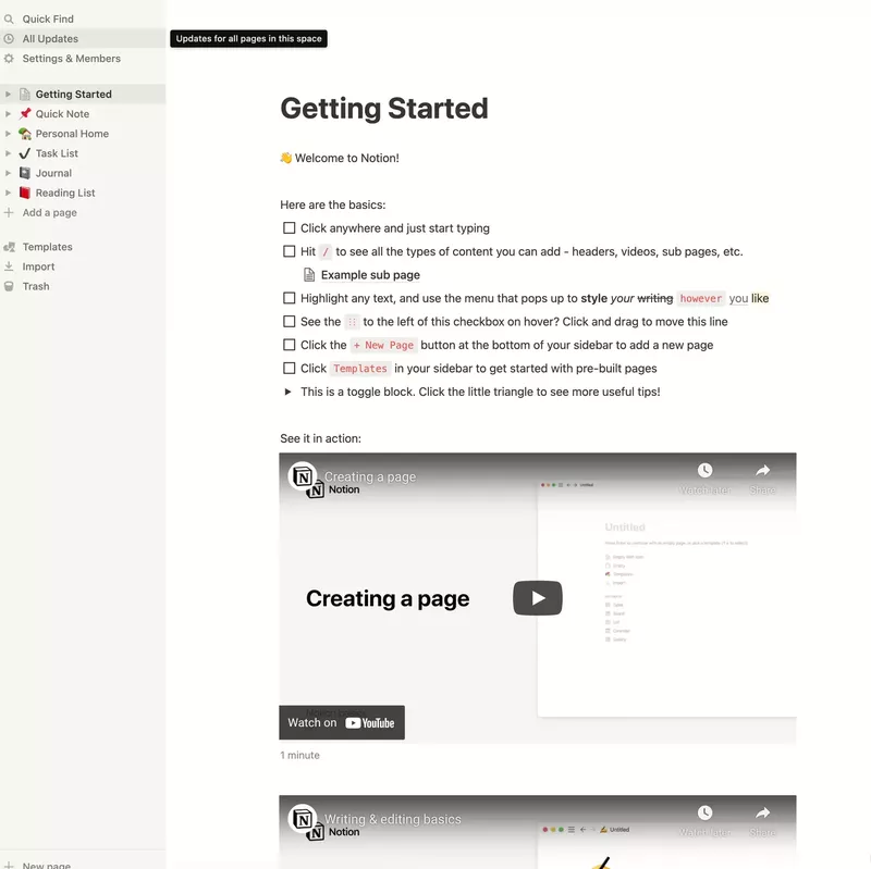
In the image below, we see how Notion uses its empty state to show the product in action. Notice how they combined this with an onboarding checklist and micro-videos to create a smooth user onboarding flow.
Onboard users with a choose your own journey onboarding flow
Every user visiting your app is there for a different reason. To help them find value, create unique experiences for each user type.
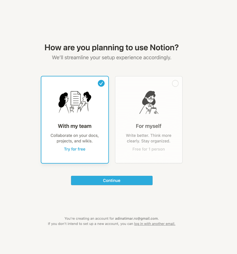
For instance, Notion creates a branched experience right from the start of its onboarding process. From here, every user type can journey down a different path based on how they plan to use the app.
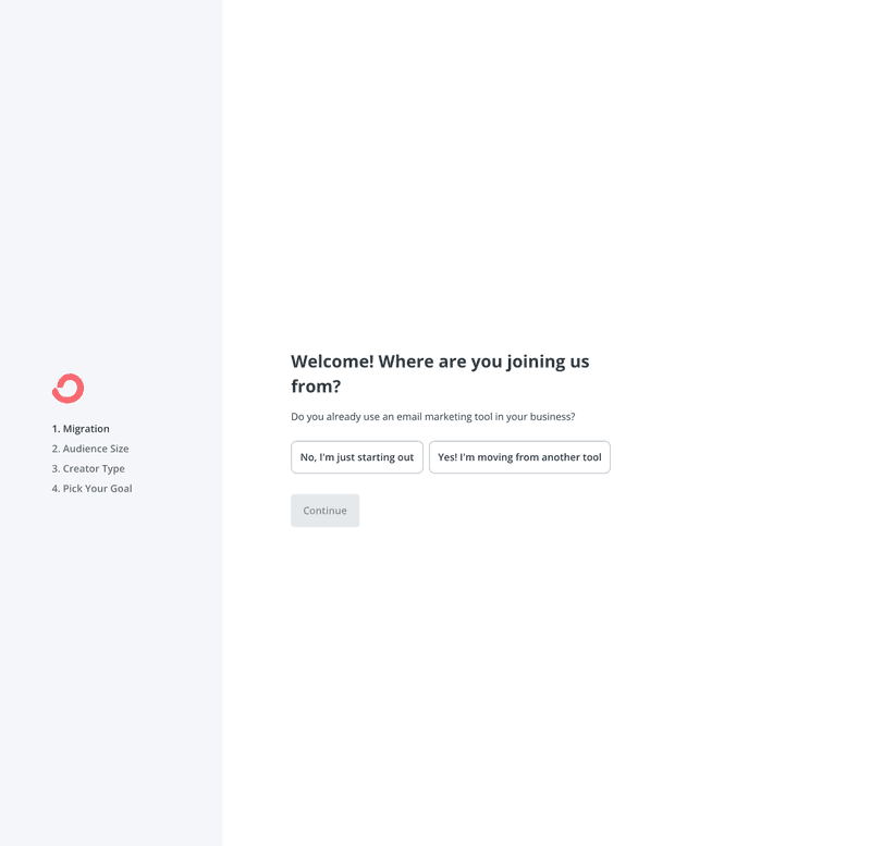
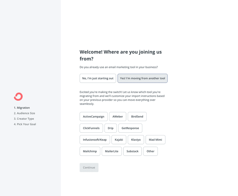
Convertkit, an email automation tool, also segments users right from the start. It makes sense for them to offer two paths: one for users who are brand new to email marketing and another for users who already have data.
If you users are moving from another tool, offering them the option to import their data and skip the manual setup is a must.
Personalize the onboarding experience based on the user’s job to be done
Create a friendly welcome screen to welcome users after the sign-up sequence. Then, use microsurveys to understand their main goals for using your app.
With the data collected, it’s easier to direct them to engage with features relevant to their use case- shortening the time to value.
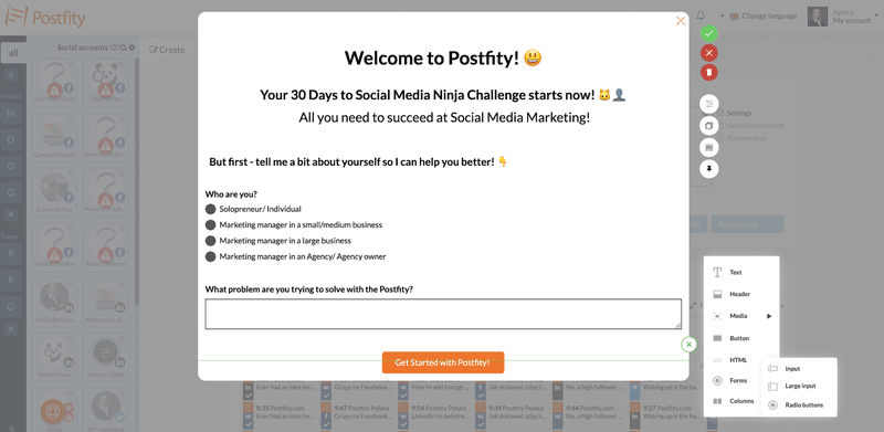
Postfity uses a brilliant welcome page design that combines a great microcopy, a microsurvey, and a CTA to segment its users and come across as a friendly brand.
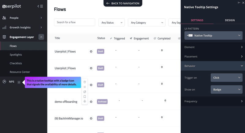
Introduce users to hidden functions as they progress through the journey
As users become familiar with your product, remember to introduce them to different parts of the product that might be relevant to them but aren’t as visible on the UI.
Use hotspots, spotlights, or native tooltips (these all mean the same thing) to guide them.
The image below shows what a spotlight is.
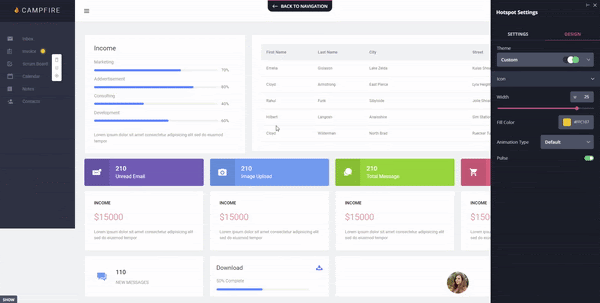
The small beacons are really helpful for drawing users’ attention to specific features without disrupting the user experience, like an onboarding screen modal for example.
They blend smoothly into the UI but still manage to draw attention without being intrusive.
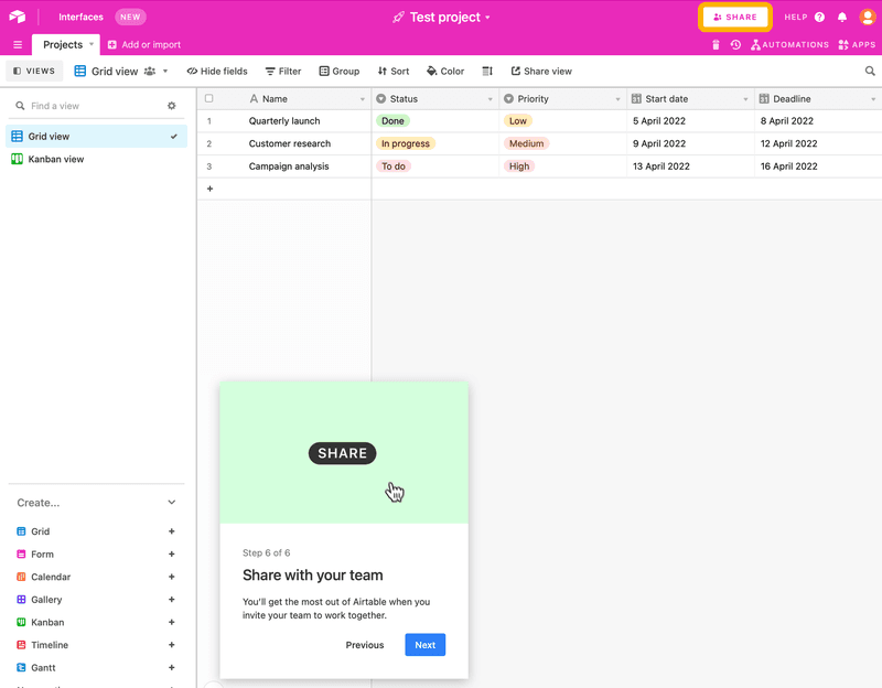
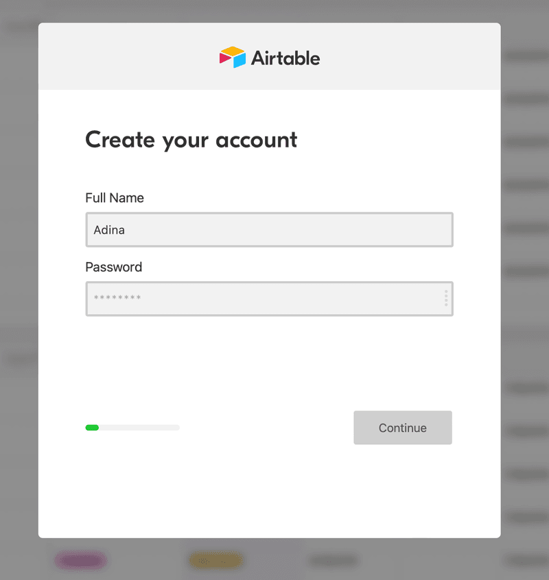
Take a look at how Airtable creates a smooth onboarding process. Notice how they highlight the share button with a spotlight while the tooltip explains it.
With a tool like Userpilot, you can easily create and place these small beacons for on-demand help across the UI. It’s also very easy to set up.
Facilitate learning as you go through the design process
Don’t force users to learn all about your product at once; break it down instead.
Let users trigger their learning experiences when they interact with a new feature. Don’t start an interactive walkthrough as soon as they land on the page.
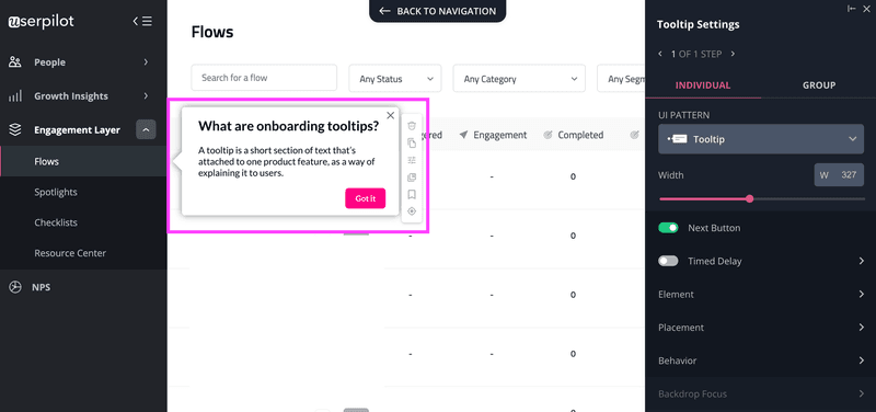
More importantly, avoid triggering a sequential tour—or multiple tooltips—that point to different elements in the UI and explain their functionality.
Use driven actions to guide users step-by-step as they become more involved with your product. Each step will explain what they have to do, and the next one will trigger based on the user’s action.
The idea is to help them learn as they go.
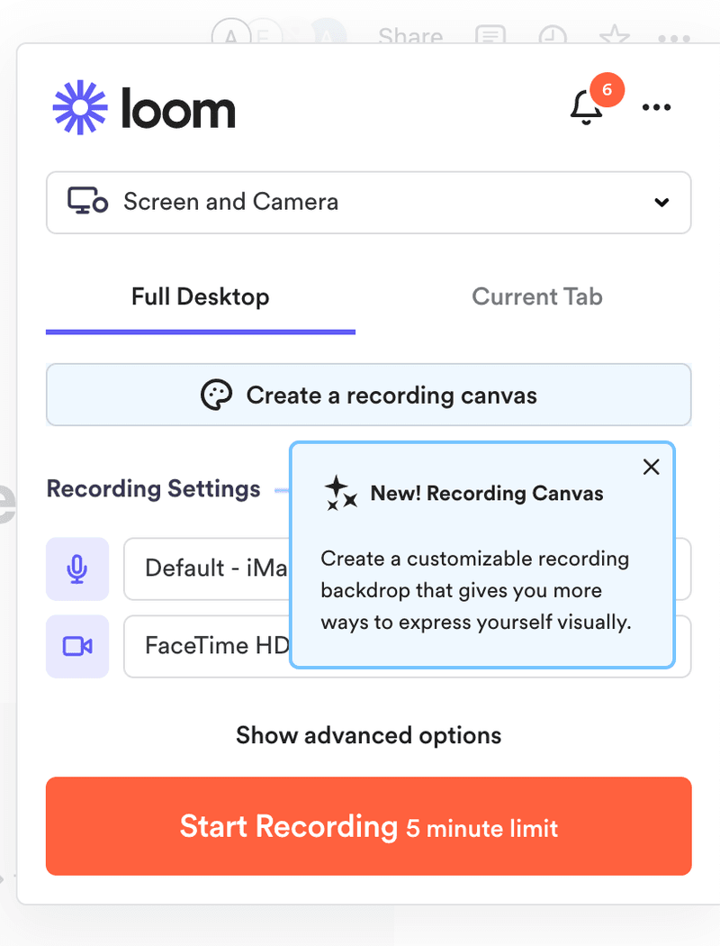
Introduce new features to increase user retention
The fastest way to introduce a new feature is using a tooltip.
Tooltips are great for driving the user’s attention to a new feature that will bring more value to them. By helping users progressively discover features relevant to them, your app becomes important enough for them to stay longer.
This is a great way to increase retention.
Here’s how Loom uses tooltips effectively to explain a new feature to customers.
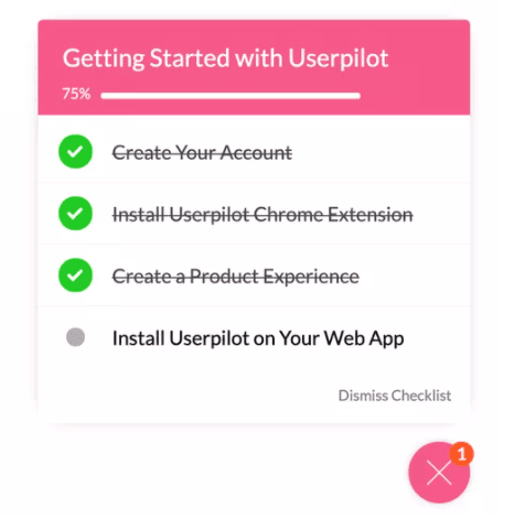
Keep users engaged with progress bars
To avoid a poor user experience, use progress bars to reduce friction and ease customer tension. Don’t leave users in the dark. Instead, use a progress bar to give them a sense of direction.
Include progress bars to keep users engaged when they must perform a task across multiple onboarding screens. For example, during a signup flow.
You can also use them when you want to enhance the user to finish multiple actions in a checklist.
Showing how close a user is to the finishing line, always helps motivate them to take action.
Progressive onboarding mistakes to avoid
While progressive onboarding is a great idea, minor oversights like a bad UX design or ignoring these product engagement mistakes can cause a major downturn. That said, here are some mistakes to avoid:
Avoid cluttering the user interface (UI)
Cluttered screens are messy, overloaded, and too busy for the user to understand.
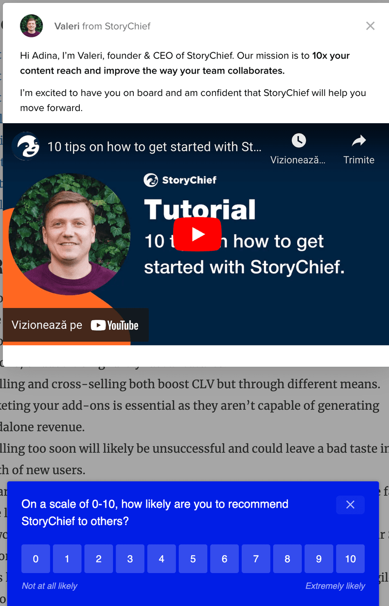
Like this screen in Storychief. You’ll immediately notice how the entire screen is covered with two features demanding the user’s attention at once.
There’s a modal attached to a tutorial video (triggered at the wrong time- I already know how to use the tool, in fact, I was in the middle of using it) and an NPS survey at the bottom of the screen.
Which one should I engage with?
The same thing is happening on this screen on Zoom. By displaying too many tooltips at once, it’s hard to tell what you should be doing.
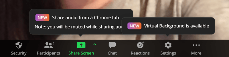
The point is this: avoid crowding your UI and confusing your users. Too much of this and they’ll churn right into the hands of your competitors.
Avoid using disruptive UI patterns
UI patterns can be a great solution—until they become disruptive. The key is to know when to use the right one. For instance, don’t use large modals when a tooltip would do the job perfectly.
It’s fine to announce new product updates or features with major changes using modals.
But when guiding users through different parts of the UI with small hints, banners and tooltips work great.
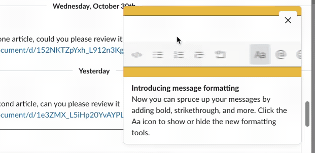
Always choose the best and less disruptive UI pattern for the job. A good example is how Slack keeps users updated without disrupting their experience.
Not adding a skip option
There is nothing more frustrating than omitting a skip button. This means you’re locking users into your experiences and forcing them to sit through displays they don’t want to see.
Always let your users choose; it gives them a sense of ease and freedom. It doesn’t matter the wording or button placement, as long as it’s visible.
Let’s see some examples:
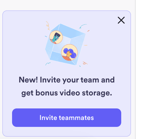
- Use a modal X button or an okay button to easily close or dismiss a popup.
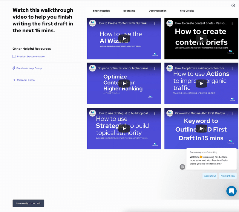
- Add a button for users to skip to the next stage (in this example, if they’re ready to outrank)
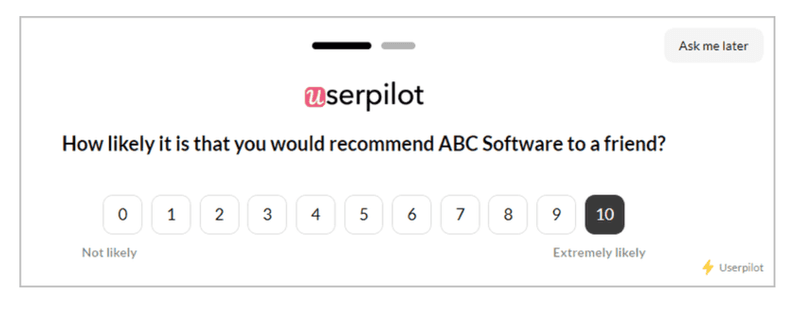
- In this example, the “Ask me later” button at the top right can help users carry on with their tasks if they don’t wish to take the survey.
Conclusion
Whether you’re starting a new web design, launching a new product, or building mobile apps, think about how to make your onboarding progressive.
Progressive onboarding should be a vital part of your user experience design. Done well, it can help you streamline your onboarding process and increase user adoption.
Designing an amazing progressive onboarding experience can be tasking… unless you have an effective tool like Userpilot. Book a demo call with the Userpilot team and get started!
About the author