Healthcare Product Metrics Benchmark Report 2024


Userpilot’s SaaS Product Metrics Benchmark Report has found that compared to other industries, healthcare SaaS companies perform lower across most of the 6 metrics we studied.
What are the reasons?
That’s what we try to explain in the article. You will also learn how healthcare companies can improve their product metrics.
TL;DR
- Userpilot’s SaaS Product Metrics Benchmark Report contains data on 6 key metrics like new user activation rate or time to value from 34 SaaS companies in the healthcare niche.
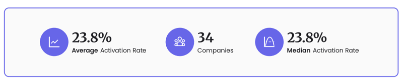
- The new user activation rate for these companies was 23.8% (the overall average for all companies was 37.5).
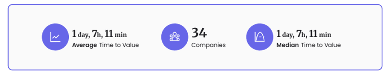
- At 1 day, 7h hours, and 11 minutes, the TTV was relatively short compared to other verticals.
- The onboarding checklist completion rate was one of the highest (20.5%).
- Their month 1 retention rate (34.5%) and NPS (25.6) were also at the lower end of the spectrum.
- The two conclusions from the study: healthcare SaaS products face challenges that other sectors don’t (like strict regulation). And the only way to make meaningful comparisons is by benchmarking your product against others within the same vertical.
- If you’d like to boost the metrics of your healthcare SaaS product with Userpilot, book the demo!
What is the Healthcare Products Metrics Benchmark Report 2024
Userpilot has just published its first SaaS Product Metrics Benchmark Report. In the report, we look into 6 metrics:
- New user activation rate.
- Onboarding checklist completion rate.
- Time to Value.
- 1 Month Retention Rate.
- Net Promoter Score.
- Core Feature Adoption Rate.
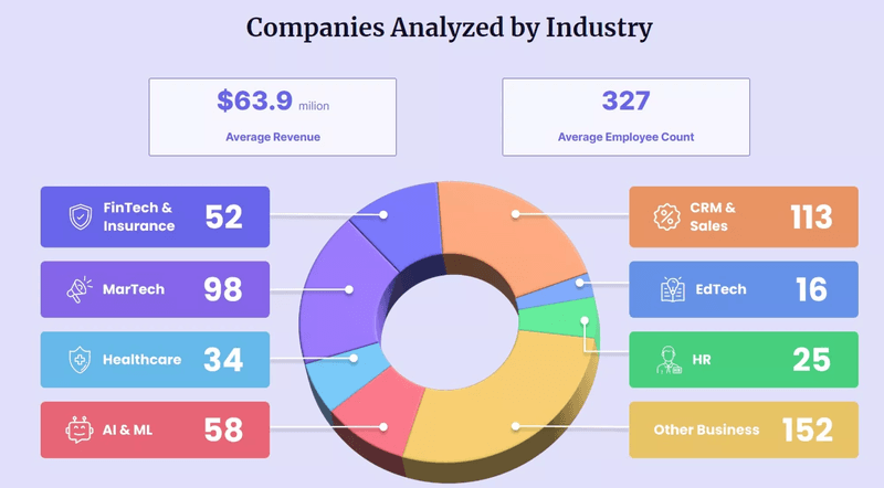
The data comes from 547 SaaS companies across 7+ different verticals. This included 34 Healthcare companies.
Average customer activation rate
The average activation rate is the percentage of users who reach the activation milestone in their journey. Which is when they experience the product value.
The average activation rate for healthcare companies in our study was 23.8%. That’s considerably lower than the overall average (37.5%) and a long way behind the AI & ML companies (54.8%).
What could be the cause?
We believe it has to do with healthcare regulations. The compliance rules, for example, regarding patient data security, add friction to the user journey, which has an impact on their activation.
How to improve activation rate in healthcare products
To improve the activation rate for a healthcare product, first, ensure you understand your users’ problems and how your product solves them.
Next, analyze power user interactions with your product to identify the most optimal routes to activation and design onboarding experiences that help others emulate it.
The key to onboarding success is making the experience relevant. You can do it by personalizing the product for different user personas and their unique use cases.
Average time-to-value
Time-to-value (TTV) is closely linked to user activation: it’s the time users need to reach the activation milestone and experience how the product can solve their problems.
The 34 companies we studied had an average TTV of 1 day, 7h hours, and 11 minutes. Which is the second best in our report.
How does it fit into the relatively low activation rate?
Healthcare products users often receive robust training and support during the onboarding process. So, while the activation rate might be lower, streamlined onboarding reduces the time that they need to experience value.
How to shorten time-to-value in healthcare products
Just like with the activation rate, the key to success is designing purposeful and personalized onboarding experiences.
By exposing users only to relevant features, we help them reach the activation point in less time and without overwhelming them with unnecessary features.
If your TTV is below the healthcare average, use analytics tools like funnel and path analysis to find friction in the onboarding process. And A/B test various flows to find the best-performing ones.
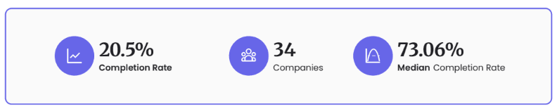
Average onboarding checklist completion rate
Talking of onboarding flows: checklists could be one of the most powerful onboarding tools out there. When designed well, they exploit our natural reluctance to leave unfinished tasks to drive user activation.
The average onboarding checklist completion rate among the healthcare companies was 20.5%, just after FinTech & Insurance companies.
Explanation?
First, healthcare SaaS products, due to their complexity, cannot be learnt by simply jumping in and trying things out. Structured onboarding is a must.
More importantly, patient health and well-being often depend a lot on healthcare professionals’ competence. This could be why they’re more conscientious when it comes to software onboarding than other professionals.
How to increase onboarding checklist completion rate in healthcare products
To increase the checklist completion rates in your product, make them meaningful by including the tasks that lead directly to value.
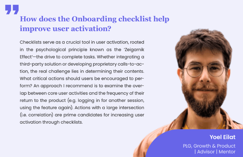
Yoel Eilat, a growth and product consultant, recommends analyzing feature usage and correlations with user retention. That’s how you can identify what to include in your checklist.
Don’t forget to add a progress bar to give users a sense of achievement and reinforce the Zeigarnik Effect.
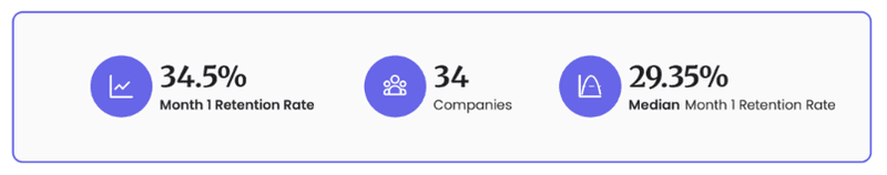
Month 1 retention rate
Month 1 retention rate is the percentage of sign-ups who keep using the product after a month. We included the metric in our report because it shows if users find the product valuable early in their lifecycle. It’s also linked to long-term retention and customer lifetime value.
Healthcare companies had the lowest Month 1 retention rate. At 34.5%, it was 12.4% lower than the overall average and 19.6% the average for AI & ML companies, which performed the best.
Again, we could attribute the trend to strict regulation and the need for significant product personalization.
How to improve month 1 retention rate in healthcare products
Just like with the other metrics, personalized onboarding, which reduces the time to value and drives user activation, is essential.
In addition, ensure your users have access to excellent support that helps them overcome the challenges they face. This includes high-touch support by customer success managers as well as low-touch support with self-serve resources. Like video tutorials, knowledge bases, and how-to guides.
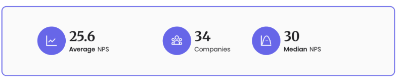
Average NPS
NPS, or Net Promoter Score, is a metric based on a survey in which you ask customers how likely they are to recommend the product to their friends or colleagues on a scale of 1 to 10.
A high NPS is an indication of customer satisfaction and loyalty.
Users who offer high scores (9-10), called promoters, are also more likely to take part in referral programs and promote the product via WOM. Which reduces customer acquisition costs.
Healthcare companies had the 2nd lowest average NPS of all companies, 25.6, while the overall average was 35.7, and Edtech companies boast that NPS is as high as 47.5.
The low score could be linked to issues such as service delivery problems or a lack of engagement with healthcare users.
How to improve NPS in healthcare products
Start improving your NPS by identifying the reasons why your customers may not be satisfied with the product. That’s how you identify areas for improvement that will gradually help you build a better product.
You can do it by asking them follow-up questions in the NPS survey and interviewing the detractors.
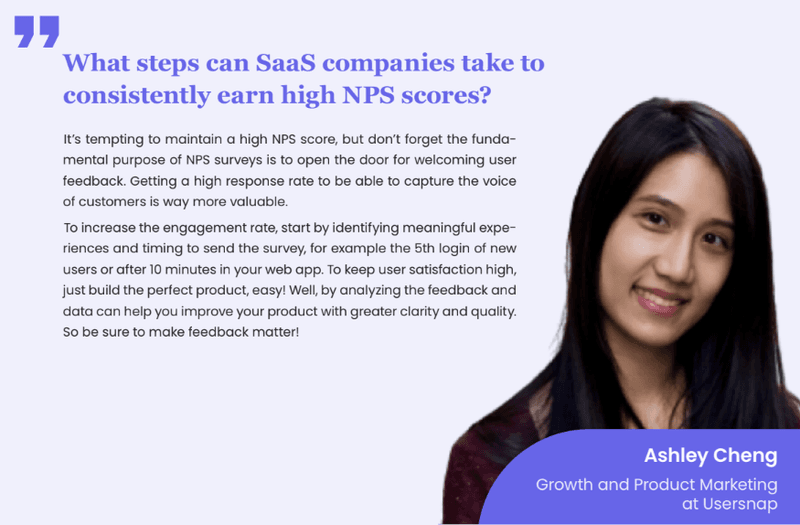
To avoid non-response bias, which could lead to misdiagnosis, look for the best time to send the surveys. Ashley Cheng, the Head of Growth at Usersnap, recommends analyzing user behavior in-app to identify meaningful experiences.
To increase the engagement rate, start by identifying meaningful experiences and timing to send the survey, for example the 5th login of new users or after 10 minutes in your web app.
Conclusion
The healthcare vertical in SaaS faces numerous challenges, which lead to lower product metrics than in other industries. That’s why, when comparing product performance, it’s vital to look for benchmarks that differentiate between industries, like our SaaS Product Metrics Benchmark Report.
If you’re a healthcare company and would like to improve your product metrics, book the Userpilot demo!
About the author