Cohort Retention Analysis in 2026: How to Separate Real Users From AI Tourists


A cohort retention analysis curve can look “normal” and still hide a serious problem. I’ve seen products with 38% Month-1 retention numbers continue declining month after month, with no sign of stabilization. On paper, the metrics looked acceptable. In practice, the product wasn’t building lasting usage.
In 2026, this problem is getting harder to interpret. AI-assisted onboarding and frictionless sign-ups have created a wave of what a16z’s research calls “AI tourists”: users who sign up out of curiosity, explore briefly, and churn before ever becoming real customers.
These users inflate cohort sizes and distort early retention data, making healthy products look weaker than they actually are. That’s why retention analysis today is less about headline percentages and more about reading the shape of the curve. In this guide, I’ll show you how to identify meaningful retention patterns, filter out tourist noise, and find the users who are genuinely likely to stay.
The key takeaways
- Why a single retention rate isn’t enough: Blended averages flatten out the differences that matter most. The shape of your cohort curve (whether it declines perpetually, flattens, or starts to smile) is the diagnostic. The headline figure is not.
- The three cohort types: Acquisition cohorts show what happened over time. Behavioral cohorts explain why it happened. Predictive cohorts let you act before the curve turns bad.
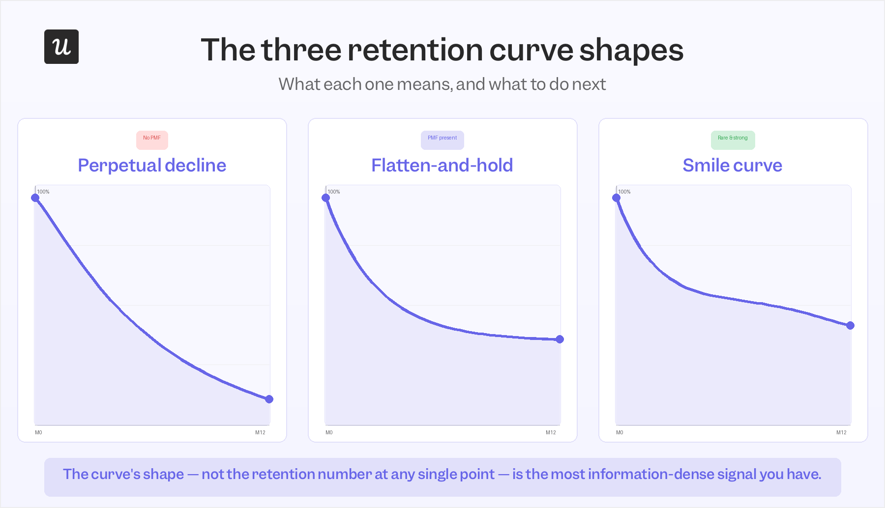
- Reading the curve shape: A perpetual decline means your foundational users haven’t arrived yet. A flatten-and-hold means product-market fit is present. A smile curve, where churned users return as the product improves, is the rarest and most promising pattern of the three.
- The M0 problem: Tourist churn distorts early curves and makes retention look worse than it actually is. Rebasing to Month 3 (M3) gives a cleaner read of who your real users are.
- What to do when the curve looks wrong: Four scenarios: early drop-off (usually an onboarding failure), slow decline past month 3 (missing sticky behaviors), a cliff at month 12 (renewal risk), and a feature launch that seemed to move retention (separating causation from coincidence).
- Running it in Userpilot: How to configure a cohort retention report, layer behavioral segmentation on top, and connect insights directly to in-product interventions without leaving the platform.

Why a single retention rate is a blunt instrument (and what to use instead)
The 2025 median Net Revenue Retention for private SaaS companies is 101%, according to SaaS Capital, meaning the average SaaS company’s expansion revenue is barely covering its gross churn. Most teams see a figure like that, compare it to a benchmark, and move on. What gets lost is that a blended NRR can hide a situation where your strongest retention cohorts are expanding at 130% while your weakest are contracting at 70%, and the two cancel each other out into something that looks like stability.
The same flattening effect applies to user-level retention metrics. Our benchmarks put the average SaaS product at roughly 46.9% user retention after one month. A product with a growing core of power users and a large tourist cohort churning early will produce an almost identical one-month number to a product whose entire user base is slowly disengaging.
Cohort analysis fixes this by breaking users into groups and tracking how each group’s retention evolves separately. The differences between cohorts are where the insight actually lives, not in the average across all of them. What you’re looking for, specifically, is whether any cohort’s curve eventually stops declining.
The three cohort types, and what each one is actually for
They are acquisition, behavioral, and predictive cohorts. Here is how they are different:
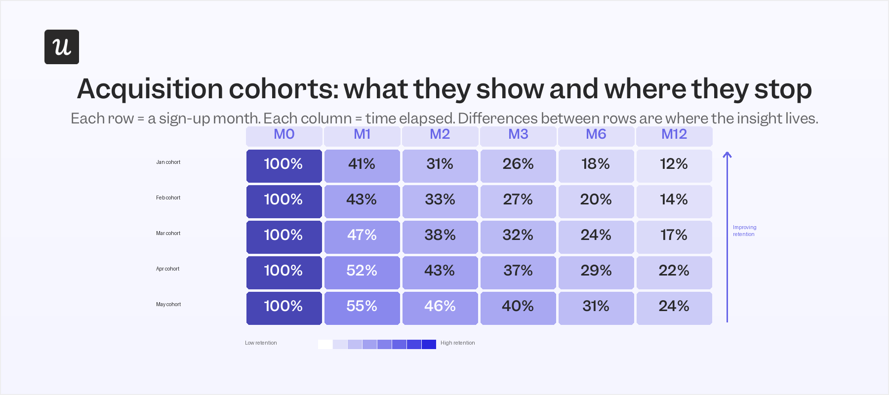
Acquisition cohorts
They’re the easiest to set up: users grouped by when they signed up, tracked forward in time. They’re genuinely useful for seeing the macro effect of product or marketing changes on retention. If cohorts acquired after you rebuilt your onboarding flow retain better at 60 days, that’s a real signal. What they won’t tell you is whether the improvement came from the onboarding change, a pricing update, a different acquisition channel mix, or some combination of all three.
Behavioral cohorts
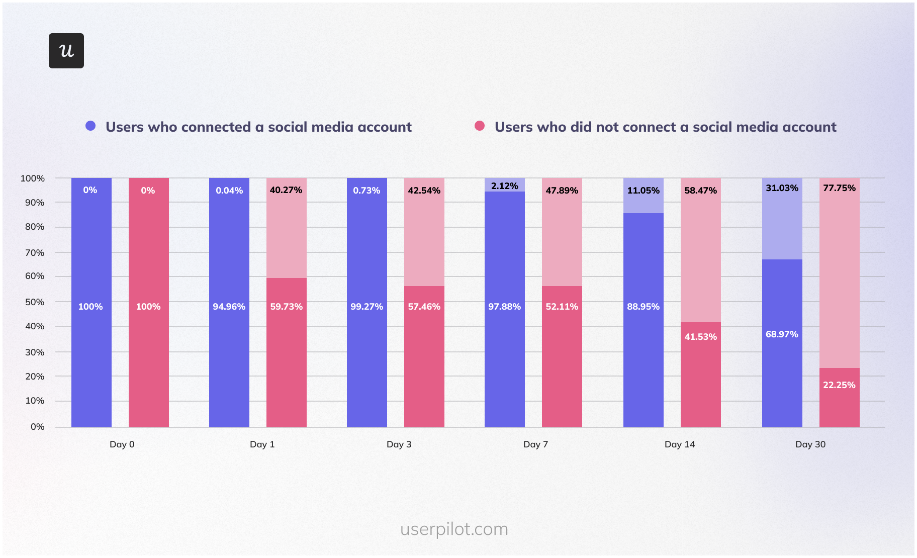
Here, users are grouped by the specific actions they did or didn’t take inside the product: whether they connected an integration in the first week, whether they completed a checklist, or whether they used a particular feature before day 7. By isolating user behavior from acquisition timing, you can see whether a specific action predicts long-term retention independent of when someone joined. When I ran a behavioral cohort in Userpilot comparing users who hit a meaningful activation milestone in their first seven days against those who didn’t, the retention gap at month 3 was large enough to rebuild our entire onboarding sequence around that one event.
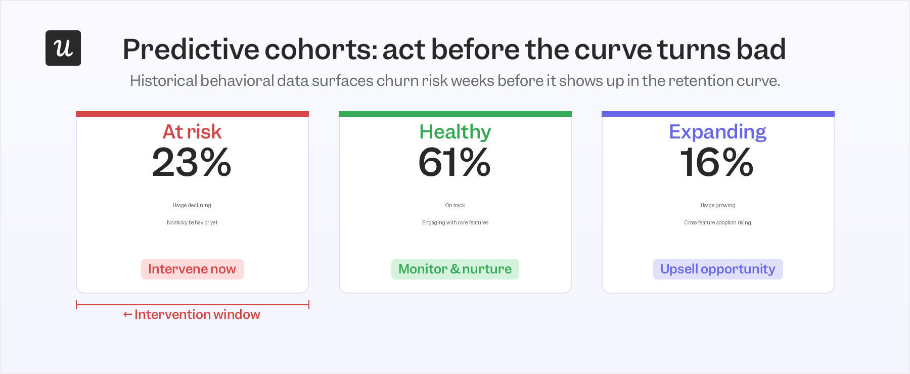
Predictive cohorts
These are built on historical behavioral data and machine learning to identify users who are likely to churn, expand, or reach a key milestone before any of that shows up in the retention curve. The practical value isn’t prediction for its own sake. It’s the intervention window it opens: you can respond to a declining signal before it becomes a churned user, while the customer is still motivated to be successful.
In practice, acquisition cohorts surface the question, behavioral cohorts find the answer. Predictive cohorts add a third dimension: time to act before the data turns bad. Most of the useful analysis I run starts with an acquisition cohort to identify the pattern and then move immediately into behavioral sub-segments to explain it.
How to read the shape of your retention curve
The shape of a retention curve is, in my view, the most information-dense signal in all of retention analysis. Three patterns come up repeatedly, and each one prescribes a different response.
The first is the perpetual decline. The curve drops steeply in the first few weeks and keeps declining past month 3 with no sign of stabilizing. When every cohort shows this pattern regardless of acquisition timing, it’s not a measurement problem or a seasonal blip. Malika Aubakirova at a16z documented this in her 2025 analysis of real LLM usage across OpenRouter: products that never produced a “foundational cohort” showed all their sign-up cohorts behaving identically, with fast early churn and no long-term floor. She calls these products ones where the glass slipper never fit. A perpetual decline usually signals a product-market fit problem, not a messaging or onboarding one.
The second shape is the flatten-and-hold. The curve drops in the first four to eight weeks (some early drop is always expected, because some users will leave regardless) and then stabilizes at a plateau. That plateau is your foundational cohort: users who’ve decided the product is worth keeping, built it into a workflow, and whose cost of switching is now higher than their daily frustrations with it.
The third is the smile curve, the rarest and, when it appears, most significant shape. Retention dips early, flattens, and then starts rising as users who had reduced usage or churned come back because the product has improved. Rodriguez and Immerman at a16z documented this in September 2025 using ChatGPT’s retention data as the clearest example. A smiling curve is an early indicator that a product could eventually reach net revenue retention above 100% at scale, because previously churned users aren’t permanently lost.
When I see a curve that won’t flatten, I stop analyzing at the cohort level and look for the users whose curve is flattening. Understanding what they did differently is how you find the sticky behavior worth making easier for everyone else.
The M.0 problem: Why tourist churn is distorting your retention baseline
If you’re running a self-serve or PLG motion, your Month 0 cohort almost certainly includes a meaningful share of tourists: users who signed up because the friction was low, not because they had a specific problem your product solves. They churn in weeks two through five, drag down the early slope of the curve, and make the post-tourist portion of your cohort look worse than it would in isolation. The baseline measurement is working against you.
The a16z’s research introduced a rebase approach that addresses this directly. Instead of measuring M12 retention against M0, measure it against M3. By month 3, most tourist churn has cleared, and the users still active have made a real decision to keep using the product. In their dataset of top-performing AI companies with more than $1M ARR, M12/M3 ratios already projected toward long-term net revenue retention above 100%, even for products whose M0 curves looked rough. The method works just as well for traditional SaaS products; the tourist-to-real-user transition just happens at a slightly different inflection point depending on the free-trial structure and onboarding friction.
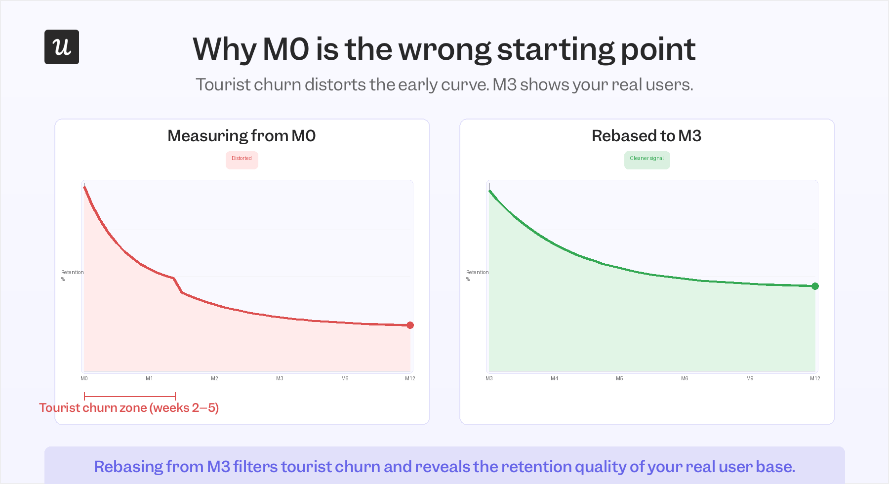
In practice, I apply this by narrowing cohort date ranges in Userpilot to isolate the post-tourist period, and by using behavioral segmentation to separate users who completed a meaningful engagement milestone from those who never did. The goal isn’t to pretend the tourist churn didn’t happen. It’s to see your foundational cohort clearly, without it being blended into a group that was never representative of your real user retention potential.
What I do when a retention curve tells me something is wrong
The curve is a diagnostic, not a verdict. When it tells me something is wrong, I use it to narrow down where the problem actually is, not as a final verdict but as a starting coordinate for the analysis. Four situations come up consistently in my work.
Scenario 1: Early drop-off in the first two weeks
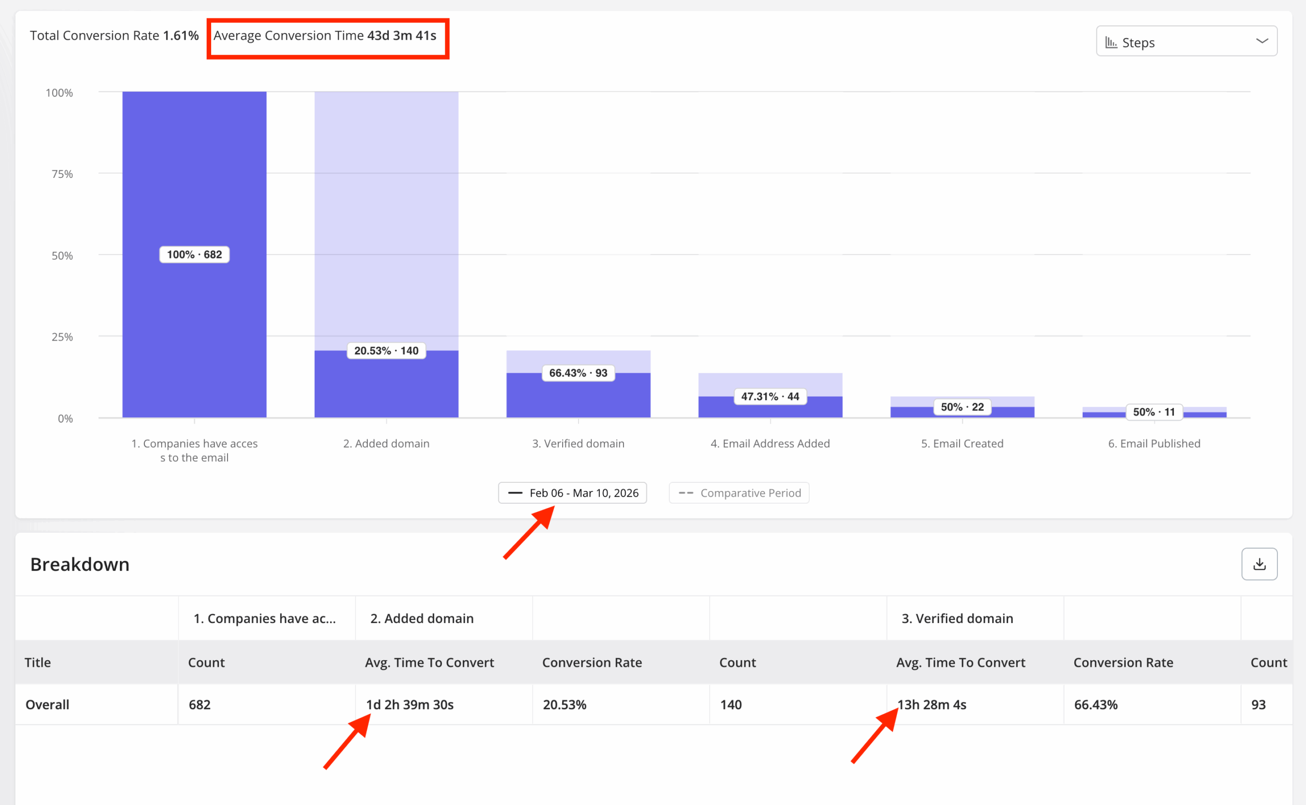
This is almost always an onboarding problem, and the fastest way to confirm it is to split the acquisition cohort into two behavioral sub-groups: users who completed a key activation milestone and users who didn’t. Then run a funnel analysis comparing conversion rates at each onboarding step, looking for where the churned group diverges from the retained group.
When Userpilot launched our email feature, the funnel showed a sharp drop-off at the domain verification step. Within a few hours, I built a targeting tooltip inside Userpilot that highlighted the correct steps for users who’d stalled at that point, without any engineering work involved. Drop-off at that step closed quickly, the kind of fix that acquisition cohort data alone would have buried inside an average.
Scenario 2: Slow decline past month 3 with no sign of flattening
Users making it past onboarding is a good sign, but a curve that keeps declining past the third month usually means they never built a real habit around the product. The analysis here is about finding the sticky behavior that separates users who stayed from those who didn’t, looking at the same first-30-day window for each group and identifying which actions appear consistently in the retained cohort but are absent or rare in the churned one.
Once that behavior is identified, the question shifts to how many new users are currently completing it and how to increase that number. In Userpilot, this usually means adjusting the onboarding checklist to feature the sticky action earlier, or building an in-app nudge that triggers when a user reaches the step just before it.
Scenario 3: A cliff at month 12
Month-12 churn is almost always a renewal failure rather than a product failure, and the behavioral data usually surfaces it before the renewal conversation does. James Mitchinson, Userpilot’s Head of Customer Success, described one account where login activity looked steady month after month but no meaningful progress was materializing in terms of actual outcomes. Being able to see that gap between login volume and workflow adoption gave the team an opening for a different kind of conversation:
“We got them back on track before they gave up. If we hadn’t intervened at that moment, would they have looked for another solution?”
What James is describing is the pattern behavioral cohorts reveal as “high activity, low depth”: users who log in regularly but stay within one or two features, never expanding into the rest of the platform. Those accounts carry the highest month-12 churn risk. As James puts it: “Churn prevention has to come from earlier intervention, when you’re working with a customer who is still motivated to be successful with the platform.” The fix is building cross-feature adoption before the renewal window opens, not during it.
Scenario 4: A feature launch that seemed to improve retention
Correlation and causation look identical in an aggregate retention chart, and this scenario is where that confusion does the most damage. The right test is a behavioral cohort of users who actually engaged with the new feature, compared against a cohort that didn’t. If the retention improvement is concentrated in the feature-engaged group and the timing aligns with engagement rather than just the launch date, you have a real signal. If both cohorts are improving at the same rate regardless of feature usage, something else is driving it, and shipping more of that feature won’t help.
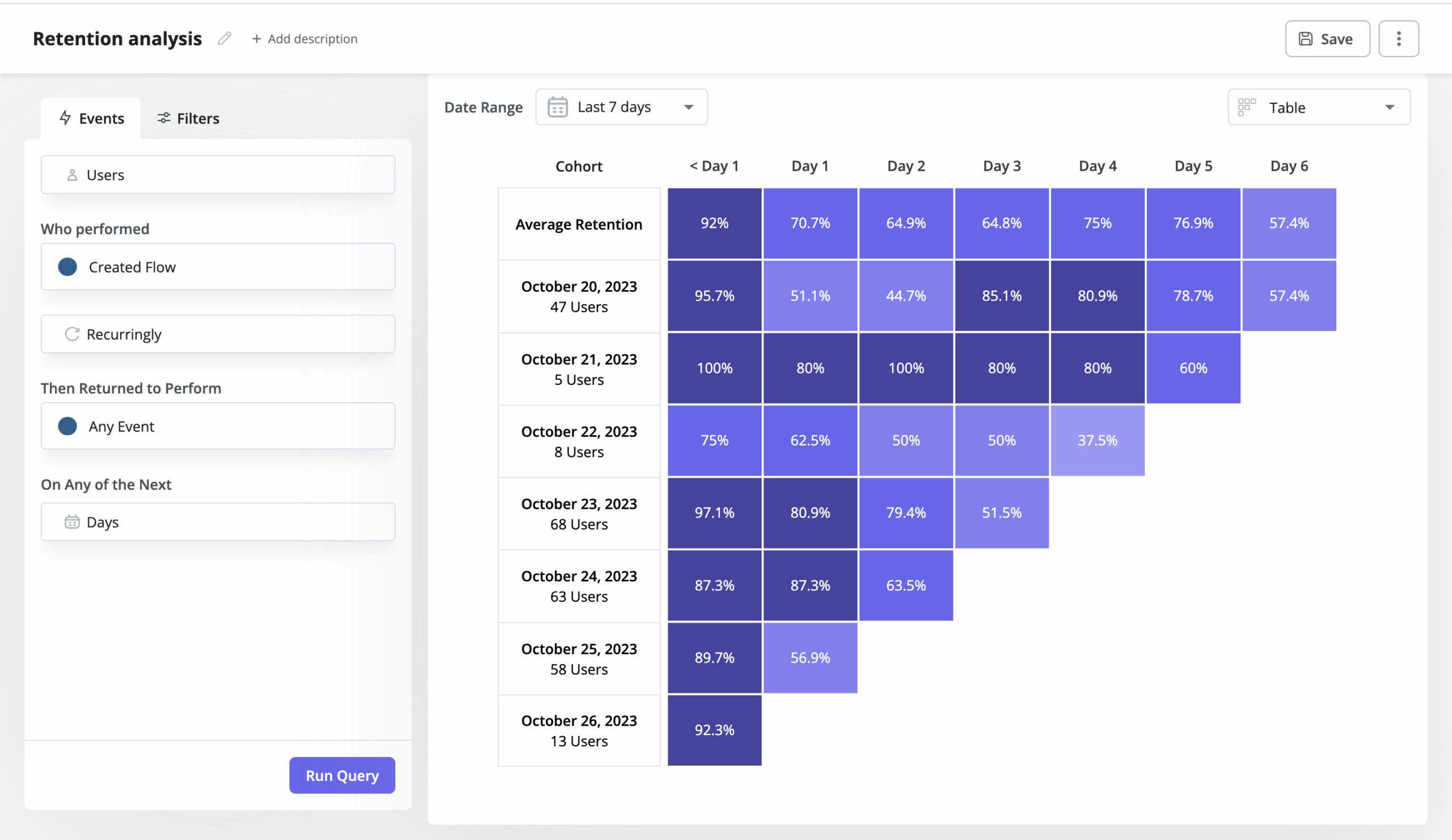
How I run cohort retention analysis in Userpilot
The setup follows a structure I use as my starting point for every new retention strategy analysis. First, define the initial cohort event: for most products, that’s sign-up or first login, but for a product with a meaningful activation step, I often use that instead, since it filters out users who never really started. Then define the retention event: the specific action a user has to take to count as active in a given period. Logins are almost always the wrong choice here; a feature interaction, a workflow completion, or a business-outcome event will give you a far more meaningful retention rate.
From there, set the time interval (daily, weekly, or monthly, depending on your product’s natural usage cadence) and the date range, and Userpilot generates the retention table automatically. The segmentation layer is where the analysis becomes genuinely useful: filter by plan, by feature usage, by user attributes, or by behavioral milestones to cut the cohort into sub-groups and compare their curves side by side. That segmentation step is what turns a single retention chart into a set of testable hypotheses about what’s driving the pattern.
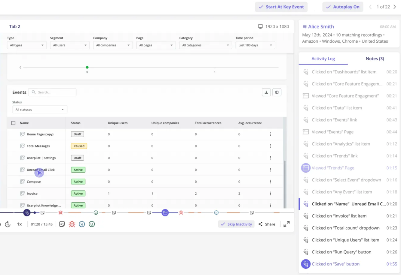
Once I’ve identified something worth acting on, I stay inside the platform to respond. If the funnel shows an onboarding drop-off, I build a tooltip or checklist update directly in Userpilot. Session replay that surfaces a friction point becomes a direct brief for the product team, with a specific, reproducible example to work from.
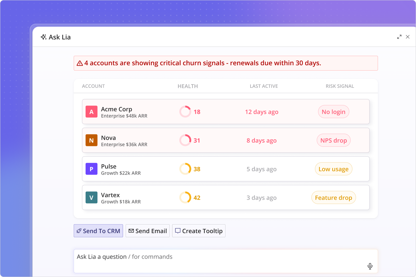
For accounts showing early churn signals in the behavioral data, Lia, Userpilot’s AI agent, monitors key metrics across accounts and flags the ones where usage patterns are starting to diverge from the retained cohort’s baseline before it shows in the retention curve. The difference between that early signal and waiting for the curve to confirm the problem is roughly three months of intervention runway. That’s enough time to rebuild a use case, relaunch an onboarding path, or have the kind of conversation that actually changes whether someone renews.
Back to the curve that wouldn’t flatten. After running behavioral segmentation, I found a clear pattern: users who connected a key integration in the first seven days had a month-3 retention rate roughly 28 percentage points higher than those who didn’t. The acquisition cohort had been averaging the two groups together, and the average looked acceptable. The behavioral split made the real signal visible. Over the next two cohort cycles, I rebuilt the onboarding checklist around that integration step and watched the M3 baseline improve. The retention number improved as well, but the curve’s shape is what told me where to start.
If your cohort analysis is producing figures you can benchmark but not actions you can take, the shape of the curve is likely what’s missing. Book a demo to see how Userpilot’s cohort retention analysis and behavioral segmentation work together in practice.
FAQ
What is a good GRR and NRR?
A good Gross Revenue Retention (GRR) rate is typically between 85% and 95%, as it shows you are retaining most of your existing revenue before expansion. A strong Net Revenue Retention (NRR) rate is above 100%, indicating that expansion revenue from upgrades or upsells is more than offsetting churn or downgrades.
Is 84% retention rate good?
An 84% retention rate is generally considered good, especially for early-stage or mid-market SaaS products. What counts as good depends on your industry, pricing model, and customer lifecycle, so it should always be compared against your own historical benchmarks and similar companies in your segment.
What is the formula for cohort retention?
Cohort retention is calculated by dividing the number of users who remain active during a given time period by the total number of users in the original cohort, then multiplying by 100 to express it as a percentage. The definition of “active” is the retention event you set in your analysis.
What are the 8 C's of customer retention?
The 8 C’s of customer retention are commonly defined as clarity, convenience, consistency, communication, customization, credibility, care, and community. Together, they describe the elements that build lasting relationships with customers. In practice, however, the most actionable of the eight for SaaS teams are consistency and the clarity of the value a user experiences in the first 30 days.
About the author