User Onboarding Metrics in 2026: What to Track for Humans and AI Agents


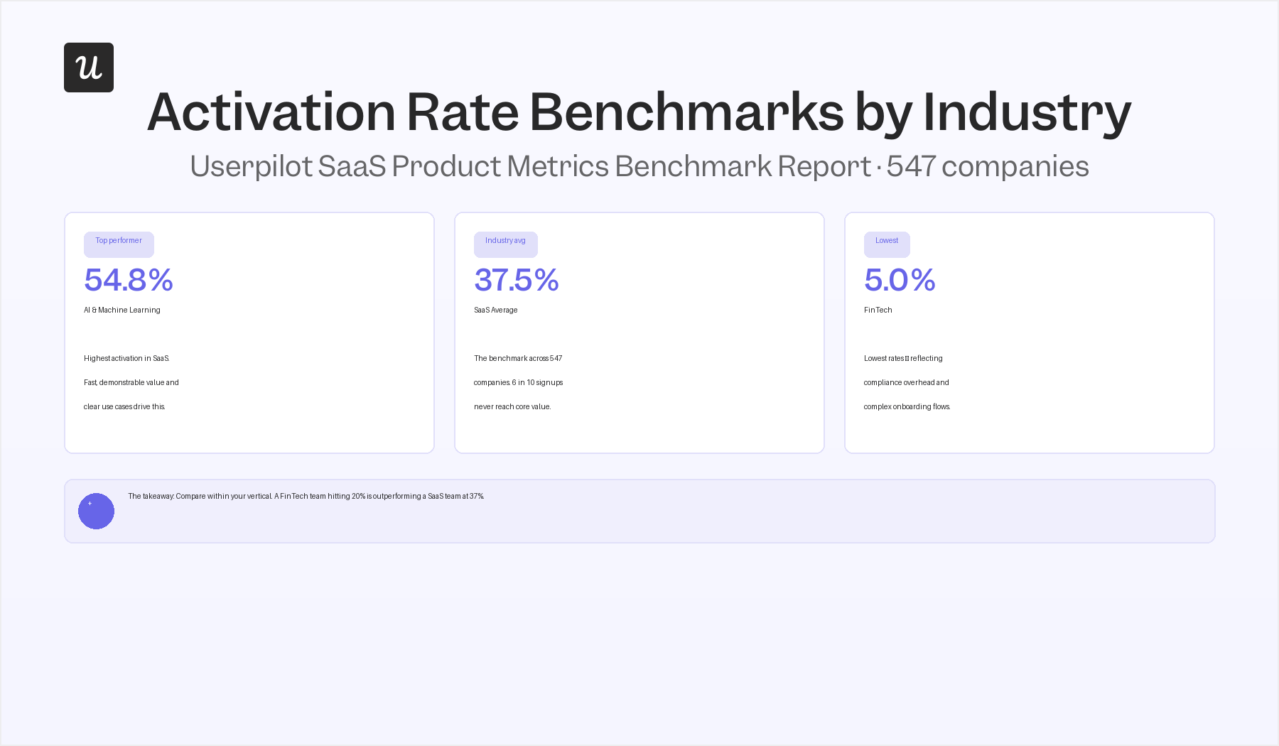
User onboarding metrics have a signal problem, and most SaaS teams don’t realize how bad it’s gotten. Userpilot’s own benchmark data, drawn from 547 SaaS companies, puts the average activation rate at 37.5%, meaning more than six out of ten signups never experience the core value of the product they signed up for. That number hasn’t improved much since 2023.
Since then, a new type of “user” has quietly started showing up in your analytics: AI agents. They connect via MCP servers and APIs on behalf of the humans who configured them, execute tasks, and generate event data that looks nothing like a human exploring your product for the first time.
The welcome checklist never fires for them. The activation milestone may never trigger. Time-to-value calculations have no framework for any of it yet.
Both problems share a root cause: the standard onboarding metric stack was built around a single assumption, that a human being discovers your product, one interaction at a time. That assumption now only covers half of what’s actually happening.
I’ve spent years in customer success watching what happens downstream when onboarding fails, and I wanted to write something more useful than another list of ten metrics with formulas. This guide does three things: ranks the standard metrics by actual signal quality, adds the three metrics most guides skip (Day 1/Day 7 retention, onboarding completion rate, feature adoption rate), and gives you a practical framework for thinking about agent onboarding, including whether AI agents need onboarding at all.

Not all onboarding metrics are equal
The mistake I see most often isn’t tracking the wrong metrics, it’s treating all onboarding metrics as equally important. Teams end up chasing CSAT scores while their activation rate quietly bleeds, or optimizing their checklist completion rate while ignoring the fact that 80% of users who complete the checklist still don’t convert to paid.
Ramli John, who wrote Product-Led Onboarding with ProductLed’s Wes Bush, frames the onboarding journey as three sequential gates: Setup, Aha, and Habit. Each gate has different measurement requirements, and trying to optimize Habit metrics before Setup is working is how teams burn quarters on the wrong problem. The hierarchy I use maps to that same logic.
There’s a hierarchy here, and it matters. I think about onboarding metrics in three tiers.
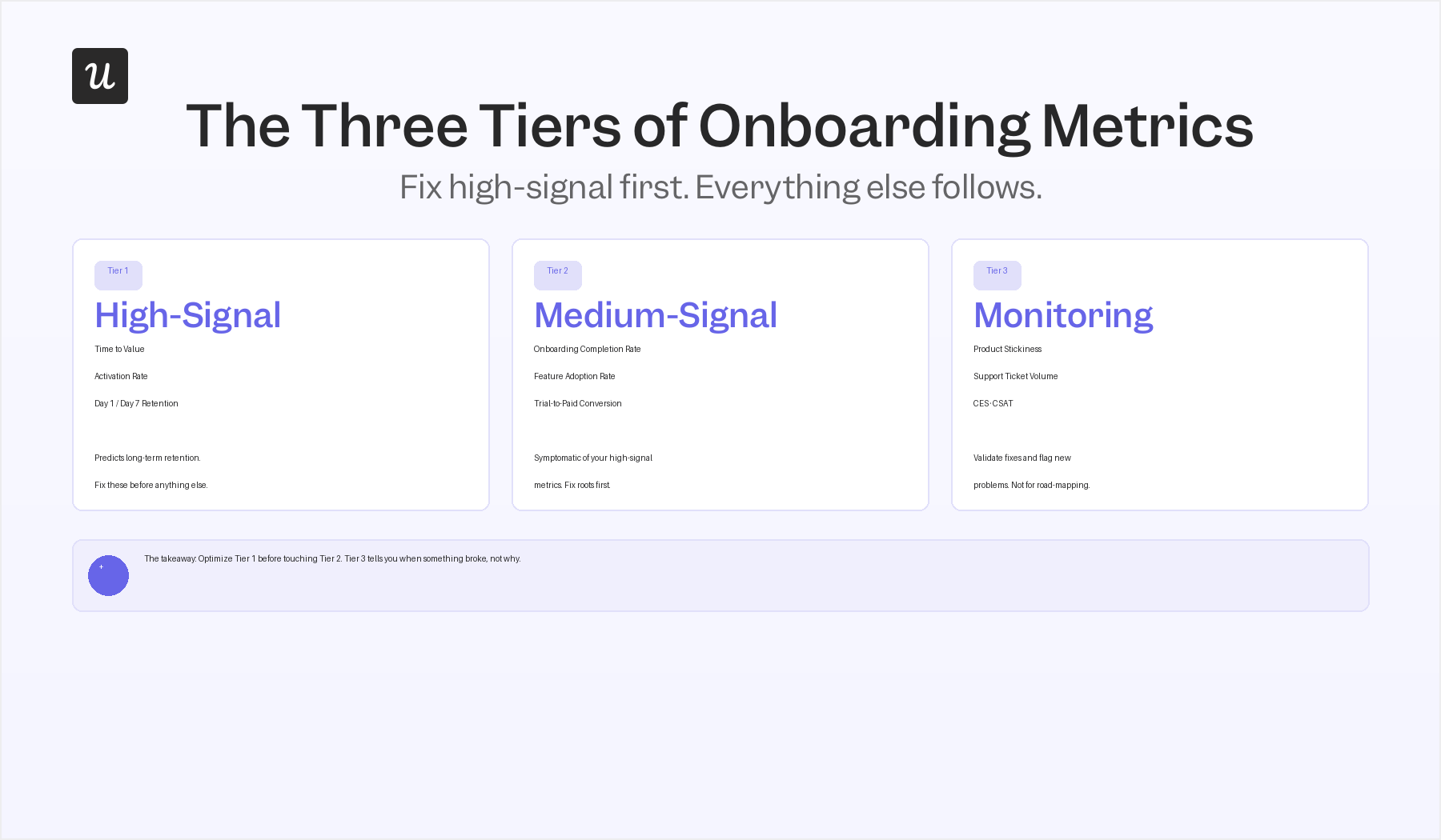
- High-signal metrics: Predict long-term retention, and if they’re broken, everything downstream is broken too. TTV, activation rate, and early retention all fall here. Fix these first.
- Medium-signal metrics: Tell you whether your onboarding flow is working mechanically: are users finishing the process, adopting the right features, and converting? These matter, but they’re downstream symptoms of your high-signal metrics. If activation and TTV are broken, no amount of checklist optimization will compensate.
- Monitoring metrics: CSAT, CES, product stickiness, support ticket volume, are useful for detecting new problems and validating fixes, but they shouldn’t drive your roadmap. A rising support ticket volume during onboarding signals a usability issue, but it doesn’t tell you which step is breaking or why. You need the higher-signal data to diagnose.
The high-signal onboarding metrics
Time to value
Time to value, TTV, is the elapsed time between signup and the moment a user reaches their first “aha moment” with your product. Before you can measure it, you need to define what “value” actually means in your product: the specific action, milestone, or output that tells you a user has crossed from evaluating to experiencing. Without that definition, TTV is just a number with no anchor.
The Userpilot benchmark puts average TTV at 1 day, 12 hours, and 23 minutes across 547 SaaS companies. Top-quartile products deliver first value in under five minutes. That gap is enormous, and it’s where the majority of trial abandonment happens, a shorter TTV directly reduces the likelihood that a user walks away before they’ve had a reason to stay.
The question I’d push every CS and product team to answer is: what is the single action a new user needs to complete to feel the value of your product? Optimize your onboarding flow around that action. Everything else is secondary.
Activation rate
The user activation rate is the percentage of users who reach your predetermined activation milestone within a specific time window. Every product defines activation differently, it should be the set of actions that, when completed, strongly predict a user will stick around. Getting this definition right is harder than the formula.
Calculate it by dividing the number of users who hit the activation milestone by the total number of signups in the same period, then multiplying by 100. The SaaS average sits at 37.5%, but that average hides dramatic variation by industry. Userpilot’s benchmark data shows AI and Machine Learning tools achieving 54.8% activation, while FinTech companies average just 5%, a gap that almost certainly reflects differences in onboarding complexity and time-to-value, not user quality.
Tracking activation rate is only the start. The more valuable question is: which step in the onboarding flow is causing users to drop before they activate? Funnel analytics inside your onboarding flow will show you the exact drop-off point, and that’s where to focus your optimization effort first.
Day 1 and Day 7 retention
Day 1 and Day 7 retention are two of the strongest early predictors of long-term user retention, and most teams I talk to are underusing them. Day 1 retention measures the percentage of users who return within 24 hours of signup; Day 7 captures whether they come back within the first week. Both measure whether onboarding created enough pull to bring someone back, not just whether they finished the flow.
The pattern I see most often with churned accounts is that Day 1 retention looked fine, but Day 7 numbers collapsed. That gap usually means onboarding got users through the steps but didn’t connect the product to a habit or workflow they actually needed. Good onboarding doesn’t just complete, it creates a reason to return.
Aakash Gupta, who writes the Growth Memo newsletter and has done some of the most detailed public work on activation metrics, makes the point that D7 retention is often a better proxy for long-term retention than the activation milestone itself, because it catches the gap between “finished the flow” and “actually came back.” That gap is where most onboarding programs quietly fail.
If you’re only looking at overall retention rates on a monthly or quarterly basis, these early signals are getting lost in the aggregate. By the time monthly retention looks broken, you’ve already lost the users you could have saved with a better Day 3 or Day 5 touch in the onboarding flow.
The medium-signal onboarding metrics
Onboarding completion rate
The onboarding completion rate is the percentage of users who finish your defined onboarding process, typically measured by checklist completion or flow progression. The Userpilot benchmark puts the SaaS average at 19.2%, which means roughly four out of five users who start the onboarding process don’t finish it. A low rate is almost always a friction problem, not a motivation problem.
The most useful thing you can do with this metric is pair it with step-by-step funnel analysis. If 70% of users drop off at step three of a five-step checklist, that step has a problem, unclear instruction, too much effort required, or a feature that isn’t ready to demonstrate value at that point in the journey. The completion rate tells you something is wrong; the funnel tells you exactly where.
FinTech and Insurance companies have the highest average completion rates in Userpilot’s data at 24.5%, while Martech trails at 12.5%. If you’re in a complex product category, a lower completion rate may reflect genuine onboarding complexity rather than a broken flow, but it’s still worth optimizing, because every uncompleted step is a user who got less value than they could have.
Feature adoption rate
Feature adoption rate measures the percentage of active users engaging with a specific feature over time. It’s the metric that tells you whether your onboarding is driving users to the right actions, not just completing steps, but actually using the capabilities you built for them. High activation with low feature adoption often means users are completing your onboarding flow without understanding what your product actually does for them.
Measuring feature adoption is straightforward: divide the number of users who engaged with a feature in a given period by the total number of active users in that period, multiply by 100. The more useful version tracks this over time, a feature adopted by 40% of new users in week one that drops to 10% in week four has a stickiness problem that the initial onboarding flow probably isn’t addressing.
Effective feature adoption comes from combining user education, contextual in-app guidance, and feedback mechanisms, not from assuming users will discover features on their own. If a feature matters for retention, it should appear explicitly in the onboarding flow at the moment it’s relevant, not buried in a menu users may never open.
Trial-to-paid conversion rate
The trial-to-paid conversion rate, the percentage of free trial users who become paying customers, is a useful onboarding metric, but only if you’ve already got TTV and activation in reasonable shape. Teams that try to optimize conversion without fixing the underlying activation problem are working the wrong end of the funnel. Users convert when they’ve experienced enough value to pay for continued access; if they’re not activating, conversion tactics won’t compensate.
To calculate it: divide the number of free trial users who converted in a given period by the total number of trial users, multiply by 100. The benchmark varies by product type, sometimes by an order of magnitude, and pricing model, so your baseline matters more than any industry average. Track the trend over time rather than comparing to a published number.
The onboarding insight here is simple: if your trial-to-paid rate is low, the most reliable fix is shortening TTV and improving the depth of activation, making sure users experience multiple value moments during the trial, not just one. An effective trial leaves users unable to imagine going back to doing things without your product.
The monitoring onboarding metrics
Product stickiness, support ticket volume, Customer Effort Score (CES), and Customer Satisfaction (CSAT) all belong in your onboarding dashboard, but as monitoring signals, not primary drivers of roadmap decisions. These metrics are best used to validate that a change you made worked, or to flag that something new has started breaking.
Product stickiness (DAU/MAU) measures how often users return relative to how many have been active in the month. A more engaging onboarding flow generally moves stickiness upward over time, but the metric is too lagging and too aggregate to use for onboarding optimization directly. If stickiness drops, it tells you something changed; funnel analysis tells you what.
Support ticket volume during onboarding is one of the most undervalued signals in this category. High volumes aren’t a customer success problem, they’re a product problem. When users repeatedly open tickets about the same step in your onboarding, that step has a friction point that in-app guidance can almost always resolve faster than a support response.
Both Net Promoter Score (NPS) and Customer Satisfaction (CSAT) can be used to gauge initial user satisfaction shortly after onboarding, but “shortly after” matters. Running a CSAT survey at the end of an onboarding flow captures sentiment about the process, not the product. If you want onboarding-specific feedback, time your survey to the moment a user completes their first meaningful action, not when they finish the welcome checklist.
The Customer Effort Score (CES) is worth tracking during onboarding because it isolates the question you actually care about at that stage: how hard was it to do this? A high CES at any onboarding step tells you the UX or instruction is creating unnecessary friction, and friction during onboarding is expensive because users haven’t yet built enough loyalty to push through it.
Do AI agents need onboarding at all?
This is the question I’ve heard more in the last six months than in the previous three years combined, and it’s a genuinely good one. AI agents, software that connects to your product via MCP or API and executes tasks on behalf of a human operator, are now a real “user type” in many SaaS products. They interact with features and generate usage data without exploring, without getting confused, and without needing to understand what your product does conceptually.
So, no, AI agents don’t need traditional onboarding. They don’t need a welcome screen, a product tour, or an onboarding checklist. What they do need, and what is genuinely measurable, is successful activation: completing a meaningful first task that returns value to the human who set them up.
The measurement framework for agent activation differs from human activation in three specific ways. First, the “aha moment” doesn’t apply: agents are configured with a task, so success means the first execution completes without error.
Second, retention means whether the human who set the agent up keeps invoking it, not whether the agent itself “returns.”
Third, the support ticket equivalent is API error rates and failed task logs, which are system-generated signals rather than user complaints, which means you need a different monitoring layer to catch integration failures early.
Kyle Poyar, who writes the Growth Unhinged newsletter and spent years as a growth partner at OpenView, has been arguing that the product metrics that served PLG companies well in 2020 to 2023 are increasingly noisy as non-human traffic grows. The signal-to-noise problem is getting worse, not better, and most teams are only beginning to notice it in their aggregate numbers.
Yazan Sehwail, Userpilot’s CEO, has been tracking the same problem from the product side. He frames it in terms of what faster feature shipping does to measurement complexity:
“As producing and building features become a lot cheaper, instead of every quarter, you’re releasing one or two features, now you’re releasing 7, 8, 9. It becomes even harder for product teams to manually have to track each one and understand usage for each one.”
— Yazan Sehwail, CEO, Userpilot
The same problem scales to agent users: when many agents are connecting to your product, the aggregate usage data starts to drown out the human signals you need to see clearly.
The practical implication is straightforward: segment your analytics. If a meaningful portion of your new “users” are agents, your aggregate activation rate is already a blend of two different populations with different behaviors and different success criteria. Track human activation and agent activation separately, and you’ll immediately get a clearer picture of both.
Userpilot’s MCP Server is designed to give you that segmentation layer, connecting agent usage data back to the same product analytics stack you already use for human users, so you don’t need a separate analytics tool to monitor both populations.
How to collect and act on the human and agentic data
Knowing which metrics to track is only useful if you have a reliable way to collect the data and a clear process for acting on it. Here’s how I’ve seen teams do this well.
Welcome screens: Collect the data that personalizes everything downstream
Welcome screens are the first opportunity to collect user data that shapes the rest of the onboarding. The goal isn’t to ask a lot of questions, it’s to ask the two or three questions whose answers let you route users into a flow that matches their actual job to be done. Company size, primary use case, and experience level: any of these can be used to personalize the onboarding path and reduce TTV for each user segment.
The data you collect here also gives you a segmentation layer for every metric downstream. If one user segment activates at 60% and another at 20%, the welcome screen data tells you who those segments are, and that’s where to focus your onboarding optimization first.
Onboarding checklists: Track progression and act on drop-off
A well-designed onboarding checklist does two things: it guides users to activation, and it generates step-by-step completion data that shows exactly where they’re dropping off. The checklist itself is the measurement instrument, every unchecked item is a data point about where your onboarding flow needs work.
The pattern that works well: set up automation to re-trigger a checklist item or send an in-app nudge when a user has been inactive for a specific period at a specific step. Personalized intervention at the exact point of drop-off is far more effective than a generic re-engagement email sent days later.
Feature usage tracking: Find the friction before users tell you about it
Tracking in-app feature usage, clicks, hovers, inputs, navigation paths, gives you the behavioral data to pinpoint exactly where friction is happening in your onboarding flow. You don’t need users to open support tickets to learn that a step is broken; the usage data will show you a cliff edge in the funnel before anyone complains.
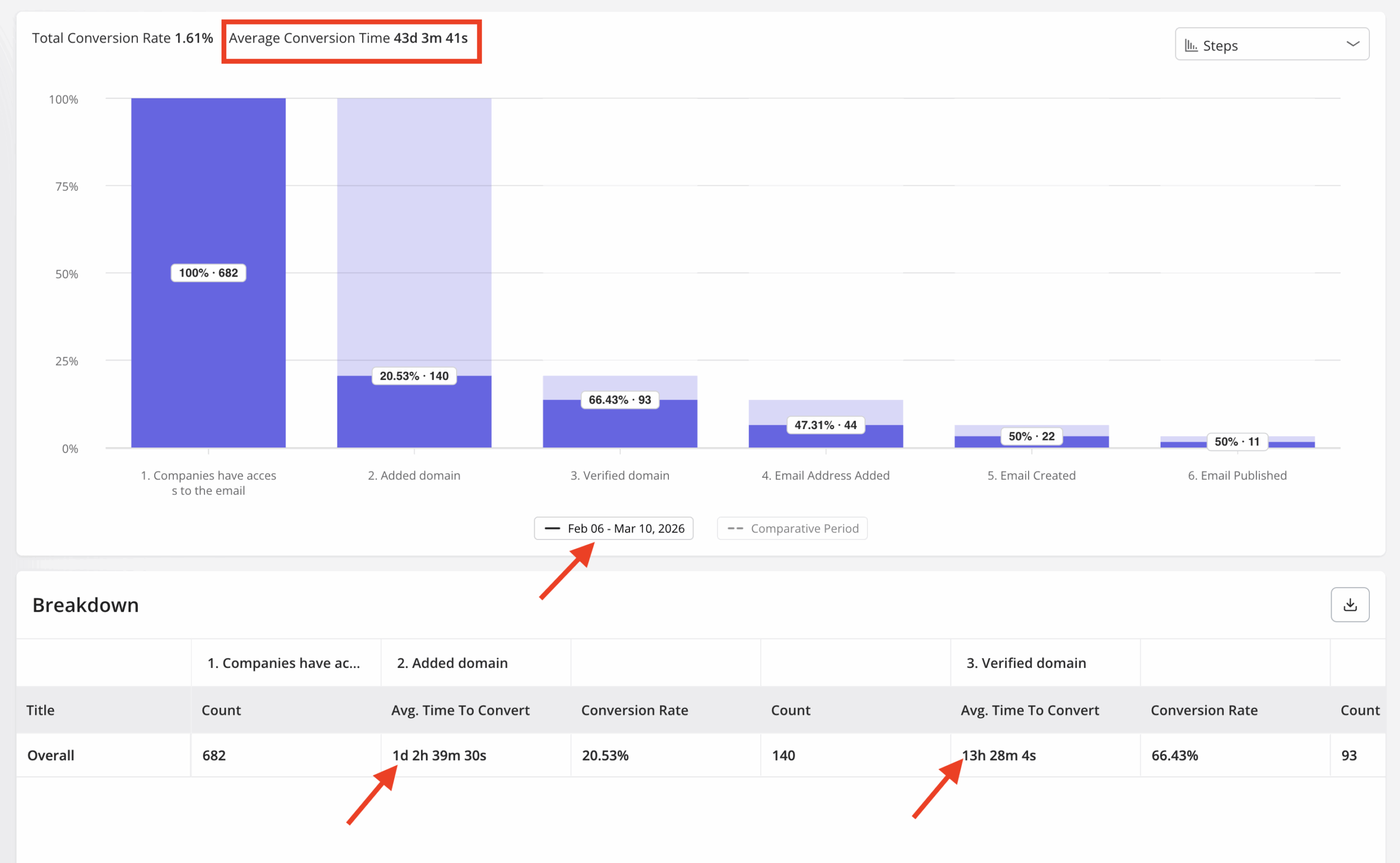
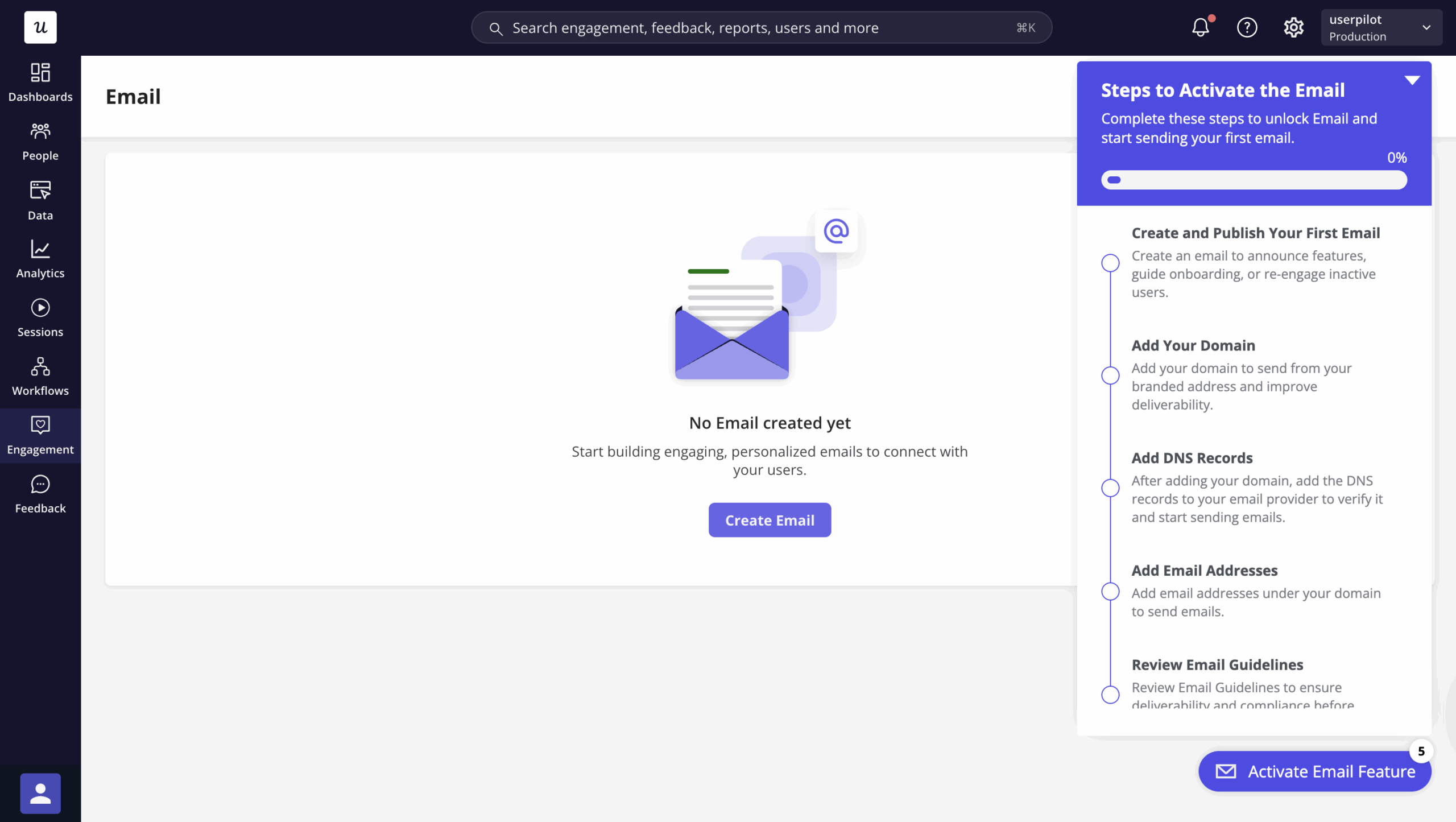
Abrar Abutouq, one of Userpilot’s product managers, described how this works in practice with the email feature launch: “Within a few hours, I just created a targeting tooltip and showed it to users and highlighted the correct steps for them to make it clear what to do next. That helped a lot on reducing friction and supporting users in real time without involving our dev team.” The drop-off at domain verification showed up in the funnel; the fix shipped in an afternoon, no engineering ticket required.
In-app self-service: Reduce tickets by putting answers where users already are
A resource center embedded in your product gives users access to documentation, tutorials, and onboarding guides at the moment they need them, without breaking the product experience to open a support ticket or navigate to an external knowledge base. The analytics on resource center usage tell you which topics generate the most searches during onboarding, which is a reliable proxy for where users are getting stuck.
High support ticket volumes during onboarding are a direct indicator of usability issues or gaps in your onboarding process. Before hiring more support reps, dig into the tickets and categorize them by step, you’ll almost always find that a handful of recurring issues account for the majority of the volume, and in-app content can resolve most of them without human intervention.
Product analytics: Connect the dots between onboarding and long-term behavior
Effective product analytics means tracking user behavior across the full post-signup journey, not just the onboarding flow. The most useful onboarding insight isn’t “did users finish the checklist”, it’s “which onboarding paths produce users who are still active 90 days later.” That longitudinal view is what turns onboarding from a one-time setup task into a retention driver.
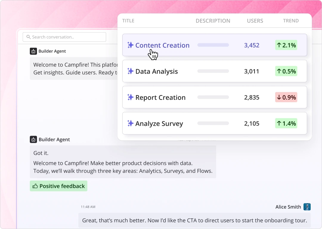
Lia, Userpilot’s AI agent, can analyze your onboarding funnel and surface the specific drop-off points, segment-level activation patterns, and feature adoption gaps without you needing to build custom reports for each question. The shift in how onboarding analytics works in practice is that you ask a question and get an answer, rather than building a dashboard and hoping it shows you the right thing.
Agentic analytics: Track what your AI agents are doing
Userpilot’s Agent Analytics gives you three measurement layers for any AI agent deployed in your product. The first is usage overview: unique users, companies, and conversation volume, plus drop-off analysis by conversation length and agent impact on activation, adoption, retention, and revenue. The second is topics and intent: AI-identified topic categories across all conversations, surfaced to show high-frequency pain points, track how topics shift over time, and flag unmet needs before they become churn signals. The third is failure signals: AI detection of frustrated and abandoned conversations, resolution failures tracked by topic, and identification of which conversation types fail most often. Those three layers feed into eight specific metrics the dashboard tracks: conversation volume, resolution rate, activation and adoption lift, satisfaction score, conversation entry points, top asked questions, queries per user, and failure rate.
Turn onboarding metrics into retention
The goal of tracking user onboarding metrics isn’t to have a dashboard that looks complete, it’s to know which part of your onboarding process is failing and fix it fast enough to keep the users it’s losing. Start with the high-signal metrics: TTV, activation rate, and Day 1/Day 7 retention. Get those in shape before optimizing anything else.
Then build in the medium-signal layer: onboarding completion rate and feature adoption rate will tell you whether the flow itself is working, and trial-to-paid conversion will confirm that the value you’re delivering during onboarding translates into revenue. Use CSAT, CES, and support ticket volume as monitoring signals, they’ll tell you when something new has broken, but they won’t tell you how to fix it.
And if a meaningful share of your new “users” are AI agents, start tracking them separately now, before the aggregate numbers start obscuring what’s actually happening with your human users. That segmentation is the most underdone onboarding analytics task in SaaS right now, and the teams who get ahead of it will have a measurement advantage that compounds quickly.
Want to start tracking all of this without building a custom analytics stack? Get a Userpilot demo and see how it connects onboarding flows, funnel analytics, feature adoption data, and agent usage into a single view.
About the author