17 Best In-App Messaging Examples To Improve Customer Engagement


In-app messages are targeted prompts that appear while someone is using your product. They include welcome screens, tooltips, checklists, banners, surveys, and upgrade prompts, and their job is to help the user take the most relevant next action in context.
Despite having in-app messages in place, most SaaS users still fail to reach meaningful value. Our SaaS Product Metrics Benchmark Report at Userpilot puts the average activation rate at 37.5%, core feature adoption at 24.5%, and onboarding checklist completion at 19.2%. In other words, a signup or feature release does not guarantee that users will understand what to do next.
In-app messaging can close that gap, but it should not replace every other communication channel. It reaches users who are already inside your product, making it ideal for guidance, feature discovery, feedback, and contextual upsells. Email and push are still better for re-engaging people who have stopped logging in or for messages they need to revisit later.
I’ll walk you through 17 in-app messaging examples to show you how SaaS teams use different patterns across onboarding, adoption, retention, and account expansion. More importantly, I’ll explain why each example works, where I would use the same approach, and what I would change before copying it.

17 Best in-app messaging examples to improve customer engagement
I’ve grouped the examples by the customer journey stage they support:
- In-app onboarding: Learn what a new user wants and guide them to their first value moment.
- Adoption: Help users complete key workflows and discover relevant features.
- Retention: Reinforce value, introduce advanced capabilities, and collect feedback before friction becomes churn.
- Account expansion: Present upgrades when the user has encountered a real reason to consider one.
In-app messaging examples for user onboarding
During onboarding, I use in-app messaging to answer three questions quickly: Who is this user? What are they trying to accomplish? What is the shortest path to proving that the product can help?
The biggest mistake is turning onboarding into a guided tour of the interface. New users do not need an explanation of every menu. They need enough direction to complete the action that makes the product worth returning to.
#1 Postfity uses a welcome screen to personalize onboarding
Postfity starts with a welcome screen that asks users to identify their role or use case. That one answer gives the product enough information to change the guidance that follows.
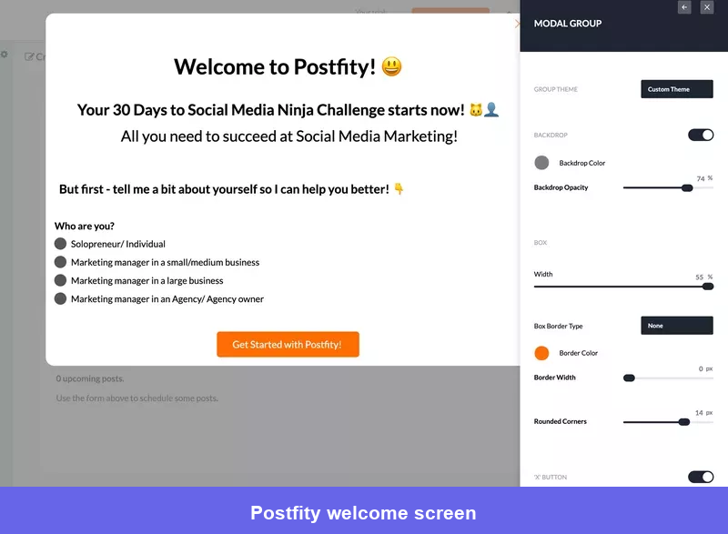
What I like about this example is the restraint. The welcome screen does not ask five demographic questions simply because the data might be useful later. It collects information that can immediately improve the experience.
That is my rule for welcome surveys: only ask a question if the answer will change the next screen, checklist, or recommendation. If every response leads to the same tour, the survey creates friction without delivering personalized onboarding.
For a project management product, for example, asking whether someone manages client work or an internal team could determine which template, terminology, and activation task they see first. One useful answer is often enough to make the rest of the onboarding feel intentional.
#2 Kontentino sets expectations and guides users to two activation events
Kontentino’s welcome screen introduces the onboarding process, puts a human face to the experience, and invites users to ask for help. The tone is supportive, but the flow is still focused on action.
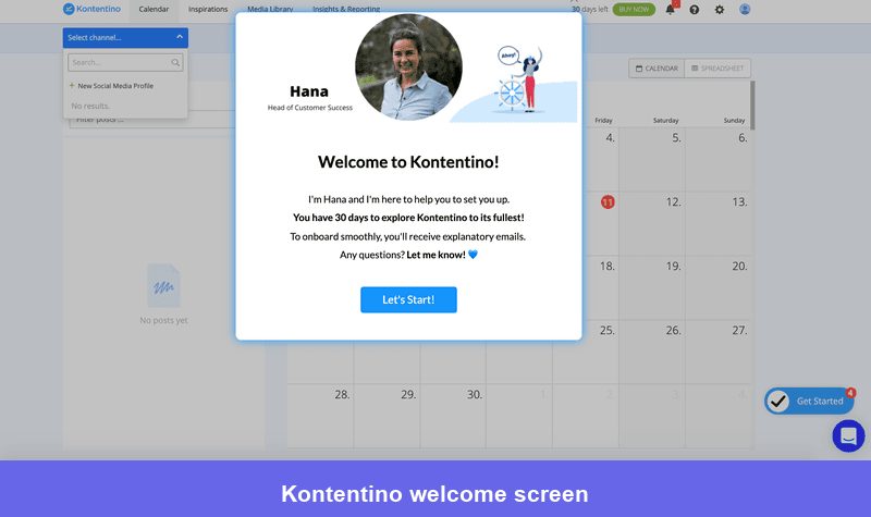
The important part is what happens after the welcome. Kontentino identified two actions that signal early value: connecting a social media account and scheduling the first post. Its walkthrough and checklist guide users toward those actions rather than showing them around the entire platform.
That focus produced a measurable result. According to the Kontentino case study, the company increased new-user activation by nearly 10% in its first month using the new flow.
This is the kind of evidence I look for before expanding an onboarding experience. First, define the activation events. Then build messages around them and compare activation for users who engage with the flow against those who do not. Completion alone is not a success metric if the completed flow does not change product behavior.
#3 Canva uses a welcome survey to segment users by intent
Canva asks new users what they plan to create, then uses the answer to prioritize relevant templates and recommendations. This is more useful than segmenting by job title alone because two people with the same role may have completely different reasons for using the product.
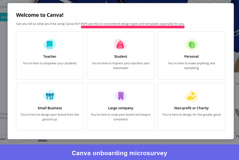
When I design this kind of survey, I separate three possible inputs:
- Role: Who is using the product?
- Goal: What outcome are they trying to achieve?
- Experience: How much guidance are they likely to need?
You rarely need all three at once. Choose the input that creates the clearest difference in the next experience. Userpilot’s role- and behavior-based user onboarding tools, for example, let teams route users into different flows and checklists without building separate onboarding logic into the product itself.
The practical lesson from Canva is not “add a welcome survey.” It is to use the answer. Change the starting template, recommended workflow, checklist, or help content so the user can see that the product understood their intent.
In-app messaging examples for product and feature adoption
Activation proves initial value. Adoption happens when users repeat the valuable behavior and incorporate more of the product into their workflow.
At this stage, messages should respond to what the user has or has not done. A generic feature announcement sent to the entire user base may create awareness, but it will not necessarily change behavior. I prefer to trigger adoption messages after a relevant event, repeated workaround, milestone, or sign of hesitation.
#4 Userpilot combines an announcement, webinar invitation, and on-demand help
When we launched the Userpilot Resource Center, we did not try to explain the entire feature in one announcement. We used a full-screen modal to introduce the release and show why it was useful.
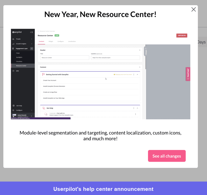
We then used a slideout to invite users to a webinar where they could see the feature in action and ask questions.
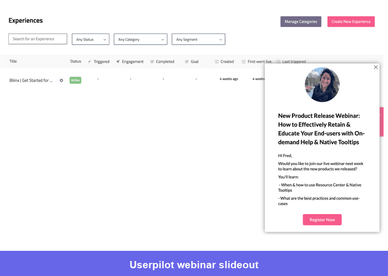
The sequence works because each message has one job. The modal creates awareness, the slideout offers deeper education, and the in-app resource center keeps tutorials, product news, and support content available after both messages disappear.
I use this layered approach for substantial releases. Do not force the complete tutorial, release note, webinar registration, and feedback request into one modal. Introduce the value first, then let users choose how much more help they need.
#5 Loom uses a checklist to drive users toward the core workflow
Loom’s checklist centers on the behavior that makes the product valuable: recording and sharing a video. The tasks do not send users to profile settings or secondary features just to make the list look comprehensive.
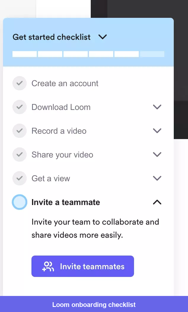
A strong user onboarding checklist should function as a route to value, not a table of contents. I normally keep the initial version to three to five meaningful tasks, write each item as an action, and complete it automatically when the product detects the behavior.
The order matters too. Put the task with the highest value-to-effort ratio first so users experience progress quickly. Optional setup work can appear later or move into a secondary checklist after activation.
Before publishing a checklist, I ask one uncomfortable question: would completing these tasks make the user more likely to return? If the answer is unclear, the checklist is probably measuring activity rather than adoption.
#6 Respond.io uses a checklist for a multi-step, collaborative setup
Respond.io, previously known as Rocketbots, has a more involved setup than Loom. Its checklist reflects that by guiding users through the actions required to make a business messaging workspace operational.
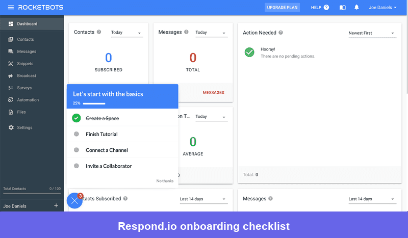
This is an important distinction. The ideal checklist length is not a universal number. It depends on the minimum configuration required to deliver value. A collaborative B2B product may need users to connect a channel, invite a teammate, and configure an automation before the workflow can work as intended.
In those cases, I would still avoid presenting every setup step at once. Break the process into phases, explain why each task matters, and keep completed items visible long enough to reinforce progress. For account-level products, also decide whether one person completing a task should update the checklist for everyone in the company.
The lesson here is to model the real implementation journey, including dependencies outside the individual user’s control, rather than pretending every product has an instant aha moment.
#7 Get a Newsletter uses a two-step interactive walkthrough
Get a Newsletter proves that an interactive walkthrough does not need ten tooltips. Its two-step flow directs users to the relevant interface and gives them enough information to continue independently.
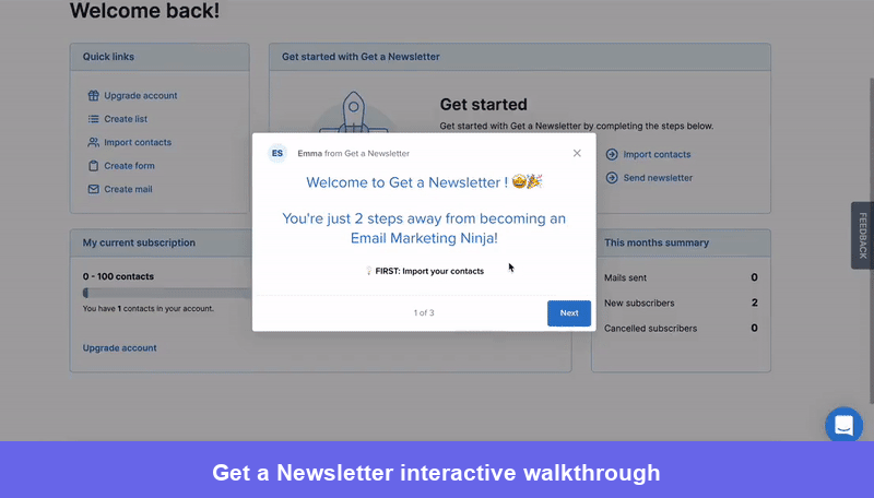
I call this minimum viable guidance. The message should remove the next point of uncertainty, not pre-empt every question the user might have later. Short interactive walkthroughs also make it easier to identify which step causes abandonment and revise the experience without rewriting a full tour.
Attach each tooltip to the element the user must interact with, allow them to complete the action before advancing, and end as soon as they can continue on their own. That creates learning through action rather than passive clicking.
For complex features, I would pair the walkthrough with optional in-app help. The user who needs more detail can open a tutorial, while everyone else gets out of the flow quickly.
In-app messaging examples for retention
Retention messaging should help active users keep finding value. That can mean introducing a more advanced workflow, explaining a major product change, asking for feedback after a specific interaction, or intervening before a cancellation.
Timing becomes especially important here. Long-term users already understand the product, so broad educational prompts can feel patronizing. Use user behavior analytics to distinguish people who need guidance from those who have already adopted the feature.
#8 BacklinkManager uses secondary onboarding for advanced feature discovery
BacklinkManager uses a checklist to introduce an automation workflow after users have had time to understand the product’s basic value.
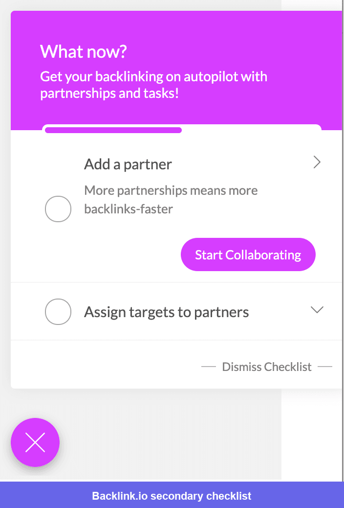
This is a good example of secondary onboarding. Advanced features often improve user retention, but promoting them during the first session competes with activation. Waiting until a user completes the primary workflow gives the message more relevance and reduces cognitive load.
I would trigger this checklist after a meaningful milestone, such as completing the manual workflow several times, reaching a usage threshold, or visiting the automation page without configuring it. I would also exclude anyone who already uses the feature.
The message should connect the advanced feature to the work the user is already doing. “Automate your recurring link checks” is more compelling than “Discover our automation feature” because it explains the payoff in the user’s terms.
#9 Moz uses a modal for a significant feature announcement
Moz uses a modal to announce a new feature and give users a clear route to try it.
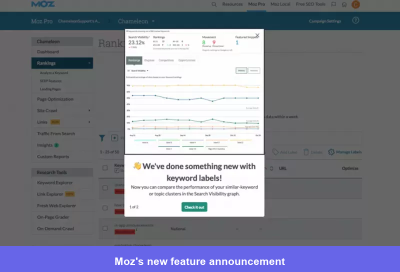
Good modal UX design says a modal is justified when the release materially changes what users can accomplish or how they complete an important workflow. It is not the right default for every minor improvement.
For a strong new product announcement, I look for three elements: what changed, why it matters to this user, and one clear next step. Screenshots or short videos help when the interface is unfamiliar, but the copy still needs to communicate the value because not every user will study the visual.
I would also control frequency carefully. If users learn that every login brings another blocking modal, they will dismiss announcements before reading them. Reserve interruption for releases that deserve it and use announcement banners, tooltips, or a news center for smaller updates
#10 Kommunicate uses small cues to improve feature discovery
Kommunicate discovered that many customers were asking for capabilities that already existed. Around 60–70% of users relied on only three or four major parts of the platform, so the team focused on drawing attention to features connected to conversion.
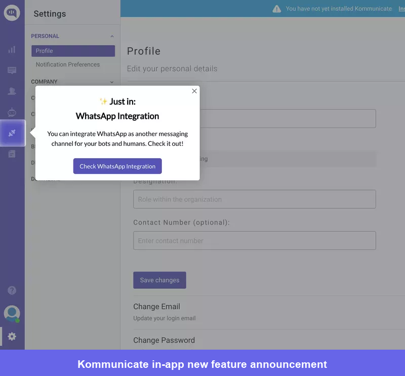
Rather than relying on one large tour, Kommunicate used a series of small in-app cues. The broader Kommunicate case study covers a product adoption program that increased signup-to-chatbot integration from roughly 40–45% to 55–60%, raised discovery of key product goals from 28% to 41%, and improved usage of one important feature by 3%.
The lesson is that feature discovery is rarely solved by one announcement. Start with behavioral data to identify features that successful customers use, then introduce those features when another user reaches the point where they become useful.
I also prefer subtle patterns for this work. A tooltip attached to the relevant control is easier to act on than a modal that describes a feature while blocking the interface needed to use it.
#11 Miro uses an oversized “What’s new” modal for a bundled update
Miro’s “What’s new” modal is one of the better UI modal examples I’ve seen: it groups several meaningful updates into one visual summary.
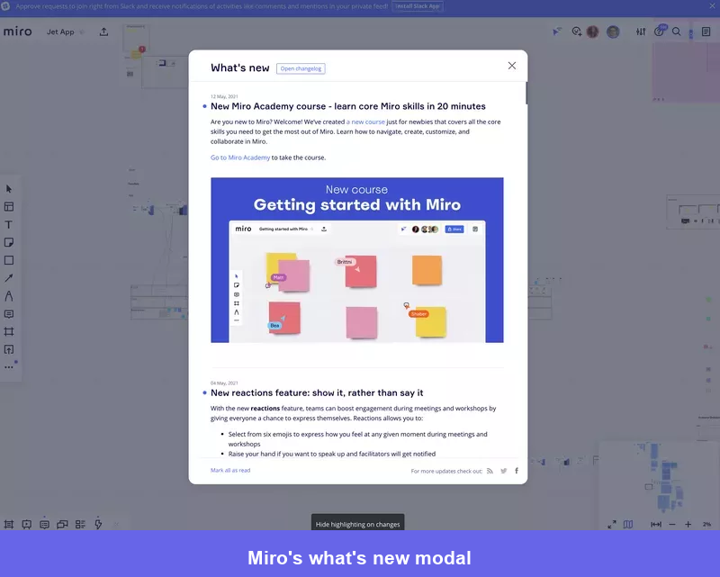
This format works better for a bundled release than a series of separate pop-ups. It lets users scan the updates, choose what is relevant, and continue without being interrupted again during the same session.
I would not show the same list to every user by default. A facilitator, designer, and product manager may care about different Miro capabilities. Segmenting the content by role, plan, or prior feature usage would make the modal easier to scan and increase the chance that each CTA leads somewhere useful.
For minor changes, move the update into a persistent news area instead. The size of the message should reflect the importance of the change, not the amount of work the team invested in shipping it.
#12 Jira collects feedback immediately after a product change
Jira uses an in-app survey to ask users about a recently released change while the experience is still fresh.
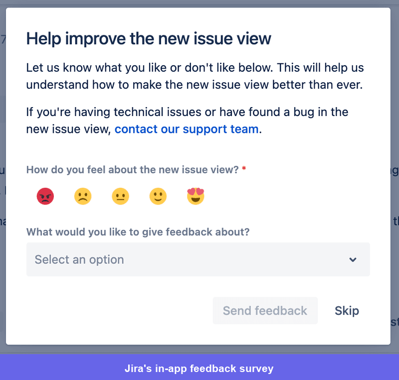
This is much more reliable than emailing the entire customer base and asking people to remember an interaction from days earlier. The event provides context, and the feedback can be connected to the user’s plan, role, and actual behavior.
I normally start with one rating or multiple-choice question and make the open-text follow-up optional. Userpilot, for example, can trigger targeted in-app surveys and analyze responses without asking engineering to build a new form for each release.
Do not trigger the survey immediately after the user opens the feature. Give them enough time or require a meaningful action first. Otherwise, you measure first impressions of the interface rather than whether the feature solved the problem.
#13 Dribbble keeps its post-support satisfaction survey short and on-brand
Dribbble asks for feedback after a support interaction and styles the survey to feel consistent with the rest of the product.
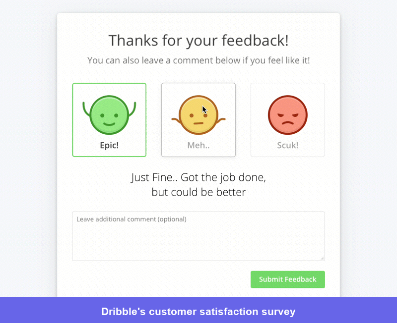
The timing is more important than the illustration. A post-support CSAT survey should refer to a specific interaction, appear after the issue has been handled, and take only a few seconds to answer.
I would route low scores into a short follow-up question asking what remained unresolved, while high scores can end immediately or invite an optional testimonial later. That creates a useful recovery path without making satisfied users complete unnecessary fields.
Branding can make a survey feel less clinical, but clarity must come first. Users should understand exactly what they are rating: the support agent, the resolution, or the overall product experience. Mixing those questions produces feedback that is difficult to act on.
#14 Asana uses an exit survey to learn why users cancel
Asana asks users why they are leaving during the cancellation flow.
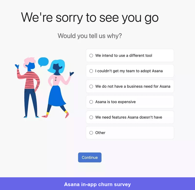
The survey creates value only when the response changes what happens next. A user canceling because the product is temporarily unnecessary might benefit from a subscription pause. Someone blocked by implementation may need help. A price-sensitive user might prefer a lower plan. Someone who has made a firm decision should be allowed to cancel without additional friction.
Well-designed churn surveys collect structured reasons for analysis and use conditional follow-ups to understand the underlying problem. They should not trap users in a loop of offers or hide the final cancellation button.
I also compare cancellation reasons with product behavior. “Too complicated” means something different when the user never completed setup than when a long-term power user encounters a new workflow problem.
In-app messaging examples for account expansion
An upgrade message is useful when it explains how a higher plan solves a limitation the user has just encountered. It becomes noise when it appears because the account happens to be eligible for an upsell.
Before showing an expansion prompt, I look for evidence of intent: clicking a locked feature, approaching a usage limit, repeatedly using a manual workaround, adding teammates, or adopting features associated with larger accounts.
#15 Intercom uses a contextual tooltip to introduce an upgrade
Intercom places an upgrade tooltip next to the feature the user is exploring.
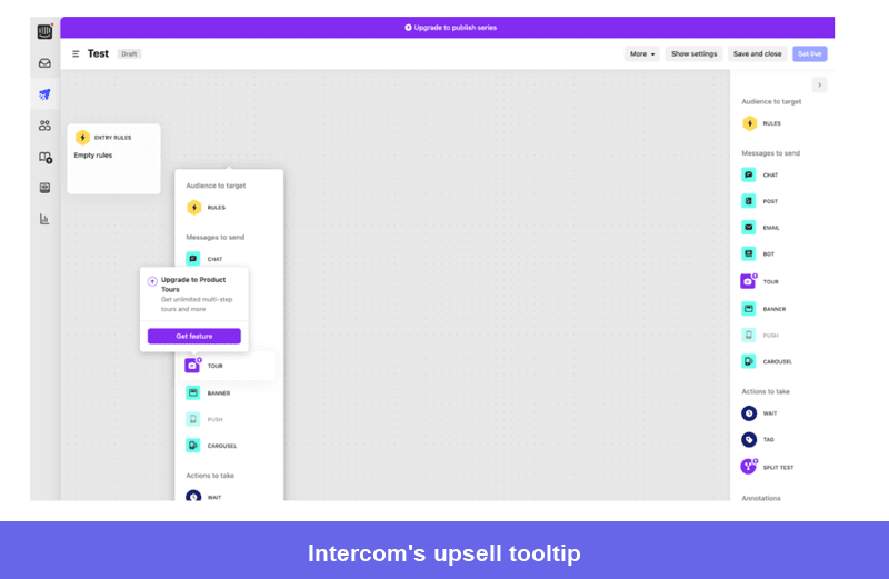
The placement gives the message context. The user does not need to guess which capability the upgrade unlocks, and the prompt does not interrupt unrelated work elsewhere in the product.
The best upselling examples in SaaS explain the outcome rather than repeating the plan name. “Create guided tours for new users” is more persuasive than “Upgrade to Pro.” I would also show the prompt only after the user demonstrates interest, not every time they visit the page.
Where possible, let users preview the feature, see an example, or start configuring it before asking them to upgrade. Experiencing part of the value makes the commercial decision more concrete.
#16 Zapier triggers an upgrade modal at a usage limit
Zapier shows an upgrade modal when users reach the number of tasks available on their current plan.
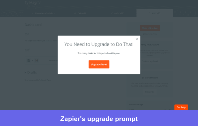
This is one of the few moments when a blocking modal is appropriate because the account cannot continue the intended action without resolving the limit.
A good limit message should show current usage, explain what the next plan changes, and provide a direct CTA. It should also make alternatives clear when they exist, such as deleting unused items, waiting for the limit to reset, or reviewing usage before upgrading.
The timing makes this different from a generic promotion. Zapier is not manufacturing urgency; it is explaining a constraint the user has already encountered. That is the standard I use for expansion prompts: the product state should justify the message.
#17 FigJam uses a banner for a persistent account-level upgrade
FigJam uses a banner to communicate an upgrade opportunity without blocking the canvas.
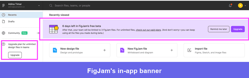
Banners work well for ongoing account states, such as beta access ending, a trial approaching its deadline, or a workspace nearing a limit. They remain visible while allowing the user to keep working.
The best notification banners are concise because they share limited space with the product interface. State the condition, the consequence, and the next action. Put detailed plan comparisons on the destination page rather than squeezing them into the banner.
I would also set clear dismissal and recurrence rules. A permanently ignored banner becomes part of the interface and stops communicating anything. If the account state changes or the user takes another relevant action, update the message rather than repeating the same prompt indefinitely.
What the best in-app messages have in common
Across these examples, the strongest messages follow the same operating principles:
- Start with the behavior you want to change: Define the activation event, adopted feature, feedback signal, or upgrade condition before choosing a UI pattern.
- Use the smallest interruption that can do the job: A tooltip or banner is usually better than a modal when the user can continue working.
- Target by context, not only by persona: Role and plan matter, but recent actions, missing events, and product state often provide a stronger reason to show a message.
- Keep in-app and email complementary: In-app guidance works when users are present. Use email to bring inactive users back, provide durable recaps, or continue a journey outside the product.
- Measure downstream behavior: Clicks and dismissals tell you whether the message was noticed. Activation, feature usage, retention, feedback quality, and upgrades tell you whether it worked.
For more complex journeys, Userpilot Workflows coordinate in-app, survey, and email touchpoints with behavioral branches, delays, and completion rules. That lets you stop sending the same sequence to everyone and respond to what each user does next.
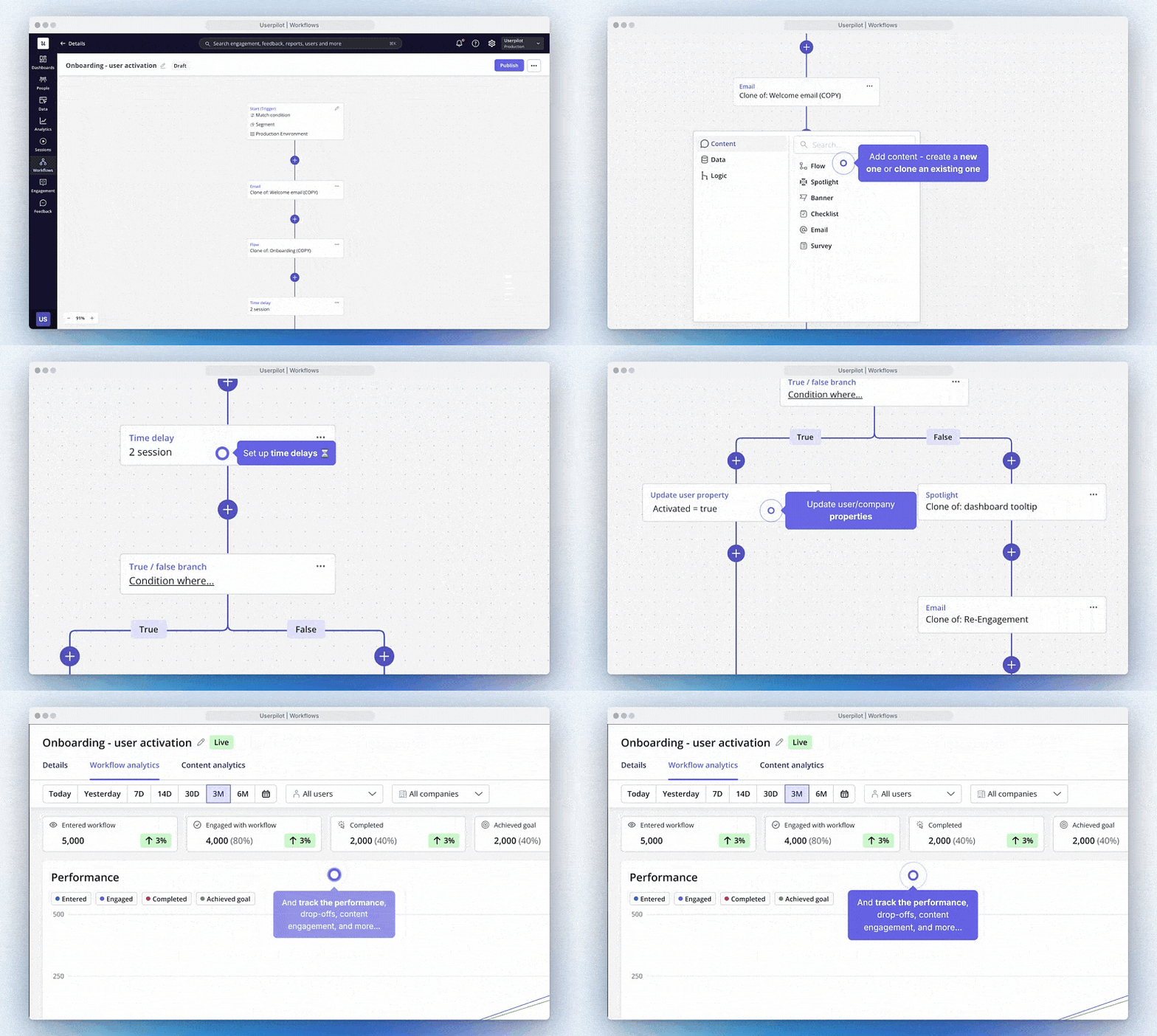
I also pair messaging data with product analytics and session replay. A funnel shows where users leave, replay helps explain what happened on the screen, and a targeted survey captures why. Only then do I decide whether the solution is a message, a product change, or both.
Build messages around user context!
In-app messaging works because it meets users inside the task they are trying to complete. The strongest examples do not simply broadcast information. They remove the next point of uncertainty, make a relevant feature easier to discover, or explain an account decision at the moment it becomes necessary.
Userpilot brings the patterns used throughout this article into one platform: flows, spotlights, banners, checklists, surveys, resource centers, email, and cross-channel Workflows. You can target them using user attributes and behavior, then measure whether the experience changed activation, adoption, or retention.
For teams that want to shorten the build-and-test cycle further, Lia can analyze product signals and create in-app flows or surveys from the resulting insight. The team still reviews the experience, but it no longer has to move manually from dashboard to hypothesis to first draft.
See how Userpilot can help you build, target, and measure contextual in-app messages across the customer journey. Book your free demo!
About the author