10+ UI Modal Examples That Make Sense


The first time I watched a session replay of a user encountering a UI modal on page load, they dismissed it in under a second, before the body copy had even finished loading.
They weren’t being impatient. They’d simply been trained by every other product that had interrupted them the same way.
That’s what makes modals such an interesting UI pattern. They’re incredibly effective at capturing attention because they interrupt whatever the user was doing. But that same interruption is exactly why they’re one of the easiest UI components to misuse.
A modal is an interface overlay that appears on top of the current screen, blocks interaction with the content behind it, and requires the user to either complete an action or deliberately dismiss it before continuing.
That last part is what separates a modal from most other UI patterns.
| Pattern | Blocks the background? | Best for |
|---|---|---|
| Modal | ✅ Yes | Focused decisions and high-priority actions |
| Drawer / Side panel | ❌ No | Editing or viewing content while keeping context visible |
| Tooltip | ❌ No | Contextual guidance |
| Banner | ❌ No | Persistent announcements |
| Toast | ❌ No | Temporary confirmations and status updates |
| Side panel | ❌ No | Large detail views that shouldn’t interrupt the workflow |
Personally, I reach for a modal last, not first.
That’s probably surprising considering this article is full of UI modal examples. But after reviewing hundreds of SaaS products over the years, I’ve found that most modal problems aren’t caused by poor design; they’re caused by using a modal when another UI pattern would’ve worked better.
So, before looking at UI modal examples worth copying, it’s worth understanding why so many of them fail.
Why do users hate modals?
Modals don’t have a reputation problem because users dislike overlays. They have a reputation problem because products often interrupt users at the wrong time, for the wrong reason, with the wrong message.
I’ve found that most frustrating modals share one of three problems.
Because they interrupt what people were trying to do
The entire purpose of a modal is to steal focus.
Unlike a banner or tooltip, a modal freezes everything underneath it until the user responds. Sometimes that’s exactly what you want. If someone is about to permanently delete a project, for example, stopping them for confirmation is completely justified.
Most modals aren’t doing that, though.
Instead, they appear halfway through a workflow to promote a webinar, announce a feature the user wasn’t looking for, or ask for feedback before the user has even experienced the product.
This meme (that I stole from our VP of Marketing at Userpiot, Emilia) says it best.

Eventually, users learn that these interruptions rarely help them. Instead of reading the headline, they immediately look for the close button. UX researchers call this modal blindness. It’s the same learned behavior we see with banner blindness: after enough unnecessary interruptions, users stop paying attention altogether.
That’s why one poorly timed modal costs more than a single dismissal. It makes every future modal—including the important ones—less likely to be read.
I’ve started thinking of modals as trust decisions. Every interruption asks the user to pause what they’re doing. If that interruption wasn’t worth it, you’ve made the next interruption easier to ignore.
Because they demand attention before they’ve earned it
One pattern appears across almost every SaaS product.
- A newsletter signup modal appears before you’ve read the article.
- An upgrade prompt appears before you’ve experienced the premium feature.
- A feature announcement appears while you’re trying to finish an unrelated task.
None of these interactions is inherently bad. The timing is.
A modal asks users to temporarily abandon their current goal in favor of yours. If your request has nothing to do with what they’re trying to accomplish, the interruption feels selfish instead of helpful.
Compare that with a storage-limit warning that appears when someone is actually running out of storage, or a confirmation dialog before deleting customer data. Those interruptions make sense because they appear exactly when users expect additional guidance.
In other words, users don’t hate attention-grabbing UI. They hate products that ask for attention before they’ve earned it.
Because they often exist for the wrong reason
The question I ask before recommending a modal is surprisingly simple:
What happens if this opens as a normal page instead?
If the answer is “nothing,” then it probably shouldn’t be a modal.
The wrong reason for choosing a modal is that it’s faster to build than creating another page or route.
The right reason is that leaving the current screen would genuinely hurt the user’s experience.
Maybe they’d lose the context of a large table they’re editing. Maybe they’d lose scroll position while reviewing dozens of support tickets. Maybe they’re making a quick edit that should happen without leaving the current workflow.
Those are situations where a modal—or sometimes a drawer—is doing real work.
When preserving context is the goal, the interruption becomes justified. When convenience for the product team is the goal, users end up paying the price.
That’s also why I don’t think modals should be the default solution whenever you need another screen. Most of the time, there are better alternatives that preserve context without trapping users inside an overlay—which is exactly what we’ll look at next.
Does this really need to be a modal?
One question has saved me from recommending a lot of bad modals: If this weren’t a modal, what would it be?
Most teams start with the opposite assumption. They know they need another interface, so they default to a modal. Only afterward do they realize the content has grown into a multi-step form, requires scrolling, or would work better as its own page.
I find it much easier to work backwards instead.
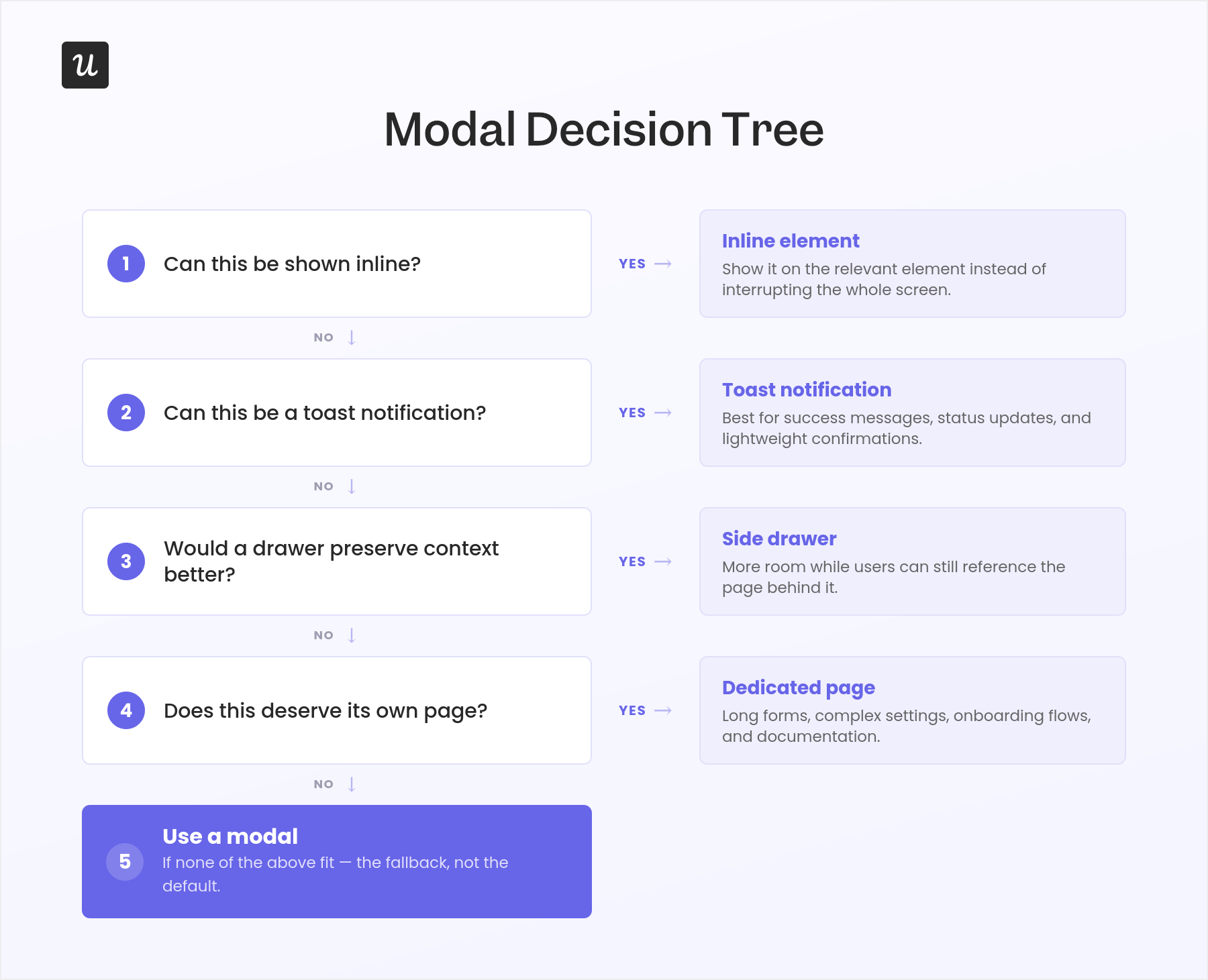
Before introducing an interruption into your product, run through this simple decision flow:
- Can this be shown inline?
If the message relates to a specific element on the page, show it there instead of interrupting the entire screen. - Can this be a toast notification?
For success messages, status updates, and lightweight confirmations, a toast lets users continue working uninterrupted. - Would a drawer preserve context better?
If users need more room but still need to reference the page behind it, a side panel is usually a better choice. - Does this deserve its own page?
Long forms, complex settings, onboarding flows, and documentation are almost always easier to complete on a dedicated page. - If none of those work, use a modal.
Notice how the modal is the last option, not the first.
That’s because a modal introduces the highest interaction cost of any UI pattern on this list. It blocks the interface, steals focus, and asks users to temporarily abandon whatever they were trying to accomplish. That cost is perfectly acceptable when the interruption is justified—but unnecessary when another pattern can accomplish the same thing with less friction.
Fortunately, there are several alternatives that preserve context without forcing users into a blocking dialog.
What should you use instead?
Replacing a modal doesn’t necessarily mean sending users to a completely different page. Modern SaaS products have evolved a handful of interface patterns that preserve context while feeling considerably less disruptive.
Use a drawer when users need more room without losing context
One of my favorite alternatives is the slide-over drawer.
Unlike a centered modal, a drawer slides in from the side while leaving the underlying page visible. Users can still remember where they were, making it much easier to return to their original task once they’re done.
Products like Linear and Intercom use this pattern extensively for editing issues, viewing conversations, or inspecting records. Instead of navigating away from a table or opening a blocking dialog, the details simply appear alongside the existing view.
That’s a subtle difference, but it has a big effect on how trapped the interface feels. The user’s context never disappears—it simply moves into the background.
Drawers are particularly effective when users are:
- Editing items from a table.
- Reviewing customer records.
- Checking issue details.
- Making quick updates before returning to a list.
If preserving context is your primary goal, I’d almost always explore a drawer before reaching for a modal.
Use a peek view when users may want to expand later
Sometimes users don’t need a blocking dialog—they just need somewhere to quickly inspect information before deciding whether they want to dive deeper.
That’s where the “peek view” pattern shines.
Notion and Airtable both use a variation of this approach. Clicking an item opens a lightweight preview that lets users scan or edit the content without leaving their current workspace. If they decide they need more room, there’s an “Open as page” option that expands the record into its own dedicated view.
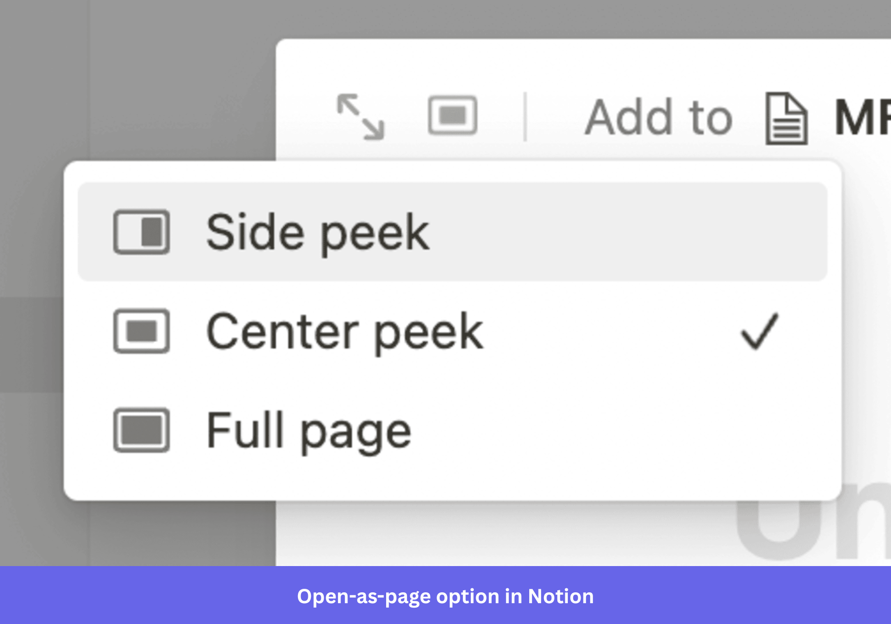
I love this pattern because it gives users both choices.
Someone making a quick edit never has to leave their current workflow. Someone working on something more substantial can switch to a full page without feeling constrained by a small dialog.
Instead of forcing every interaction into the same container, the interface adapts to the complexity of the task.
Use a full page when the task is complex
One misconception I see fairly often is that navigating to another page automatically creates more friction than opening a modal.
In reality, the opposite is often true.
If users need to complete a long form, configure multiple settings, upload several files, or work through a multi-step onboarding flow, squeezing everything into a modal usually creates a worse experience. Eventually, the modal starts scrolling, the content becomes cramped, and users lose the sense of where they are in the process.
A dedicated page solves those problems naturally.
It gives content room to breathe, makes navigation easier, supports bookmarking and deep linking, and removes many of the accessibility challenges that come with modal dialogs.
As a general rule, if users need to spend more than a minute or two completing a task, or if the interface requires multiple sections, tabs, or extensive scrolling, it’s probably earned its own page.
Modals work best for helping users finish something quickly. Pages work best when users need space to think.
Now that we’ve established when a modal actually deserves to exist, let’s look at the situations where the interruption is justified—and the different types of modals that handle those jobs best.
What are the main types of modals?
Not every modal serves the same purpose. Some ask users to make an important decision, while others simply communicate information or help them complete a quick task.
Rather than classifying modals by size or animation, I find it more useful to group them by the job they’re trying to accomplish. If you know what the modal is supposed to achieve, choosing the right pattern becomes much easier.
Confirmation modals
Confirmation modals exist to prevent costly mistakes.
They should only interrupt users when an action is difficult—or impossible—to undo, such as deleting data, changing permissions, or publishing something to production.
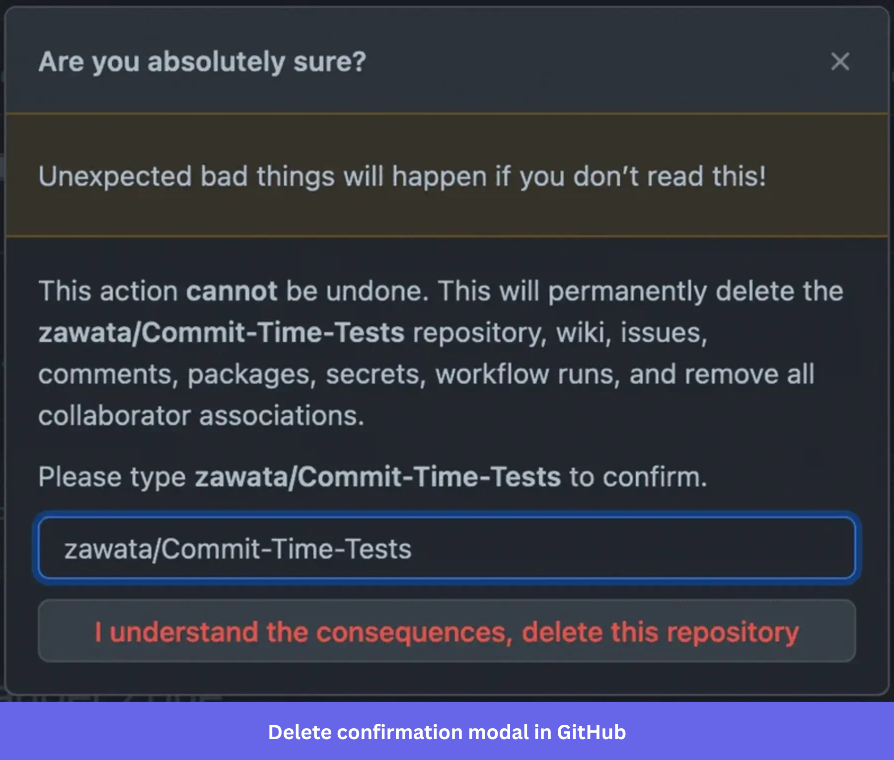
GitHub’s repository deletion flow is one of the best examples of this pattern. Before allowing users to permanently delete a repository, GitHub asks them to type the repository’s name into a confirmation field. The destructive action stays disabled until the names match.
The extra friction is intentional. It forces users to pause and confirm that they’re making a deliberate decision instead of clicking through on autopilot.
Not every confirmation modal needs to prevent a mistake, though. Sometimes its job is simply to reassure users that an action has completed successfully. Slack’s workspace invitation confirmation is a good example of this post-action pattern. Instead of asking users to decide anything, it simply confirms what happened and tells them what to expect next.
Form modals
Form modals let users complete a small task without leaving their current workflow.
The keyword here is small.
If the form grows beyond a few fields, requires multiple sections, or starts scrolling, it’s usually a sign the task belongs in a drawer or on its own page instead.
Userpilot’s welcome screen is a good example of a form modal done well. It collects just enough information to personalize onboarding before users enter the product, without turning the experience into a lengthy setup wizard.
As a rule of thumb, every form modal should have one purpose and one clear outcome. The moment users need to complete several unrelated tasks, the modal has outgrown its job.
Information modals
Sometimes the goal isn’t to collect information or stop users from making a mistake. It’s simply to make sure they don’t miss an important update.
Information modals work well for significant product changes, security notices, policy updates, or anything else that would leave users confused if they never saw it.
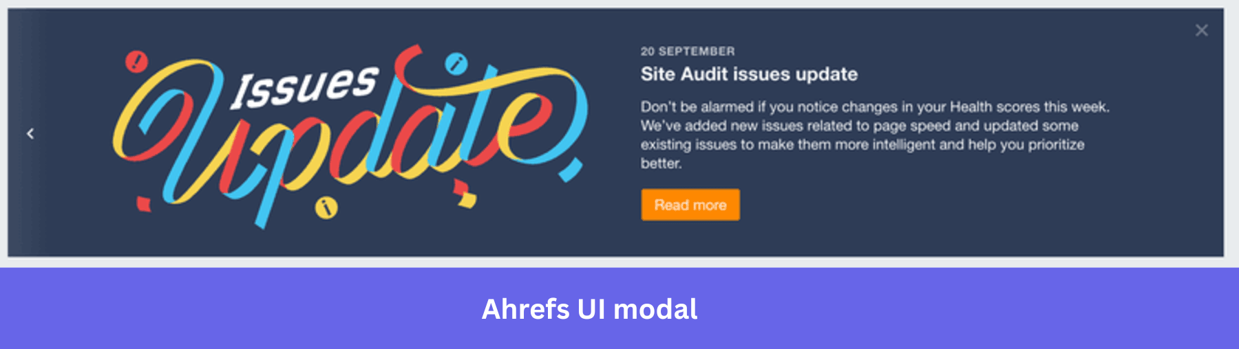
I like Ahrefs’ Health Score announcement because it answers the questions users are most likely to ask before they even contact support. Rather than surprising users with different numbers, the modal explains what changed, why it changed, and what they should expect going forward.
The same principle applies whenever you’re rolling out a major redesign. For example, Amplitude used a similar informational modal before introducing its updated interface, giving users context before they encountered an unfamiliar layout.
Media modals
Unlike every other modal we’ve discussed, media modals aren’t interruptions. They’re user-initiated.
When someone clicks on an image, video, or gallery, they’re asking to focus on that content. The modal simply provides a larger viewing experience without forcing users to navigate away from the page.
Dribbble’s image viewer is a classic example. Selecting a design opens it in a lightbox while keeping users anchored to their position in the gallery. Closing the modal returns them to exactly where they left off.
This idea also appears frequently on mobile. Spotify, for example, uses bottom sheets to display contextual information and upgrade prompts while leaving part of the current interface visible. It’s the same principle as a media modal: give users temporary focus without completely disconnecting them from the screen underneath.

When is interrupting the user actually worth it?
Even the best-designed modal will fail if it appears at the wrong moment.
In my experience, timing has a much bigger impact than colors, animations, or button copy. A simple modal shown at exactly the right moment consistently outperforms a beautifully designed one that interrupts users for no good reason.
So rather than asking what type of modal should I build?, I think the better question is: When has the user actually earned an interruption?
There are five moments where I’ve found modals consistently improve the experience instead of getting in the way.
💡 Did you know?
Timing is something you configure, not something you hope for. In Userpilot, a modal can trigger on a specific user event, target a saved segment, and cap itself to fire only once or repeat until a goal is met.
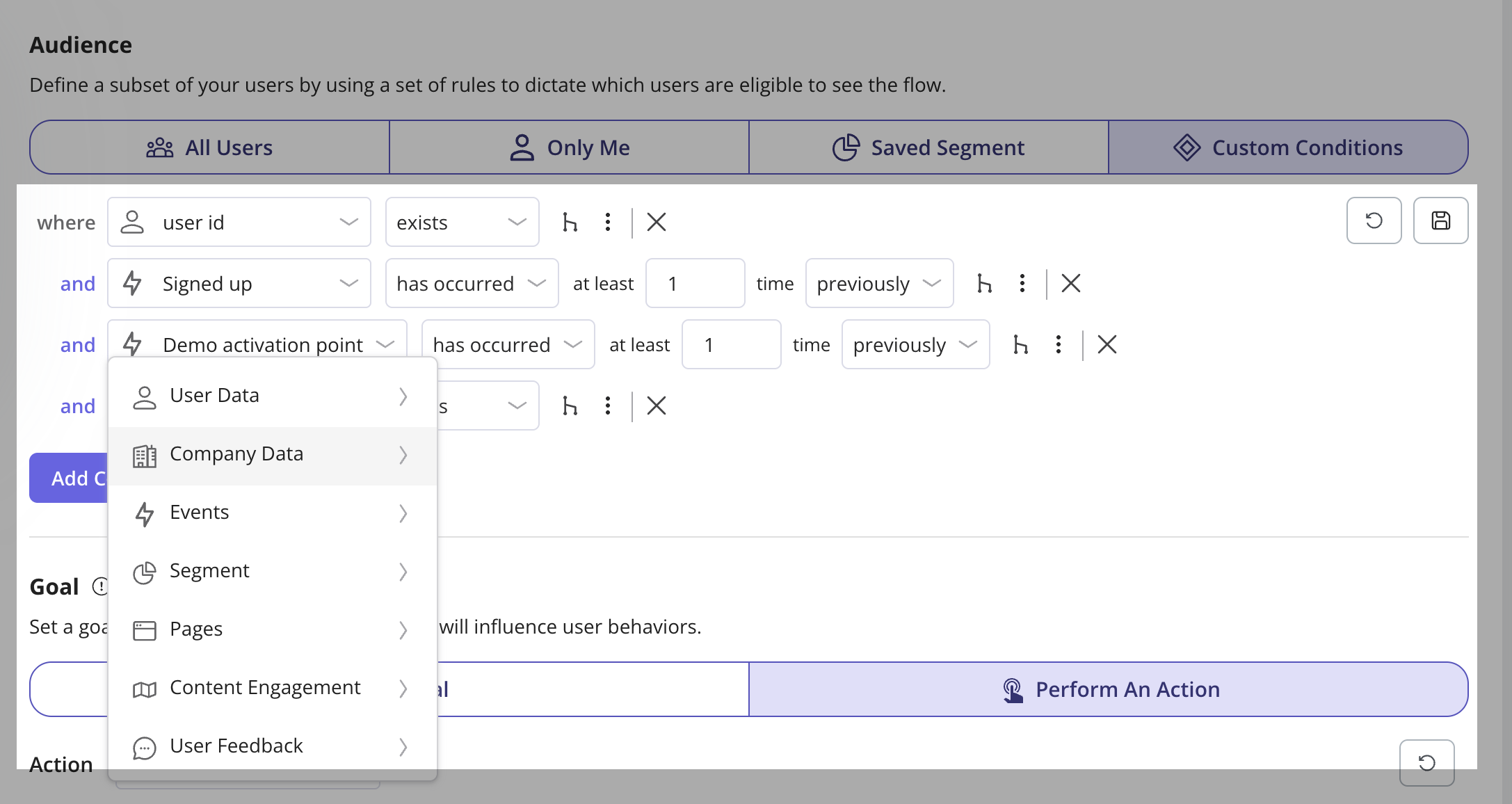
That makes it easier to tie each interruption to the moment a user has actually earned the guidance.
When users first arrive
The first session is one of the few moments where users naturally expect guidance.
They’re still learning the interface, looking for their first success, and deciding whether the product delivers on its promise. A well-timed welcome modal can introduce a new feature, explain what’s changed, or guide users toward their activation milestone without feeling intrusive.
Kommunicate’s “What’s New” modal is a good example. It acknowledges that users have just arrived, highlights the most relevant update, and offers a walkthrough instead of forcing one.
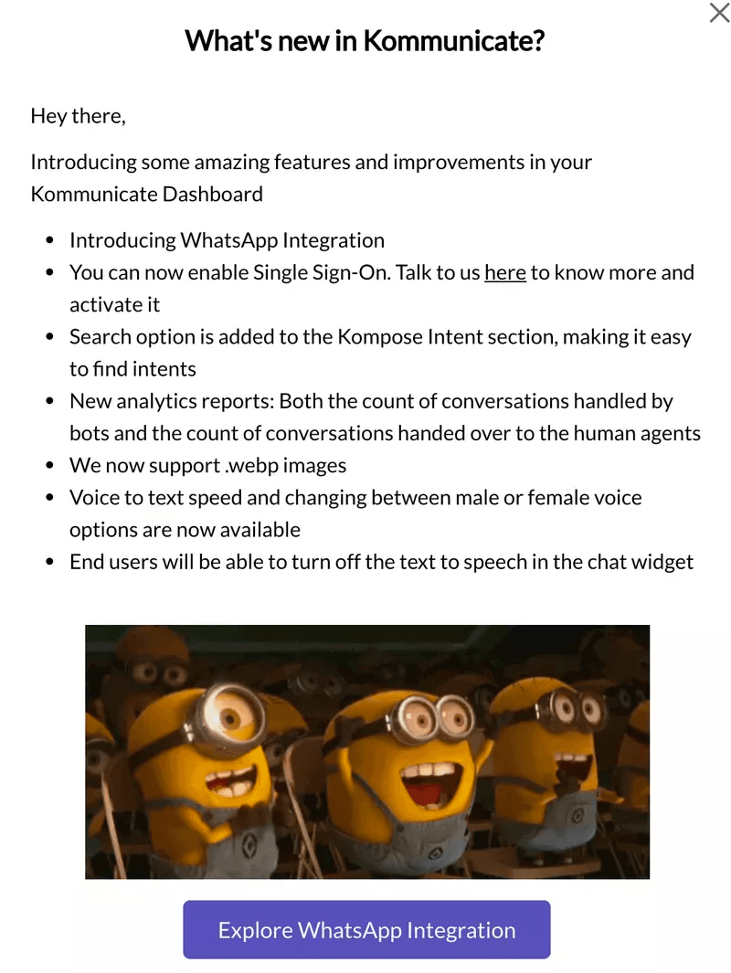
Kommunicate introduces product updates when users first return to the application.
Other products apply the same principle differently. Figma uses first-login modals to introduce major features, while Dropbox used one to explain its redesigned interface before users encountered the new experience.
After users reach an important milestone
Completing a meaningful action is another moment where an interruption feels natural.
Whether someone creates their first project, connects an integration, or reaches a usage milestone, a modal can reinforce progress and guide them toward the next step while motivation is still high.
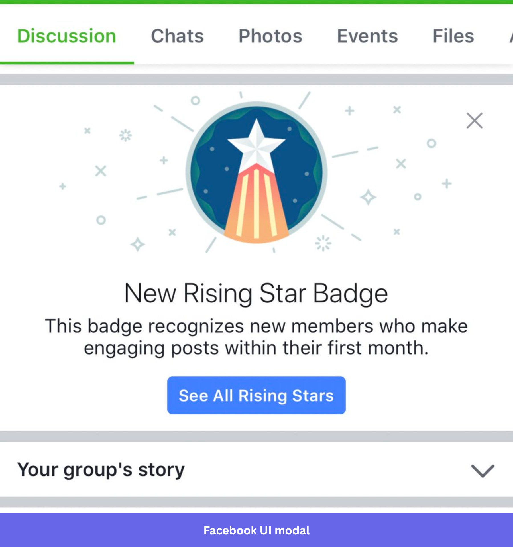
Facebook’s achievement modal is a simple but effective example. It immediately acknowledges the milestone without interrupting the user’s momentum with unnecessary choices.
The same principle appears in products like Nike Run Club, where achievements become celebratory moments, and Asana, which uses milestone modals to introduce logical next steps.
When users are approaching a limit
Limits are one of the few moments where users expect the product to interrupt them.
If someone is about to run out of storage, hit a usage cap, or exhaust their trial, surfacing that information early helps them make a decision before they run into a frustrating dead end.
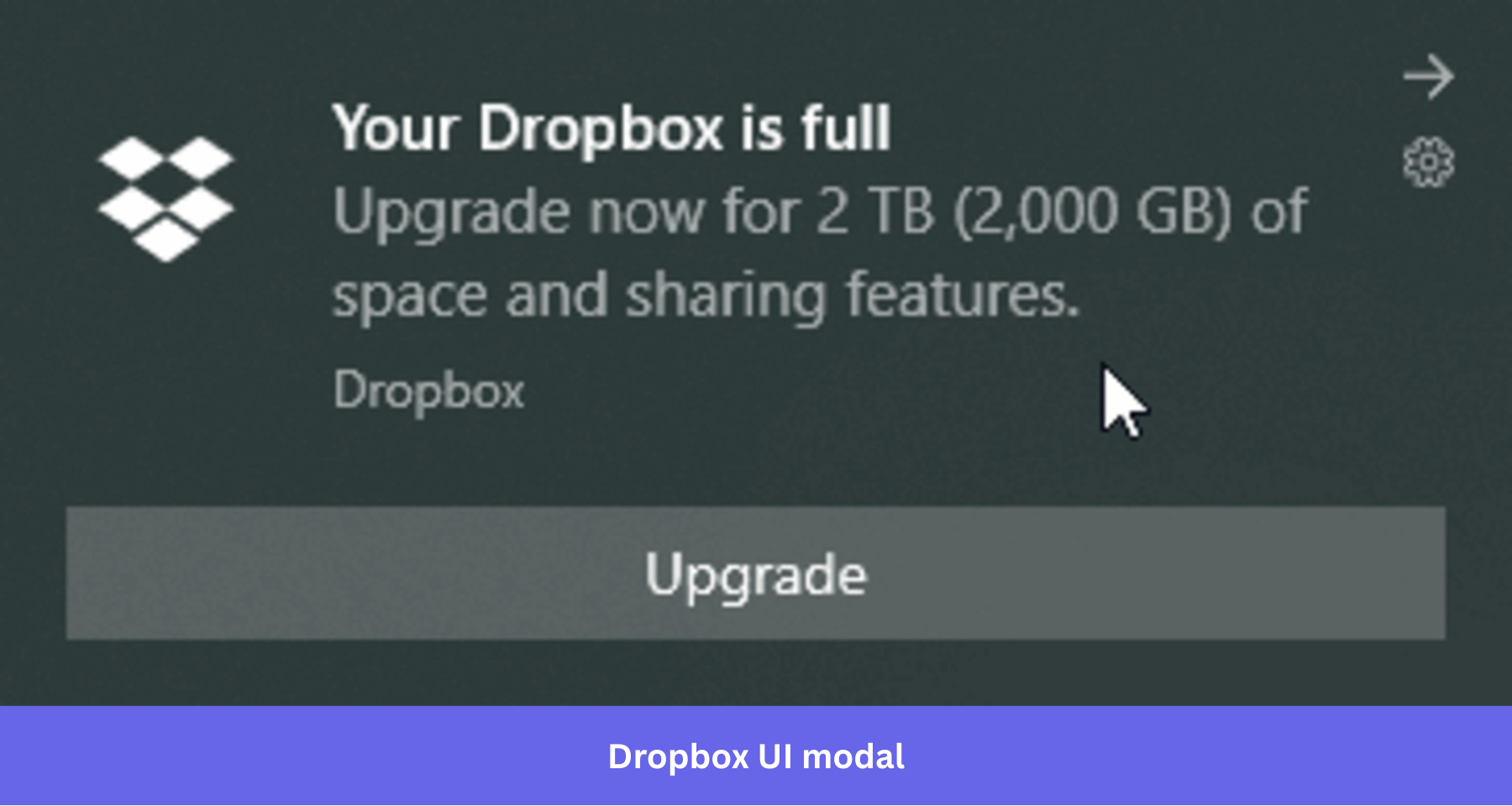
Dropbox handles this well by warning users before they reach their storage limit instead of after uploads start failing. The modal feels helpful because it’s tied directly to what users are trying to accomplish.
Before irreversible actions or important product changes
Some interruptions simply shouldn’t be optional.
If users are about to permanently delete data or you’re rolling out a change that will significantly alter how the product works, taking over the screen is justified. These are exactly the situations where confirmation and information modals earn their place.
When users decide to leave
The final opportunity to interrupt users comes when they’re already heading for the exit.
At this stage, the modal shouldn’t try to guilt users into staying. Instead, it should help them make the best decision by presenting meaningful alternatives.
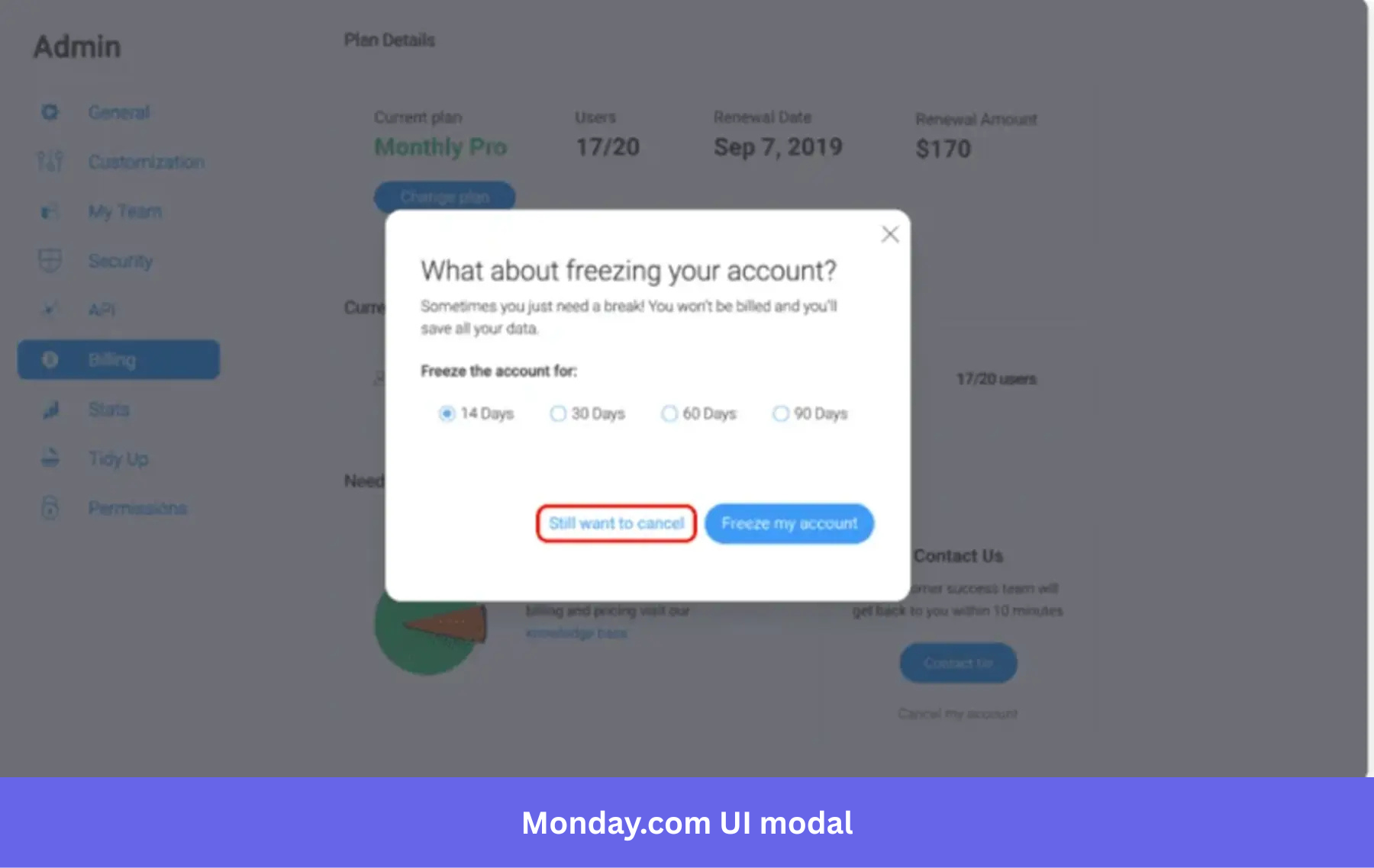
Monday.com’s cancellation flow does this particularly well by offering users the option to freeze their account instead of permanently canceling it.
Other SaaS products follow the same principle in different ways. Loom offers downgrade options, while Mailchimp lets users pause their account before deleting it altogether.
What makes a good modal?
By this point, you’ve probably noticed a pattern: users don’t dislike modals because they’re overlays. They dislike modals that interrupt them unnecessarily, ask too much of them, or make it difficult to leave.
Whether you’re building an onboarding modal, confirmation dialog, or feature announcement, the same principles apply.
Keep it focused on one task
The best modals ask users to do exactly one thing.
Confirm a deletion. Fill in a few onboarding questions. Read an important announcement. Upgrade a plan.
Once a modal starts combining multiple objectives—collecting profile information, introducing three new features, promoting an upgrade, and asking for feedback—it becomes harder to understand and easier to dismiss.
One trick I like borrowing from Notion is writing the modal title as a question that users can answer immediately.
“Delete this page?”
“Leave workspace?”
“Move to trash?”
The title tells users exactly what’s happening before they read the body copy.
There is one notable exception to the “single task” rule. In SaaS products with large tables or calendars, editing a record inside a modal can be a better experience because users don’t lose their place in the underlying list. Even then, the modal should stay focused on editing that single record—not several unrelated actions at once.
Never stack modals
If clicking a button inside one modal immediately opens another modal, it’s usually a sign the flow needs to be redesigned.
Stacking overlays forces users to remember multiple layers of context while figuring out which close button returns them to which state. Even if they eventually complete the task, the experience feels heavier than it needs to.
If a workflow naturally contains multiple steps, turn it into a stepper instead. Users stay inside the same modal while progressing through each stage, with a clear indication of how many steps remain.
For simple confirmation messages, inline confirmation patterns often work better than opening another dialog on top of the first.
The goal isn’t to eliminate complexity—it’s to keep users focused on one decision at a time.
Avoid scrolling inside modals
A modal shouldn’t feel like a miniature web page.
If users have to scroll through multiple screens of content before reaching the primary action, you’ve probably chosen the wrong container.
Long content creates several usability problems at once. Users can miss fields below the fold, lose sight of the primary CTA, and struggle to compare information hidden behind the overlay.
Whenever I see a scroll bar inside a modal, I ask whether the content would work better in a drawer or on its own page. Most of the time, the answer is yes.
As a simple rule, users should be able to understand the purpose of the modal and complete its primary action without scrolling.
Keep the dismiss option visible
Never make users hunt for a way out.
Hiding the close button might increase the number of people who stay in a modal for a few extra seconds, but it rarely improves conversions. More often, it frustrates users and teaches them to distrust future interruptions.
Canva consistently includes a visible close button, even on promotional and educational modals. The experience feels respectful because users know they can leave whenever they’re ready.
The same principle applies to upgrade prompts and feature announcements. Users who aren’t interested today may return tomorrow—but only if the first interaction didn’t make them feel trapped.
Make accessibility non-negotiable
A modal isn’t finished when it looks good.
It also needs to work for keyboard users, screen readers, and anyone relying on assistive technologies.
At a minimum, every modal should:
- Move keyboard focus into the dialog when it opens.
- Trap focus until the dialog is closed.
- Support the Esc key for dismissal where appropriate.
- Use the correct ARIA attributes such as
role="dialog"and accessible labels. - Return focus to the element that launched the modal after it’s closed.
These are baseline expectations. A modal that can’t be navigated without a mouse is broken, regardless of how polished it looks.
💡 Did you know?
Userpilot applies these baselines to modals automatically. Every flow ships with role="dialog", ARIA labels, semantic headings, keyboard navigation, and Esc-to-dismiss without any manual setup.
The same support extends across spotlights, banners, checklists, and surveys, helping your in-app messages align with key WCAG 2.1 AA principles.
How do you build modals without engineering bottlenecks?
One reason so many modals end up overstaying their welcome is that changing them often requires engineering time.
If updating the copy, adjusting the audience, or changing when a modal appears means opening a sprint ticket, teams naturally stop experimenting. The modal ships once, gets forgotten, and continues interrupting users long after it has stopped being effective.
That’s exactly the problem no-code onboarding platforms solve.
With Userpilot, product, customer success, and growth teams can build modals, target specific user segments, and control when they appear—all without waiting for engineering resources.
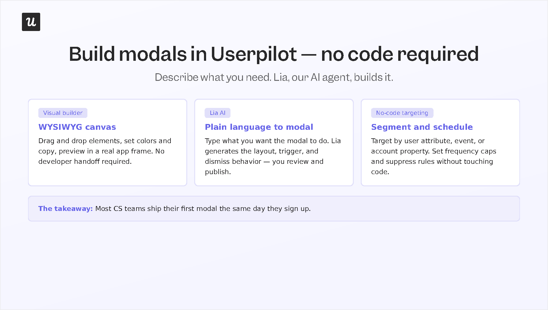
Creating a modal is straightforward. Choose a modal layout, customize the content using the visual editor, define who should see it, decide what behavioral trigger should launch it, preview the experience, and publish it. Because everything is managed without code, teams can continuously test and refine their messaging instead of treating modals as one-time releases.
Build modals even faster with Lia
If no-code removes engineering bottlenecks, Lia removes much of the manual setup as well.
Instead of configuring every audience rule, trigger, and design element yourself, you can simply describe what you want to achieve.
For example, you might ask Lia to create a dismissible feature announcement for users who haven’t tried a newly released capability after seven days. Lia generates the modal, suggests the targeting logic, and prepares it for review before publishing.
As Userpilot CEO Yazan Sehwail puts it:
“You’re no longer operating. The AI is operating. You’re just basically evaluating and monitoring the agent workflow.”
That shift makes it much easier to build the kind of contextual, behavior-driven modals this guide has focused on. Instead of showing the same announcement to everyone, you can target the right message to the right users at the right moment—without creating another engineering backlog.
If you’re ready to build modals that users actually engage with, book a demo and see how Userpilot helps you create, target, and optimize them without writing code.
About the author