15 Onboarding Screens Examples That Set New Users Up for Success


Looking for onboarding screens examples to get inspiration for your own design? You are in the right place!
In this article, we’ll carefully examine onboarding screens from 15 successful brands, distill what makes them effective, and share best practices for enhancing your onboarding experience.
Hopefully, by the end of the article, you’ll know how to design onboarding screens that educate and engage users from the get-go!
Different types of onboarding screens
An onboarding screen is the initial page users see when they launch an app for the first time. It welcomes the user, introduces them to the app, and prompts them to get started.
Onboarding screens come in various shapes, such as:
- Greeting messages: The most common type of onboarding screens are in-app messages on pop-ups that thank users for signing up, and point them to the next steps. Additionally, these messages also have embedded welcome surveys to collect data on users’ JTBD and tailor their in-app experience accordingly.
- Empty states: Minimalist apps often skip the welcome page and go right to the product screen, making the “empty state” a primary onboarding screen. The best SaaS empty states are filled with helpful information that drives users to the activation point.
- Interactive guides: Some companies don’t waste any second – their onboarding screen is the first step of a guided tutorial that helps users adopt the core features of the app and experience the value of the product.
15 Onboarding screens examples that drive user engagement
Ready to explore the examples from successful SaaS brands? This section will show you 15 of our favorites and why they work.
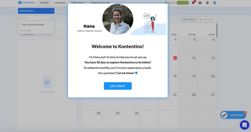
Kontentino
Kontentino, a social media management platform, humanizes the brand by including a smiling image of a customer success team member on the welcome screen.
The onboarding screen then proceeds to set user expectations and informs users that moving forward, they’ll receive a sequence of onboarding emails to guide them through the platform. This helps ease user anxiety and primes them to start engaging with the platform.
The screen ends with a “Let’s start!” button that launches an interactive walkthrough upon clicking.
Sked Social
Sked Social’s onboarding screen jumps right into introducing users to the crucial steps for account setup: integrating the platform with social media channels.
What makes their approach unique is that they allow users to choose between a self-serve onboarding experience and having someone from the team provide hands-on guidance. This strategy is great because it acknowledges users have different preferences and gives them the freedom to pursue it.
Also, notice how the self-guided option reassures them that live chat is available whenever needed. This boosts the user’s confidence and motivates them to start exploring the tool right away.

Groupize
Groupize takes a personable approach to onboarding by leveraging a gamified avatar named “G.G.” to guide new users. This friendly face adds a touch of personality and helps create a sense of companionship that makes the process less intimidating.
The microcopy further reinforces the welcoming atmosphere. It’s conversational, empathetic, and addresses the user’s potential needs. Using the user’s name adds a layer of personalization and makes them feel seen.

Attention Insight
Attention Insight, an analytics platform, features a checklist on its onboarding page to guide new users through key actions needed to experience the value of the product.
This approach taps into the Zeigarnik Effect—our natural tendency to remember and prioritize unfinished tasks.
Adding a progress bar further enhances this effect. It’s a subtle but effective way to nudge users toward activation events and potentially increase adoption rates.
Attention Insights also enriches its interface with templates so users can get started quickly:
As with all the previous examples in our article, Attention Insight also used Userpilot to create these onboarding patterns code-free!

Fullstory
As a platform designed to help users harness data for product improvement, it’s no surprise that Fullstory understands the value of gathering insights.
They use the onboarding screens as an opportunity to collect key customer data. This allows the company to easily identify user personas, and tailor the onboarding experience for each segment for faster activation.
Additionally, Fullstory employs a progress bar to provide users with a visual representation of their onboarding journey. This gamification element encourages completion by highlighting how far users have already come.

Mixpanel
When you have a complex product consisting of multiple layers, blocks of text may not be enough to drive quick activation. Mixpanel understands this well – that’s why it populates the onboarding page with demo content users can play around with.
By creating different visualizations with the dummy data Mixpanel provides, users grasp how the platform works and how data can be presented when they begin using the tool.

Slack
Slack’s onboarding screen consists of an empty page populated with actionable in-app messages.
At the top, it’s written “Welcome!” and a punchy tagline instantly conveys the product’s value.
Then, Slack’s bots take over, guiding new users through a conversational tour that feels more like a friendly chat than a tutorial.
Onboarding tooltips pop up along the way, offering bite-sized explanations for different UI elements and features to eliminate confusion and familiarize users with the app.

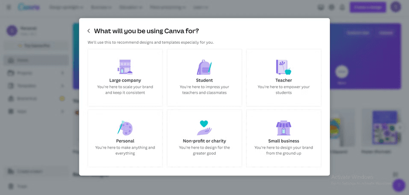
Canva
Canva, the go-to online graphic design tool, presents new users with a welcome survey to understand their specific needs and goals.
What’s noteworthy here is that Canva also explains to users the purpose of data collection and communicates how it benefits users. Users are impatient to get inside the product, so this added friction in the signup flow can be frustrating to them. However, knowing that the data will be used to suggest personalized templates softens the blow and encourages them to move forward.
Canva doesn’t just tell users about its power; it demonstrates it. The onboarding screens themselves are a testament to the platform’s capabilities, with vibrant graphics and eye-catching designs that leave a lasting impression. It’s a clever way to demonstrate the product value without relying solely on words.
Grammarly
Grammarly’s onboarding screen consists of two layers: the main interface filled with demo content and a modal overlaying it.
The first thing users see is the modal inviting them to view a quick, linear product tour. Users also have the option to dismiss the modal and instead explore the demo document under it.
The error-ridden demo document is populated with hotspots, each in-line suggestion from Grammarly, and contextual guidance on how to make the most of those suggestions.

ActiveCampaign
ActiveCampaign recognizes that onboarding feature-rich software with in-app messages can be overwhelming, so they opted for a more engaging approach: video tutorials.
This is not merely an opinion but a fact backed up by research – studies show that 65% of customers prefer videos to other forms of onboarding.
Upon signup, ActiveCampaign users receive a personalized video from a customer success team member guiding them through the platform’s essentials.

BacklinkManager
BacklinkManager is one of the few lucky products that have built-in virality, meaning each of its users generates a certain number of new users by some sort of invitation or referral.
BacklinkMnager smartly capitalizes on user invitations and strategically uses its onboarding screen to turn guests into paying customers.
When someone receives an invite to join a Backlink Building Partnership, they’ll see a personalized and concise welcome screen highlighting the tool’s core benefit.
The screen also reminds the invitee that they’re missing out on a valuable opportunity by not signing up. It ends with a prominent sign-up CTA after discouraging users from continuing as guests.

Get a Newsletter
Get a Newsletter has one of the best onboarding screen examples you want to copy if your goal is to save time.
It starts with a friendly greeting message that humanizes the brand (“Emma from Get a Newsletter”) and gets the user excited about using the product (“…becoming an email marketing Ninja”).
Most importantly, the user onboarding flow cuts to the chase and jumps right into interactive guidance without overwhelming the user with needless information:

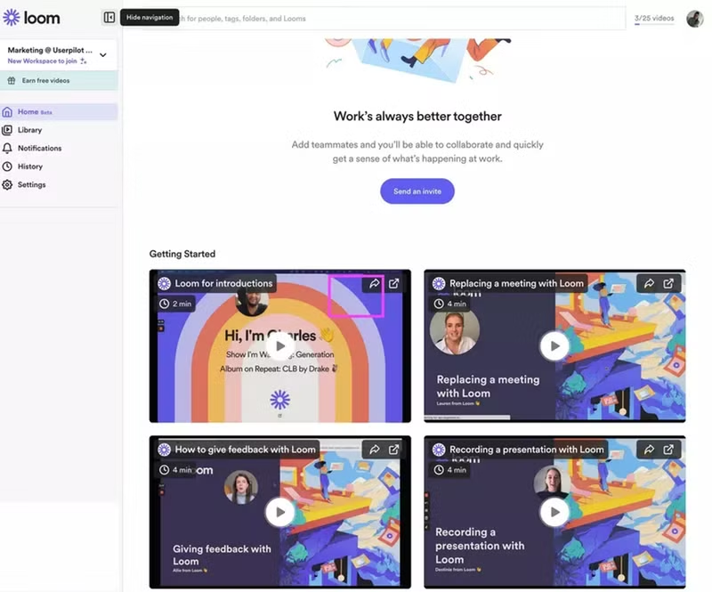
Loom
Upon logging in, new users see a dashboard filled with video tutorials created with Loom itself.
This “show, don’t tell” strategy serves a dual purpose: it reduces the learning curve and subtly reinforces Loom’s value proposition as a video communication platform.
By showcasing its capabilities within its own onboarding flow, Loom encourages users to embrace video messaging as a natural part of their communication toolkit.
Notion
Notion is a versatile workspace, capable of handling everything from personal notes to complex project management.
This flexibility, however, can also make it feel a bit overwhelming for newcomers. To ease the learning process, Notion transforms the often-empty canvas into a comprehensive user guide.
New users are greeted with a “Getting Started” page that doubles as a filled-up dashboard. This space is packed with clear, concise instructions and even embedded video tutorials, showcasing Notion’s core features and guiding users towards their “Aha!” moment.
Looking for onboarding screen examples?
Let’s find the best inspiration for your product. First, what’s your primary goal with user onboarding?
Got it. What kind of product are you building?
The best onboarding screens differ based on product complexity.
And what type of onboarding are you interested in?
This helps us narrow down the right examples for you.
Perfect! We’ve got the best onboarding screen examples for you.
See how companies like Slack, Canva, and Notion build world-class onboarding flows and learn how you can do it too, code-free.
Best practices for creating onboarding flows
Here are some general tips gathered from previous onboarding screen examples for creating successful designs:
- Personalize the onboarding experience: Doing this makes the experience more relevant and engaging for the user, increasing the chances of adoption.
- Implement progressive disclosure: This is an onboarding technique where you present information to new users gradually and sequentially rather than overwhelming them with everything at once. It makes the learning process easier and more manageable.
- Use rich media on your onboarding pages: Visuals like images, videos, and animations are more engaging and memorable than plain text. They help explain complex concepts, demonstrate product features, and create a more enjoyable user onboarding experience.
- Incorporate gamification elements: Gamification adds an element of fun and challenge to the onboarding process, motivating users to complete all the steps. As mentioned earlier, progress bars and animated screens are common gamification elements that have proven to work for SaaS users. If you want to go beyond the usual, you can offer valuable rewards like trial extensions for each key milestone users complete within a specific period.
- Give users control over their experience: Not all users learn or interact with products in the same way. In practice, this could translate to providing several customer education options to cater to different learning styles or allowing users to skip specific onboarding steps.
Conclusion
Effective onboarding screens allow you to create a positive first impression and lay a solid foundation for a strong relationship.
Ready to get started? With Userpilot, you can implement insights from onboarding screens examples we discussed so far, track your onboarding performance, and make data-driven changes to boost engagement. Book a demo to discuss your needs with our team today!
FAQ
What are the onboarding screens?
Onboarding screens are the first steps users see in an app or product. They welcome users, highlight key features, request permissions, and guide them through setup or personalization—helping them get value quickly and reducing drop-off early on.
What are the 5 C's of onboarding?
The 5 C’s of onboarding are:
- Clarity: Make the product’s value and next steps clear.
- Context: Show relevant info based on user behavior or role.
- Consistency: Keep messaging and experience aligned.
- Control: Let users explore at their own pace.
- Confidence: Help users feel successful early.
What is an example of user onboarding?
An example of user onboarding is when you sign up for Dropbox and it shows you a short tour of how to upload files, share links, and access files across devices. It might also prompt you to complete setup steps like installing the app or connecting your phone.
About the author