Mobile App Experience in 2026: Why Apps That Ask Less Win More Users


The pattern in many mobile apps is that development teams focus on driving engagement before delivering value. Users open the app to complete a task, but are often met with onboarding flows, permission requests, promotions, and feature announcements first. The average mobile app loses 75% of new users on day one, and most teams call that a retention problem. Turns out, it isn’t. It’s an attention problem.
Users use their smartphones in short, fragmented windows, and every app on the device is competing for the same finite pool of focus. The standard fix is a shorter onboarding flow or a cleaner UI, but those are surface-level responses. Most mobile UX problems in 2026 are, in fact, related to attention management.
In this article, I went deeper into specific ways mobile app experiences break down and showed what better experience looks like in practice, including how we handle these problems inside Userpilot.

What’s broken in most mobile app experiences (and what’s the fix)
The standard diagnosis of bad app experience focuses on design, like cluttered UI, confusing navigation, and slow load times. Those still matter, but the bigger problem most apps keep running into in 2026 goes beyond the visual and navigational aspects. It’s about what the app is asking for the user’s attention, and how often it asks.
Mobile apps now operate alongside dozens of other applications on the same device, each sending notifications, requesting permissions, and competing for users’ attention. The UX challenge focuses on how your app competes with its competitors for users’ attention.
Research on cognitive overload in mobile UX has found that every notification forces a context switch, every new feature adds to the mental model users have to maintain, and multiple apps compete for the same attention pool simultaneously. Most mobile UX problems in 2026 are attention-management problems, not design problems.
This reframes how teams should think about friction points. Reducing the number of decisions a user has to make matters more than reducing the number of taps. This is exactly why a six-screen flow with zero ambiguous choices will outperform a two-screen flow that asks users to make three unclear decisions. I’ve started calling this the “cognitive load over click count” frame, and it changes almost every onboarding and engagement problem I’ve worked on.
The problems break down into four patterns, and each one has a specific fix.
Onboarding friction has become a trust problem
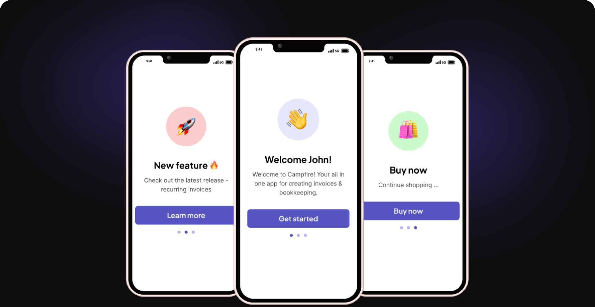
Most onboarding still assumes users are patient enough for a step-by-step onboarding experience. Mobile behavior no longer supports that assumption. When a new user opens your app and sees a long signup flow, a permission request before they’ve seen any value, or a five-screen product tour, many of them read it as a signal about what the rest of the experience will feel like.
In a Reddit thread on forced signup friction, one developer put it plainly by saying, “People like me might uninstall just because of the first screens.” This is the dominant behavior pattern for users who haven’t yet decided whether your app is worth their attention.
A 2026 analysis of why onboarding flows damage retention identified three specific failure patterns:
- Excessive explanations increase first-session drop-offs.
- Long onboarding sequences create friction before users see value.
- Early permission requests trigger resistance from users who haven’t built trust yet.
All three still appear in mobile apps, because most SaaS onboarding advice was written for desktop intent. On a desktop, users generally arrive with a specific goal. They searched for a tool, they’re evaluating a purchase, and they have twenty minutes to get something done.
Mobile behavior is different. Users pick up their phones during fragmented attention windows, switch between apps quickly, and have a much lower tolerance for being walked through anything. As one PM observed in a discussion on why SaaS onboarding fails on mobile, “SaaS onboarding assumes users come with intent.” Mobile doesn’t give you that assumption, so designing as if it does creates friction from the first screen. What works is progressive onboarding that delivers value first and asks for context later.
Here’s what you can do:
- Show users what the app does before asking them to configure anything.
- Request permissions at the moment they become necessary rather than at launch.
- Design the first session around a single activation moment instead of a complete product tour.
Inside Userpilot, we use mobile carousels to handle this. Mobile carousels let teams show users a specific value moment in three to five screens without forcing a full setup sequence. The constraint that makes them work is simple. Every slide has to either show the user something useful or ask them one thing, never both at once.
Notification overload is pushing users to uninstall, not re-engage
Push notifications were supposed to solve the re-engagement problem. The logic made sense when users forget about apps, so you remind them. Something has shifted, and the companies that sell push notification infrastructure are starting to say so publicly.
Research from Airship explicitly states that asking for notification permissions too early overwhelms the users, and that users need to build trust with an app before they’ll meaningfully opt in. When the tool vendor tells you to slow down on their own tool, that’s worth paying attention to.
The result of ignoring this is retention resistance. Users who feel over-notified don’t just disable notifications; they form a negative association, develop notification fatigue, and uninstall. Apps described as “needy” by users have high uninstall rates, and this behavior never shows up in notification engagement dashboards.
The notification dashboards show messages being sent. What they don’t show is how many uninstalls those messages caused, which means teams can be optimizing a metric that’s actively costing them, users.
Here’s what you can do:
- Switch from schedule-based to behavior-driven notifications. Trigger on what the user was doing last time in the app, not on a fixed calendar.
- Ask for notification permissions after users have seen real value from the product, not at launch.
- Audit your notification frequency. If sending more messages isn’t improving retention, it’s probably hurting it.
Userpilot handles this by letting teams build push notifications from the same platform as in-app onboarding flows, so trigger conditions can be tied to actual product behavior rather than time-based schedules.
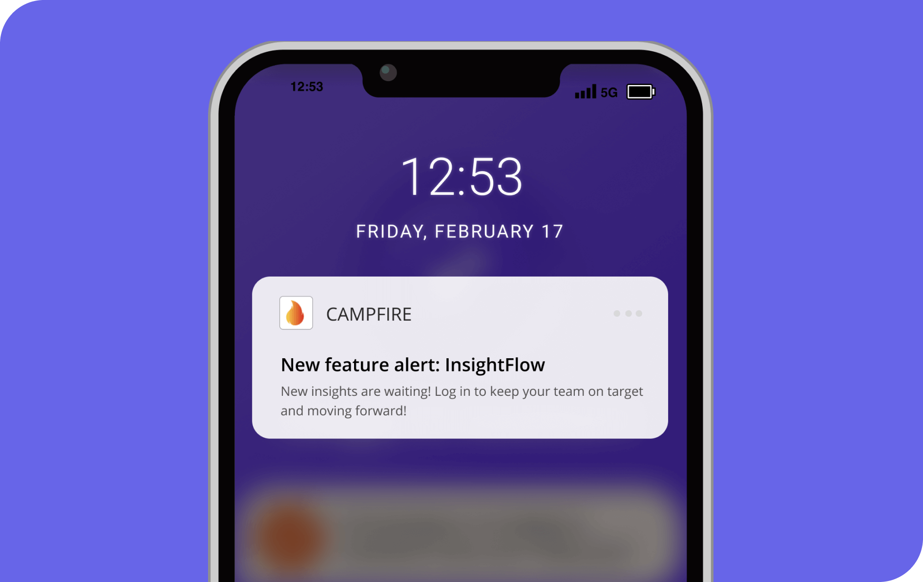
The version of push notifications that actually works in 2026 is behavior-driven, not schedule-driven. Instead of sending a daily “you haven’t logged in” reminder, you trigger based on what the user was doing the last time they were in the app and what would genuinely pull them back to a useful next step. Userpilot handles this by letting teams build push notifications from the same platform as in-app onboarding flows, so trigger conditions can be tied to actual product behavior rather than time-based schedules.
Feature bloat makes your product harder to use, not more valuable
Features get added because they were requested, because a competitor shipped them, or because the roadmap had space. What doesn’t get tracked as carefully is whether each new feature makes the product easier to understand overall.
A thread on the r/UXDesign subreddit about features teams removed that improved the product collected several examples of exactly this problem. One insight that stuck with me is “Teams keep adding features thinking it’ll make users happier, but it often just clutters the experience.” Feature velocity, one of the metrics product teams celebrate, now directly damages product clarity.
The cognitive load problem in mobile makes this harder than it would be on a desktop. On a desktop product, users can navigate menus, search help docs, and explore at their own pace. On mobile, the surface area is smaller, attention windows are shorter, and features that aren’t immediately understandable within the first few sessions effectively don’t exist for most users.
Adding more features makes the ones that already exist harder to find, which is why PMs in mature apps treat discoverability as a separate problem from shipping. Teams ship features successfully, but users never notice them because the product is already full of things competing for their attention. Shipping is no longer the hard part; making a feature mentally discoverable is.
Here’s what you can do:
- Use mobile slideouts to introduce a feature contextually, when the user is already doing the adjacent thing.
- Use progressive disclosure — surface features at the moment users are most likely to need them, not all at once at login.
- Treat discoverability as a separate problem from shipping. A feature nobody finds is the same as a feature that doesn’t exist.
I saw this play out firsthand when Userpilot’s email feature launched, and the funnel showed a sharp drop-off at domain verification, the gate to unlocking email entirely. Rather than queuing an engineering ticket, I built a checklist that walked users through setup step by step, with reminder nudges at each stage to keep them moving forward. The feature itself hadn’t changed. Users just finally had the context they needed, at the moment they needed it.
Most apps treat space on users’ phones as a given, not something they have to earn
Users are more demanding than ever, and they don’t want to download just any app. When Reddit started blocking mobile web access to force app downloads, the reaction was immediate: “If Reddit forces us to download an app, then I just won’t use Reddit anymore.” Users who feel pushed into a commitment they didn’t choose tend to walk away entirely, not negotiate.
The Wired coverage of users building browser workarounds to avoid the Reddit app is more instructive than any NPS score on this point. When users invent workarounds, they’re telling you that your UX strategy is at odds with their intent. They’re not saying the product is bad; they’re saying the cost of getting to use the product is high enough to justify building around it.
There’s a technical dimension to this, too. Research on mobile app bloat found that much of the growth in app file sizes comes from inefficient code and resource management rather than proportional increases in functionality. In practice, this becomes installation resistance, update fatigue, and a performance perception problem that erodes trust before users have engaged with anything useful.
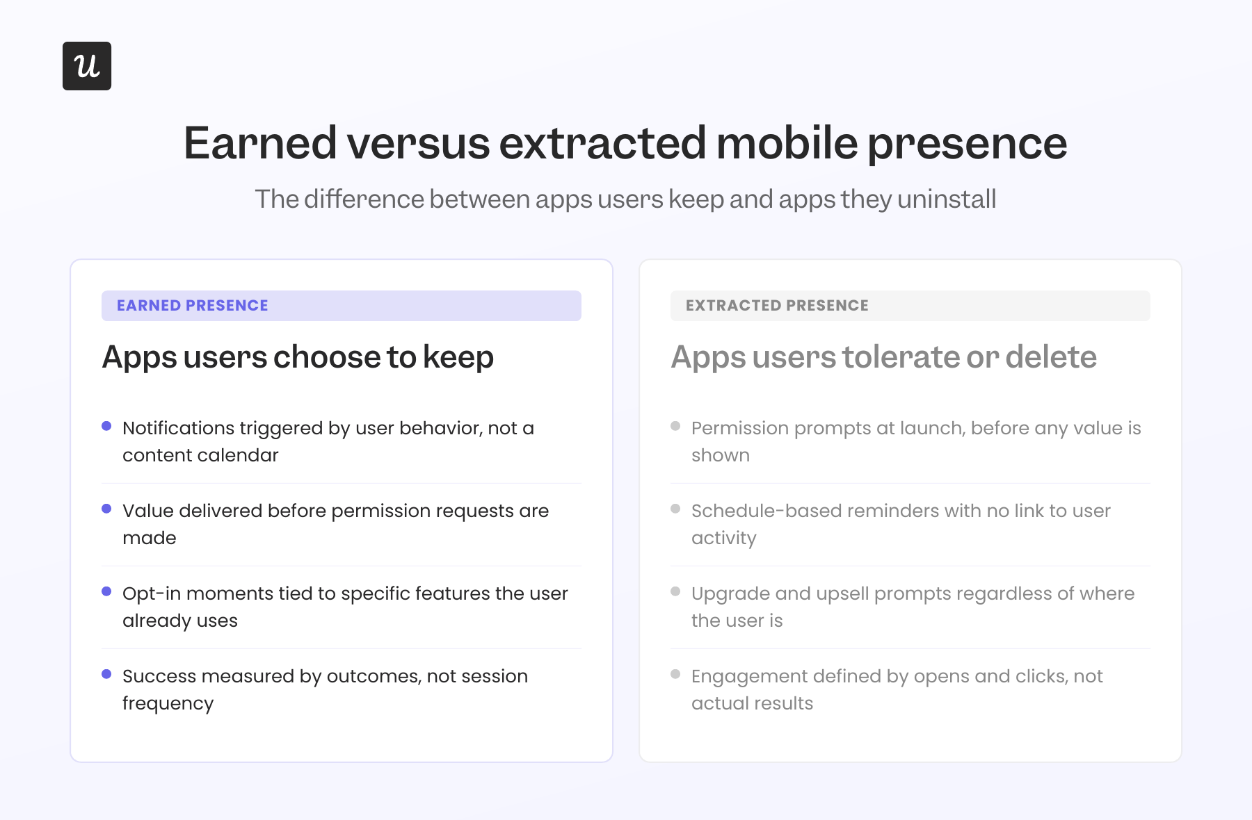
The concept I find most useful here is earned mobile presence. Your app isn’t entitled to space on someone’s phone. It earns that space by proving, continually, that it justifies the storage, respects the user’s attention, uses permissions for things the user actually values, and sends notifications worth receiving.
Here’s what you can do:
- Use behavioral triggers for outreach instead of schedule-based reminders.
- Deliver value before asking for permissions. Let users see what the app does before it asks for anything.
- Introduce features in context, at the moment they’re relevant, so they feel like help rather than announcements.
How to measure app experience without misleading yourself?
The metrics most mobile teams reach for first (DAU, session length, notification open rates) are output metrics. They describe what users did, not whether they got what they came for. A PM community discussion on engagement metrics put this plainly: high engagement can coexist with low satisfaction when users are opening an app out of habit or anxiety rather than because it’s solving something real.
Here is a more actionable list of metrics you should measure.
Quantitative data
- Activation rate: What percentage of new users reach their first meaningful value moment within the first session? This tells you more about experience quality than DAU, because it measures whether the app delivered on its promise, not just whether it was opened.
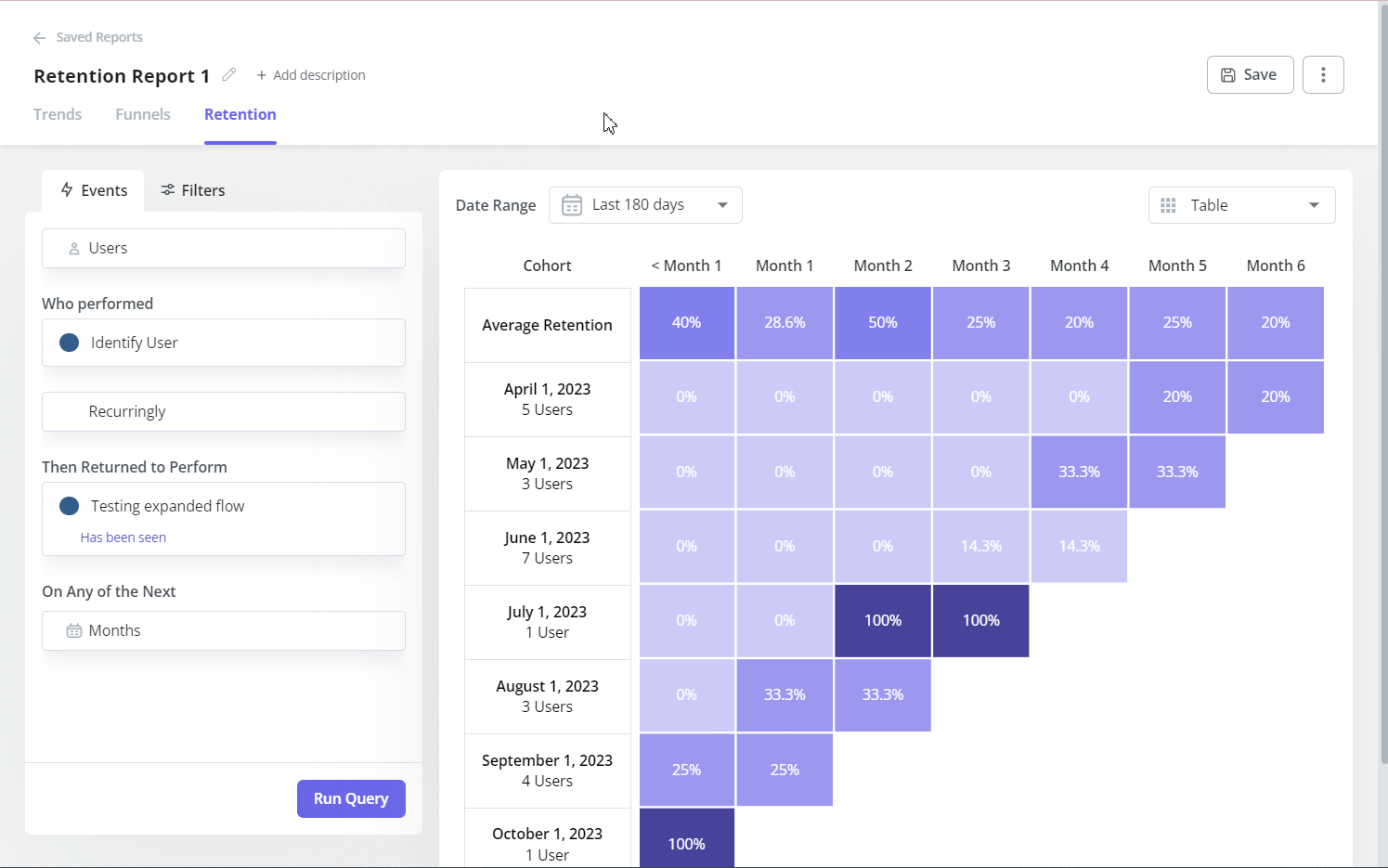
- Day 7 and Day 30 retention, split by activation cohort: Compare retention rates between users who hit the activation moment and those who didn’t. The gap between those two groups is usually where the story about onboarding quality is hiding.
- Funnel drop-off: Funnel analysis shows where users leave specific flows. Use it to rank friction by severity so you fix the highest-impact steps first, rather than treating all drop-offs the same.
- Path analysis: Funnels show a predefined sequence. Path analysis shows how users who actually activate navigate the app, which reveals whether the journey you designed matches the one users actually take. The gaps between the two are often where the most friction lives.
Qualitative data
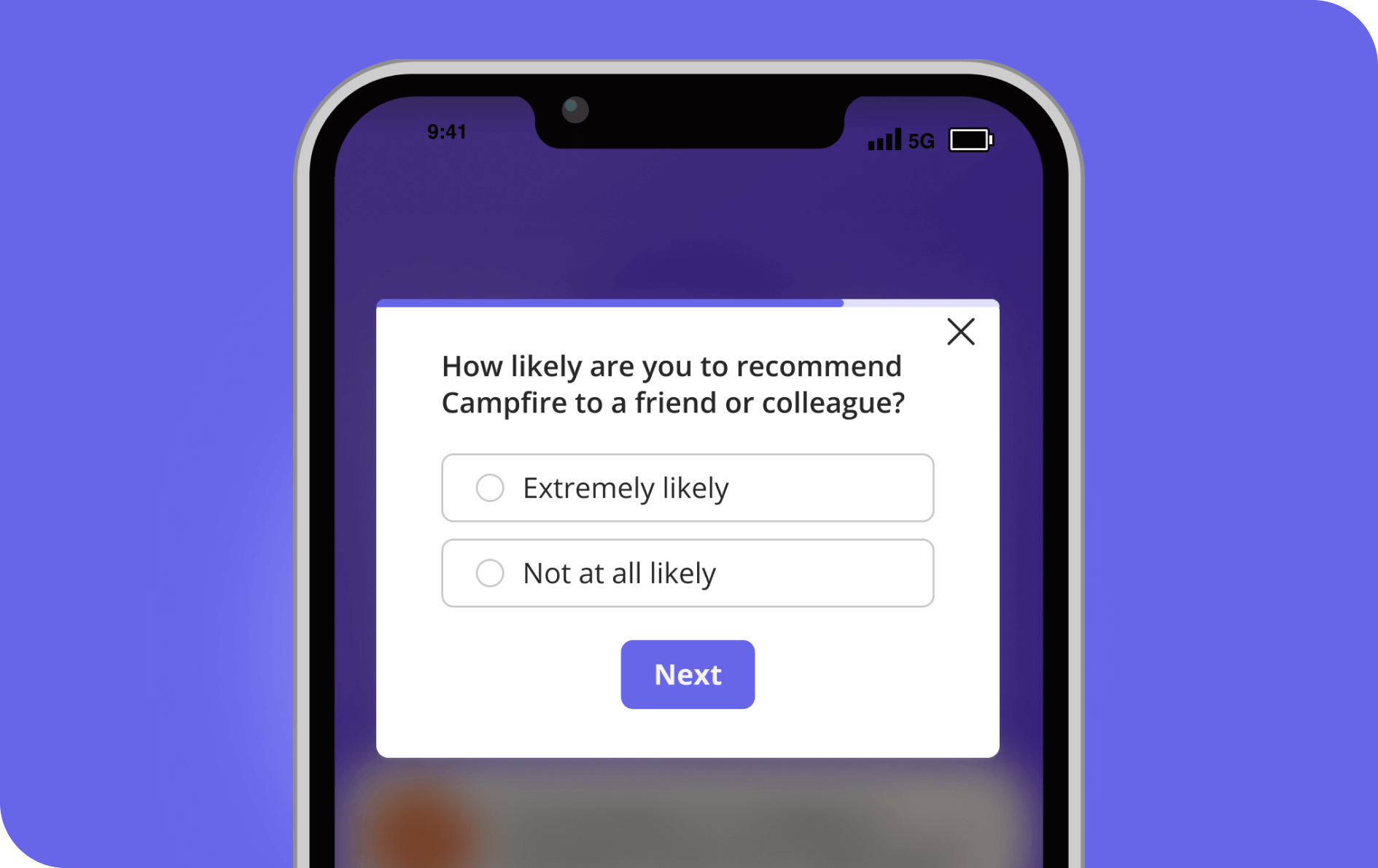
- Triggered CSAT and CES surveys: A funnel drop-off tells you where users are leaving. A CSAT survey triggered at that exact step tells you why. These need to fire at the moment of the experience. Users can’t accurately reconstruct what frustrated them once the session is over.
- Session replays: Watching real sessions in the parts of your product with high drop-off tells you things no metric will. You’ll see hesitation, repeated taps on unresponsive elements, and dead ends that never appear in your analytics dashboard.
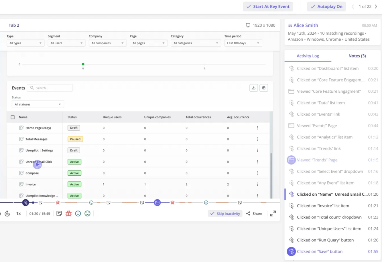
Userpilot’s analytics dashboard tracks views, completions, and dismiss rates across specific flows, broken down by segment, device type, and geography. Combining all this with mobile survey data gives you a closed loop: you see where people drop off, find out why through a triggered survey, and test a fix in the same platform without involving engineering.
What does a better mobile app experience look like in practice?
I’ve spent most of this article on the diagnosis because that’s where most teams go wrong. They head straight to tactics (add a tooltip here, reduce onboarding steps there, etc.) without a clear model of what they’re building toward. The model I’d propose is a mobile app experience that earns attention at every stage instead of assuming it.
Here’s how to approach building your app experience:
#1 Segmentation and personalization, on the surface, create a generic experience and unnecessary friction because they ignore who the user is and what they’re actually trying to do. Personalized in-app experiences built around user role, behavior, or lifecycle stage feel relevant rather than generic, which reduces the cognitive overhead of deciding what to do next.
Userpilot’s segmentation lets you target flows by persona, platform, or behavioral event, so a new user who hasn’t yet connected an integration sees something different from an active user three months into the product. Localization builds on this with AI-powered translation, so you don’t have to rebuild messages from scratch for each language.
#2 Contextual onboarding means getting users to their first activation moment as fast as possible, not walking them through the full product. Onboarding that delivers one clear value before asking for setup information consistently outperforms flows that front-load configuration. Especially on mobile, this means designing for a user who may have eight minutes and low patience, not twenty minutes of focused setup time.
#3 Progressive feature discovery where features introduced at the moment of relevance get adopted. While features announced at login to everyone get ignored. Slideouts and contextual tooltips let you surface the right capability when the user is already in the adjacent workflow, making the feature feel like a useful next step rather than a cold announcement.
#4 Behavior-driven notifications tied to specific in-product events (a workflow the user started but didn’t finish, a feature they’ve almost adopted) are qualitatively different from time-based reminders. Notifications triggered by behavior feel like the app is paying attention to where the user left off, while scheduled reminders feel like a re-engagement script running regardless of whether the user is ready. The difference shows up in both opt-in rates and uninstall rates.
#5 Feedback at the right moment, understanding whether your mobile app experience is working, requires asking users at points anchored to a real interaction. NPS, CSAT, and CES surveys triggered after specific user actions, like onboarding completion, first use of a core feature, or a support interaction, give you feedback grounded in what just happened, not a general impression formed hours later.
Turn mobile app experience into earned retention
The apps winning user trust in 2026 are doing it by asking less, not by adding more distractions in the name of features. Fewer friction points in onboarding, more relevant notifications, and features surfaced when they’re needed rather than announced to everyone at once. All of this is the difference between an app users keep and one they uninstall after a week.
Userpilot gives mobile product teams a single platform to analyze where users drop off, understand the ‘why‘ through targeted feedback, and eliminate friction points with in-app guidance, all without going back to the engineering team for every change. If you’re working on mobile product adoption and want to see how this works in practice, consider booking a demo with our team, and we’ll walk through your specific use case.
FAQ
What is a mobile app experience?
Mobile app experience is the full impression a user forms from interacting with your app. That is, how quickly they reach value, how much cognitive effort the app requires, how it communicates with them, and whether it respects their time and attention. It goes beyond visual design or navigation to cover onboarding friction, notification behavior, feature discoverability, and performance. A good mobile app experience makes users feel like the app was built for how they actually use their phone, not for how a product team hoped they would.
Great app UX anticipates customers’ needs, reduces friction, and makes every tap feel natural.
How do you measure mobile app experience in 2026?
The most useful measures are tied to activation and outcome rather than raw engagement. Track what percentage of new users reach their first meaningful value moment within the first session, compare churn rates between users who hit that activation point and users who didn’t, and watch funnel drop-offs at specific steps to identify where friction is highest.
Pair behavioral data with in-app CSAT or CES surveys triggered at key moments so you understand not just where users are leaving but why. High DAU numbers can mask low satisfaction, and the metrics worth tracking are the ones that show users achieving outcomes, not just returning.
What makes a mobile app experience good in 2026?
A good mobile app experience in 2026 earns user attention rather than demanding it. That means delivering value before asking users to configure anything, requesting permissions at the moment they become relevant rather than at launch, and introducing features contextually rather than front-loading everything at once. Apps that users trust most in 2026 are the ones that do less in each session but make each session clearly worthwhile, rather than the ones trying to maximize time-in-app through every mechanism available.
About the author