When Should You Use a Modal? UX Rules and Alternatives


As a UX researcher at Userpilot, I’d say no to using modals in most cases.
A modal is a window that appears over the main interface and requires the user to interact with or dismiss it before continuing. Because it interrupts the current task, I only recommend using one when the user genuinely needs to stop, focus, and make a decision.
I’ll show you how to decide whether a modal is the right pattern, which alternatives to consider first, and how to design one properly when it is necessary, including its size, structure, content, and mobile behavior.

Should you use a modal at all?
My answer to this question is always: Yes, but probably not.
Vitaly Friedman of Smashing Magazine says, “by default, prefer non-blocking dialogs.” I agree. I think every modal should justify its existence against a concrete alternative before anyone starts designing it.
So, how do you determine whether you need a modal?
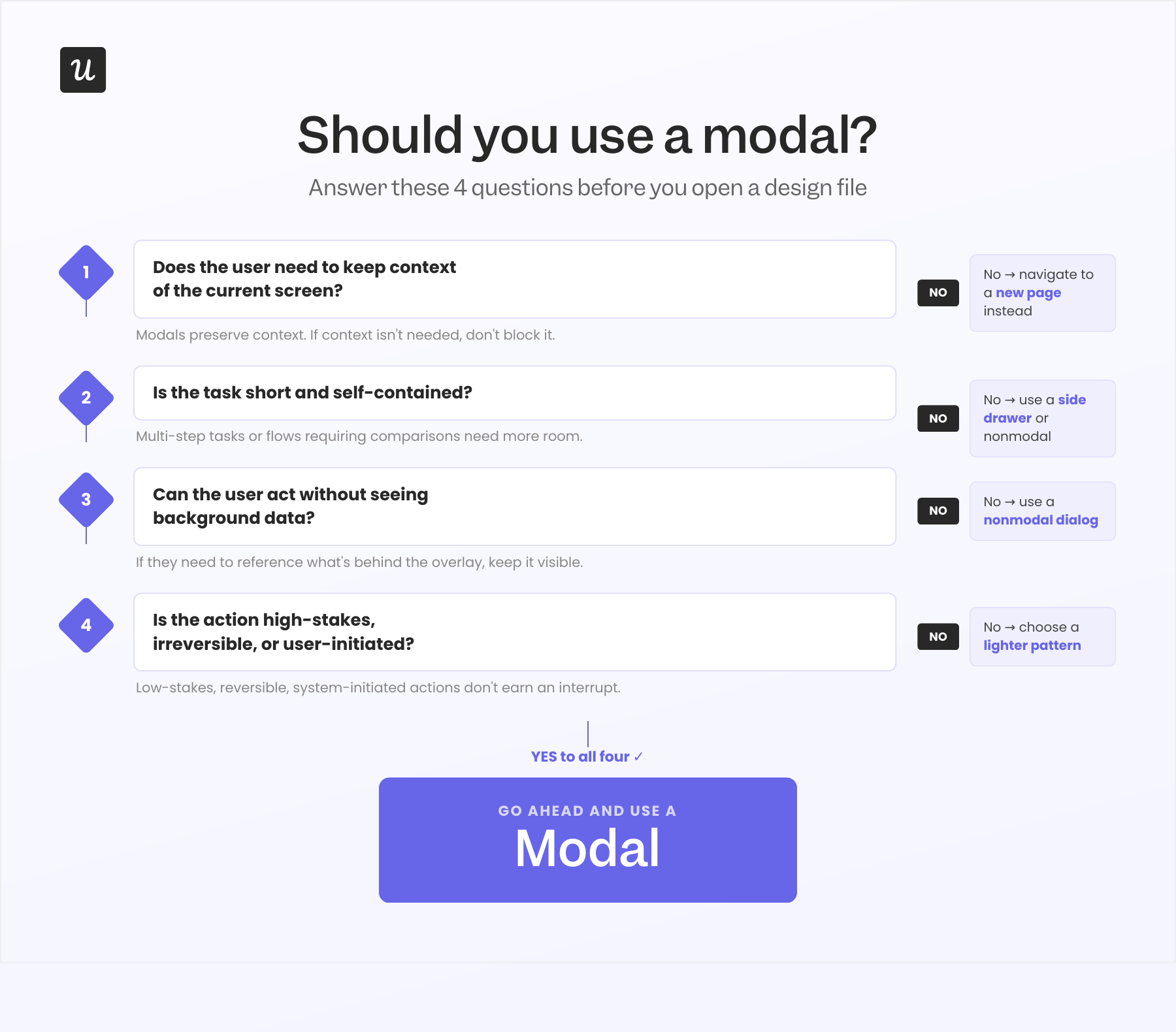
I adapted the following four-step decision framework from Ryan Neufeld’s decision matrix and Vitaly Friedman’s Smashing Magazine guide. Before I open any modal design file, I first test the idea against the framework:
- Step 1: Does the user need to keep the context of the current screen? If the answer is no, navigate to a new page instead. Modals exist to preserve context. Using one when context preservation is not the goal just adds friction without a benefit.
- Step 2: Is the task short and self-contained? If it takes more than about 30 seconds, involves multiple steps, or requires the user to compare data from different sources, a dedicated page or side drawer will likely serve them better. As a rule of thumb, side panels and drawers work better for anything that extends beyond a single focused decision.
- Step 3: Does the user need to reference background data while acting? If the user needs to look at something behind the modal before responding to it, blocking the background is actively working against them. A nonmodal (a side panel or drawer) or inline text keeps that context accessible.
- Step 4: Is the action high-stakes, irreversible, or user-initiated? If yes to any of these, a modal is appropriate. If the action is low-stakes, reversible, and system-initiated, default to a lighter pattern.
When should you use a modal?
With all of the above in mind, there are only a handful of occasions where I believe modals earn their place. Some include:
- Confirming destructive or irreversible actions, such as deleting a record, revoking access, or overwriting a file.
- Collecting information that is critical to continuing a user-initiated flow, such as a login gate before saving, an email address before sending, etc.
- Upsell moments that are triggered when the user hits a real limit, such as storage full or a feature gate reached.
- Urgent system alerts that genuinely cannot wait, such as a subscription expiring today or a security event that requires acknowledgment.
What should a modal include?
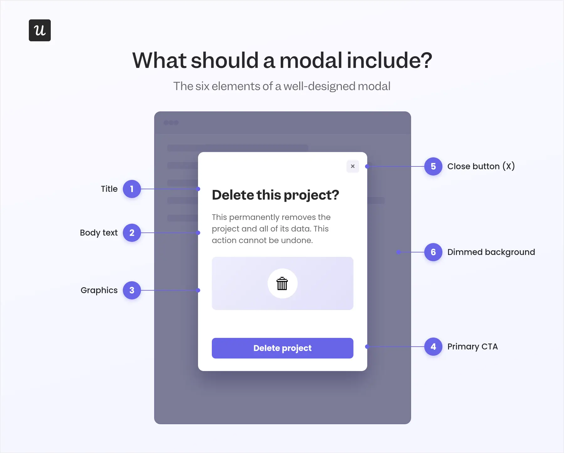
If you must use a modal, you have to use it right. In my experience, there are six core elements:
- A clear, action-focused title: Name the decision or task rather than the feature. Use “Delete this project?” instead of “Project settings” so users immediately understand why the modal appeared.
- Brief body copy: Explain what the user needs to know and why they should act in two or three lines. If the content requires scrolling, it probably belongs on a separate page.
- An optional supporting graphic: Add an illustration, animation, or short video only when it clarifies the message, demonstrates something useful, or reinforces the tone.
- A specific primary CTA: Make both the action and its outcome clear with labels such as “Delete project,” “Confirm upgrade,” or “Start free trial.” Avoid vague buttons such as “OK,” “Yes,” or “Submit.”
- An obvious way to dismiss it: Include a high-contrast close button unless the user genuinely cannot continue without completing the action. Place it where users expect to find it.
- A dimmed background: Visually separate the modal from the parent page while keeping the original context visible. This signals that users can return to their previous task once they act or close the modal.
How to best use a modal
When you do need to use a modal, you have to design it in a way that minimizes the disruption it creates. Here are 7 rules to follow:
Keep it to one task
A modal should do exactly one thing. If you find yourself adding tabs, sub-sections, or content that requires scrolling, that content doesn’t belong on a modal. Your users came from somewhere and want to return there quickly.
Now, I’ll admit that there are edge cases where modals are the right pattern for multi-step flows. When dealing with such an edge case, avoid stacking separate modals. Instead, use a carousel within a single modal, and add a progress indicator so users know exactly where they are in the sequence.
Sked Social’s onboarding modal illustrates such an edge case. But instead of using modal carousels, it tries to accomplish too much on a single screen, producing multiple competing CTAs that pull user attention in different directions at once.
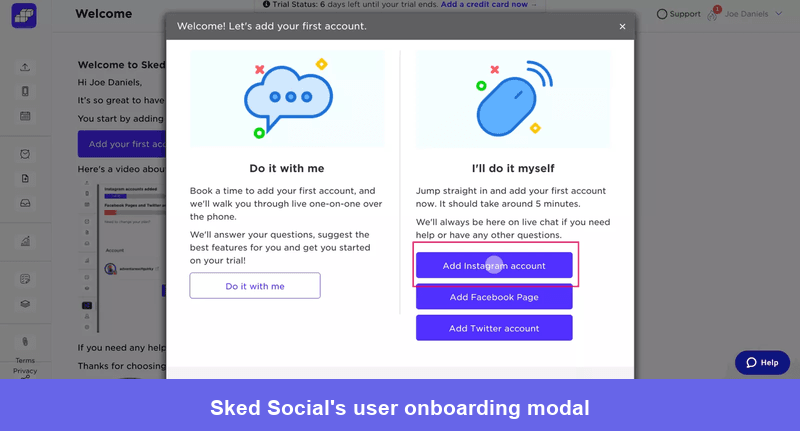
If I were to design this, I’d dedicate a slide to asking the user whether they need assistance. Those who need assistance will be routed to a demo booking screen, while those who don’t will be routed to the other half of the above screen, where they’ll select their first action.
Make it easy to dismiss
Always give users at least three ways out: the X button, a cancel or secondary button, and the Escape key. Allowing users to click outside the modal to close it is a fourth option worth adding.
Adrian Egger of modalzmodalzmodalz.com has a simple rule on the topic which I agree with: if you cannot make a modal easy to dismiss, you do not have a modal problem, you have a design philosophy problem.
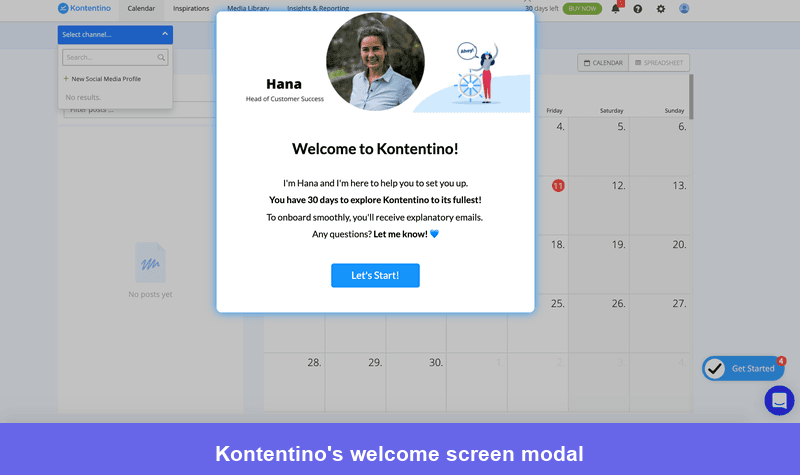
Kontentino’s welcome screen modal is the example I come back to most often in this discussion because it shows exactly how a missing element can unravel an otherwise solid design.
The imagery is friendly, the CTA is clear and inviting, but there is no X button. A new user who is not ready for the product tour right now has no way out. That modal UX design choice turns a welcoming moment into a trap that signals the product does not respect their time.
Write CTAs that make the consequence clear
The CTA label is the single most important piece of copy in a modal. It should make the outcome of clicking unmistakable before the user acts: “Delete project” instead of “Confirm”, “Get 30 more days free” instead of “Upgrade”.
Users who have to guess what happens when they click are more likely to dismiss than to proceed.
You must also avoid placing two equally weighted buttons in a modal. One choice must be visually primary, one secondary, and the hierarchy should be obvious at a glance.
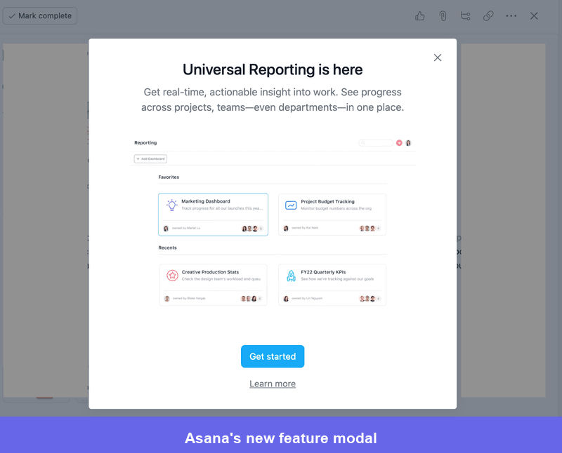
Asana’s new-feature modal gets the X button right (large and easy to spot). But the CTA is confusing. It’s hard to tell the difference between the CTA options: “Get started” and “Learn more.” Even worse, both have roughly equal visual weight, except for the button color.
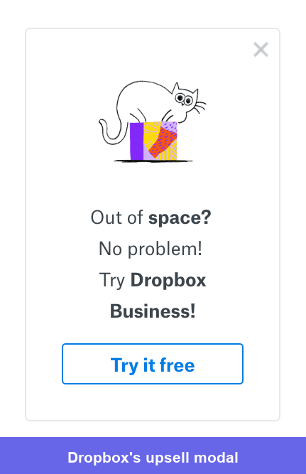
Of all the UI modal examples I’ve collected, Dropbox’s upsell modal is the high-water mark for this pattern. One CTA, specific and low-friction because starting is free, copy so short it takes three seconds to read, and a memorable image that makes the pain point tangible. It earns a 10/10.
Never auto-trigger unless the situation is genuinely urgent
This is the principle I feel most strongly about, because the violation is so common and so costly. System-initiated modals are more disruptive than user-initiated ones because they arrive without warning.
A modal that fires because a user explicitly clicked something is expected. One that fires because a timer elapsed or a condition was met silently is not. In every usability testing session I’ve run, users respond to that difference with immediate irritation.
So, I always reserve auto-triggered modals for situations where the user genuinely needs to know right now, such as a…
- Subscription expiring today.
- Destructive action about to become irreversible.
- Security event requiring acknowledgment.
Things like feature announcements, in-app surveys, and upsell nudges should wait for a user-initiated moment, or you can use a lighter pattern entirely.
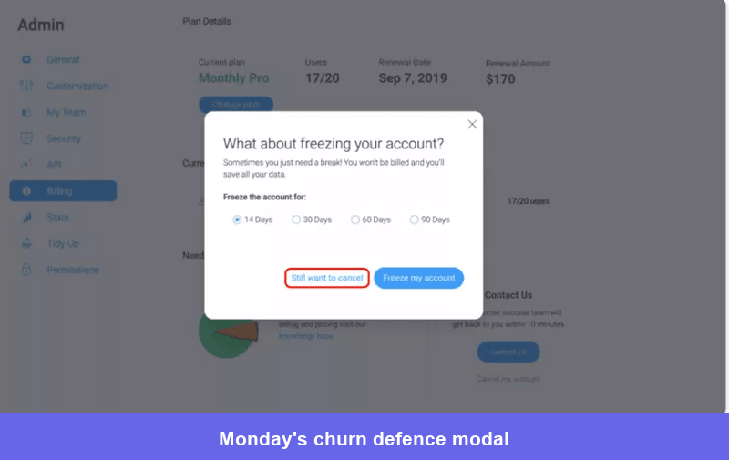
Monday’s churn-defense modal is one of the cancellation flow examples I’ve seen doing this right. It fires specifically when the user actively tries to delete their account, which is precisely the moment when pausing earns its interruption.
Get the size and placement right
Modals do not have a single standard size, and I would argue they should not. The right size follows the content, not a design system default.
A simple confirmation dialog, for example, requires very little space, while a form modal needs considerably more. The practical ceiling I apply is roughly 20-25% of the overall interface: enough to capture attention without overwhelming the screen or hiding the fact that the background still exists.
Here’s my basic placement guide:
- Center modals that require an immediate decision.
- Modals tied to feature announcements or survey prompts can sit toward the side, where they feel less urgent and give users a clearer sense of choice.
- No modal earns the right to fill most of the screen. Any content that requires a full-screen modal doesn’t belong there, but on its own page.
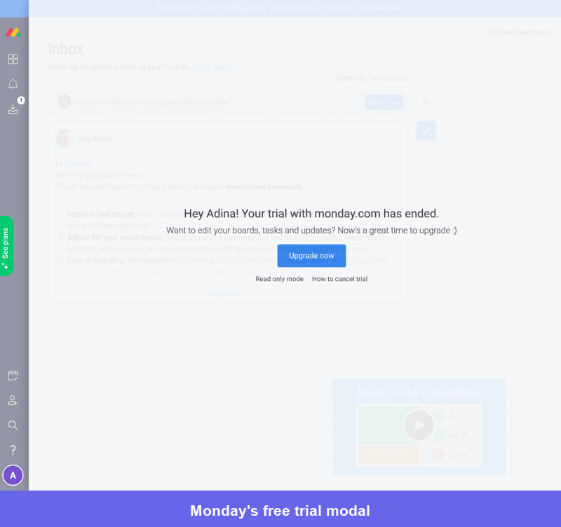
Monday’s example shows one of the only situations where a full-screen modal earns its place. It’s intentionally disruptive by design to let the user know their time in the product has come to an end.
Mobile modals need a different approach
Desktop modal patterns break on mobile, and I think that is one of the most under-discussed failures in mobile UX design. A centered box on mobile screen sizes frequently pushes the X button and the primary CTA below the fold, leaving users stranded with no obvious way to act or dismiss without scrolling.
Two patterns work reliably on mobile.
- A bottom sheet (slide-up panel) is the right default for quick confirmations and short tasks; it sits within natural thumb reach, feels native to mobile interaction, and can be dismissed by swiping down.
- Fullscreen modals are appropriate for high-commitment flows where undivided attention is genuinely required: in-app onboarding steps, checkout, legal consent forms
That said, in most situations, I’d suggest going with a bottom sheet instead of a full-screen modal. Whatever you do, though, keep the X button and the primary CTA visible without scrolling. Touch targets should also be a minimum of 44 by 44 pixels.
Design for accessibility
Unfortunately, even in 2026, I still find a lot of modal UX designs that don’t account for accessibility. A modal that sighted users can navigate easily may be completely inaccessible to someone relying on a keyboard or screen reader.
There are a few requirements I consider vital to accessibility:
- Focus management: When a modal opens, keyboard focus must move inside it immediately and stay there until the modal closes. Once it closes, focus should return to the element that triggered it, so keyboard users know exactly where they are in the page.
- All interactive elements, including the CTA, cancel button, X button, and any form fields, must be reachable via the Tab key in logical order.
- The Escape key should always dismiss the modal.
- On the ARIA side, use
role="dialog"for standard modals androle="alertdialog"for destructive or critical ones. Addaria-labelledbypointing to the modal title,aria-describedbypointing to the body text,aria-label="Close"on the X button, andaria-hidden="true"on the background content while the modal is open. - The X button must meet WCAG AA minimum contrast of 4.5:1 against the modal background; a close button that is difficult to see for low-vision users undermines every other accessibility improvement in the design.
Are there any alternatives to modals?
I’ve covered how I decide whether to use a modal with the four-step framework. But what should you do when a modal doesn’t meet the mark, and how do you choose between a modal vs popup vs overlay?
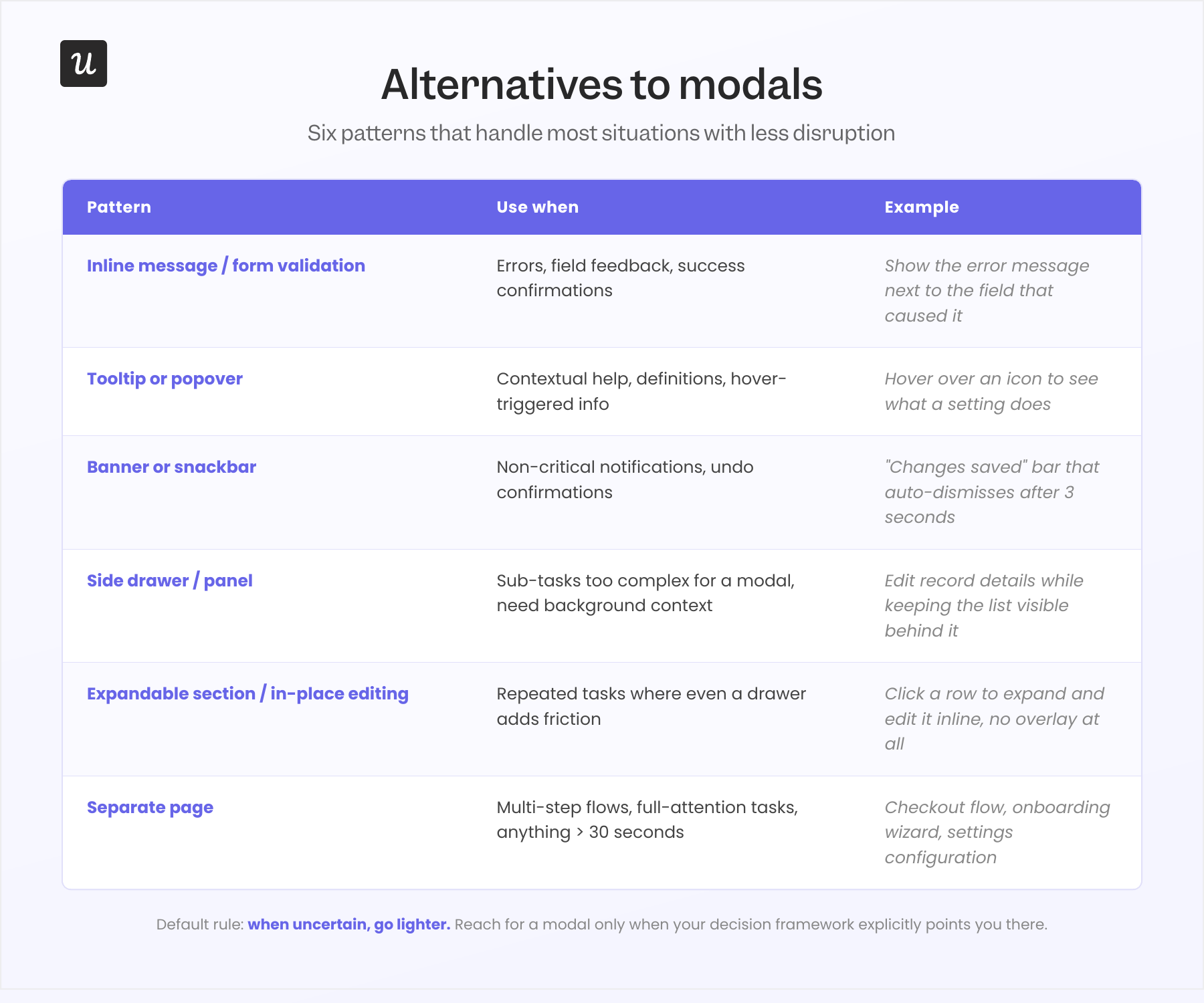
In my experience, six alternative patterns handle most of the situations teams default to a modal for, with considerably less disruption to the user’s flow. I’ve listed them and summarized the situations where they earn their place.
- Inline message/form validation: Useful for errors, field-level feedback, and success confirmations. Keeps the user at the exact point where action is needed, rather than pulling them into a separate overlay and back again.
- Tooltip or popover: Useful for in-app help, definitions, and hover-triggered clarification. Non-blocking and dismissible by moving focus elsewhere, making them far less disruptive for informational content.
- Announcement banner or snackbar: Useful for non-critical notifications, system status, and undo confirmations. Appears without interrupting the current task and can be dismissed or ignored without forcing a decision.
- Side drawer/panel: Useful when a sub-task is too complex for a simple modal but does not justify navigating away from the current screen. Particularly useful when users need to reference background data while acting, since the drawer keeps that context visible.
- Expandable section/in-place editing: Useful for repeated tasks where even a drawer adds friction. Letting users edit a field or update a record directly in the UI, with no overlay at all, is the lowest-friction option available.
- Separate page: Useful for multi-step flows, tasks that require the user’s full attention, and anything that takes more than about 30 seconds. As Vitaly Friedman says, “Save modals and page navigation for moments where the interruption genuinely adds value, especially to prevent critical mistakes.”
Build and iterate on modals without the engineering overhead!
Even when a modal looks good on paper, you still need to see how users respond to it. Do they take the intended action, dismiss it immediately, or abandon what they were doing altogether?
With Userpilot’s user onboarding software, you can build and target modals without engineering support, then use session replay to watch what happens after they appear. That makes it easier to spot whether the problem is the copy, design, timing, audience, or the decision to use a modal in the first place.
From there, you can refine the experience, replace the modal with a less disruptive pattern, or remove it entirely when it is not helping users move forward.
Book a demo to see how Userpilot helps you build, test, and improve in-app experiences based on real user behavior.
FAQ
What is a modal web design?
A modal is a web page element that appears on top of the main content, temporarily blocking interaction with the underlying page until the user interacts with it or closes it.
What is multimodal UX design?
Multimodal design focuses on using multiple modes of interaction, such as voice, touch, gestures, or haptics, to create a more natural and intuitive user experience.
What are modal sizes in UX design?
Modal sizes refer to the dimensions (width and height) of the modal window, which can vary depending on the content and context. Common sizes include small, medium, and large.
What is a module in UI/UX design?
A module is a reusable, self-contained component or block of content within a user interface, designed to perform a specific function or display a particular type of information.
About the author