UI Modal Examples from the Best SaaS Apps


Modal windows stop everything. The rest of the interface fades, the user’s task pauses, and whatever you put inside that modal becomes the only thing on screen.
Use them at the wrong moment, and users dismiss without reading a word. Get the timing right, and they’re one of the highest-converting UI patterns in your product.
In this article, I’ve pulled together 16 UI modal examples from SaaS companies getting those decisions right, with a breakdown of what each modal does, why the design works, and what you can steal from it.
What are UI modals?
A modal (also called a modal window, dialog, or overlay) is a UI element that sits on top of your main interface, temporarily disabling other elements behind it until the user takes action or dismisses it.
The dimmed backdrop signals that the rest of the interface is on pause, directing full attention to the task at hand. Modals work best for moments that demand focus: confirming a critical action, collecting user input, or surfacing a key point.
Types of modal windows
Modal types vary based on UI design goals and the context in which they appear. Here are some common types:
Fullscreen modal windows
A fullscreen modal window is a user interface element that extends from the left edge of the browser window to the right edge. Designed to command the user’s full attention, it obscures the entire screen until the modal is closed.
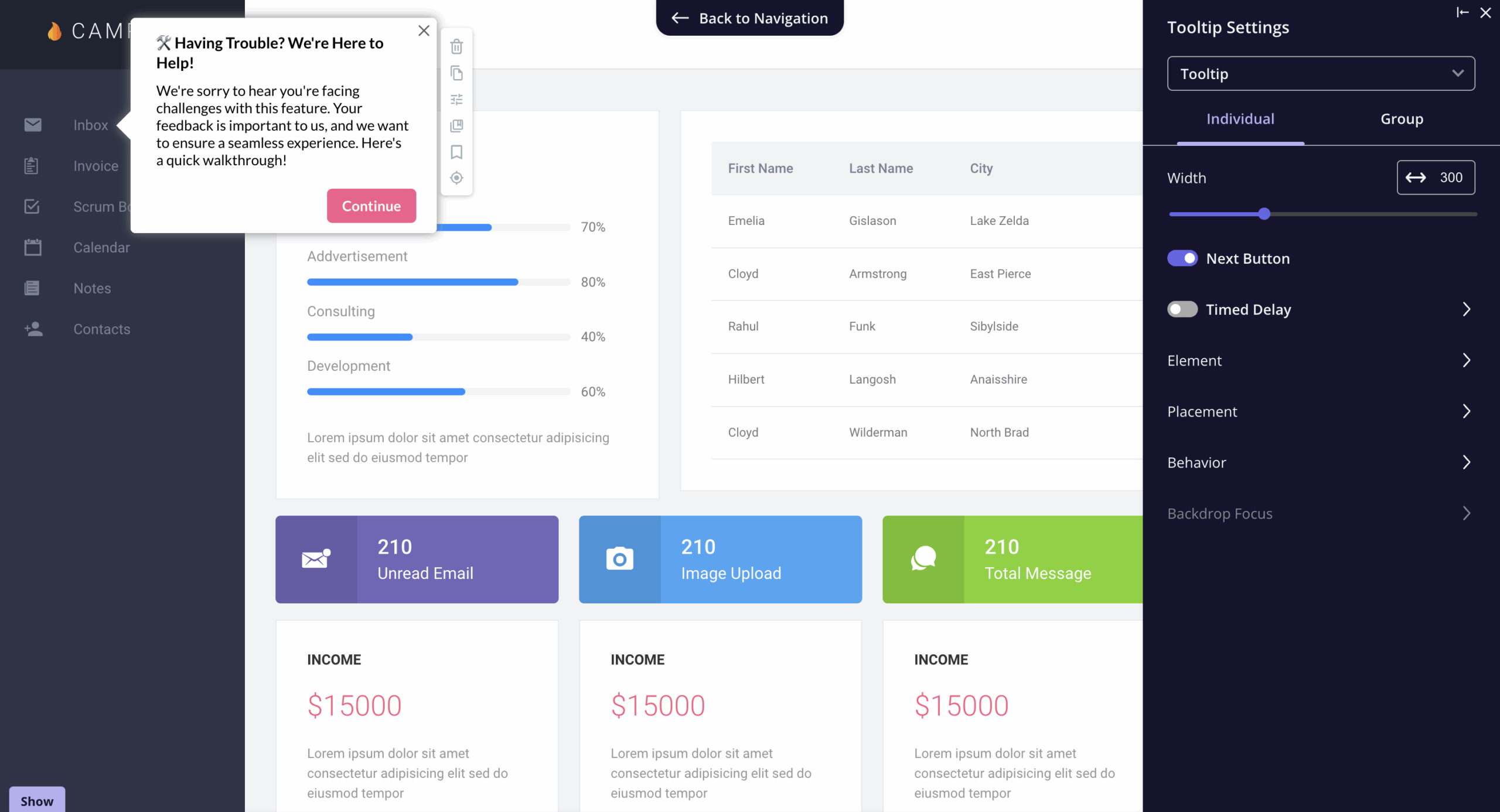
Tooltip modal windows
Tooltip modals are user interface design patterns that provide additional information or explanations about specific elements when a user interacts with them. They reduce interface clutter without sending users to a dedicated page for additional context.
Pop-ups and lightboxes
Pop-ups open as separate browser windows and are often associated with advertising. Lightboxes are interactive elements that appear on top of the current page, keeping users within the same context.
Mobile modal windows
Mobile modals are a design pattern built for smaller screens and touch-based interactions. Mobile users have less screen space and less patience for interruptions, so every element, copy, CTA, and dismiss option needs to be immediately visible without scrolling.
When designed well, mobile modals guide users through specific tasks on their mobile app without overwhelming users or eating up the entire screen. Userpilot’s mobile modals are built specifically for this: letting you create and trigger mobile-optimized modals across mobile devices without writing code, separate from your web content.
16 Best announcement UI modals examples to inspire you
If you’re looking for inspiration, then these announcement modals from some of the biggest SaaS players in the game will surely give you a few ideas.
1. Kommunicate ‘what’s new’ UI modal
A large modal surfaces on login after a release, listing seven new features with a GIF at the bottom and a single CTA to explore WhatsApp Integration.
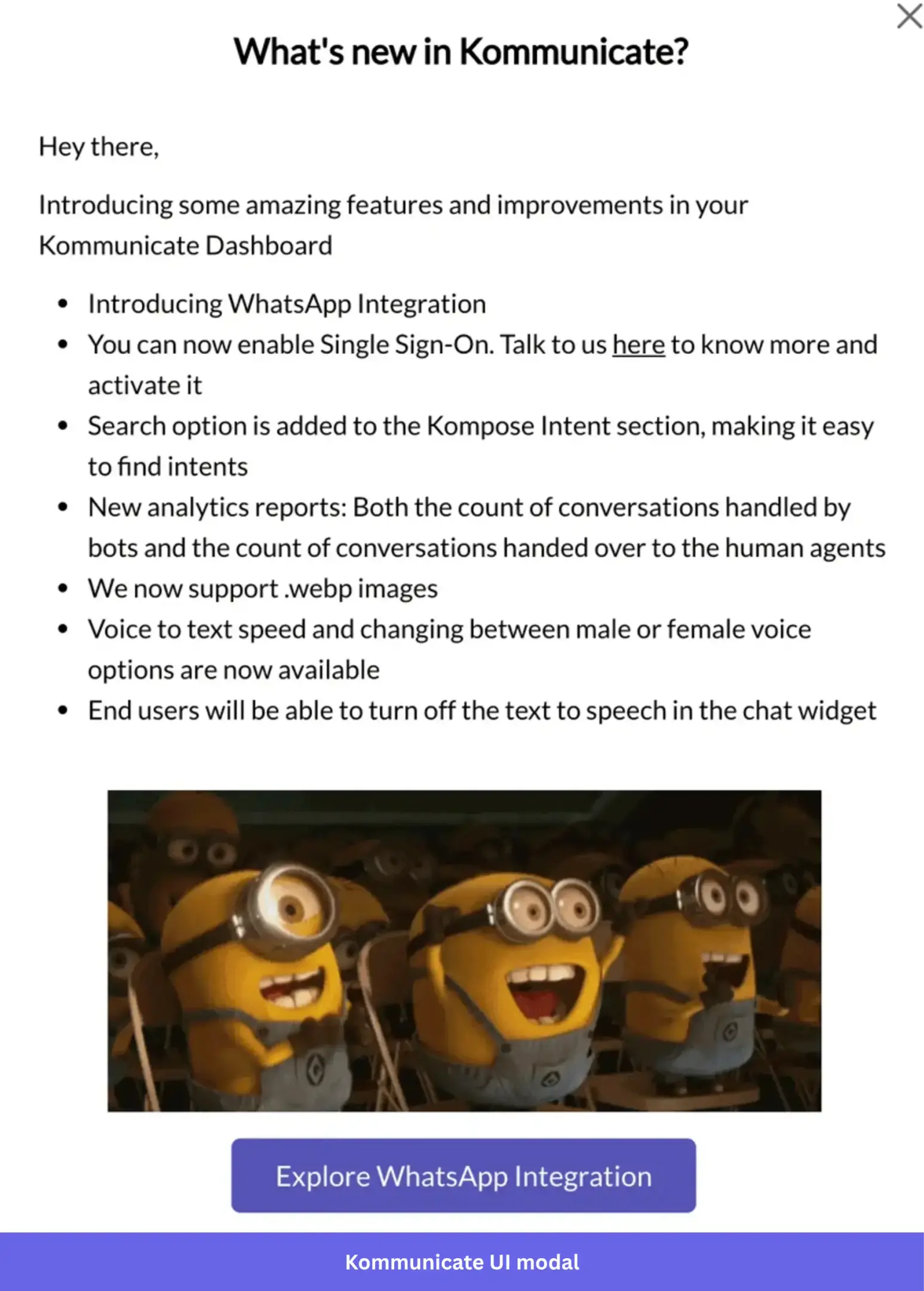
Most “what’s new” modals read like patch notes. This one leads with the biggest update, WhatsApp integration, and lets the Minions GIF do the heavy lifting emotionally.
The CTA then funnels users directly into a walkthrough so the modal doesn’t just inform them about the new features, it gets them using one immediately.
Steal this: If you’re announcing multiple updates at once, let the CTA focus on the most important one. A walkthrough that follows the modal turns awareness into adoption far faster than a help doc ever will.
2. Dropbox’s storage upsell modal
When a user tries to copy a file and hits their storage limit, Dropbox surfaces a modal with an overflowing filing cabinet illustration, two lines of copy, and two buttons: Cancel and Add storage.
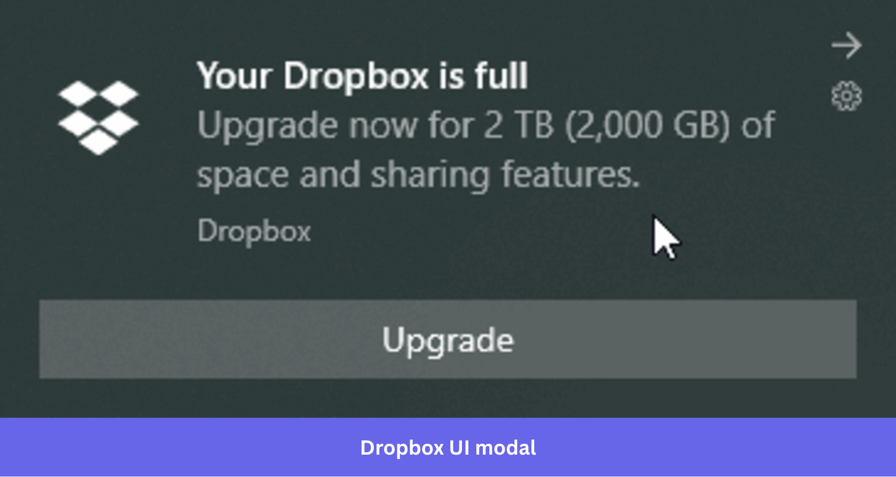
The user came here to copy a file. Their storage plan wasn’t part of the plan. Dropbox meets them exactly where they are. “You’re out of storage. To copy this content you need more storage space.” That’s it. There is no pitch, or list of plan features, just a plain explanation of what’s blocking them and one button that solves it.
The filing cabinet illustration softens what is essentially a paywall into something that feels more like a helpful nudge. And because the modal only appears when the user has actually hit the limit, the upgrade doesn’t feel like a sales tactic. It feels like the logical next step.
Steal this: Upsell modals work best when they’re tied to a real moment of friction. Trigger them when users hit a meaningful limit, keep the copy situational, and make the CTA the most obvious path back to what they were trying to do.
3. Figma’s new feature announcement modal
When Figma launched bulleted and numbered lists, users saw a modal with a bold yellow and blue graphic showing the feature in context, a two-line headline, one sentence of copy, and two buttons: “Learn more” and “Show me how.”
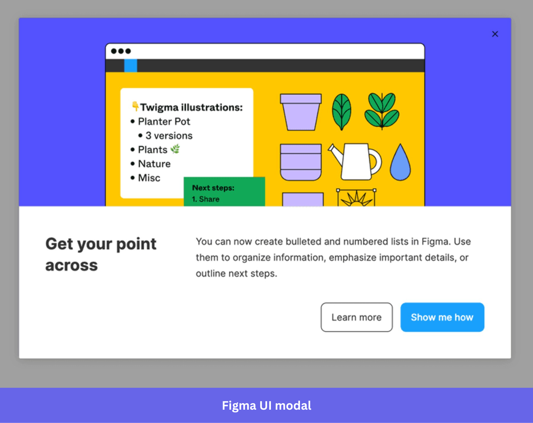
Figma’s users are designers. They notice a clear visual hierarchy before they read a single word. The high-contrast graphic does the announcing, and by the time they reach the headline, the feature has already made its case visually.
The two-button structure also gives users a meaningful choice without adding friction. “Learn more” for the curious, “Show me how” for the ready. Neither option feels like the wrong answer.
Steal this: Show the feature working inside your product before you describe it. A well-designed graphic does more convincing than a paragraph of copy ever will.
4. Facebook badge UI modal
When a user earns a badge in a Facebook group, a modal appears with the badge illustration, a one-line explanation of what it recognizes, and a CTA to see all rising stars.
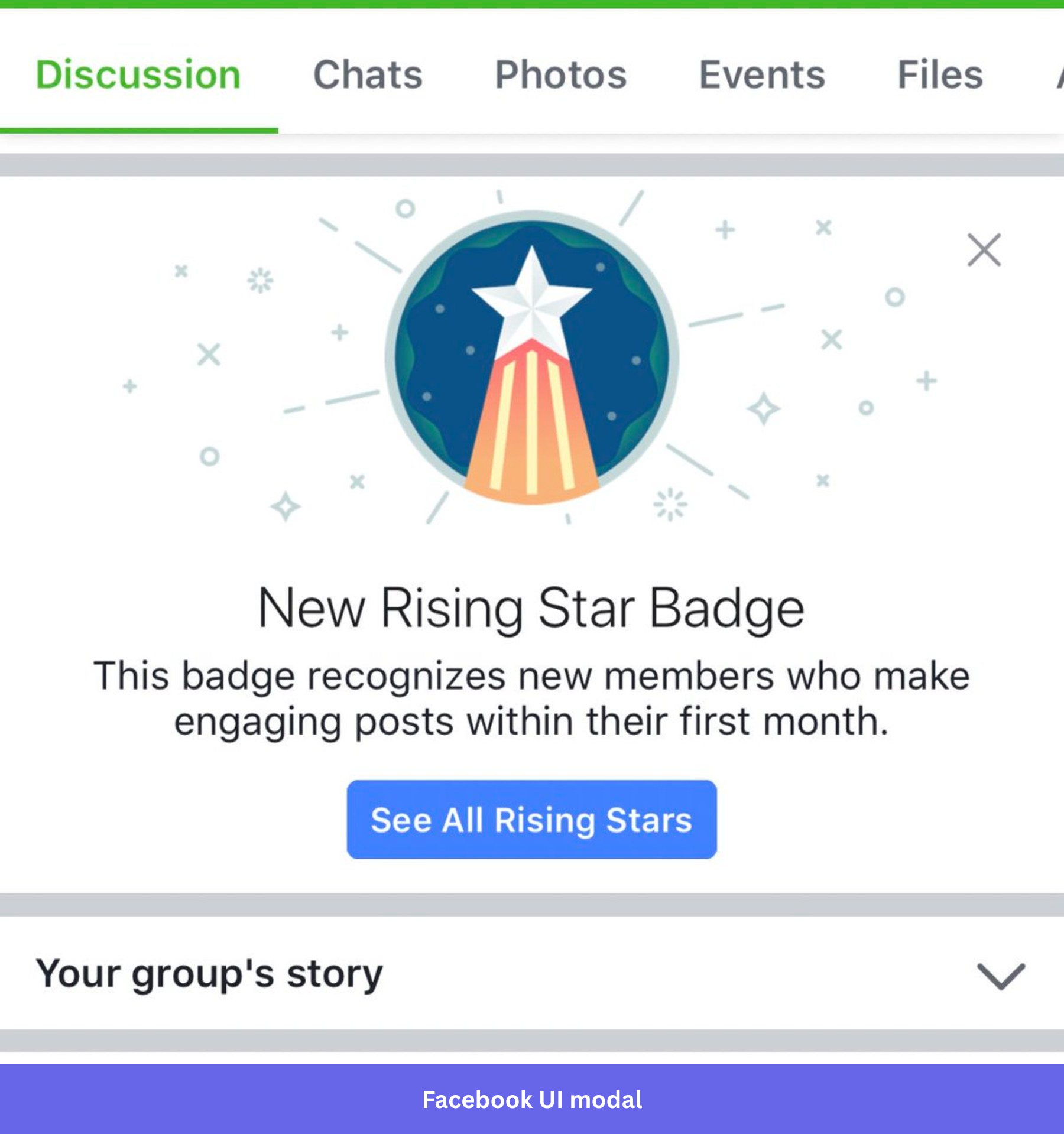
The badge does most of the talking. Facebook doesn’t need three paragraphs explaining why engagement matters or what being a rising star means for the community. The illustration is celebratory enough to make the moment feel earned, and the copy lands the point in a single sentence.
The CTA then turns a personal achievement into a social one, giving users a reason to see who else earned the badge and stay in the community a little longer.
Steal this: Celebration modals work best when they’re brief. One visual, one line of copy, one optional next step. The moment you over-explain the achievement, you deflate it.
5. Ahrefs notification UI modal
After shipping a Site Audit update, Ahrefs greeted users at login with a modal dated September 20, explaining that Health Score changes were coming and why.
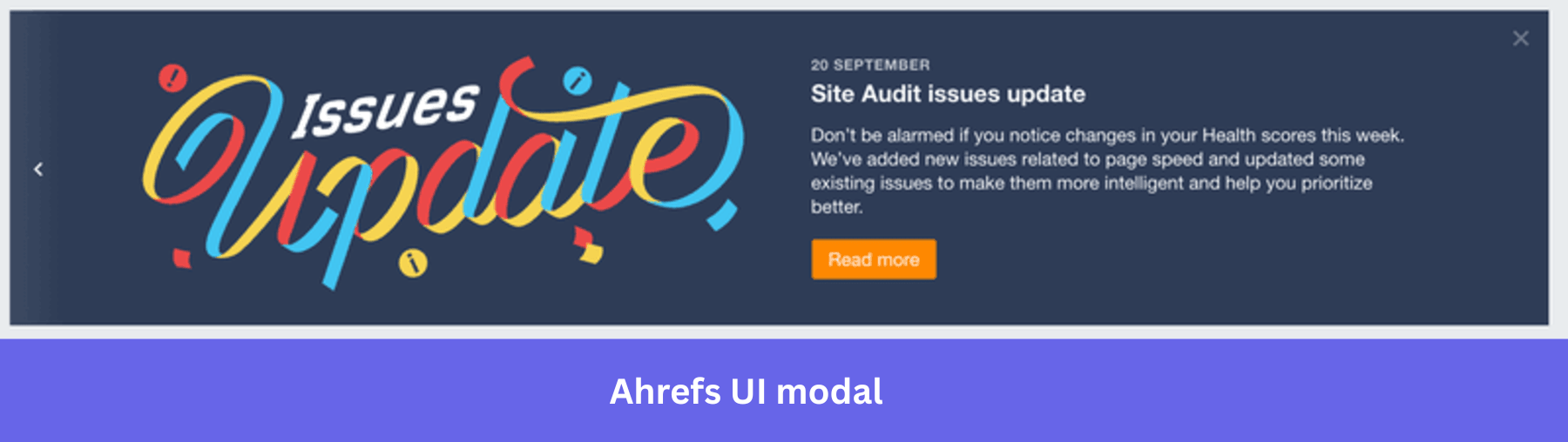
Health scores are the kind of metric users watch closely. A sudden drop with no explanation is a support ticket waiting to happen. Ahrefs gets ahead of that by surfacing the modal before users even open their dashboard, so by the time they see a change in their numbers, they already know why. The “don’t be alarmed” framing in the copy does exactly what it says. It removes the anxiety before it has a chance to form.
Steal this: Any time you ship a change that affects a metric users care about, tell them before they notice it themselves. A proactive modal at login costs you nothing and saves your support team hours.
6. Asana’s Goals feature announcement modal
When Asana launched Goals, users saw a fullscreen modal with a benefit-focused headline, a live dashboard preview showing Goals in action, and a “Try for free” CTA.
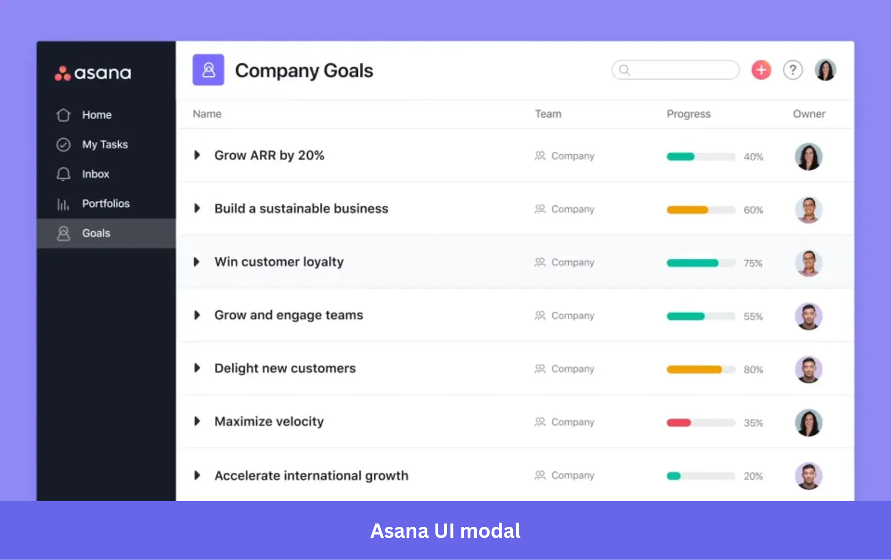
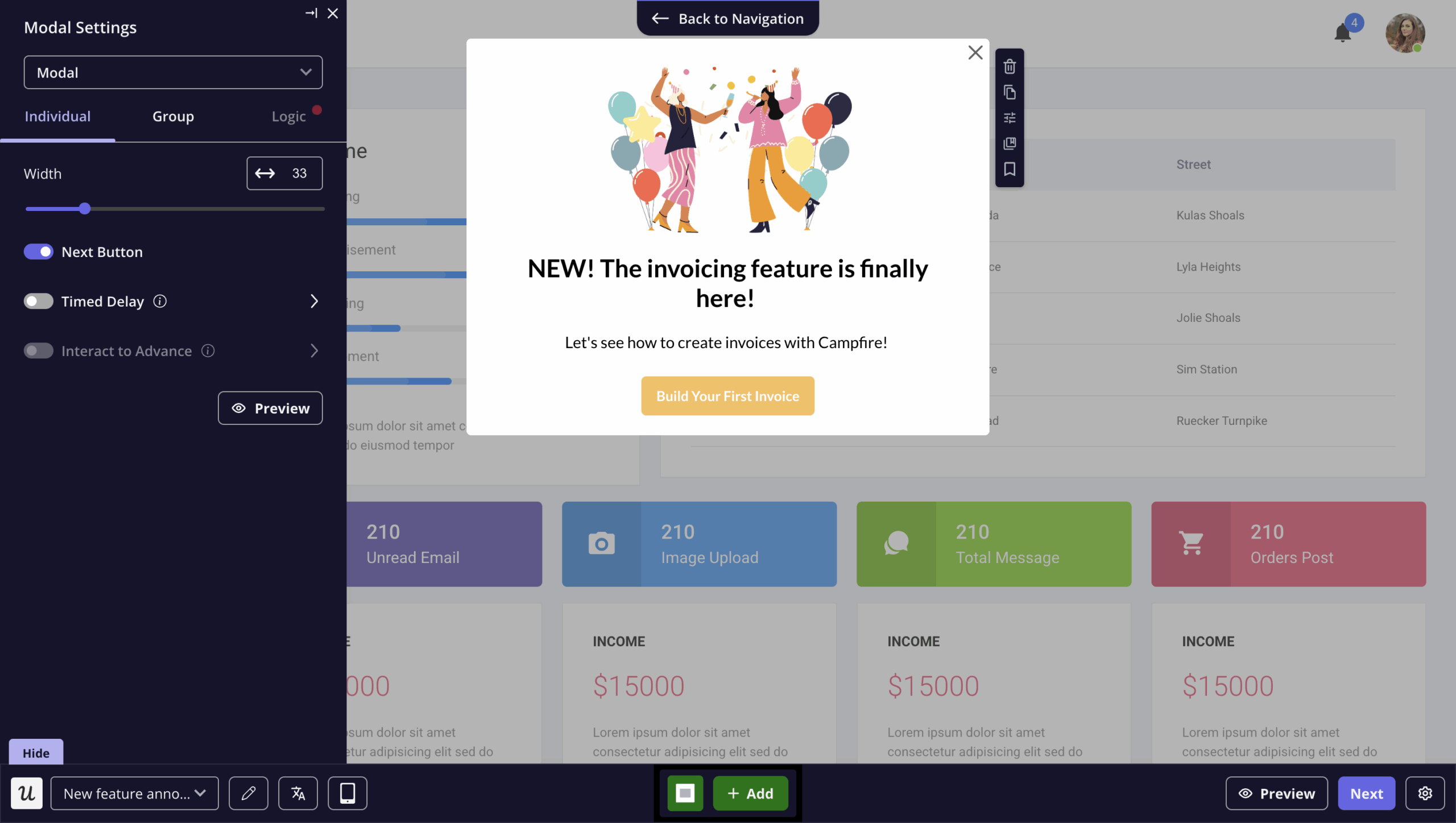
“Achieve your most important objectives with Goals.” That headline doesn’t explain what the feature does. It tells you what you’ll be able to do once you use it. The dashboard preview then shows you exactly where you’ll land if you click, removing the hesitation that comes with trying something unfamiliar. Rather than hitting users with everything at once, Asana spread the introduction across a sequence of modals, each adding a layer of context without overwhelming.
Steal this: For multi-step processes or complex feature launches, spread the introduction across a short sequence of modals rather than cramming everything into one. I go a step ahead and add progress indicators inside the modal so users always know how many steps remain and where they are in the flow.
7. Dropbox’s new UI announcement modal
When Dropbox rolled out a redesign, users were greeted with a centered modal, one illustration, a headline, a single line of copy, and a “Start tour” CTA.
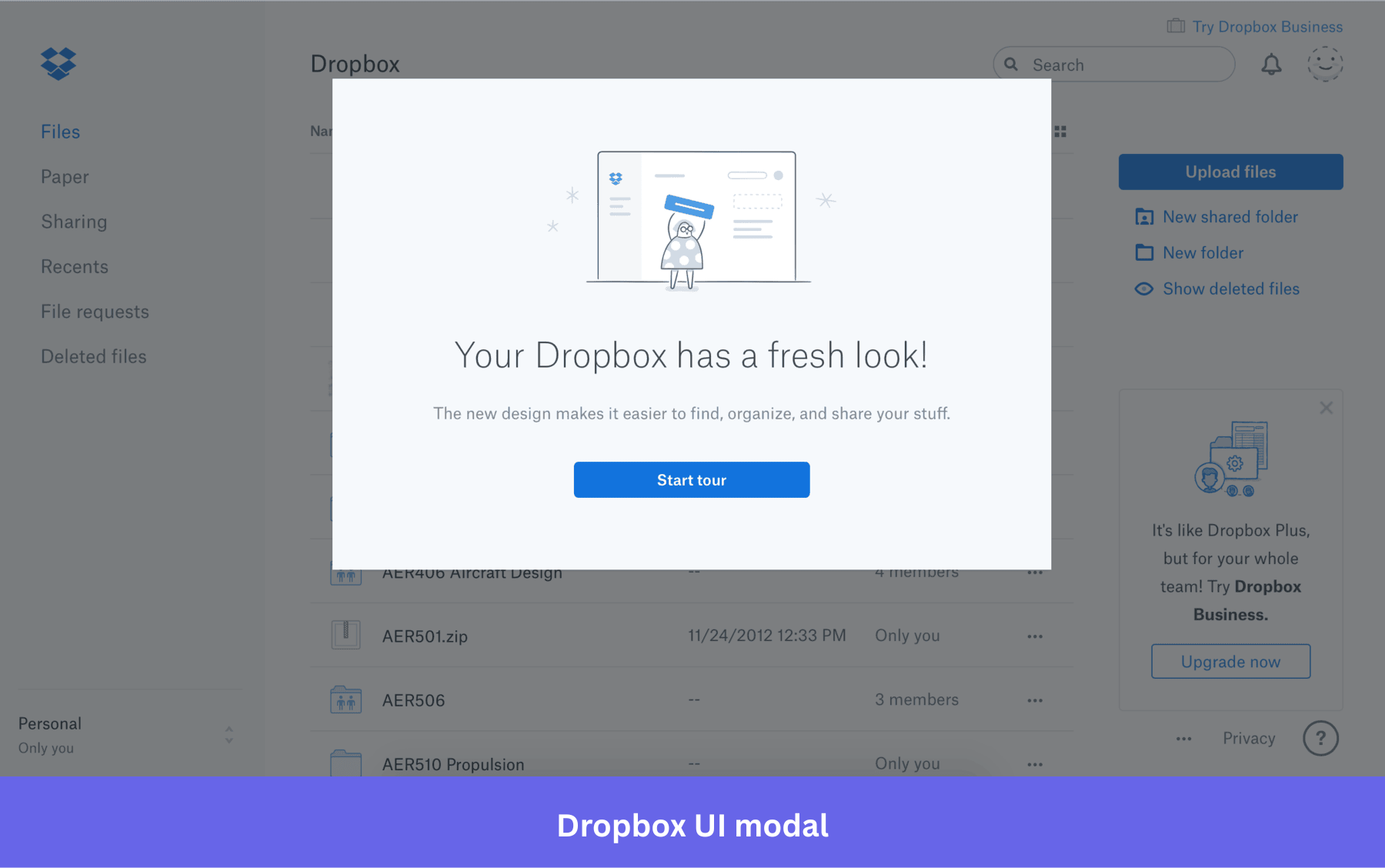
“Your Dropbox has a fresh look.” Five words and the modal has done its job. Most users opening Dropbox on a Tuesday morning aren’t there to read about product updates. They’re there to find a file.
Dropbox respects that by keeping the copy to one sentence and putting the tour behind a button rather than forcing it. Users who want to explore can. Users who just want to get back to work can close it and move on without feeling like they missed anything.
Steal this: When announcing a redesign, resist the urge to over-explain. One headline, one line of copy, one CTA. The product will do the rest.
8. Monday.com freeze account announcement UI modal
When a user tries to cancel, Monday intercepts with this modal offering to freeze the account instead, for 14, 30, 60, or 90 days. Billing stops, data stays. Two buttons: “Freeze my account” and “Still want to cancel.”
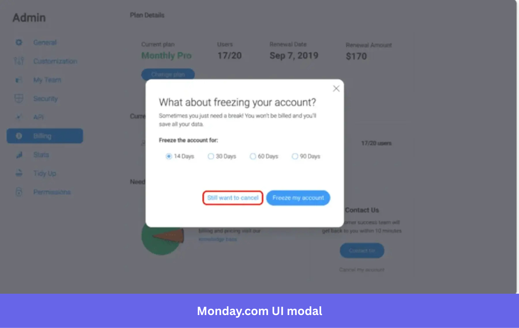
“Sometimes you just need a break.” That single line does more work than any feature list could. The user wants to cancel, and Monday responds not with guilt but with understanding. Then the freeze duration options pull a quiet trick.
By asking you to choose between 14 and 90 days, Monday shifts your thinking from “should I stay” to “how long do I need.” Most people pick a duration rather than hit cancel.
Steal this: Give users a duration to choose, not a binary to decide. Asking ‘how long do you need?’ converts better than ‘stay or go?’
9. Amplitude new layout announcement modal example
When Amplitude rolled out a new navigation and layout, users were greeted with this modal on first login. An illustration of the new UI, a headline crediting user feedback, one line of copy, and a single “See What’s New” CTA leading into an interactive walkthrough.
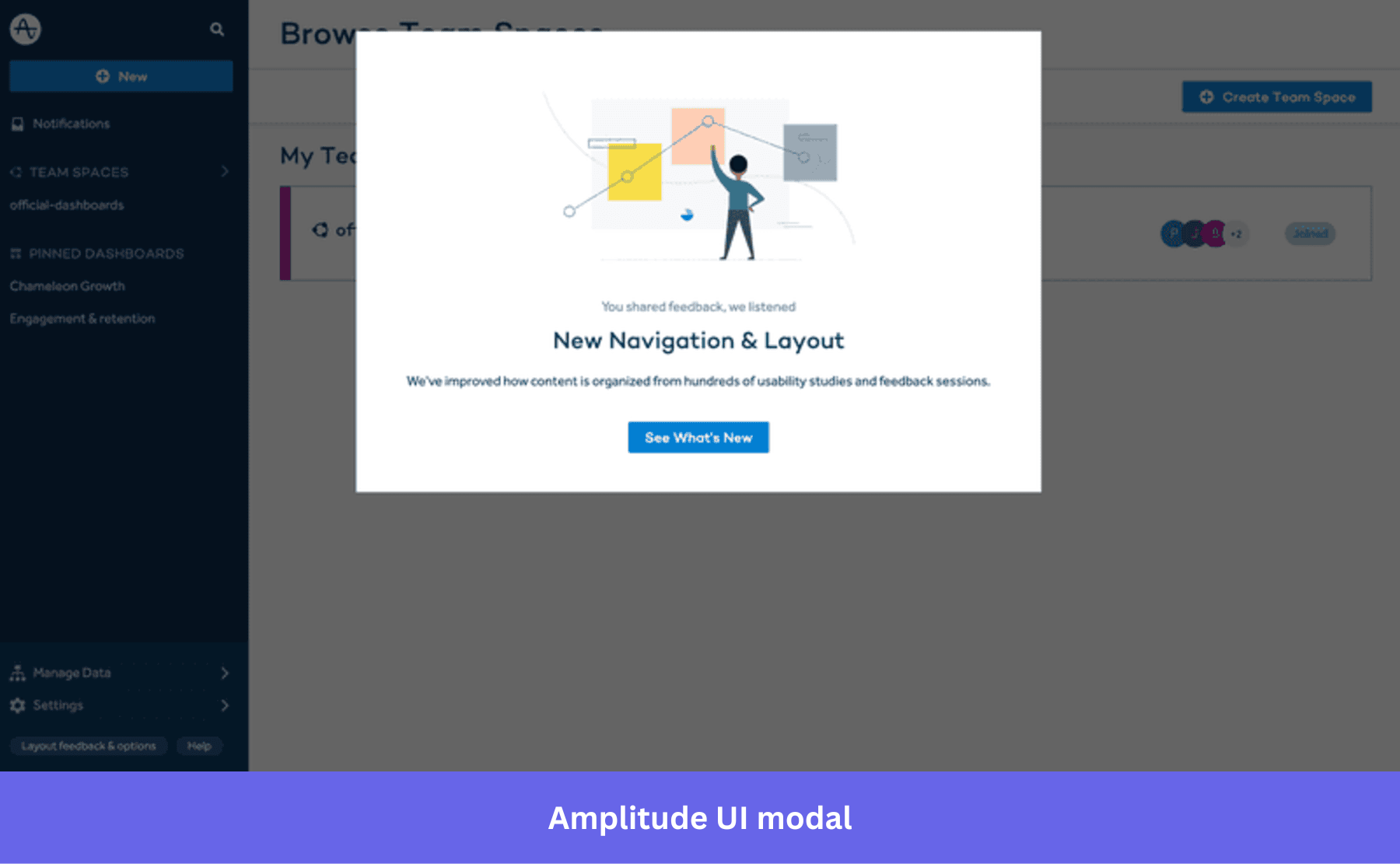
Navigation changes disorient users fast. Everything they knew has moved, and without context, that disorientation turns into user frustration. Amplitude gets ahead of it by showing users the new layout before they stumble into it. The “You shared feedback, we listened” line does something smart too.
Navigation changes are easier to accept when users feel like they asked for them. That one line turns a product decision into a response to feedback. The walkthrough CTA then converts that goodwill into actual product comprehension.
Steal this: When you ship a major UI change, don’t just announce it. Show users what changed, explain why, and give them a guided path through it before they’re left clicking around confused.
10. Loom downgrade and upsell notification UI modal
After downgrading from Business to Starter, Loom surfaces a modal confirming the change, listing exactly what’s been lost, and offering two options: see upgrade options or review changes.
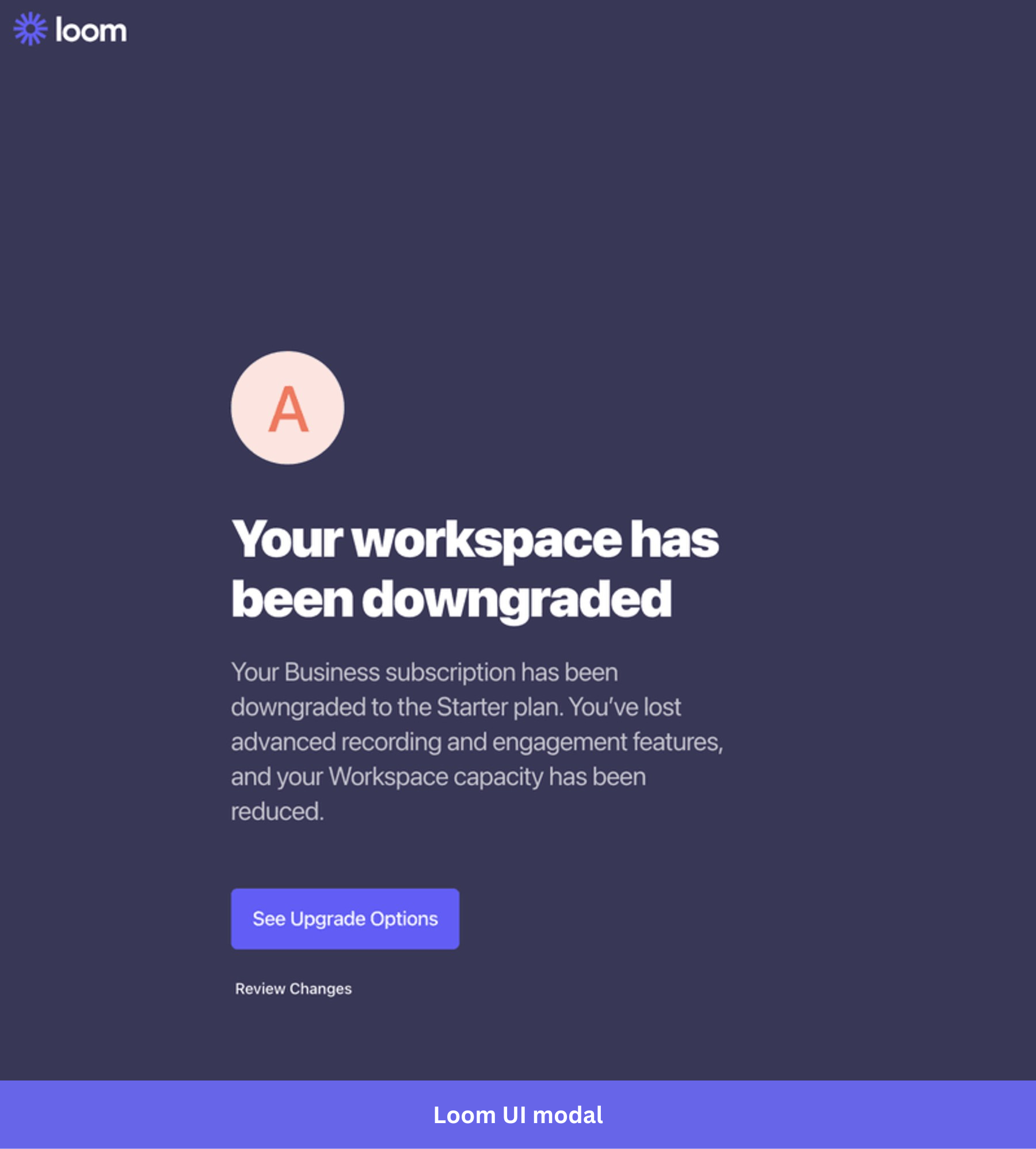
Loom doesn’t try to stop you from downgrading. By the time this modal appears, that decision is already made. What Loom is doing instead is making sure you feel the weight of it. “You’ve lost advanced recording and engagement features” Loom frames it as information, not consequence and that distinction changes how the list lands.
And for anyone who downgraded impulsively or because of budget pressure, reading that list is often enough to make them reconsider. The “See Upgrade Options” CTA sits right there when they do.
Steal this: The moment right after a downgrade is one of the highest-intent moments in your entire product. Don’t waste it on a generic confirmation. Show users exactly what changed and make the path back obvious.
11. Mailchimp pause or delete account UI modal
When a user tries to close their account, Mailchimp surfaces a modal with three options: pause billing, permanently delete, or chat with support. One Continue button at the bottom.
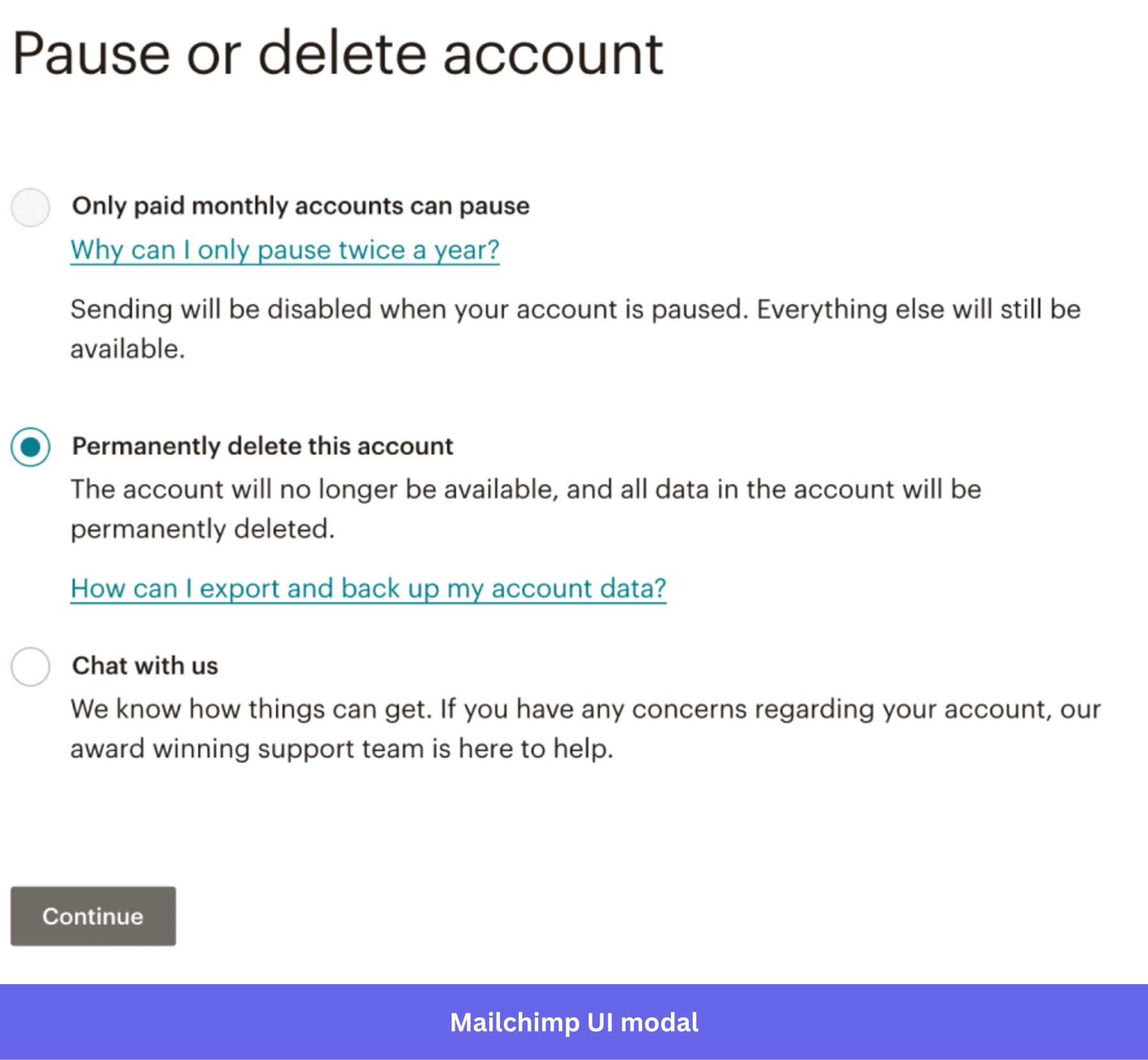
The user came here to leave. Mailchimp slows them down just enough to consider whether leaving is actually what they want. The guilt-trip approach stays off the table entirely. Pausing keeps everything intact except sending, which is the perfect middle ground for anyone who’s just quiet for a season.
And by placing “Chat with us” as a third option, Mailchimp opens a door for users who are frustrated rather than done. The delete option stays visible and accessible.
Steal this: Put a concrete, low-friction alternative inside your cancellation flow before the user reaches the point of no return. The easier you make it to pause, the fewer people will delete.
12. Slack confirmation UI modal
After you accept a workspace invitation, Slack surfaces a confirmation modal telling you the invitation was received, what happens next, and that you can close the window. Green checkmark, two illustrated steps, no CTA needed.
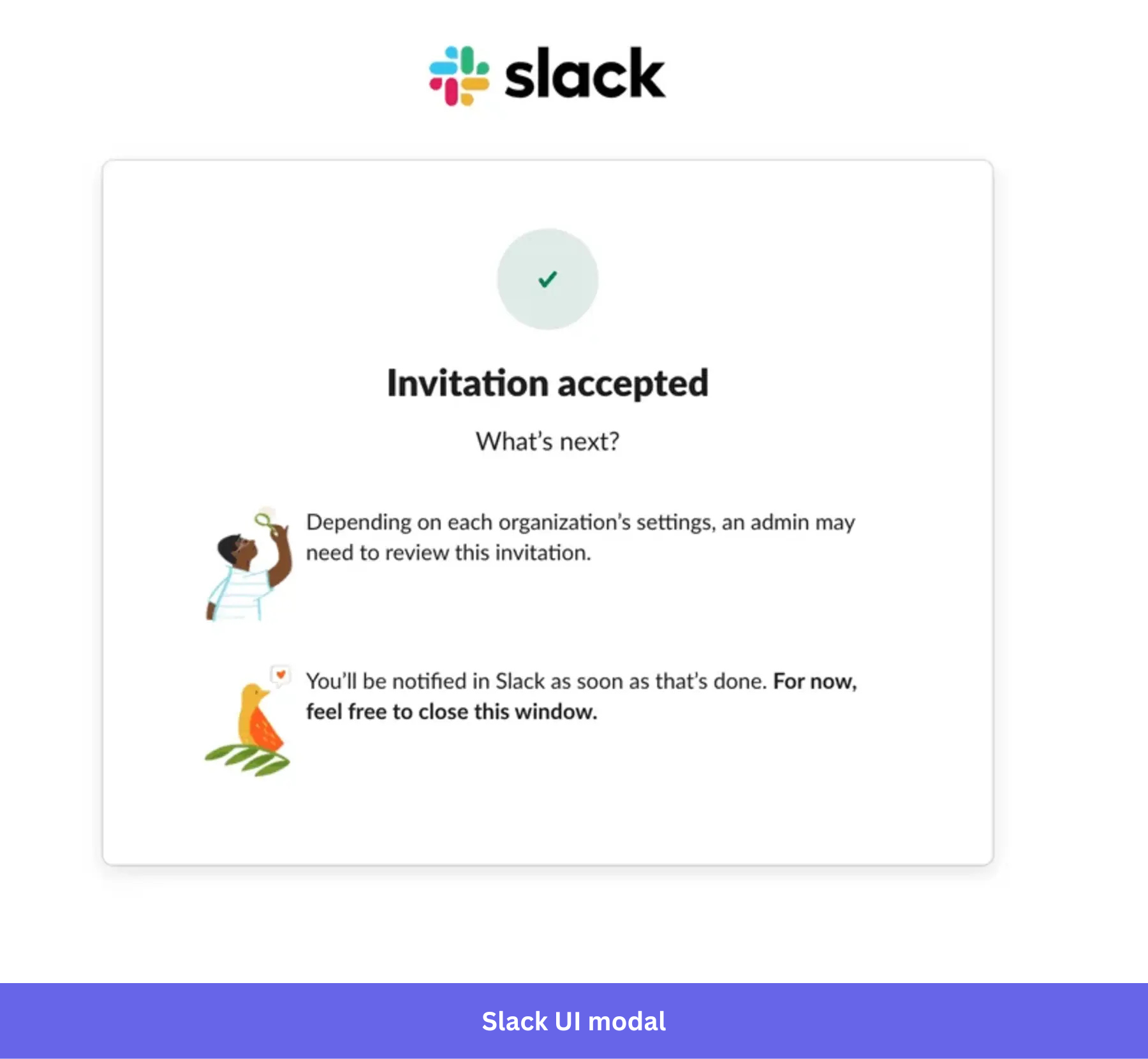
Slack answers the question every new user has the moment they accept an invitation: now what? The two illustrated steps remove that uncertainty before it becomes friction, and “feel free to close this window” means nobody is left wondering if they missed a step.
Steal this: A confirmation modal isn’t just a receipt. Tell them what just happened, what comes next, and when they’ll hear from you.
13. Spotify’s smart home feature nudge
Spotify’s mobile modal appears while you’re listening to music near a Google Home device. It shows the artist you’re currently playing, a single voice command to try, and one dismiss button.

This modal earns its place entirely through context. It doesn’t appear at login or during an unrelated task. It triggers at the exact moment the feature is useful inside the mobile app, when you’re already listening. The artist photo grounds it in what the user is doing right now, which is what makes it feel personal.
Spotify’s own experimentation team has written about how timing and context matter more to modal effectiveness than copy or visual design alone, which is exactly what this modal gets right.
Steal this: Tie your modal trigger to a specific user action rather than a time delay. A modal that appears because of what a user is doing right now will always outperform one that appears because a timer fired. In Userpilot, you can trigger modals based on specific user actions or events rather than time delays. This means you can replicate this kind of contextual timing without hardcoding trigger logic.
14. Nike Run Club’s gamified achievement modals
Nike surfaces fullscreen modals when you hit milestones, whether that’s completing a challenge series or running seven times in a week. Bold visuals, a badge, minimal copy, one CTA.
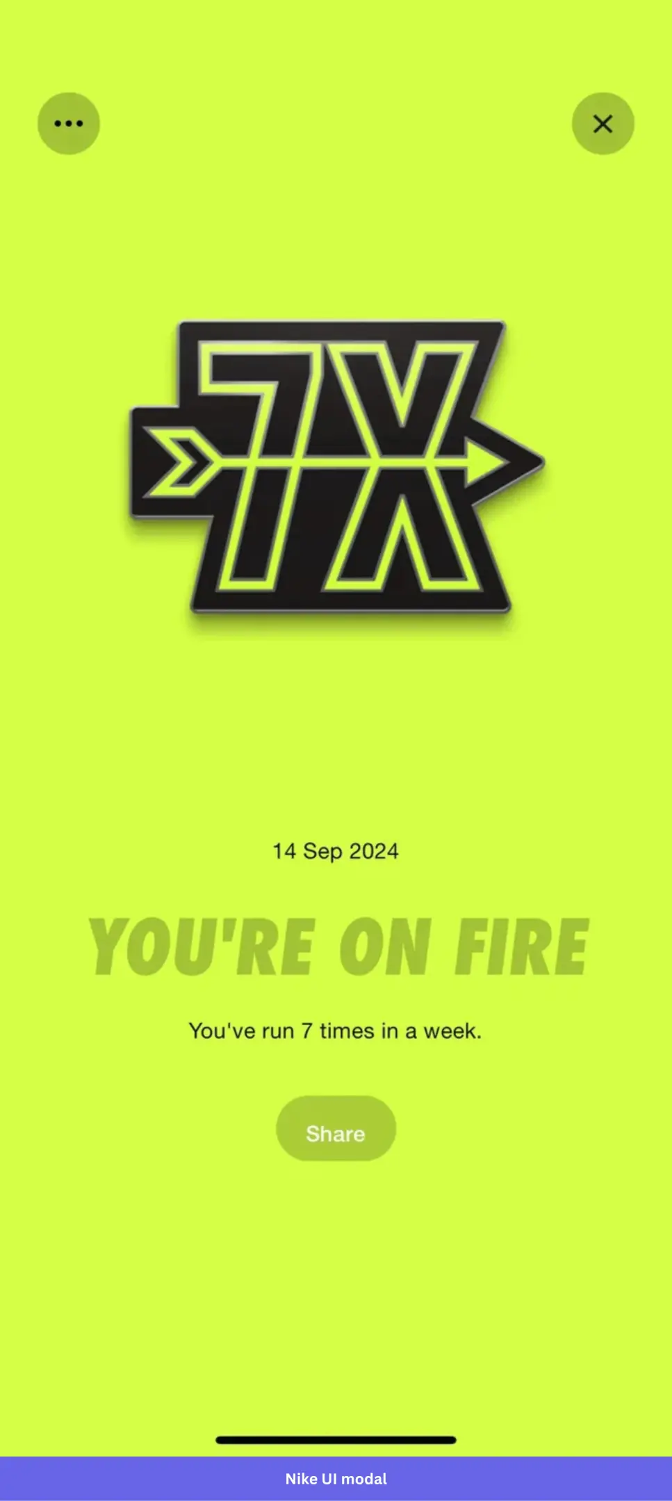
Nike doesn’t over-explain the achievement or tell you why streaks matter. They just show you the badge, tell you you’re on fire, and let you decide if you want to tell your friends. That restraint is the point.
When a user hits a milestone, the modal’s job isn’t to inform them of anything. It’s to make them feel something, and that feeling is what brings them back tomorrow.
Steal this: Celebration modals don’t need much copy. The achievement is the message, so let the visual do the work and make sharing effortless.
15. LinkedIn’s hiring intent modal
LinkedIn detects signals that a user might be hiring and surfaces a personalized modal asking directly: “Hi Ben, are you hiring?” Two buttons, yes or no, no other options.
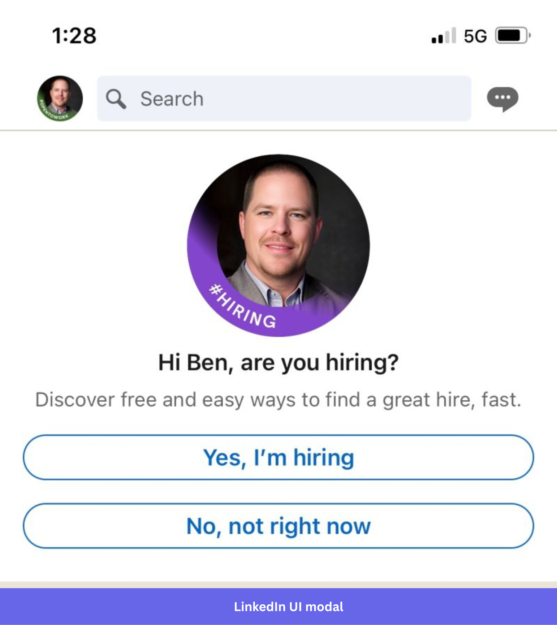
Most modals tell you something. This one asks you something. By putting the user’s name in the modal title and framing it as a question rather than a prompt, LinkedIn makes the user interaction feel like a conversation rather than an upsell.
The #Hiring badge on the profile photo is also doing quiet work here. It shows you what saying yes actually looks like before you commit, which removes the uncertainty that usually makes people dismiss these things. Two equally weighted buttons with no visual hierarchy between them also matters. LinkedIn isn’t pushing you toward yes. They’re just asking.
Steal this: When your modal goal is intent capture, a direct question with two honest answer options will outperform a persuasive pitch every time. Make both buttons feel like valid choices.
16. Duolingo’s streak repair modal
When you break a streak, Duolingo surfaces a modal with a crying Duo owl, the exact number of days lost, and one option to repair it for $9.99. A quiet “No Thanks” sits below.
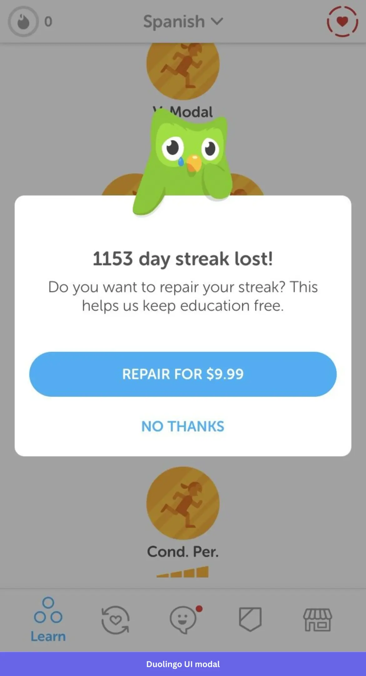
1,153 days. That number does all the heavy lifting before you read a single word of copy. Duolingo knows that by the time this modal appears, it doesn’t need to convince you of anything. The user did that convincing over three years of daily lessons. The modal just makes the cost visible and the crying owl add to the dramatics. The $9.99 repair button is priced against the cost of losing everything, not against the cost of the subscription.
Steal this: When users have built up something worth protecting, your modal doesn’t need to sell them anything. It just needs to show them what they’re about to lose.
When should you use a UI modal window?
The rule of thumb is to stick to non-modal UI patterns whenever possible. Using a banner or slideout is more appropriate for small, routine announcements.
That said, when used at the right moment, modals are one of the highest-converting UI patterns available. Modals convert at 7.39% on mobile compared to 4.2% for slide-ins. And timing matters: modals shown after a 2-page delay convert at 9.84%, according to WisePops.
A quick guide on when to use a modal dialog.
- When welcoming new users: Welcome screens are universally accepted as an appropriate use of announcement modals as they streamline account creation to ensure the user doesn’t get stuck. They also provide a great opportunity to use a microsurvey and leverage user segmentation to personalize the onboarding flow based on the users’ needs.
- When announcing new features: Feature announcements can benefit greatly from modals due to Robert Zajonc’s mere exposure effect. The phenomenon where people prefer things they’re familiar with. You can use a basic modal window to inform users about upcoming updates.
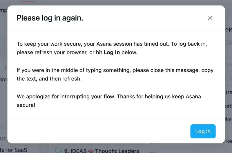
- When sending notifications: Modal windows can also be used to give users more information in the form of notifications. These could announce upcoming updates, service interruptions, or issues that are currently being addressed by your developers. You can also give the user helpful tips like how to save their work if their session expires, as seen in the Asana modal below.
- When announcing a confirmation: Modal windows that confirm completion are one of the most common modal types. They often play a role in gamification strategies in the form of celebration modals. Even a small modal cheering the user on can motivate them to continue engaging with your product.
- When displaying a churn survey: Simply stating the effects of canceling the account above the cancel button can make your users think twice before going through with it. Furthermore, you can use churn survey modals to display alternative solutions like a product demo call or a discounted subscription.
Best practices when creating an effective modal window
There’s no one-size-fits-all template for a well-designed modal window. Here are a few practices that will help you get creative in the right direction.
- Set the right expectations with the modal title: Having a descriptive modal title is essential if you want your modal to appeal to users. If the user isn’t getting the point straight away, then something is wrong with the dialog modal.
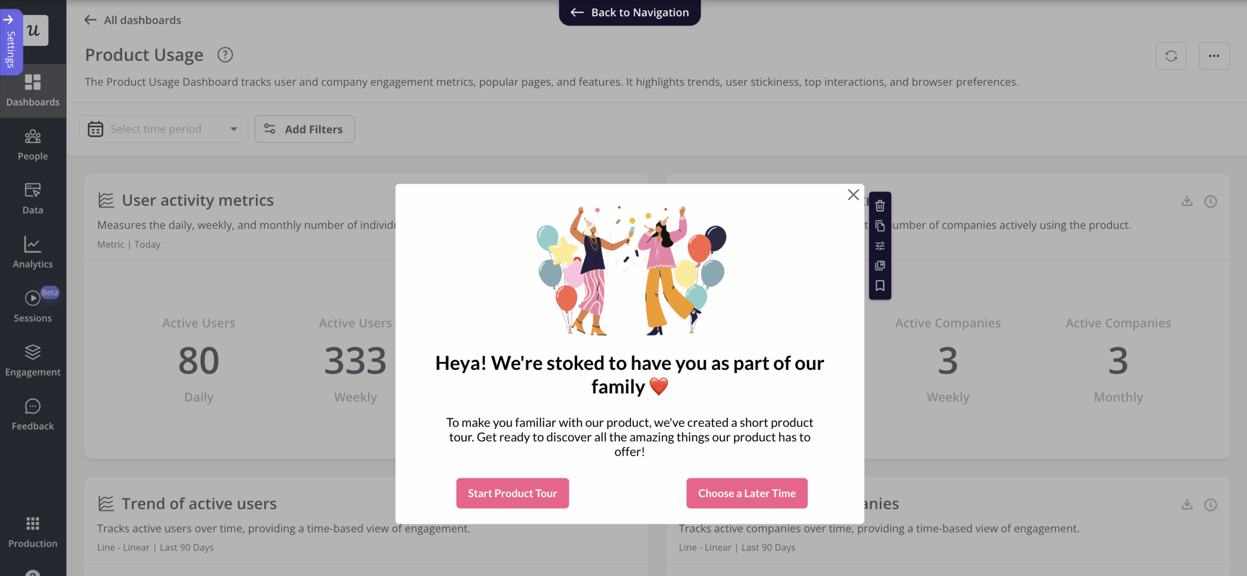
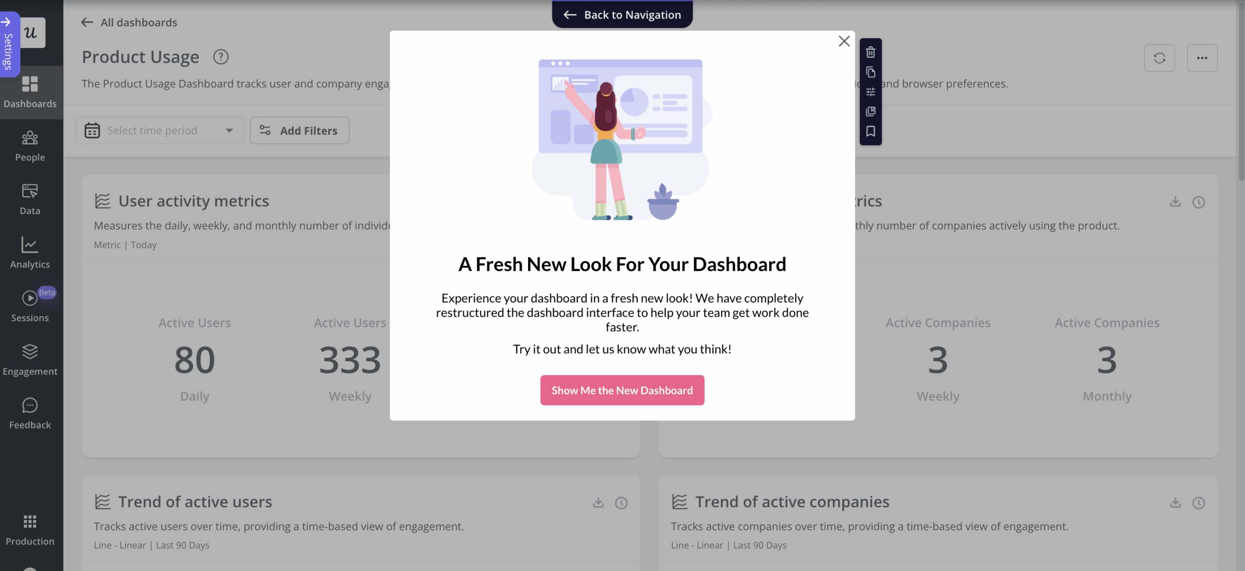
- Use visuals in your modal design to engage the user’s attention: Images can complement your microcopy to help engage users and reinforce the modal’s message. You can include dashboard images to tease an upcoming feature or add micro videos to make long announcements more human.
- Keep your modals consistent with your design system: Use the same typography, button styles, and color usage as the rest of your product. Modals that look out of place feel like interruptions rather than part of the experience.
- Use clear and straightforward modal content: When writing copy for your modal, your goal should be to help the user understand what the modal dialog wants in a matter of seconds. You’re already interrupting users’ workflow with an intrusive modal window, so be concise with clear instructions. Stick to the topic in the title, add a few bullet points for key details, and close with a single CTA. You never want to have more than one CTA in a single modal, but you can A/B test different variations to figure out what appeals most to your target audience.
- Always show the dismiss button on your modal window: The dismiss button and CTA are the only ways out of a modal. If you hide the dismiss button, you’ll be forcing them to take an action they may not be ready for, which will lead to a poor user experience. Always give them the choice to return to what they were doing.
- Add a CTA button text to your modal window: You should have one in every modal. Whether you want them to try a new feature, reconsider their cancellation, or acknowledge a service interruption, your CTA is what guides user focus to their next action.
How to make UI modals work for you
Modal windows are one of the highest-converting UI elements in your product when used at the right moment. The examples above show that the difference between a modal that converts and one that users dismiss comes down to timing, copy, and a clear CTA.
Userpilot lets you build modals and other in-app messages code-free, trigger them on user actions, and A/B test them across web and mobile. Book a demo today!
About the author