Examples of Good Onboarding Surveys [+30 Questions]
![Examples of Good Onboarding Surveys [+30 Questions] cover](https://blog-static.userpilot.com/blog/wp-content/uploads/2022/02/examples-of-good-onboarding-surveys-30-questions_be546bb02e19c5b3de6db02756f12241_2000-1024x670.png)
A good onboarding survey can easily turn into higher user satisfaction. You can review your adoption or freemium conversion rates and discover if your onboarding works. But, the only way to know the specifics of your program is by gathering user feedback.
In this article, we’ve summed up the basics of optimal onboarding surveys and the different types of questions to ask. We’ve also included a list of examples you can borrow.
Note: This article is about customer onboarding, not a company’s onboarding process.
What is an onboarding survey?
A customer onboarding survey is a list of questions that SaaS companies ask to collect data from new users. These are usually good for collecting customer insights either for triggering customized onboarding flows or gathering feedback on how to improve user onboarding.
Think of Asana. When a user signs up for a new account, the platform prompts them with questions regarding expectations:
- What’s your role?
- Are you using Asana for work, school, or personal reasons?
- What’s your main goal?
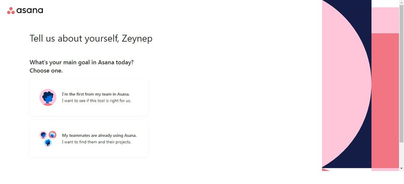
Then, it prompts you with templates that you might find useful based on your answers.
What makes a good onboarding survey?
An efficient onboarding survey usually helps you offer a better experience. It also allows the product team to gain insights to further improve the tool. For this to happen, your onboarding survey needs to:
- Have a clear objective. You know exactly why you’re asking those questions and what you’ll do with that information. Having a clear goal lets you come up with a list of inquiries to help you reach it. For example, if you want to know how easy it is to sign up, ask questions about the process, not the app’s design. The answers will let you know if you need further product testing.
- Be triggered contextually. An onboarding survey is only effective if it accompanies the users during their journey. For example, ask a user what their primary goal is when they create the account, not during the first few weeks.
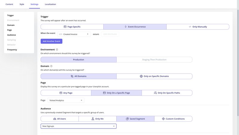
- Be concise. No matter how good your survey questions are, the longer they are, the higher the risk of getting a low response rate. Avoid writing long forms that could hurt the onboarding experience; stick to a maximum of three to five.
Common types of customer onboarding questions
There are different types of survey questions to ask during customer onboarding that vary depending on your goals. These are often open-ended or close-ended survey questions and include:
Likert scale questions
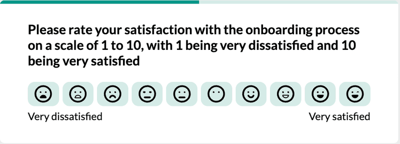
These are close-ended questions that people can answer on a specific scale of one to five, one to seven, or one to nine points. One to five being the most common. E.g., very dissatisfied, dissatisfied, neutral, satisfied, very satisfied.
These require little effort for the user to answer and are less likely to be ignored. For example, rate your overall satisfaction with the onboarding program.
Rating scale questions
Similar to the previous example, rating scale questions also let users answer by rating their experience on a rank. The difference between this and the previous one is that the rating scale doesn’t need to be specific. The range can go from “strongly agree” to “strongly disagree” without any specification of the ones in the middle. You can even use vaguer options like emojis or numbers.

A valuable insight you can get from using rating scale questions is the sentiment users have about your onboarding program, for example.
Multiple choice questions
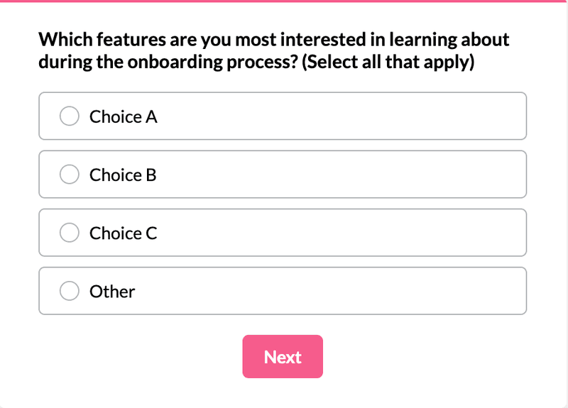
Provide users with two or more options to narrow the answers to the given alternatives. This is particularly useful to get a clear understanding of your features. For example, ask your users which features they’re most interested in learning about during the onboarding program. Allow them to choose one or select all that apply.
Open-ended questions
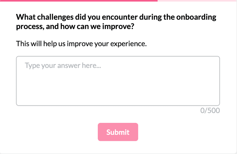
You should always have one open-ended question in your onboarding survey template. This allows your users to provide feedback in writing without any limitations.
These questions are particularly helpful for identifying areas of improvement or learning about individual good or tumultuous experiences. For example, instead of using a multiple-choice question to identify challenges, ask users to tell you what they found hard. This helps you paint a clear idea of the user journey and their specific struggles.
While open-ended, make sure your questions are clear and avoid asking different things at the same time.
❌ Is there any feature you liked more than others? Why? Is there anything we can do to improve? Please elaborate.
✅ 1. Which feature did you appreciate the most? Please explain why.
Examples of best onboarding survey questions
As mentioned throughout this blog, onboarding survey questions need to answer specific goals. Here are examples you can borrow to ask your new customers and gather onboarding feedback:
Questions to understand customer onboarding expectations
Use these onboarding survey questions to gauge your users’ expectations about your app. For example, imagine you sell software for customer onboarding. You might want to know whether they want to increase trial-to-paid conversion rates or evaluate marketing campaigns and identify your more performant channel.
Here are a couple of examples of survey questions for this case scenario:
- What motivated you to sign up for our product/service?
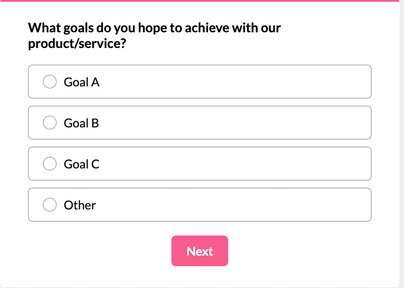
- What goals do you hope to achieve with our product/service?
- How did you first learn about our product/service?
- What features or benefits are you most interested in exploring?
- How long do you expect the onboarding to last?
- What do you think you can achieve with our product/service? (Select all that apply)
Questions for measuring the onboarding experience
These are user experience survey questions to ask after they’ve completed the onboarding. The goal is to collect data and drive insights to improve your onboarding experience. Examples of customer satisfaction survey questions to ask after they’ve been onboarded include:
- Did you encounter any challenges during the onboarding process?
- On a scale of 1 to 10, how well did our onboarding process meet your expectations?
- How satisfied were you with our onboarding process?
- How intuitive did you find our onboarding process?
- How helpful was the assistance provided during onboarding?
- How likely are you to recommend our tools to others?
- What aspects of the onboarding process did you find most helpful?
- What suggestions do you have for improving our onboarding process?
- How could we make the onboarding process better for future users?
- Were there any aspects of the onboarding process that you found unclear?
- Did you find our onboarding materials (videos, guides, etc.) helpful?
- Is there anything you expected from the onboarding process that was missing?
- On a scale of 1 to 5, how helpful did you find the onboarding?

Questions to understand a particular aspect of the onboarding process
Gather continuous feedback from your users by asking questions on specific parts of your onboarding. Although you’ll need to create a detailed customer service survey, you can also use this space to gain valuable insights about your tool and features. Examples of questions to ask after onboarding in your user feedback survey include:
- How satisfied were you with our customer support during onboarding?
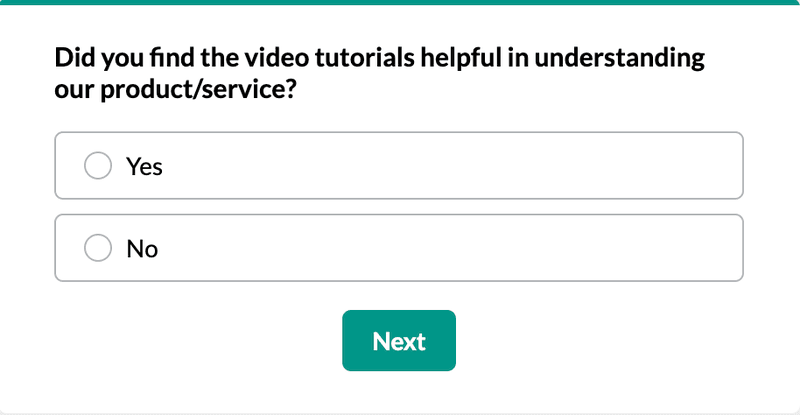
- Did you find the video tutorials helpful in understanding our product/service?
- On a scale of 1 to 5, how easy was it for you to set up your account?
- Were you satisfied with the information provided about our product/service features?
- Did you encounter any technical issues during the onboarding process?
- How would you rate the accessibility of our onboarding materials (guides, tutorials, etc.)?
Questions to collect insights on feature engagement
Determine feature engagement by asking the right questions. You’ll probably need to address this in more detail at a different time, but borrow product survey questions for the onboarding one. Examples include:
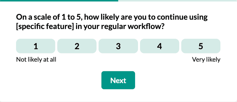
- On a scale of 1 to 5, how likely are you to continue using [specific feature] in your regular workflow?
- Were there any features you expected to see during onboarding that were not available?
- Did you encounter any difficulties in understanding how to utilize certain features? If so, which ones?
- Would you like to see any additional features added to our product/service in the future? If so, what are they?
- Which specific features did you find most useful during your onboarding experience?
- How easy is it for you to navigate [specific feature]?
You can also borrow some of these ideas to include in your feature feedback survey template.
Conclusion
You have all the resources to craft the best onboarding experience for your users. Make sure you keep them short, trigger them at the right time, and build them with a clear goal in mind.
Borrow the sample questions on this list to evaluate your onboarding program and use the answers to improve your product. Want to build an onboarding survey code-free? Book a demo to see how we can help!


![Your Guide to SaaS Welcome Surveys (Best Practices + Examples]](https://blog-static.userpilot.com/blog/wp-content/uploads/2023/04/Your-Guide-to-SaaS-Welcome-Surveys-Best-Practices-Examples-1024x670.png)

