Best User Onboarding Experiences in 2026: Examples and AI-Era Best Practices That Actually Work


The best user onboarding experiences I’ve seen lately are AI-assisted in one way or another.
AI made it easier for any product team to ship personalized welcome flows, build checklists, and deliver context-aware tooltips. So most teams embraced it.
The problem is over-engineering the user onboarding process at the exact moment the user wants less of it. The product itself should be doing the heavy lifting. The flows should keep the user on the right path, nudge them back when they stray, and then allow for self-serve continuation.
This guide shows you how to do it well. We’ll cover seven user onboarding best practices, a couple of SaaS examples worth learning from, and the metrics that tell you whether your onboarding is helping users build product intuition or just replacing friction with better-looking friction.

User onboarding in 2026: What’s changed and what hasn’t
The core argument for great user onboarding has not changed: Get the user to the aha moment quickly, with minimum friction, in a path that fits their Job-to-Be-Done. Wes Bush, founder of ProductLed, has been making this case since 2019. His Bowling Alley framework assumes that you have a lane (your product), and pins at the end of it (the user’s desired outcome). The job of user onboarding is to put up bumpers in the gutters so the ball stays on the lane.
What has changed is the cost of building bumpers. Three years ago, a single contextual flow took a product manager a week of work and an engineering ticket. Today, an AI agent inside your no-code customer onboarding tool can draft twenty of them in an afternoon. The old constraint is gone, which makes restraint more important than ever.
The question is no longer “can we add more guidance?” Most teams can. The better question is whether the guidance appears at the exact moment it helps the user move forward. One comment I saw in a Reddit thread captures this idea well:
“Good onboarding should feel less like a theme park ride and more like a competent person noticing where you are stuck. The useful AI version is not another popup; it is ‘you imported messy data, here are the 3 things to fix before this product can help.'” — r/SaaS, on the state of SaaS onboarding in 2026
That is the direction your onboarding should move toward. Users do not need more decoration around the product. They need the product to notice when they are stuck, explain what matters, and help them take the next useful step.
After working with and studying SaaS onboarding strategy across different product categories, I see most teams fall into one of three patterns: they over-engineer the first session, build contextual guidance that appears only when the user needs it, or go almost invisible and hope the product explains itself.
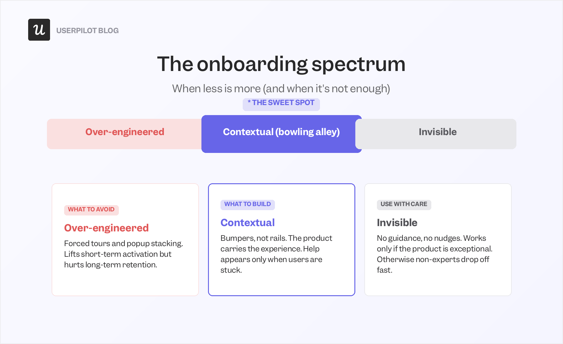
The middle path is the one worth aiming for. Forced tours and stacked popups can lift short-term activation while leaving users dependent on guidance. Invisible onboarding can work, but only when the product is unusually simple or unusually well-designed. Most SaaS products need something in between.
How to find your user onboarding sweet spot?
Once you accept that the middle path is the goal, the next question is how to build it without drifting back into over-guidance or leaving users alone too early. The best user onboarding experience has to do two jobs well.
First, it needs to give users enough freedom to explore the product naturally, because that is how product intuition forms.
Second, it needs to keep the happy path to value clear, so users understand what progress looks like and which action will move them closer to it. A product that only does the first one will confuse most users. A product that only does the second one can start to feel too rigid.
James Mitchinson, Userpilot’s Head of Customer Success, frames it this way when he works with customers:
“You want to empower users to navigate and explore on their own, so you don’t want to provide too many guardrails on how they’re moving through the product for the first time. But it’s really important that if a user does get stuck, that they can access the information that they need very quickly to get unstuck.”
In summary: Add guidance only at the moments when behavioral data tells you the user is stuck. Treat every pop-up, tooltip, checklist item, and tour step as a tax on the user’s attention that you have to justify.
Best practices for user onboarding in 2026
1. Cut friction in the signup process
As a rule of thumb, the less friction a user encounters in the SaaS signup flow, the better. Every extra field, email verification step, and “let us help you set up your workspace” interstitial increases the chance the user drops off before they have seen the product do anything for them. Move any optional step into the product, where the user has at least had a chance to taste the value before being asked for more.
Miro is the clean SaaS example here. The signup page asks only for a work email, then makes that step easier with Google, Microsoft, and Slack SSO right next to the field. Nothing else lives on that page.
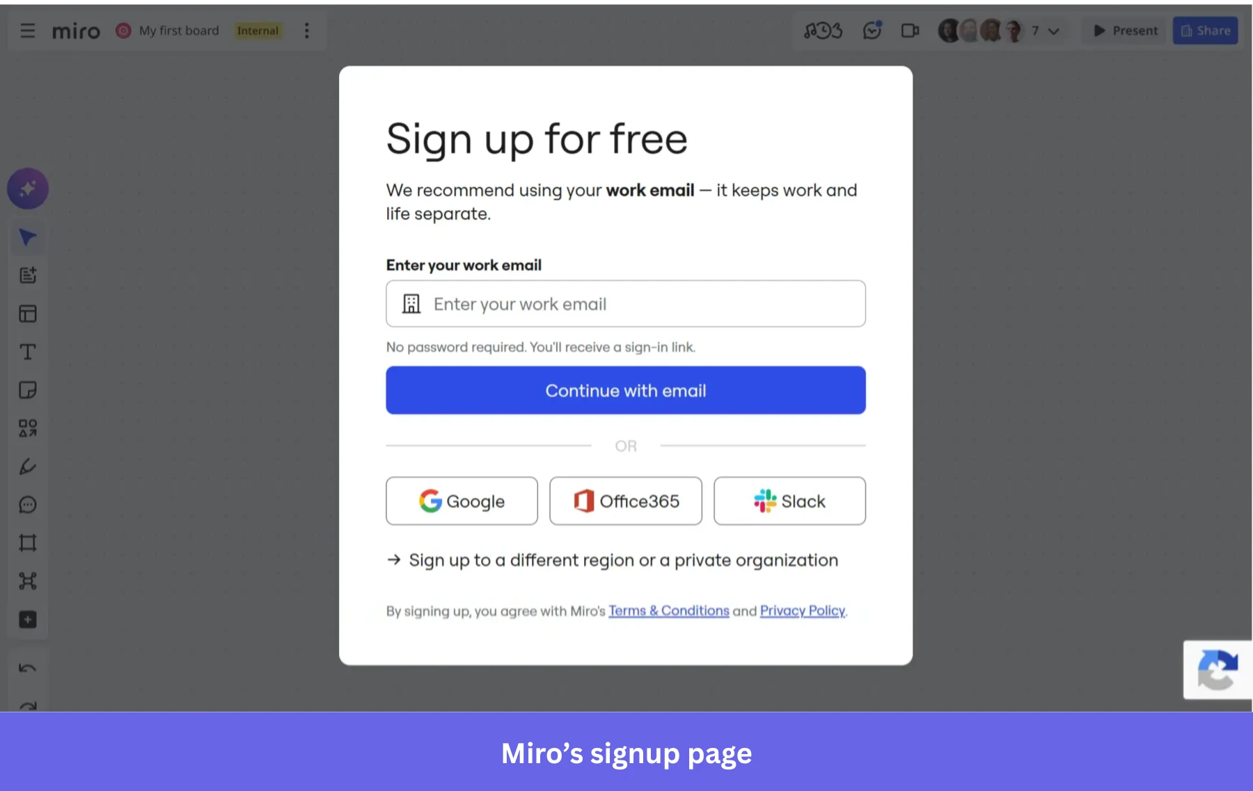
Note: A complex signup flow is sometimes the right call. Complex enterprise platforms that require technical setup and human support in the early days of the user journey often benefit from a heavier signup. The rule is to match the signup friction to the product’s complexity, not to default to “less is always more.”
2. Lead with a microsurvey that earns its keep
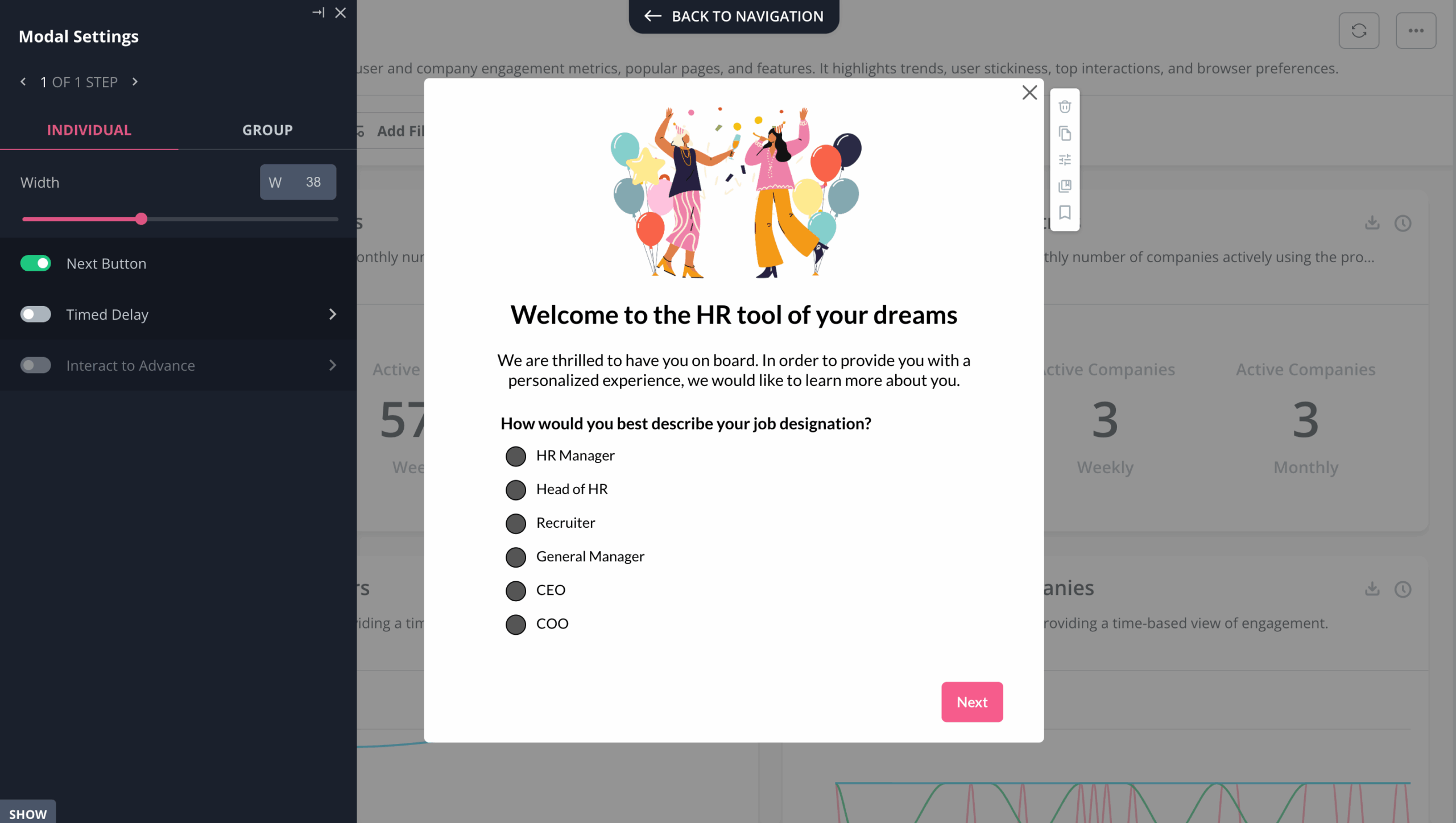
Make your welcome screen do real work. Ask one or two questions about what the new user wants to accomplish, or let them pick a “choose your own adventure” path through the product. The data you collect in this early stage is the foundation for further personalization.
For example, two users can sign up for the same email marketing tool and need completely different first sessions. A freelance store owner with no list may need help creating a signup form. An e-commerce operator moving over with 20,000 contacts wants the import screen, not a beginner video. Good microsurveys help you tell the difference before you send both users down the same path.
3. Build an onboarding checklist that respects user intent
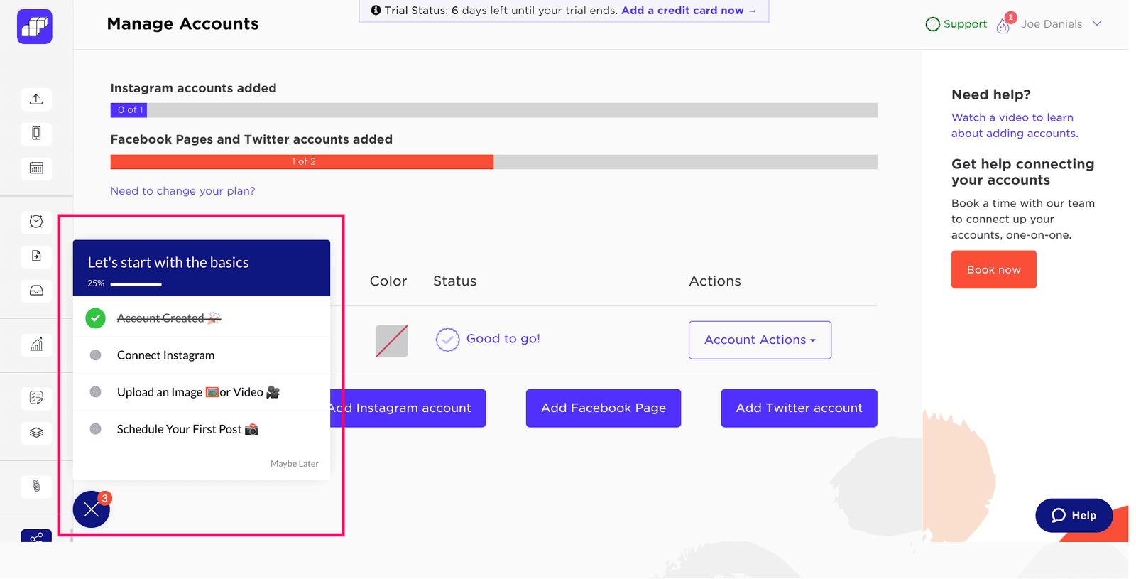
The purpose of great user onboarding is to take the user on the shortest path to value. Checklists are still the single best tool for this in 2026, because they naturally trigger the brain’s urge to close an open loop. The Zeigarnik effect and the endowed-progress effect both push users to complete the activation tasks once they see the partial list.
Internal Userpilot research shows that sales-led growth (SLG) companies outperform product-led growth (PLG) companies on onboarding checklist completion rates: 22.1% versus 19%. The gap is real, and it has stayed stable over the years. The most likely reason is that SLG companies have a CSM or onboarding specialist nudging the user through the list in parallel, so the checklist is acting as a shared artifact between the user and a human, not just a UI element.
PLG companies do not have that CSM nudge. To close the gap, the checklist itself has to do more of the work. Three tactics consistently lift PLG checklist completion in our customer data:
- Progress bars: Putting a bar above the checklist visualizes the loop the user is trying to close. Users who complete a progress bar are measurably more likely to convert to paid plans, and the lift compounds with bar prominence.
- Endowed progress: Pre-check the first task before the user starts. Even a single pre-checked item makes the user feel they are already partway in, which makes them more likely to finish the rest. The cost of implementing it is zero.
- Tailored checklists: Different user segments should see different tasks. An admin onboarding for a workspace should not see the same checklist as the team member they invite. Map the checklist content to the answers from your welcome microsurvey.
One of our customers, Sked Social, found success by sticking to this model. They kept the checklist to four tasks, used a progress bar, and pre-checked the first item, tied every task to an in-app action, and closed with a celebration message. Users who completed the four-step checklist were three times more likely to convert to paying customers.
4. Replace linear product tours with interactive walkthroughs
A linear product tour shows the user a sequence of tooltips, each with a “Next” button that advances to the next feature regardless of whether the user did anything with the last one. Users hit Next, Next, Next until the tour ends, and then forget every feature they were shown.
Interactive walkthroughs teach by doing. Each step only advances after the user completes the action it asks for. The user clicks, creates, imports, selects, or edits something, and then the next instruction appears. That makes the onboarding harder to skim through and easier to remember, because the user is learning the product through action.
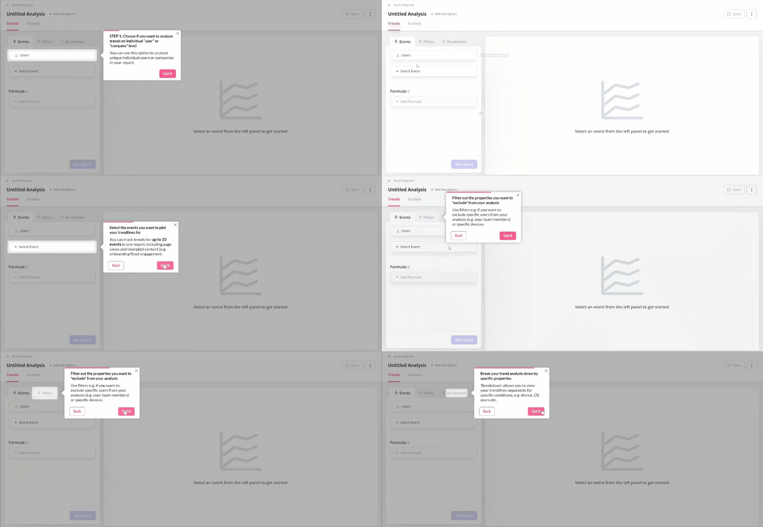
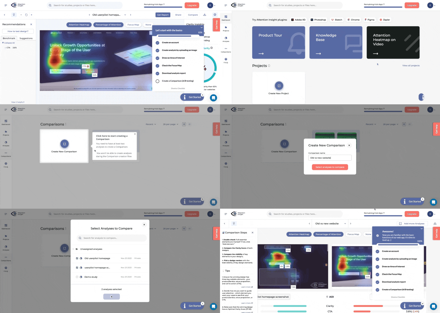
The Attention Insight case study shows how they did this with Userpilot.
Their Head of Product, Miroslav Vargan, had identified feature-discovery gaps that a passive tour could not fix. Moving the same content into a guided walkthrough that required completion at each step improved engagement and boosted activation rate by 10%.
5. Make your onboarding contextual, not scheduled
Stop scheduling a sequence of flows to fire in the first session, and start triggering each piece of guidance based on real user behavior.
Imagine a user of a social media scheduling tool with an inspiration block. They are typing and deleting words in the editor. Their queue is empty. Nothing is scheduled. A helping hand pointing them to the post calendar with content templates, fired at that moment, is contextual onboarding. The same helping hand fired five minutes earlier, before they even tried to write a post, is a pop-up the user dismisses.
The Groupize gamification story shows exactly this kind of contextual layer built with Userpilot. Their Manager of Implementation and Onboarding, Justin Peticolas, described their virtual assistant G.G. as “like having a professional event planner that spent years on the job inside the app, that our users can ask for advice anytime.”
After they rolled out the contextual layer, support tickets did not just go down. They got better. Users used the in-app help as their first line, and the human support team started seeing more specific, more useful tickets from the cases that truly needed a human.
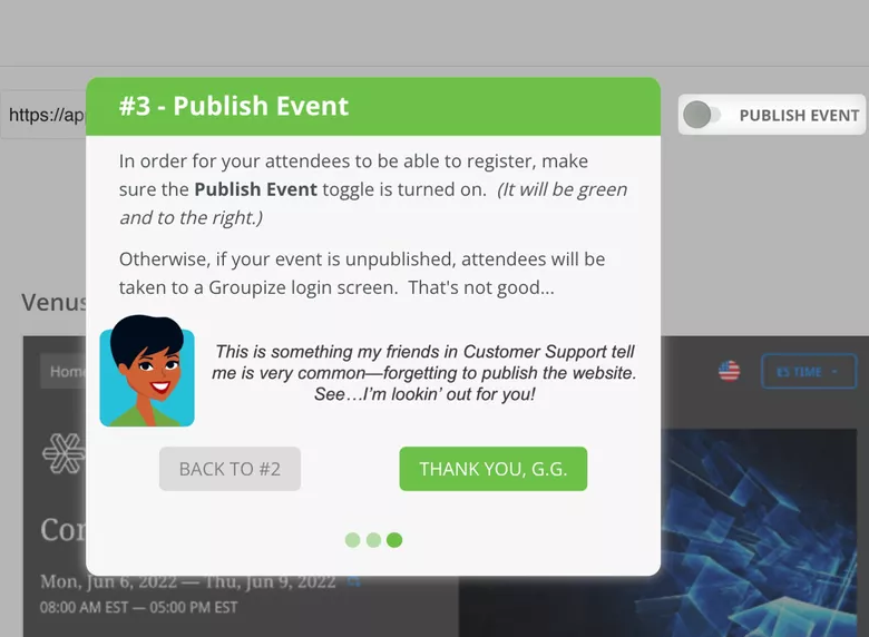
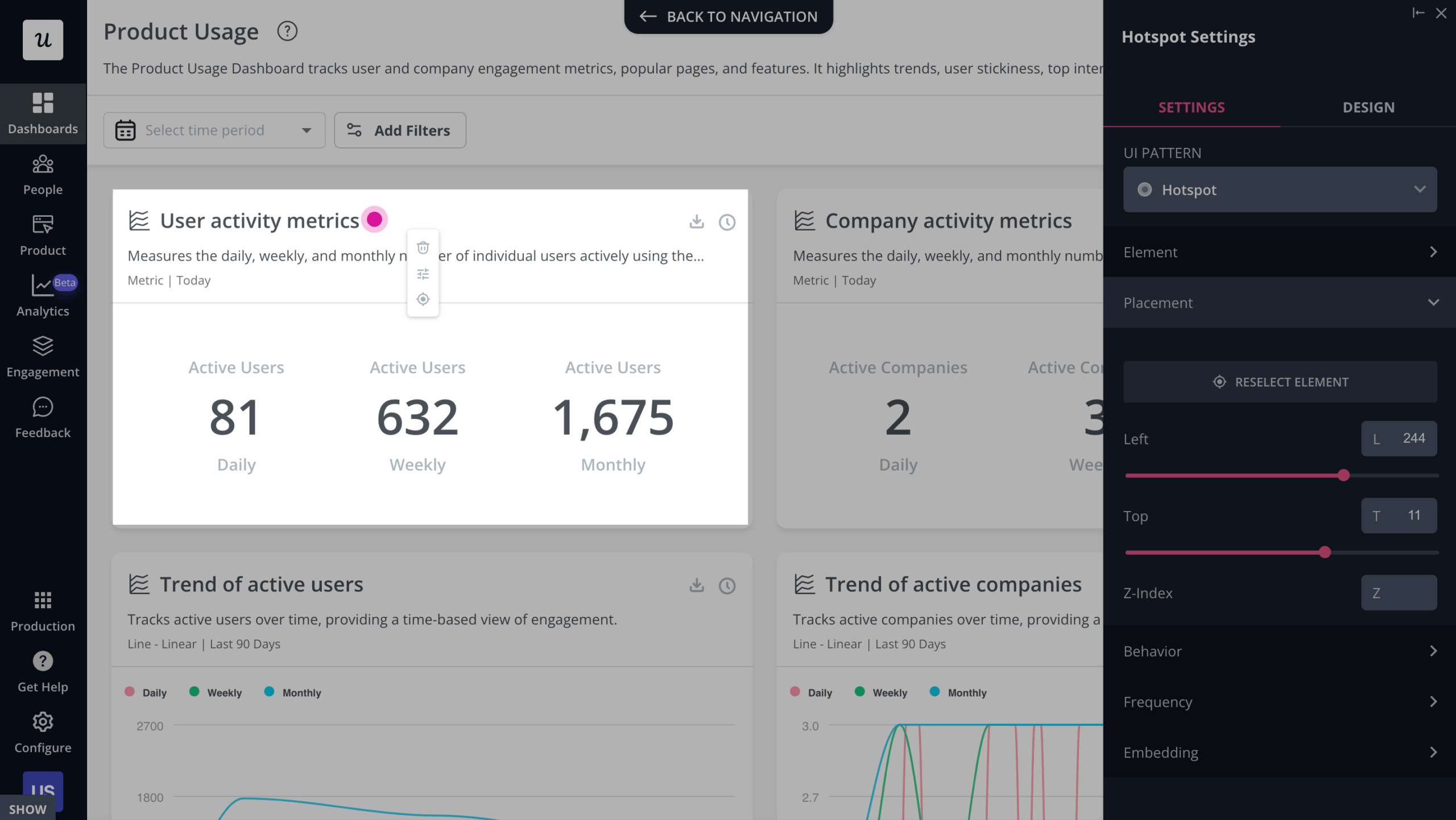
Contextual onboarding rests on two pieces of infrastructure. Subtle in-app experiences (native tooltips, hotspots, banners), and behavior-based triggers that fire on the custom events the user actually performs.
6. Use AI to personalize the onboarding path
AI user onboarding is the upgrade path for everything we have already discussed. AI can pull personalization signals out of behavior, role, in-app properties, and account context, going beyond the information gathered in the welcome flow.
Used well, that means AI can help decide which onboarding path a user should enter, what success metric should define activation for that segment, and which experiment is worth running next. A new admin setting up a workspace, a teammate joining an existing account, and a power user exploring an advanced feature should not all receive the same flow. AI can help separate those paths without asking every user to fill out another form.
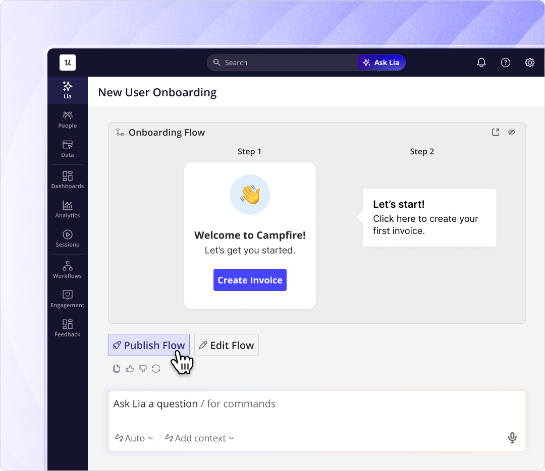
This is the design principle behind Lia, our product growth agent. Lia analyses activation funnels, surfaces friction signals to the PM in a single place, and proposes the next experiment to run, all without adding unnecessary steps to the user experience.
7. Make support self-serve and put it where stuck users will find it
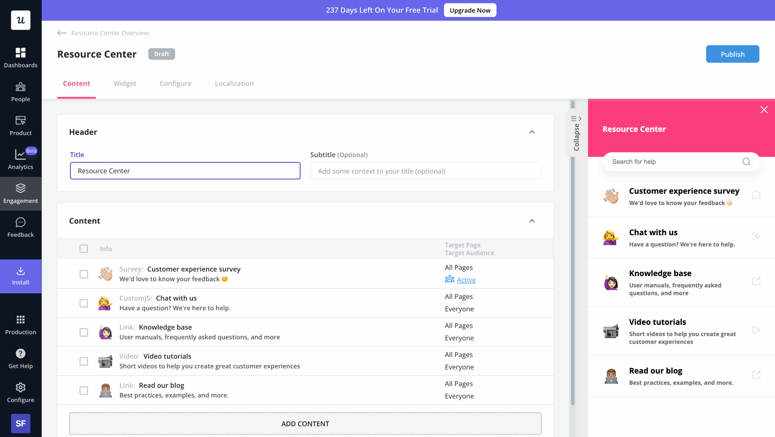
If the rule is “default to silence and add guidance only when users get stuck,” then “when users get stuck” has to be answered with a place to go. A resource center embedded in the product is that place. It holds the help articles, the video tutorials, the relevant flows, and the knowledge base in one in-app surface, searchable by keyword, available 24/7 without the user leaving the app to Google for an answer.
The Room case study is a good example: a platform connecting African tech talent with global employers used this pattern to fix a critical activation gap. New members were not uploading their CVs after signing up, which meant they could not be discovered by potential employers.
Their Senior PM, Arjoon Talukdar, built a self-serve onboarding flow with Userpilot using a “driven action” UI pattern, guiding users to the upload CV button without involving a CSM. CV uploads climbed 75% within ten days, from 200 to 350 per week. Arjoon shipped it without engineering resources and iterated on the flow as engagement data came in.
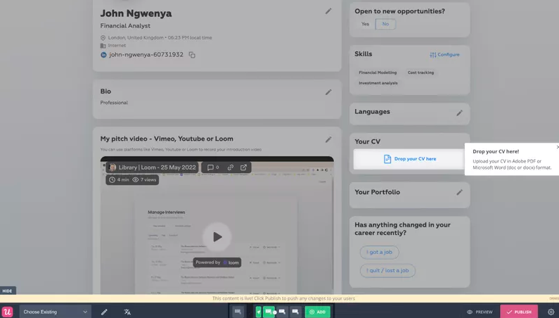
James from customer success put the design philosophy this way: empower users to navigate and explore on their own, do not pile on guardrails, but make sure the help is one click away when they get stuck. The resource center is the “one click away” piece of that mandate. Without it, your “default to silence” strategy is just silence.
Bonus: Keep testing, because your product keeps changing
A/B test every meaningful onboarding change you ship. Your product evolves, your positioning evolves, your user personas drift, and your onboarding has to keep up.
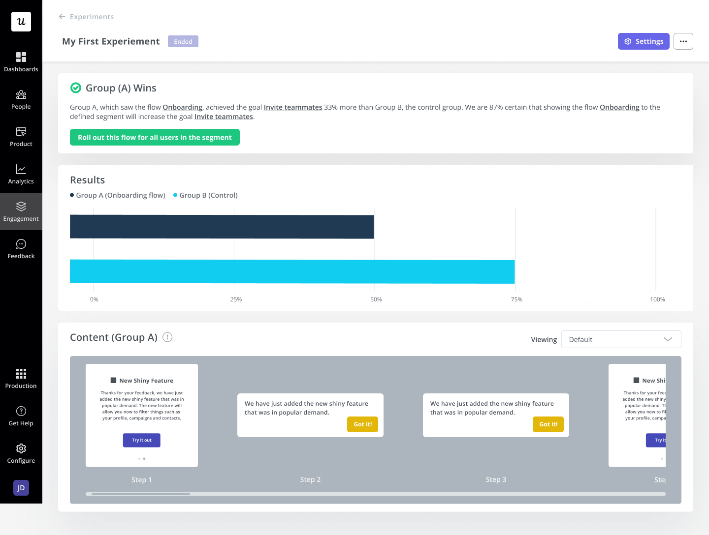
Smoobu ran an A/B test with Userpilot, evaluating whether to trigger a channel-connection tutorial immediately after signup or to let users find it on their own. One French-market cohort saw the walkthrough; the other did not. The data, not the opinion, decided which version shipped.
Best user onboarding examples in 2026: 8 SaaS products to copy
Best practices are easier to internalize when you can see them running in a real product. Below are seven SaaS onboarding UX examples worth studying. For each one, I have noted what they get right and where they are starting to feel dated.
Best user onboarding example #1: Calendly
Calendly is a scheduling automation platform built around one job: removing the back-and-forth involved in booking meetings. Its onboarding works because every setup step moves the user closer to a usable scheduling link.
After signing up, Calendly asks upfront questions to determine the user’s role, preferred meeting format, availability, and whether they need payment collection. The platform personalizes the onboarding flow based on their responses.
More importantly, it uses that survey data to create a 30-minute meeting link they can easily share with others. This immediately reinforces product value even before the user onboarding process is complete.
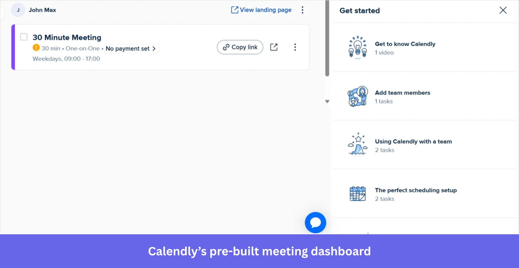
The piece worth copying is how Calendly separates required setup from optional learning. New users can’t skip the first few steps where they provide useful data about their JTBD. Once they reach the product, the extra guidance moves into a side panel with videos and setup tasks they can open, ignore, or revisit later.
What’s strong: Calendly turns setup into activation. The onboarding creates a usable event before the user reaches the dashboard, then moves education out of the way.
What could be improved: The flow still depends on a fixed sequence of screens. A more adaptive version would shorten the path based on the user’s calendar, meeting tools, and selected use case.
Best user onboarding example #2: Productboard
Productboard is a product management tool designed to gather feedback and turn it into product roadmap decisions. Their onboarding flow is the cleanest example of friction-reduction-via-good-defaults in this list.
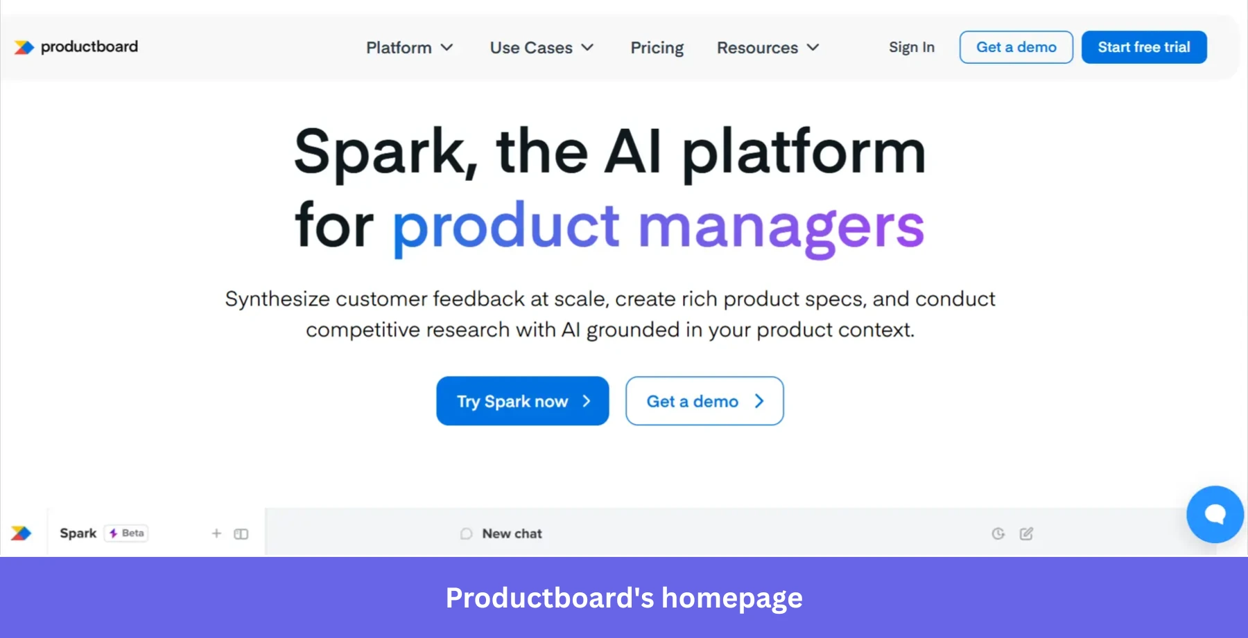
Similar to Calendly, Productboard uses its welcome flow to collect customer data upfront. After the quick survey, the platform automatically creates a workspace, then drops the user into an onboarding checklist.
The first checklist task is creating that workspace, so it is already ticked off when the user arrives. That small bit of progress changes the feel of the whole flow. The checklist is not asking the user to start from zero. It is asking them to continue something already underway.
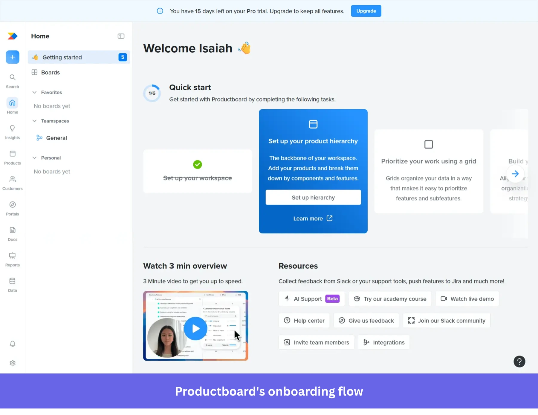
Productboard also keeps extra help on the same page: a short overview video, links to the help center, integrations, academy resources, and its Slack community. Users who want more context can get it without sitting through another forced tour.
What’s strong: Productboard uses pre-completed progress well. The workspace is created before the checklist appears, which lowers the psychological weight of getting started.
What could be improved: The onboarding checklist still looks like a fixed path. A stronger version would adapt the next task based on the user’s role, team size, and first action inside the workspace.
Best user onboarding example #3: Loom
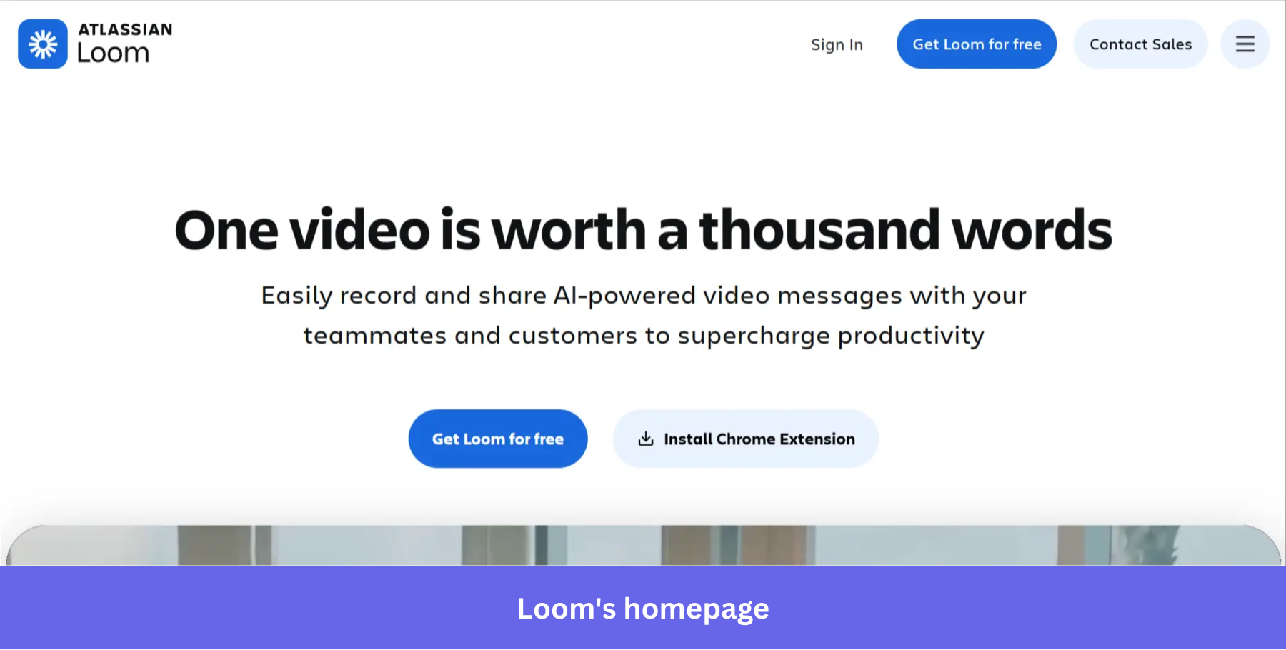
Loom is an AI-powered video messaging platform built for async communication, screen recording, and meeting recaps. Its onboarding is product-led in the most literal sense: the product teaches the product.
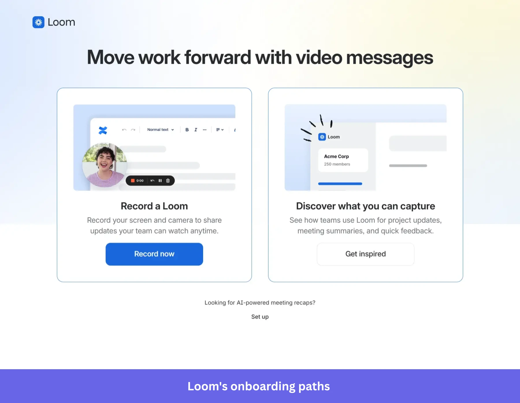
After signup, Loom gives users three clear paths: record a video, explore what they can capture, or set up AI-powered meeting recaps. That choice keeps the first onboarding screen focused without assuming every new user came for the same reason.
The strongest move comes on the “record your first Loom” screen. Instead of explaining the workflow through a tour, Loom uses a short Loom video from someone on the team to show how recording works. The user sees the product’s value in the same video format they are about to create.
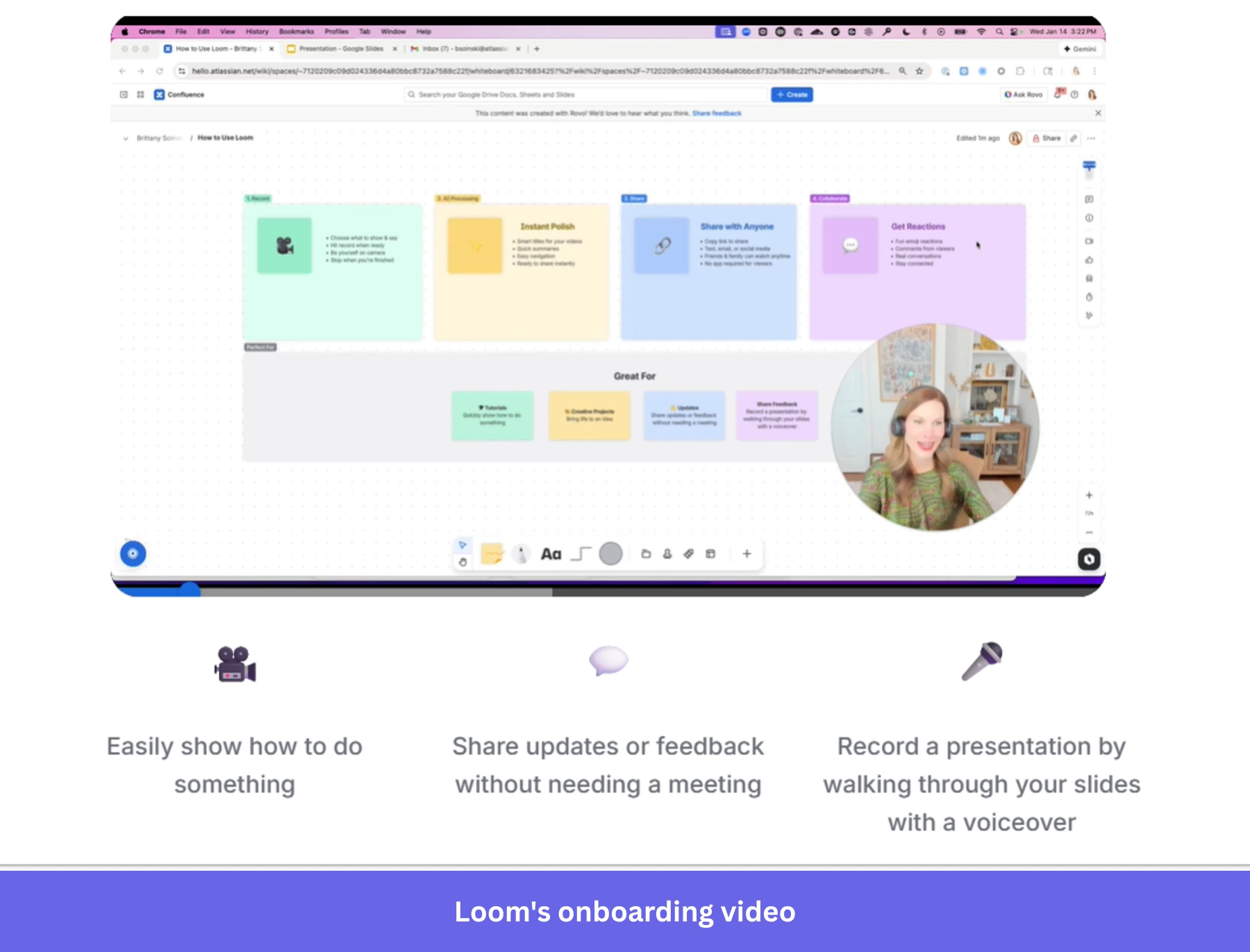
What’s strong: Loom gets users close to the first creation moment quickly, then teaches with its own product instead of adding another layer of onboarding UI.
What could be improved: The flow still asks users to make a few setup decisions before they record anything. A stronger version would let users start recording first and handle setup after the first video exists.
Best user onboarding example #4: Airtable
Airtable is one of my favorite examples of template-based onboarding done well. The product is powerful, but that power creates a real onboarding problem: a blank Airtable base can feel like a spreadsheet, a database, and an app builder all staring back at you at once.
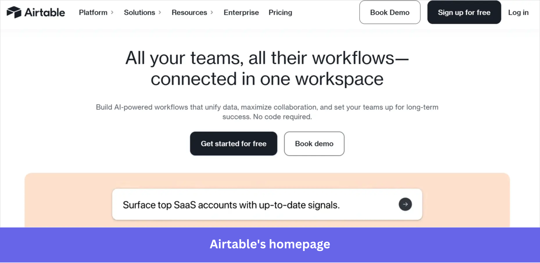
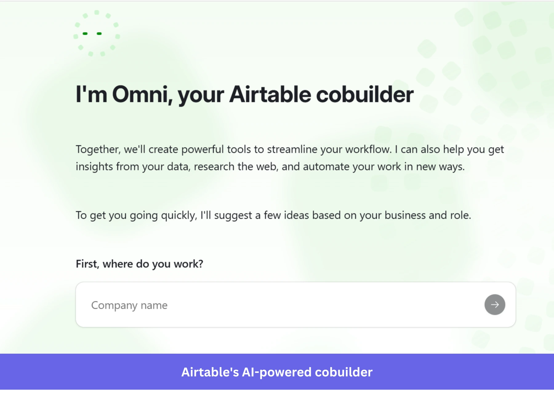
Airtable solves that by using Omni, its AI cobuilder, to turn the user’s context into a starting point. It asks for details like company name, industry, team, and preferred AI tool, then suggests a workspace idea based on those answers.
The important part is that Airtable does not make the user start by browsing a static template gallery. It gives them a suggested prompt they can edit, replace, or build from. Templates are still there, but AI moves the user closer to a useful base before they have to make too many decisions.
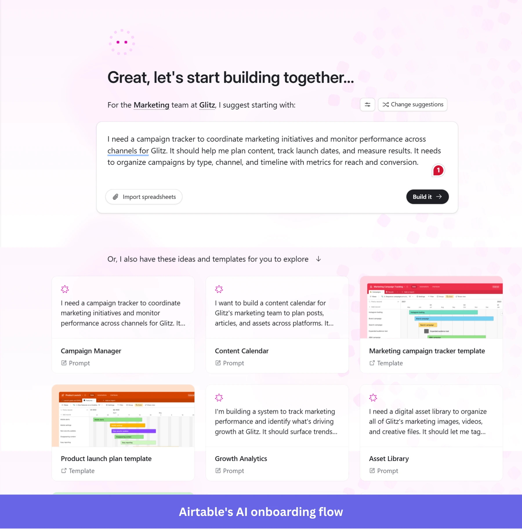
What’s strong: Airtable uses AI to reduce empty state anxiety. The user is not configuring tables from scratch or guessing which template fits. They are reacting to a suggested workspace built from their own context.
What could be improved: The AI-assisted setup still asks for several inputs before the user sees the result. A stronger version would let users describe the workflow in one sentence and refine the base after it is created.
Best user onboarding example #5: Linear
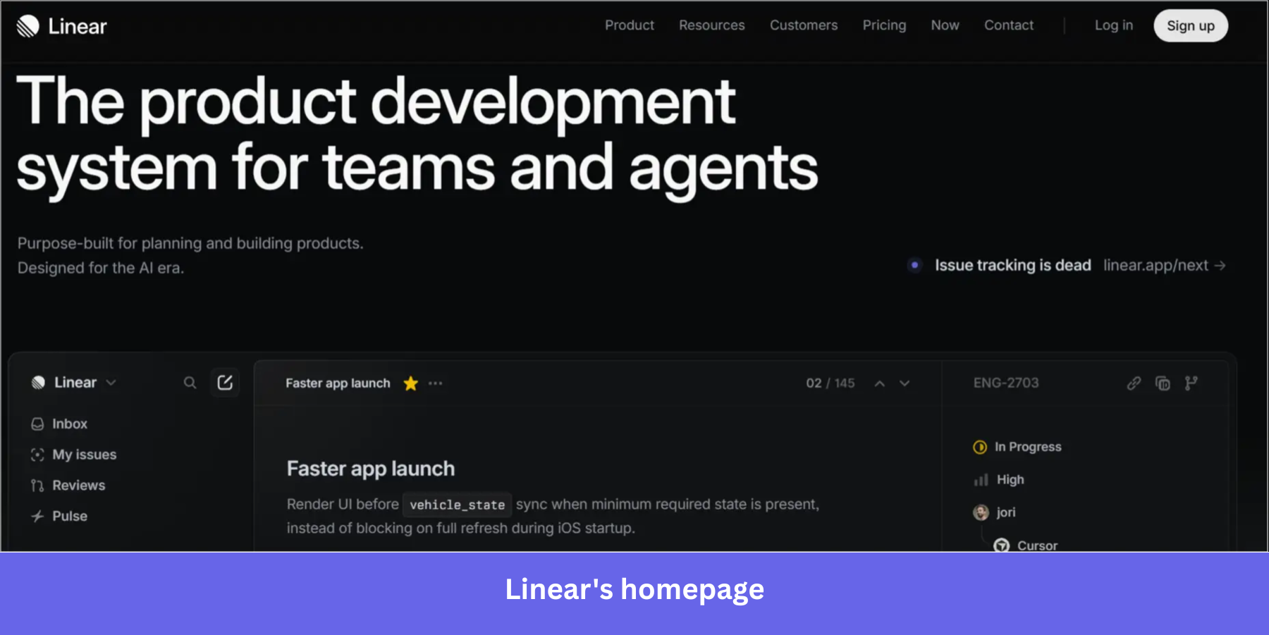
Linear is a technical product development and issue-tracking tool built for product and engineering teams. Its onboarding works because it teaches the product through Linear’s own operating model: issues, queues, and focused workspace views.
After the basic workspace setup, Linear drops the user into an issue list where the first “work” is onboarding itself.
The active queue contains tasks like getting familiar with Linear, setting up teams, connecting tools, and importing data. That sounds small, but it is a smart product lesson because Linear is not explaining issue tracking from the outside. It is making onboarding behave like the product.
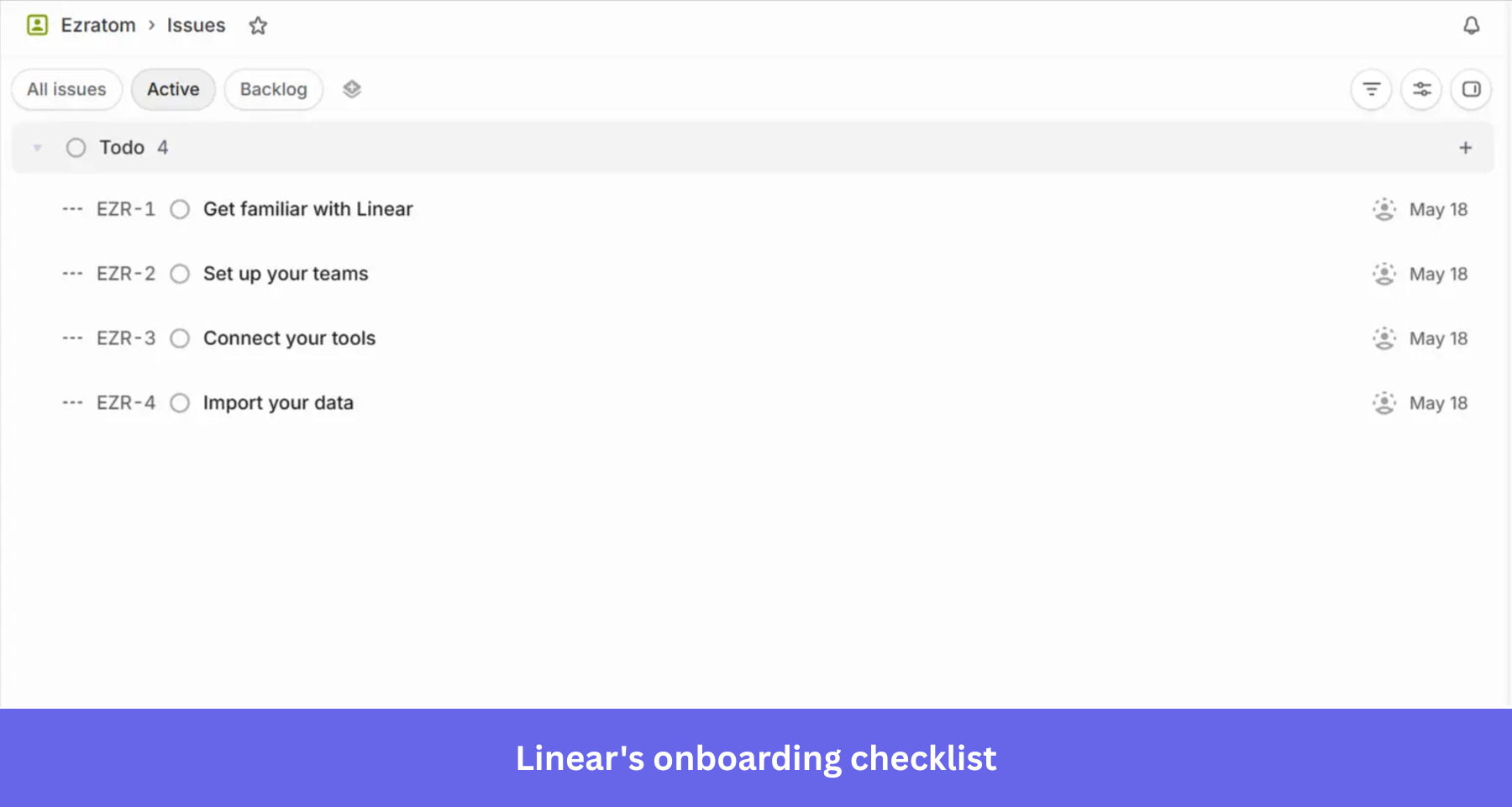
What’s strong: Linear turns onboarding tasks into product-native issues, so users learn the system by working inside the system. That’s a smart way to boost key feature adoption.
What could be improved: The checklist starts from zero, even though the user has already created a workspace and completed basic setup. A stronger version would carry that progress into the issue queue, so the first onboarding task is already checked off when the user lands in Linear.
Best user onboarding example #6: Notion
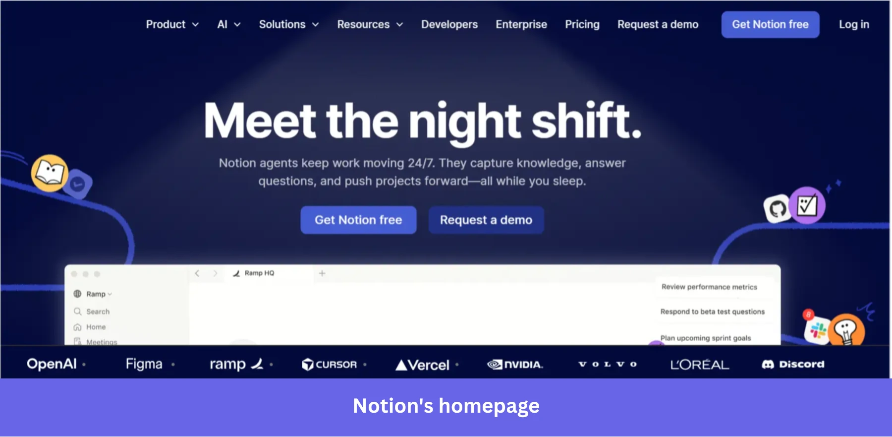
Notion is an all-in-one workspace for notes, documents, wikis, project management, databases, and AI-assisted workflows. Its onboarding balances structure with flexibility unusually well for a product this broad.
Instead of pushing users through a rigid tour, Notion drops them into a workspace with a lightweight onboarding checklist and an AI agent available beside the page. The checklist uses progressive onboarding to teach the product’s fundamentals gradually: creating pages, using slash commands, organizing content, and navigating the workspace.
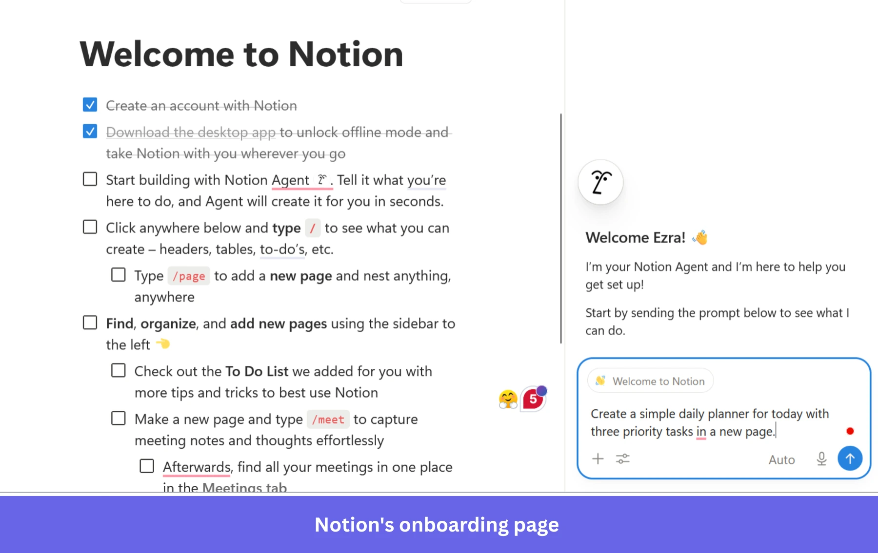
What stands out is how Notion uses AI to reduce the product’s learning curve. The onboarding agent does not just explain features. It demonstrates them. A prewritten prompt invites the user to generate a simple planner automatically, immediately showing that the AI can create usable workflows inside the workspace itself.
That matters because Notion can feel intimidating to new users. The AI agent lowers the cost of getting started, which in turn shortens the ‘Aha!’ moment.
What’s strong: AI used as a learning assistant instead of an interruption, plus lightweight onboarding tasks that teach the workspace gradually.
What could be improved: The onboarding checklist still assumes a fairly linear learning path. A stronger version would adapt the suggested tasks dynamically based on what the user creates first.
Best user onboarding example #7: Figma
Figma is a collaborative design platform for interface design, whiteboarding, prototyping, and team collaboration. Its onboarding is built around reducing blank-canvas paralysis.
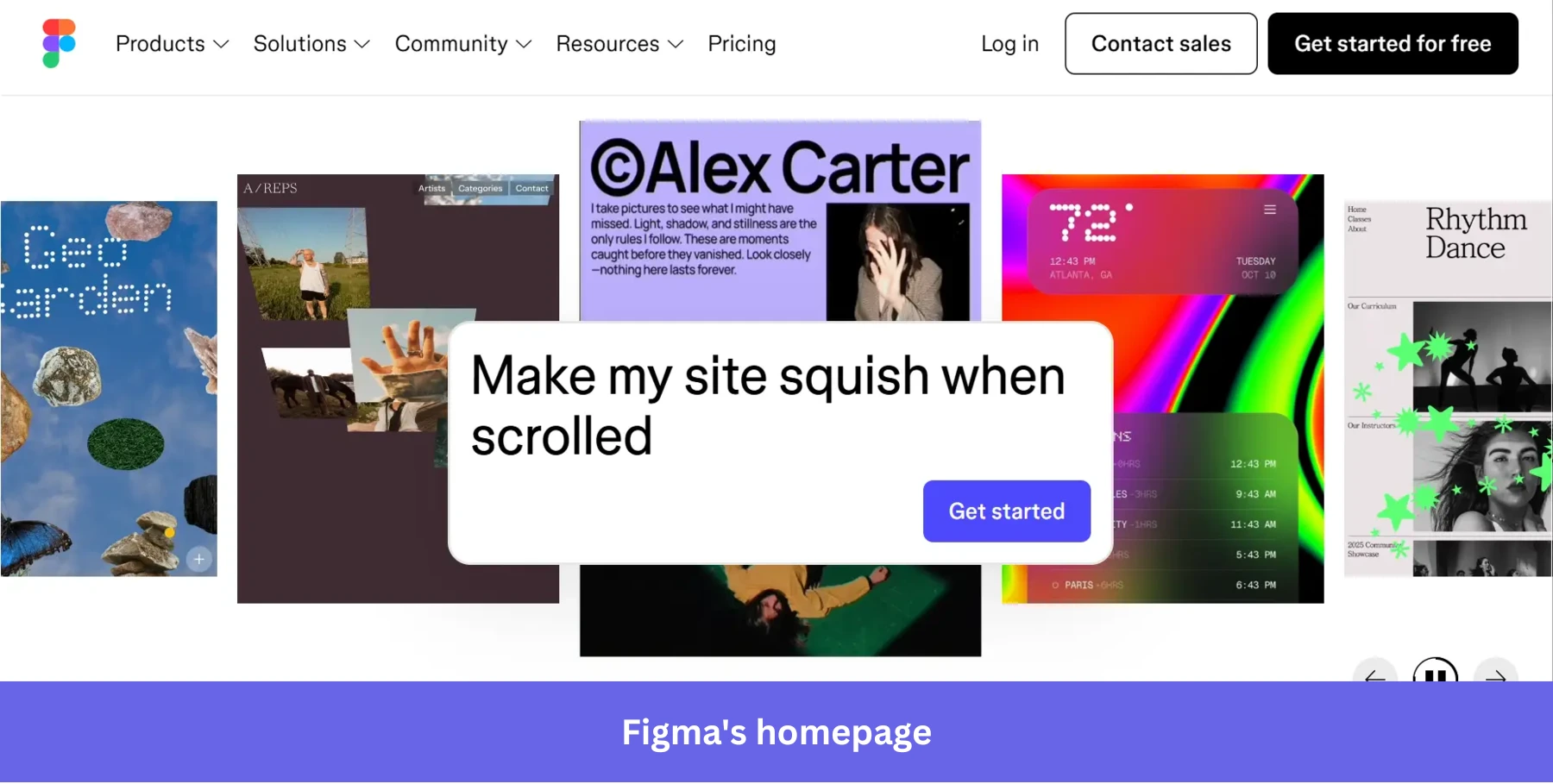
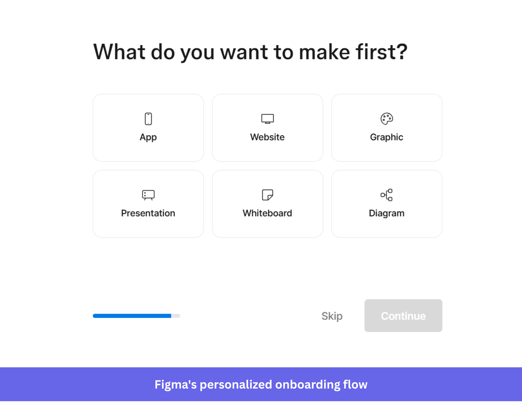
Figma begins with a quick welcome survey that asks users what they want to create first: apps, websites, graphics, whiteboards, presentations, or diagrams. The onboarding flow then adjusts the workspace based on that choice, narrowing the user toward a more relevant starting point.
Once inside the workspace, Figma continues guiding the user without forcing a rigid walkthrough. For example, a user who says they want to create whiteboards will see templates tied to brainstorming, planning, and diagram creation, while lightweight tooltips explain the interface gradually as the user moves around the canvas.
AI-assisted creation is also positioned directly inside the workspace, allowing users to generate templates and diagrams from prompts instead of starting manually.
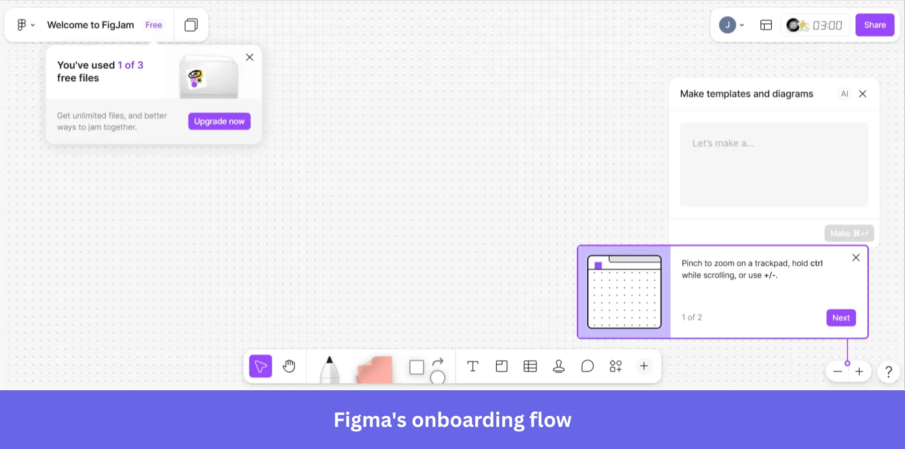
The onboarding works because it reduces the pressure of the empty canvas. The user is not asked to “figure out Figma.” They are asked to pick a direction and begin from there.
What’s strong: The branched onboarding shortens time to value and helps users reach activation faster.
What could be improved: Too many onboarding layers appear at once after entering the workspace. Templates, AI prompts, tooltips, and upgrade reminders compete for attention before the user has created anything meaningful.
How to measure user onboarding success
The dashboard your onboarding team watches in 2026 should be shorter than it used to be. Activation-metric tunnel vision was part of how the over-engineering trap got built. The four metrics below are the ones worth keeping a daily eye on, plus two that are starting to break and should be moved off the headline view.
1. Activation rate: The percentage of new users who reach the specific in-product action that signals value realization. This is still the most telling of the activation metrics in early-stage SaaS onboarding. Define the activation event narrowly. “Logged in three times” is not activation. “Published their first flow,” “imported their first list,” “invited a teammate to the workspace” is activation.
2. Time to value (TTV): How long it takes a user to reach the activation event after signing up. A long TTV almost always means the onboarding flow has too many steps, or the activation event is the wrong one. Track it as the median, not the mean (the long-tail dropouts will distort the average).
3. Onboarding checklist completion rate: This is tracked alongside activation rate, because a checklist that the user completes but does not learn from still isn’t useful. If the completion rate is high but the activation rate is flat, the checklist is misaligned.
4. Day 1 / Day 7 / Day 30 cohort retention analysis: Onboarding’s job is not just to activate. It is to build the product intuition that keeps the user around. A cohort that activates fast but churns by Day 7 is a sign the user was pushed through the flow without learning the product. Watch the Day 7 and Day 30 cohort more than the Day 1 one.
Two metrics to deprioritize:
DAU/MAU ratio: A user who logs in once a week to ship a high-value report is worth more than one who logs in daily to check an analytics dashboard they never act on.
Average session length: Same logic. A short session that ends in a completed task is better than a long session that ends in confusion.
When a feature isn’t getting used, how do you figure out if it’s an onboarding problem or a product problem?
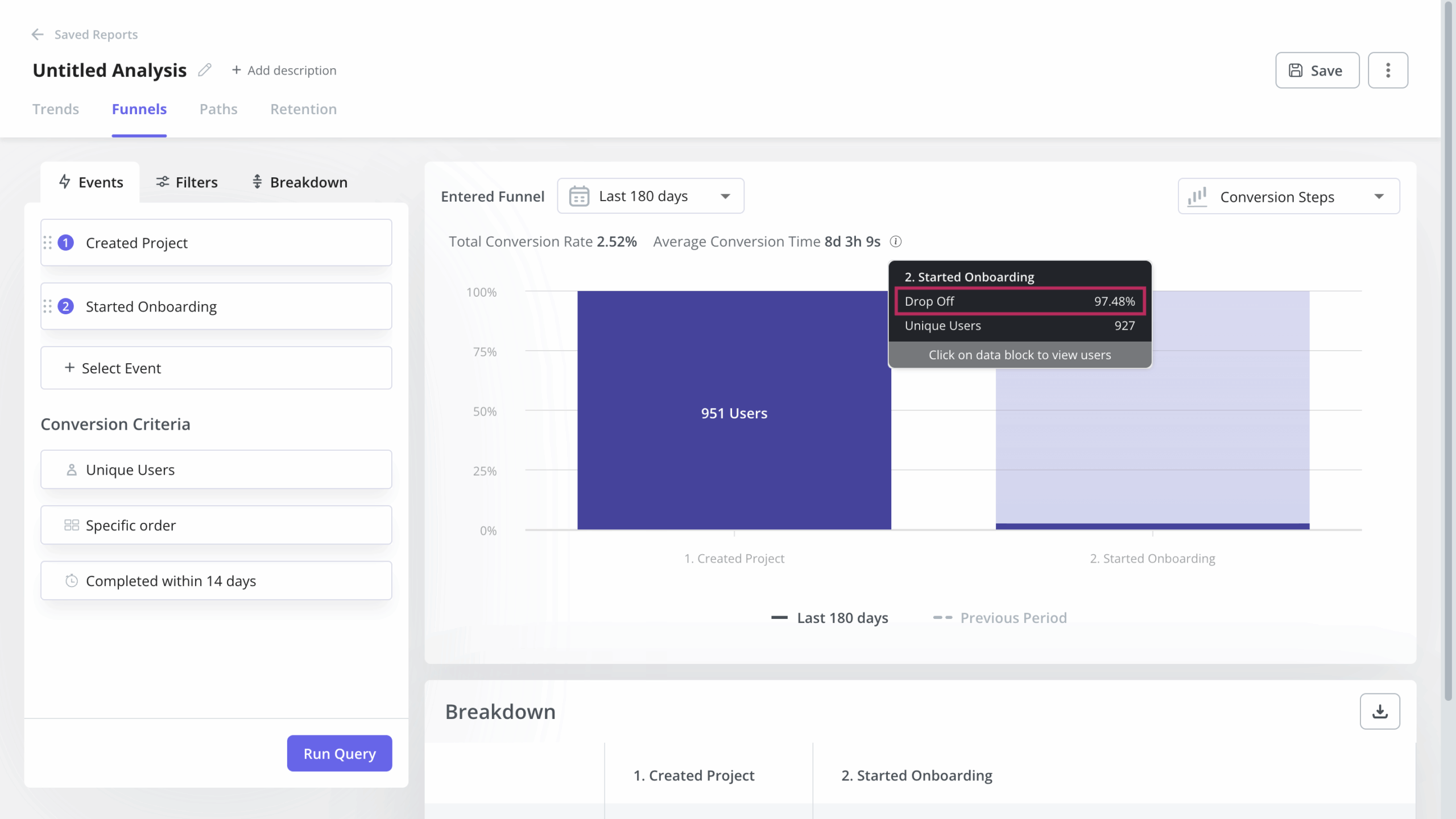
This is the hardest question in my role as a PM, and the framework I use day to day is a three-layer triage. User behavior analytics tell me where the drop-off is. Session replay tells me why it’s happening at that step. In-app surveys close the loop by asking the user, in their own words, what got in the way.
Here’s an example of this: our email feature was launched five or six months ago, and within the first weeks, we saw a huge drop-off at step two of activation. Users had access to the feature but were not activating their domains, which is a critical requirement for the feature to work. Funnel analysis showed me where the drop off happened. Session replay confirmed the friction point. I then shipped an in-app checklist that walked users through the domain activation step by step. That flow provided clarity, and within a short time, we saw many users engaging with the feature.
One more lesson from that period, because it changed how I look at adoption metrics: When we launched mobile support, the headline adoption number was 10%, which read as catastrophic. I built a one-question in-app survey (“Does your company support a mobile app?”), and the data reframed the picture. Roughly 25% of customers with a mobile app were using our mobile features. The 10% was misleading because the denominator was wrong. Most onboarding failure modes are really denominator problems in disguise.
The best user onboarding in 2026 does less, on purpose
I started this article by saying the best user onboarding experiences in 2026 are quieter than they used to be, and the seven best practices, eight examples, and four metrics above are all variations of that one claim. The product carries the experience. The onboarding flow keeps the user on the lane and gets out of the way when the user is moving toward the pins under their own momentum. AI gets used to suppress unnecessary interruptions, not to manufacture more of them.
If you measure your onboarding team by activation rate alone, you will keep ending up in the over-engineering trap, because more flows almost always lift activation in the short run and almost always hurt user retention in the long run. Pair the activation number with a Day 30 retention cohort and the picture corrects itself.
If you want to see what the seven practices and the four metrics in this article look like running inside a real product, book a Userpilot demo. We will walk you through how we run them ourselves, and what our customers are shipping right now.
About the author