The Metrics Blindspot: Why You Need to Watch Your Users Suffer

As product leaders, we often pride ourselves on being data-driven.
But I’ve learned through years of building products that there’s a dangerous blindspot in our metrics-first approach – one that’s costing us user satisfaction and long-term growth.
Three stories of the same product: The reality gap
Let me tell a real story that happened to me.
The dashboard story
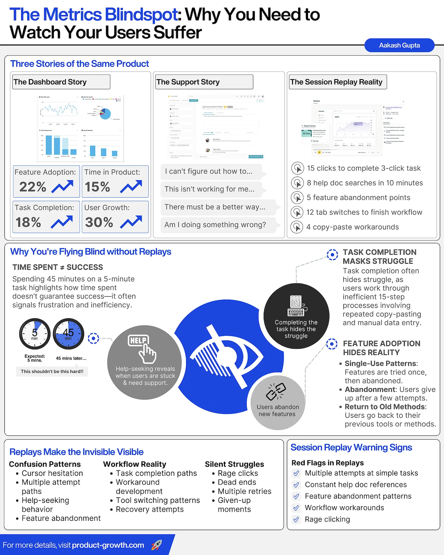
Looking at our dashboards, everything appeared promising:
- Feature adoption climbing at 22%
- Time in product increasing by 15%
- Task completion rates at 18%
- User growth soaring at 30%
These metrics would make any product manager proud in their quarterly review.
I remember presenting similar numbers to an all-hands meeting, feeling confident about our product’s trajectory.
The support story
But then reality hit through customer support tickets: “I can’t figure out how to…”, “This isn’t working for me…”, “There must be a better way…”, “Am I doing something wrong?”
These weren’t just isolated incidents – they were symptoms of a deeper problem that our metrics were masking.
The session replay reality
When we finally started watching session replays, the truth was brutal:
- Users taking 15 clicks to complete what should be a 3-click task.
- 8 desperate help documentation searches in just 10 minutes.
- 5 distinct points where features are abandoned.
- 12 tab switches to finish a single workflow.
- 4 copy-paste workarounds that shouldn’t exist.
We had serious product problems being masked by the metrics.
And if it were not for the support tickets, we wouldn’t have known.
And what I had proudly displayed at all-hands, wasn’t so great after all.
Outline for the rest of the post
In today’s post, I’m going to break down:
- The hidden cost of flying blind.
- Making the invisible visible through replays.
- Red flag: What to watch for.
- How to move forward.
1. The hidden cost of flying blind
The most concerning insight I’ve gained from analyzing session replays is that time spent ≠ success.
We often celebrate when users spend more time on our products, but the reality can be darker.
There are two categories of issues that often happen if we don’t regularly watch replays.
The 45-minute warning sign
When a 5-minute task takes 45 minutes, it’s not engagement – it’s frustration.
I’ve seen countless examples where our “successful” task completion metrics were hiding:
- Repeated copy-paste actions.
- Manual data entry that should be automated.
- Multiple help documentation visits.
- Eventual abandonment of new features.
It’s easier for us, knowing what we know, to use the product as designed.
But users don’t know what we know.
So many apps focus on time spent. But not all time spent.
Feature adoption’s dark patterns
On top of this, our adoption metrics often tell an incomplete story:
- Single-use patterns: Users try a feature once, struggle, and never return.
- Silent abandonment: Gradual feature abandonment after multiple failed attempts.
- Regression to old methods: Users reverting to previous, less efficient workflows.
There are some things metrics just don’t catch.
That’s why having a replay practice is so important.
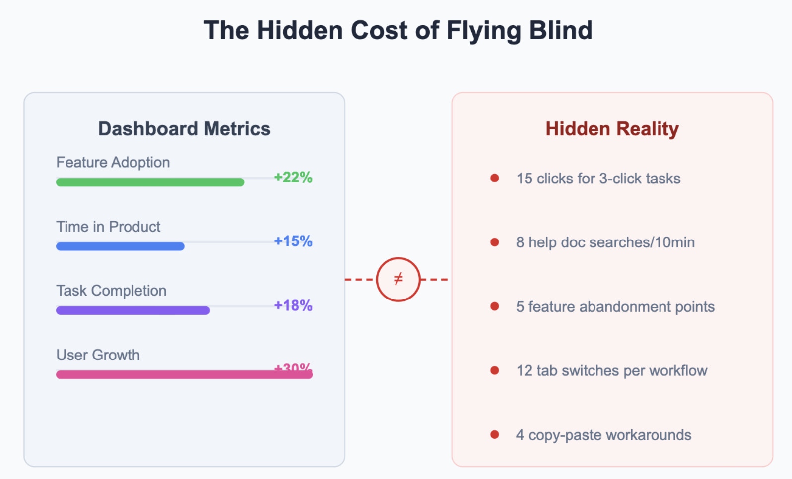
2. Making the invisible visible through replays
Session replays reveal three critical patterns that metrics alone can’t capture:
Confusion patterns
These are things like:
- Cursor hesitation indicating uncertainty.
- Multiple attempt paths showing design confusion.
- Help-seeking behavior highlighting documentation gaps.
- Feature abandonment signaling fundamental usability issues.
Very easy to detect in replays, but harder otherwise.
Workflow reality
This is how the user actually uses your product. Replays reveal things like:
- Actual task completion paths (often vastly different from our assumed flows).
- Creative workaround development.
- Tool switching patterns revealing integration needs.
- Recovery attempts after errors.
Silent struggles
Finally, replays help you see what I call “silent struggles.” These are things like:
- Rage clicks expressing user frustration.
- Dead ends in the user journey.
- Multiple retries indicating unclear feedback.
- “Given-up moments” where users abandon tasks entirely.
This is why replays are so powerful.
3. Red flags: What to watch for
Product analytics tell one story. User behavior tells another. Through thousands of session replays, I’ve identified critical warning signs that signal deeper product issues. Here’s what I’ve learned to watch for.
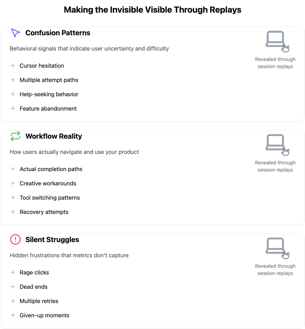
Multiple attempts signal confusion
When watching replays, patterns emerge quickly. Users attempting the same task multiple times, taking different paths each time, signal deeper usability issues. I’ve seen this repeatedly – what should be a 3-click process turns into a 15-click journey of frustration.
The numbers won’t show you this pain. But the replays will.
The documentation dance
Another telling sign is the documentation dance. Users shouldn’t need to constantly reference help docs to complete basic tasks.
When I see rapid tab switching between product and documentation, I know we’ve failed to create an intuitive experience.
This behavior often masks itself as “engagement” in our metrics.
Silent feature abandonment
First impressions matter more than we think. Users typically give new features one chance – just one. In our case, watching replays revealed users abandoning our new analytics dashboard after a single frustrating attempt.
These moments of abandonment never show up in our adoption metrics.
Creative workarounds
The most fascinating replay insights come from watching user creativity. They’ll build elaborate spreadsheet systems or create complex copy-paste workflows rather than use our intended features. These workarounds are gold mines of product insight.
Rage clicking: The ultimate frustration signal
Nothing speaks louder than watching a user repeatedly click in frustration. These “rage clicks” often cluster around unclear interface elements or unresponsive features. When I see this pattern, I know we’ve hit a serious usability wall.
Every rage click represents a moment of pure user pain.
If you watch for these 5 things, you’re well on your way.
4. Moving forward: Balancing metrics with reality
The path forward isn’t about abandoning metrics – it’s about enriching them with real user insights. Here’s how we’ve learned to balance quantitative data with qualitative understanding.
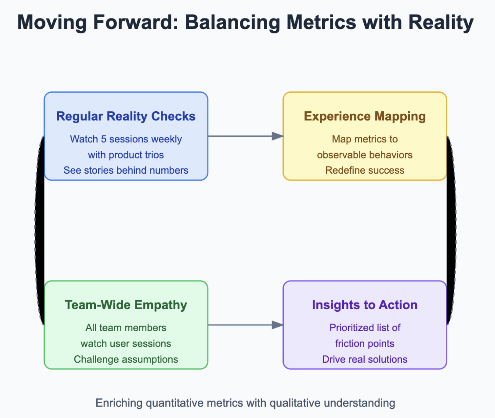
Regular reality checks
I’ve made it a practice with my product trios to watch five user sessions weekly. These viewings generate more actionable insights than any dashboard review. It’s about seeing the story behind the numbers.
Better metrics come from better observation.
Experience mapping in practice
We now map each key metric to observable user behaviors in session replays. This keeps us honest about what “success” really means. It’s not just about completion rates – it’s about the quality of that completion.
Watching replays changes how you think about metrics forever.
![]()
Analyze User Sessions No-Code With Userpilot

Building team-wide empathy
Every product team member now regularly watches user sessions. Engineers see their features in action. Designers observe their interfaces being used. Product managers witness their assumptions being challenged.
This shared experience drives better decisions.
Turning insights into action
Each replay session generates specific, actionable improvements. We maintain a focused list of friction points, prioritized by impact. This ensures we’re solving real problems, not just chasing metrics.
The gap between metrics and reality is where the most valuable product insights live. By watching users struggle, understanding their pain points, and acting on these insights, we build better products that truly serve user needs.
Final words
Remember: Your metrics aren’t lying – they’re just telling an incomplete story.
The real insights come from watching your users struggle, understanding their pain points, and building solutions that truly serve their needs.
The most valuable product insights often come from the gap between what our metrics tell us and what our users actually experience.
It’s in this gap that we find our greatest opportunities for improvement.