Difficult but Not Frustrating: The Art of Cancelling a Product

Let’s get straight to the question that product managers ask themselves quietly but rarely admit out loud: Should I make it hard to cancel my product?
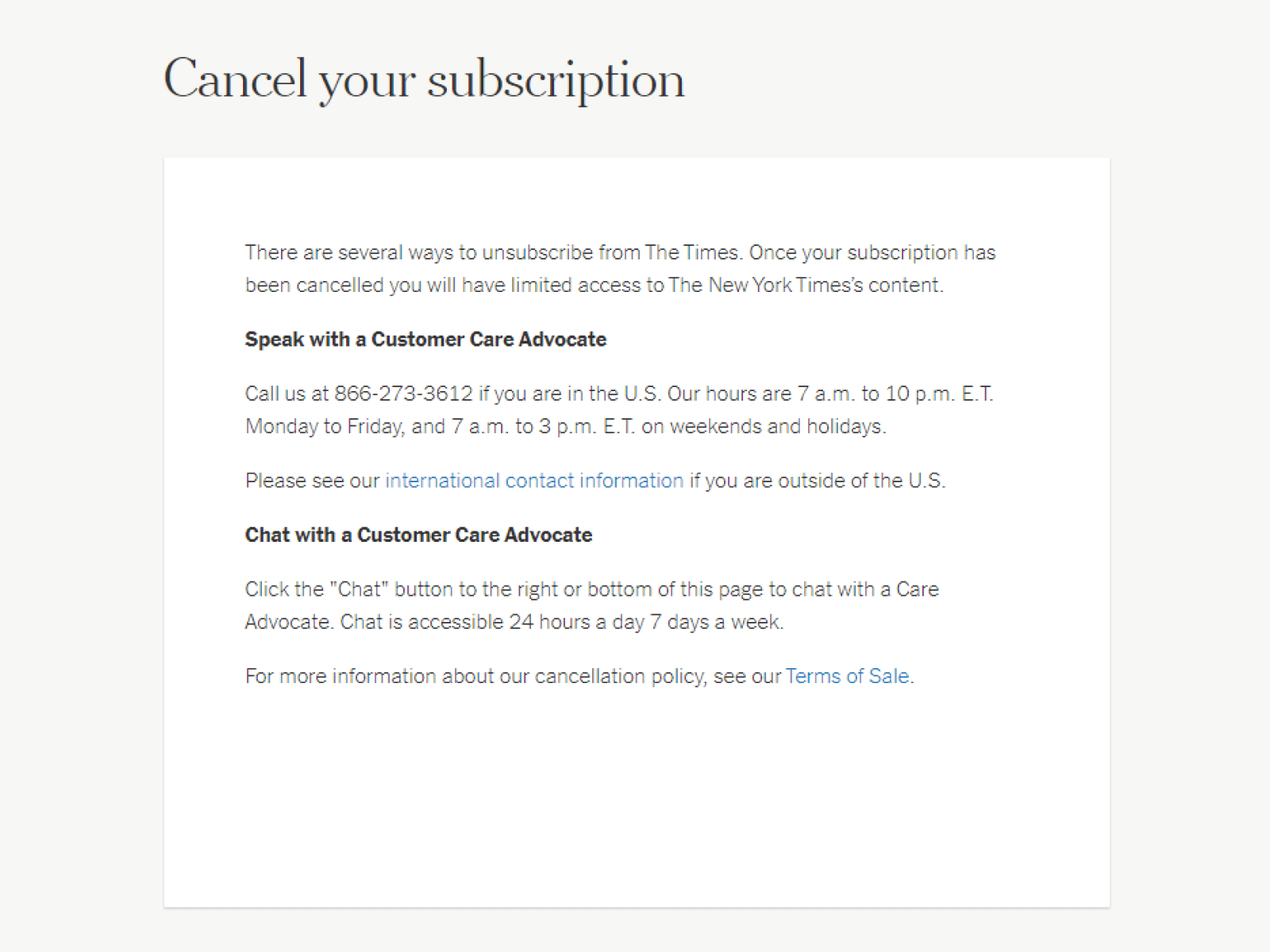
On the surface, the answer seems obvious. No one wants to be ‘that’ company. Who would like to be famous for hiding the “cancel subscription” button, asking for a fax (yes, still happens), or looping you into a never-ending maze of confirmation screens?
But once you start to think about it, the real question becomes more interesting: Is there a way to slow down cancellation ethically without damaging the relationship?
And the answer to that is yes! As long as you’re focused on clarity, not confusion, value, and not resistance, it is fair game to put a few stopgaps in place.
Because sometimes, what looks like a user on their way out is a dissatisfied customer.
As a product manager, it’s also your job to make offboarding as thoughtful and intentional as the onboarding. Just because someone is leaving doesn’t mean you have no product to offer them anymore. Let’s look into some tactics you can use to prevent churn.
1. Adding value to the exit path
Instead of treating the cancel button like an opening to a bridge-burning scene, treat it as a final opportunity to engage the user in a helpful way. If done right, this doesn’t delay their exit unnecessarily and instead adds context, alternatives, and sometimes a reason to stay.
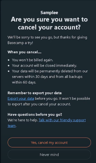
A clear example of this is Basecamp, which offers a very clear two-step cancellation process that offers to export your data on your way out. This is the product being helpful and user-focused, even when the user is on their way out. This is an excellent example of showing empathy and providing value at the last second.
Another example is Adobe Creative Cloud. As a user begins the cancellation process, Adobe often presents a few tailored offers. It could be a 60-day discount, a temporary pause, or an alternative plan.
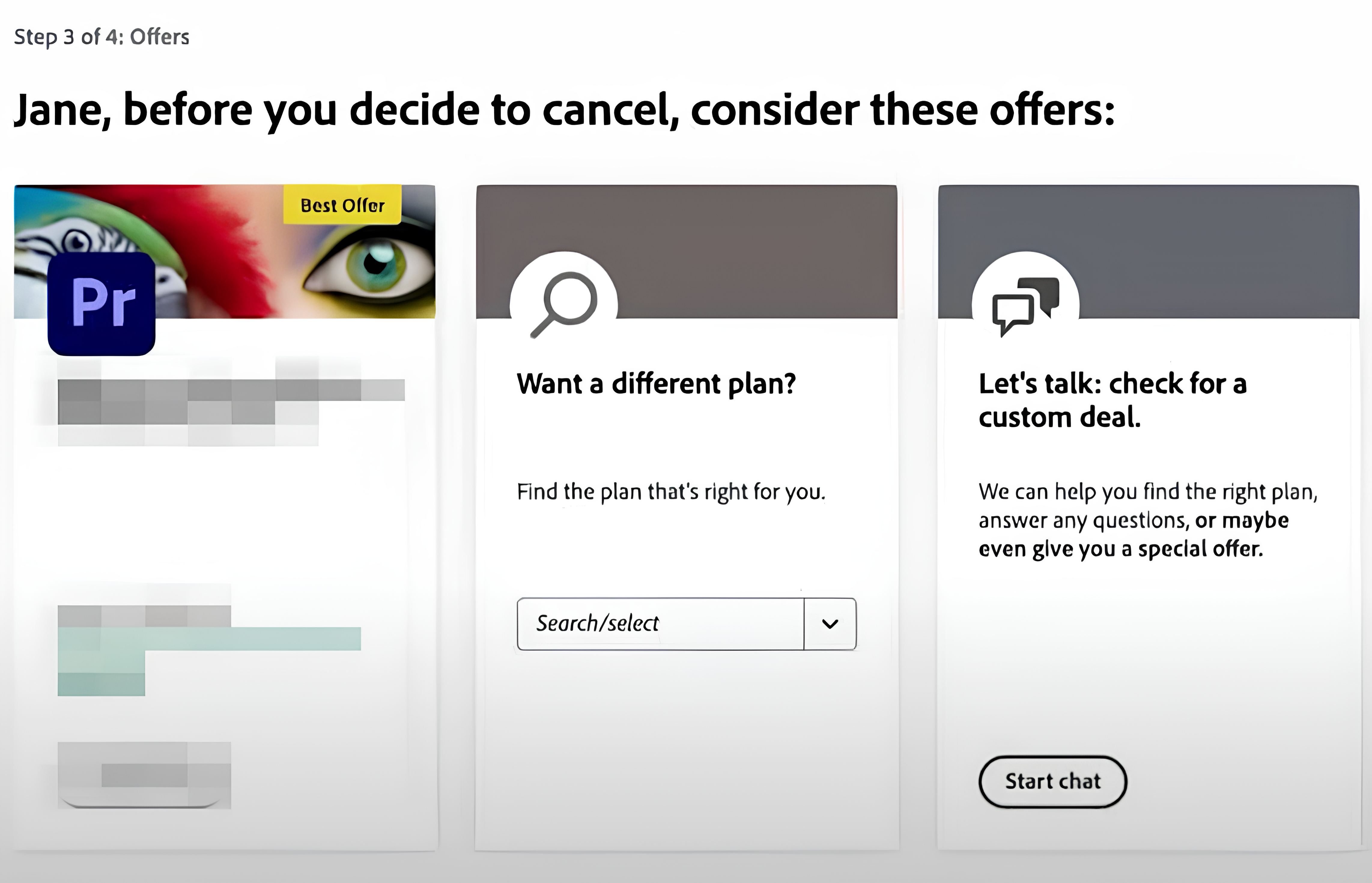
Though I present this as a positive example, I do need to stress that the only viable angle for this is when you look at this step out of context. Adobe actually has a 4-step cancellation process that includes:
- Review of the benefits being lost.
- Providing a reason for cancellation.
- Offering you a last-second offer.
- Cancellation summary screen.
Oh boy, they do ask a lot for their products and really don’t want to see you go, don’t they? They are actually guilty of several “cancellation product sins”, so I will recall their process again later in the article.
Another way you can add value to the exit path in-app is by creating contextual cancellation experiences.
For example, if a user indicates they’re leaving because they found the product difficult to use, Userpilot can automatically trigger a specialized off-boarding flow that offers a quick tutorial video or connects them with customer success. If pricing is the concern, it can present a tailored discount or alternative plan.
2. Asking for feedback but not demanding it
Exit surveys can be immensely helpful, but only if they are truly optional and truly short. Netflix provides a nice example here:
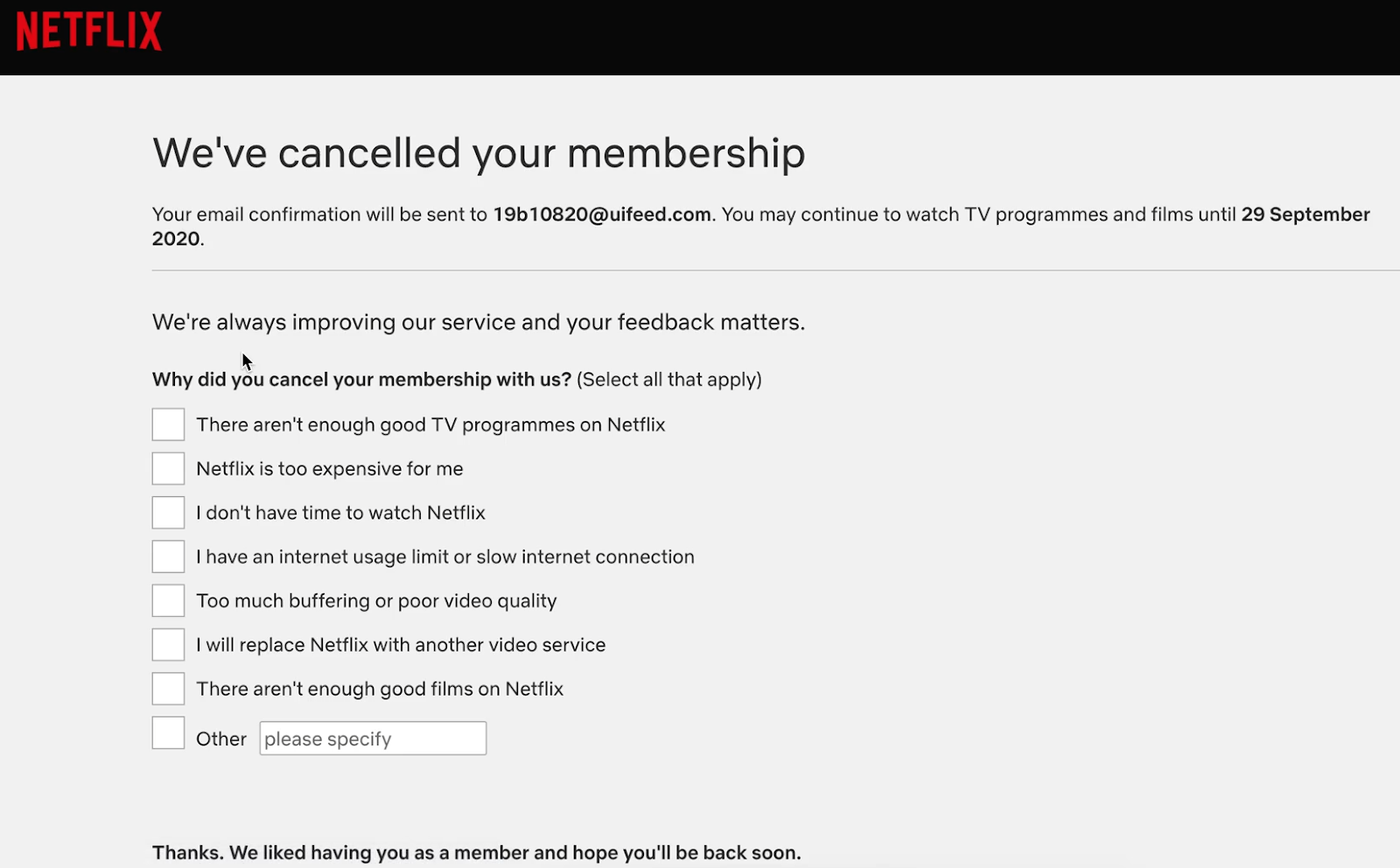
After confirming the cancellation, users are presented with a short list of common reasons for leaving.
It’s skippable. It’s fast. And it’s just enough for the team behind the scenes to gather some valuable insight.
What is great, unlike Adobe’s similar survey in the same flow, is that this doesn’t pop up until you actually cancel. For Netflix, it’s a one-step process, and the survey at the end of it is as invasive as possible.
The lesson here is simple. If your goal is to learn, don’t make the users feel like they’re taking a final exam. If they want to speak, they will. If not, let them go in peace. It’s ok to ask for data; it’s not OK to pretend to ask for it and try to do whatever is possible to keep the user subscribed.


3. Offer support without gatekeeping
Sometimes, users cancel not because they’re unhappy with your product but because something broke along the way, i.e., a billing issue, a misunderstood feature, or a simple annoyance. In such cases, a human conversation with a competent support agent can almost magically turn things around.
You can see this in Adobe’s example above, though again, it’s only good when you ignore the 4-step process that utilizes every “ethical” play in the book, but makes it annoying due to the number of hoops to jump through.
Another poor implementation of this philosophy is demonstrated by a product called ConvertKit. There, you have no UI option to cancel the product, but it’s super easy once you request it via chat.
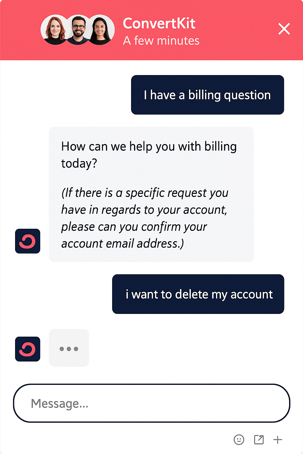
This sort of organically puts you on a path for the support agent to get to understand your motivation. If I were a PM there, I would keep it the same, but still leave an easy-to-find cancellation option. Clicking the button would simply summon the chat and automatically start the right conversation topic.
However, that is the furthest I believe one should go. Beware of going further than that. Forcing a phone call or hiding behind support tickets just to wear people down is not the same thing. The difference is whether the user still feels like they’re in control of their decision.
4. Avoid patterns that breed resentment
Some patterns are universally hated, as they don’t provide value or clarity, and simply provoke frustration. They are built to keep as many users paying as possible, no matter the ethics. Examples of such UI patterns include:
- Requiring users to call or email to cancel: Places like gyms have been known to mandate in-person or mailed cancellations, making the process irritating. It was even a gag on one of the “Friends” episodes.
- Making the cancel button almost impossible to find: Some services bury the cancellation option deep within account settings, hoping users will give up searching.
- Adding multiple redundant confirmation screens: Users are forced to navigate through several “Are you sure?” prompts, each with varying button placements to cause confusion.
- Loading delays or intentional errors during cancellation: Some platforms introduce “technical issues” when users attempt to cancel, discouraging them from completing the process. This is in hopes that the user will get frustrated, quit the process, and not come back later.
- Mandatory surveys or personal information requirements: Requiring users to fill out lengthy forms or provide unnecessary personal details before allowing cancellation. So, in addition to losing a user, you add to their frustration.
Granted, these techniques might retain some users temporarily, but at the cost of long-term trust and bad word of mouth, if not terrible ratings and reviews. This might be a product “Hail Mary” to prevent user churn, but it’s short-sighted at best. On top of that, such practices are becoming illegal (more on that later), so using those techniques may also end up in court.
It’s much better to focus on good retention, focused on giving people a reason to stay, not a reason to warn others about your brand.
To mind, however, that this may end up backfiring as well:
Don’t train users to manipulate you
It might sound clever to offer last-minute discounts to those who try to cancel. And sometimes, it works. But it also sets a risky precedent. If users learn that threatening to leave triggers a reward, they might game the system. Worse, your loyal customers, the ones who stayed and paid full price, will feel punished for staying.
“If you choose to offer incentives, make them feel like a thank-you, not a bribe. And don’t build a system that turns your cancellation page into a discount loophole.”
Of course, you may bake this into your business model. Say you have a minimum subscription fee that you are happy to be paid, while having options where the same service is more expensive. However, with coupon codes and “don’t cancel” discounts all over the place, users are simply happy to have found a way to ”lower” the price.
Case study: SubtitleBee reduces churn by 40% with targeted cancellation flow
SubtitleBee, a platform that automates multilingual video subtitles, faced challenges with customer retention due to technical issues, limited features, and inconsistent subtitle quality.
Strategy implemented:
- Integrated Churnfree’s retention flow: SubtitleBee utilized Churnfree to enhance its cancellation process.
- Feedback collection: They gathered insights from users intending to cancel, identifying key pain points.
- Tailored offers: Based on feedback, they presented personalized offers, such as discounts and the option to pause subscriptions.
With lots of feedback captured, they could move to product improvements. That mostly consisted of addressing technical glitches and expanding feature offerings, including more language options. Results?
- 40% Reduction in churn: The combination of personalized retention strategies and product enhancements led to a significant decrease in customer cancellations.
- User engagement: Approximately 47% of users chose to pause their subscriptions instead of canceling outright.
SubtitleBee’s example clearly shows there’s a lot of value and contracts to be saved on the cancellation flow, even without resorting to shady tactics.
Summary
Your cancellation flow is part of the product. And like every part of the product, it should reflect your values, your understanding of your users, and your maturity.
Making the “goodbye” flow slightly complicated doesn’t mean making it painful. It means offering options, understanding intent, and maximizing the chance of keeping a customer: not against their will, but through better alignment.
At the end of the day, keeping every user matters, and if cancellation can be prevented easily and ethically, why not at least try? There’s absolutely nothing wrong with encouraging people to stay. But it must come from a place of clarity and honesty.
You are not tricking them into anything. You are giving them one last offer to consider. If they still choose to leave, let them. And make sure they feel respected as they go. Because that’s the kind of goodbye that leads to a future return and recommendations to other future users.