Heat Map Analysis in 2026: How AI is Rewriting What User Behavior Data Means


Heat map analysis is one of the most useful yet underused diagnostic tools in SaaS. In 2026, AI is changing both what heat maps can reveal and where they still have blind spots. The AI-driven heat map market is growing at 23.3% year-over-year, which tells you the tooling is advancing faster than most teams are adapting to it.
The new pressure is structural. AI agents that interact with your product through integrations like MCP don’t click, scroll, or hover the way human users do; they execute tasks programmatically, and many of those interactions never register in your heat map data. A product team relying solely on traditional heat maps in a product with meaningful agent traffic is working from an increasingly incomplete picture.

What heat map analysis actually involves
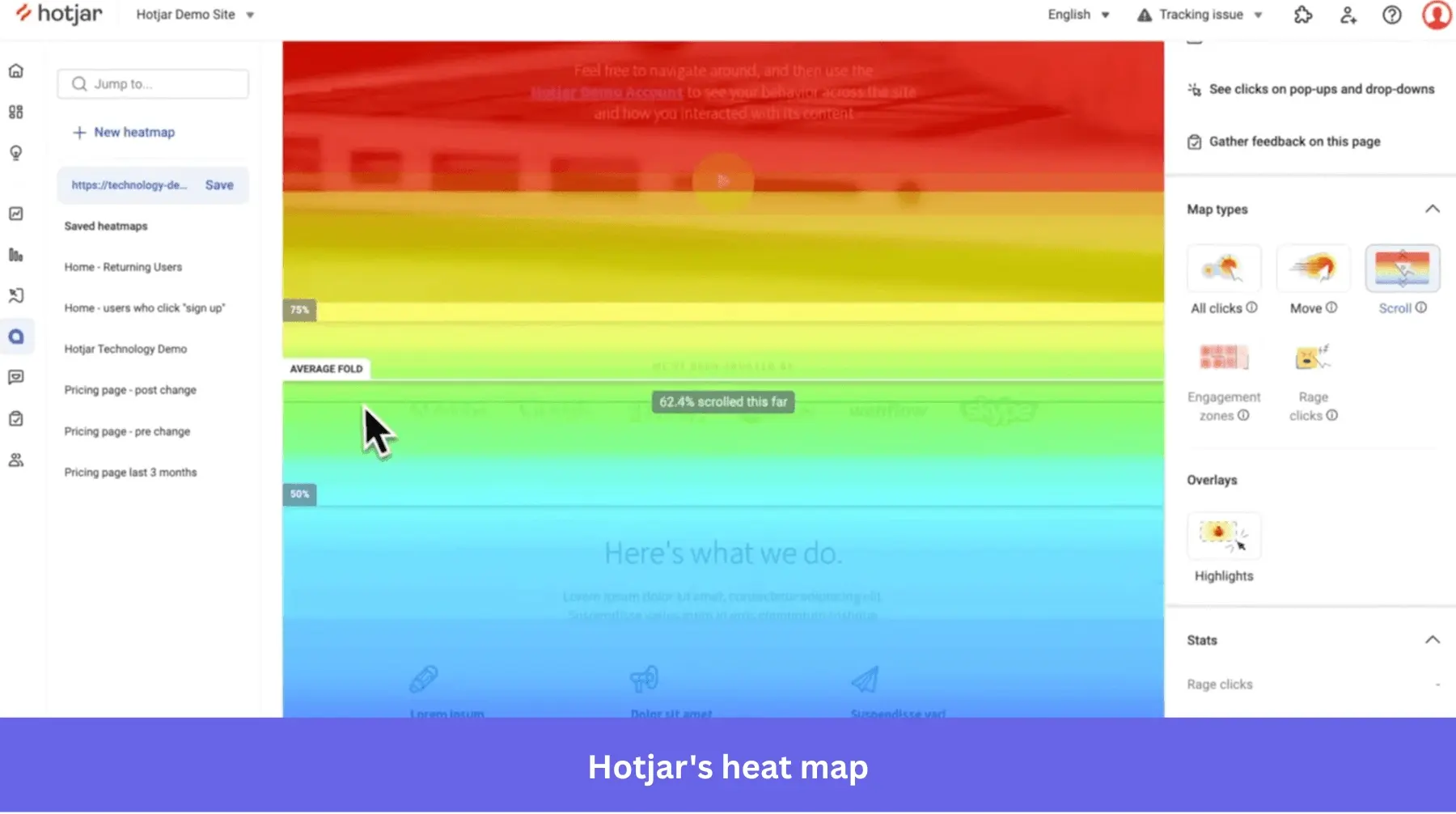
A heat map is a data visualization layer placed on top of your product or web pages that records how users interact with them. The color encoding works on a simple scale: red and orange mark hot zones of high activity, while blue and green mark cold areas that users overlook or avoid. The visual summary makes it possible to identify patterns in large data sets at a glance, without reading every individual numeric value.
The main type of heat map you’ll use depends on the question you’re asking:
- Scroll maps track how far users scroll before they drop off, which tells you whether your critical content is above where most users stop reading.
- Click maps record where users click and tap, revealing whether your CTAs are getting attention or being ignored.
- Hover maps follow mouse tracking movement without a click, indicating where users pause or hesitate.
- Eye-tracking heat maps, whether from lab studies or AI-based gaze prediction models, show which parts of a page draw visual attention.
Running more than one type together gives you a more complete picture than any single view.
One quick clarification worth making: heat maps and choropleth maps are often confused, but they differ in how they aggregate data. Choropleth maps visualize information grouped by geographic boundaries (states, countries), with each region colored by a corresponding value. Heat maps use an independent grid that doesn’t follow geographic boundaries, which makes them far more flexible for representing user interaction patterns on a web page or in-app screen.
The traditional method: Pairing heat maps with session recordings
Heat map analysis has traditionally required a manual read. You generate the heat map, identify the cold zones and dead clicks, pull a batch of session recordings from users who dropped off in those areas, and piece together a diagnosis. Done well, this process surfaces friction points that never appear in a standard funnel report: the CTA that looks clickable but isn’t linked, the scroll cutoff that hides your pricing, the form field that causes users to abandon mid-flow.
The approach still works. Most SaaS products have primarily human users who generate exactly the kind of click-and-scroll heat map data that these tools were built to read. Pairing click maps with scroll maps, then using session recordings to understand the why behind a specific drop-off, remains the correct diagnostic sequence for most product teams.
The limitation is throughput. A product manager manually reviewing heat maps across a 12-step onboarding flow, segmented by device type and user cohort, can spend half a workday just looking at data before forming a single hypothesis. That’s the bottleneck AI is now starting to address directly.
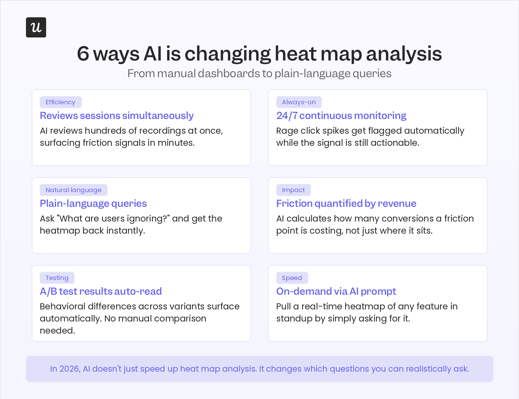
Six ways AI is changing heat map analysis
AI doesn’t just make heat map analysis faster. It changes which questions you can realistically ask and how quickly a friction signal becomes a product decision. Here are the six shifts that matter most for product teams in 2026:
- Reviews multiple sessions simultaneously: A product manager can watch one session recording at a time. Amplitude’s Session Replay Agent reviews hundreds simultaneously, identifies patterns across them, and surfaces the friction signals that would take a human analyst days to find. What used to require a dedicated sprint of qualitative review now happens in the background, continuously.
- Continuous 24/7 monitoring: Traditional heat map analysis is point-in-time: you generate a snapshot and review it when you have bandwidth. AI-assisted heat map tools monitor user behavior around the clock, which means a spike in rage clicks after a deployment gets flagged automatically rather than discovered three weeks later during a review cycle. The signal reaches you while it’s still actionable.
- Plain-language queries replace manual dashboard navigation: Contentsquare’s Sense Chat lets you generate and analyze heat maps through a natural language question. Instead of selecting a page, choosing a date range, and applying filters manually, you ask: “Which elements on the onboarding dashboard are users ignoring?” The tool returns the answer from your heat map data without you building the view yourself.
- Friction quantified by revenue impact, not just location: AI tools can now calculate the business cost of a friction point, not just flag where it sits. Amplitude’s agentic analytics doesn’t just show where the rage clicks are; it estimates how many conversions that friction is costing and prioritizes fixes by business impact. That turns a heat map observation into a prioritized engineering task with a number attached.
- A/B test results read automatically across variants: Heat maps have always been useful for comparing layout variants, but reading the behavioral differences across multiple versions requires manual side-by-side analysis. AI tools overlay the difference between variants and surface the meaningful changes without requiring a manual comparison. A redesigned CTA that generates more clicks but less downstream engagement shows up as a nuanced signal rather than a simple win.
- On-demand heat maps via AI prompt: The ability to surface specific heat maps through a prompt changes how product teams use behavioral data in practice. A PM in a standup can pull a real-time view of the feature they just shipped by asking for it, rather than opening a separate analytics interface.
Userpilot’s CEO Yazan Sehwail described exactly this shift:
“If you as a marketer wanted to see, using session replay, NPS data, survey data, and product usage data, you’re able to get your answer without having to go to Userpilot, without having to pull data and upload it to someone. So this is why MCP is gonna be a game changer.”
Where heat maps break in 2026
Heat map analysis has real limitations in 2026 that most articles on the topic either gloss over or miss entirely.
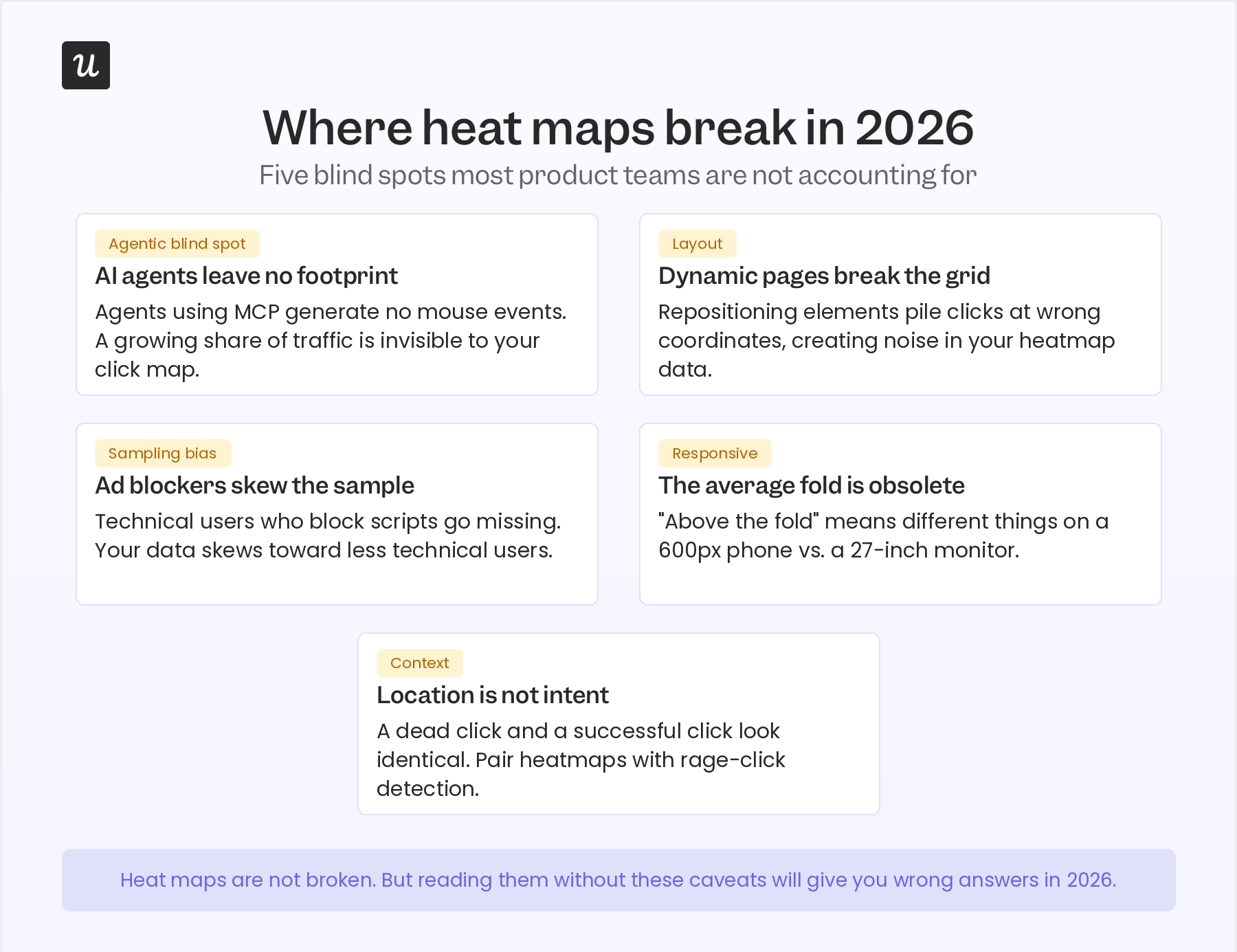
Here’s where the data stops being reliable, and why each blind spot matters more now than it did three years ago:
- AI agents don’t leave a click-and-scroll footprint: This is the blind spot most product teams aren’t accounting for yet. An AI agent accessing your product via MCP executes tasks without generating the mouse events your heat map records. If your product has any agent or API-first users, a growing share of your traffic is invisible to traditional click maps. A human-intended conversion button can show an artificially low CTR because agent interactions fail to register as clicks, making it look like a UX problem when there isn’t one. Before drawing conclusions from a click map in 2026, check what share of your sessions are non-human.
- Dynamic pages break the coordinate grid: Heat maps aggregate clicks on a static coordinate grid. On pages where elements reposition based on user state, device, A/B variant, or personalization logic, clicks can pile up at coordinates that don’t correspond to the element the user actually interacted with. For SaaS products with highly personalized or context-aware UIs, this creates significant noise in the heat map data that requires careful segmentation to catch.
- Heat maps show location, not intent: A dead click on a non-interactive element looks the same in heat map data as a successful click on a working button. Distinguishing between them requires pairing your heat map with rage-click detection or session recordings. Treating a high-click zone as a UX success without verifying whether those clicks converted to anything is one of the most common ways heat map analysis produces wrong conclusions.
From reactive diagnostic to predictive design tool
The traditional framing of heat map analysis is that it tells you what went wrong after the fact. You ship a page, wait for traffic, generate the heat map, and interpret what happened. That reactive model is still the dominant one, and it still works.
AI-assisted gaze prediction is expanding what’s possible. Tools like Attention Insight use machine learning models trained on eye-tracking study data to predict where users will look on a page before it goes live. You upload a mockup and get back a simulated attention heat map showing which elements will draw the eye and which will be missed. Here’s what it looks like:
![]()
The design feedback loop that used to require a user research study now takes minutes.
This shifts heat map analysis from a post-launch diagnostic into a pre-launch design instrument. Rather than using heat map data to fix friction after users have experienced it, you can test whether a new layout directs attention where the design intends.
Heat map analysis is becoming a design tool, not just a diagnostic
Heat map analysis started as a tool for optimizing what already exists: find the cold zones, fix the friction, measure the improvement. In 2026, with AI-assisted gaze prediction and agentic session replay running in the background, it’s also becoming a tool for validating what doesn’t exist yet. Product teams can now run simulated attention heat maps on mockups before a single line of code is written.
The limitation to keep in mind is the agentic blind spot. As more of your product traffic comes from AI agents, the click-and-scroll data that traditional heat maps were built to capture will represent a shrinking share of total interactions. That doesn’t make heat maps obsolete; it means they need to be read alongside behavioral data that accounts for non-human users, and segmented carefully before drawing conclusions about what “users” do.
The teams that get the most from heat map analysis in 2026 are the ones who treat it as an active instrument, not a passive report: specific questions, fast interventions, and AI tooling that surfaces the signal automatically. Want to run product analysis directly inside your product, without waiting for an engineering sprint to ship the fix? Get a Userpilot demo and see how in-app behavioral data connects to in-app interventions in the same workflow.
About the author