How to Rewrite Your Homepage with Sharper Positioning and Messaging by Anthony Pierri

“Software that keeps you running while you keep the world running.” That’s the main heading from a SaaS product homepage. Can you tell what the product does? Or how it’s unique?
Nope. This line sounds good on the surface, but it lacks substance.
The company needs to work on its positioning and messaging.
Anthony Pierri, the founder of Fletch PMM, explained how to do it in his talk at this year’s Product Drive Summit hosted by Userpilot.
In the article, you’ll get a sneak peek of the key takeaways from Anthony’s presentation:
- What’s positioning and its different types.
- Common issues with homepage positioning and messaging.
- How to position your product using Anthony’s canvas.
- How to design a homepage that converts.
Let’s get right to it!
What is product positioning?
At its core, product positioning answers four questions:
- What is your product?
- Who is it for?
- What does it replace?
- Why is it better?
Answering these questions allows you to craft your positioning statement.
And it’s more than just words in a document buried in a Google Drive folder! Positioning needs to be in your messaging, front and center on your homepage.
Why?
Because a clear homepage forces you to stay aligned on those essential answers and helps everyone see and understand your product in the same way. Your customers, investors, and all internal teams.
The problem with homepages
Here’s the problem: lots of home pages are unclear. They’re clever, sure, but they often leave you scratching your head, asking, “What is this product even about?”
Take ServiceNow’s old homepage: “Put yes to work. Save or grow? Satisfy shareholders or satisfy customers? When facing tough choices, choose the one platform that lets you say YES to both.”
It sounds almost poetic, but it doesn’t say what ServiceNow does. There’s no clarity about the product, who it’s for, or how it’s different. Cleverness clouds the message.
Unclear positioning on your homepage is like giving someone a puzzle with missing pieces. It leaves your audience guessing. And if your potential customers don’t understand what you do, why should they stick around?
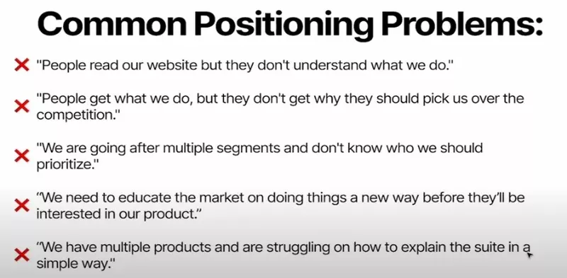
Signs you have a positioning problem
So, how do you know if your homepage has a positioning issue?
Here are some tell-tale signs:
- People read your website but don’t understand what you do.
- They get what you do but don’t know why they should pick you over the competition.
- You’re targeting multiple segments but aren’t sure which to prioritize.
- Your market needs to be educated on doing things in a new way.
- You have multiple products, and you’re struggling to explain them in a simple way.
If any of these sound familiar, it’s time to rethink how you position yourself on your homepage.
How to answer four key positioning questions with positioning and messaging canvas
To make positioning clear, let’s tackle each of those four questions. I’ll walk you through effective ways to answer them — and equally important — how not to.
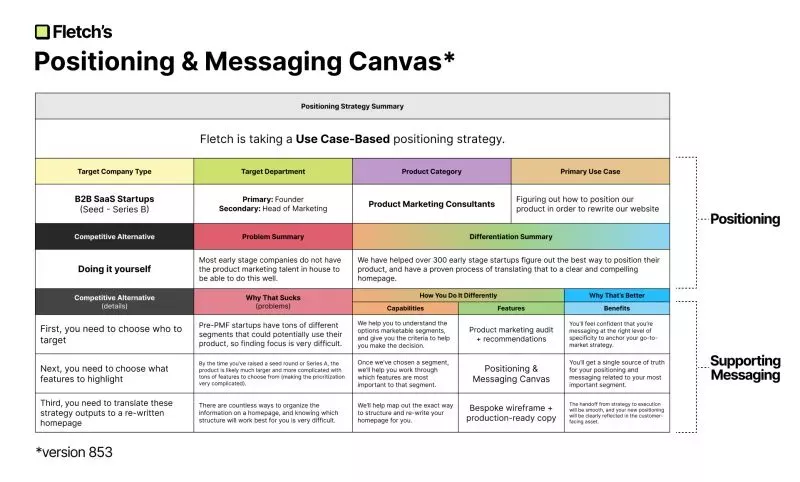
Question 1: What Is It?
Let’s start with the basic question: “What is your product?” Believe it or not, many companies trip over this first question.
Don’t answer the question with:
- An outcome: Saying, “It’s a great way to make your team more efficient” might sound appealing, but it doesn’t tell anyone what your product is.
- A mission statement: Lines like “We’re democratizing logistics” might impress investors, but they’re often too abstract for customers.
- A favorite feature: If you say, “It’s an AI platform,” you’re not explaining what makes your product unique or valuable.
So, how do you answer “What is it?”
You have two options:
- State the product category
- State the use case
Let’s explore each of the two options in more detail.
Category-based positioning
Focusing on your category can help position you as a leader within a known space.
For instance, Figma described itself as an “interface design tool” when it first launched. This gave designers a clear understanding of what it was.
Pro tip: If you’re unsure about your category, listen for moments when your leaders say, “We’re so much more than a [blank].” That blank? It’s often your category.
Use case-based positioning
What if there isn’t an established category? Describe the use case.
Calendly, for example, couldn’t call itself a “scheduling tool” because there were no similar tools around. A “calendar tool” wouldn’t have worked because they didn’t offer a full calendar.
Instead, it focused on the use case: scheduling meetings.
This way, Calendly didn’t have to invent a new category. It just became the best tool for that specific task.
Pro tip: The key here is to find a use case that is broad enough to attract a large audience but specific enough to convey a clear message.
Question 2: Who is it for?
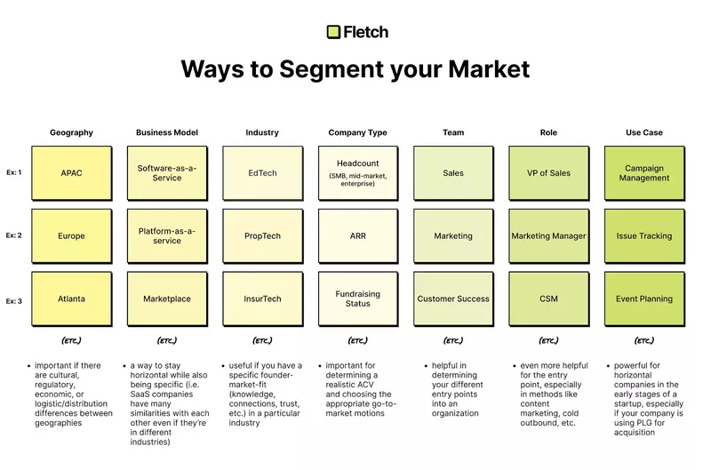
This is where segmentation comes in. While there are plenty of ways to slice up your target market, four main approaches tend to work best:
- Company Type
- Target Department
- Category
- Use Case
Only starting?
You don’t need all four types. One specific use case might be enough, as SmallPDF discovered. They focused on the use case of “shrinking PDFs.” The result? Their website attracts 45 million visitors monthly.
Question 3: What does it replace?
Who is your competitive alternative?
For some products, this is straightforward. If you’re in an established niche like CRMs, your competitors are other CRMs.
What if there are no direct competitors because it’s a new category?
Position yourself against the current ways of doing things.
For example, take EvidenceNow, a tool for collecting customer proof.
When they entered the market, companies needed to gather testimonials and case studies manually. This was inefficient. Their positioning statement, “Don’t beg for case studies, get customer proof at scale,” promised to streamline it.
Question 4: Why is it better?
This question digs into differentiation. There are two main approaches here:
Binary differentiation
This is when you position yourself as the opposite of a competitor.
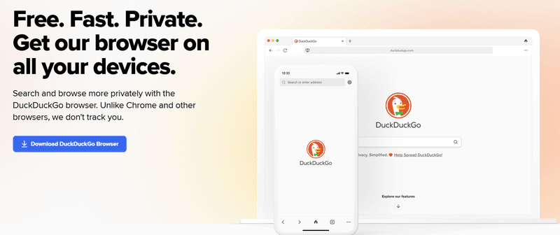
For example, DuckDuckGo’s browser focuses on privacy, unlike Chrome, which tracks user data. This clear difference gives privacy-minded users a clear reason to choose DuckDuckGo.
Differentiation by degree
This is when you’re better by a measurable amount.
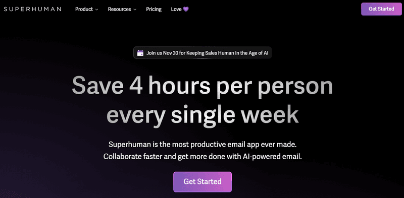
For instance, Superhuman claims to be the most productive email app ever made. This isn’t just a vague claim! It’s backed up by measurable time savings, making it clear why users might prefer it.
Translating the positioning strategy to the homepage
Once you’ve nailed your positioning, it’s time to bring it to life on your homepage.
A homepage typically has five main sections.
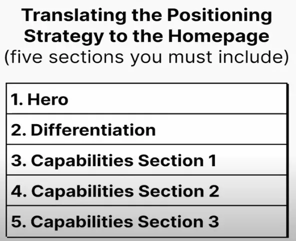
Let’s unpack each of them!
1. Hero
The hero section is where you need to make a strong, clear statement that answers as many of the four key positioning questions as possible.
This section typically includes a prominent H1 headline that states the main benefit of your product, an H2 for supporting details, and a CTA to invite visitors to engage further.
What it looks like depends on your strategy.
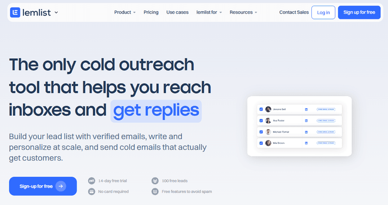
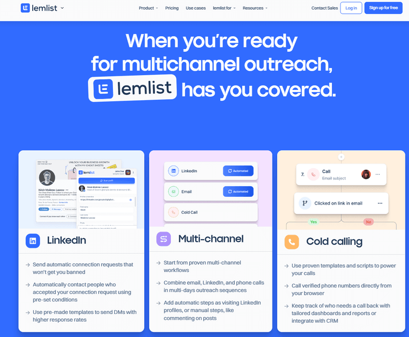
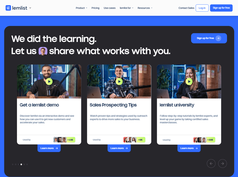
For example, Lemlist, a cold outreach tool, crafted its hero section around its key differentiator. Their headline states, “The only cold outreach tool that helps you reach inboxes and get replies.”
There’s also the social proof section where you can add your customers’ logos and testimonials.
2. Differentiation
In the differentiation section, you aim to show visitors why your product stands out. This is where you can use an “us vs. them” comparison, a problem-solution format, or “the old way vs. the new way” approach to emphasize what makes you superior.
The goal? Position your product against the main alternatives — whether that’s a competing tool or a commonly used manual method.
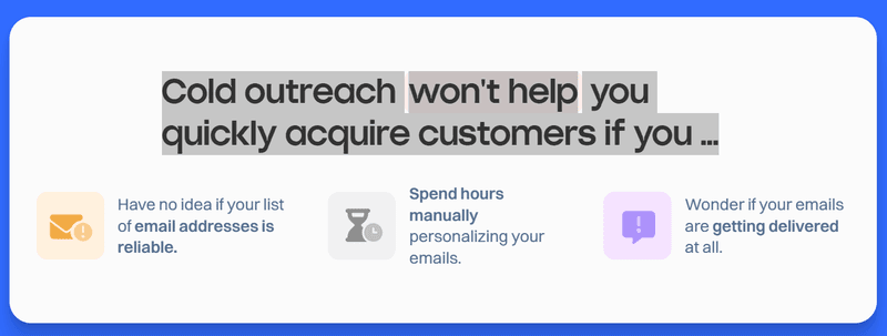
Lemlist did it by pointing out issues with existing solutions. For example, “Cold outreach won’t help you quickly acquire customers if you … Have no idea if your list of email addresses is reliable.”
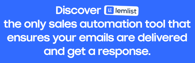
And then, they drive the message home by stating how their product solves their problem “Discover Lemlist, the only sales automation tool that ensures your emails are delivered and get a response.”
3. Capabilities sections
Now that visitors understand why your product is unique, you need to make your claims believable by showing them how it works.
Consider the capabilities sections as a 15-second product demo. Present key features at a high level, keeping in mind that people tend to skim homepages.
You should have three capabilities sections, each focusing on one feature that directly supports your differentiation.
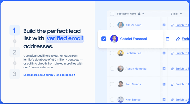
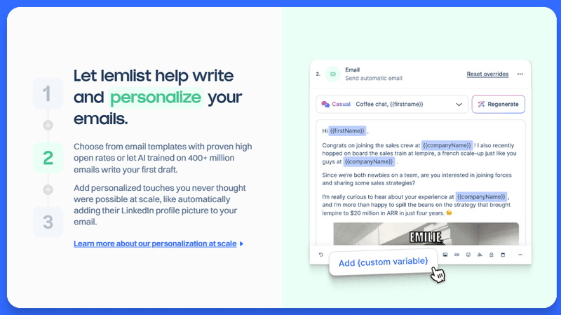
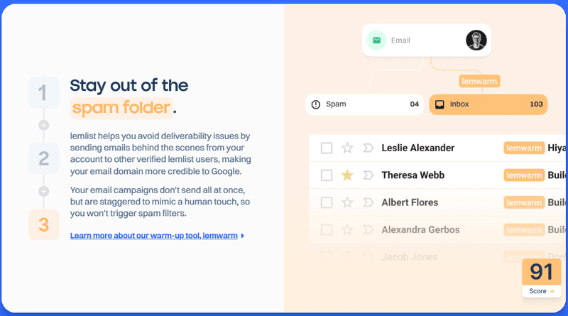
For Lemlist, these features were building the perfect lead list with verified emails, personalizing the emails, and keeping them out of the spam folder.
Additional sections
Once you cover the capabilities, you can reinforce the message with additional sections.
These could be:
- Further capabilities.
💡 Editor’s note: Showcasing capabilities that complement the core functionality helps users understand the full product value. Clearly explain what they do, focusing on user benefits, and illustrate them with screenshots, gifs, and short videos.
- Full-page testimonials.
💡 Editor’s Note: Adding testimonials can increase conversion rates by a third (32%–34%). Feature testimonials from real users with diverse use cases sharing concrete data about the product value.

- Resources.
💡 Editor’s Note: Resources like guides or video tutorials help users understand the value proposition and improve adoption. Just make sure they’re up-to-date and logically organized.
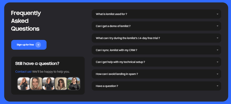
- FAQs.
💡 Editor’s Note: A good FAQ section is based on real user inquiries and offers clear and concise answers. It helps reduce friction, reassures customers, and prepares them for a product demo.
- Additional CTAs.
💡 Editor’s Note: The more CTAs across the page, the more opportunities for users to do what you want. For maximum impact, use benefit-oriented copy (“Boost Your Sales Today”), add trust-building elements (”Join 1,000+ businesses who use X”), or create a sense of urgency (“Sign Up Today and Get 20% off”).
Conclusion
Clear product positioning and messaging are vital for highly converting home pages.
When prospective customers visit your website, they need to know immediately what your product does, how it’s different from your competitors, and what features make it possible to deliver on its promise.
To create solid positioning and messaging strategies, you need to understand your customers. Their pain points, needs, and desires.
Userpilot analytics and feedback features can help you gain such insights! Want to learn more? Book the demo!
About the author