How To Create a Website Notification Banner Code-Free? [+ 3 Best Practices]
![How To Create a Website Notification Banner Code-Free? [+ 3 Best Practices]](https://blog-static.userpilot.com/blog/wp-content/uploads/2022/05/How-to-Create-a-Website-Notification-Banner-Code-Free_ebc2a3a9fcd8e03af6a56b6ea103b7f2_2000-1024x670.png)
What is a website notification banner?
A website notification banner (also known as notification bars, announcement bars, alert banners, sticky bars, or floating bars) is a small bar that often appears on the top of your website, usually used to communicate updates, promote a new feature, or announce limited-time offers.

What are the benefits of website notification banners?
If your website/app/tool/product isn’t stuck in a static state, then you’ll need to alert and announce updates to your users regularly. How do you do that?
When it comes to feature/product announcements or important updates, there are several approaches. You can use modals, tooltips, hotspots, and many more. But notification banners have some advantages over those types.
Let’s see why notification banners are an excellent way to reach the right people with the right message and what makes them different.
Ready to dive in?
Notification bars are less intrusive
Unlike other in-app notification methods, notification banners are less intrusive and don’t hurt users’ experience. They take up about 5% of the entire page, and it’s not overwhelming for the users. As notification bars are non-disruptive, users don’t feel the urge to dismiss the bar and tend to engage with the product/app more.
Notification bars are attractive
Since notification bars are often placed at the top of the page, they immediately grab the user’s attention. This means that users always see the announcement which increases your chances of higher engagement.
What are the website notification banner use cases?
Website notification banners have a lot of use cases depending on your goals. You can use them to communicate important news, notify users about feature announcements, product updates, policy changes, special deals or even collect customer feedback.
Here are several examples and use cases of how you can utilize notification banners and get the most of them.
Important news announcements
Sending out important news updates by email may end up in the junk folder, and in-app notifications can sometimes be annoying for users. So what should you do?
Use notification banners to announce them right in the app. This is how we do at Userpilot.

New feature announcements
Do you have a new feature ready that you’ve been working on lately? Great! A website notification banner is an effective way to tell your users about this kind of information.
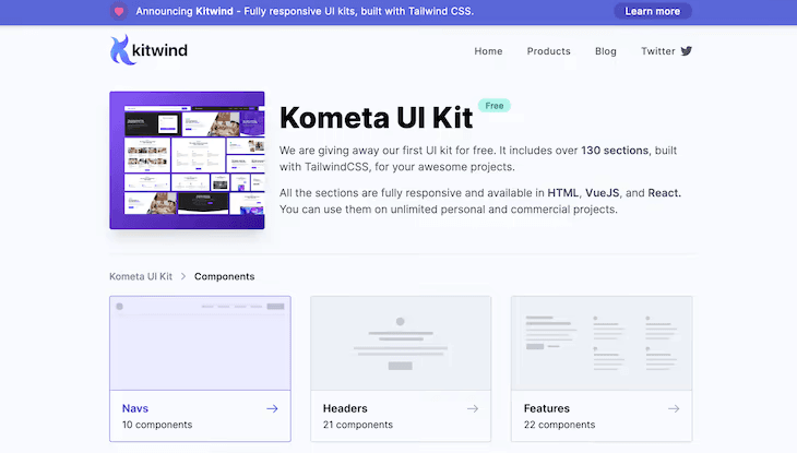
Rather than simply waiting for your customers to discover new features, you can use a notification banner to let them know about the exciting news.
These tiny notification bars can lead users to feature discovery which will result in feature adoption later.
NPS surveys
Banners are also a great way to collect customer feedback. This is how Asana uses notification bars to show an NPS survey to its customers. It is strategically placed at the top of the website to ensure that it is not missed by customers.
And the fun part is that you don’t need to have programming skills to create such kinds of NPS surveys. With a tool like Userpilot, you can create NPS surveys like this code-free.

Discount or special offer announcements
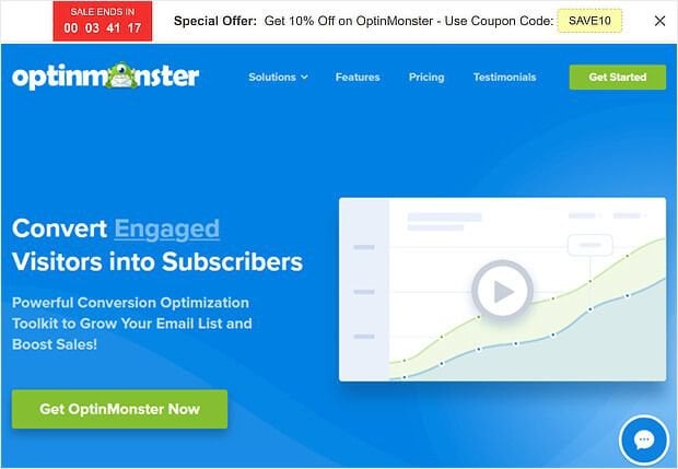
This is one of the most common uses of announcement bars. With announcement bars, you can easily let users know about a discount or sale because they are often placed near the top of the website.
You can display a coupon that can be copied and applied during checkout. Countdown timers can also be used to grab the attention of your audience and create FOMO. Your users will most likely take action when they see a countdown timer on your website since they know the sale/promo will not last forever.
Here is how Optinmonster does that.
System maintenance and downtime announcements
Your announcement bar is the perfect place to share upcoming maintenance notifications to alert users. You can also email users to notify them about maintenance or downtime but it’s not as effective as announcement bars.
Emails can get lost in the customers’ inbox, but in-app notification bars make sure that logged-in and active users don’t miss the announcement.

Lead capturing
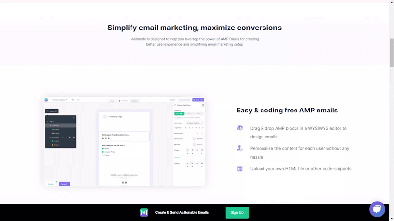
Are you aware that you can use sticky bars to capture leads? To drive signups, Mailmodo uses a floating sticky bar in the footer of its product page. The bar appears once the user has scrolled to the middle of the page.
When users scroll down the website it indicates that they are interested in the product/service enough and you can take action to drive more engagement and convert them to customers.
Website notification banner best practices
As mentioned above, website notifications banners are a great way to communicate and engage with your customer. It has a lot of benefits but there are also some best practices that you need to follow.
Now let’s talk about some rules to make your notification bars as effective as possible.
Use a minimal amount of text within a notification banner
The notification bars are small banners, so it makes sense to keep the text within the bar to a minimum.
Your objective is to communicate your message in the shortest time possible without distracting your users. Don’t load it with too many images or make it several paragraphs long; it’s not a modal.
Best practice: keep your texts short and in a single line
Use links or call-to-action buttons to guide users. However, if you are adding a call to action, make sure that it is between one or two links to keep the user focused on what’s important. Too many links will confuse your users, and they will not take action.
Include a date in your alert banners if your alert notifications contain time-sensitive information, so your users will know if it’s the most up-to-date information.

Make notification banners dismissible
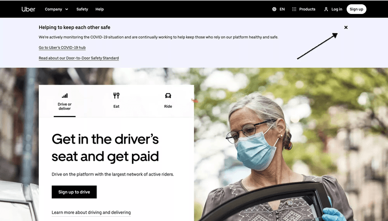
Users should always have the option to close the announcement bar; otherwise, it will lead to a bad user experience.
Ensure that you keep the notification bar hidden when the user navigates to another page. If your alert banner keeps popping up on every page, you will annoy your users.
Userpilot can help you create notification banners that are easily dismissible. The best thing about these banners? They are code-free and you can roll them out within a few minutes.
Choose a color scheme that’s aligned with your brand
Website notification banners must be visually appealing and accessible to all visitors. A notification bar should be large enough to catch attention and convey your message, but it shouldn’t take over the browser window or blend in with your website’s background color, making it difficult to read.
Make sure that the design of your in-app notification bar is aligned with your brand style while still standing out from the rest of your site.
Ensure that your website notification bar meets the AA standard of the Web Content Accessibility Guidelines (WCAG), which requires a 3:1 contrast ratio for large text and a 4:5:2 for a standard text.
Conclusion
Now it’s time for a recap.
Website notification banners are a great way of communicating with your users, increasing engagement, and capturing leads. Remember to follow the best practices discussed above and you’re all set. Always make experiments, try different texts, and designs and see how users react to those changes and which ones receive higher engagement.

