![7 Best Real User Monitoring Tools [In-Depth Comparison] cover](https://blog-static.userpilot.com/blog/wp-content/uploads/2025/03/7-best-real-user-monitoring-tools-in-depth-comparison_f82a4f70704d9fa8b37117c25f6fd5df_2000-450x295.png)
User experience can make or break a web app. If your software is slow or buggy, users won’t stick around for long. The worst part? If you’re only finding out about these issues after users complain, you’re already too late. That’s where real user monitoring tools come in: They provide real-time insights into how users engage with the app, helping you detect performance issues before they impact your bottom line.
But with so many options out there, how do you know which one to pick?
We’ve done the research for you! In this guide, we’re breaking down the 7 best real-user monitoring tools, comparing their features, pricing, and how they can help you keep your site running smoothly.
Features to look for in real user monitoring tools
Now, there are two different categories of user monitoring tools, some more geared towards developers and some more suitable for non-technical teams, so obviously they’ll also offer a different set of features for each use case.
I’ll share some features you can expect to find in a typical tool, although please note that it’s unlikely you’ll find a tool that has them all:
- Event tracking: All real user monitoring tools capture user actions like clicks, scrolls, and form fills, so you can see precisely how users interact with each page.
- Session replays: Watch real users interact with your site as if you were looking over their shoulders. See where they click, how they navigate, and where they get stuck.
- Conversion funnel tracking: Analyzes where users abandon processes like the onboarding flow.
- User journey analysis: Tracks the flow of users across pages to detect drop-offs.
- Core performance monitoring: Tracks key performance metrics like page load time, First Contentful Paint (FCP), Largest Contentful Paint (LCP), Time to Interactive (TTI), and Cumulative Layout Shift (CLS) to measure how fast and stable a webpage loads.
- Third-party integration: Supports integration with analytics and DevOps tools like Google Analytics, Mixpanel, Splunk, or Datadog.
Top 7 real user monitoring tools for product teams
Before we discuss each tool in detail, check out this comparison table of popular solutions for a quick overview:
| Tool Name | Best For | Starting Price | G2 Rating | Key Features |
| Userpilot | User journey optimization & in-app engagement | $299/month(billed annualy) | 4.5/5 | Auto-capture, Session replays, Custom dashboards, Funnel, Path and Retention analysis reports. |
| DebugBear | Front-end performance monitoring & Core Web Vitals | $200/month | 4.6/5 | Continuous performance tests, Core Web Vitals dashboards, Collaboration features |
| Datadog | Comprehensive digital experience monitoring | Free plan available, RUM starts at $2.2 per 1,000 sessions | 4.3/5 | APM & distributed tracing, Log management, Custom dashboards |
| New Relic | Full-stack observability & microservice tracking | Free plan available | 4.4/5 | Distributed tracing, AI-driven root cause analysis, All-in-one dashboards |
| AppDynamics | Enterprise-level APM & user experience monitoring | $6 per vCPU core/month | 4.2/5 | End-to-end transaction tracing, Baseline & anomaly detection, Comprehensive dashboards |
| Raygun | Crash reporting & real-time issue tracking | $120 per 100k sessions/month | 4.5/5 | Crash reporting, Error tracking, Detailed diagnostics |
| Pingdom | Website uptime & speed monitoring | $15 per 100k pageviews/month | 4.1/5 | Synthetic monitoring, Page speed reports, Straightforward alerting |
1. Userpilot
Userpilot is an all-in-one platform that combines real-user monitoring tools, such as session replays, with traditional product analytics and qualitative feedback to give non-technical teams a complete overview of user behavior. On top of that, Userpilot also offers in-app engagement tools you can use to act on the collected data.
Now let’s discuss in more detail how Userpilot features help product teams diagnose user friction and optimize user experiences.
Key features
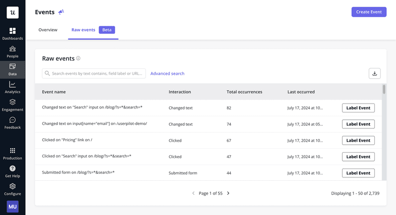
- Autocapture: Userpilot automatically records click form submissions and text inputs without requiring you to manually tag and define each event.
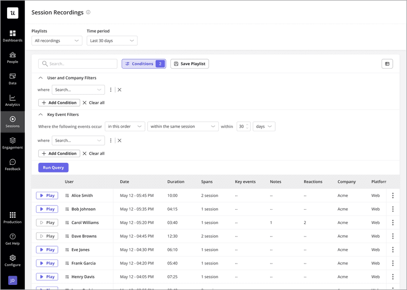
- Session replays: Watch real recordings of how users interact with your product to identify rage clicks, friction points and usability issues. Userpilot’s session replays also have advanced filters, making it easier to find relevant sessions (e.g. you can choose to watch sessions from users who used a specific feature).
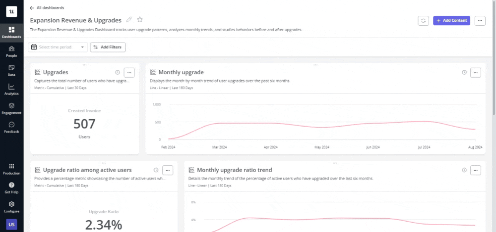
- Custom dashboards: Custom dashboards help you gather crucial metrics, like average session duration, recurring revenue, or funnel conversions, all in one place. You can choose from ready-made templates or build your own with performance metrics relevant to your product goals.
-
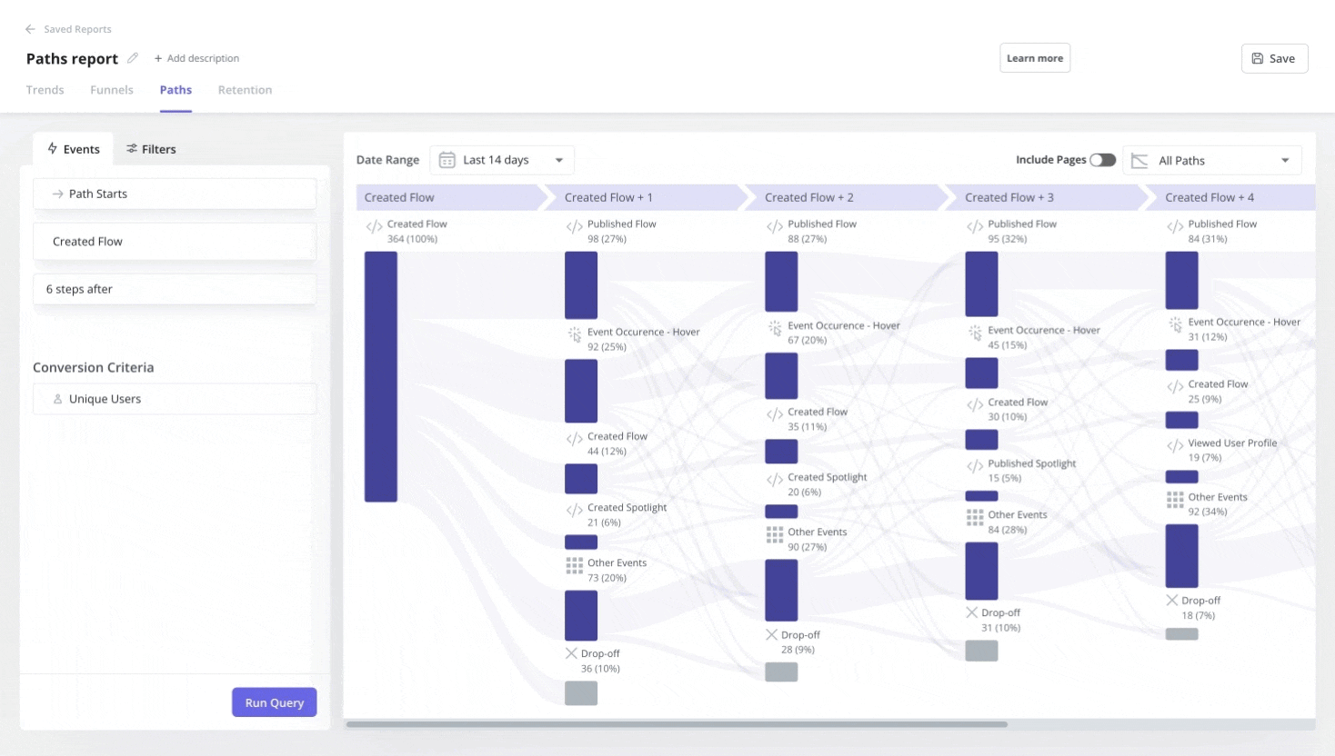
Path analysis reports: Track the exact routes users take across your site. See their natural navigation patterns, common detours, and unexpected exits, so you can refine workflows and eliminate roadblocks.
-
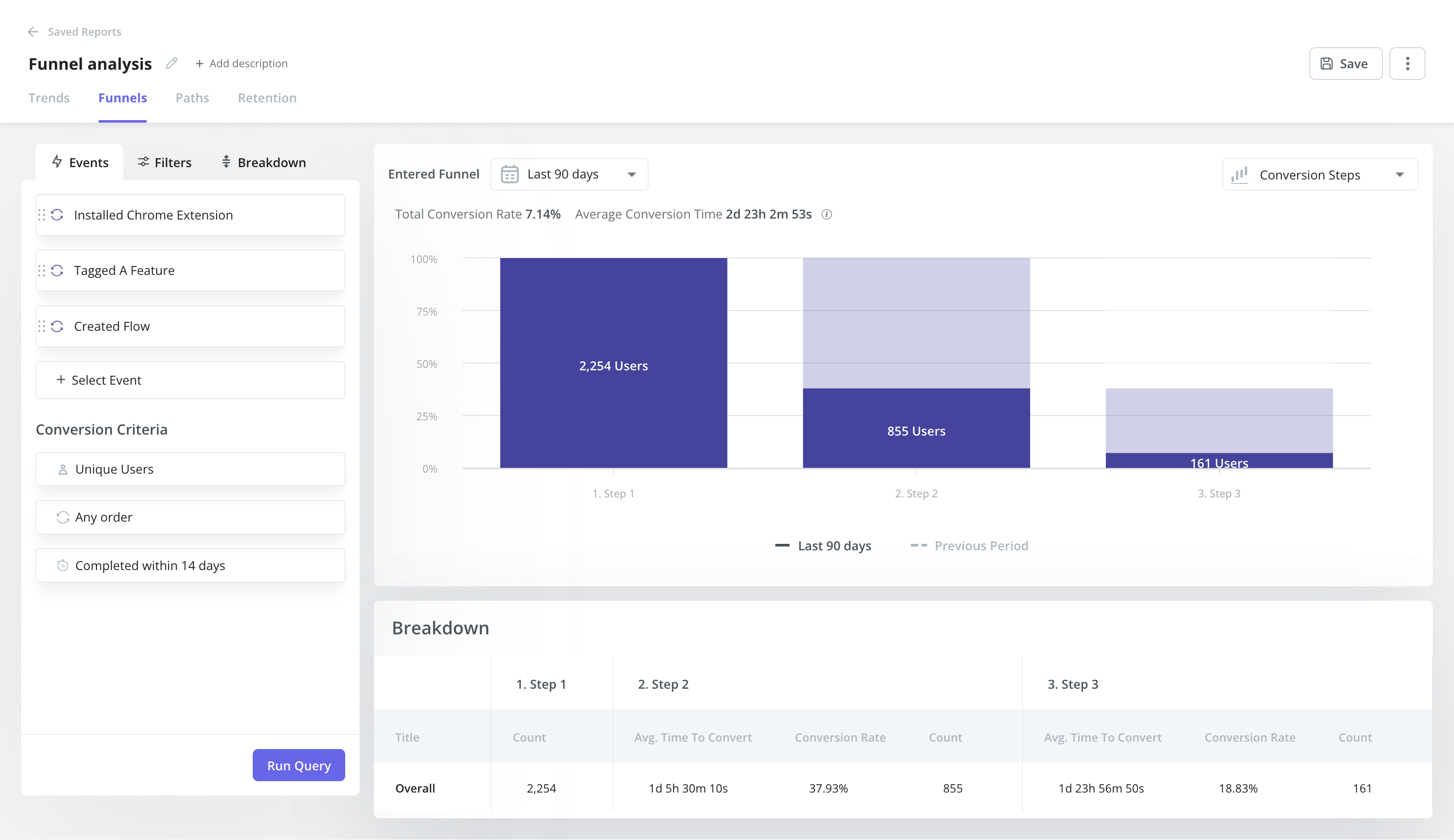
Funnel analysis reports: Visualize where users drop off in key flows, like onboarding or feature adoption. Identify friction points and optimize conversion paths to guide users seamlessly toward their goals.
-
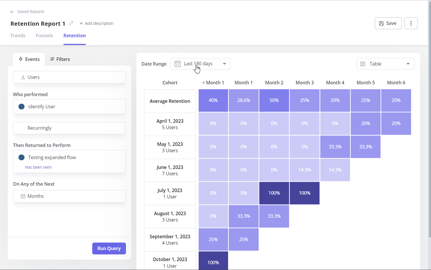
Retention reports: Discover how often users return, what keeps them engaged, and which behaviors correlate with long-term retention, so you can turn one-time users into loyal customers.
Pros
- Offers both analytics and engagement tools in a single platform.
- Easy-to-use interface with minimal technical expertise required.
- Affordable price for an all-in-one platform and great value for money.
Cons
- It may not offer all the traditional performance metrics (e.g., CPU usage, network speed) if you need deep technical monitoring.
- Best suited for SaaS companies focused on user journey optimization rather than pure infrastructure monitoring.
Pricing
- Starter: From $299/month (billed annually).
- Growth: Custom pricing based on growing teams’ needs.
- Enterprise: Custom pricing based on advanced needs. Contact us or book a demo to check it out.
![]()
Monitor User Behavior with Userpilot

2. DebugBear
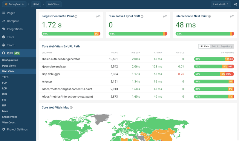
If your product’s user experience hinges on page speed and front-end performance, DebugBear zeroes in on metrics like load time and Core Web Vitals.
It helps you see which site elements slow down user sessions, making it straightforward to address blocks and boost engagement.
Key features
- Continuous performance tests: Automated tests reveal trends in speed and stability over time.
- Core Web Vitals dashboards: Track metrics like Largest Contentful Paint(LCP), Interaction To Next Paint (INP), and Cumulative Layout Shift (CLS) so you can prioritize the improvements that matter most.
- Collaboration features: Share performance reports with teammates to quickly resolve issues.
Pros
- Straightforward setup with detailed, easy-to-read performance insights.
- Focuses on front-end metrics critical to user satisfaction.
Cons
- Due to its narrow scope, it’s best for performance monitoring rather than deeper in-app analytics.
- Fewer integrations compared to broader monitoring solutions.
Pricing
- A 14-day free trial is available with no credit card required.
- Startup plan + RUM add-on: Starts at $200 with 500,000 page views per month.
- Team plan: Starts at $325/month.
- Corporate plan: Starts at $899/month.
3. Datadog
Datadog is a comprehensive digital experience monitoring platform for organizations with complex infrastructures, such as microservices or distributed systems.
It combines real user monitoring, application performance monitoring (APM), and log management in one place.
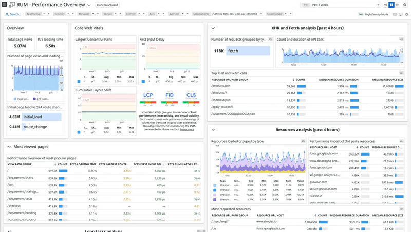
Key features
- APM and distributed tracing: Shows you how requests flow through different services, helping you spot latency spikes or memory leaks.
- Log management solution: Collects and analyzes logs from multiple sources so you can identify issues and correlate them with specific events.
- Custom dashboards: Visualize everything from front-end performance to back-end throughput, making it easy for product teams to see patterns and take action.
Pros
- Integrates seamlessly with AI, popular cloud platforms, and third-party services.
- Centralizes technical metrics and user experience data, helping you connect the dots faster.
- Enables you to watch recordings of your users’ web and mobile experiences to troubleshoot UX problems faster.
- Alerting and incident management features with tags and machine learning to address issues in real time.
Cons
- Pricing can escalate quickly if you have many hosts or extensive log volumes.
- The interface offers many features, which might overwhelm smaller teams looking for a simpler solution.
Pricing
- 14-day free trial with no credit card required.
- A free plan is available.
- RUM: Starts at $2.2 per 1,000 sessions/month.
- RUM with Session Replay: Starts at $2.6 per 1,000 sessions/month.
- Other plans: include APM, logs, and infrastructure monitoring. Each has separate pricing tiers, which can add up based on usage.
4. New Relic
New Relic offers a full-stack observability platform that combines application performance monitoring with real user monitoring.
For product managers juggling multiple microservices or high-traffic apps, it provides a central view of everything from front-end performance to back-end infrastructure. This makes it easier to spot issues like latency spikes before they affect the overall user experience.
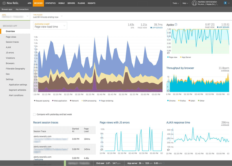
Key features
- Distributed tracing: Helps identify bottlenecks in complex microservice architectures by showing how each service handles requests.
- AI-driven root cause analysis: Automatically surfaces performance anomalies and suggests likely culprits, speeding up troubleshooting.
- All-in-one dashboards: Gather APM, infrastructure data, and user engagement metrics into one interface.
Pros
- Centralizes all performance metrics, from front-end experiences to back-end operations.
- AI insights help product managers quickly pinpoint and resolve issues.
- Offers a free tier for smaller projects or initial testing.
Cons
- It can feel overwhelming due to the number of features and 780+ integrations, especially for teams new to observability platforms.
- Pricing may increase as you monitor more services or need advanced features.
Pricing
- A free plan is available.
- You can get pricing for paid plans by contacting their team.
5. AppDynamics
AppDynamics (now part of Splunk Observability) by Cisco is an enterprise-focused application performance monitoring tool that offers real user monitoring.
It gives product managers a high-level view of how end users experience the product and deep diagnostic capabilities to fix bottlenecks at the code level.
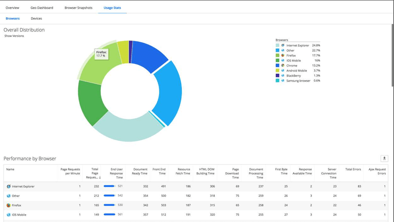
Key features
- End-to-end transaction tracing: Follows each request across multiple services, making it easier to pinpoint friction points in complex architectures.
- Baseline and anomaly detection: Analyzes data to automatically detect unusual performance patterns, allowing for proactive fixes.
- Comprehensive dashboards: Assess business-relevant metrics, from funnel conversions to technical performance, in one place.
Pros
- Offers a unified view of both technical performance and user interactions.
- Ideal for enterprises with distributed systems and high-traffic environments.
- Strong anomaly detection helps teams respond to issues before they escalate.
Cons
- It can be expensive for smaller teams or startups.
- It may require a learning curve due to its extensive features and settings.
Pricing
- You can sign up for a free trial.
- Infrastructure: $6 per month per vCPU core, billed annually.
- Premium: $33 per month per vCPU core, billed annually.
- Enterprise: $6 per month per vCPU core, billed annually.
- Real user monitoring is an add-on that starts at $0.06/month per 1000 tokens, billed annually.
6. Raygun
Raygun is a crash reporting and real user monitoring solution designed to help teams pinpoint and fix real-time issues. For product managers seeking immediate visibility into user sessions and error data, Raygun provides clear diagnostic insights that drive quick resolutions.
Key features
- Crash reporting: Automatically captures crashes in mobile and web applications, including detailed stack traces for faster debugging.
- Error tracking: Alerts you to JavaScript errors so you can proactively solve problems before they spread.
- Detailed diagnostics: Offers granular visibility into user sessions, device types, and even network speed to narrow down issues efficiently.
Pros
- Combines error tracking, crash reporting, RUM, and APM in one platform.
- Straightforward setup with a clean interface for troubleshooting.
- Great for teams that need a clear, code-level view of performance issues.
Cons
- It may not provide deep infrastructure metrics (like CPU usage) for large-scale systems.
- Limited focus on in-depth product analytics or user behavior insights compared to broader platforms.
Pricing
A 14-day free trial is available. Pricing plans vary based on crash reporting, RUM, and APM. For just real user monitoring, pricing starts at:
- Basic: $120 per 100,000 sessions/month.
- Team: $240 per 200,000 sessions/month.
- Business: $1,200 per 1,000,000 sessions/month.
- Enterprise: contact sales for custom plans.
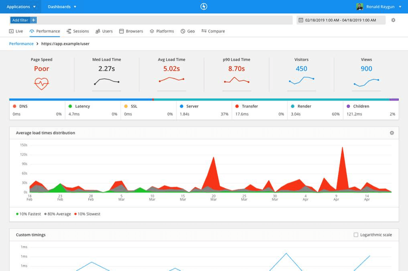
7. Pingdom
Pingdom, a SolarWinds product, is best known for its uptime checks and website speed monitoring, but it also offers real user monitoring features.
It provides an at-a-glance view of how long pages load on different devices and browsers, making it easier for product managers to spot and fix user experience issues quickly.
Key features
- Synthetic monitoring: Simulates user sessions to catch performance bottlenecks before they affect actual users.
- Page speed reports: Break down load times by element, helping you pinpoint what slows down your web pages.
- Straightforward alerting: Get notified when your site goes down or encounters slow load time issues.
Pros
- Easy to set up with a user-friendly dashboard.
- Offers both real user monitoring and synthetic tests for more comprehensive coverage.
- Clear, visual reports that help product teams prioritize performance fixes.
Cons
- Primarily website-focused, it may lack deeper in-app analytics for SaaS platforms.
- Integrations and advanced customizations can be limited compared to enterprise solutions.
Pricing
A 30-day free trial is available. Pricing plans vary based on synthetic monitoring and RUM. For only real user monitoring, pricing starts at $15 per 100,000 pageviews/month.
Monitor real users and optimize UX with Userpilot
With real user monitoring, you’ll find the exact issues slowing down your user experience and fix them before they affect retention.
If you are a non-technical team looking for an easy to use platform that not only gives you insights into user behavior, but also enables you to act on data and refine in-app experiences, then Userpilot is the right choice for you.
Want to see Userpilot in action? Then book a demo today! We’ll show you how to leverage real user data to drive product-led growth and deliver a better experience for every user.
![]()
Monitor User Behavior with Userpilot
About the author