How to Measure User Experience in 2026: Friction-First UX Metrics


Collecting user experience data is getting increasingly easy, and so is deriving trends and patterns from it. Still, many teams don’t understand which signals deserve attention and fail to observe where users are actually struggling.
Part of the problem is that the standard UX measurement playbook was built for products that shipped slowly. Quarterly NPS cycles, periodic SUS surveys, and post-launch usability tests made sense when teams shipped features once or twice a year. SaaS teams shipping weekly often learn about friction points through these channels too late to address them before users have already found workarounds or left.
This guide covers the standard UX metrics every product team should know, the ones most SaaS teams overlook, and how to build a measurement approach that connects to real outcomes. I’ve pulled observations from Userpilot’s own UX researchers and designers throughout, because the most useful insights in UX measurement tend to come from people who deal with this data every day.

Why standard UX measurement falls short in 2026
Nielsen Norman Group’s October 2025 research on aligning UX metrics with organizational goals reports that most UX teams are stuck reporting metrics that don’t matter to decision-makers, either because they inherited measures like NPS or SUS out of habit, or because they collect data nobody acts on.
The three failure modes NNGroup identified were measuring vanity (high NPS alongside high churn), measuring in silos (metrics chosen by UX alone with no stakeholder buy-in), and collecting noise (data that sits in a dashboard and never influences anything).
Your UX team should shift focus away from collecting more metrics and toward connecting existing ones to actual user outcomes.
Part of the problem is that NPS, CSAT, and similar satisfaction scores were designed to answer “how do users feel about the product overall?” That’s a legitimate question, but it’s different from “where are users struggling and why?“.
The other part is attribution. Let’s say a design team rebuilds onboarding. A few months later, activation improves, retention improves, and support tickets fall. Was that the UX work, the pricing change, or the new email sequence?
The practical response isn’t to chase a single definitive answer, but to build confidence through multiple signals pointing in the same direction. This means tracking more types of evidence in parallel rather than waiting for proof of causation that may never arrive.
Three types of UX metrics (and what each tells you)
Measuring user experience effectively requires a balance of quantitative data and qualitative insights. Numbers show you where problems exist, while conversations and observations explain all the possible reasons behind those problems. To make UX measurement manageable, organize the metrics into three categories based on what they’re actually measuring. Each answers a different question, and a measurement program that leans entirely on one category will produce an incomplete picture of the user experience.
Organizing your metrics into the following three categories makes it easier to see which type of evidence you’re collecting and what’s missing:
| Category | Key question | Examples |
|---|---|---|
| Behavioral metrics | What are users actually doing in your product? | Time on task, error rate, abandonment rate, and average session duration |
| Attitudinal UX metrics | How do users feel about the product? | NPS, CSAT, SUS, retention rate |
| Performance metrics | Can users complete what they came to do? | Task success rate, efficiency, and learnability |
The weight you put on each category should depend on what you’re investigating at a given moment:
- If you’re diagnosing a specific drop-off in a funnel, behavioral data is the first port of call.
- If you’re building a case for a major redesign, attitudinal data gives stakeholders something they can understand.
- If you’re evaluating whether a new feature is usable by people who’ve never seen it, performance metrics give the clearest signal.
Behavioral metrics to track what users actually do
Behavioral metrics track real user actions inside the product. They’re the most objective type of UX measurement because they reflect what users do rather than what they say they do, and the gap between those two things tends to be larger than most teams expect. Common methods for collecting behavioral data include session recordings, heatmaps (which visualize where users click, scroll, and get stuck), funnel analysis, and bounce rate tracking. Bounce rate measures the percentage of visitors who leave after viewing only one page, which can indicate whether the entry point is meeting user expectations or not.
Here are the four behavioral metrics worth tracking, and what each one tells you about where users are actually getting stuck:
1. Time on task
Time on task measures how long it takes a user to complete a specific task, such as setting up a workspace or publishing their first campaign. If users are spending much longer than expected, it usually points to friction in the interface in the form of vague instructions, hard-to-find settings, or too many steps before reaching the actual goal.
Formula: Total time for all users / Number of users
One micro-metric worth tracking alongside time on task is hesitation time. That is the pause before a user clicks a critical button or submits a form field. A spike in hesitation time after a UI change often flags a usability problem before it shows up in downstream satisfaction scores, because users are signaling confusion through their behavior before they consciously register it as frustration.
2. Average session duration and engagement metrics
Average session duration measures how long users typically stay in the product during a single visit. Longer sessions often correlate with engagement, but this metric requires context to be useful. A long session on a setup page might mean users are engaged with a complex configuration. And it might also mean they’re stuck and can’t find what they need.
Formula: Total session time / Total number of sessions
User engagement metrics more broadly track how users interact with a digital platform, measuring aspects such as clicks, page views, and time spent on page. They give a useful surface-level picture of activity, but need to be read alongside behavioral and outcome data to tell you whether users are getting value from the experience.
3. Abandonment rate
Abandonment rate tracks the percentage of users who start a process but never finish it, such as beginning an integration setup or starting an invite-a-teammate flow. High abandonment on a specific flow is one of the clearest signals that something in that path is creating friction worth investigating. The most useful thing about abandonment data is that it tells you exactly where to look, even if it doesn’t tell you why users stopped.
Formula: (Number of abandoned tasks / Total number of initiated tasks) × 100
4. Error rate
User error rate tracks how often users make mistakes while completing tasks like entering invalid data, clicking the wrong element, or hitting dead ends. A high error rate on a specific interaction usually means the interface isn’t communicating clearly what’s expected, and it creates error opportunities that reduce user confidence even when users eventually complete the task.
Formula: (Total errors / Total attempts) × 100
Attitudinal UX KPIs and attitudinal metrics: How to measure user satisfaction
While behavioral data tells you what users do, attitudinal UX metrics give you the context behind those actions. A user can complete a task and still find the experience frustrating, and only attitudinal data will surface that. In SaaS, these metrics matter most around high-stakes moments like onboarding completion, feature launches, and support interactions.
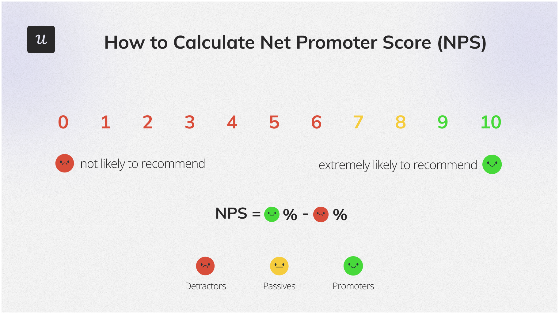
1. Net Promoter Score (NPS)
The Net Promoter Score asks one question: “How likely are you to recommend this product to a colleague?” Scores range from 0 to 10, and the final NPS is calculated as the percentage of promoters (9-10) minus the percentage of detractors (0-6), giving a range of -100 to 100.
Formula: % of promoters (scores 9-10) minus % of detractors (scores 0-6)
A high NPS alongside high churn is a common warning sign that the metric is giving a false read. Many teams now use NPS to track long-term sentiment trends rather than as a diagnostic measure for where users struggle. Pairing it with a follow-up open-text question asking what specifically drove the score gives it considerably more value.
2. Customer Satisfaction Score (CSAT)
A CSAT survey asks users to rate their satisfaction with a specific interaction, typically on a scale of 1 to 5. It’s most useful immediately after a defined event like completing onboarding, using a feature for the first time, or resolving a support ticket. If users consistently rate support interactions low, that often reflects a product problem rather than a support problem. When the product is too confusing to begin with, support is dealing with the downstream friction rather than creating it.
Formula: (Number of satisfied responses / Total responses) × 100
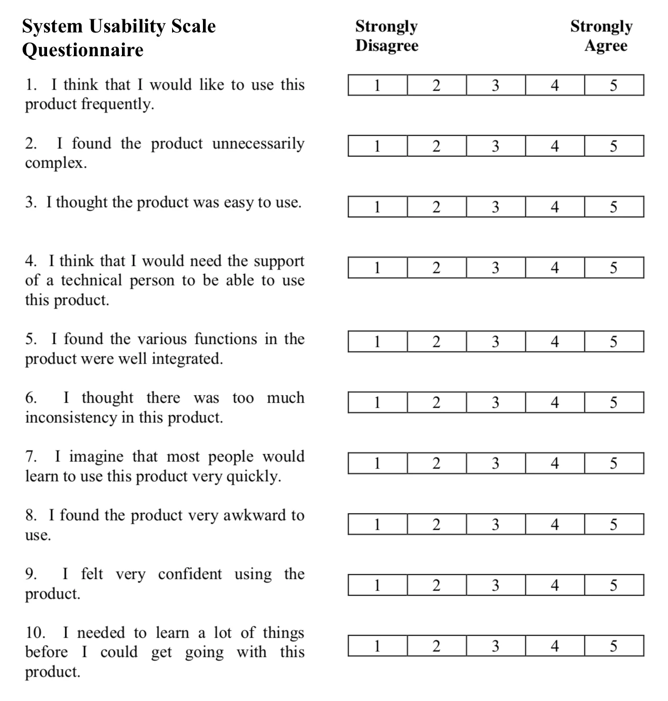
3. System Usability Scale (SUS)
The System Usability Scale is a standardized questionnaire used in usability testing to assess perceived usability. It consists of ten questions, each answered on a 1 to 5 scale where 1 means “strongly disagree” and 5 means “strongly agree.” After scoring, results convert to a 0-100 scale, with an average score of 68 across products. Anything above that generally indicates good perceived usability.
Those ten questions cover the user’s comfort with the system, whether they found it unnecessarily complex, how much prior learning was required before getting started, and whether they felt confident using it. SUS doesn’t require a technical person to administer, which makes it practical for product teams without a dedicated UX research function.
Formula: (Sum of adjusted scores) × 2.5, resulting in a 0-100 scale
4. DAU/MAU ratio
The DAU/MAU ratio measures product stickiness, or how often users return within a given month. A low ratio often signals that users don’t find enough daily value to return regularly, whether because core features are buried, notifications aren’t pulling people back, or the product hasn’t become a habit. For SaaS products competing for daily attention, this is one of the most honest indicators of whether the experience delivers ongoing value.
Formula: Daily active users / Monthly active users
5. User retention rate
Retention tracks how many users who signed up during a period are still active at the end of it. If users aren’t reaching the “Aha!” moment quickly enough, or if the core product doesn’t deliver enough ongoing value to justify continuing, retention falls. Alongside churn rate (which measures users who stopped using the product), retention is one of the clearest long-term indicators of whether the user experience actually holds up over time.
Formula: ((Users at end of period minus new users during period) / Users at start of period) × 100
Performance metrics for tracking whether users can get things done
Performance metrics measure whether users can actually complete what they came to do. A product can look polished in a demo and still fail when a real user attempts a real task under real conditions, and performance metrics are the most direct way to surface that gap.
1. Task success rate
Task success rate (TSR) measures the percentage of users who successfully complete a task, helping to identify usability issues and benchmark performance over time. In practice, this might be publishing a report, setting up billing, or inviting a teammate. A low rate on any core workflow is a direct signal that something in the UX design isn’t matching what users expect from the interface.
Formula: (Number of successful completions / Total attempts) × 100
Task success rate and task completion rate measure different things. Completion rate tracks whether users finished a task regardless of how; success rate tracks whether they did it correctly, without errors or outside help. For diagnosing usability issues, the success rate gives a more useful signal because it counts only the outcomes that actually reflect a good experience.
2. Efficiency
Efficiency combines speed and accuracy. In a dashboard product, it might measure how quickly a user builds and shares a report without making mistakes. Low efficiency on a core workflow often means the layout is cluttered, or the controls aren’t where users expect to find them when completing tasks for the first time.
Formula: Task success rate / Average time on task
3. Learnability
Learnability measures how quickly new users get comfortable with a product. It’s tracked by comparing how long a task takes on the first attempt versus the same task on a later attempt. If users can complete a core workflow within minutes of signing up without consulting documentation or contacting support, learnability is high.
Formula: (Time on first attempt minus time on later attempt) / Time on first attempt × 100
The concept of affordances is relevant here: visual cues in the interface that suggest how something works, like a button that looks clickable or a handle that suggests pulling. When affordances are clear, learnability improves because users can navigate the product based on what they see rather than what they’ve memorized. The UX Collective has a useful breakdown of how affordances affect learnability in practice.

Katie Kelly, UX Researcher at Userpilot, described how quantitative performance data and qualitative research complement each other in her work: “The behavioral data gave me some context, but it kind of pinpointed who I needed to talk to in order to gain better insight as to how the product should be built.” The numbers tell you where to look; the conversations tell you what’s actually causing it.
Three UX metrics most SaaS teams overlook
While the metrics above are tracked by many UX teams and sill work to assess product performance, there are a few more measurements that can help you track real outcomes.

Workflow completion rate
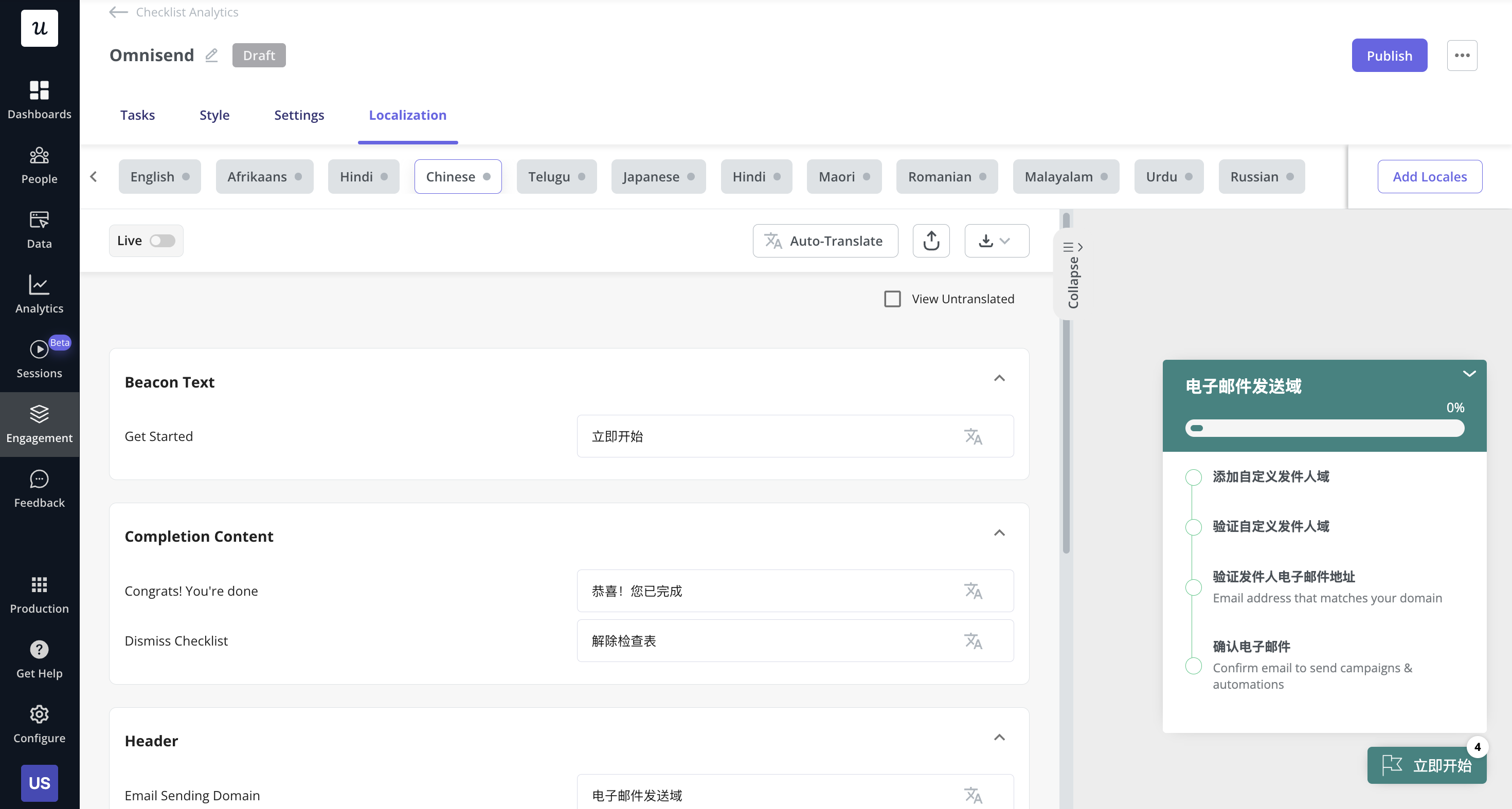
Most SaaS teams track feature adoption. Very few track whether users completed the workflow that the feature belongs to. There’s a meaningful difference between a user who clicked “create campaign” and a user who actually launched a campaign, or between clicking “invite” and a teammate successfully joining and activating. Workflow completion rate measures the latter: whether users finished the job they came to do. For B2B SaaS, especially, a workflow might touch the CRM, email, the product, and a support tool, all in sequence.
At Userpilot, we tracked the email feature’s setup funnel and found a 60-day lag between domain verification and email address setup steps. Identifying this at the workflow level, rather than the feature click level, revealed exactly where the friction was concentrated.
Friction-created behaviors
One of the strongest signals that UX has failed a user is when they build workarounds. Repeated clicks, backtracking through navigation, exporting data to Excel, visiting the help center multiple times in a single session, reopening the same support ticket, copying data manually between tools: these are behaviors that users wouldn’t perform if the product were doing its job. Tracking friction-created behaviors as UX metrics requires looking beyond surveys and into session recordings, support conversations, and behavioral patterns.
A support ticket that says “I had to export everything to Excel because your reporting is impossible” is often more diagnostic than a low CSAT score, because it contains the user’s language, the specific friction, and the workaround they chose. Support conversations that surface this kind of language are a legitimate UX research source, and many practitioners trust them more than survey scores precisely because users describe real problems in their own words.
UX debt
Engineering teams track technical debt systematically. Almost no SaaS teams apply the same thinking to UX. UX debt is the accumulation of known friction points, design inconsistencies, and workarounds that users have adapted to but that still cost time and trust. A rough UX debt inventory might include the number of workarounds discovered through session review, support volume tied to specific friction points, onboarding drop-offs caused by documented issues, and design inconsistency counts across major flows. Too much inconsistency across an interface compounds into a perceived usability problem, even when individual components work fine.
Tracking UX debt makes visible the experience quality cost that teams are already carrying. A team that knows it has 15 documented friction points generating 500 support tickets per month is in a much stronger position to argue for UX investment than a team presenting a CSAT score and nothing else. Katie Kelly observed this challenge directly: “Research tends to be perceived as slow and sometimes time-consuming. Companies sometimes struggle to make the link between the research and the return on investment.” A UX debt backlog is one practical way to close that gap.
How to measure user experience (connecting metrics to business goals)
Having a full picture of UX metrics doesn’t mean tracking everything. The teams that get the most from UX measurement usually track a purposeful set connected to real goals, measure continuously rather than in periodic batches, and treat every data source as one signal in a larger picture rather than a definitive answer on its own.
Step 1: Start with business goals, not metrics
Before choosing any metric, define what you’re trying to learn: whether you want to reduce onboarding friction, improve activation after a trial, understand week-three churn, or something else entirely. The goal determines which metrics are worth tracking. According to NNGroup’s 2025 research, when teams start with metrics rather than goals, they tend to end up in one of three traps: measuring vanity (numbers that look good but don’t drive decisions), measuring in silos (data nobody else in the organization acts on), or collecting noise (metrics that sit in dashboards and never influence anything).
A practical framework for aligning goals with measurement is Google’s HEART framework, which organizes UX metrics into five categories: Happiness, Engagement, Adoption, Retention, and Task Success. Each category maps to measurable signals, and the framework works best when applied to a specific feature or flow rather than the whole product at once.
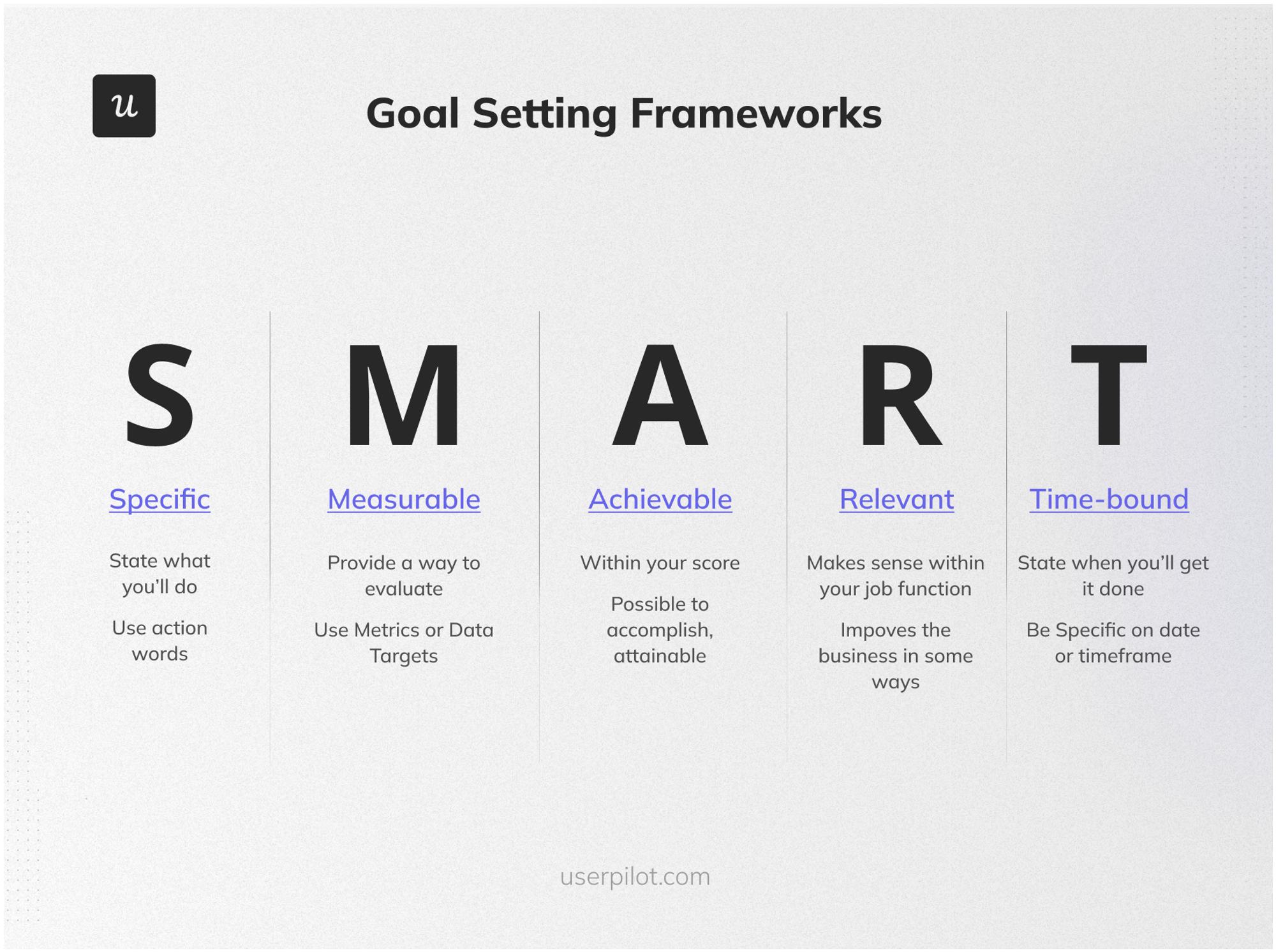
Setting SMART goals (Specific, Measurable, Achievable, Relevant, Time-bound) before beginning any measurement cycle forces teams to define what success looks like before they start looking for it.
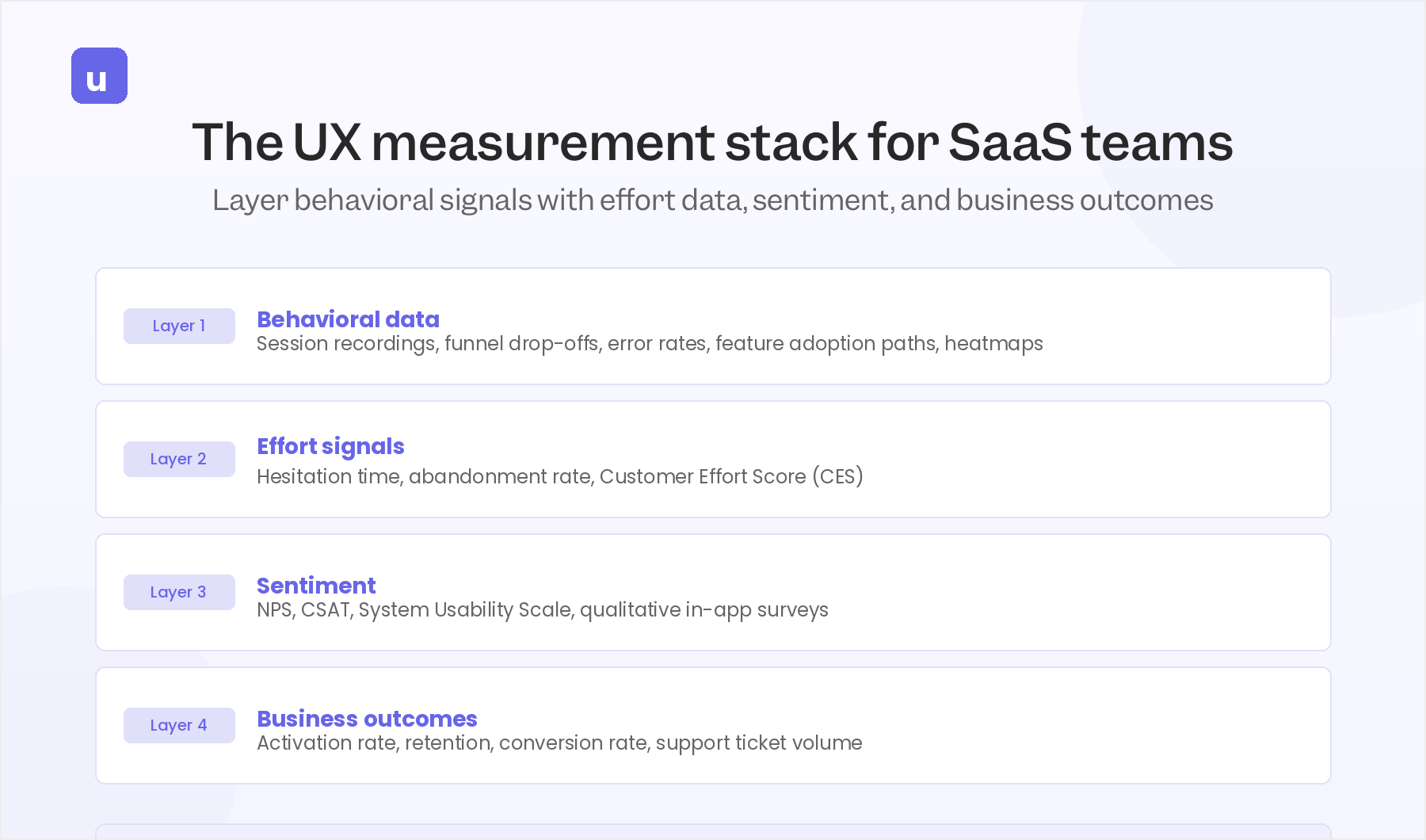
Step 2: Build a layered measurement stack
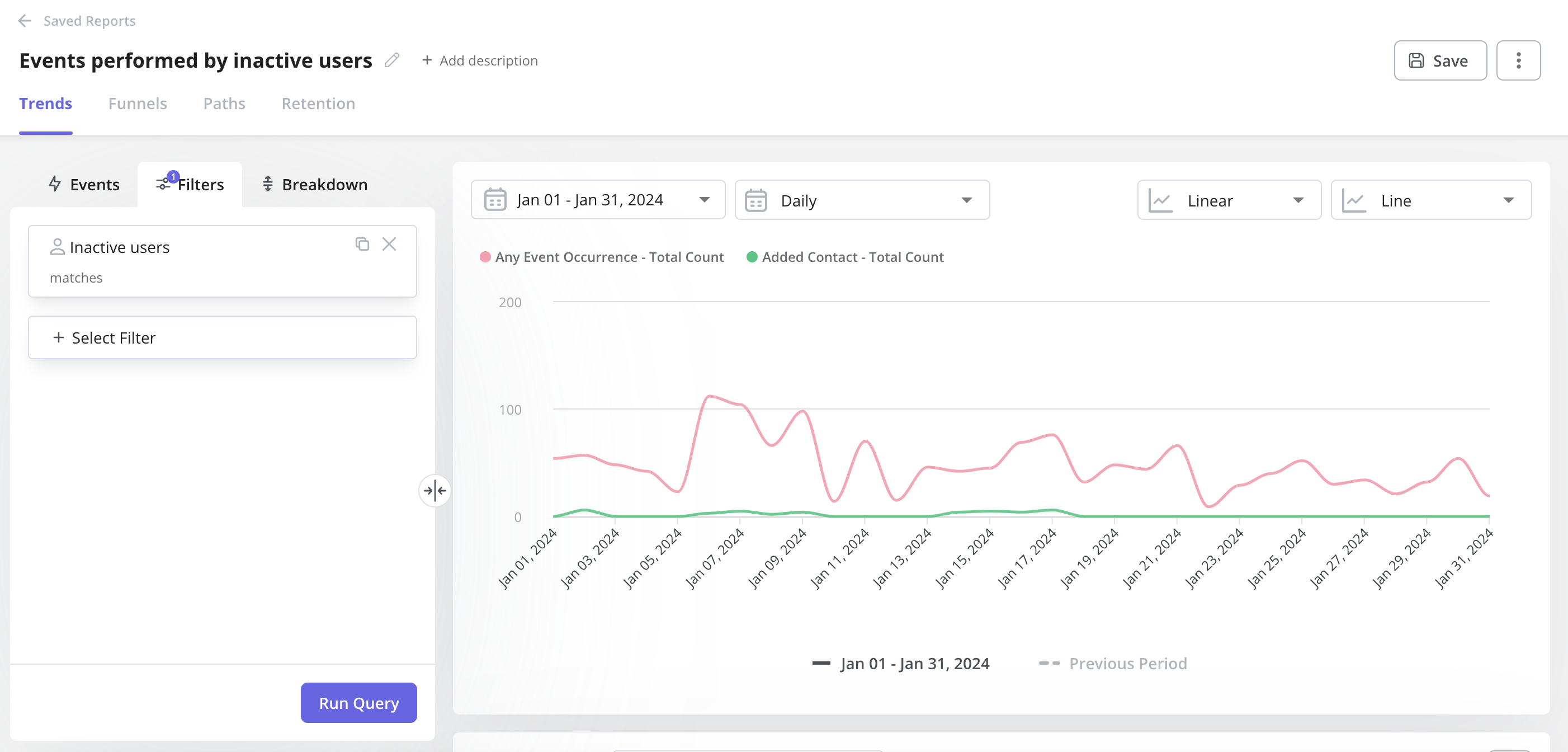
There is no single UX metric that tells the whole story. Practitioners across UX research communities consistently say that the right approach is to combine behavioral data, effort signals, sentiment, and business outcomes rather than looking for one number to rule them all. A practical measurement stack for SaaS teams looks like this:
- Layer 1: Behavioral data. What users actually do: session recordings, funnel drop-offs, error rates, feature adoption paths, and engagement metrics from tools like Userpilot Analytics or Google Analytics.
- Layer 2: Effort signals. How hard users had to work: hesitation time, abandonment rate, and Customer Effort Score (CES), which asks users directly, “How hard was this task?” Users tolerate bad UX more often than they mention it, but they rarely forget effort.
- Layer 3: Sentiment. How users feel: NPS, CSAT, SUS, and qualitative feedback from in-app surveys or support conversations. These attitudinal UX KPIs give context that behavioral data alone can’t provide.
- Layer 4: Business outcomes. What changed as a result: activation rate, retention, conversion rate (the percentage of users who complete a desired action, reflecting whether the user flow is working), and support ticket volume tied to specific flows. These connect UX work to the key performance indicators that leadership tracks and values.
The value of layering these isn’t just having more data points. It’s triangulation. When behavioral data shows a drop-off, effort signals show backtracking, and support tickets show users exporting to Excel, three signals pointing at the same flow give a team strong enough evidence to act without waiting for a definitive causal study.
Step 3: Measure UX continuously and close the loop
Periodic UX measurement gives you snapshots. Continuous measurement gives you signals you can act on before problems compound. With Userpilot, you can trigger in-app surveys right after specific interactions, track feature adoption patterns over time, and use session replay to investigate funnel drops as they appear rather than weeks later.
Katie Kelly described what continuous measurement looks like in practice at Userpilot: “One of the benefits of Userpilot is that you can change your surveys and how they’re being sent pretty quickly and efficiently. In my last role, sending out surveys was a very long process that required three or four different tools.” Continuous measurement only works if the tooling makes it practical. A measurement program that takes 45 minutes to launch a survey will get skipped whenever the team is under time pressure.
Four moments for measuring success in every SaaS product
Regardless of which specific metrics you prioritize, these four points in the user journey generate consistently useful UX data across most SaaS products:
- During onboarding: Track activation speed, task success on core setup flows, and hesitation time on critical steps. A survey triggered immediately after onboarding captures feedback while the experience is fresh. Userpilot lets you trigger these surveys automatically based on user behavior, with no code required.
- Before the trial ends: Look at feature adoption patterns and workflow completion rates. Users who haven’t completed a core workflow by day 14 are at higher churn risk, and knowing that early enough to act on it is the difference between retention intervention and post-mortem analysis.
- After users interact with a specific feature: Trigger a short in-app survey immediately after a user engages with a new feature to capture their immediate reaction. Userpilot lets you tag specific features, trigger surveys on interaction, and analyze adoption trends over time in the same interface.
- After support interactions: A post-support CSAT or NPS survey reveals whether the help experience resolved the underlying friction or just worked around it. If users consistently rate support interactions poorly, it’s worth checking whether the core product is generating friction that support can’t fully resolve.
Start optimizing for task completion instead of sentiments
NPS or CSAT are not going away since they’re still useful for tracking whether overall sentiment is moving in the right direction. However, what they can’t do is tell you which screen, step, or interaction to fix.
Workflow completion rate, friction-created behaviors or support ticket patterns metrics can close this gap. They point to specific places where users get stuck, work around a problem, or drop off. If your team is choosing between adding another satisfaction survey and tracking where workflows actually break down, the latter will change more roadmap decisions.
To help teams take better roadmap decisions, Userpilot brings behavioral data, in-app surveys, and event tracking into one place. This way, you can see where users get stuck without stitching together separate tools for analytics, surveys, and session replay. Book a demo to see how it can work for your product.
FAQ
What is a UX metric?
A UX metric is a specific, measurable indicator of how users interact with a product and how they perceive its quality. UX metrics capture different dimensions of the user experience, including efficiency, satisfaction, and ease of use, so teams can track changes over time and identify where the experience is working or breaking down.
How do you measure user experience on a website?
Combine behavioral data (session recordings, heatmaps, funnel drop-off analysis, bounce rate, and average session duration) with attitudinal data (CSAT surveys, NPS, and usability questionnaires like SUS) and performance data (task success rate, error rate, and time on task). Tools like Userpilot, Google Analytics, Mixpanel, and Amplitude cover different parts of this picture, and most teams need at least two to get both behavioral and attitudinal signals.
How do you run a usability test?
Usability testing involves observing real users as they complete defined tasks, either moderated (with a facilitator guiding the session) or unmoderated (where users work through tasks independently and record their screens). The most useful usability tests combine task-level performance metrics (success rate, time on task, error count) with qualitative observation of where users hesitate, backtrack, or express confusion. A/B testing is a related method that compares two versions of a design to see which performs better on a specific metric like task completion rate or conversion rate.
What's the difference between UX metrics and KPIs?
UX metrics track the day-to-day quality of specific user interactions, while key performance indicators (KPIs) are strategic goals measured over longer time horizons. Task success rate is a UX metric; activation rate is typically a KPI. A team that only tracks KPIs may miss the usability issues that explain why those KPIs are moving in the wrong direction, since the root cause often sits at the interaction level rather than the dashboard level. Google’s HEART framework is one practical approach for mapping UX metrics to KPIs in a way that makes the connection visible to leadership.
About the author