Strategic SaaS Onboarding Emails: How Top B2B Companies Drive Activation


Most SaaS users churn before they ever see value. They sign up, click around for a few minutes, and disappear: all because no one showed them where to go next.
Onboarding emails fix that.
SaaS onboarding emails are automated, behavior-triggered messages sent in the days after signup. Their job is singular: move new users to activation. That’s the moment they complete a key action that proves your product works for them. Think “first project created,” “first report exported,” or “first teammate invited.” Users who reach that moment stay.
The numbers make the case fast. Users who don’t engage within the first 3 days have a 90% chance of churn. Yet most companies do little to prevent it. Structured onboarding increases retention by 50%. That’s a gain that compounds across every cohort you acquire.
The best onboarding email sequences don’t just welcome users. They guide, nudge, and re-engage based on real behavior. Personalization based on user role or intent lifts 7-day retention by 35%, and poor onboarding accounts for 40 to 60% of early churn.
In this guide, I will go over the main types of SaaS onboarding emails, with real examples from top B2B companies and onboarding email templates you can adapt directly. Each section covers what to write, when to send it, and what separates a high-converting email from one that gets ignored.
Best examples of saas onboarding email sequences + templates
Each stage of the user lifecycle calls for a different email with a different goal. The templates below are built around bracketed variables so you can swap in your product, user role, and activation milestone without rewriting the structure.
Day 0: Warm welcome + quick start
Day 0 is the highest-intent moment in the entire lifecycle. Users just signed up, which means they’re motivated, curious, and unlikely to be this receptive again. One clear welcome message with a next step is all this email needs.
Teams sometimes load their SaaS onboarding emails with feature overviews, links to the help center, and multiple CTAs, then wonder why nobody clicks anything.
Template: Day 0 welcome email
Subject: [First name], you’re in. Here’s your first step.
Hi [First name],
Welcome to [Product]!
We built it to help [target role] [specific outcome your product delivers].
Your first step is [single onboarding action]. It takes less than three minutes.
Once you’ve done that, [Product] will [describe what immediately changes for the user].
Here’s how:
- [Step one]
- [Step two]
- [Step three]
[CTA: Primary action]
Run into any issues? Reply here and I’ll help you out.
[Name], [Title] @ [Product]
Day 1–2: Personalized onboarding checklist
At day one or two, you have two groups of users: the ones who took the first action and are ready to keep going, and the ones who signed up, looked around, and haven’t done anything yet.
In both cases, a checklist email works well. It needs to be personalized based on the new signups’ JTBDs you have learned about from the in-app welcome survey.
Template: Day 1–2 onboarding checklist email
Subject: [First name], you’re just 3 steps away from finishing your [Product] setup
Hi [First name],
Since your goal is [stated goal from signup], here are the three steps that will get [Product] working for you fastest:
- [Step tied directly to stated goal] so that [specific outcome]
- [Second step] so you can [specific outcome]
- [Third step] so you have [specific outcome]
[CTA: Open your setup checklist]
Each step takes under 5 minutes. Once you’ve done all three, you’ll have [describe the concrete state the user is now in].
Stuck on any step? Drop a reply here or check the [setup guide link].
[Name]
Day 3-5: Educational content
The day 3–5 email has a clear directive: teach something useful, make it immediately actionable, and ask for nothing in return. Not yet.
By this point, users have split. Some completed the basics and want to go further. Others stalled and are quietly losing interest. A single, focused email that delivers a quick win serves both.
A CopyHackers study of 127 SaaS trial sequences confirmed what most good email marketers already know: sequences that lead with value before pushing upgrades retain users at meaningfully higher rates.
Template: Day 3–5 educational email
Subject: The [feature] most [target role]s miss in week one
Hi [First name],
Now that [previous milestone they’ve hit] is running, here’s something a lot of [target role]s skip for later: [feature name].
[Product] lets you [one-sentence description of what the feature does]. [One sentence describing what this automates or removes from their workflow].
[CTA: Set up your first [feature]]
[Name]
Day 6-7: Regular check-in to deepen user engagement
By day 6–7, you have something most email sequences never use: actual behavioral data. You know who activated, who stalled, and who’s gone quiet. This is the moment to stop sending the same email to everyone.
- Quiet users need re-engagement with the lowest barrier possible: one action, clearly framed, easy to complete.
- Active users need something that pulls them further in: a case study from a company similar to theirs in industry, use case, and team size that reinforces the product works for people like them while surfacing features they haven’t touched yet.
Same send time, two completely different onboarding emails, and a meaningful difference in what happens next.
Template A: Day 6–7 re-engagement (disengaged user)
Subject: [First name], [specific incomplete step] isn’t set up yet
Hi [First name],
I noticed you [completed previous step] but haven’t [next required step] yet.
That’s the step where [Product] starts [describing the value that becomes available]. Without it, you’re [describe the gap they’re experiencing].
[CTA: Complete the step] — it takes less than three minutes.
If you get stuck, I’m right here.
[Name]
Template B: Day 6–7 case study (active user)
Subject: How a [team size] [team type] [achieves relevant outcome]
Hi [First name],
[Observation about what they’ve already done well].
As you start to scale, here’s a quick playbook from a [team description] using [Product] to [relevant outcome].
[One sentence summarizing their core approach.]
Here’s the exact workflow they use:
- [First workflow step]: [One sentence description of what they do and when]
- [Second workflow step]: [One sentence description of the trigger and what happens]
[CTA: Set up your first [workflow element]]
[Name]
Day 8-10: Trial reminder or upsell nudge
If you want to make the most of your free trial users, you need to send them a nudge to upgrade.
The more important thing is your copy. You won’t see any success with a generic “Your trial ends Friday” email.
Instead, you need to remind the user of what they have accomplished and would lose if the trial expires. For instance, a subject line like “53 of your accounts are flagged as at-risk” shows users real work they’ve done, and what losing access would feel like.
Template: Day 8–10 trial expiration email
Subject: [First name], [specific user progress metric from their session]
Hi [First name],
[Reference the specific thing they’ve built or achieved inside the product].
Your trial expires in [X] days and when it does, [describe specifically what they lose access to and what pauses].
Everything you’ve built so far — [list the key assets: configurations, setups, data] — is securely saved in your workspace. Once you activate any plan, [describe what immediately resumes].
Want to chat about which tier fits your team? Book [X] minutes here: [calendar link].
Or just drop a reply to this email.
[Name]
10 Impactful onboarding email examples from SaaS companies
If you need some inspiration for your own sequence, here is a look at how the top SaaS companies successfully activate their new users.
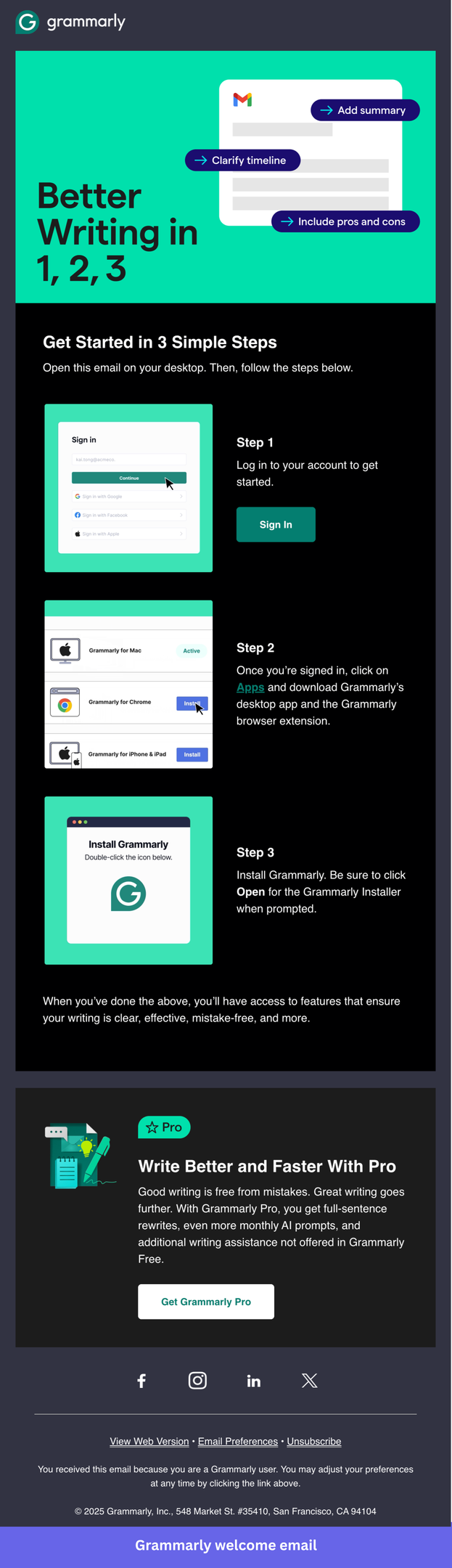
1. Grammarly introduces new users to its key features
Grammarly is an AI writing assistant that only proves its value once the extension is installed and running in the background, which makes installation the single most important activation step in the entire sequence. Without it, users never experience the product passively doing its job, and they have no reason to come back.
This welcome email earns its place as a benchmark example because it does something most onboarding emails get wrong: it resists the urge to explain the product and focuses entirely on one concrete task.
The numbered, visual step-by-step removes setup anxiety, the copy assumes the user already understands what Grammarly does, and there is no competing CTA pulling attention away from the install. It is a masterclass in restraint.
What you can implement in your onboarding emails:
- Lead with the install, not the pitch: Grammarly skips any reintroduction of the product and opens with “Get Started in 3 Simple Steps.” By day zero, users already know what they signed up for. Repeating the value proposition wastes the one moment when intent is highest.
- Make the first action feel small: Three numbered steps with a screenshot for each reframes installation from a technical task into a quick checklist. The cognitive load drops, and completion rates rise. If your activation step feels intimidating, break it into micro-steps and show each one visually.
- One CTA, one job: Every button in this email points to the same destination: getting the extension installed. There is no secondary offer, no blog link, no social follow prompt. Grammarly understood that a distracted user is a churned user.
- Place the upsell below the fold, not above it: The Pro upgrade prompt appears only after the installation steps are complete. This sequencing matters: asking users to pay before they have experienced any value is the fastest way to lose them. Show value first, then monetize.
- Use visuals as instructions, not decoration: Each step includes a screenshot of exactly what the user will see on their screen. Users don’t have to interpret anything; they just follow along.
2. Asana introduces a free trial for their premium plan
Asana is a B2B project management platform that sells on team-wide adoption, which means a single user evaluating the tool during a free trial is rarely the final decision-maker.
The entire onboarding sequence is designed to progressively build the case for upgrading, with early emails focused on project setup and team collaboration, and later ones shifting toward higher-value features like goals, portfolios, and AI automation.
This trial expiration email is worth studying because it avoids the two mistakes most SaaS companies make at this stage: it doesn’t panic, and it doesn’t beg. The headline “Choose a plan to keep using Asana” acknowledges the trial ended without dramatizing it, and the two secondary options (contacting sales and finding a certified partner) give enterprise buyers a path forward that doesn’t require a credit card decision on the spot.
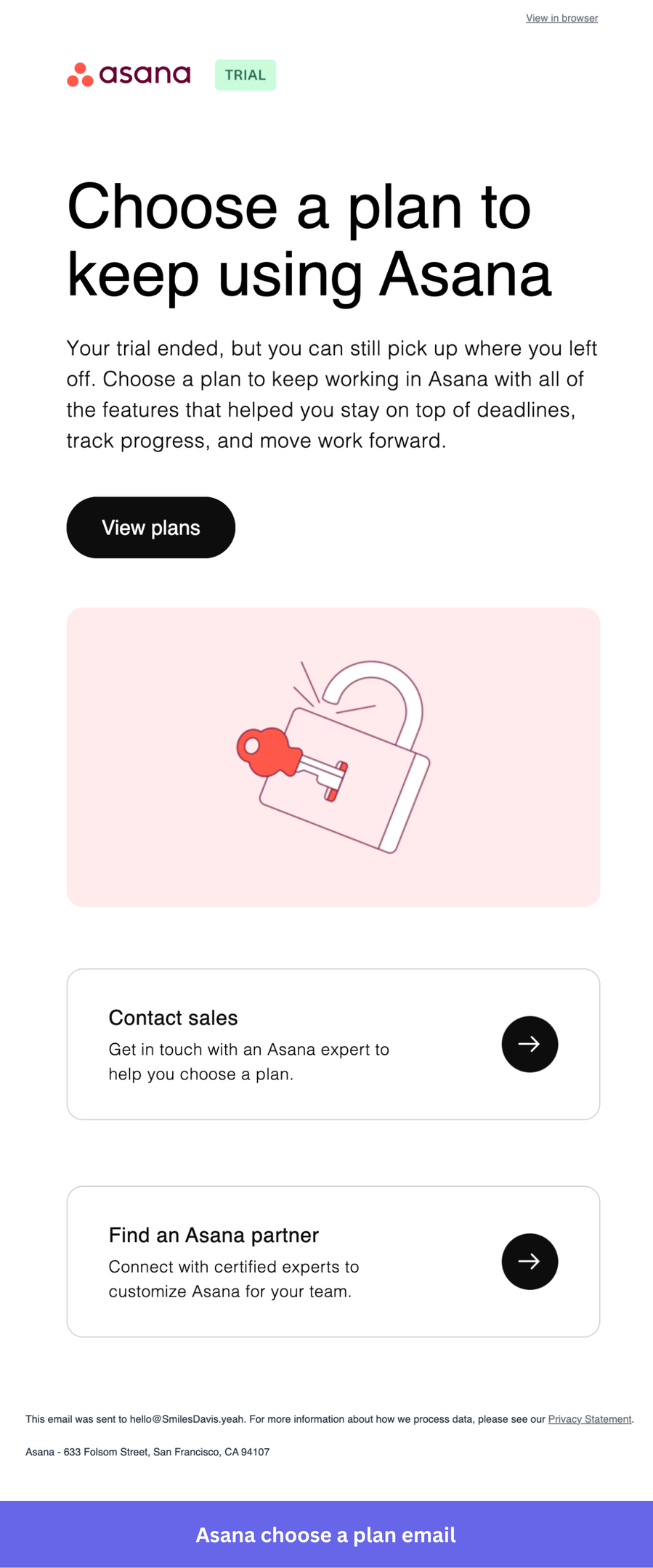
What you can implement in your onboarding emails:
- Frame the upgrade as a continuation: “You can still pick up where you left off” acknowledges the user’s existing investment in the product and makes upgrading feel like a small step, not a big decision.
- Keep the primary CTA simple: “View plans” doesn’t ask the user to commit to anything yet. It moves them one step forward without pressure, which reduces friction at the moment users are most likely to bounce.
- Add a human escalation path below the CTA: “Contact sales” and “Find an Asana partner” give users who need help choosing a way to get it without having to figure it out alone. For team plans, especially, having a sales contact available at this exact moment can make the difference between conversion and churn.
3. SurveyMonkey guides users to the next action
SurveyMonkey is an online survey platform whose value only becomes real once a user has sent a survey and started collecting responses, making that first send the activation event the entire onboarding sequence should point toward.
This welcome email stands out because of how confidently it strips everything back to a single task. There is no product tour, no feature list, no explanation of what SurveyMonkey is. The entire email is built around one CTA: “Create Survey”.
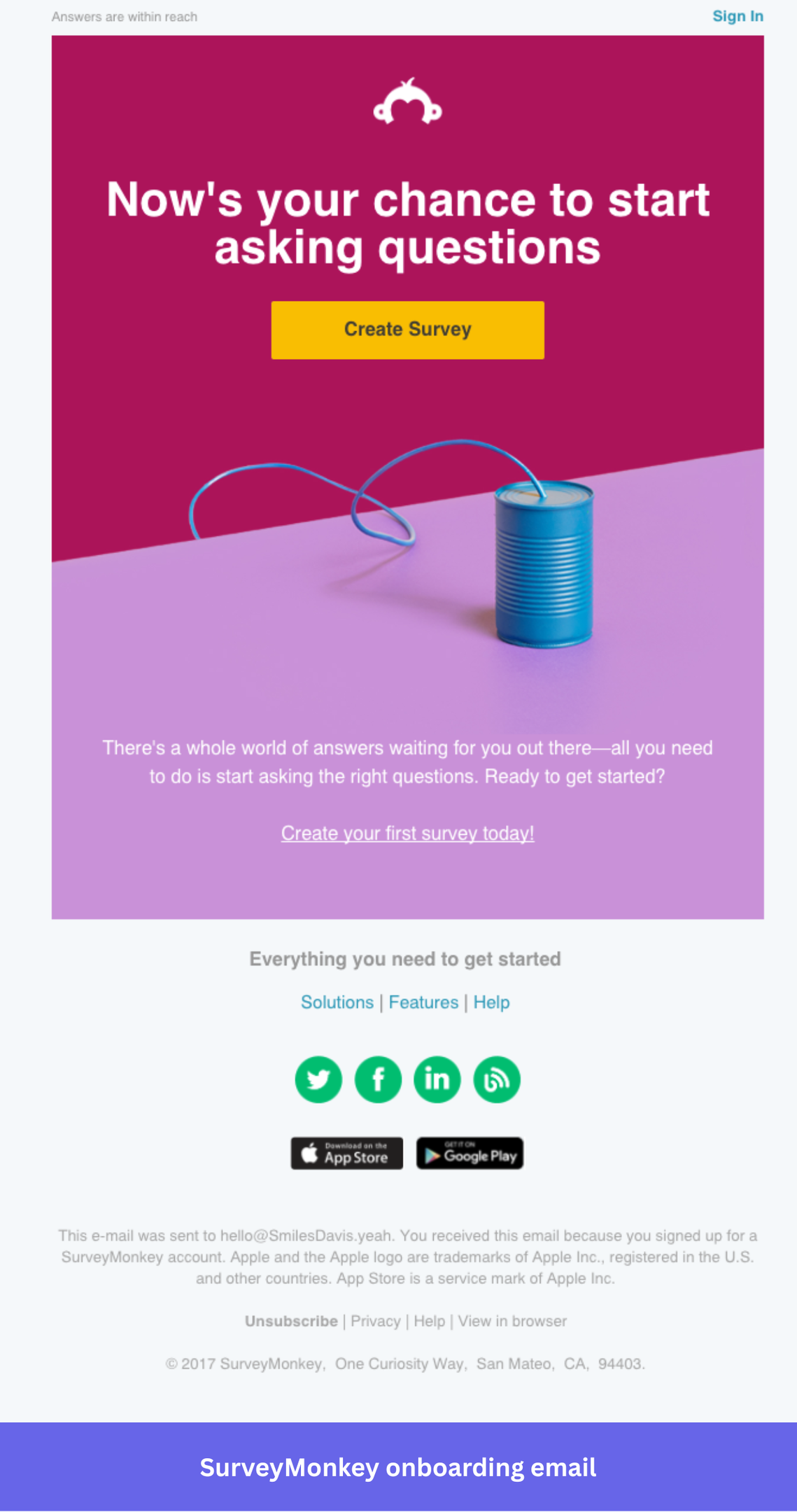
What you can implement in your onboarding emails:
- Lead with action: The headline “Now’s your chance to start asking questions” is about what the users signed up for. The copy meets them at their intent, not at the product’s feature set.
- Don’t over-explain at day zero: SurveyMonkey’s welcome email is deliberately short and straightforward, built to get users into the product without friction rather than front-loading them with information they don’t yet need. If users have questions, they’ll ask. The job of the first email is activation, not education.
- A bold visual does the selling: The bright image with the paper plane creates energy and signals simplicity, communicating “this is easy and worth trying” without a single word of copy.
4. Loom encourages activation with an interactive onboarding email
Loom is a video messaging tool where the “aha moment” only arrives after you record and share your first video, so the entire onboarding sequence has to make that first recording feel less intimidating than it actually is.
Loom’s welcome email embeds a video recorded by their VP of Product, encouraging users to start recording. Before the user has created a single recording, they receive one, demonstrating exactly what a finished Loom looks like in the format they’re being asked to use. It’s the most direct way a product has ever shown instead of being told.
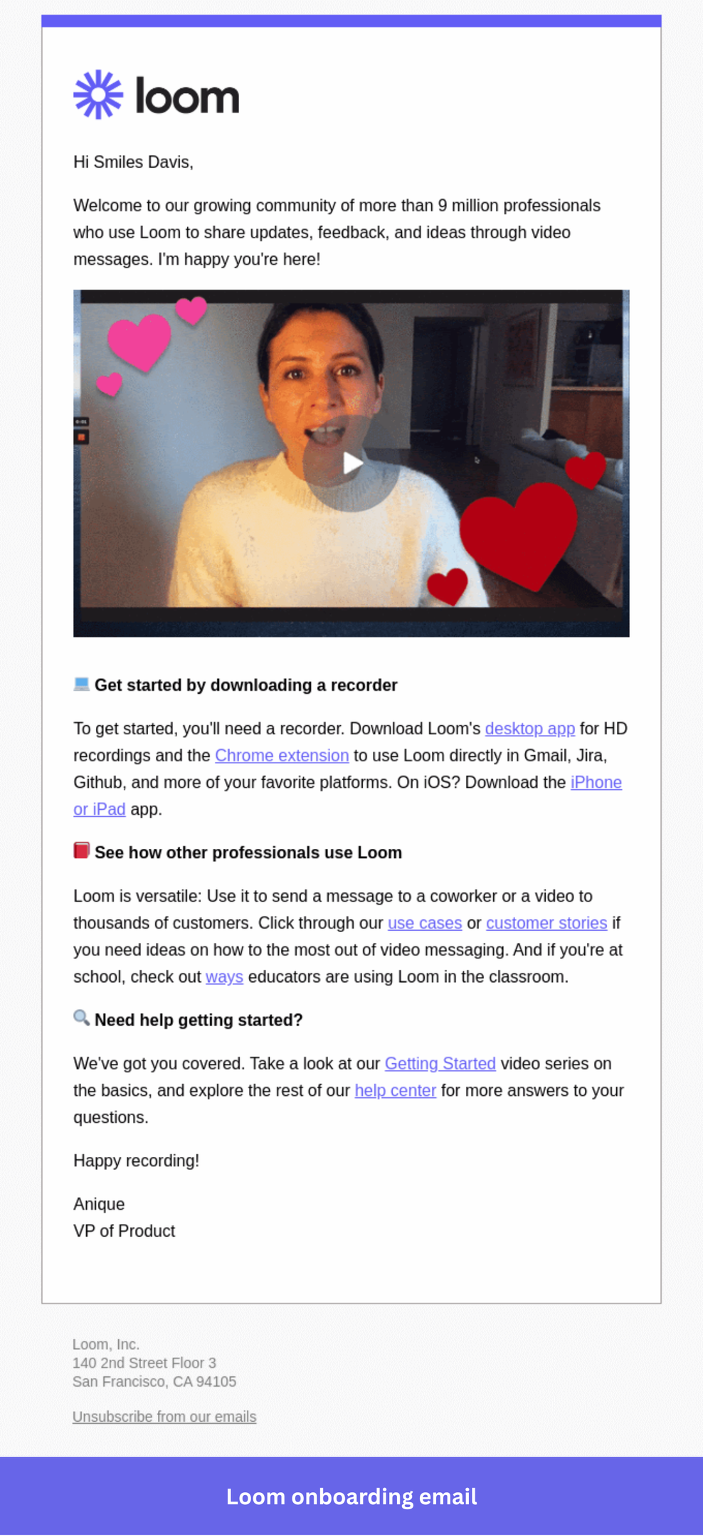
What you can implement in your onboarding emails:
- Use the product to demonstrate the product: Receiving a Loom inside the welcome email is the fastest possible way to show new users what they signed up for. It removes the “what will this even look like?” anxiety before they’ve recorded anything.
- A message from a real person builds trust immediately: The video is from the VP of Product, not a generic company account. That personal touch signals that real humans are invested in the user’s success.
- Follow the video with a simple next step: After the embedded video, Loom links to the Getting Started guide and help center. Available for users who want more, but not competing with the main experience.
5. Trello leverages social proof in its welcome email
Trello is a visual project management tool built around boards, lists, and cards. Because Trello serves an unusually wide range of users and use cases, from solo freelancers to large cross-functional teams, the onboarding sequence has to do one thing well: get users into a board quickly, so the product can demonstrate its own value rather than relying on email copy to explain it.
Why I picked this email: Trello’s welcome email opens with a warm, personal tone, immediately links to four key resources, and sets expectations for what comes next. What makes it stand out is that it creates the sense that someone is actually watching out for the user’s experience, not just running an automated drip.
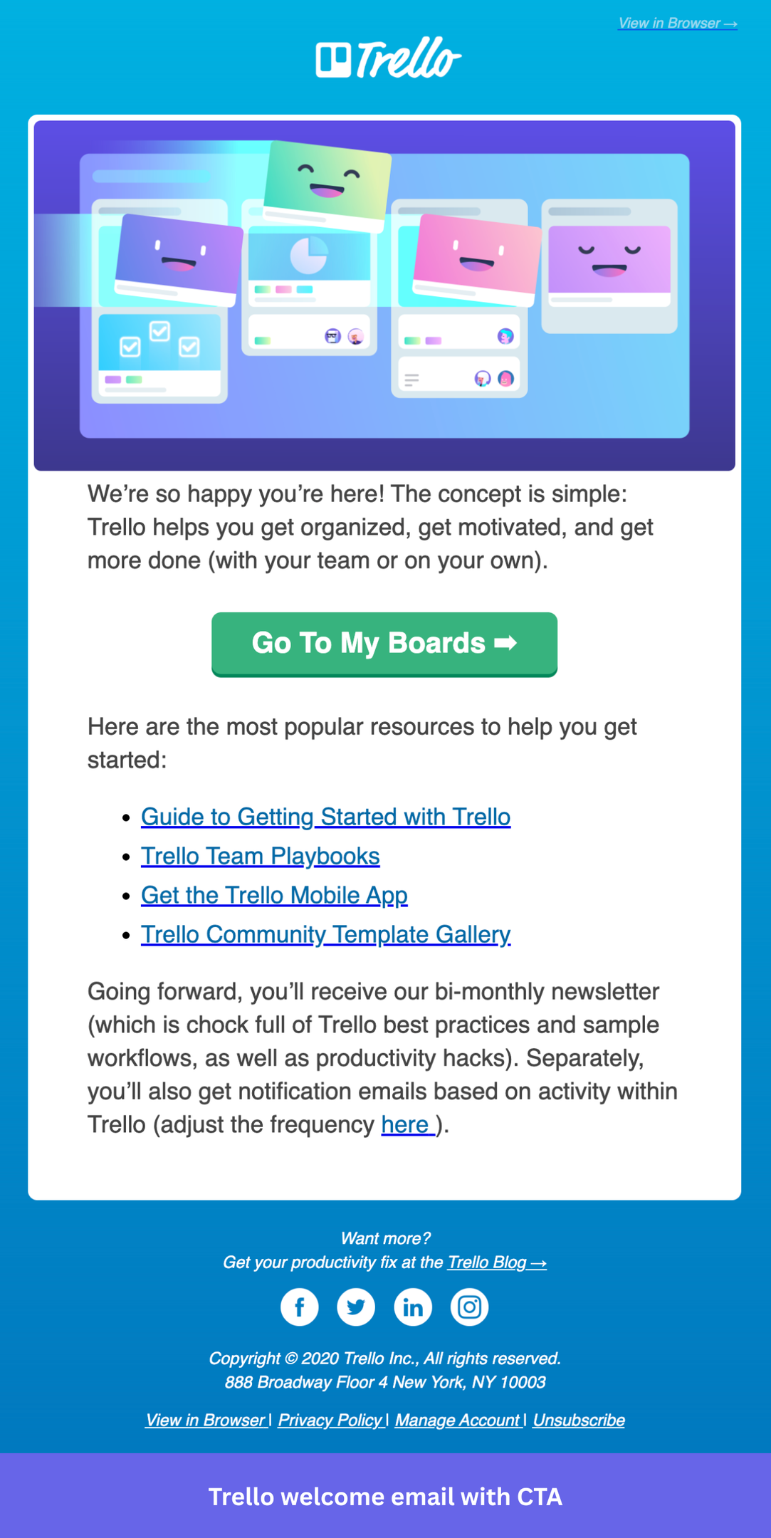
What you can implement in your onboarding emails:
- Set expectations for the relationship: Trello tells users they’ll receive a bi-monthly newsletter with best practices. Saying what comes next reduces unsubscribes because users know what they’re opting into.
- Use a resource list to serve different user types without segmenting the email: The four links (getting started guide, team playbooks, mobile app, template gallery) cover the most common reasons different users might stall. Rather than building separate onboarding paths at day zero, Trello offers a self-directed menu that lets users pull what they need. Avoid overwhelming users with too many resources, though.
- Keep the primary CTA personal: “Go to My Boards” uses “My” rather than “Your”, a small detail that makes the action feel like it belongs to the user, not the company.
6. Typeform shares a step-by-step guide along with customer success resources
Typeform is a form builder whose real power, quizzes, lead flows, research surveys, and product feedback forms, only becomes visible once users get past the blank-canvas problem of not knowing how to start their first form.
Why I picked this email: This “Get more from your forms” email breaks the setup process into concrete steps. This gives new users a clear picture of what they can do with Typeform right now to get started.
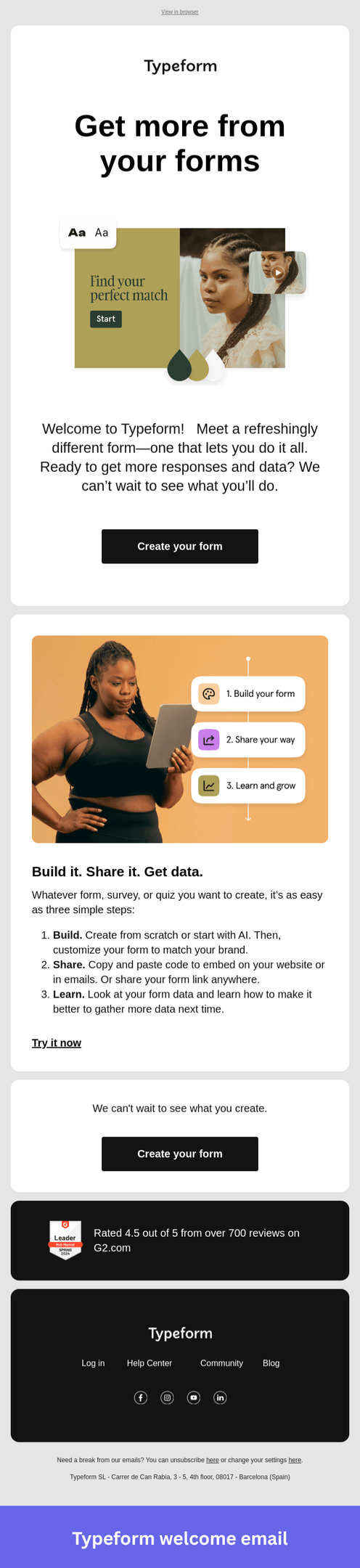
What you can implement in your onboarding emails:
- Pair every step with a screenshot: Showing users what they’ll see at each stage removes ambiguity and makes the instructions feel achievable rather than abstract.
- Number the steps explicitly: A numbered list tells users exactly how much they’re committing to before they start. Three steps feel manageable; an open-ended guide does not.
- End with a clear next step: Typeform closes with a “Create your form” link that takes the user directly to the form creation page. If your product allows immediate action, this sort of CTA can help you get people to take the first step.
7. Todoist expands retention through integration discovery
Todoist is a task management app where the activation moment, creating and completing your first task, happens fast. The harder problem is retention: keeping users from drifting back to whatever system they used before. Integrations solve this by embedding Todoist into tools users already live in, and this email exists to surface that possibility.
Why I picked this email: “40+ ways to make your Todoist work harder” skips onboarding entirely and focuses on deepening commitment from users who are already in, each integration gets a color-coded card with a single-sentence use case, communicating breadth without clutter. The parenthetical in the headline, “so you don’t have to”, does the most work in the email by framing integrations as effort-reduction rather than added setup.
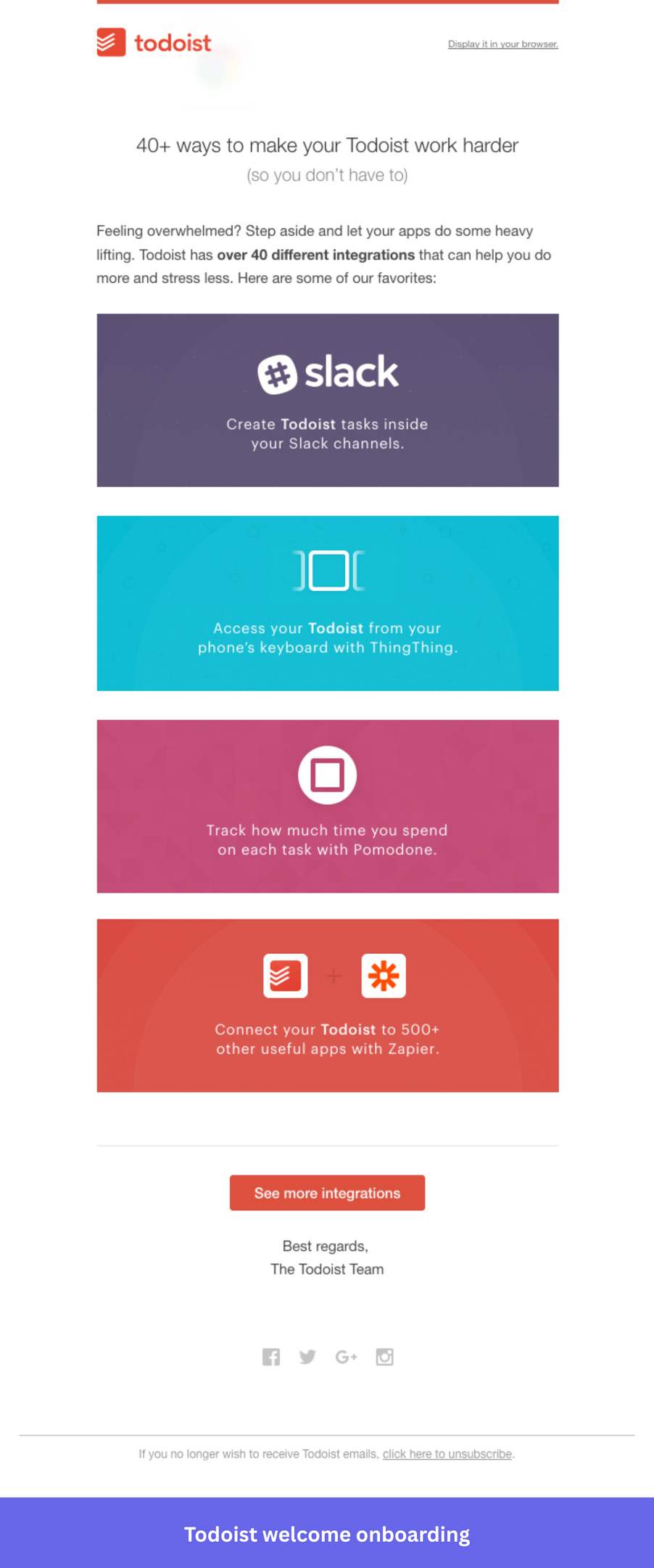
What you can implement in your onboarding emails:
- Lead with the user’s payoff, not the feature count: Todoist doesn’t say “40+ integrations.” It says those integrations make your work harder so you don’t have to. Think about what your product’s features actually spare users from doing, and lead with that instead of the capability itself.
- Use visual cards to make a list feel curated: Todoist presents four integrations as branded tiles rather than bullets. If you’re showcasing multiple features or use cases, think about whether a visual format makes the options feel hand-picked rather than exhaustive.
- Show enough to create pull, then point to the rest: Todoist surfaces four integrations and closes with “See more integrations.” If you have a large feature set or catalog, resist the urge to show everything. Give users a reason to click through.
8. Qualtrics explains the customer onboarding process in three steps
Qualtrics is an experience management platform where value only arrives after a survey has been created, distributed, and returned with responses worth acting on. Users who don’t understand that full path before they start are likely to stall somewhere in it.
Why I picked this email: The welcome email compresses the entire core workflow into three steps, each with an icon, a one-sentence description, and a direct help link. The personalized headline and hero CTA handle the emotional entry point; the three-step layout handles the practical one. Users arrive in the product already knowing what to do and in what order.
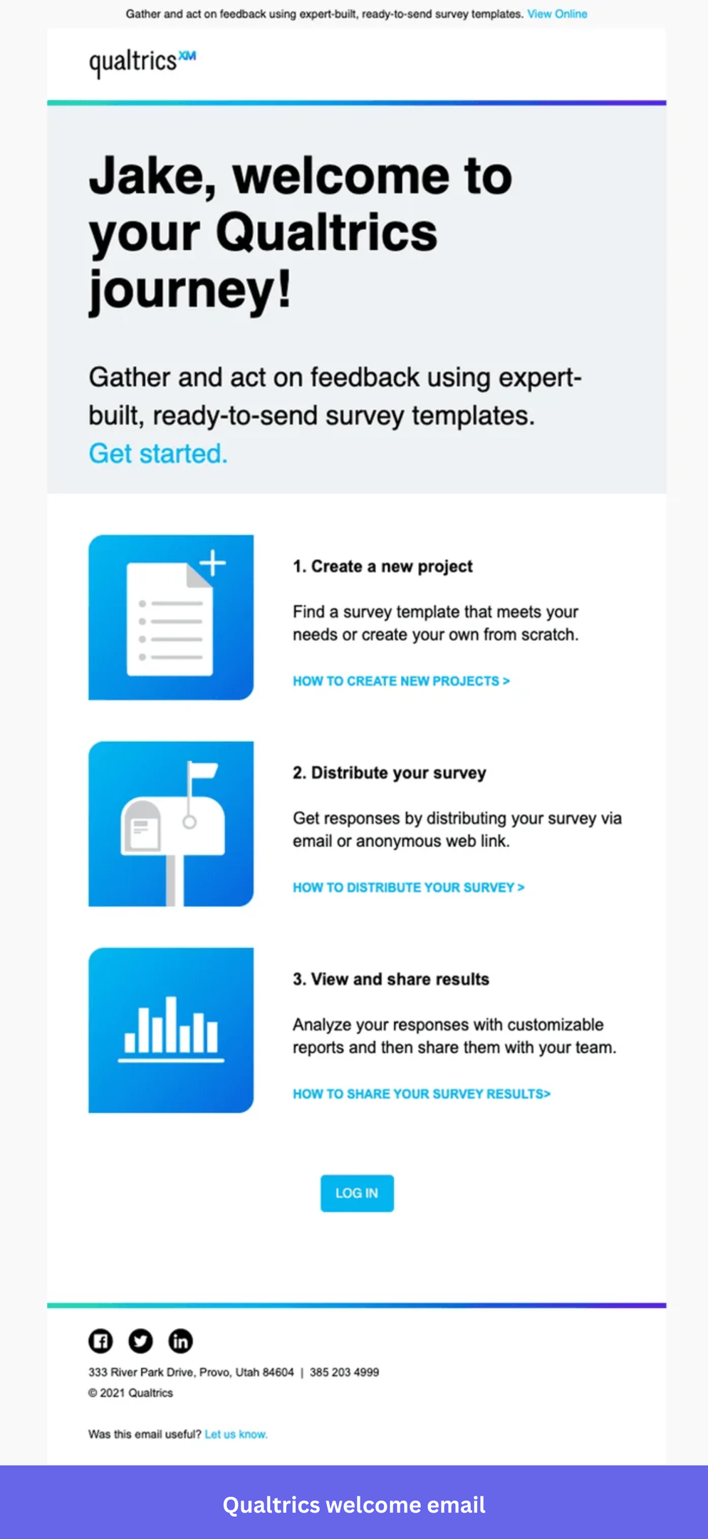
What you can implement in your onboarding emails:
- Show users where the path ends before they start walking it: If your product’s value requires multiple steps to reach, you need your welcome email to provide the complete steps. Three labeled steps with clear outcomes set the right expectation, and commitments feel finite.
- Position support where confusion actually happens: Instead of adding a help center link at the end of the email, find which steps in your setup are most likely to cause friction; that’s exactly where the documentation link belongs.
- Ask if your email is working: A simple “was this useful?” at the bottom is something most onboarding sequences never bother with. If you’re still iterating on your welcome flow, that’s a low-effort way to collect signal directly from new users while the experience is fresh.
9. Clay builds emotional context before asking for anything
Clay is an AI-powered data enrichment and outreach platform with a steep learning curve, and users who don’t quickly understand what it can do for them will assume it’s too complicated and churn before finding the value.
Clay’s welcome email takes a deliberately different approach to a complex product. Rather than screenshots or numbered UI steps, it’s a personal, text-heavy message that explains what Clay was built for and sets the user up with three specific tips for getting the most out of the product immediately. The tone is thoughtful and direct, matching the type of user Clay attracts.
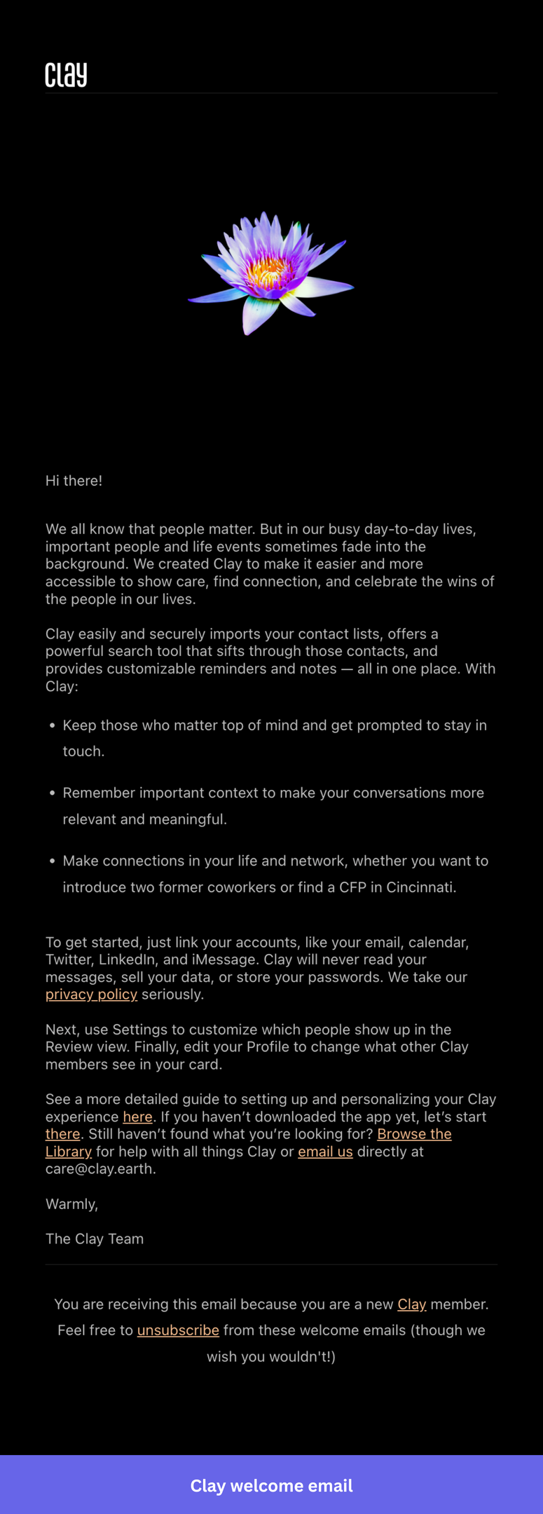
What you can implement in your onboarding emails:
- Name the emotional gap before you name the product: Think about the feeling your product resolves. If your welcome email leads with features before the reader has agreed they need them, you’re skipping the part that makes users care.
- Put reassurance where hesitation actually happens: If you’re asking users to connect accounts, grant permissions, or share sensitive data, that’s where the trust-building copy belongs. A privacy note in the footer doesn’t do the same job.
- Consider whether a checklist is needed: If getting started is simple, prose can communicate that better than a formatted list of steps.
10. ActiveCampaign onboards users into a powerful but complex platform
ActiveCampaign is a marketing automation platform whose value compounds the more workflows users connect, so getting users to their first automation fast is what determines retention. What I like: the onboarding sequence is built around what users say they want at signup, so a list grower and an automation-focused user receive completely different email paths.
The Quickstart Guide email lays out numbered steps, each with a short explanation, and a dedicated CTA button. There’s no ambiguity about what to do next at any point in the email. The unique login link at the top also does something most welcome emails skip: it gives users a reason to save the email rather than archive it immediately.
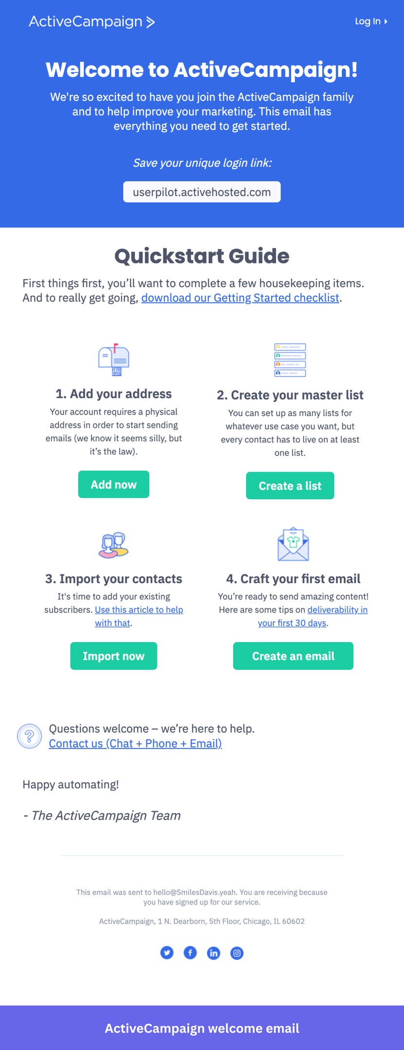
What you can implement in your onboarding emails:
- Put the action where the user is ready to take it: A single CTA at the bottom assumes everyone reads to the end before acting (spoiler: they don’t). If your setup has multiple stages, think about where users are most likely to click based on your email analytics data and put the entry point there.
- Make the email worth saving: It could be anything like a unique login link, a key URL, an account ID, or a getting-started checklist. If you have something a new user will need to reference later, surface it prominently and tell them to save it. Most welcome emails get archived immediately; give yours a reason to stick around.
- Don’t silently include a confusing step: If part of your onboarding is going to raise eyebrows, a brief, honest explanation lands better than leaving users to wonder. Acknowledging that something seems odd and explaining why it exists keeps trust intact.
Best practices for crafting an effective welcome email for new users
Writing good onboarding emails is half the work. The other half is making sure the emails reach the right person at the right moment, and that comes down to how you build your system.
1. Send behavior based emails
The biggest upgrade you can make to your sequence is moving from time-based to behavior-triggered emails.
A time-based email that fires three days after signup, regardless of what the user has done, is essentially a guess. You’re assuming they’re at a specific stage when they might have already converted, already churned, or never logged in after day one.
Build triggers around milestones instead. For instance, if a user has already added teammates and started a few conversations, skip the basics and surface automations or integrations.
2. Only share what new users actually need
It’s also quite common for teams to pack multiple features into a welcome email and then wonder why activation rates are low. It causes cognitive overload for users who haven’t built a habit around your product yet.
So, before writing any email in your sequence, answer these honestly:
- Who is this user and what are they trying to accomplish?
- What is the aha moment?
- What are the exact steps to reach it, and which are strictly necessary?
- Where does the most friction occur?
Think about Slack users. The aha moment is a conversation happening in a channel. So the day one email doesn’t need to mention custom emojis, huddles, or workflow builder. It gets you to add people and send a message. Everything else waits until that moment has completed that step.
Make sure your onboarding emails are responsive
Statista puts mobile devices at over 54% of global web traffic, so there’s a better than even chance your welcome email gets opened on a phone.
To accommodate this, I always run through the same checklist before sending:
- CTA buttons are large enough to tap comfortably.
- Body text at minimum 14px.
- Images that scale without breaking the layout.
- Single-column structure.
Also, always test on an actual device. A hero image that forces horizontal scrolling on iPhone will kill clicks regardless of how good the copy is.
How to measure the effectiveness of your SaaS onboarding email sequence?
The most direct way to measure your sequence is by tracking how many users who receive each email actually hit the activation milestone. Open rates and CTR are vanity metrics that don’t tell you whether the onboarding emails moved anyone closer to activation. That means defining the core activation metrics first. For a health score tool, it might be running a first scan. For Slack, it’s sending a message that gets a response.
Once you have that defined, you can measure what each email contributes to getting users there and identify where people are dropping off.
If a sequence isn’t converting, A/B test it to compare a feature-heavy email against a plain-text outcome-focused version so you can see which approach drives action for your audience. Look at your cohort analysis to compare 30-day retention between users who went through your new sequence and those who went through the old one. That’s the number that tells you whether the change actually mattered.
And the most important thing: trigger a short in-app feedback survey after onboarding completes and read it alongside your user behavior data. A user who gives you a 9 but never hits the activation milestone is still at risk. A user who gives you a 7 but has logged in every day for two weeks is probably fine.
FAQ
What is a SaaS onboarding email?
SaaS onboarding emails are a series of automated or manually sent messages that guide new users through their initial experience with a product. They provide users with key resources and structured guidance, helping them transition from sign-ups to active, engaged users who have experienced real product value.
Why send onboarding emails?
A SaaS welcome email during an onboarding process capitalizes on the enthusiasm users have immediately after signing up. Here’s why sending them matters:
- Engage new users from the start: Channels sign-up excitement into a first action and build momentum from day one.
- Provide a clear structure: Outlines next steps, manages expectations, and reduces early confusion that leads to drop-off.
- Improve activation: Links to setup guides and tutorials give users early access to support, increasing the chance they reach their first win.
- Reduce churn: Users who experience product value firsthand are more likely to adopt it into their workflow.
About the author