5 Methods to Visualize Customer Feedback for Actionable Insights
Saving time isn’t the only benefit of visually analyzing customer feedback. Being able to examine customer feedback data visually also makes it easier to derive actionable insights and, ultimately, form decisions.
How do you visualize user feedback, and what are the different methods to go about it? We’ve got the answers right here!
Why should you visualize customer feedback data?
Data visualization makes customer feedback analysis simpler and quicker, saving your product team tons of time. But that’s not all; there are several other reasons why you should focus on visualizing customer feedback data. Let’s look at what some of these are:
- Easier to identify patterns, trends, and outliers: Instead of analyzing user feedback manually, seeing it displayed visually helps uncover patterns or anomalies to explore further.
- Aids in better communication of key findings: Showing, instead of telling, results in greater impact and understanding when conveying key findings to stakeholders.
- Transforms raw feedback into actionable insights: Once you gather customer feedback data, what then? The raw data isn’t useful until visualization helps make it usable.
Types of customer feedback data
Before you can start the customer feedback analysis process, you need a key element: the data itself.
While collecting customer feedback data isn’t complicated, you still have to think of the data type you’re looking for. Here are the two data types you should collect when running surveys.
Quantitative customer feedback data
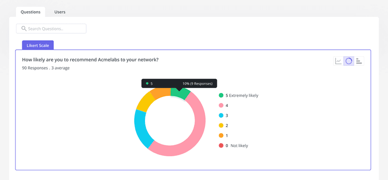
Quantitative data includes all the numerical stats and metrics you track related to customer feedback. This could include scores such as your Net Promoter Score (NPS), Customer Satisfaction Score (CSAT), or Customer Effort Score (CES).
These metrics help measure customer experiences through close-ended survey questions, like the one shown below.

Quantitative data can be tracked over time, which allows for easier comparison of product performance and customer satisfaction rates.
Qualitative customer feedback data
While numbers help highlight a problem and identify trends, qualitative insights provide context and get to the root cause of an issue.
This is because qualitative data is much more subjective. It gives customers a chance to express information or opinions through words and descriptions rather than just numbers. This type of data collection is most useful when you want to get a deeper understanding of what your customer is thinking and why.
Unlike its quantitative counterpart, qualitative feedback is collected via open-text questions or customer interviews.

How to visualize quantitative customer feedback data?
Once you’ve collected the numerical data, it’s time to start the visualization process. There are various customer feedback analysis methods, but let’s look at the most commonly used ones.
Use combined charts to monitor customer satisfaction scores over time
Instead of relying only on one chart for data visualization, try combining different charts to uncover deeper and more detailed insights.
For example, you could combine bar charts and line graphs to compare how your chosen metric changes over time and as compared to the previous period. Such data analysis on customer satisfaction can help find areas of improvement so you can work on boosting satisfaction rates.

Study customer feedback distribution with graphs
You can also use visualization aids to study the distribution of customer satisfaction rates. This helps understand how your product is doing in terms of customer experience, all at a glance.
To do this, use a pie chart to represent the quantitative data distribution across the feedback rating scales.

Alternatively, you could also use bar graphs to understand the customer satisfaction distribution in multiple-choice answers.

How to visualize qualitative customer feedback data?
While qualitative data focuses more on explanations, however, that translates into hundreds of answers, and it’s impossible to read every single response.
That’s why you need to know which methods to use to analyze qualitative data more efficiently.
Tag customer responses to identify common issues
To identify the most commonly occurring issues across your product, you could start tagging responses. Once you have all the data, you can filter the answers by response tags.
With a tool for survey data analysis, you can also visualize whether there are more positive or negative reviews. It can help you visualize the NPS score using emojis to represent the satisfaction levels across user answers.

Use tables to gauge customer feedback
Tables are a great way of displaying feedback data to see customer satisfaction levels at a glance. You can do this by opting for a list view of all the answers and then gauging the frequency and nature of the customer feedback.
This approach enables you to have a detailed examination of specific comments for better feedback analysis.

Analyze customer feedback with word clouds
Word clouds help you see which words are used the most in your customer feedback data. The bigger the size of the word, the greater its frequency of use.
Word clouds are super easy to create and provide a quick yet effective way of performing customer sentiment analysis. Moreover, they also help you prioritize what issues to tackle first because the frequently used words are the most pressing issues customers might be facing.
How to collect customer feedback and automate customer feedback analysis
Clearly, trying to analyze customer feedback manually is no longer the smart way of doing things anymore. Instead, you can save yourself the hassle by adopting a customer feedback analytics tool like Userpilot.
You can create feedback collection surveys without coding a single line. Plus, there’s a whole template library of customer feedback surveys at your disposal to get you started.
There are also advanced survey settings that enable you to automate feedback collection at scale, such as setting trigger conditions, AI localization for auto-translation, etc.

Moreover, you get survey analytics and data visualization tools to help you gain valuable insights into customer loyalty and satisfaction.
Conclusion
Wrapping things up, if you want to gain deeper insights into customer satisfaction or retention issues, then customer feedback visualization is the starting point.
Plus, try complementing your quantitative data analysis with qualitative feedback as well, for a more well-rounded approach.
Want to visualize customer feedback on your own? Get a Userpilot Demo and see how you can gain insights to improve customer satisfaction.


![Your Guide to SaaS Welcome Surveys (Best Practices + Examples]](https://blog-static.userpilot.com/blog/wp-content/uploads/2023/04/Your-Guide-to-SaaS-Welcome-Surveys-Best-Practices-Examples-1024x670.png)